This post may contain affiliate links. See our affiliate disclosure for more.


How to Present a Logo to Clients in 6 Steps (Tips from Experts)
Preston Lee
Preston Lee is the founder of Millo where he and his team have been helping freelancers thrive for over a decade. His advice has been featured by Entrepreneur, Inc, Forbes, Adobe, and many more. Learn more »
Adam Wright
Adam Wright is the Content Manager at Millo, in addition to running his own graphic and web design business, Adam Wright Design. When he's not working on his business, you can find him watching hockey or just about any type of racing. Learn more »
1. Start with the logo design brief
2. make the logo presentation in-person or via video, 3. tell a compelling story about the logo, 4. include mockups & provide context, 5. show off the logo’s versatility, 6. focus on the audience, 3 logo presentation templates for inspiration, mastering how to present a logo.
BIG NEWS! We just released The Freelance Files , a collection of professional done-for-you email scripts, contracts, invoices, and more for smarter freelancing. The first 50 customers, save 50% with this link .
Mastering how to present a logo to clients can take years of practice and experience.
Plus, there’s the pressure of getting a client logo presentation right the first time in order to avoid starting over or frustrating your client.
While a logo technically should stand on its own, my friend and logo expert Ian Paget perhaps put it best:
“I’ve learned through experience that how you present your design work is as important, if not more, than the physical design phase.”
With that in mind, I reached out to Ian, who runs a wonderfully successful logo design company in the UK and asked for a favor.
Could he connect me with dozens of talented logo designers to answer the question of how to present a logo to a client successfully?
What I got back was a collection of incredible advice from experienced logo designers who have been designing logos and presenting them to clients for years.
That means, instead of slogging through learning how to present a logo from scratch, you can learn from some talented and experienced logo designers exactly how to present a logo for the highest chances of client satisfaction.
- When presenting a logo, keep it simple. Present only your best design option(s).
- Explain how your design choices align with the client’s brand and goals.
- Consider using mockups to show how the logo would look in real-life scenarios.
Below are some of the most helpful responses I received. I hope they’ll prove useful as you perfect how to present a logo to your own clients.
The success of your logo presentation to a client starts long before you sit down to present your logo.
The real secret of how to present a logo begins in your initial meetings with clients when you send a proposal and agree on a creative brief.

Then, presenting a logo to a client becomes a matter of showing them how your design fulfills the requirements you both agreed on earlier in the process.
Here’s what a few expert logo designers had to say about how to present a logo according to the design brief:
Always start with a detailed design brief. If the client doesn’t provide you with one, create your own by asking the right questions. Once you have created a brief, get the client to approve this before starting anything. As part of my logo design process I create a tick-list of objectives by asking questions. I then ask the client to check and approve this list. 🎉 FINALLY... Our all-new version of SolidGigs has arrived. Get freelance leads on autopilot from a team of AI-assisted human experts. More leads, less work for you. Try FREE for 7 days » This approach ensures that we’re both on the same page from the outset, and that I have goals to refer back to when presenting my work. — Ian Paget, LogoGeek Before presenting I start with a conversation. I tell them what they are going to see, and how I will explain the reasons behind the work. I talk about research and reiterate what the creative brief outlines. —Susan Feinberg, Fireside Sponsored Become a sponsor Take them through the logo design process and show them how your concept meets their criteria. —Col Gray, PixelsInk Refer back to the brief to show your understanding of their brand and requirements. — James Mortimer Start with the end in mind – the goal – then repeat the brief, linking to aspirations they have for their company/brand. Then take them through what you will be presenting and your thought process for each. — Danny Matthews, Danny & Co. The most important thing is that the client can see how the solution delivers the strategy. — Iain Hamilton
Another suggestion on how to present a logo that came up over and over again in our group of experts was to make your logo presentations to clients in-person (or online), not via email.

Part of mastering how to present a logo is being able to gauge client reactions on the fly and adapt to a wide variety of responses. This proves near impossible when you simply present a logo via email.
Taking time to prepare a logo presentation that you make “in person” also shows you care about how you present the logo and that you believe in your final logo design.
Here’s what a few of our expert logo designers had to say about how to present a logo in-person (or via video):
My best advice is to always present [the logo] face to face. Never just send a file… It’s a simple one but also one of the most important things, in my opinion.
— Mads Haakansson, N’fellows Have structure to the presentation and always do it in person/live, instead of email. — Danny Matthews If you’re presenting the logos over skype or Zoom, do not send the presentation document to the client ahead of the call, instead present the logos document to them page by page and talk them through what they are seeing. — Ben Stanbury – Prosper
Learning how to present a logo to a client is as much about storytelling as it is about professional presenting skills.
In fact, a story will often get you much further with a client than a stiff, executive-style presentation ever will.
Your story should present the problem the company or its customers have faced and how the new logo solves many previous issues.
Here’s what some of our experts had to say when it comes to using storytelling when presenting a logo:
Tell the story behind the logo and it’s meaning. Touch on how it meets their criteria and how you see it resonating with the target market. Make sure to summarize that story as a simple blurb in the presentation, so the client can reference it as they deliberate.
— Rachel Stoneking, Stoneking Design Take them on a journey. Tell a meaningful story both visually and in writing. — Craig Burton Make a little animation or GIF to explain the story of the logo. This makes your client’s life easier as they explain further to all other stakeholders. — Mohak Ahuja Tell their story. Show how you’ve listened and interpreted their core. Show them that you understand and share their vision and goals. The craft and implementation can come later in the presentation but they need to believe you’ve ‘got it’. — Jonathan Harris, Harrisment
In addition to telling a story and showing how your logo solves the client’s problem-at-hand, you’ll also want to learn how to present a logo in context by providing real-life scenarios and mock-ups.
By presenting a client’s logo in real-world settings (like on their products, on business stationary, or in advertisements), your client will be more likely to envision the strength of the new logo you’re presenting.
Here’s what logo presentation pros told me about harnessing the power of logo mockups:
Include mockups to show the logo in use in real world situations and not just on an empty white page. Many people need help with visualising their logo in use and it really helps to sell the design. — Col Gray Give the logos some context. Whether that’s on the back of a business card, or the side of a building. It will help them understand how their new brand is going to work in the real world. — Simon Potter, Pixels & Paper Show them how the logo will be used in real life and suggest an application they may not have thought of relating to their aspirations. So if they would love to bring out a new product in future – show how that would look in real life to give longevity to the designs. —Danny Matthews Showcase the logos on mockups! Be sure to use the typical business stationery mockups, but also include a few that are relevant to the clients and their industry. Mockups are a great way to show clients how their new logo will work in the real world. —Rachel Stoneking Choose some selected key visuals/mockups of their identity in action. Get them to buy into themselves and their audience using and experiencing the new scheme. —Jonathan Harris You have to present [the logo] in context, and build on a story that the client will embrace. All of this stems from understanding the business, the culture, and the brand to help establish the right design for the right narrative. — Tony Lopez
In addition to presenting mockups of the logo’s potential usage, it will be helpful to show how versatile your logo can be.
Learning how to present a logo in a wide variety of ways will help your client see how flexible and timeless your new design is. It will help them see exactly why you charge good money for logo design .
Here’s what some of our logo design pros said about versatility:
Present it in as many ways as you can. Show it big, small, white only, black only. Show it embroidered, screen printed, embossed, glossy, matte. Show it on a mug, a hat, a t-shirt, on paper, on a car, on a billboard, in a newspaper… you get the idea. The point is to show them the versatility of the logo. Show that you’ve put in enough thought on the design that no matter the situation your design is going to work for them and not be something they need to “find a solution for” down the road. — Mike Pickett Don’t just show it large, show it tiny too. Large is impactful, but small shows it has range. There’s no point progressing a design that doesn’t work at 100px wide. —Mark Bowley, Bowley Design
Throughout your entire logo design presentation, you want to focus on the logo’s audience.
The audience is often not the client you’re presenting the logo to, but their customers or clients. So while it may be tempting to talk about how much your client should like your new logo designs, learning how to present a logo with the right audience in mind is critical to your success.
Perhaps one of the most critical pieces of advice was given by logo designer Ben Mottershead from Ben Designs: “Always show the logo as it would be seen by an audience.”
That means as you’re presenting mockups or highlighting the versatility of your new logo design, make sure you highlight the new logo from the perspective of the most important audience: your client’s customer.
You may find you need to remind your client to judge the new concept based on the audience, as I was reminded by designer Darius Enache: “Tell them on what criteria they should judge the logo (functionality, not personal preference).”
Show customers using products with the new logo. Show team vans parked on streets with the new logo plastered on the side. Mock-up a banner to see what the logo might look like at a major convention.
Putting the audience first through the entire process will be critical as you learn how to present a logo successfully.
To help your logo presentations and spark some ideas, here’s 5 designs done from experts showing you how it’s done.
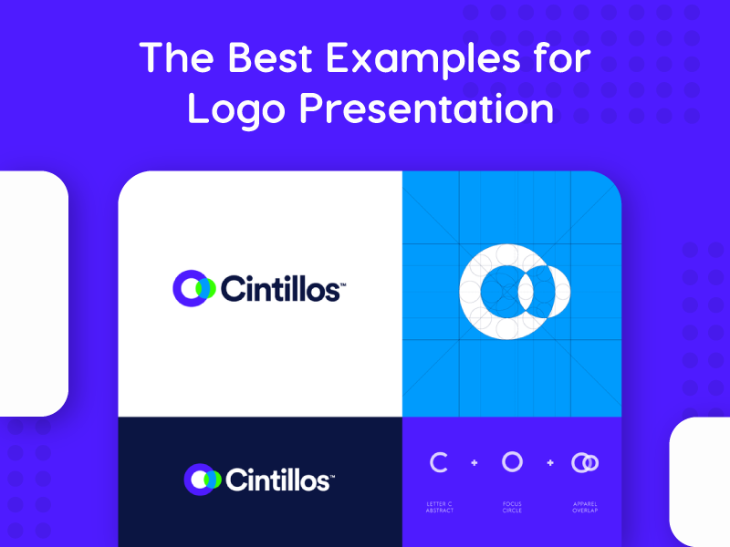
Grid logo presentation by Gennady Savinov

In this logo presentation, designer Gennady Savinov created a simple, yet effective grid layout to show both color variations. Additionally, he included the logo spacing spec for added visuals. This layout quickly and easily shows the client your design concept.
Single logo presentation by Angie Mathot

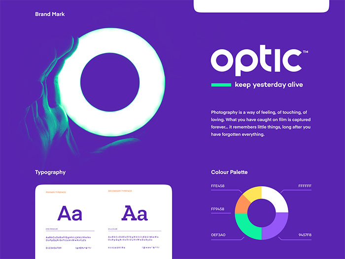
Detailed logo presentation by Jeroen van Eerden

In this logo presentation design, designer Jeroen van Eerden created a one-pager full of info. This gives a breakdown of who the company is, what they’re about, the logo design variations, and the typography to be used. Although it’s a little busy, this style can be super informational and useful for relaying brand guidelines.
The truth is, you won’t be perfect at presenting logos to clients overnight. And that’s ok.
But with time, and using the advice of the expert logo designers above on how to present a logo, you’re way ahead of the competition.
In addition to the advice shared above, Steve Evans from Sed+Co urges, “Make sure you … tell them to sleep on the concepts. Far too often clients are too quick to pick an option. Once they’ve gained some distance from the initial excitement, they’re mind is clearer to make an informed ‘business minded’ decision.”
And, of course, perhaps the most important advice for anyone wanting to learn how to present a logo comes from designer Liam Jackson:
“Only present designs you’re happy with. (We all know why 😅 ).”
For anyone who doesn’t know (yet), there’s an unwritten law in logo design that the client will always, ALWAYS pick the design you like the least.
So when presenting logos to clients, never show them something you’re not happy with yourself.
With that, you’re ready to go. All of us wish you the best of luck on your next logo design presentation!
Keep the conversation going...
Over 10,000 of us are having daily conversations over in our free Facebook group and we'd love to see you there. Join us!
Clients Creativity

Written by Preston Lee
Editor at millo.co.
Preston Lee is the founder of Millo where he and his team have been helping freelancers thrive for over a decade. His advice has been featured by Entrepreneur , Inc , Forbes , Adobe, and many more.
Preston's Articles
Reviewed & edited by Adam Wright , Editor at Millo.
At Millo, we strive to publish only the best, most trustworthy and reliable content for freelancers. You can learn more by reviewing our editorial policy .
Comments from the community
All of these are highly appreciated and remarkable client dealing strategies. But I have a query, what if you get some really annoying client who is not willing to show any interest in that design you made with full dedication and hard work. I was in a trouble last month when this type of situation happened to me and after all the efforts, I was no excuse for my services I provided him. However, nice post and I’ve learnt a lot from this.
Thank you for this great article. It is very important to provide clients with more than one logo concept for them to be satisfied with the service you have offered. This gives them a chance to choose from different styles and options.
Offering clients free revisions will also win clients over.
I just want to know how designers deliver the logos to the client? By email? By jump drive?
i see that a lot of logo designers who post their work online present their work on business cards or a large wooden panel. Especially for compete branding packages. How do they do this?
Focus should be on the logo and not presenting it on different material or backgrounds. That stuff comes later. The logo should be on a white background and free of clutter and other distractions. what your talking about is a brand identity which comes with big budget clients and possibly after they select one of the designs.
I’m not in agreement with this. A logo is never seen in isolation, so why present in this way? I think a logo needs to be tested in application by the designer, and also presented in this way too. I personally present the logo on its own as you mentioned, together with a few slides showing it in use as it helps to sell the design. There’s lots of really cool tools out there to make this a quick/easy process.
Awesome article. I love being able to explain “why” I create a logo the way I do and the elements I choose to include. It does double duty as showing the client that I was listening to their wants and it serves as a barrier to keep me from including irrelevant information or elements. Again, awesome post!
Your article covers almost all points.But I want to know to make a attractive background and portfolio that can help me getting more clients.I make good logos but problem comes while showing them .please help
Great article, nice tips! The first impression is so important, that there’s no room for bad logos. Unfortunatelly it is sometimes hard to convince clients of the solution that would be the best for them.
Nice article. Anyone that is presenting full web designs should remember to create a “mockup” of their work that your client can view in a browser with a background.
Very good post, awesome read, thanks
To echo Shea’s comment, Murphy’s law applies here. If you include a logo you are not 100% pleased with, the client will pick that one. Also, if you are working with an AE on the project, be sure to sit down beforehand and explain your reasoning so they can appropriately champion your work to the client. If you don’t work together as a team, it will make everyone look bad, not just the design. Great article Preston!
– “Present practical application”
Very often their first reaction is not so good when you showed them JUST logo. Then you put in on the business card, stationery, t-shirt, whatever – and they love it.
Most people perceive things depending on their surroundings :).
@Michal Kozak, That is a very good point! It seems that the client is always more impressed when you go the extra mile to help them understand application of the logo. Thanks for adding.
Sure do all that work but make sure your getting paid for all that additional work. That stuff comes after they decide on one of the concepts. Also the proper way is to have them pic a logo and if there are additional revisions, then you move to all that jazz with business cards etc.. You only do that if they pay for it, not to win them over. Your logo should do that by itself.
Nice Article. The first impression counts!
The “why” factor is always acting as the main principle in my presentation. From my experience: the more time you spend and efforts give to writing presentation the more positive client’s reaction is. So obviously sometimes it’s just not enough for a result and then it comes to how good you can be at explanations of your decisions.
And never present something that you don’t love. If it’s just okay… It it’s your least favorite… If it’s one one that you did just to illustrate how much better of an idea the others are, It is guaranteed that the client will pick that one.
YES! THIS CANNOT BE OVERSTATED! It has proven true SO many times.
It must be your best pick. Nice one Shea.
Nice tips! The way we present the logos might be 50% of success. We can drive the client’s mind to what we want 🙂
wicked article. You defiantly hit the nail on the head with a lot of those points. A lot of what I have read says that how you present your concept is just as important as what you present to a client.
How To Present Logo Design Projects
Top 3 picks:.
Our Top Products:

The Brand Master Bundle

The Creative Suite Bundle

The Brand Strategy Guide

The Brand Story Guide

The Rich Designer Book

The Brand Guidelines Kit

The Brand Archetypes Course

The One-Page Style Guide
Deals for creatives:.

I'm a branding expert and graphic designer based in Brooklyn, New York. Need help with branding?—Just Get in touch

Need help with branding?
Learn how to present logo design and identity projects to your clients and win their hearts and minds..
I have mastered this presentation methodology by years of experience working with some of the best design agencies.
So if you're wondering how to present logos to your clients—you're in the right place!
Before we go into nitty gritty of how to present logo design work, first it’s worth to mention that:
Presenting logos is a science, not an art.
If you follow my proven process, you won’t have to sell nothing to your client, they will be sold on their own.
If your logo is the product that you sell, then your logo presentation is the packaging of that product.
As we all know, we buy with eyes, so that your logo presentation just as packaging must be very attractive.
How you present your logos is as important as the logo designs themselves.
PS. If you prefer watching a YouTube video— check it out my channel .
5-Steps To Present Logos
- Prepare your client
- Start with objectives
- Explain your process
- Reveal the logos
- Get the feedback
Of course, before you proceed you have to have some logo concepts to show and someone to show them to.
I’m not going to talk here about how to design a logo , but I will just focus on the presentation itself—so let's assume that you have some logos designed.
First, it's important to establish some rules—let’s talk about the DO’s and DONT’s of presenting logos.
Common mistakes when presenting logos
The first biggest mistake you can make is presenting too many options .
How many logos should you present?—Show only three logos.
I’ve heard of designers presenting even 20 to 30 concepts—that’s way too many!
My client recently called me and said that some other designer presented them with 15 logos .
All of which were really bad, they didn’t like none of them .

You might be thinking that the more logos you present the greater the chance your client will like one, but the reality is that it will only confuse them .
Not even mentioning the energy and creativity you have to dilute over those 15 concepts—most likely you would end up with mediocre concepts.
It’s much better to focus on presenting only three strong logo concepts!
Behind the scenes you can sketch hundreds of logos —no problem, just don’t show them all to your client!
The second biggest mistake you can make is sending them over by emai l, in an attachment.
Is best to present logo and identity design projects either over the phone or in-person .
I usually present my logo design work via Zoom video call , after which I send my client the link to that logo presentation by email.
That way I get the chance to describe my logos , explain my ideas and say what I have to say, before letting the client voice their opinion.
Now, let’s talk about some of the best practices when it comes to logo presentation.
Best practices when presenting logos
The first best practice to follow when presenting your logo concepts is to start with a solid strategy session .
This sessions will provide you with all the necessary words that you can use to translate strategy into visual concepts .
This is basically about extracting important information from the client, but also engaging the client in the process and generating some ideas.

Learn more about how to develop and then translate strategy into visual design in my other article.
The second best practice to follow when presenting your logos is to take smaller steps with your client.
You see, logo and identity design is often a long windy road towards the right solution.
It’s not like you just design something fast and there's is a big reveal where you expect to WOW your client.
it’s more of a sequential process where you’re building towards the final logo in a set of steps.
One of the best steps you can take is to use moodboards or stylescapes.
Taking smaller steps will point you (and your client) in the right direction with confidence.
So remember—Never just send your logo presentation by email, and never present more than three concepts.
Tools to prepare your logo presentation
There are many ways in which you can present your design work successfully.
It could be a high-res PDF, a PowerPoint or Keynote, or you can simply use an online visual board tool like InVision.
First, I prepare mockups in PSD , then I embed these mockups in Indesign (one mockup per slide).
So that when I'm making changes to my mockup in Photoshop, the presentation will be automatically updated in Indesign.
Next, I don’t export a PDF like you would expect, but I rather publish that PDF to the cloud straight form InDesign, so that I can simply send my client a link later on.
That way, if I want to change something in my presentation, I simply republish it with just one click straight from InDesign and my client can see the changes .
They can also download the PDF for their own record or just to print it out if they want to.
So with that being said, let’s jump into building the logo presentation.
1. Prepare your client
First, before you show any of you logo work, you need to prepare your client for what’s coming.
You must put your client in the right state of mind before you show them anything.
I like to remind my client about two things: what a logo is and what makes a good logo .
So I open my presentation with a quite by great designer Sagi Haviv (that I had a pleasure to work with):
“A good logo is NOT about what one likes or dislikes, it’s about what works.“ —Sagi Haviv
The reason for saying that is to simply remind your client that logo design is NOT about personal preferences .

A logo doesn’t have to communicate or illustrate everything, so you shouldn’t try to say too many things with it.
A logo is more like an empty vessel and meaning can be attached to it over time , with its consistent use and following through on brand promise.
I say this in order to prevent the client from trying to make the logo look too busy and therefore confusing.
Next, I follow up with a slide that talks about logo design principles— what makes a good vs bad logo.
Clients usually tend to be a bit subjective, so you have to remind them about some of the basic principles of logo design.
This should save you from hearing pointless suggestions later on that could ruin your great work.
We, as designers, have a good sense of aesthetics and we usually know why one logo is better than the other.
However, sometimes it’s not easy to explain that to our client.
That’s why I use the following slide with three logo design principles (again, developed by Sagi Haviv).
"A logo must be appropriate, simple and memorable." —Sagi Haviv
I say this out loud when I show this slide.
Next, I describe shortly each of them:
- Appropriate —Is your logo appropriate for the business?
- Simple —Is your logo simple enough to work in all sizes?
- Memorable —Is it distinctive, so it can be easily remembered?
I also explain that I use these rules when determining what logos would potentially work (I use it as a checklist).
Now, with those two opening slides, I don’t go into showing off the logos yet.
2. Start with objectives
Before you show any of your logo design concepts, you need to start with some basic facts .
You can start by saying something like this:
“Our goal is to design a new identity for Medihuanna, one that resonates better with our customers...”
Your goal here is to remind the client about the goals and objectives of this project or what kind of problems we’re trying to solve.

Here are some of the examples of the reasons why people need a new brand identity.
- repositions you to gain more sales
- increase your revenue
- connect better with target audience
This should have been fleshed out way before you start working—in your first sales call.
So if you follow my other guides on how to develop brand strategy and how to translate strategy into visuals , then you should know by now what I’m talking about here.
By reminding your client about the objectives for designing the logo, you will put them back into the buying mode—which can be a powerful thing when it comes to approvals.
This is also a great way to reassure the client that you understand the problem and you truly want to help them succeed.
Aside form that, it will help you remove yours or clients’ design preferences from the equation.
They will be more likely to settle on a logo they may not necessarily love, but they know it can work effectively for their business.
3. Explain your process
Once I stated the project's objectives, then I inform them about the strategy we took to accomplish these objectives.
Here, you simply want to summarize what you’ve done so far—I usually say something like:
"Before I show you the work, let’s take a step back and review the process to date."
Here I simply refer back to our strategy session and the brief that came out of that.

First, I show them the words that we chose to describe the brand , and next I show them the moodboards we created to express these words visually.
Here I just want to remind them what we’ve gone through together, from initial phone call, through brand strategy, to brand brief with moodboards.
I do this because it’s much more difficult to disagree with yourself than with other people.
So if you remind them about something they said earlier in the process (like during the strategy session), they most likely won’t refute the results of those decisions.
For example, if they chose the word “ credible ” to describe their brand during the strategy session, and then I use colors or fonts to reflect that “credibility”—it's much easier for me to explain my designs.
This whole summary shouldn’t take more than 5 minutes—it’s just a good way to get everybody on the same page .
This will help your client stay objective when you start showing them your logos.
Moreover, it will give your client a sense of ownership—after all, it’s their insights what drove your decisions .
4. Reveal the logos
Finally it’s time to reveal your logos and explain your thoughts behind each concept.
For example, this is how I presented my first logo concept:
"In the first logo we use a minimalist sans-serif font that conveys the simplicity of use and the clarity of our courses.“
First I say this as I show the first slide, which is just the logo alone centered on a white background .
The second slide is usually the logo on dark background and with some photo behind it.
So as I continue going through the slides I'm describing my work:
“To make the logo distinctive, we replaced the dot over the “i” with a leaflet which symbolizes nature and natural treatment that cannabis provides.“
The next—third slide—is a split screen showing the logo on white background on the left and black background on the right.
As I navigate through the slides (3-5 sec for each) I also say a few words about the designs and the decisions I’ve made.
For example, when I reach the slide with the pattern, I say this:
“I designed a geometric leaflet that can be used as an identity element and an extension of the simplistic wordmark”
And then when I go to the next slide I follow up with:
“This leaflet allows us plenty of room for expression, it can be used as a unifying graphic element on all applications.”
Remember that a huge part of successful presentation is your ability to articulate your design choices (the style, fonts and colors you picked).
Here, you can prepare yourself by reading design reviews , for example: I like to read the BrandNew Blog .
This will help you build your design literacy, so that describing your work will become much easier.
Of course, whatever you say it must be backed up by strategy and decisions you’ve made with your client in the past.
So the following few slides is a collection of different mockups relevant to your client.
You should know by now what mockups to use based on the discovery session ( the 6th exercise of my strategy guide ).
However, typical mockups would include something like business cards , envelope , stationery , perhaps a website , maybe social media graphic , a signage and so on.
All the things that your client expect to see the logo on.
Here, it’s important to show a couple of small format mockups like pins, icons, pencils, cufflinks as well as large-format mockups like signage, way-finding, interior graphics, billboards etc.
Your client needs to see how the logo will look like when used in small size as well as at scale—in large format.
Here you can even go beyond of what they would typically use the logo on and add a couple of extra mockups .
That way you can really help them envision this logo in use in real life.
Beginner designers often ask me—how to find best mockups for logo presentation?
There are many places where you can find free mockups , but the problem with that is that they tend to be everywhere just because they’re free.
A much better way is to buy premium mockups —they won’t cost you a fortune, but you will end up with a gorgeous logo presentation.
Alternatively you can create mockups yourself by finding stock photos and then using Smart Objects in Photoshop.
It always try to include at least one or two realistic photos, for example a billboard on the street or on the side of a building.
As I go through these slide, I’m NOT asking for the feedback yet— I simply lead the presentation and navigate through slides while describing the designs.
If client interrupts me, I simply stop them saying:
"Please let me go through all the concepts first and then we can discuss them".
Once I’m done with presenting the first concept, then I go straight to the second one.
As I already mentioned, the ideal number of logos to present is three .
And each of the three logo concepts should be explained on the same sequence of slides.
What it means is that you should use the same mockups for each concept just to make the comparison fair.
Your client will probably reject one of them and then lean toward either one of the other two.
Rarely clients will make a decision on the spot—but that’s fine, that’s why we’re preparing such a beautiful logo presentation.
That way the client can sleep on it, show it to other people and get back to you with some feedback.
So you do the same with the other two concepts—you should have about 5 to 10 slides per concept.
And again, while you’re preparing those mockups, try to describe your thought behind each concept .
For example, this is how I described my 3rd logo concept:
“This concept was inspired by crests that are often being used in logos of universities.”
and then while I go through the slides, I add:
“In combination with the prestigious-looking color palette, this identity portrays Medihuanna as a well-established and respected educational organization.”
When I reach the slide with the mark, then I add:
“Here we retain the serpent-entwined rod (symbol of health) from the old logo, but we refined the shape to nicely sit inside the university-like crest.”
When I’m on the slide with book covers, I talk about typography:
“Using the classic, traditional serifs as the primary font, adds to the heritage, plus it compliments well the sans serif wordmark set in all caps.”
So I just gave you a few examples of what I say when presenting logos to my clients and I hope it gives you an idea of how to describe your logos.
Remember—having a story behind each piece helps you sell it easier .
And finally at the very end you need to add one more slide to compare all three options .
Once I reach this comparison slide, I follow up with a question to release the tension .
A good question you can end your logo presentation with is:
“Did we take a step in the right direction to connect better with our customers?”
After all, I have been presenting for the past few minutes and didn’t let them talk yet.
Now, it’s time to get some feedback.
5. Get the feedback
Once you finished your presentation, then let your client talk but don’t push them to make a decision just yet.
The worst you could say at the end is:
“What do you think?”, or “Which concept do you like?”.
Instead, you should refer back to the strategy and ask them to step into customer shoes .

I usually say something along the lines:
“How do you think John would react to each of those concepts?”
This will help you take the client away from subjectivity (once again) and help them see it through the eyes of customers.
Every time your clients says something like “I don’t like this” or “I like that” — help them get back in the right mindset.
Simply remind them that while you understand that they pay and they must “like” the new identity, we should really focus on the target audience because ultimately it is for them.
We should really think about how potential customers would respond when judging these logo concepts.
Even if your client have some favorite right away, they most likely won’t tell you just yet and you shouldn’t force either.
A much better way is to follow up with something like that:
“Is there one direction that we should definitely eliminate now?”
Usually, clients will come to consensus that one concept we could cross off the list.
Sometimes clients can give you an immediate feedback like “I’m leaning toward the first concept”.
However, I usually want to give them some time to sleep on it and invite them to discuss these concepts internally.
I say something like this:
“I know it’s a lot to digest and you probably want to show it around—how about we regroup in 3 days?”.
By saying that, you will take the pressure off your client and give them more time to make the final decision.
Just don’t leave the meeting without scheduling a specific time to talk.
Whether it be a call or an email, ask them when they might be ready.
Conclusions
When you present your work as a graphic designer , you might feel a bit anxious and insecure , but this is normal.
Only you know the amount of time and effort you’ve put on into designing these logos, so it’s natural to fear the client rejecting them all .
Just imagine your client “not getting it” or demanding changes that will ruin your hard work.
Does it sound familiar?—It happened to me so many times when I was starting my career as a logo designer.
But eventually, over the years I’ve developed this process that makes my logo presentations go smooth .
Not only the logo presentation, but the whole process of working with clients who come to me for logo design.
Starting with the initial discovery call, to strategy session, to execution and presentation—my process allows me to be super effective and efficient.
So if you follow my process of presenting logos, then you should just nail it at first with a beautiful presentation that is hard to reject.
My client picked the 1st logo concept, next we just refined the leaflet a bit, polished the designs and then I delivered the logo artwork and brand guidelines.
You can see the final work for Medihuanna on my portfolio.
Need a custom logo?— Just shoot me an email.
Download my template
Looking to save time create your own logo presentation template ?—Look no further.
Now, you can download my InDesign files —the presentation I've done for Periti Digital (more recent project than Medihuanna ).
For only $29 you can get all the files ( 2.1 GB )—The template is made in InDesign with Photoshop and Illustrator files embedded in it (including mockups and logo files).
Just customize the template, change the logo and branding (colors, fonts)—and you'll be able to use it with your clients right out of the box!
In any case—I hope you enjoyed my tutorial on how to prepare a successful logo design presentation.
As an Amazon Associate, I earn from qualifying purchases.

I'm a branding expert and graphic designer based in NY. I specialize in the development of brands: brand strategy, identity & web design. Need help with your project?— Get in touch

Learn branding
Top branding resources.

Pre-order now

The Brand Naming Guide

The One-Page Style Guide Template

Branding Guide
Build a brand your customers will love., start a brand sprint ..

Good design is good business.

10 Examples of a Professional Logo Presentation
Logo presentation, and leaving a great first impression is one of the crucial moments in every successful project. Your design may be solid, and you have researched it thoroughly. Still, if your presentation isn’t professional, you can have overly negative feedback. Every designer needs to have multiple logo presentation templates for every occasion and type of project. Here are some of the best examples that can make an impact on your workflow.
1. Blurred Background Image Logo Presentation
Here is one of the most straightforward ways to present your logo. Find an image that is related to your logo in some way. It could be a similar design idea, complementing shapes, or colors. Additionally, a great photo or an image will help you set the right mood. You can find thousands of royalty-free stock photos on websites like unsplash.com . All you have to do then is to apply your logo. Consider adding a blur effect on the background image to concentrate attention on the logo itself.
2. Visual Explanation of The Logo
‘How did you come up with that?’ is a question many designers don’t like to hear. It isn’t very enjoyable to explain the whole process or a moment of inspiration when it comes to creative work. By presenting your work this way, you will be able to avoid that situation. Here we have an example of precisely that. The designer presented a primary logo, an inverted color logo, an outline grid, and a simple visual explanation with essential elements.

3. Inverted Color Options Presentation
Here is an option you can use that works excellent for mascots. Also, you can use it for logos meant to be used on various color backgrounds. This particular designer added just a bit of a drop shadow effect to make a mascot ‘pop’. On the right side of the screen is a mascot on a darker background, and of course, a color palette.

4. Multiple Logo Variations
Can’t decide which version of the logo looks better? Simply lay them all out on the artboard and let the client decide. This style of logo presentation works well if you already have to design multiple variations or styles (vertical, horizontal, inverted color, badge, etc.)

5. Background Logo with reduced opacity
Similar to adding a background image, adding the actual logo to the background will look even better. Scale the design, reduce opacity, and send it to the back.
6. Colored Bottom Line with Color Palette
This is one of the most straightforward ways to get away from the blank artboard. Present a nice and clean logo design is adding a colored bottom line. Not only that, but it can provide contrast and serve as a creative way to present the color palette used.
7. Logo Wireframe Presentation
Geometry is an essential factor when it comes to designing a logo. Then why shouldn’t you show how carefully planned out are your designs? It will help you show your work in a much more professional way. Feel free to make a beautiful logo presentation, with a finished product and initial wireframe right next to each other.
8. Sticker Bomb
Knowing where and how your design is going to be used is a big part of the process anyway. In this case, it is in the form of a sticker. Take that opportunity to present it as a sticker bomb. It will look more natural, and your client will love it!

9. Logo Sketch
With a sketch of the logo with gridlines, 3D looking mockup, and simple white on black background, this logo presentation has it all. Keep in mind that sometimes less is more, and to use this way of presenting sparingly.
10. Hand Drawn Logo Sketch Presentation
Designers sometimes argue if sketching out your logo by hand first is necessary. Even more, if your client should ever see your sketches and initial ideas. However, this is the way to go if you are on an extremely tight schedule, or have to work with superficial information. It will help you get started and test out which direction to take before you fully commit and deliver a final presentation.
Grow Your Business with Web Design, Development and Branding
You may also like.

What is E-commerce Personalization & Why is It Important For Brands?

Yellow color in Branding
Leave a comment cancel reply.
Save my name, email, and website in this browser for the next time I comment.
Logo Presentation Template
Present your design ideas with confidence and make your clients fall in love with their new logo.
Trusted by 65M+ users and leading companies
About the Logo Presentation Template
This Logo Presentation Template helps you create the right context for your logo ideas and give them compelling backstories. You can use it to create presentations for your clients, colleagues, employees, or partners.
Help your audience recognize the relatability, beauty, and versatility of the new logo at a glance. Delight them by showing how it can help their brand become more recognizable and attractive to their target customers.
How to present a new logo
Sending over a PNG file with a logo on a white background won’t impress your clients — giving a stunning presentation will. Instead of making your clients wonder why they should change their branding at all, you can tell them a captivating story with your slides.
Delivering your logo design ideas in a professional way allows you to:
Highlight your expertise and skills and make your clients trust you and your design solutions more.
Convince your audience that the new logo is more compelling and won’t go out of style.
Show how the new logo can be used in different situations and on different media.
Help your clients overcome doubts and cut ties with the old brand identity.
What should be included in a logo presentation?
You don’t want to just present your logo — you want to amaze your audience and make them love the new concept. You can use mood boards or style scapes to convey the mood and show your sources of inspiration. It’ll add depth to your logo presentation and make it more emotive and engaging.
Your clients may have questions about the new logo applications, and you can answer them even before they arise. Add mockups to your presentation to demonstrate the new logo’s potential and how it will “behave” in real life. Put the new logo on merchandise, mobile apps, billboards, or public transport, depending on the niche and scale of your clients’ company.
How to use the Logo Presentation Template
Save time with Miro's easy-to-use presentation maker . You can prepare and assemble a pixel-perfect presentation in less than an hour, especially if you already know how you want to structure it. You can even use other Miro templates for brainstorming to speed up the ideation process and find more logo ideas with your team.
Step 1 . Prepare your mood boards, mockups, and other assets. Choose up to three of your boldest and most contrasting ideas. Make sure your logo works equally well in all sizes and on different materials, and outline the most important logo usage guidelines.
Step 2 . Choose this template and start customizing it. Add your branding, copy, and visuals. Show your logo in different sizes and on white and dark backgrounds. At this step, you can invite your colleagues to collaborate and share their thoughts on how formal or informal the presentation should be or how many slides to include.
Step 3 . When you’re done editing the template, switch to Presentation mode . It’s a full-screen view that lets you see your presentation exactly how your clients will see it, so it’s a good opportunity to spot and fix any minor mistakes. You don’t have to download or install anything to give a presentation — just always use Presentation mode whenever you need to use your slides.
The dos and don’ts of logo presentation
No matter how great your new logo is, the way you present it still plays a huge role. If you want to impress your audience, make sure to follow these best practices.
The dos of logo presentation:
Present your logo concept in person . You don’t want to distance yourself from your creative work. Presenting it in person also allows you to connect with your audience and address their concerns.
Show how you’ve arrived at the idea . Give your audience a glimpse of your design process and explain what influenced your decisions. You can also include their buyer personas in your presentation to remind your clients what this logo is for.
Explain why the new logo is better . Is it more relevant? Is it more memorable? You don’t have to make a side-by-side comparison, but it makes sense to list your new logo’s advantages using, for example, bullet points.
There are also some common mistakes to avoid.
The don'ts of logo presentation:
Don’t overwhelm your clients with too many ideas . Narrow down the list of possible design choices before you show it to your audience. Ideally, you should present no more than three of your most interesting design concepts.
Don’t assume your clients have the same aesthetic taste as you . Try to stay objective and explain what makes a great logo, why the new logo will work better in different situations, and why it’ll resonate with their target audience.
Don’t overexplain your logo . Avoid making your slides text-heavy — use mockups and other visuals to get your point across. Also, instead of defending your idea after the fact, try to predict your clients’ objections and handle them right in your presentation.
Who should give a logo presentation?
You can present your logo designs as a team, but it’s always better to have one person do most of the talking to help your audience focus. If you are a design agency, usually, it’s the art director’s job to present finished design projects. In any case, you need to position yourself as an expert and build trust with your clients — it’ll also help you justify your price tag.
What makes a terrific logo presentation?
When you present a logo, you need to avoid subjectivity and focus on the practical tasks you’re solving with your design. If your clients see that your design can help them attract a new target audience or increase revenue in some other way, they will grow to like it. Also, don’t ask for feedback right away — give them some time to digest your creative logo designs and discuss them with their peers. This way, your presentation will be impactful but not pushy.
Get started with this template right now.

Proposal Template
Works best for:.
Presentations, Strategic Planning
Create the perfect proposal presentation for your prospects with the Business Proposal Presentation Template. Plan, structure, and deliver all the key information in a professional and visually-appealing presentation.

Pitch Deck Template
Presentations, Meetings
Stand out and leave a lasting impression with the Pitch Deck Template. Make people care about your idea and gain supporters everywhere.

Marketing Proposal Presentation Template
Presentations, Marketing
The Marketing Proposal Template is a simple outline you can use to quickly and easily structure your next bid for a project.

Effective Meeting Template by Zoom
Team Meetings
Run effective meetings and keep everyone focused with Zoom’s Effective Meeting Template. Bring structure and creativity to every online meeting.

Critical Design Review Presentation Template
Presentations, UX Design
Use this template to finalize the design phase of a project. Keep all team members on the same page and ensure that your team’s technical efforts are on track.

Consulting Proposal Template
Presentations, Business Management
Use this Consulting Proposal Template to develop an active working relationship with your prospects. Show them what you do, what you can deliver for them, and why they should work with you.
- Color Palettes
- Superhero Fonts
- Gaming Fonts
- Brand Fonts
- Fonts from Movies
- Similar Fonts
- What’s That Font
- Photoshop Resources
- Slide Templates
- Fast Food Logos
- Superhero logos
- Tech company logos
- Shoe Brand Logos
- Motorcycle Logos
- Grocery Store Logos
- Pharmaceutical Logos
- Beer Brand Ads
- Car Brand Ads
- Fashion Brand Ads
- Fast Food Brand Ads
- Shoe Brand Ads
- Tech Company Ads
- Motion graphics
- Infographics
- Design Roles
- Tools and apps
- CSS & HTML
- Program interfaces
- Drawing tutorials

The ETH Zurich Logo History, Colors,

Top 9 WordPress LMS Plugins for

Modern Color Palettes for Contemporary Designs
The Mcgill University Logo History, Colors,
Design Your Way is a brand owned by SBC Design Net SRL Str. Caminului 30, Bl D3, Sc A Bucharest, Romania Registration number RO32743054 But you’ll also find us on Blvd. Ion Mihalache 15-17 at Mindspace Victoriei
- Graphic Design
How to do a great logo presentation for your clients
- BY Bogdan Sandu
- 12 April 2023
When you design a logo, you might think that the entire process is all about designing. However, there is also another important element when you want to deliver a project, and that is a strong logo presentation .
You might feel really confident about the way you do your work but when it comes to presentations some of us might be anxious. Presenting your logo can actually be the most important step of the logo design process .
Sometimes graphic designer fails to communicate well and understand exactly the client’s needs and this results in confusion and undesired redesigning efforts. One of the key aspects when creating a logo is to take your client into confidence. They don’t know what colors to choose or to give certain guides but still a client will be part of the design process because in the end they give the final approval!
How to present a logo
The Nike logo (symbol) and the history behind its simple design
Get the hulk font or similar options for your designs.

You may also like

Layout Design for A Magazine Page and Printing Tips
- Bogdan Sandu
- 19 March 2018

The best graphic design quotes to inspire you while working
- 26 October 2018
Home Blog Design How to Create and Deliver a Logo Presentation
How to Create and Deliver a Logo Presentation
What do Amazon, Walmart, Apple, and GE have in common? A logo identity with a powerful story behind its creation. Working with a well-crafted logo is the first step in a company’s visual branding, as it encapsulates its values, ethos, and vision in a single, memorable emblem. However, it’s important to understand that this logo becomes the cornerstone of a more extensive corporate identity presentation, which encompasses every visual aspect of a company’s brand. That being said, part of the process of creating a logo is submitting it for its approval at board meetings and mass public, and here’s where our expertise will guide you.
This article delves into the significance of creating and presenting a logo that resonates with both the market and the ethos of the business. We will discuss the rules behind creating a logo presentation, tips for introducing the new brand identity, and how to construct a story that refers to each stage of logo creation. Let’s get started.
Table of Contents
What is a Logo Presentation?
What should be included in a logo presentation, how to explain the logo creation process, common mistakes in logo presentations, recommended logo presentation decks, final words.
A logo presentation is one of the core elements of a brand identity presentation , and it helps designers or marketing teams introduce the new logo identity in board meetings or deliver company-wide presentations about new branding strategies.
This type of presentation reveals the design and articulates its rationale, demonstrating how it aligns with the company’s branding and business goals. A well-crafted logo presentation can significantly influence the client’s decision-making process and perception of the company’s value.
Key Elements of a Logo Presentation
In order to structure a logo presentation, designers must be aware of the following elements.
- Understanding Client Needs: Before the presentation, the designer must have a thorough understanding of the company’s business, target audience, and brand values. This understanding guides the design process and forms the foundation of the presentation.
- Conceptualization and Design: The core of the presentation is the logo itself. Designers typically present several concepts, showing variations in color, typography, and style. Each design is not just a visual but a strategic solution to the client’s branding needs.
- Rationale and Storytelling: A crucial part of the presentation involves explaining the reasoning behind each design. This includes the symbolism of shapes and colors used, the choice of typography, and how the design communicates the brand’s message. Effective storytelling can connect the logo to the client’s brand story, making it more meaningful and impactful.
- Application and Versatility: Demonstrating how the logo will look in various applications (like business cards, websites, or billboards) helps clients visualize the logo in real-world scenarios. This also shows the logo’s versatility and scalability.
- Feedback and Revision Process: A logo presentation is often an interactive session where clients provide feedback. This stage is required for refining the design and ensuring it aligns with the client’s expectations and needs.
- Technical Details: The presentation may also cover technical aspects like file formats, color codes, and usage guidelines, ensuring the client knows how to use the logo correctly across different mediums.
We can summarize a logo presentation deck as a set of 5-7 slides. We will introduce some examples for each section.
Title Slide
As with any other topic, knowing how to start a presentation in style is a plus. Therefore, we highly recommend using a title slide that doesn’t instantly disclose what the logo is about but gives general guidelines for your ideas.
For example, you can use a title slide that contains photos of your sketches laid out on a table to give hints about the creative process that brought the logo to life.
Background Info
The information that drove the company to the research and the information gathered by the designer to back up its creation has to be presented next. Using proper visual communication techniques, we can condense that information into a series of graphics or placeholder text areas that pinpoint the core reasons that support a branding change.
Presenters can use up to two slides to summarize this point, and customer testimonials can also help gain insights into market trends for a particular design.
Logo Presentation
This is what everyone wants to see: the new logo. Presenters can use up to two slides to introduce the process that drove them to create the logo, then the logo itself. A well-crafted story has to link the points between the different stages to create the logo to the end piece and its potential real-life application.
The new logo should be highlighted in an individual slide with its associated values.
Presenters must also demonstrate the logo in action, which can be done in the next slide or by using a video presentation that features the logo in target consumer products (in this case, mockups of bottles, t-shirts, etc.).
As the background research is already covered in the slides, a good question arises: how do we explain the logo concept presentation? Designers can initially speak about which ideas the initial meeting with the customer evoked. Those are the driving forces behind logo creation.
One approach is to show competitors’ logos and briefly analyze why they successfully convince the target audience that their product is good. For starters, using a logo maker can help generate initial concepts to discuss in relation to these competitors’ designs before customizing further to align with the client’s core values and vision when introducing the first drafts of the new logo.
Speak of the objectives your logo has to answer for, then honestly say why some ideas were accepted or discarded. Present hand-drawn mock-ups about how the logo ideas fit the target products. Then, move on to your pre-selection of 2-4 potential logos, their high-quality format, and the reasons why you consider these logos may be apt for the customer.
Out of the pre-selection of logos, choose the definite logo for the project and introduce it by telling a story about a potential customer looking for a product, how no other option in the market seemed to answer their search intent, and how seeing the logo was the answer. Put yourself in the shoes of the ideal customer persona of that brand and present facts that drove that customer’s interest. Using storytelling techniques can help build a convincing story from a consumer’s perspective, and the outcome format should contain either a physical product as a logo presentation example or a video telling that same consumer story.
Mistake #1 – Not Using Mockups
Your client may not understand the full impact of the logo until a physical application of the logo is seen. Although you must present the logo in full format, you must also introduce realistic mockups, videos, and physical products showing the new identity and submit them to the customer’s approval.
Tiny details like the chosen typeface not being clear enough can only be appreciated on the final product, not with an upscaled image that shows no imperfection.
Mistake #2 – Considering the Logo as a Solo Piece
Your logo ppt presentation is part of a new brand identity concept. Therefore, designers should align their efforts to disclose which fonts should be used alongside this new logo, which colors best suit any media advertisement using the logo, etc. This mistake is commonly triggered when multiple teams work on the brand identity or if that process is made in different stages.
Mistake #3 – Revealing the Logo in the Title Slide
Ignoring the surprise factor is one certain way to tank your presentation in seconds. You need to build excitement, present your ideas aligned to the course of your talk rather than showing the end product on the first slide, and have no extra surprise factor to gather the interest of your audience.
If you fall prey to presenting the logo in the title slide, the rest of the conversation will steer towards why they like certain aspects of the logo or not and why it should be accepted or discarded, rather than a reasonable story explaining each of your design decisions.
Mistake #4 – Ignoring the Feedback
Delivering a logo design presentation doesn’t automatically imply the customer accepts the logo. A back-and-forth process of changes may be triggered instantly, where the designer must clearly state the agreed revisions per contract on that logo. Then, a new meeting should be scheduled where the designer will answer the customer’s requirements.
Safely keep copies of your previous presentations to protect yourself against misunderstandings. These logo presentation templates save you time and document your decisions and what you present to your customer on one specific date. If one revision requires going back to a previous version of the design, bring that particular presentation file to the front and explain why it was initially rejected and the changes the customer requested.
Take a look at this selection of PowerPoint templates and Google Slides themes that can fit your logo presentation needs. You can also find comprehensive corporate identity presentation templates that follow the brand identity and brand guidelines, ensuring a cohesive presentation of your company’s visual brand to stakeholders.
1. Logo Presentation PowerPoint Template
An all-in-one solution that lists the tools required to create a captivating logo presentation. In a clear timeline format, this logo presentation deck can help us structure the story that backs up the logo creation process – ideal for those who prefer to omit hand-drawn illustrations and stick to the final digital files. We can also find a slide that gives guidelines on the typography to pair your logo, preferred color palette and ideal use size of the logo.
Use This Template
2. Branding Process Logo Presentation Slide Deck for PowerPoint and Google Slides
For larger projects that require full guidance on every aspect of the brand identity, this slide deck contains tools such as surveys, roadmaps, brand logo options, and more. Presenters can use this PPT slide deck to attend the initial meetings for findings about which direction should the logo creation process take.
3. One-pager Logo Creative Brief PowerPoint Template
After your initial meetings with the customer conclude, it is time to put your hands into logo creation, but how do you express the ideas gathered with pen and paper to your team in a clear, easy-to-understand format?
Meet this one-pager creative brief, ideal for reference, and check all the aspects your logo creation process should cover. This document can be shown in your logo presentation as part of the background research done, as it contains a summary of the ideas agreed with the customer.
A logo presentation may divert from the usual format of presentations as it combines aspects like factual data with design decisions and the reasoning behind them. Presenters should approach this type of presentation as not a final product but a series of iterations that will result in an end product. The logo presentation then becomes a collaborative project between the designer and the customer, where the designer needs to keep an open mind to allocate new ideas or present a past concept from a different perspective.
Like this article? Please share
Logos, Presentation Approaches Filed under Design
Related Articles

Filed under Presentation Ideas • June 6th, 2024
10+ Outstanding PowerPoint Presentation Examples and Templates
Looking for inspiration before approaching your next slide design? If so, take a look at our selection of PowerPoint presentation examples.

Filed under Design • May 22nd, 2024
Exploring the 12 Different Types of Slides in PowerPoint
Become a better presenter by harnessing the power of the 12 different types of slides in presentation design.

Filed under Design • March 27th, 2024
How to Make a Presentation Graph
Detailed step-by-step instructions to master the art of how to make a presentation graph in PowerPoint and Google Slides. Check it out!
Leave a Reply
- See All Buying Guides »
- Best Art Supplies
- Best Computers
- Best Courses
- Best Headphones
- Best iPhones
- Best Keyboards
- Best Laptops
- Best Monitors
- Best Office Hardware
- Best Photography Gear
- Best Printers
- Best Scanners
- Best Smartphones
- Best Smartwatches
- Best Software
- Best Speakers
- Best Tablets
- Best Video Gear
- Work From Home Tools
- Top Gear for Designers
- Buying Guides
- Illustrator
- Logo Design
- Popular Articles
- Top Tools & Resources
- What is branding?
- How much for a logo?
- Free Branding Briefcase
- Our Services
- Brand Strategy
- Cricut & Craft
- Deals & Freebies
- Digital Art
- Guest Articles
- Graphic Design
- NFTs & Web3
- Photography
- Tools & Gear
- Videography
- Web Design & UX
- After Effects
- Premiere Pro
- All Adobe »
- Adobe Discounts
- Google’s Apps
- State of Brand Report
- Envato Elements: Unlimited Stock Offer
- JUST Sans Font
- Logo Package Express
How To Present Logo Design Projects to Clients (Pro Tips)
- Adobe Deals

We independently research, test, review, and recommend the best products—learn more about our process . If you buy something through our links, we may earn a commission.
What makes the difference between a premium designer and a beginner?
At first glance, the logos of a professional design studio don’t seem that much different from a freelancer’s work. That’s just the first glance, though.
sponsored message

The truth is, there’s a whole other layer of design process that beginners ignore.
It’s presenting your work to clients.
Premium designers understood that a logo is only as valuable as the story and strategy behind it. So, they convey their reasoning and vision to clients – while beginners simply send an image.
Below you will discover how to present logo design projects including identity design projects.
How To Present Logo Design Projects to Clients

In this post, I’d like to share a logo presentation strategy honed by many years and trial-and-error attempts. Over years of work, it became clear that presenting logos is a science, not an art. Just like in science, there are methodologies and conventions to follow.
A good presentation allows you to:
- Sell your logo designs to prospective clients
- Present your portfolio in a fresh, detailed brand book
- Display your creative vision and create the appealing end result
A logo is the product of your work, but its presentation is the packaging. Who if not designers should pay attention to packaging and presentation? After all, it’s why people hire us.
Presentations make the first impression
The client hasn’t seen any of your logos yet. It’s time to introduce them to your creative vision. Keep in mind that clients have huge expectations getting into this.
When I work with beginner designers, they choose a simple strategy. They attach jpg files with different logo versions to an email. Usually, the files are accompanied only by a short explanation. Clients get a pack of visual information with no context and explanation.
The traditional approach is deeply flawed
When you send your logos via email, you treat your client as a team member, and not as the end audience. It’s almost as if you expect the client to choose among 5-10 variations and give you some artistic direction.
You should be responsible for the creative vision – and don’t expect the client to outline the direction.
Clients are not designers
Sending an email with 10 attachments might be okay if you are working with fellow designers or art-directors. Clients, on the other hand, might not have the skills that are needed for choosing among logo variations.
Explain your concept and vision and don’t expect clients to identify a creative direction for you.
Don’t treat your work like a draft
When you send your logos via email, clients can’t approach it as a final version. You give them a reason to believe that it’s a rough draft. Don’t be surprised to get 10-15 revisions – after all, you were the one to lead clients to believe your work wasn’t complete.
If you were to pack it in a fancy presentation with engaging headlines and wholesome design, the results will definitely be different. Presentation reduces the number of revisions to 2-3 sessions.
Act like a senior
If you want to increase your rates, it’s important to take a look at your practices and abandon junior habits. If you want to get premium rates, you need to constantly prove that you are not a junior anymore.
So, go the extra mile and pay attention to details that beginners ignore. This is what sets you apart from the rest of the market. This is how you can get the biggest slice of the pie and finally transition to the premium segment.
How To Present Logo Design Projects
Designers want to charge a lot for the logo but don’t spend enough time learning to justify the price tag. If you want to charge more for your current work, it’s time to go the extra mile besides designing.
So, we already established that sending logos in the email is NOT a logo presentation. Now, let’s throw in the criteria for actual professional design presentation.
You know your logo presentation is awesome when it:
- Presents multiple design choices to your clients without confusing them;
- Answers all questions about design and concepts in your presentation before a client even thinks of asking them;
- Describes the mission, vision, and values behind the logo;
- Makes file navigation comfortable both for you and your client.
Let’s take a look at the visuals and tools that you’d need to accomplish this goal. You’ll be surprised, but you might not need much additional information. As long as you apply available resources in a smart way, you’ll be able to impress clients.
Rule #1 – Let the client know the process
For non-designers, the logo design process might seem straightforward. Your clients could think that it’s something that can be done in an hour. They aren’t to be blamed – you should be the one to introduce them to the intricacies of creative work.
Creating a logo takes a lot of research, experiments, and creative thought. If you demonstrate the step-by-step process to your clients and prove that every stage of the process was valuable, they will be ready to pay more.
How to present the process to the client?
- Show logo variations and explain why you chose your favorite option: show a client your experiments and explain the process behind your brainstorming and creative search
- Display applications of a logo : seeing a logo on different backgrounds, colors, mediums helps the client to understand how universal your chosen concept is
- Introduce your clients to the scientific side of the process : walk them through the dimensions and proportions of your logos, explain why you chose a particular composition standard, and show examples.
Letting clients get a peek of your creative thoughts increases the transparency of the cooperation. Most importantly, this is how you demonstrate your hard work and argument the price.
Rule #2 – Build a visual identity, not a logo
When you say “a logo”, a client imagines a small icon that can be generated by any automated creator. Even if they acknowledge the value of custom work, it’s still just one picture. Naturally, there’s a limit to how much you can charge.
However, if you conduct proper research and present them with a full concept, you aren’t working on a logo anymore. You are creating a visual identity for a brand – and that entails a lot more than just a logo.
Turning logos into visual identity isn’t difficult.
Here’s what you need to do:
- Describe the values and inspiration that you considered before building a logo. Present your thoughts in a structured, researched manner.
- Offer multiple options for different applications . It’s not difficult – because you likely already have these variations. Now, instead of hiding them, demonstrate them to clients, as variations of an identity. Show mockups that demonstrate how the logo fits into multiple mediums and backgrounds – websites, paper, outdoor advertising, merchandise, etc.
- Create fonts and color palettes that complement the logo . You don’t need to do it manually – there are tools that can do it for you (but we’ll get to that later).
A tip: there are tools that walk designers through the process of creating logo presentations and brand books. The editor will suggest what to upload and how to group it. You don’t need branding experience.
Rule #3 – Tell a story
Several years ago, the New York Times did research where journalists set out to understand how much the story behind the product impacted its final cost.
The journalist who was working on the experiment collected items with an average price of $1.25. These were very typical items – a plastic bottle cap, a room key, a cup. Nothing special.
The next step was to contact professional writers who wrote a story about each object. They wrote engaging stories about each object. Then, he updated the description of objects and waited to see for how much they’d sell.
In the end, the plastic cup worth 0,99 was sold for 62 dollars. He spent 197 dollars to buy all his items – and made in total more than 8000 dollars. The intrinsic value of products didn’t change – but their presentation did.
You can and should apply the same strategy to your creative work.
How to tell a story about a logo?
- Describe values, mission, and vision . Use bold, creative images to create the vibe about your work. Remember, designers get paid for out-of-the-box concepts – not only for the final combination of lines and figures.
- Let the presentation show your work in the best light . Prepare your presentation in brand colors. Create a stylish layout that would drive attention to logos.
- Make it relevant . Underline the fact that all the context is based on the careful research of the company. Analyze current logos and positioning before offering your own vision. You need to show respect to current style of the company before offering a new vision.
Most importantly keep your story engaging. If it’s a story, it should be fun to read – and look at.
Rule #4 – Show respect for your own work
If you are a designer, you are also an artist. Artists are very picky about how they demonstrate and interpret their work. You should have the same mentality towards your logos, too.
Letting clients use your logos however they please is not what an artist would do.
Reglament use cases for your logos
No matter how great a logo is, it won’t look good if someone were to stretch it disproportionately or put it on the unfitting background. As an artist, you have a right to come up with constraints for your logo usage. It will help clients achieve better results and show them how seriously you treat your work.
- Define use and misuse cases for your logos . Let clients know if the image can’t be stretched, rotated, or placed on a certain background.
- Show allowed alternatives . Demonstrate the best-looking modifications of your logos, the ones that express your vision, and don’t violate the composition rules.
Present your work as if it’s art. It will make the client respect your expertise and creativity a lot more.
Rule #5 – Use the right tools
Even if designers are ambitious about logo presentation, they make it manually in Illustrator or Photoshop, spending hours.
At first, you need to modify each logo alternative manually. Then, you have to put all these modifications together on a single page. Formatting, converting, and organizing takes a lot of time – almost as much as the design itself.
When you see how much time manual strategies take, it’s no wonder that many designers get discouraged.
Isn’t there a smarter, more awesome way to present your epic logos to clients?
Well, yeah.
Try Present Your Logos in Brand Books
Gingersauce is an automated brand book builder that lets designers build a professional brand book around their logos.
The platform creates a PDF presentation of your logos that explains a designer’s vision and generates multiple logo variations a client can review and approve of.
You can do in minutes what others are accomplishing in hours:
- Generate a PDF presentation with logo variations, use cases, automatically generated palettes, and fonts;
- Tell the story behind your logo concept and design process
- Earn 2-3 times more just by changing the presentation of your logos
- Generate a full visual identity automatically just from a logo – Gingersauce generates palettes, use cases, fonts;
- Forget about sending multiple attachments via email – instead, give your work a premium look and feel.
After packing logos in a brand book, you’ll be getting fewer questions and edits. The brand book will sell your concept. Clients will get a professional result, which will likely be far beyond their expectations.
Frequently Asked Questions
How are you supposed to present your logo.
When presenting your logo, keep in mind brand visuals. In order to do this, the designer must create a brand color palette, logo alternatives, sizing, and compile all these together in a brand book. When presenting to the client, it’s important that you build a brand story behind your design that is cohesive to the brand image.
What are the best tools for logo presentation?
When it comes to designing logos, color palettes, a questionnaire / brief about the direction the brand is moving towards along with a software like photoshop or illustrator are your first tools to create a logo from scratch.
What is the best software for creating a logo from scratch?
When it comes to creating a logo from scratch the best vector graphic software would be Adobe Illustrator, that said the best raster graphic software for working with designs would be Adobe Photoshop. Both options entirely depend on what it is you’re going for.
How do you tell a compelling story around your logo for a client presentation?
When presenting to the client it’s important that you go with a cohesive brand image, values and mission and build your whole presentation around this. Consider your brand colors, brand goals and relevant themes and images to set the feel for your design.
How much should your logo cost?
Pricing your logo depends entirely on your experience level and portfolio. Newbie designers usually charge anywhere from $0 to $500. But more experienced designers usually charge around $500 to $5000, while professional firms charge $5000 and upwards depending on size and portfolio. That said, you should check out our logo pricing article for more details on this.
What should be there in your brand book?
In your brand book you include the positioning of your logo, the brand colors, various logo coloring alternatives and their treatment on different backgrounds. Other than this, using the logo design on different creative mock-ups like billboards, banners, and merchandise can really help sell your design.
More Logo Resources
- Best Logo Design Courses
- Best Free Logo Makers
- The Logo Design Process of Top Designers [Infographic]
- Color Psychology in Logo Design
- Best Logos of Popular Brands
- Best Logo Design Software
Do you have any other logo design presentation tips ?

About Jacob Cass
Jacob Cass is a brand designer & strategist, educator , podcaster , business coach and the founder of JUST Creative, an award-winning branding & design consultancy that doubles as an industry-leading blog. Get in touch .
Meet our expert writers and contributors

Logo Design Presentation Template
Organize and share your logo design concepts
How you present your design work is just as important as the actual artwork itself. It's here that you get to tell the story and strategy behind your work, not just share the final artwork.
Whether you're presenting in person or remotely, it's important to display your concepts in a way that's easy for others to compare and discuss, and most importantly shows your work in the best light.
In this guide, you'll learn the modern approach to presenting logo concepts and gathering feedback from your team and client using Milanote. This template is part of our guide on How to plan a logo design project .
- Explore ideas
- Organize visually
- Share with your team & clients
- Gather feedback
- Export to PDF
How to use this template
Whether you’re a designer or creative director, follow this step-by-step guide to learn the modern process of sharing logo concepts with your team or client in Milanote, a free tool used by top creatives.
1. Start with an empty template
The Logo Design Presentation template contains beautifully composed placeholders for images, video, notes and more. Just drag and drop your content onto the board to create a presentation in minutes.
Create a new board for your concepts.
Create a new board
Drag a board out from the toolbar. Give it a name, then double click to open it.
Choose the Logo Design Presentation template.
Choose a template
Each new board gives you the option to start with a beautiful template.
2. Arrange your concepts
Start by uploading the concepts you've designed so you can share them with your team or client. Provide a few example of the logo in different environments. E.g. If it's a logo for a clothing brand, show how the logo will looks on its own, on store signage and on packaging or wrapping paper.
It's best to provide at least 2-3 different concepts so your team and client can start to debate which one best suits the business.
Drag files from your computer.
Upload a file or document
Click the "Upload" button or just drag a file onto your board. You can add images, logos, documents, videos, audio and much more.
3. Explain your thinking
Next, include some written notes about each concept. This will help explain your ideas and keep everything in context. Refer to the client's goals you set earlier in the Logo Brief and the visual direction from the Moodboard to communicate the path to this point.
Try to provide reasons why these concepts will provide the perfect visual brand for the client's company. Explain how they embody the brand personality and why they'll appeal to the target audience.
Add a note to describe each option.
Drag a note card onto your board
Start typing then use the formatting tools in the left hand toolbar.
4. Share with your team or client
With any creative technique or project, it’s important to be open to constructive criticism. Now that you've prepared the initial concepts, it's time to ask for specific feedback. Share the board with your team or client and get together to choose a final direction.
Share the concepts with your team.
Share a read-only link with others.
Click Share in the top right of your board. You can add a Welcome message for viewers, allow comments, set a password or embed the board in another app or website.
5. Agree on a concept
Ensure that everyone involved agrees on the concept direction before you start finalizing the logo artwork. Try to keep the conversation focused on the strategy behind the logo rather than discussing just the visual aspects. Consider how the logo addresses the goals, audience and requirements. Lastly, make sure you stay open to suggestions and improvements and try not to take criticism personally.
Start a conversation about the options.
Start a comment thread
Drag out a comment from the toolbar on the left and place it on your board. Other editors can reply to your comment.
Mention others to get their attention.
Mention teammates to get their attention
Type '@' in any text field to mention someone who has access to your board. They'll receive a notification and be able to respond to your comment.
Start your Logo Design Presentation
Organize and share logo design concepts
Sign up for free with no time limit
Milanote is where creative professionals organize their most important work.
Free with no time limit
Create your account

Top 10 Tips for an Effective Logo Presentation
Top 10 Tips for an Effective Logo Presentation
Creating a logo design is one of the most important steps of building your brand, and yet, it can also be one of the most tedious and complicated aspects.
A logo is not just some combination of fonts , graphics, and colours.
It is what symbolises and represents your brand to the point that it becomes even more recognisable than the name of your business itself!
This is precisely why ample time and extensive efforts should be done in designing the perfect logo that would reflect your brand’s identity and values .
If you are just about to start crafting or perhaps redesigning your brand’s logo , make sure to keep these ten essential tips in mind for an effective logo presentation .
Table of Contents
1 – Follow the right logo design process
As with every other essential aspect of planning your business, you should also follow the step by step process of logo design.
The logo design process is as follows:
- Design brief
- Sketching and conceptualising, with some reflection in between
- Presentation
Following this process ensures more success in landing the perfect logo presentation, as opposed to just going directly to the drawing board and then calling it a day.
Of course, you can likewise develop your process but what remains essential is following a procedure.
Taking things step by step guarantees that all criteria in proper logo presentation are being followed to make sure that the final result includes nothing but the very best elements representing your brand.
2 – Keep it simple
In looking for tips on the best logo designs presentation, you will often find “simplicity” at the very top of the list.
Keeping it simple is one staple tip for a logo design then and now, and for a good reason.
Keeping it simple allows the focus to be solely on the essential elements representing your brand, making it even more memorable.
Unnecessary, flashy elements would just distract your target audience from your brand message , and it may even cause your logo to look tacky and tasteless.
A perfect example of a simple and on-point logo is Nike.
It ranks among the best and most recognisable logos in the world, representing the largest sportswear manufacturer with just one iconic swoosh.
3 – Make it relevant to the brand
What is your brand all about?
What’s the message you want to convey with your logo?
The best way to go about this is to create a mood or inspiration board before proceeding to design your logo.
Also, come up with different adjectives that you want to be associated with your logo presentation and brand identity .
Don’t just include fun or colourful graphics and fonts for the sake of doing so.
Consider what your brand and business are all about and come up with the design in line with your overall identity.
4 – Think about the colour combination
Part of your logo’s overall visual presentation is the colour combination used.
There’s a whole science dedicated to different colours in logo design , and it is best to be fully aware of it before you come up with the different shades you want for your logo.

Here’s a quick summary of the psychology behind colours:
- Green: organic, instructional, growth
- Red: sexy, bold, energetic
- Blue: trustworthy, tranquil, professional
- Orange: friendly, creative, youthful
- Brown: steady, historical, rural
- Black: powerful, credible
- Purple/Violet: wise, evocative, spiritual
- Pink: flirty, fun
- White: clean, simple, pure
- Yellow: optimistic, sunny, inventive
Even just one colour can quickly transform the message of your logo presentation .
Naturally, it is essential to take into account colours that go well together but what’s more relevant is to choose the hue that best reflects your brand’s message in a way that would appeal to your customers.
5 – Study trends but be unique
For every generation of logos and businesses, there are notable trends that can be derived from every one of them.
There’s been the minimalist approach, the vintage look, using only the brand’s name or perhaps just a symbol or image, and so on.
While it is undeniably essential to study trends and fads in logo presentation, don’t just fall into the trap of following cliches.
Don’t just merely rip off what’s current or trending, instead, always strive for uniqueness.
Sure, you can integrate one or two elements of these trends but be sure to make it your own unless you want to end up with a logo that “looks like this and this brand.”
6 – Tell a story
Logos, as with photos and images, must tell a story to be more compelling.
It should not be just a fun-looking and straightforward illustration.
An excellent logo presentation should be chocked full of meanings, both overtly and hidden.
Each element of the design included should also stand for a particular company value or brand identity.
This includes the colours used, the typography, the positioning, even down to the shapes and images, if any.
It should convey a feeling that’s unique to your brand – one that your customers would remember and something that would drive them to be drawn towards your name.
7 – Consider proportion and symmetry
Proportion and symmetry come in handy during the construction of logo designs .
It is about crafting a well-balanced logo using different elements of design, which would result in a visually appealing logo that won’t come off as something that’s randomly illustrated.
Famous logos such as that of Twitter and Apple are comprised of consistent and measured curves and arcs, resulting in a slightly whimsical but highly proportioned and symmetrical design.
8 – Make use of negative space with double entendres
Inserting double entendres is an excellent way of making use of negative space in logo presentation.
Do you know that there’s a hidden arrow found within the design of the FedEx logo ?
Do you know that the number 31 can also be found in the Baskin Robbins logo presentation, signifying the 31 flavours that it has?
These are just some well placed hidden design elements that give off double entendres and efficiently make use of negative spaces at the same time.
Not only do you utilise the available space and make it more meaningful and symbolic for your brand, but it is also quite impressive to add a not-so-hidden element of design into your logo as well.
9 – Aim for design flexibility
In choosing a design for your logo, go for something that’s flexible and can quickly be updated and revised in the future.
By flexible, it means that your logo can be used for different purposes (e.g. billboards, print, merchandising, marketing materials , etc.) without losing its primary elements.
Design flexibility also comes in handy in redesigning and updating your logo , especially when the time and demand call for it already.
Take for example the logo of Adidas.
It has undergone several iterations through the years that the brand has been in business, and yet it has managed to maintain still the three stripes and the font for which is popularly known.
10 – Design with the customer in mind
One of the critical mistakes of designers and business owners is designing with their interests in mind and not that of their customers.
If you are designing a logo for children’s toys, then a minimalist black and white logo may not be the best way to go.
Even if that is aesthetically pleasing to your eyes.
Your logo should effortlessly and immediately connect with your customer at first glance.
Just merely establishing that connection could already do wonders for your business.
It may be somewhat hard and exhausting at times, but arriving at the perfect logo to represent your brand is well worth it, especially over time.
Think of it as an integral part of your business’ foundation on which you will build your brand’s identity, and you will realise just how vital it is to exert your best efforts in designing it.
However, don’t worry, given these crucial tips in mind, you are sure to come up with the best logo presentation for your brand .

Stuart Crawford
Need help building your brand.
Let’s talk about your logo, branding or web development project today! Get in touch for a free quote.
Leave a Comment Cancel reply
Trusted by businesses worldwide to create impactful and memorable brands.
At Inkbot Design, we understand the importance of brand identity in today's competitive marketplace. With our team of experienced designers and marketing professionals, we are dedicated to creating custom solutions that elevate your brand and leave a lasting impression on your target audience.
Logo Presentation Template for Clients | Free Download
- December 11, 2019
Nick Saporito
In this post I’ll be sharing a copy of the template that I use to present logo ideas to my clients. This is useful because it lays out all of the potential design choices in numbered rows and displays how they look on a light background, a dark background, and in monotone.
One of the members of my logo design academy requested that I share a copy of this template after watching the client presentation section of the course, and I thought it would be helpful to share a copy of it here on my blog as well.
Logo Presentation Template
Whenever I present logo designs to a client, I usually offer several design ideas to choose from. The way that I do this is by placing each design on its own row, and in 3 different columns that display variations of how the design will look under the following conditions…
- In color, on a white background
- On a dark background
- In monotone
Logos need to be versatile enough to work in many in different contexts, and because of that you will typically need to provide your client with color variations that they can use on any color background. This logo presentation template allows the client to visualize how their logo would look in those contexts.
Here’s an example of the template in use…
Click to enlarge
Each box of the logo presentation template is sized at 800px by 500px. This is typically a large enough size for the client to get a good enough view of the logos on any device (desktop, tablet, phone,) but not so large that it’s going to hog disk space.
Free Download
You can download a free copy of the template here: Logo-Presentation-Template.zip
Here’s how the blank template looks…

I’ve included two copies — one for Inkscape users (.svg) and one for Illustrator users (.ai.) However, the the SVG copy can be used with any vector graphics software, not just Inkscape.
I use this template so frequently that I’ve set it as my startup document in Inkscape so that every time I launch Inkscape, it opens this document instead of the standard blank document. I have a tutorial on changing Inkscape’s startup file here if you’d like to do the same.
Use it however you’d like. No attribution or credit necessary. Enjoy!
| The Software Gain a complete understanding of your favorite design apps with my comprehensive collection of video courses. Each course grants access to our private community where you can ask questions and get help when needed. | |
| | |
| | |
View All Courses

Hi, I'm Nick— a Philadelphia-based graphic designer with over 10 years of experience. Each year millions of users learn how to use design software to express their creativity using my tutorials here and on YouTube.
You might also like

Vector Lens Flares | Free Download

Vector Dog Silhouettes | 25 Common Breeds for Designing Logos & More

36 Vector Metallic Gradients To Add Some Shine To Your Artwork

Thank you, very helpful!

Thank you, Nick.

Kenyan Grafik
Hi Nick, I have been reading your articles and this resource is very nice. Thanks for helping us in all sorts of ways.

Muhammad Hamrozi
Hi Nick! Thank you so much for the blog.
I wonder, if I wanted to send the concept to the client. What kind of file I should send?
Thank You -Ozi

I usually send it as a PNG

Great value Nick, thank you so much! What a great time saver!
Glad to help 👍

Frank Okunwe
Thank you for this, I normally do this on the design brief, just colored and grayscale, incorporating this in future deliveries would be such an upgrade, once again, thank you!

Good stuff. Thanks for everything. I’m very grateful to have found you on the net.
May your charity increase as much as your wealth.
Leave a Reply Cancel Reply
Your email address will not be published.
Get my Logo Design Starter Kit 👉
Thank You 🙌
- Inspiration
Presentation
Presentation logos

Show off your brand’s personality with a custom presentation logo designed just for you by a professional designer. Need ideas? We’ve collected some amazing examples of presentation logos from our global community of designers. Get inspired and start planning the perfect presentation logo design today.
Want your own presentation logo?
Try our Logomaker today. It's fast, free and oh-so-easy.

Custom Wordmark For BAMF
It's a custom created wordmark for BAMF, street vibe.

Logo for gift company
Vector logo

Arts design for live event
Tiny Talks is a live events, presentations are shorter and more fun.

Logo for a SaaS product
SlideKit is a provider of google slides, and templates, most of their target customers are corporate and education institutional.

PitchPro is a business presentation design agency. We design and build custom digital presentations for businesses who require an effective way to market their products and services.

Food distributor logo
Knife and spoon hidden in negative space of letter 'e' to associate to dining and 'U' to directly communicate to the viewer. But I don't like how 'men' gets extracted since it's not gender oriented business.

App improves the presentation (as in power point) experience, makes it easier to share knowledge, learn, communicate ideas and connect with like-minded people.

Flores (Cuarto de Flores)
Series of flower with the letter "C" as a middle initial of personal or business name.

Social Starterz

Logo design for MySlide Studio

Logo and presentation for Moquer .

A final presentation of modern and Eco-Friendly logo design for client involved in recycling

Logo and presentation for Speed Bar

HUB logo design
Logo presentation

Fitness Logo
Regent Fitness - Font style logo

powerful logo for MovieHatch®

Presentation and Laboratory

5th Gear Marketing
5th Gear Marketing provide two core services; Full service digital marketing including Search Engine Optimization, Social Media Marketing, Email Marketing, etc. And we provide Location Data management to improve brick and mortar businesses' ability to drive people into their stores

Logo for Bio cosmetic brand "My bio skin"
Stylish minimalist logo for your brand. One idea in horizontal, vertical and round way can be used for different purposes (stickers, business cards, packaging and labels).

Logo Design Contest Winner

Logo Design Contest Entry

logo concept for a business-focused time management app
Contest Finalist!! The client needed a minimal logo for a business-focused time management/distraction blocking app. In this minimal concept, I tried to illustrate the following things- - watch/stopwatch for efficient time management... - tick mark and reverse arrow for the word 'reclaim' in your brand name... - tick mark illustrating the clock hands...

Create the next logo for Travelling Memories

Presentation logos not a good fit? Try something else:
It all starts with a presentation logo.
Whether you're brand new or on brand two (or three!), we've got a solution that'll suit your business and elevate your branding.

Free Logomaker
Create your presentation logo design in minutes. It's fast, free and oh-so-easy. The perfect way to get started, or use it as inspiration for our designers to level up your branding.
Run a logo contest
Take your branding further. Get dozens of professional, custom presentation logo options from our community of freelance designers, and experience next-level creative direction.
What makes a good presentation logo?
A great logo shows the world what you stand for, makes people remember your brand, and helps potential customers understand if your product is right for them. Logos communicate all of that through color, shape and other design elements. Learn how to make your presentation logo tell your brand’s story.

Types of logos There are 7 different types of logos. They’re all a combination of image and typography, but each gives your brand a distinct feel... Keep reading
Logo colors Choosing the right logo colors can highlight your business’ strengths and help you attract the right customers... Keep reading
Logo shapes The shape of your logo can tell customers if your company is friendly or serious, scientific or artistic, traditional or cutting edge... Keep reading
Logo Presentation
1,303 inspirational designs, illustrations, and graphic elements from the world’s best designers. want more inspiration browse our search results ....

- For designers
- Hire talent
- Inspiration
- Advertising
- © 2024 Dribbble
- Freelancers
We’re sorry, but Freepik doesn’t work properly without JavaScript enabled. FAQ Contact
- Notifications
- Go back Remove
- No notifications to show yet You’ll see useful information here soon. Stay tuned!
- Downloads 0/60 What is this?
- My collections
- My subscription
Find out what’s new on Freepik and get notified about the latest content updates and feature releases.
- Logo presentation
- Brand guide
- Brand guidelines template
- Brand guide template
- Brand guidelines
- Business card
- Brand style guide
- Brand style guide template
- Logo guidelines
Logo Presentation Template Images

- Add to collection
- Save to Pinterest
- business card minimal
- business card template
- card template

- brand manual
- brand presentation
- brand guide

- business card

- company identity
- brand identity

- gradient template
- business card logo

- corporate template
- business template
- company template

- blank business card
- minimal mockup

- label template
- sticker template

- card mockup
- business card mockup
- elegant mockup
- brand mockup
- branding logo

- business mockup

- abstract business card

- report template
- presentation

- informative
- brand guidelines
- description

- bussines card

- mockup stationery

- branding mockup

- customizable

- business card cards

- creative logo

- branding template
- branding design

- envelope mockup
- envelope template

- stationery template
- corporate stationery
Free AI Presentation Maker for Generating Projects in Minutes
- Generate ready-to-use presentations from a text prompt.
- Select a style and Visme’s AI Presentation Maker will generate text, images, and icon.
- Customize your presentation with a library of royalty-free photos, videos, & graphics.
Generate a presentation with AI

Brought to you by Visme
A leading visual communication platform empowering 27,500,000 users and top brands.

Presentations Engineered With Visme’s AI Presentation Maker
Ai presentation prompt 1.
Craft a presentation outlining a leading company’s cutting-edge innovations in AI-powered hardware, emphasizing their impact on enhancing workplace productivity and efficiency.
AI Presentation Prompt 2
Generate a comprehensive presentation highlighting the latest digital marketing trends, focusing on strategies for enhancing brand visibility and customer engagement across diverse platforms.
AI Presentation Prompt 3
Create a detailed presentation elucidating a company’s diversified investment portfolio, emphasizing its robust performance, risk mitigation strategies, and the potential for sustainable long-term growth.
AI Presentation Prompt 4
Develop a compelling presentation showcasing a company’s groundbreaking medical devices and software solutions, emphasizing their role in revolutionizing patient care, treatment efficacy, and healthcare accessibility worldwide.

How it works
How to generate AI presentations with Visme
Save time and create beautiful designs quickly with Visme AI Designer. Available inside the Visme template library, this generator tool is ready to receive your prompts and generate stunning ready-to-use presentations in minutes.

- Log in to the Visme dashboard, and open the template library by clicking on Create New button -> Project -> Presentations. Inside the template library, scroll down and click on the Generate with AI option.
- In the popup that opens, type in a prompt and describe in detail what aspects your presentation should feature. If you don’t provide enough information, chatbot will ask you follow-up questions.
- Visme Chatbot will suggest template styles; choose the most relevant for your presentation, and wait for the AI to create the design. Preview, regenerate or open your project in the Visme editor.
- Customize your project in Visme: Pick a color theme or create your own, edit text, and use assets from Visme’s royalty-free library of photos, videos, and graphics, or create your own with AI tools.
Features of the AI Presentations Maker
Ready-to-use presentations in minutes.
Starting is often the hardest part of a project. Visme’s free AI presentation maker helps you overcome this block and generates results within minutes. It gives you a headstart and a good first draft that is ready-to-use with minimal or no customization.

Customize every part of your presentation
Visme editor is easy to use and offers you an array of customization options. Change the color theme of your presentation, text, fonts, add images, videos and graphics from Visme royalty-free library of assets or generate new ones with AI image generator, AI image touchup tools, or add your own. For more advanced customization, add data visualizations, connect them to live data, or create your own visuals.

Add your branding
Stay on-brand even with AI-generated presentations. Quickly and easily set up your brand kit using AI-powered Visme Brand Wizard or set it up manually. Use your brand colors and fonts in AI-generated presentations. Add your logo and upload your brand assets to make a presentation match your company’s branding.

Download, share or schedule your presentation
Share your presentations generated with Visme AI Designer in many ways. Download them in various formats, including PPTX, PDF and HTML5, present online, share on social media or schedule them to be published as posts on your social media channels. Additionally, you can share your presentations as private projects with a password entry.

More than just an AI Presentation Maker

Beautify your content
Unique Elements & Graphics
Browse through our library of customizable, one-of-a-kind graphics, widgets and design assets like icons, shapes, illustrations and more to accompany your AI-generated presentations.

Visualize your data
Charts & Graphs
Choose from different chart types and create pie charts, bar charts, donut charts, pyramid charts, Mekko charts, radar charts and much more.

Make it engaging
Interactivity
Share AI-generated presentations online with animated and interactive elements to grab your audience’s attention and promote your business.
More AI tools in Visme
Ai image generator.
The Visme AI Image generator will automatically create any image or graphic. All you need to do is write a prompt and let AI magic do the rest.

Visme AI Writer helps you write, proofread, summarize and tone switch any type of text. If you’re missing content for a project, let AI Writer help you generate it.

Save yourself hours of work with AI Resize. This feature resizes your project canvas and adjusts all content to fit the new size within seconds.

AI TouchUp Tools
The Visme AI TouchUp Tools are a set of four image editing features that will help you change the appearance of your images inside any Visme project. Erase and replace objects that you don’t want in your photos.

The Brand Wizard
The AI-based Visme Brand Wizard populates your brand fonts and styles across a beautiful set of templates.

Make the most of Visme’s features
Choose the perfect visual from our extensive photo and video library . Search and find the ideal image or video using keywords relevant to the project. Drag and drop in your project and adjust as needed.
Incorporate 3D illustrations and icons into all sorts of content types to create amazing content for your business communication strategies. You won’t see these 3D designs anywhere else as they’re made by Visme designers.
When you share your Visme projects, they’ll display with a flipbook effect . Viewers can go from page to page by flipping the page like a digital magazine. If you don’t want the flipbook effect, you can disable it and share as a standard project.
Remove the background from an image to create a cutout and layer it over something else, maybe an AI-generated background. Erase elements of the image and swap them for other objects with AI-powered Erase & Replace feature.
Create scroll-stopping video and animation posts for social media and email communication. Embed projects with video and animation into your website landing page or create digital documents with multimedia resources.
With Visme, you can make, create and design hundreds of content types . We have templates for digital documents, infographics, social media graphics, posters, banners, wireframes, whiteboards, flowcharts.
Design and brainstorm collaboratively with your team on the Visme whiteboard . Build mind maps and flowcharts easily during online planning and strategy sessions. Save whiteboards as meeting minutes and ongoing notes for projects.
Edit your images , photos, and AI image-generated graphics with our integrated editing tools. On top of the regular editing features like saturation and blur, we have 3 AI-based editing features. With these tools, you can unblur an image, expand it without losing quality and erase an object from it.
Frequently Asked Questions (FAQs)
How can i get better results with the ai presentations maker.
Like any AI generator from a text tool, the prompt is everything. To get better results with the AI Presentation maker, you need better prompts. Write the prompt to be as detailed as possible. Include all the content topics you want the presentation to cover. As for style elements, there’s no need to include it in the prompt. Focus on choosing the style that you like from the Chatbot suggestions. Try to select the style that already features the color palette and shapes that you like. AI will change icons and photos based on text it generates.
How many AI Presentations can I generate?
Visme AI Presentation maker is available in all plans with higher credits/usage available in Premium plans. Note: AI credits are spread amongst all AI features. So if you use other AI features, your credits will be deducted.
Is the Visme AI Designer a third-party API?
No, Visme AI Presentation maker was developed in-house and is a unique tool. However, it does use third-party APIs: ChatGPT and Unsplash.
This website uses cookies to improve the user experience. By using our website you consent to all cookies in accordance with our cookie policies included in our privacy policy.
- Newsletters
- Best Industries
- Business Plans
- Home-Based Business
- The UPS Store
- Customer Service
- Black in Business
- Your Next Move
- Female Founders
- Best Workplaces
- Company Culture
- Public Speaking
- HR/Benefits
- Productivity
- All the Hats
- Digital Transformation
- Artificial Intelligence
- Bringing Innovation to Market
- Cloud Computing
- Social Media
- Data Detectives
- Exit Interview
- Bootstrapping
- Crowdfunding
- Venture Capital
- Business Models
- Personal Finance
- Founder-Friendly Investors
- Upcoming Events
- Inc. 5000 Vision Conference
- Become a Sponsor
- Cox Business
- Verizon Business
- Branded Content
- Apply Inc. 5000 US
Inc. Premium

I Coach Speakers at the World's Largest Brands. The Best Speakers Follow This 5-Step Rehearsal Guide
Great speakers put in the work to make their presentations look effortless..

One of the biggest misconceptions I hear about public speakers is that they are "naturally gifted." Nothing could be further from the truth. Show me a natural, and I'll show you a speaker who put in the work to make their performance look effortless.
In a recent episode of the Armchair Expert podcast with Dax Shepard, Bill Gates acknowledged that part of Steve Jobs's genius as a speaker was his ability to "make it look like he was thinking up the stuff right there on stage." Gates was surprised to learn that Jobs rehearsed relentlessly to make his presentations look smooth and polished.
Practice separates a confident presenter from one who stumbles and appears nervous and disjointed. I insist on a rigorous rehearsal schedule when I work with CEOs and entrepreneurs to prepare for IPO road show presentations, CES keynotes, analyst meetings, CNBC interviews, or major product launches.
Speakers don't always like setting aside time to rehearse, but once they see the immediate benefit of each practice session, they quickly buy in and start clearing out their schedules to make more room to prepare.
While practicing a presentation is critical, practicing the right way will help you make the most of your time. And practice starts well before the first slide is created. It starts by bringing all the pieces together.
1. Gather intelligence.
Think about the audience before you think about the slides. Who are they? What's on their mind? What challenges do they face, and what problems do they need to solve? What fears keep them up at night?
The answers to these questions will help shape the stories you tell and the examples you use.
When you get to know your audience, your audience will know that you care.
2. Write the script.
Once you know your audience, you'll be in a better position to write the script. I prefer to outline key ideas first, followed by a detailed script. Only then will I consider the slides.
Remember, presentation slides c omplement a story, but a good story should be written first.
Use a Word document or iPad to outline your ideas. Write full sentences and compelling stories. Practice reading those words out loud to hear how they sound. You'll likely make many changes to the words you use with each reading. That's fine. Keep editing and keep tightening.
3. Rehearse the presentation out loud.
Once you feel confident about the structure of your presentation, your script, and the assets you've gathered (data, photos, graphics), you can create the slides to accompany your story. Put the words you wrote in the script into the notes section of each slide.
Now, you can practice the entire presentation with slides. If you stumble or forget your place, look at the notes and try rereading the slide. At first, it'll take you time to get through the entire presentation, but with each session, your presentation will get tighter and shorter.
4. Ask for feedback.
Invite friends or peers to watch your presentation. Listen to their feedback and incorporate what you hear. You might be surprised. That story you thought was a home run might fall flat with most listeners.
Good communication is collaborative because delivering a good presentation is hard work. Get help where you can.
5. Schedule dress rehearsals.
For dress rehearsals, wear the same kind of clothes you'll have for the presentation. If you can, find a room that mimics the setting where the presentation will take place. Above all, if you'll be standing, then stand for rehearsals. If you'll be pitching over Zoom, then turn on Zoom and press record.
When I give a keynote presentation, I get to the venue early, walk the stage, test the microphones, and advance the slides. Uncertainty makes people nervous, so control for as much as you can.
Don't let your good ideas get lost in a bad presentation. Create a structure and practice the presentation like you would any performance. A solid preparation process will build your confidence with every step.
A refreshed look at leadership from the desk of CEO and chief content officer Stephanie Mehta
Privacy Policy
Find the images you need to make standout work. If it’s in your head, it’s on our site.
- Images home
- Curated collections
- AI image generator
- Offset images
- Backgrounds/Textures
- Business/Finance
- Sports/Recreation
- Animals/Wildlife
- Beauty/Fashion
- Celebrities
- Food and Drink
- Illustrations/Clip-Art
- Miscellaneous
- Parks/Outdoor
- Buildings/Landmarks
- Healthcare/Medical
- Signs/Symbols
- Transportation
- All categories
- Editorial video
- Shutterstock Select
- Shutterstock Elements
- Health Care
- PremiumBeat
- Templates Home
- Instagram all
- Highlight covers
- Facebook all
- Carousel ads
- Cover photos
- Event covers
- Youtube all
- Channel Art
- Etsy big banner
- Etsy mini banner
- Etsy shop icon
- Pinterest all
- Pinterest pins
- Twitter all
- Twitter Banner
- Infographics
- Zoom backgrounds
- Announcements
- Certificates
- Gift Certificates
- Real Estate Flyer
- Travel Brochures
- Anniversary
- Baby Shower
- Mother’s Day
- Thanksgiving
- All Invitations
- Party invitations
- Wedding invitations
- Book Covers
- Editorial home
- Entertainment
- About Creative Flow
- Create editor
- Content calendar
- Photo editor
- Background remover
- Collage maker
- Resize image
- Color palettes
- Color palette generator
- Image converter
- Contributors
- PremiumBeat blog
- Invitations
- Design Inspiration
- Design Resources
- Design Elements & Principles
- Contributor Support
- Marketing Assets
- Cards and Invitations
- Social Media Designs
- Print Projects
- Organizational Tools
- Case Studies
- Platform Solutions
- Generative AI
- Computer Vision
- Free Downloads
- Create Fund
21 Tasteful Logo Color Combinations for Modern Brands
Pick the perfect color combination for your logo color palette with this guide to the best logo colors for branding and marketing. discover 20+ logo color schemes that make for memorable and effective brand identities..
In this article, we’ll cover:
- Why Logo Color Combinations are Important
Common Mistakes When Deciding on Color Combinations
How many colors can be in a logo color combination.
- Red-Orange and Buff White
- Buff Pink and Gray
- Neon Green and Blue
- Mint Green and Cyan Blue
- Peach and Brown
- Green and Cream
- Gradient Pink and Blue
- Forest Green and Amber Brown
- Red and Camel
- Purple and Yellow
- Keep scrolling for more . . .
How Shutterstock Can Help You Create a Unique Brand Logo

License this logo template via Nicholas Slavinsky .
Why Logo Color Combinations Are Important
The logo color schemes used by some of the world’s most popular brands are rarely the result of chance. Branding experts know that business color schemes are crucial for making the right first impression, forging a lasting connection with your customer base and shaping the emotional reactions of individuals towards your brand.
If you thought choosing a logo color palette was simply a case of picking a couple of hues from the color wheel , think again!
- How to Use the Color Wheel to Build a Brand Palette
- 10 Tech Color Palettes for Branding and Logos
- The Ultimate Guide to Creating a Website Color Scheme (Plus 20 FREE Color Palettes)
We know that color can have huge psychological, emotional, and social effects on humans, but the role that color plays in logo design and branding cannot be underestimated.
Research has shown that a logo color scheme unlocks potentially hundreds of culturally-loaded interpretations in the human brain, such as this 2021 survey which connects logo color choice to gender perception in consumers, while this 2020 study showed how crucial logo color choice was in determining whether a consumer thought a product was eco-friendly or not.
In addition to these very specific cases of color use in logo design, it’s important to be aware of how particular colors can make customers feel towards your brand.
A logo that uses an all-red palette might risk appearing aggressive or intimidating in the wrong brand context, or make a consumer feel energized and motivated in a different type of logo design.
When using multiple colors as part of a logo color palette, it is also possible to maximize, downplay, or offset certain psychological color effects, making the task of choosing logo color schemes a fine-tuned balancing act.

You can manipulate the psychological impact of colors in your logo designs by choosing color pairings that bring out the best characteristics of each color. License these logo templates via Dexter Vector and createvil .
License this logo template via sreewing .
What to Consider Before Choosing Colors for Your Logo
The best logo color combinations are those that are perfectly suited to your brand and its target audience , which requires thoughtful market research into the psychological impact of your chosen colors, as well as insights into common color schemes that are considered to be appropriate for your brand’s industry.
For example, a construction business might opt for an orange and blue color scheme on a logo template , which aligns with the colors usually favored within this sector, but this logo color combination also sends out the right sort of psychological messaging to customers and other B2B contractors, which is that orange is energizing and perceived as representing good value , while blue is stable , reliable , and has a corporate association.
- Brand Colors: The How and Why of Picking the Right Colors
- Sustainable Design: 10 Brand Color Palettes to Stop Greenwashing
However, you might want to choose a logo color combination that differs to the norm within your industry, in order to create a disruptor brand and mark the business out as offering something different. This is a riskier choice in some ways, but can pay off hugely if the right colors are chosen.
Think, for example, of Apple , who used a multicolored logo in the 1980s and 1990s to create a point of difference in an emerging tech industry that was dominated by blue and gray branding.
While the brand later reverted to minimal black and gray logo color schemes, Apple revisited their rainbow-hued brand origins in a super-colorful ‘Spring Loaded’ marketing campaign in 2021.
While a rainbow of colors might not be the most suitable choice for your brand (but if they are, go for it!), there are a number of different types of color schemes that work particularly well for logo color combinations, including:
- Using a scheme that features high color contrast : This a good color strategy for creating interest and energy in your logo design, and is also an effective way of boosting the visibility of a logo when using for designs that require accessibility , such as websites and apps. Black and white is a high contrast color combination, as is black and yellow , or blue and yellow .
- Using complementary colors as part of your logo color palette : Complementary colors sit opposite each other on the color wheel, and make for a balanced color pairing that feels both interesting and natural. Think red and green , yellow and purple , or blue and orange .
- Try analogous colors in your logo design : A good option for brands that require a calm and collected color scheme, analogous colors sit next to each other on the color wheel, allowing you to create a subtle, graduating logo color palette. Try blue-violet, violet and red-violet , or red-orange, orange and yellow-orange .
The two most common mistakes when choosing colors for logo designs is selecting either colors that clash , creating a visually unattractive result, or colors that send out the wrong message to your brand’s audience.
You can sidestep the latter by following the guidance above , and to avoid using clashing colors, you’ll need to familiarize yourself with the color wheel .
You can also invest in a Pantone color guide , which suggests seamless (and never clashing) color combinations based on the color institute’s latest marketing research.
There is no limit to the number of colors you can have in a logo color palette, and indeed some very successful brands opt for logo color schemes that incorporate multiple colors, to create an ultra-colorful effect.
However, a good rule of thumb is to generally use only one or two colors in a logo color combination . This ensures that the design of the logo will remain clear and legible, and the psychological effect of the chosen colors in your design won’t be diluted by using too many colors.
How do you match logo colors to create a simple yet effective logo color palette? While seeking out color combinations that traditionally ‘match’ one another is a fail-safe approach for building your brand color palette, you might be surprised at the positive results of using unexpected or unusual color combinations.
Below, you’ll find 21 logo color combination ideas that bring together two color combinations into a perfectly balanced pairing.

License this logo template via Vozduh .
21 Logo Color Combination Ideas
Looking for logo color combinations to breathe life into your business brand identity? These 21 color schemes suggest colors that look good together when used in logo design and branding projects, including the suggested best three color combinations for tech startups , retailers, corporate brands, and more.
Below, you’ll find trend-driven logo color schemes to suit every type of brand identity, including neon pastel colors, jewel-toned schemes, and go-getting color combinations for sports logos and fitness brands.
1. Red-Orange and Buff White
Best for: hr businesses, sports branding, corporate logos.
Temper red’s aggression by using a softer red-orange that radiates warmth without losing the energy and passionate nature of red.
This is a subtle take on a go-getting logo color combination that would be a great fit for corporate branding.
2. Buff Pink and Gray
Best for: lifestyle logos, retail branding, wellness logos.
Designing a logo for a lifestyle brand? Try out this whispery and gentle logo color palette of buff pink and green gray that radiates calm and gives a nature-inspired mood to a logo design.
3. Neon Green and Blue
Best for: tech branding, electronics logos.
Play with the eye-catching benefits of color contrast with this dark blue and neon green logo color palette.
Blue brings a corporate, stable element to the energy and eco credentials of neon green.

4. Mint Green and Cyan Blue
Best for: medical branding, pharmaceutical logos.
Medical brands often use green, blue, or white in their branding to signify healing and tranquility. For a modern twist on medical logos, try mint green and cyan blue in a gradient logo color scheme.
5. Peach and Brown
Best for: beauty brands, yoga branding, organic products.
This earth-toned logo color combination would be a perfect fit for organic branding or beauty logos. Brown is associated with nature and stability, while peach brings a retro 1970s feel to the color scheme.

6. Green and Cream
Best for: organic food brands, eco branding, sustainable logos.
Up the eco impact of your logo design with this environmentally-minded logo color palette. Combining green with cream feels more contemporary than pairing with white, giving this logo color combination a more muted, pared-down feel.
7. Gradient Pink and Blue
Best for: media companies, advertising brands, website logos.
Gradient color palettes are great for injecting logos with dynamism and a sense of movement. They also translate beautifully to websites and app designs, especially when set against deep black backgrounds .
This logo color combination uses two on-trend colors, fuchsia pink and purple blue, that can be graduated together for a serene and futuristic logo design.
8. Forest Green and Amber Brown
Best for: wildlife branding, charity logos.
Bring your brand project down to earth with this nature-inspired business color scheme.
Forest green and amber brown are both colors commonly found in natural environments, and you can boost their earthy mood even further by bringing in sky blue to the logo design or background color.
9. Red and Camel
Best for: retro branding, sports team logos.
This retro-inspired logo color combination would be the perfect match for sports teams. Red is energetic and primal, but it is given a softer, retro feel when paired with the earthiness of camel brown.
10. Purple and Yellow
Best for: tech logos, sports team branding, research branding.
Purple is one of the most underused hues in business color schemes, but it really shouldn’t be so neglected. After all, purple is expansive, representing forward-thinking, wisdom, and spirituality.
This makes purple a wonderful color partner for brands that want to appear authoritative and future-minded. Team purple with mustard yellow to use a complementary color in your logo color palette, and to offset the somewhat serious mood of this understated hue.
11. Orange and Red-Brown
Best for: vacation branding, hotel logos, real estate brands.
This logo color combination makes use of analogous colors , which are neighboring colors on the color wheel, to create a harmonious and relaxing logo color scheme.
Rich orange and red-brown are warm and pampering hues, bringing to mind the earthy comforts of home, making this color scheme a good fit for hotel brands and real estate logos.

12. Violet and Coral Pink
Best for: media and advertising logos, pr, startup branding.
A playful take on color combinations, multi-colored logos are a great way to tap into a childlike, open-minded mood in your brand designs.
Violet , occupying the mysterious space between blue and purple, is experimental and creative, while coral pink is naive, warm, and fun-loving.

License this logo template via Dexter Vector .
13. Orange and Royal Blue
Best for: food brands, wholesale logos, logistics branding.
Solid and stable blue teams up with more vibrant and active orange in this well-balanced, complementary color palette.
If you’re looking for a logo color combination that speaks of both a go-getting nature and solid reliability, this is the brand color palette for you.
License this logo template via createvil .
14. Teal Blue and Dark Green
Best for: adventure branding, outdoor sports logos, travel branding.
Aquatic teal blue and forest-inspired dark green create the perfect logo color combination for adventure sports logos or travel branding.
Natural and exploratory, this is a color scheme to inspire wistful vacation dreaming.
15. Black and White
Best for: creative branding, art logos, movie production branding.
Black and white is an often underused color combination in logo design, or at least sometimes seen as a basic color pairing to use when nothing else quite fits.
However, both black and white have distinctive personalities and, when combined, create the most striking color contrast.
Use this striking color combo for chic logos (think Chanel), creative branding, or logos for art or movie studios.

16. Hot Orange and Straw Yellow
Best for: summer branding, travel logos, budget brands.
Transport your customers to warmer days with this summer-inspired logo color scheme.
A balance of hot orange, which brings passion and energy, and paler straw yellow, which speaks of carefree days under the summer sun, makes this logo color palette a great fit for seasonal branding or budget-friendly brands.
17. Dark Teal Blue and Red
Best for: fitness logos, gym branding, food logos.
Inspire action with this sports-inspired palette of dark teal blue and rich scarlet red. Use this assertive color combination for fitness brands, gym logos, or food packaging.
18. Neon Turquoise and Red-Purple
Best for: creative studio logos, film and photography branding.
Mysterious and expansive, red-purple is the perfect foil to the sharp, acid energy of neon turquoise green in this high-contrast logo color palette—a nice fit for creative logos or photography brands.
19. Dark Plum and Pink
Best for: retail branding, beauty logos, wellness branding.
Bohemian-inclined brands should consider an alternative to earth colors with this dark plum and pink logo color scheme.
Feminine and down-to-earth, this rich color palette brings depth and warmth to logo designs for retail, fashion, or beauty.

20. Orange and Black
Best for: construction branding, architecture logos.
Construction firms and architecture practices trade on reliability and safety, making it paramount to communicate these values through your brand identity.
Orange is considered to be near-universally the color of safety—seen on signage, bridges, and high-visibility clothing—so it makes sense to bring this color into your logo color combination.
This logo color scheme also offers black as a high-contrast pairing for bright orange.
21. Aqua Blue and Violet
Best for: app logos, tech startup branding, corporate branding.
Give your app logo the best chance of standing out on a crowded phone screen with this sharp, tech-minded logo color combination.
Aqua blue is cool and collected, boosting the authority of your brand, while violet brings edgy interest.
Now that you’ve browsed some of the best business color schemes for creating eye-catching logos, you’re ready to start building your own unique brand logo! Where to begin?
With the resources on offer through Shutterstock, you can create logo designs that are completely bespoke, easily incorporating your own choice of text and colors into a professionally-designed logo template .
You can also check out the brand design templates available on Shutterstock Create , to start creating your own unique brand identity in no time.
Don’t forget to check out these helpful resources for creating brand logos, as well as brand building for solopreneurs, startups, and small businesses:
- How to Design a Logo
- FREE Modern Logo Design Clip Art Pack
How to Build a Brand Identity in 5 Easy Steps
- How to Make a Brand Kit
License the logo template used in the cover image via Surricen .
Recently viewed
Related Posts

Website Design Ideas, Examples, and Inspiration
A good website design merges usability with aesthetic style. We’ll…

Branding Package Ultimate Guide (with Examples)
Bringing together all of your brand identity elements into a…

10 Successful Pitch Deck Examples (and 2 Examples to Avoid)
A pitch deck is a short presentation used to communicate…

Follow this guide to streamline the branding process and design an effective, professional brand identity ASAP.
© 2023 Shutterstock Inc. All rights reserved.
- Terms of use
- License agreement
- Privacy policy
- Social media guidelines
Summer Game Fest 2024: Everything Announced
Putting a spotlight on the biggest summer game fest reveals..

The 2024 Summer Game Fest showcase has come to a close after bringing out a steaming plate of game reveals, trailers, and surprises. It was a presentation jam-packed with nearly every kind of video game from across the industry.
Summer Game Fest 2024 Games

The show put the spotlight on games of every shape and size throughout its two-hour runtime, with some highlights bringing first looks at new titles like Lego Horizon Adventures, Harry Potter: Quidditch Champions, and everything Blumhouse Games is cooking up. We’ve gathered everything you need to know here.
Lego Horizon Adventures is coming to PlayStation 5
The long-rumored Lego Horizon Adventures game kicked off Summer Game Fest, revealing brick versions of Aloy and the robot dinosaurs fans have come to know over recent years. First footage of the project revealed a Lego adventure that’s a bit more family-friendly than Guerrilla Games’ mainline series, including what seems to be the option to play co-op with a friend. The footage also teases customization options to enjoy when Lego Horizon Adventures comes to PC via Steam and the Epic Games Store, Nintendo Switch, and PS5 this holiday season.
Quidditch Champions launches this year
Harry Potter fans looking for something to tide them over after the release of Hogwarts Legacy last year can finally look forward to Harry Potter: Quidditch Champions when it launches for PC via the Epic Games Store and Steam, Nintendo Switch, PlayStation, and Xbox on September 3, 2024.
No More Room in Hell Early Access arrives this Halloween
No More Room in Hell 2 is bringing its first-person shooter zombie gameplay to Early Access this Halloween. Gameplay for the gory action title revealed brutal combat and gruesome enemies that will stop at nothing to take you down. The trailer, which also highlighted dismemberment mechanics and a handful of weapons, also teased eight-player co-op in a world with plenty of replayability.
Star Wars Outlaws teaser trailer reveals more gameplay
Ubisoft’s first crack at an open-world Star Wars game, Star Wars Outlaws, warped into Summer Game Fest 2024 to show players a new swash-buckling gameplay trailer. Quick cuts of the scoundrel-centered sci-fi game showed off locations both old and new as protagonist Kay Vess made her way through and around the Empire. We’ll learn more at the upcoming Ubisoft Forward, but until then, Star Wars Outlaws is expected to launch on August 30.
Sid Meier's Civilization VII is coming to consoles in 2025
Developer Firaxis Games and 2K announced that its long-awaited strategy game, Sid Meier’s Cvilization 7 is coming to PC and consoles in 2025. The project’s reveal trailer understandably didn’t show off any gameplay yet, but it did give fans an atmospheric trailer to keep them waiting for a few months. Come August, Firaxis will host a gameplay showcase, meaning players don’t have much longer to wait before learning more.
Dragon Ball: Sparking! Zero release date set for October
The Dragon Ball franchise will continue to deliver frenetic Super Sayain gameplay when Dragon Ball: Sparking Zero launches for PC via Steam, PS5, and Xbox Series X | S on October 11, 2024. Our latest look at the anime spinoff game revealed destructive gameplay for iconic characters like Goku, Frieza, Buu, Vegeta, and more. The footage also promised six early character unlocks for those who pre-order their copy, including another mystery fighter to play as, too.
Batman: Arkham Shadow trailer introduces players to VR Gotham City
The Meta Quest 3-exclusive Batman: Arkham Shadow finally stepped out of the darkness to give DC fans a better look at its younger Batman and the new threats he faces. The new footage of the VR spinoff game arrived during Summer Game Fest, revealing a cinematic look at a Bruce Wayne that might seem a bit familiar to Arkham fans. Its trailer, which sets up the Rat King as its main villain, also packs in a few Easter Eggs for those looking for nods to the rest of Gotham’s criminals.
For more, be sure to check out our interview with developer Camouflaj .
Street Fighter 6 Is Getting a Fatal Fury Crossover
More Street Fighter 6 content is on the way, as Capcom is promising to deliver four new characters with Season 2 . The upcoming season promises to be one of the classic fighting game’s busiest yet, as the new roster includes a crossover with Fatal Fury that will see fighters Terry and Mai joining the battle. Also on the way are classic Street Fighter characters M. Bison, who seems to be sporting a new look, and Elena. The content will rollout throughout the remainder of the year.

Blumhouse Games unveils Crisol Theater of Idols, Fear the Spotlight, and More
Blumhouse, a studio that has made a name for itself over the last decade with horror movies like M3GAN and Five Nights at Freddy’s, is entering the games business . Instead of launching the new endeavor with just one video game project, the studio announced a variety of horror games from teams like Eyes Out, Half Mermaid, Cozy Game Pals, Perfect Garbage, PlayMe Studio, and Vermila. Blumhouse explained that its goal is to offer games for more than one kind of player. It kicks off with Fear the Spotlight, but other titles, like Grave Seasons, Sleep Awake, Crisol Theater of Idols, are on the way, too.
Power Rangers: Rita’s Rewind reveals new old-school-style beat-em-up
Beat-em-up gaming fans time traveled back to the ‘90s when Power Rangers: Rita’s Rewind was revealed at Summer Game Fest 2024. This old-school-style video game sees players team up to fight off Putties and other iconic villains while playing as the original Rangers themselves. So far, the game’s strength seems to be the variety of activities it offers, as players can be seen switching between beat-em-up, FPS, and racing gameplay.
MECHA Break sets beta test date for this August
MECHA Break appeared during Summer Game Fest 2024 to show off a new trailer while promising to let players join in on the action this August. No specific date for the beta test was revealed, but the presentation also revealed that Takayuki Yanase (Metal Gear, Gundam, Armored Core) and Junya Ishigaki (Xenogears, Gundam) provided their talents to help design some of the game’s mechs. We’ll learn more about what MECHA Break has in store as we inch closer to that August beta test.
The First Descendant gets July release date
Nexon’s free-to-play sci-fi looter shooter, The First Descendant, has locked down a release date of July 2, 2024, for PC via Steam, PS4, PS5, Xbox One, and Xbox Series X | S. It’s a date that was revealed with a new trailer highlighting the project’s fast-paced exo-suit action. Additionally, Nexon says fans can expect to hear more details about “launch elements and events” as launch grows closer. With only a few weeks to go, it shouldn’t be much longer before we hear more.
Alan Wake 2 Night Springs DLC is out tomorrow
Remedy Entertainment’s Sam Lake took the stage at Summer Game Fest 2024 to announce that the first Alan Wake 2 DLC, Night Springs, is out in less than 24 hours . It was a surprise reveal for the studio’s otherworldly horror game, and its trailer teases some interesting ties to its grand video game universe. Specifically, Control’s Jesse Faden makes an appearance in the footage, though it’s unclear how exactly she'll fit in. Of course, all will be revealed when players get their hands on Alan Wake 2 Night Springs tomorrow, June 8.
Skate gameplay reveals console playtests are on the way
EA’s long-dormant Skate franchise is back, and during Summer Game Fest 2024, we got a good look at what its gameplay is like . Skate is looking, well, like Skate, as players can be seen climbing buildings and chaotically rolling around as they use every inch of the city to get around. Unfortunately, EA says its next Skate game is still in pre-pre-alpha, but there is at least a silver lining: console playtests. Fans hoping to pick up their skateboards once again can head here to sign up for the playtests before they kick off this fall.
Valorant is coming to consoles
League of Legends developer Riot Games is bringing its competitive fantasy shooter Valorant to PS5 and Xbox Series X | S . It’s a big move for the first-person shooter, which has otherwise remained exclusively on PC since its launch. While it won’t feature cross-play support, the studio says it will let players keep their progress across platforms with cross-progression. A limited beta test is set to begin next week on June 14, with the full console launch expected to follow sometime in the future.

Among Us animated series clip and Outersloth revealed
Developer Innersloth vented into Summer Game Fest 2024 to show off our first look at the animated series based on its hit social party game, Among Us . The video follows a long wait for more information on this show version of the studio’s game-changing project, revealing its art style and how its star-studded cast fits in. Innersloth had a strong presence at the showcase, as it also revealed a new initiative called Outersloth that is meant to help lend a hand to indie developers.
Dune: Awakening story trailer sets the stage for Paul Atreides
Funcom’s open-world survival MMO take on Dune, Dune: Awakening, appeared during Summer Game Fest to show players a closer look at its take on the rule of Paul Atreides. This cinematic trailer gets fans up to speed by letting Arrakis’ fearsome ruler monologue about his past, his future, and what could have been. Dune: Awakening will reappear at Gamescom this August and is expected to eventually launch for PC via Steam, PS5, and Xbox Series X | S.
Kingdom Come: Deliverance 2 trailer shows off gameplay ahead of 2024 launch
Warhorse Studios is gearing up for the release of Kingdom Come: Deliverance 2, but it made sure to make some time to deliver a gameplay trailer for Summer Game Fest 2024 watchers. This all-new look at the studio’s medieval sequel swaps between bloody battles and comedy as it shows off some of the different encounters players may find themselves in. There’s no release date yet, but the project is at least still expected to arrive on PC, PS5, and Xbox Series X | S later this year.
Slitterhead gameplay trailer reveals November release date
Silent Hill creator Keiichiro Toyama revealed a trailer for his next twisted creation, Slitterhead , at this year’s Summer Game Fest presentation. This more action-focused title from developer Bokeh Game Studio keeps the nightmare creatures from the Silent Hill series while giving players a few more tools to progress. Specifically, it looks like you’ll be able to switch between humans and even some animals to get around when launch arrives November 8, 2024.
For more, you can also check out our interview with Toyama to learn more about how Slitterhead came to be and how players can expect it to differ from his previous work. Then be sure to check out our preview of the game .
Delta Force: Hawk Ops trailer promises global PC alpha test in July
Delta Force: Hawk Ops brought grounded first-person shooter gunplay to Summer Game Fest 2024 with a new trailer. This new footage of the military shooter takes players to several different locations while showing off how they’ll be able to cooperate with a team to complete missions. More importantly, though, the video sets a course for players to enjoy a PC alpha test next month before the game comes to more platforms down the line.

Killer Bean early access drops this summer
Tongue-in-cheek action game Killer Bean is bringing its over-the-top sandbox gameplay to players in summer 2024. A trailer for the title showed there’s more to killer beans than many may have expected, as footage showed the ability to drive card and jet skis, breakdance through bullets, switch between first- and third-person perspectives, and so much more. At this point, it’s more of a question of what can’t you do in Killer Bean.
We’ll know more about its gameplay when we get our hands on it this summer.
Wanderstop trailer reveals a cozy game with a dark secret
Annapurna Interactive, Ivy Road, and The Stanley Parable creator David Wreden revealed their new game Wanderstop at Summer Game Fest, revealing a cozy farming sim that might have a few secrets to hide. Life in Wanderstop seems pleasant as we watch its protagonist garden, make tea, and relax in a small fairytale-like town. It isn’t long, however, until the quiet life starts to get to them. We’ll learn more about what lies beneath the surface when Wanderstop comes to PC via Steam and PS5 later this year.

New World: Aeternum gets October release date for PC and consoles
Amazon’s upcoming MMO, New World: Aeternum, has secured a release date of October 15, 2024. This is essentially an upgraded version of the already existing New World that includes all previously released content, such as the Rise of the Angry Earth expansion, as well as new content for players to enjoy. For example, those who pick up this enhanced version of the experience can look forward to a massive PvP zone, end-game solo trials, and changes to the dialogue system. Additionally, if you’re a new player looking to hang out with a friend on PC, New World: Aeternum will support cross-play between platforms.
Palworld is getting a new island and more Pals
Last year’s breakout Pokemon-like Palworld is getting more content , as announced at Summer Game Fest 2024. A trailer for Pocketpair’s massively popular monster-catching experience revealed that players can expect to receive an update soon that adds more Pals, a new raid, a new island, a higher level cap, and more. It’s all set to drop with the Sakurajima Update come June 27, meaning there’s only a few weeks left before Palworld changes in some big ways. Adding to the good news is the fact that Pocketpair confirmed that the update will also add dedicated servers for Xbox.
Monster Hunter Wilds gets crossplay on all platforms
Capcom showed up for Summer Game Fest 2024 to talk crossplay details for Monster Hunter Wilds, confirming that the feature will be supported for players on PC via Steam, PS5, and Xbox Series X | S. A new trailer for the latest in the Monster Hunter series revealed the addition while clarifying that cross-progression will not be supported. Still, crossplay support is yet another promising update to keep players waiting until launch arrives in 2025.
Kunitsu-Gami: Path of the Goddess nabs July release date on PC and consoles
Capcom kept ups its strong night at Summer Game Fest 2024 by announcing a PC, PS4, PS5, Xbox One, and Xbox Series X | S release date of July 19, 2024, for its upcoming action game, Kunitsu-Gami: Path of the Goddess. An overview trailer for accompanied the schedule update, promising that the project will also launch for Xbox Game Pass subscribers on day one.
Phantom Blade Zero trailer reveals break-neck action, world tour demo
Summer Game Fest came to an end with a brand-new trailer for developer S-Game’s Phantom Blade Zero. The video comes in at just less than two minutes long, delivering a good look at some of the project’s action and the weapons players can use in their fight against its nightmarish enemies. While we still have to wait for a release date, Phantom Blade Zero will soon reach players’ hands thanks to a demo world tour. The demo will make the rounds starting with Summer Game Fest this weekend, then coming to ChinaJoy in July, Gamescom in August, and Tokyo Games Show in September.
The Summer Game Fest presentation may have come to a close, but things are only just starting to heat up now that Summer of Gaming 2024 is officially underway. For more, you can keep a look out for updates on more events, like IGN Live , the Xbox Games Showcase , and more, throughout the weekend.
Michael Cripe is a freelance contributor with IGN. He started writing in the industry in 2017 and is best known for his work at outlets such as The Pitch, The Escapist, OnlySP, and Gameranx.
Be sure to give him a follow on Twitter @MikeCripe.
In This Article

IGN Recommends

Xbox Just Had it Best Showcase Ever – and at the Perfect Time

Support for Xamarin ended May 1, 2024. Build cross-platform mobile and desktop apps with .NET today.
Migrate Xamarin apps to .NET
Xamarin Support Ended May 1, 2024
As of May 1, 2024, Xamarin is no longer supported or updated by Microsoft. See the Xamarin support policy for details.
We recommend you use .NET Multi-platform App UI (.NET MAUI), the evolution of Xamarin.Forms, which lets you create Android, iOS, macOS, and Windows apps with a modern, cross-platform framework. We have resources and guidance to help you migrate Xamarin apps to .NET MAUI.
Dig deeper: Mobile apps with .NET

Multi-platform with .NET MAUI
.NET MAUI is the evolution of Xamarin.Forms and uses the latest technologies for building native apps on Windows, macOS, iOS, and Android, abstracting them into one common framework built on .NET.
Xamarin.Forms apps can be migrated to .NET MAUI using the upgrade assistant so you can start taking advantage of the latest features and performance enhancements.
Dig deeper: .NET MAUI
Salesforce is closed for new business in your area.
IMAGES
VIDEO
COMMENTS
1. Start with the logo design brief. The success of your logo presentation to a client starts long before you sit down to present your logo. The real secret of how to present a logo begins in your initial meetings with clients when you send a proposal and agree on a creative brief. Sponsored Become a sponsor.
1. Prepare your client. First, before you show any of you logo work, you need to prepare your client for what's coming. You must put your client in the right state of mind before you show them anything. I like to remind my client about two things: what a logo is and what makes a good logo.
Here are some of the best examples that can make an impact on your workflow. 1. Blurred Background Image Logo Presentation. Here is one of the most straightforward ways to present your logo. Find an image that is related to your logo in some way. It could be a similar design idea, complementing shapes, or colors.
The dos and don'ts of logo presentation. No matter how great your new logo is, the way you present it still plays a huge role. If you want to impress your audience, make sure to follow these best practices. The dos of logo presentation: Present your logo concept in person. You don't want to distance yourself from your creative work.
To create an engaging logo presentation, focus on storytelling and visuals. Walk the client through your creative process, highlighting the key stages of research, concept development, and refinement. Use compelling visuals, such as mood boards, sketches, and mockups, to keep the audience engaged.
Create a new board to display your concepts. Drag a board out from the toolbar. Give it a name, then double click to open it. Drag files from your computer. Click the "Upload" button or just drag a file onto your board. You can add images, logos, documents, videos, audio and much more. 2.
67 545. Monkacode ™ Logo Design / App Logo Design. Snehashis Paul. 107 737. Stack® / Brand Identity. Multiple Owners. 142 1.3k. Behance is the world's largest creative network for showcasing and discovering creative work.
1. Logo Presentation PowerPoint Template. An all-in-one solution that lists the tools required to create a captivating logo presentation. In a clear timeline format, this logo presentation deck can help us structure the story that backs up the logo creation process - ideal for those who prefer to omit hand-drawn illustrations and stick to the final digital files.
My new template bundle: https://www.ebaqdesign.com/creative-suiteLearn how to present logo design and identity projects to your clients effectively, so that ...
Rule #2 - Build a visual identity, not a logo. When you say "a logo", a client imagines a small icon that can be generated by any automated creator. Even if they acknowledge the value of custom work, it's still just one picture. Naturally, there's a limit to how much you can charge.
Whether you're a designer or creative director, follow this step-by-step guide to learn the modern process of sharing logo concepts with your team or client in Milanote, a free tool used by top creatives. 1. Start with an empty template. The Logo Design Presentation template contains beautifully composed placeholders for images, video, notes ...
2 - Keep it simple. In looking for tips on the best logo designs presentation, you will often find "simplicity" at the very top of the list. Keeping it simple is one staple tip for a logo design then and now, and for a good reason. Keeping it simple allows the focus to be solely on the essential elements representing your brand, making it ...
Grab this template: https://www.abiconnick.co.uk/product-page/brand-presentation-templateHow I can help you ⬇️👉 Wow your clients with easy-to-customize temp...
SlidesCarnival templates have all the elements you need to effectively communicate your message and impress your audience. Download your presentation as a PowerPoint template or use it online as a Google Slides theme. 100% free, no registration or download limits. Create a professional presentation that showcases your brand with these logo ...
This logo presentation template allows the client to visualize how their logo would look in those contexts. Here's an example of the template in use…. Click to enlarge. Each box of the logo presentation template is sized at 800px by 500px. This is typically a large enough size for the client to get a good enough view of the logos on any ...
A great logo shows the world what you stand for, makes people remember your brand, and helps potential customers understand if your product is right for them. Logos communicate all of that through color, shape and other design elements. Learn how to make your presentation logo tell your brand's story. There are 7 different types of logos.
Adobe Express. Make standout social content, logos, and more from stunning templates. Start for free. US $39. Infographics & Presentation Templates! Free PowerPoint. Genious Infographics. Pro.
Share this logo presentation template with your students and online audience to explain why the logo is important, how to design a perfect logo, etc. or customize the design to suit another purpose. Change colors, fonts and more to fit your branding. Access free, built-in design assets or upload your own.
US $39. Info Graphic Design. Free Animated Data Visualization. Wowly Design. 2k 27.6k. 1. Logo Design Presentation Mockup AI file | Free Download. Dhaval Pandya.
Logo Presentation. 1,298 inspirational designs, illustrations, and graphic elements from the world's best designers. Want more inspiration? Browse our search results ... Ruben Daems Pro. 22. 2.2k. MD JAHIRUL HAUQ JONY (Logo Designer) 29.
Page 1 of 100. Find & Download Free Graphic Resources for Logo Presentation Template. 100,000+ Vectors, Stock Photos & PSD files. Free for commercial use High Quality Images.
Browse our logo design templates or start one from scratch. Customize your logo with your brand colors on our design dashboard. Insert icons and text to bring your visual identity to life. Send a link to your team, get their input, and collaborate. Save your design, create product mockups, or order prints from Canva Print.
Choose a design from our presentation templates or create your own from scratch. Customize your presentation with colors, fonts, and key information. Add animations, videos, images, illustrations. Use assets and other media content from your Brand Kit (Pro) to stay consistent with your business or school brand.
Use your brand colors and fonts in AI-generated presentations. Add your logo and upload your brand assets to make a presentation match your company's branding. Download, share or schedule your presentation. Share your presentations generated with Visme AI Designer in many ways. Download them in various formats, including PPTX, PDF and HTML5 ...
I Coach Speakers at the World's Largest Brands. The Best Speakers Follow This 5-Step Rehearsal Guide Great speakers put in the work to make their presentations look effortless.
A balance of hot orange, which brings passion and energy, and paler straw yellow, which speaks of carefree days under the summer sun, makes this logo color palette a great fit for seasonal branding or budget-friendly brands. License this logo template via artyway. 17. Dark Teal Blue and Red.
Remedy Entertainment's Sam Lake took the stage at Summer Game Fest 2024 to announce that the first Alan Wake 2 DLC, Night Springs, is out in less than 24 hours. It was a surprise reveal for the ...
Xamarin Support Ended May 1, 2024. As of May 1, 2024, Xamarin is no longer supported or updated by Microsoft. See the Xamarin support policy for details.. We recommend you use .NET Multi-platform App UI (.NET MAUI), the evolution of Xamarin.Forms, which lets you create Android, iOS, macOS, and Windows apps with a modern, cross-platform framework.
Welcome to the real virtual. Adobe Connect gives you complete control over your virtual sessions, with the ability to create stunning, custom experiences. Adobe Connect helps deliver engaging training and learning sessions, highly customized, branded, and engagement-led webinars, as well as reliable, personalized, high-quality meetings.
Customer relationship management (CRM) is a system for managing all of your company's interactions with current and potential customers. The goal is simple: improve relationships to grow your business. CRM technology helps companies stay connected to customers, streamline processes, and improve profitability. When people talk about CRM, they ...