- Color Palettes
- Superhero Fonts
- Gaming Fonts
- Brand Fonts
- Fonts from Movies
- Similar Fonts
- What’s That Font
- Photoshop Resources
- Slide Templates
- Fast Food Logos
- Superhero logos
- Tech company logos
- Shoe Brand Logos
- Motorcycle Logos
- Grocery Store Logos
- Pharmaceutical Logos
- Beer Brand Ads
- Car Brand Ads
- Fashion Brand Ads
- Fast Food Brand Ads
- Shoe Brand Ads
- Tech Company Ads
- Motion graphics
- Infographics
- Design Roles
- Tools and apps
- CSS & HTML
- Program interfaces
- Drawing tutorials


The Chelsea Logo History, Colors, Font,

What are Analogous Colors? A Color
The Arsenal Logo History, Colors, Font,
How Do I Put My Logo
Design Your Way is a brand owned by SBC Design Net SRL Str. Caminului 30, Bl D3, Sc A Bucharest, Romania Registration number RO32743054 But you’ll also find us on Blvd. Ion Mihalache 15-17 at Mindspace Victoriei
Academic Appeal: The 11 Best Fonts for Academic Papers
- BY Bogdan Sandu
- 26 February 2024

Imagine settling into the rhythm of crafting your academic magnum opus—the words flow, ideas chime, yet it all hinges on how your prose meets the reader’s eye. You’re well aware that the best fonts for academic papers don’t just whisper to the intellect; they shout to the discerning critic in each evaluator. Here unfolds a narrative, not merely of typography but your academic saga’s silent ambassador.
In forging this guide, I’ve honed focus on one pivotal, often underestimated player in the academic arena: font selection .
Navigate through this roadmap and emerge with a treasure trove of legible typefaces and format tips that ensure your paper stands hallmark to clarity and professionalism.
Absorb insights—from the revered Times New Roman to the understated elegance of Arial —paired with indispensable formatting nuggets that transcend mere compliance with university guidelines .
Dive deep, and by article’s end, unlock a dossier of sage advice, setting your documents a class apart in the scrutinous world of academic scrutiny. Here’s to typography serving not just as a vessel but as your ally in the scholarly discourse.
The Best Fonts for Academic Papers
| Serif | High | Formal papers, journals | Standard and widely accepted | |
| Sans-serif | High | Presentations, less formal | Clean and modern appearance | |
| Sans-serif | High | General academic work | Default in Microsoft Word, well-balanced | |
| Sans-serif | High | Professional papers | Classic and neutral, can be less formal | |
| Serif | Moderate | Long texts, books | Old-style, gives a classic look | |
| Serif | High | Humanities papers | Elegant and easy-to-read | |
| Serif | Moderate | Formal and traditional works | Professional and authoritative | |
| Serif | High | Academic journals | Traditional and long-lasting readability | |
| Serif | High | Online and printed text | Specifically designed for screen readability | |
| Serif | High | Electronic and printed papers | Designed for on-screen readability and output |
Traditional Choices and Their Limitations
Times new roman : ubiquity and readability vs. overuse.

The Pittsburgh Penguins Logo History, Colors, Font, And Meaning
The dallas stars logo history, colors, font, and meaning.

You may also like

Ad Impact: The 19 Best Fonts for Advertising
- Bogdan Sandu
- 20 December 2023

T-Shirt Typography: 30 Best Fonts for T-Shirts
- 21 December 2023
What font should I choose for my thesis?
This post is by DrJanene Carey, a freelance writer and editor based in Armidale NSW. She occasionally teaches academic writing at the University of New England and often edits academic theses, articles and reports. Her website is http://www.janenecarey.com
Arguably, this question is a classic time waster and the student who poses it should be told to just get on with writing up their research. But as someone who edits theses for a living, I think a bit of time spent on fonts is part of the process of buffing and polishing what is, after all, one of the most important documents you will ever produce. Just bear in mind that there is no need to immerse yourself so deeply in the topic that you start quibbling about whether it’s a font or a typeface that you are choosing .
Times New Roman is the standard choice for academic documents, and the thesis preparation guidelines of some universities stipulate its use. For many years, it was the default body text for Microsoft Word. With the release of Office 2007, the default became a sans serif typeface called Calibri. Lacking the little projecting bits (serifs) at the end of characters makes Calibri and its many friends, such as Arial, Helvetica and Verdana, look smoother and clearer on a screen, but generally makes them less readable than a serif typeface when used for printed text . The other problem with choosing a sans serif for your body text is that if you want passages in italics (for example, lengthy participant quotes) often this will be displayed as slanted letters, rather than as a true italic font.
You would like your examiners to feel as comfortable as possible while their eyes are traversing the many, many pages of your thesis, so maximising legibility and readability is a good idea. Times New Roman is ubiquitous and familiar, which means it is probably the safest option, but it does have a couple of drawbacks. Originally designed for The Times in London, its characters are slightly narrowed, so that more of them can be squished into a newspaper column. Secondly, some people intensely dislike TNR because they think it has been overused, and regard it as the font you choose when you are not choosing a font .
If you do have the luxury of choice (your university doesn’t insist you use Times New Roman, and you have defined document styles that are easy to modify, and there’s enough time left before the submission deadline) then I think it is worth considering what other typefaces might work well with your thesis. I’m not a typographical expert, but I have the following suggestions.
- Don’t use Calibri, or any other sans serif font, for your body text, though it is fine for headings. Most people agree that dense chunks of printed text are easier to read if the font is serif, and examiners are likely to expect a typeface that doesn’t stray too far from the standard. To my eye, Calibri looks a little too casual for the body of a thesis.
- Typefaces like Garamond, Palatino, Century Schoolbook, Georgia, Minion Pro, Cambria and Constantia are all perfectly acceptable, and they come with Microsoft Word. However, some of them (Georgia and Constantia, for example) feature non-lining numerals, which means that instead of all sitting neatly on the base line, some will stand higher or lower than others, just like letters do. This looks nice when they are integrated with the text, but it is probably not what you want for a tabular display.
- Consider using a different typeface for your headings. It will make them more prominent, which enhances overall readability because the eye scanning the pages can quickly take in the hierarchy of ideas. The easiest way to get a good contrast with your serif body text is to have sans serif headings. Popular combinations are Garamond/Helvetica; Minion Pro/Myriad Pro; Times New Roman/Arial Narrow. But don’t create a dog’s breakfast by having more than two typefaces in your thesis – use point sizes, bold and italics for variety.
Of late, I’ve become quite fond of Constantia. It’s an attractive serif typeface that came out with Office 2007 at the same time as Calibri, and was specifically designed to look good in print and on screen. Increasingly, theses will be read in PDF rather than book format, so screen readability is an important consideration. Asked to review Microsoft’s six new ClearType fonts prior to their release, typographer Raph Levien said Constantia was likely to be everyone’s favourite, because ‘Even though it’s a highly readable Roman font departing only slightly from the classical model, it still manages to be fresh and new.’
By default, Constantia has non-lining numerals, but from Word 2010 onwards you can set them to be lining via the advanced font/number forms option, either throughout your document or in specific sections, such as within tables.
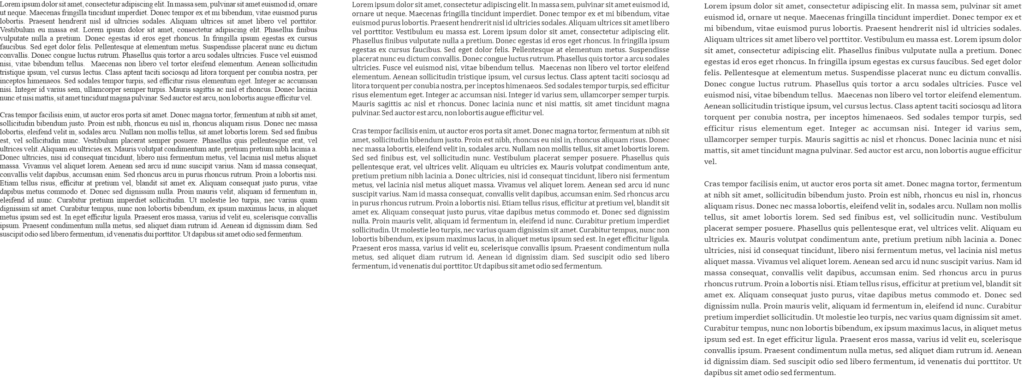
Here is an excerpt from a thesis, shown twice with different typefaces. The first excerpt features Calibri headings with Constantia body text, and the second has that old favourite, Times New Roman. As these examples have been rendered as screenshots, you will get a better idea of how the fonts actually look if you try them on your own computer and printer.

Related posts
Should I get an editor for my thesis?
Love the Thesis whisperer and want it to continue? Consider becoming a $1 a month Patreon and get special, Patreon only, extra Thesiswhisperer content every two weeks!
Share this:
The Thesis Whisperer is written by Professor Inger Mewburn, director of researcher development at The Australian National University . New posts on the first Wednesday of the month. Subscribe by email below. Visit the About page to find out more about me, my podcasts and books. I'm on most social media platforms as @thesiswhisperer. The best places to talk to me are LinkedIn , Mastodon and Threads.
- Post (607)
- Page (16)
- Product (6)
- Getting things done (259)
- Miscellany (138)
- On Writing (138)
- Your Career (113)
- You and your supervisor (66)
- Writing (48)
- productivity (23)
- consulting (13)
- TWC (13)
- supervision (12)
- 2024 (6)
- 2023 (12)
- 2022 (11)
- 2021 (15)
- 2020 (22)
Whisper to me....
Enter your email address to get posts by email.
Email Address
Sign me up!
- On the reg: a podcast with @jasondowns
- Thesis Whisperer on Facebook
- Thesis Whisperer on Instagram
- Thesis Whisperer on Soundcloud
- Thesis Whisperer on Youtube
- Thesiswhisperer on Mastodon
- Thesiswhisperer page on LinkedIn
- Thesiswhisperer Podcast
- 12,157,626 hits
Discover more from The Thesis Whisperer
Subscribe now to keep reading and get access to the full archive.
Type your email…
Continue reading

5 fonts that add credibility and professionalism to scientific research
by ikumikayama | Apr 29, 2013 | Uncategorized | 14 comments

Choosing the right fonts can affect how your scientific research is received.
Note: This is part 2 of a 2-part blog series about choices in fonts. You can read part 1 here .
You are dressed in your best. You edited the manuscript with a fine-tooth comb…but are your figures and images wearing flip-flops?
Last time we talked about fonts that suck professionalism out of your scientific research . In this article, we’ll talk about fonts that actually add credibility and professionalism to your research. Dress your research in a custom-tailored suit by just using these fonts!
My friend and colleague, Cassio Lynm described how a good figure should be like a billboard found in many highways around the country. Anyone who sees the billboard will understand what they are advertising in a split second. If someone is confused or gets the wrong idea, the image is not very successful.
Similarly, the best professional fonts should be one that’s easy to read with very little “bells and whistles”. When writing prose of informational value such as scientific research, a reader should pay attention to what the text is describing, not how the text looks. A good professional font should be like air–we don’t really even pay attention to it most of the time.
Some of the fonts I’ll share with you today are considered “boring” and “overused” by some. These fonts are everywhere because they are champions of legibility and simplicity. Make your work professional and trustworthy by using a time-tested font.
[bra_divider height=’40’]
1. Arial- “All-Around Champion with IBM Roots”

According to fonts.com , Arial is one of the most used typefaces of the last 30 years. Its electronic origins go back to 1982 for IBM laser-xerographic printers by designers Robin Nicholas and Patricia Saunders. When it came out, it was supposed to compete with Helvetica, which was one of the core fonts in Apple Computers in the mid 1980’s.
Arial letters have more round shapes and the edges of letters do not end in a horizontal line. Instead, the edges are at an angle.
Arial is an easy-to-read font in small and large blocks of text. Nature requests that the figure text be in Arial or Helvetica. It’s especially nice for figure labels and legends. When using Arial as figure legends, keep the font size small ~8 points for best results.
2. Helvetica- “All-Around Champion with Apple Roots”

Helvetica is the most heavily-used font. Helvetica was originally designed by a Swiss designer named Max Miedinger in 1957. The font was designed to be an easy-to-read font. The name “Helvetica” comes from “Helvetia” – Latin name for Switzerland. Actually, the font received a facelift in 1983-the newer version is called, you guessed it, Neue Helvetica.
Helvetica even has its own movie . I haven’t seen it yet, but please comment in the section below if you have.
Besides its Hollywood (Indie) status, Helvetica is a font that looks great on both print and on screen. Nature , Science , and Cell request that their figure labels be in Helvetica. (If you need assistance setting up figures, I’m here to help). It looks great small as in figure labels, and it looks pretty good in large formats as posters. I lost count of how many figures I labeled using Helvetica, since that’s what one of the publishers used for their books.
3. Baskerville- “Tends to have positive influence on readers”

Baskerville’s history goes all the way back to 1757 when John Baskerville designed a typeface that works well in print and easy to read. Mr. Baskerville preferred his letters simple and refined. He was also a writing master, so he had some ornamental letters like the upper case Q.
There was an informal study (not official, but some experiments here and there) that showed using Baskerville font increased trustworthiness of the text compared to other fonts. In the same study, Comic Sans had the most negative influence on the readers.
Baskerville is a serif font, which means that there are “tails” at the edge of the letters. Generally, serif fonts are better suited for print. This font works best when used in long blocks of text. Try to keep this font between 8 and 14pts for best results. This font looks dignified, so use this for your important professional occasions-award ceremonies, recognitions, etc.
4. Caslon- “When in doubt, use Caslon”

Caslon is another font with a long history. William Cason I designed the typeface back in the early 1700’s. This font is considered as the first original typeface from England. This font was very popular in colonial America, and it was used for many historical documents including the US Declaration of Independence.
Caslon is a serif font (with tails), and is best used in blocks of text. Like Baskerville, try to keep this font between 8 and 14 points for best results. Using this in a report or an application would be a good places.
5. Garamond – “Second best font after Helvetica”

This font’s history also goes way back. The font was designed by Claude Garamond (or Jean Jannon), who was commissioned to make a typeface for King Francis I of France (1515-47) to be used in series of books. The modern, electric version was revived in 1989 by Robert Slimbach.
Because there are different sources available for Garamond, there are numbers of different variations of the font. Adobe Garamond is the most popular and widely-available version today.
Garamond is still used extensively by French publishers. They also insist that Garamond be printed in size 9. Some of the most famous publications in France are in Garamond such as Histoire de l’édition français. The publishers prefer this font “for its beauty, its richness and its legibility” combined with “an uncluttered graphic style that underscores the rigour of essays and analysis providing a radical critique of contemporary society”.
Garamond is a great font to be used in long proses such as textbooks, dissertations and theses. Keeping it at 9 point is optional. In fact, my master’s thesis was in Garamond.
So that’s the 5 fonts that add credibility and professionalism to your scientific research. Did you find your favorite fonts here? Do you have other favorites? Please share your thoughts in the comment section. Also, please feel free to send this article along to those who might benefit from this short article.
[bra_border_divider top=’10’ bottom=’10’]
Now that you know about great scientific fonts, learn more about: PowerPoint Tips for the Scientist

Sources and Further reading:
Arial vs Helvetica – fonts.com
Research on font trustworthiness: Baskerville vs. Comic Sans
Caslon typeface
History of Garamond
Cell Press Figure Guide
Nature -Guide to preparing final artwork
Science Magazine: Preparing your manuscript
14 Comments

I’d rather like to know which font was used to write that article – it’s simple and readable, better than all presented above.

And the font being used for that article is Helvetica, which is one of the fonts mentioned above 😀

Hi Ewa! Great point. The font used is called “Open Sans” by Steve Matteson. For my blog, I made the font color dark grey to make it easier on the eyes, and also made them slightly bigger than average for easier reading. Hope this helps!

Hollo there, i liked the article but none of this fonts looks like the one used in the papers i read, (Journals of the American Chemical Society), do you know which one they use?
Hi There! Thank you for the note! ACS suggests Arial and Helvetica for their journal figures, so that’s what I introduced in this article–for the text, they might very well have their own custom font they use for their publications. I’ll dig into this a little deeper–thank you again!

I’m sorry, but this article is full of misinformation. Part 1 is a reiteration of articles that have been around for years. Absolutely nothing new there, and honestly, is there anyone even considering the typefaces you name there for scientific articles? Is it conceivable that anyone would use Curlz for his essay?
But my real concern goes to the second part. Arial and Helvetica are absolutely not scientific typefaces. The notion that ACS suggests these typefaces doesn’t make them suitable for scientific works. I think you ought to do research as to WHY these typefaces came recommended. Helvetica has history, as it won out of contemporaries like Univers as Helvetica was very heavily marketed. As a side note, Helvetica is actually based on the Akzidenz Grotesk model. Arial was designed to have the same metrics as Helvetica so it could be used on the same printers without having to pay a license fee to use Helvetica. Arial is more legible while Helvetica is more neutral and clear, but neither is particularly great.
So I would say Helvetica and Arial haven’t been chosen because they’re perfect. They’ve been chosen because they’re popular, and Arial is on every Windows computer, so people don’t have to purchase any fonts. I would say neither Arial and Helvetica are known to be particularly good to read. I suspect typefaces like Proxima Nova and Avenir will fair better. To be clear, I don’t think Arial or Helvetica are bad choices for labels and such, but to suggest them as top 5 typefaces, that’s very clearly misinformation.
“When using Arial as figure legends, keep the font size small ~8 points for best results.” For best results? Not entirely. It’s probably a good estimate, but in actuality the pt size should depend on the layout. I would recommend always making a test print to see if the text looks good in print, if that’s what it is intended for. Sometimes 0.2pts more or less could make the difference.
“Helvetica is the most heavily-used font.” I don’t think so. First off, Helvetica is not a font. It’s a typeface. Helvetica Regular would be a font. Helvetica is the most heavily-used typeface in graphic design, and likely the most heavily-used sans typeface. It’s not the most heavily-used typeface. At least, I would be very surprised if it was. I suspect Times New Roman is the most heavily-used.
“The font was designed to be an easy-to-read font.” No, Helvetica was designed to steal the popularity of Akzidenz Grotesk away.
Also, follow this link to see some of the problems of Helvetica at small sizes, and what professionals in the field have to say about it: http://spiekermann.com/en/helvetica-sucks/
“Actually, the font received a facelift in 1983-the newer version is called, you guessed it, Neue Helvetica.” Who would guess that the prefix for the new Helvetica would be German though? Small detail… Anyway, if you like Helvetica but want a more professional typeface (because really, Max Miedinger was not a type designer and as far as I’m concerned that shows), I can recommend Neue Haas Grotesk (a typeface that is true to the original Helvetica, but improved) or Neue Haas Unica (a more fresh looking Helvetica that deviates from the original).
“Helvetica even has its own movie. I haven’t seen it yet, but please comment in the section below if you have.” I have seen it a few times now. It’s quite a pleasure to watch, but there’s a lot of propaganda involved as well. You have the likes of Massimo Vignelli drooling over how great Helvetica is. The man was a pretty great graphic designer (although insisting on always using Helvetica has little to do with graphic design, as one ought to select the perfect typeface for the job, not use one typeface for every job), but he had no insight in type design. On the other hand, you have Erik Spiekermann formulate perfectly what Helvetica stands for. I would say for a type designer the Helvetica documentary is quite pleasant to watch. For the layman I’m afraid the documentary amounts to propaganda. It gives the layman the feeling this is one of the best typefaces out there and it’s simply not, by far.
“Besides its Hollywood (Indie) status, Helvetica is a font that looks great on both print and on screen.” Absolutely not! On Windows computers, websites set in Helvetica tend to look horrendous. The problem is that Helvetica is not well hinted, and so rendering problems occur. Helvetica was obviously not designed for monitors. Neue Helvetica doesn’t have the rendering problem to the same extent I believe, but relatively few people have Neue Helvetica, so it wouldn’t be wise to use that on your website, unless you embed the fonts. For websites I highly recommend using Arial rather than Helvetica.
“Baskerville’s history goes all the way back to 1757 when John Baskerville designed a typeface that works well in print and easy to read.” Easy to read? Not particularly, though it’s not bad either. Baskerville is a transitional typeface, meaning the weight modulation is vertical and the contrast is high. This is the tradition of the Baroque, but it’s not the most pleasant to read. However, Baskerville does look quite academic. For typefaces that are more pleasant to read, I would look at the Garalde style. Garamond and Caslon belong to that classification. They have a diagonal weight modulation, which naturally leads the eyes to the next letters. Typefaces with vertical weight modulation and high contrast tend to feature a fence effect, which disturbs the reading experience. To see this effect well, look at Didone typefaces like Didot and Bodoni.
“This font works best when used in long blocks of text. Try to keep this font between 8 and 14pts for best results.” 14pt seems quite large. Try 9–12pt. This goes for any serif typeface to be used for body text that is intended for print (for the web try 10–14pt, also depending on which device it’s intended for). But again, it will depend on the layout, and always make test prints to make sure it’s pleasant to read.
“Garamond is a great font to be used in long proses such as textbooks, dissertations and theses. Keeping it at 9 point is optional. In fact, my master’s thesis was in Garamond.” I distinctly remember years ago I noticed my Harry Potter book was set in Garamond. Both Garamond and Caslon are still used extensively for books.
However, Garamond may be a bit much for scientific documents. It’s quite classical and it has a low x-height, which these days is not preferable. Caslon is a bit less expressive and has a taller x-height. I would say Caslon is probably better for scientific articles.
One group of typefaces that certainly seems to be missing here is Century. Typefaces like Century Roman and Century Schoolbook. They belong to the Clarendon classification and are reminiscent of typefaces like Baskerville. These typefaces have been popular since the late 19th century and are still used extensively in academic literature. But I suppose you should also make a consideration of whether your article should be about the most comfortable typefaces to read, or the best suitable for scientific work, because they most certainly don’t amount to the same thing, yet you seem to be equating the two in this article.
Hi Martin! Thank you so much for your in-depth note! I have to look over and digest all your excellent points. Would you be open to expanding your writing and be a guest author or send me a link to your website/blog so the readers can have more information about what types to use for their work?

THE quick brown fox jumps over the lazy dog!!!!!

Leelawadee is a bit underrated. It is easy on the eyes, and simple. It could use a bit of a TimesNewRoman-punch to it, though.

Where can I download Helvetica from? I couldn’t find it anywhere

Seriously? I don’t know what this smug guy does with typography, in which he seems to be well versed, but if he were to take up writing he would need to work on his grammar.

I’m not an expert on fonts, but I’m currently using Helvetica for headlines and other Sans text in my thesis and DejaVu for the main text. Feels pretty scientific to me 🙂

I enjoyed the historical aspect of this article. Thanks! PS. I see you use a sans serif font.

How i download these font types?
Stack Exchange Network
Stack Exchange network consists of 183 Q&A communities including Stack Overflow , the largest, most trusted online community for developers to learn, share their knowledge, and build their careers.
Q&A for work
Connect and share knowledge within a single location that is structured and easy to search.
What is the standard/recommended font to use in papers?
I looked around but did not find that anyone has asked this before, but what are the fonts that are standard/recommended while writing academic reports/papers?
- publications
- 19 No need to search for the perfect font. You just download the latex/word template that the journal / conference provides and you stick to it. – Alexandros Commented Aug 7, 2014 at 10:12
- 3 In my case there isn't a template, that is the problem. – Man Commented Aug 7, 2014 at 10:12
- 1 @O.R.Mapper yes very true, although I assume if the OP was looking for the standard font of every language in the world for academic publishing, we could close it as "too broad" – user-2147482637 Commented Aug 7, 2014 at 15:35
- 10 People stick with the Computer Modern default in LaTeX so much that I once had someone tell me a paper where I intentionally chose a different serif font "looked unprofessional." – Matt Reece Commented Aug 7, 2014 at 17:32
- 3 Please do not be "that person" who has the only paper in the journal or proceedings with a different font from the others. – Max Commented Aug 8, 2014 at 8:42
4 Answers 4
If there's no template, then the choice is yours. However, you should make sure to pick a font that's easy to read. The usual standards in academia tend to be the Times, Helvetica/Arial, and Computer Modern families. This doesn't restrict you from using fonts like Book Antiqua, Myriad Pro, Goudy Old Style, or Garamond, but they're definitely not standard.
- 9 As to Helvetica/Arial: I think conventional wisdom is that serif fonts are preferred for large bodies of text, while sans serif should be reserved for short chunks like labels, headings, etc. I've certainly never seen a published paper set entirely in Helvetica. Then again, in my field everyone uses LaTeX, so unless you make a special effort, everything comes out in Computer Modern. – Nate Eldredge Commented Aug 7, 2014 at 15:52
- @NateEldredge: You are correct that serif fonts are easier to handle in large doses, but Helvetica is the "default" font for most "official" documents and reports throughout most of Europe. And this extends to preprints when not done in LaTeX. – aeismail Commented Aug 7, 2014 at 15:56
- 14 Eurghhhhhhhhhhh. – Nate Eldredge Commented Aug 7, 2014 at 16:14
- @NateEldredge: This is not undisputed. @ aeismail: It’s rather Arial due that popular operating system (which does not make this any better; not because of serif vs. sans-serif, but because I do not want to see that font anymore to the extent that I tweaked my browser to auto-replace any resembling fonts). – Wrzlprmft ♦ Commented Aug 8, 2014 at 8:35
- @Wrzlprmft: True, it is normally Arial that is specified; fortunately the differences are small enough that I use Helvetica and no one complains. (And actually I'm starting to see more references to Helvetica nowadays.) – aeismail Commented Aug 8, 2014 at 12:00
For an academic paper each publisher journal have their standards. These do not affect or are affected by the manuscripts sent in to the journal. Some journals specify fonts, commonly standard Times Roman, for their manuscripts. If the journal specifies something, follow that specification. Otherwise use a font that is easy to read. There is no need to use anything but a standard font for whatever typesetting/word processor system.
There isn't any.
Focus on the content, write using your favorite writing software's default font, and let the journal's typesetting staff worry about the looks of the published version.
For the subset of journals that do not take care of typesetting, first make sure they are legitimate, then use the template they provide.
If no template is provided discuss with your supervisor and colleagues whether the journal is really worth your time, if it is then use your favorite software's default font.
As others have mentioned, the standard font varies, but is usually a serif font such as Times New Roman, although sans serif fonts such as Arial and Helvetica seem to be gaining traction as well. Their is major disagreement over which is easier to read--serif or sans serif fonts, with no clear consensus on the outcome. For example, see this paper .
Font size is typically twelve point. Follow the guidelines on this one, and make sure to keep your font consistent. Nothing is more likely to get you minus points than some obvious monkeying with the font size, whether to lengthen your manuscript (most commonly seen in undergrad papers) or to fit your text into the page limit (the rest of us!).
You must log in to answer this question.
Not the answer you're looking for browse other questions tagged publications writing formatting ..
- Featured on Meta
- We spent a sprint addressing your requests — here’s how it went
- Upcoming initiatives on Stack Overflow and across the Stack Exchange network...
Hot Network Questions
- Any alternative to lockdown browser?
- Minimum number of select-all/copy/paste steps for a string containing n copies of the original
- Where can I find a complete archive of audio recordings of Hitler speeches?
- Did Zapata ask a young revolutionary, "What is your name?" and then write that man's name on a piece of paper?
- Air magic only used to decrease humidity and improve living conditions?
- In a sum of high-variance lognormals, what fraction comes from the first term?
- It was the second, but we were told it was the fifth
- What is the reason for using decibels to measure sound?
- Why is there not a test for diagonalizability of a matrix
- PCIe digest explanation
- Why the number of bits or bytes is different for a folder that has been copied between two external drives?
- What is gñânendriyas?
- Using 50 Ω coax cable instead of passive probe
- Recommend an essay, article, entry, author, or branch of philosophy that addresses the futility of arguing for or against free will
- 向こう as a pronoun ("he/she/they")?
- A manifold whose tangent space of a sum of line bundles and higher rank vector bundles
- Transferring at JFK: How is passport checked if flights arrive at/depart from adjacent gates?
- Was I wrongfully denied boarding for a flight where the airliner lands to a gate that doesn't directly connect to the international part the airport?
- Would it be moral for Danish resitance in WW2 to kill collaborators?
- Is "necesse est tibi esse placidus" valid classical Latin?
- Two Sinus Multiply and Add
- Looking for the title of a short story for my students to read about a woman searching for the last man alive
- Why do Electric Aircraft Seem to Eschew Photovoltaics?
- Directions of puff pastry folds
- How it works

What Is The Best Font For A Dissertation?
Published by Alvin Nicolas at April 9th, 2024 , Revised On April 9, 2024
For many students, embarking on a dissertation is a daunting task. Beyond the research, writing, and analysis , a seemingly insignificant detail can cause unexpected stress: font selection. While it might seem like a minor concern, the right font can significantly impact the readability, professionalism, and overall look of your dissertation and can highly influence the decision of the readers.
This blog will help you in choosing the right font for your dissertation. Let’s explore!
Why Does Font Choice Matter?
While the content of your dissertation is paramount, the presentation also plays a crucial role. The chosen font can influence how easily your reader absorbs the information. A poorly chosen font can lead to eye strain, reduced comprehension, and even a negative first impression.
Here are some specific reasons why font choice matters:
- Readability: The primary function of your dissertation is to communicate your research effectively. A clear and readable font is essential for ensuring your reader can easily grasp the information presented.
- Professionalism: Certain fonts convey a sense of seriousness and formality, aligning with the academic tone of your dissertation.
- Consistency: Maintaining a consistent font throughout your dissertation creates a sense of unity and professionalism.
Key Factors To Consider When Choosing A Font
Before discussing the specific font recommendations, let’s explore some key factors to consider when making your decision:
University Guidelines
Many universities have specific guidelines regarding font choices for dissertations. Always refer to your university’s style guide or handbook to ensure you adhere to any established requirements.
Readability
Opt for fonts with clear letterforms, adequate spacing, and sufficient contrast between the font and background colour. Avoid decorative or script fonts that can be challenging to read.
Serif Vs Sans-Serif
Serif fonts, characterised by small lines extending from the ends of characters (e.g., Times New Roman), are generally considered more readable for extended reading, making them ideal for the body text of your dissertation. Sans-serif fonts lacking these serifs (e.g., Arial) can be suitable for headings or short text snippets.
Font Size & Line Spacing
Maintain a comfortable reading experience with an appropriate font size (typically 10-12 points) and line spacing (usually 1.15 or 1.5 lines).
Hire an Expert Writer
Proposal and dissertation orders completed by our expert writers are
- Formally drafted in academic style
- Plagiarism free
- 100% Confidential
- Never Resold
- Include unlimited free revisions
- Completed to match exact client requirements
Popular Font Choices For Dissertations
Now, let’s explore some popular font options that meet the criteria for dissertation writing:
Times New Roman
The classic academic font, Times New Roman, remains a widely accepted and safe choice for dissertations due to its readability and formal appearance.
Similar to Times New Roman, Georgia offers good readability with a slightly wider design, making it suitable for screen-based reading.
This elegant serif font adds a touch of sophistication while maintaining excellent readability.
A modern serif font, Cambria provides a clean and professional look often favoured for on-screen reading.
While not ideal for the body text due to its lack of serifs, Arial can be a good choice for headings and subheadings due to its clarity and clean lines.
Additional Tips for Font Selection
Here are some additional tips to ensure your font choice shines:
- Consistency is key: Maintain the same font throughout your dissertation, including body text, headings, subheadings, and captions.
- Avoid excessive font variations: Stick to one or two fonts, with variations reserved for specific purposes (e.g., different fonts for headings).
- Consider the overall design: Ensure your chosen font complements the overall visual style of your dissertation, including layout and graphics.
Frequently Asked Questions
What font should i use for my dissertation uk.
Use a clear and readable font like Times New Roman, Arial, or Calibri for a UK dissertation. Most universities recommend a serif font like Times New Roman, size 12, for the main text, with clear distinctions for headings and subheadings. Always follow your institution’s guidelines for formatting and font selection.
What font should a dissertation be in?
Use a legible serif font such as Times New Roman, Arial, or Calibri for a dissertation. Typically, the font size should be 12 points for the main text, with variations for headings and subheadings as specified by your institution’s guidelines. Consistency and readability are key for academic documents.
What size font should my dissertation be?
Your dissertation’s main text should generally be in a 12-point font size for readability and consistency. Headings and subheadings may vary, typically larger than the main text, to emphasise hierarchy and organisation. Always adhere to your institution’s specific formatting requirements for font sizes and styles to ensure compliance.
What font shall I use for my undergraduate dissertation?
For an undergraduate dissertation, using a clear and legible font like Times New Roman, Arial, or Calibri is advisable. Aim for a font size of 12 points for the main text to ensure readability. Follow any specific formatting guidelines your university or department provides for consistency and professional presentation.
You May Also Like
A Gantt chart is important for your dissertation. Here’s everything you need to know about the Gantt chart for a dissertation to do your dissertation.
Here we have discussed the foremost problems faced by international students in the UK with a focus on what can be done to overcome them.
Discover PhD dissertation resubmission rules & process. Navigate university policies & program regulations.
USEFUL LINKS
LEARNING RESOURCES

COMPANY DETAILS

- How It Works
+61 481607654
8 Best Fonts for Thesis Writing to Make It Presentable

Table Of Contents
How do font plays a critical role in thesis, 8 best fonts for thesis writing, tips to choose the best font for thesis, mistakes to avoid while choosing a font, how to format your thesis perfectly.
- Can’t Write a Thesis? Let Our Experts Do It for You
When your professor assigns you a thesis, he excepts it to be perfect at the time of submission. The textual content of the document is the utmost source of information. So, while creating content, you should take care of the font selection. Choosing the best font for the thesis provides an attractive appearance and preserves the aesthetic value of your document. Also, the font professionally presents information. Choosing font in both ways (either online or printed form) of the thesis is crucial. If you are submitting it online, then the font makes a difference in the readability. If you are providing it in the printed form, then the font reflects professionalism.
You May Like This: The Complete Guide to Breaking Down a 10000-Word Dissertation
Sometimes, it is questioned that why the font is necessary. Well, the font is as mandatory as the content. You should know that everything is in proper fonts for the thesis.
- To highlight headings, you can use bold and stylish fonts.
- To highlight the subheadings, you can use italic and cursive fonts.
- The information that you want to convey must be in a simple and decent font.
This particular formula will grab the reader’s attention to your document. If you don’t focus on the font, then your document will look imprudent. It can create a bad impact on your professor. If you don't show creativity while writing, then the reader will get bored and won’t show interest in your document. So, make sure to always use different fonts in the thesis according to the needs. Now, let’s talk about some of the most appropriate fonts included in the thesis.
This Might Be Helpful: A to Z of Assignment Writing: Everything You Need to Know About It
A thesis can look presentable if you include appropriate fonts in it. The following fonts will create a positive impression on your professor. Let’s take a look:
- Times New Roman Times New Roman was particularly designed for Times Newspaper for London. This font has a separate and different value in a formal style. Most of the universities and colleges suggest students use this font in a document.
- Georgia Georgia font was designed in 1883, especially for Microsoft Corporation. This is the best font for the students who want to submit the document online. It is preferred for the elegant and small appearance for low-resolution screens.
- Serif Serif is originated from Roman from a font written on a stone. Earlier, this font was not accepted universally. The specialty of this font is that every alphabet has a small line or stroke attached to the end of the larger stroke.
- Garamond Garamond is usually used for book printing and body text. If you want to write the main body or long paragraphs, then you can use this font. It is simple and easy to read.
- Cambria Cambria is founded by Microsoft and later distributed with Windows and Office. This font is the easiest to read in a hurry because it contains spaces and proportions between the alphabets. This is suitable for the body and the long sentence.
- Century Gothic Century Gothic is basically in the geometric style released in 1881. This font has a larger height instead of other fonts. If the university allows you to choose the font of your own choice, you can go for this one.
- Palatino Linotype Palatino Linotype font is highly legible for online documents. It enhances the quality of the letter when displayed on the screen. This font is majorly used for books, periodicals, and catalogs.
- Lucida Bright Lucida Bright has a unique quality that the text looks larger at smaller point sizes also. This font can fit words on a single line. To write a thesis, you can choose this font easily.
After getting brief knowledge about the fonts, let's now come to the tips to choose the best font for the thesis. Here are some major key points that you should follow while choosing a font.
- Make sure your font looks attractive.
- It should match your tone.
- Headings and subheadings must be highlighted.
- It should not look congested.
- Avoid choosing complicated or fancy fonts.
Take a Look: How to Write a Good Thesis Statement for an Essay? Best Tips & Examples
Students make some mistakes while choosing a font, which the professor dislikes the most. So, to avoid those, keep the below points in mind.
- Don’t choose fonts on your likes and dislikes.
- Put the reader's preference first and then choose the font.
- Avoid too many fonts as they make the work look unorganized.
- Make sure all fonts match your document instead of making it look like a disaster.
- Choose different fonts for titles, subtitles, paragraphs.
When preparing the thesis for submission, students must follow strict formatting requirements. Any deviations in these requirements may lead to the rejection of the thesis.
- The language should be perfect.
- The length of the thesis should be divided appropriately among the sections.
- The page size, margins, and spacing on the page should be correct.
- The font and point size should be displayed correctly.
Can't Write a Thesis? Let Our Experts Do It for You
The experts of Assignment Prime warmly welcome everyone who seeks help with thesis writing service . A thesis is one of the toughest academic papers to write for students. It takes a great amount of time, rigorous research, and perfect writing skills to complete it. To make this easy for you, the experts are here to help you write the thesis and the font selection for every section.
We are known for offering unmatched assistance with thesis and dissertation writing to students across the globe. Our professionals deliver a well-researched and informative academic paper before the deadline. We also provide help to students in research, topic selection, editing, proofreading, etc. So, stop searching for help and quickly start ordering without any delay to avail the best features of Assignment Prime . We are waiting to serve you with the best!
You may like this : How to write a discussion in dissertation

To Make Your Work Original
Check your work against paraphrasing & get a free Plagiarism report!
Check your work against plagiarism & get a free Plagiarism report!
Get citations & references in your document in the desired style!
Make your content free of errors in just a few clicks for free!
Generate plagiarism-free essays as per your topic’s requirement!
FREE Features
- Topic Creation RUB 355.2 FREE
- Outline RUB 857.38 FREE
- Unlimited Revisions RUB 1898.48 FREE
- Editing/Proofreading RUB 2572.13 FREE
- Formatting RUB 734.89 FREE
- Bibliography RUB 673.65 FREE
Get all these features for
RUB 7410.18 FREE

Thesis Statement Writing: How Crucial is it? How to Write? & More
![All About Short Essay Writing [Examples Included]](https://www.assignmentprime.com/images/AP_Blog_Image_How_to_Write_a_Short_Essay.jpg "best font for thesis paper")
All About Short Essay Writing [Examples Included]

How to Write a Letter of Reference with Templates?

Experts' Guidance on How to Conduct Nike’s SWOT Analysis

Avail the Best Assignment Writing Services in Just One Tap!
Add "5% extra off on app"
We use cookies to ensure that we give you the best experience on our website. If you continue to use this site we will assume that you are happy with it. Know more

Please rotate your device
We don't support landscape mode yet. Please go back to portrait mode for the best experience
Great fonts for a PhD thesis – and terrible ones
There are thousands of fonts out there – which one should you choose for a great-looking PhD thesis? I will explain the differences between serif and sans-serif fonts, what ligatures are and why you shouldn’t use that fun free font you found on the internet.
Great fonts for a PhD thesis: Serif vs. sans-serif
As I explained in my Ultimate Guide to preparing a PhD thesis for printing , there are two basic kinds of fonts: Serif fonts and sans-serif fonts. Serif fonts have small lines – serifs – at the ends of all lines. Sans-serif fonts don’t have those lines. Compare these two, Palatino Linotype and Arial:

Serifs guide the reader’s eyes, making sure that they stay in the same line while reading a printed text. In turn, your reader’s brain won’t get tired so quickly and they can read for longer.
But there is another feature that many serif fonts have. Look at these three (which are all great fonts to use in your PhD thesis, btw):

If you look closely, you will see that serif fonts often have different stroke thicknesses within every letter. This is called “weight contrast”. A subtle weight contrast further improves legibility of a printed text. Hence, I recommend you use a serif font with a bit of a weight contrast for your main text.
Which serif font should you choose?
But whatever you do, this one thing is extremely important: Choose a font that offers all styles: regular, italics , bold , and bold italics . Since these four styles all need to be designed separately, many fonts don’t offer all of them. Especially bold italics is absent in most free internet fonts and even from many fonts that come with your operating system or word processor.
Also: In your bibliography and in-text citations (if you go with an author-year citation style) you will have to display author’s names from all over the world. Many of them will contain special letters. For example German umlauts (ä, ö, ü), accented letters used in lots of of languages, i.e. French or Spanish (à, é, ñ, etc.), and dozens of other special letters from all kinds of languages (ç, ı, ł, ø, etc.). Be aware that only a very limited number of fonts offer all of these!
If you have mathematical equations in your thesis that require more than +, – and =, your font choices are limited even further . After all, the vast majority of fonts do not offer special operators.
As you can see, these criteria severely limit your choice of font for the main text. Needless to say, they rule out free fonts you can download from dafont.com or 1001fonts.com . That is why I urge you to go with a classic font. To make things easier for you, here is a table with serif fonts that offer all the characters you could dream of:
Failsafe serif fonts for your PhD thesis
| Book Antiqua | medium | 1991 |
| Bookman Old Style | wide | 1858 |
| Cambria | medium | 2004 |
| Century | wide | 1894 |
| Constantia | medium | 2006 |
| Garamond | wide | 1989 |
| Gentium Book Basic | medium | 2005 |
| Georgia | medium | 1993 |
| Palatino Linotype | wide | 1950 |
| Sitka Text | wide | 2013 |
| Times New Roman | narrow | 1932 |
These fonts are heavily based on fonts that have been in use since the invention of the mechanical printing press in the 15th century. Hence, these types of fonts have been tried and tested for more than 500 years. Hard to argue with that!
But which of these fonts is The Best TM for a PhD thesis? That depends on how much text you have in your thesis vs. how many figures, tables, equations, etc. As I have noted in the table, fonts have different widths. Look at this image showing the same text in Times New Roman (TNR), Cambria, and Sitka Text; all at the same size:
Hence, setting entire pages of text in TNR will make the page look quite dense and dark. So, a thesis with a lot of text and few figures is best set in a wider font like Sitka Text. On the other hand, if you have a lot of figures, tables, etc., TNR is a good choice because it keeps paragraphs of text compact and therefore the page from looking too empty. Medium-width fonts like Cambria are a good compromise between the two.
To see some of these fonts in action, check out this example PhD thesis where I show all sorts of font combinations and page layouts.
When to use a sans-serif font in your PhD thesis
This covers serif fonts. But which sans-serif fonts are great for your PhD thesis? And when do you use them?
As mentioned above, serif fonts are good for the main text of your thesis. But titles and headings are a different story. There, a sans-serif font will look very nice. Plus, using a different font in your headings than in the main text will help the reader recognize when a new section begins.
Here are some examples for good sans-serif fonts:

Each of these fonts – Futura, Franklin Gothic Book, and Gill Sans – are wonderful for headings in a PhD thesis. Why? Because they are easily readable, well-balanced and don’t call undue attention to themselves. Also, they have many options: regular, light, medium, bold, extra bold, including italics for all of them. And most operating systems or word processors have them pre-installed.
The criteria for heading fonts are not nearly as strict as those for main text fonts. If you have Latin species names in your headings, make sure the font offers (bold) italics. If you need to display Greek letters in your headings, make sure the font offers those. Done.
However, there are some criteria for headings. Just for fun, let’s have a look at some sans-serif fonts that would be a bad choice for a thesis:

I’d like to explicitly state that these are wonderful, well-designed fonts – you just shouldn’t use them in a scientific document. Heattenschweiler is too narrow, Broadway has too much weight contrast and Aspergit Light is too thin. All of these things impair readability and might make your opponents squint at your headings. Of course, you will want to do everything in your power to make the experience of reading your thesis as pleasant a possible for your opponents!
How are these fonts great for my PhD thesis? They are boring!
Why yes, they are, thanks for noticing!
Seriously though, the fonts not being interesting is the point. Your PhD thesis is a scientific document showing your expertise in your field and your ability to do independent research. The content of your thesis, the science, should be the sole focus. A PhD thesis is not the place to show off your quirky personality by way of an illegible font.
However, you can infuse your personality into your thesis cover and chapter start pages. There, you can use a fun font, since you probably don’t have to display any special characters.
Choosing the right font is too much pressure? Contact me for help with your layout!
Don’t use fonts made for non-Latin alphabets (Cyrillic, Hanzi, etc.)
Every computer nowadays comes pre-installed with a number of fonts made for displaying languages that don’t use the Latin alphabet (Latin alphabet = The alphabet in which this very article is displayed). Prominent examples for languages that don’t use the Latin alphabet are Asian languages such as Chinese, Japanese, Korean, Thai, etc. Other examples include the Arabic, Brahmic, and Cyrillic script. But there are many more fonts for a myriad of non-Latin alphabets. These fonts were optimized to make the characters of their languages easily readable.
However (and this is why I’ve written this entire section) they usually also contain Latin characters to be able to display the occasional foreign word.
Hence, you might want to honour your roots by using a font in your thesis that was made for your native language, by someone from your home country. It is tempting, because all the Latin characters are there, right? I completely understand this wish, but I strongly advise against it since there are some serious drawbacks.
Don’t get me wrong, I’m not throwing shade on these fonts, they are fantastic at what they were made for. Displaying long stretches of text in the Latin alphabet, however, is not one of those things. Let me explain why.
They don’t offer all necessary characters
Firstly, fonts made to display languages with a non-Latin alphabet contain the bare minimum of Latin characters. That is, the basic letters and the most important punctuation marks. Hence, they don’t have all those math operators and special characters I talked about in the section about serif fonts.
Also, the Latin characters in these fonts are usually sans-serif, so less suitable for long text.
But let’s say the non-Latin alphabet font you chose does offer all special characters and has serifs. Unfortunately, they are still not suitable to use in your PhD thesis, for the following reasons:
They are often too small or large for use with greek letters
Do you mention β-Mercaptoethanol or α-Histidin antibodies in your Materials and Methods? Or any other Greek letter? Since Latin characters are scaled differently in fonts made for non-Latin alphabets, Greek letters will not be the same size as the rest of the text anymore. For example, look at this text, where I rendered everything (I swear!) in the specified font size:

In the first panel (Cambria), the Greek letters are the same size and weight as the main text. As I have said, Cambria is one of the fonts explicitly recommended for your thesis. If you look closely at the enlarged line on the bottom of the panel, you can see that the alpha is the same height as the lower-case letters, whereas the beta is the same height as the upper-case letters. It looks neat and tidy.
However, by using a non-Latin font for your PhD thesis, you are asking for trouble.
In the second panel, I show Cordia New, a font for Thai script. At 12 pt, it is way smaller than the Latin font. The Greek letters – which are also at 12 pt! – stand out awkwardly. Also, Cordia New produces a line distance that is larger than it should be when using it for a text in the Latin alphabet.
In the last panel I show Microsoft YaHei for displaying Hanzi characters. Here, the Latin characters are larger. This leads to the Greek letters being too small. And, as you can see in the second and third lines of the paragraph of text, the line distance is quite narrow. However, the Greek letter β requires a regular line distance. So, it pushes the following line down, making the paragraph look uneven.
They don’t offer ligatures
Now, what on earth are ligatures? I could dive into the history of book printing here but I’ll spare you those details. In essence, Ligatures are two or more letters that are printed as one single glyph. Let me show you:

In the top line, you can see that the characters inside the boxes “melt” into each other. This single shape made out of several letter is called a ligature. They are mostly common with the small letter f. If you take a magnifying glass and look at the pages of a novel, you will quickly find these same ligatures. E-readers also display ligatures. Heck, even WhatsApp does it!
Ligatures also make the text easier to read. However, in order to display them, a font actually has to have the glyphs for the ligatures. And many fonts don’t. In order to find out whether a font you chose offers them, go to the character map of that font. (In Windows 10, simply click the windows logo in the corner of your screen and start typing the word “character”.) Pick a font in the drop-down menu. Now, search for the word “ligature” in the character map. If the map is empty after this, the font has no ligature glyphs.
All that being said, ligatures are not super important. I just wanted to mention them.
You can still use fonts made for non-Latin alphabets
If you want to honour your roots by way of a font, you can still do this. For example in your thesis title and/or for the chapter start pages.
In a word: Don’t go crazy with those fonts! Let your science do the talking. If you want to see what your thesis could look like with some of the fonts I recommended, check out the example PhD thesis .
Do you want to see a font combination that’s not in the example thesis? Contact me and I’ll set a few pages in your desired font, free of charge!
Click here for help with your PhD thesis layout!
Bedrijvsgegevens | About
Privacyverklaring | Privacy Policy

- Langson Library
- Science Library
- Grunigen Medical Library
- Law Library
- Connect From Off-Campus
- Accessibility
- Gateway Study Center
Email this link
Thesis / dissertation formatting manual (2024).
- Filing Fees and Student Status
- Submission Process Overview
- Electronic Thesis Submission
- Paper Thesis Submission
- Formatting Overview
- Fonts/Typeface
- Pagination, Margins, Spacing
- Paper Thesis Formatting
- Preliminary Pages Overview
- Copyright Page
- Dedication Page
- Table of Contents
- List of Figures (etc.)
- Acknowledgements
- Text and References Overview
- Figures and Illustrations
- Using Your Own Previously Published Materials
- Using Copyrighted Materials by Another Author
- Open Access and Embargoes
- Copyright and Creative Commons
- Ordering Print (Bound) Copies
- Tutorials and Assistance
- FAQ This link opens in a new window
Selecting a Font (Typeface)
Be consistent in the use of font/typeface throughout your manuscript. All text material must be in the same font/typeface; all headings and figure/table titles/captions must be in a consistent typeface.
Please select a font, size, and color that are highly legible and will reproduce clearly. Ornate or decorative fonts such as script, calligraphy, gothic, italics, or specialized art fonts are not acceptable. For electronic submissions, embedded fonts are required.
Any symbols, equations, figures, drawings, diacritical marks, or lines that cannot be typed, and therefore are drawn, must be added in permanent black ink.
Below are suggested fonts and sizes.

Establish and follow a consistent pattern for layout of all headings. All headings should use the same font size, font weight, typeface, etc.
For example: center all major headings; place secondary headings at least two lines below major headings.
Typeface/Printing Quality (Paper Submissions Only)
If you are submitting your manuscript on paper, printer quality is critical to produce a clean, clear image. You are strongly urged to use a laser printer, as ink jet and line printers generally do not produce fully clear, legible results. Dot matrix-type printers are not acceptable.
- << Previous: Formatting Overview
- Next: Pagination, Margins, Spacing >>
- Last Updated: May 31, 2024 9:34 AM
- URL: https://guides.lib.uci.edu/gradmanual
Off-campus? Please use the Software VPN and choose the group UCIFull to access licensed content. For more information, please Click here
Software VPN is not available for guests, so they may not have access to some content when connecting from off-campus.
Dr. Mark Womack
What Font Should I Use?
The Modern Language Association (MLA) provides explicit, specific recommendations for the margins and spacing of academic papers. (See: Document Format .) But their advice on font selection is less precise: “Always choose an easily readable typeface (e.g. Times New Roman) in which the regular style contrasts clearly with the italic, and set it to a standard size (e.g. 12 point)” ( MLA Handbook , 7th ed., §4.2).
So which fonts are “easily readable” and have “clearly” contrasting italics? And what exactly is a “standard” size?
For academic papers, an “easily readable typeface” means a serif font, and a “standard” type size is between 10 and 12 point.
Use A Serif Font
Serifs are the tiny strokes at the end of a letter’s main strokes. Serif fonts have these extra strokes; sans serif fonts do not. ( Sans is French for “without.”) Serif fonts also vary the thickness of the letter strokes more than sans serifs, which have more uniform lines.

Books, newspapers, and magazines typically set their main text in a serif font because they make paragraphs and long stretches of text easier to read. Sans serifs (Arial, Calibri, Helvetica, Gill Sans, Verdana, and so on) work well for single lines of text, like headings or titles, but they rarely make a good choice for body text.
Moreover, most sans serifs don’t have a true italic style. Their “italics” are really just “obliques,” where the letters slant slightly to the right but keep the same shape and spacing. Most serifs, on the other hand, do have a true italic style, with distinctive letter forms and more compact spacing.

Since they’re more readable for long passages and have sharper contrast in their italics, you should always use a serif font for the text of an academic paper.
Use A Readable Type Size
The standard unit for measuring type size is the point . A point is 1 / 72 of an inch, roughly one pixel on a computer screen. The point size of a font tells you the size of the “em square” in which your computer displays each letter of the typeface. How tall or wide any given letter is depends on how the type designer drew it within the em square, thus a font’s height and width can vary greatly depending on the design of the typeface. That’s why if you set two fonts at the same point size, one usually looks bigger than the other.
Compare the following paragraphs, both set at 12 point but in different fonts:

For body text in academic papers, type sizes below 10 point are usually too small to read easily, while type sizes above 12 point tend to look oversized and bulky. So keep the text of your paper between 10 and 12 point .
Some teachers may require you to set your whole text at 12 point. Yet virtually every book, magazine, or newspaper ever printed for visually unimpaired grown-ups sets its body type smaller than 12 point. Newspapers use even smaller type sizes. The New York Times , for example, sets its body text in a perfectly legible 8.7 point font. So with proper spacing and margins, type sizes of 11 or 10 point can be quite comfortable to read.
Font Recommendations
I usually ask my students to use Century Schoolbook or Palatino for their papers. If your teacher requires you to submit your papers in a particular font, do so. (Unless they require you to use Arial , in which case drop the class.)
One thing to consider when choosing a font is how you submit your essay. When you submit a hard copy or a PDF, your reader will see the text in whatever typeface you use. Most electronic submission formats, on the other hand, can only use the fonts available on the reader’s computer. So if you submit the paper electronically, be sure to use a font your instructor has.
What follows is a list of some widely available, highly legible serif fonts well-suited for academic papers. I’ve divided them into four categories: Microsoft Word Fonts, Mac OS Fonts, Google Fonts, and Universal Fonts.
Microsoft Word Fonts
Microsoft Word comes with lots of fonts of varying quality. If your teacher asks you to submit your paper in Word format, you can safely assume they have Word and all the fonts that go with it.

Morris Fuller Benton designed Century Schoolbook in 1923 for elementary-school textbooks, so it’s a highly readable font. It’s one of the best fonts available with Microsoft Word. Because it’s so legible, U. S. Supreme Court Rule 33.1.b madates that all legal documents submitted to the Court be set in Century Schoolbook or a similar Century-style font.

Hermann Zapf designed Palatino in 1948 for titles and headings, but its elegant proportions make it a good font for body text. Named for Renaissance calligrapher Giambattista Palatino, this font has the beauty, harmony, and grace of fine handwriting. Palatino Linotype is the name of the font included with Microsoft Word; Mac OS includes a version of the same typeface called simply Palatino.
Microsoft Word includes several other fonts that can work well for academic essays: Bell MT , Californian FB , Calisto MT , Cambria , Garamond , and Goudy Old Style .
Mac OS Fonts
Apple has a well-deserved reputation for design excellence which extends to its font library. But you can’t count on any of these Mac OS fonts being on a computer that runs Windows.

Finding his inspiration in the typography of Pierre Simon Fournier, Matthew Carter designed Charter in 1987 to look good even on crappy mid-80s fax machines and printers. Its ability to hold up even in low resolution makes Charter work superbly well on screen. Bitstream released Charter under an open license, so you can add it to your font arsenal for free. You can download Charter here .

In 1991 Apple commissioned Jonathan Hoefler to design a font that could show off the Mac’s ability to handle complex typography. The result was Hoefler Text , included with every Mac since then. The bold weight of Hoefler Text on the Mac is excessively heavy, but otherwise it’s a remarkable font: compact without being cramped, formal without being stuffy, and distinctive without being obtrusive. If you have a Mac, start using it.
Other Mac OS fonts you might consider are Baskerville and Palatino .
Google Fonts
When you submit a paper using Google Docs, you can access Google’s vast library of free fonts knowing that anyone who opens it in Google Docs will have those same fonts. Unfortunately, most of those free fonts are worth exactly what you paid for them, so choose wisely.

IBM Plex is a super-family of typefaces designed by Mike Abbink and the Bold Monday type foundry for — you guessed it — IBM. Plex serif is a solid, legible font that borrows features from Janson and Bodoni in its design. Plex is, not surprisingly, a thoroughly corporate font that aims for and achieves a bland neutrality suitable for most research papers.

John Baskerville originally designed this typeface in the 1850s, employing new techniques to make sharper contrasts between thin and thick strokes in the letter forms. The crisp, elegant design has inspired dozens of subsequent versions. Libre Baskerville is based on the American Type Founder’s 1941 version, modified to make it better for on-screen reading.
Unfortunately. Google Fonts has few really good serif fonts. Some others you might consider are Crimson Pro and Spectral .
Universal Fonts
Anyone you send your document to will have these fonts because they’re built in to both Windows and Mac OS.

Matthew Carter designed Georgia in 1993 for maximum legibility on computer screens. Georgia looks very nice on web sites, but in print it can look a bit clunky, especially when set at 12 point. Like Times New Roman, it’s on every computer and is quite easy to read. The name “Georgia” comes from a tabloid headline: “Alien Heads Found in Georgia.”

Times New Roman is, for better or worse, the standard font for academic manuscripts. Many teachers require it because it’s a solid, legible, and universally available font. Stanley Morison designed it in 1931 for The Times newspaper of London, so it’s a very efficient font and legible even at very small sizes. Times New Roman is always a safe choice. But unless your instructor requires it, you should probably use something a bit less overworked.
- KU Libraries
- Subject & Course Guides
- KU Thesis and Dissertation Formatting
- Fonts and Spacing
KU Thesis and Dissertation Formatting: Fonts and Spacing
- Formatting Specifics
- Title and Acceptance Pages
- Page Numbering
- Table of Contents
- List of Figures
- Rotating Charts or Tables
- Working with Footnotes
- Converting to PDF
- Embedding Fonts
- Completed KU Dissertations & Theses
- About: Survey of Earned Doctorates
- Copyright and ETD Release Form
- Resources for KUMC Students
- Thesis/Dissertation Filenames
- LaTeX/BibTeX Support
Office of Graduate Studies Thesis and Dissertation Formatting Guidelines
These rules are taken from the KU Office of Graduate Studies Thesis or Dissertation Formatting Guidelines. To see the full thesis or dissertation formatting requirements, visit https://graduate.ku.edu/submitting
- Students should use the same font size (11- or 12-point) and style (typically Times New Roman) through the thesis, including labels and references.
- Tables, captions, and footnotes should use the same font style but may be smaller in size (usually 10-point).
- Chapter and section headings may be bold and no more than 2 points larger than the text size.
- Non-standard typefaces, such as script, are generally not acceptable except for commonly used symbols.
- The Office of Graduate Studies recommends that students get their font choice approved by their department and their graduate division before the thesis defense.
- Lettering and symbols in tables and figures should be no less than 10 points.
- Normally theses and dissertations use double-spaced formatting.
- Single-spaced formatting is acceptable in the table of contents, footnotes, end notes, charts, graphs, tables, block quotations, captions, glossary, appendices and bibliography.
- Students may use singe- or one-and-a-half-spacing for the body of the text with prior written approval of their thesis committee and graduate division.
Subject Guide

- << Previous: Title and Acceptance Pages
- Next: Page Numbering >>
- Last Updated: May 9, 2024 9:48 AM
- URL: https://guides.lib.ku.edu/etd
Dissertation Services
- Dissertation Writing Service
- Dissertation Assistance Service
- Dissertation Consulting Service
- Buy Dissertation
- Dissertation Abstract Writing Services
- Dissertation Formatting Service
- Buy Dissertation Methodology
- Dissertation Case Study Service
- Pay For Dissertation
- Dissertation Chapter Writing Services
- Dissertation Conclusion Services
- Dissertation Data Analysis Services
- Dissertation Discussion Writing Services
- Dissertation Introduction Writing Service
- Dissertation Outline Service
- Online Dissertation Help
- Write My Dissertation
- Do My Dissertation
- Help With Thesis Writing Service
- Dissertation Writing England
- Dissertation Writing Service London
- Dissertation Writing Northern Ireland
- Dissertation Writing Scotland
- Dissertation Writing Wales
- Personal Statement Writing Service
Dissertation Subjects
- Marketing Dissertation
- Digital Marketing Dissertation
- Law Dissertation Help
- Economics Dissertation
- Accounting Dissertation
- Business Management Dissertation
- Nursing Dissertation
- Psychology Dissertation
- Social Media Marketing Dissertation
- English Literature Dissertation Help
- Finance Dissertation
- History Dissertation
- HRM Dissertation
- IT Dissertation
- Linguistics Dissertation Help
- Supply Chain Management Dissertation Help
- Health And Social Care Dissertation
Dissertation Levels
- Buy Master Dissertation
- MBA Dissertation Writing Service
- Buy PhD Dissertation
- Masters Dissertation Proposal Help
- MBA Dissertation Proposal Help
- PhD Data Collection Services
- PhD Dissertation Proposal Help
- PhD Qualitative Data Analysis Services
- Master Thesis Help
- PhD Thesis Writing Help
- PhD Dissertation Editing
- Finance Dissertation Editing
- Digital Marketing Dissertation Editing
- Accounting Dissertation Editing
- Sociology Dissertation Editing
- English Literature Dissertation Editing
- Economics Dissertation Editing
- Linguistics Dissertation Editing
- Business Management Dissertation Editing
- Psychology Dissertation Editing
- Marketing Dissertation Editing
- Academic Poster Designing Services
- Dissertation PowerPoint Presentation Service
- Dissertation Presentation Writing Services
- Literature Review Writing Service
- Primary Data Collection Service
- Qualitative Data Dissertation Services
- Research Data Collection Service
- Secondary Data Collection Help
- DISSERTATION SERVICES
- DISSERTATION SUBJECTS
- DISSERTATION LEVELS
- Buy MBA Dissertation
- PhD Dissertation Editing Services
Hire a Writer
Get an expert writer for your academic paper
Check Samples
Take a look at samples for quality assurance
Dissertation Topics
Free customised dissertation topics for your assistance
- What Font Should I Choose…
- Accounting Dissertation Topics (8)
- Banking & Finance Dissertation Topics (10)
- Business Management Dissertation Topics (35)
- Economic Dissertation Topics (1)
- Education Dissertation Topics (12)
- Engineering Dissertation Topics (9)
- English Literature Dissertation Topics (3)
- HRM Dissertation Topics (3)
- Law Dissertation Topics (13)
- Marketing Dissertation Topics (9)
- Medical Dissertation Topics (7)
- Nursing Dissertation Topics (10)
- Other Topics (10)
- Supply Chain Dissertation Topics (2)
- Biomedical Science (1)
- Business Management Research Topics (1)
- Computer Science Research Topics (1)
- Criminology Research Topics (1)
- Economics Research Topics (1)
- Google Scholar Research Topics (1)
- HR Research Topics (1)
- Law Research Topics (1)
- Management Research Topics (1)
- Marketing Research Topics (1)
- MBA Research Topics (1)
- Medical Research Topics (1)
- How To (22)
Get a native to improve your language & writing
Enjoy quality dissertation help on any topic
Qualitative & Quantitative data analysis
What Font Should I Choose for My Dissertation?
Date published November 06 2020 by Ella James
As I sat in front of my screen with all my notes gathered around me, I was quite mind boggled when I thought about this.
What is the best font for dissertation?
It seems like a very silly question but when you have been working your brains out for a few months, you get a bit paranoid ( and that is understandable).
Let’s be quick here, finding the correct font for dissertation didn’t require any rocket science or assistance from a dissertation format service. So to keep things short for you the answer is: Times New Roman.
Yep, that’s the right one but it’s not all. There are a lot of other things that you have to keep in mind. From size to spaces to margins, you have to consider everything and get everything right to be able to submit a completely legit dissertation.
How “Dissertation Proposal” Can Help You!
Our top dissertation writing experts are waiting 24/7 to assist you with your university project, from critical literature reviews to a complete masters dissertation.
Recommended Font Size
The recommended font size in a dissertation is 10 to 12 points at max. Having larger or smaller fonts can give you a bad time in structuring your dissertation according to the pages.
Margins… Are They Important?
Oh yes, they are…
Don’t you ever think: “oh, why should I care about the spacing on the sides? Does it matter?”
Margins play an important role in structuring your dissertation. So make sure that there are 1.5 inches on the left while 1 inch on the right, top, and bottom.
Final Words
You don’t have to go to professionals and ask them “write my dissertation please, I don’t know about the fonts, margins or spacing” ever. Although, if you want, you can still take assistance from services to help you write your dissertation.
Consult Our Writers to Discuss Your Needs
View different varieties of dissertation topics and samples on multiple subjects for every educational level
Times New Roman is considered the best font for dissertation. You can use it for your dissertations and thesis unless your supervisor or professor recommends any other font.
Keep that in mind that Sans Serif fonts are usually not considered an ideal choice while writing your research papers or any other professional papers. Although they are not used for body text you can use Sans Serif fonts for headings. You can such combinations such as in the format of body text/headings:
- Garamond/Helvetica
- Minion Pro/Myriad Pro
- Times New Roman/Arial Narrow
Using Calibri or any other Sans Serif might not be the valid option generally. It is recommended to use a Serif font like Times New Roman or Garamond . Although, you can use Arial Narrow for the headings in a combination with Times New Roman.
There is an endless number of new fonts being made by developers and designers every other day. Although many fonts are recognized just by their names or their designs such as:
- Times New Roman
A variety of fonts are permitted in APA Style papers. Font options include the following:
- sans serif fonts such as 11-point Calibri, 11-point Arial, or 10-point Lucida Sans Unicode
- serif fonts such as 12-point Times New Roman, 11-point Georgia, or normal (10-point) Computer Modern (the default font for LaTeX)
We recommend these fonts because they are legible and widely available and because they include special characters such as math symbols and Greek letters. Historically, sans serif fonts have been preferred for online works and serif fonts for print works; however, modern screen resolutions can typically accommodate either type of font, and people who use assistive technologies can adjust font settings to their preferences. For more on how font relates to accessibility, visit the page on the accessibility of APA Style .
Use the same font throughout your paper, with the following exceptions:
- figures: Within figure images, use a sans serif font with a type size between 8 and 14 points.
- computer code: To present computer code, use a monospace font such as 10-point Lucida Console or 10-point Courier New.
- footnotes: When inserting footnotes with the footnotes function of your word-processing program, use the default font settings. The footnote font might be smaller than the text font (and have different line spacing), and it is not necessary to change it.
Instructors and publishers vary in how they specify length requirements. Different fonts take up different amounts of space on the page; thus, we recommend using word count rather than page count to gauge paper length if possible.
Font is covered in the seventh edition APA Style manuals in the Publication Manual Section 2.19 and the Concise Guide Section 1.18
Related handout
- Student Paper Setup Guide (PDF, 3MB)
From the APA Style blog

APA Style student papers webinar
A new APA Style webinar, “A Step-by-Step Guide for APA Style Student Papers,” taking place on September 10, 2020, will provide detailed guidance on creating, formatting, and organizing APA Style student papers.
Get Instant Help From 5000+ Experts For
11 ideal fonts for dissertation writing |helpwithassignment.com.
- Dissertation
Times New Roman, Georgia, Garamond, Arial, Verdana, Cambria, Century Gothic, Constantia, and Arial Narrow are some of the ideal fonts for dissertation writing.
What is Dissertation Writing ?
In the term – Dissertation writing, the word “Dissertation” has originated from the Latin language where ‘ dissertare’ means ‘to debate’. This word was first used in the English language in around 1651 which gave us a definition to write extensively on a certain subject. It is also defined as a long piece of writing on any particular topic which you have studied.

In a dissertation writing, the writer should always choose to write with the help of using a clear font like Arial, Times New Roman, etc. They should also set perfect font sizes such are 10 to 12 also the line spacing should be done of 1.15 or 1.5 which is generally accepted as it makes the document appear more neat and tidy and allows the reader to put comments in between.
Mistakes that should be avoided while choosing the Font for dissertation writing:
- Do not choose fonts on the basis of your personal likes and dislikes. Always the writer should keep in mind that they should choose the font on the basis of the reader’s perspective as it is not easy to go through a 20 pages dissertation with a complex font.
- Always avoid using too many fonts as the write-ups become too much complicated and is also not considered well organized.
- All fonts for dissertation do not match or work together, therefore, a student should make sure that they should choose fonts which go along their write up
- Try separating the fonts of your subtitles and the paragraphs as the same fonts used might make your writing monotonous and boring for the reader.
11 Best Font for Dissertation Writing
Times new roman: most common fonts for dissertation.
This font was originally designed for Times Newspaper of London. This font has a separate and different aesthetician a formal style that is prescribed or assigned by many universities and colleges. It is also quite easy to read.
This is a serif type font designed by Matthew Carter and was founded by Microsoft Corporation. It was created and released in 1993 and 1996 respectively.
This another font which has a pleasant-looking appearance on dissertation writing and is also considered as an old-style serif typeface which was named for 16th-century Parisian engraver Claude Garamond. This font is very much popular and is used for printing books etc.
This is also a Serif style typeface commissioned by Microsoft which was designed by Steve Matteson, Robin Nicholas and Jelle Bosma in 2004. It is distributed by windows and office.
Century Gothic:
This is also designed in a sans serif typeface style and a geometric style that was released in 1991 by Monotype Imaging.
Palatino Linotype:
This font was first released in 1949 by Stempel foundry. This serif typeface style font was designed by Hermann Zapf. It has bee also classified as old style font.
This font style is one of the commonly used font styles which is also displayed sometimes as Arial MT. It has been classified as neo-grotesque sans-serif which was released in 1982 and was designed by Robin Nicholas and Patricia Saunders.
This font style is widely used for writing dissertations or any other academic papers as they provide a very cleaned and very simple – smooth look to the paper and also to the eyes of the reader. This was designed by Matthew Carter for Microsoft Corporation.
Constantia:
This was designed by John Hudson, a serif style design that was commissioned by Microsoft. The developmental work for this writing began in 2003 and was finally released in 2006
Century schoolbook: Fonts for dissertation
It is again a serif style typeface that was designed by Linn Boyd and Morris F Benton. This belongs to the century writing font family which was released in between 1894-1923.
Arial Narrow:
This is a high style font that is available for free download for personal and commercial use. However, the free version provides all upper case and lower case with some special character and features.
Therefore above are some of the most popularly used ideal fonts for dissertation writing. Times Roman is the most chosen font styles for thesis and dissertation writing but still, it has some common drawbacks as this font was created mostly to create spaces in between the words and letters but according to some professionals, the usage of this font causes overuse of view.
Similarly, Verdana and Arial fonts for dissertation might provide a simple and clear look on the screen but on the paper, it appears a little congested and a little less formal. But still, all of these fonts discussed above are some of the most appropriate fonts which are ideally used in writing a thesis, dissertation, essays or any writing assignment given to a student in college.
HelpwithAssignment.com provides the best quality dissertation help to the students. We have a team of skilled and experienced dissertation writers who have undergone double specialization in related fields. They are capable of writing any kind of dissertation from scratch within no time.
Best features of HelpWithAssignment.com ‘s Dissertation Help
Full-time experts: All the experts at HelpwithAssignment are full time assignment help experts and are dedicated experienced professionals who devote their full time in service of the students.
Best Quality Work: We never compromise with the quality of work. That is the reason why students always prefer our assignment services. Even if the deadline is very near, we only provide the best quality papers.
Talk to Subject Experts: You can talk to subject experts regarding the update of your assignment. If you want to make some changes to the solution, then you can convey some message to the expert.
Plagiarism-free: We know how plagiarism affects the grades of the student. We follow strict rules on plagiarism and use Turnitin to check the originality of the papers. Papers provided by our experts are 100% genuine and plagiarism-free.
Delivery before Deadline: We understand your stress related to the submission. Our experts complete assignments before the deadline and even give enough time to make last-minute changes.
Reasonable Cost: The cost of hiring a tutor for assignment help or homework help is very reasonable. We know the financial constraints of college or university going students. Hence, our pricing has been designed keeping in view an average student’s budget in mind.
Get Instant Dissertation Writing Help

Fill up the assignment help request form on the right or drop us an email at [email protected] . Feel free to contact our customer support on the company 24/7 Live chat or call us on 312-224-1615.
Book Your Assignment
Recent Posts

How To Prepare An Excellent Thesis Defense?
How to restate a thesis – a detailed guide, explanatory thesis: examples and guide for clear writing, how to write 3 types of thesis statements, how to effectively prepare for your thesis defense, popular categories, get assignment help from subject matter experts.
4.7/5 rating | 10,000+ happy students | Great tutors 24/7
ONLINE TO HELP YOU 24X7
OR GET MONEY BACK!
OUT OF 38983 REVIEWS
Thesis and Dissertation Guide
- « Thesis & Dissertation Resources
- The Graduate School Home
- Introduction
- Copyright Page
- Dedication, Acknowledgements, Preface (optional)
- Table of Contents
- List of Tables, Figures, and Illustrations
- List of Abbreviations
- List of Symbols
Non-Traditional Formats
Font type and size, spacing and indentation, tables, figures, and illustrations, formatting previously published work.
- Internet Distribution
- Open Access
- Registering Copyright
- Using Copyrighted Materials
- Use of Your Own Previously Published Materials
- Submission Steps
- Submission Checklist
- Sample Pages

II. Formatting Guidelines
All copies of a thesis or dissertation must have the following uniform margins throughout the entire document:
- Left: 1″ (or 1 1/4" to ensure sufficient room for binding the work if desired)
- Right: 1″
- Bottom: 1″ (with allowances for page numbers; see section on Pagination )
- Top: 1″
Exceptions : The first page of each chapter (including the introduction, if any) begins 2″ from the top of the page. Also, the headings on the title page, abstract, first page of the dedication/ acknowledgements/preface (if any), and first page of the table of contents begin 2″ from the top of the page.
Non-traditional theses or dissertations such as whole works comprised of digital, artistic, video, or performance materials (i.e., no written text, chapters, or articles) are acceptable if approved by your committee and graduate program. A PDF document with a title page, copyright page, and abstract at minimum are required to be submitted along with any relevant supplemental files.
Fonts must be 10, 11, or 12 points in size. Superscripts and subscripts (e.g., formulas, or footnote or endnote numbers) should be no more than 2 points smaller than the font size used for the body of the text.
Space and indent your thesis or dissertation following these guidelines:

- The text must appear in a single column on each page and be double-spaced throughout the document. Do not arrange chapter text in multiple columns.
- New paragraphs must be indicated by a consistent tab indentation throughout the entire document.
- The document text must be left-justified, not centered or right-justified.
- For blocked quotations, indent the entire text of the quotation consistently from the left margin.
- Ensure headings are not left hanging alone on the bottom of a prior page. The text following should be moved up or the heading should be moved down. This is something to check near the end of formatting, as other adjustments to text and spacing may change where headings appear on the page.
Exceptions : Blocked quotations, notes, captions, legends, and long headings must be single-spaced throughout the document and double-spaced between items.
Paginate your thesis or dissertation following these guidelines:
- Use lower case Roman numerals (ii, iii, iv, etc.) on all pages preceding the first page of chapter one. The title page counts as page i, but the number does not appear. Therefore, the first page showing a number will be the copyright page with ii at the bottom.
- Arabic numerals (beginning with 1, 2, 3, 4, etc.) start at chapter one or the introduction, if applicable. Arabic numbers must be included on all pages of the text, illustrations, notes, and any other materials that follow. Thus, the first page of chapter one will show an Arabic numeral 1, and numbering of all subsequent pages will follow in order.
- Do not use page numbers accompanied by letters, hyphens, periods, or parentheses (e.g., 1., 1-2, -1-, (1), or 1a).
- Center all page numbers at the bottom of the page, 1/2″ from the bottom edge.
- Pages must not contain running headers or footers, aside from page numbers.
- If your document contains landscape pages (pages in which the top of the page is the long side of a sheet of paper), make sure that your page numbers still appear in the same position and direction as they do on pages with standard portrait orientation for consistency. This likely means the page number will be centered on the short side of the paper and the number will be sideways relative to the landscape page text. See these additional instructions for assistance with pagination on landscape pages in Microsoft Word .

Format footnotes for your thesis or dissertation following these guidelines:

- Footnotes must be placed at the bottom of the page separated from the text by a solid line one to two inches long.
- Begin at the left page margin, directly below the solid line.
- Single-space footnotes that are more than one line long.
- Include one double-spaced line between each note.
- Most software packages automatically space footnotes at the bottom of the page depending on their length. It is acceptable if the note breaks within a sentence and carries the remainder into the footnote area of the next page. Do not indicate the continuation of a footnote.
- Number all footnotes with Arabic numerals. You may number notes consecutively within each chapter starting over with number 1 for the first note in each chapter, or you may number notes consecutively throughout the entire document.
- Footnote numbers must precede the note and be placed slightly above the line (superscripted). Leave no space between the number and the note.
- While footnotes should be located at the bottom of the page, do not place footnotes in a running page footer, as they must remain within the page margins.
Endnotes are an acceptable alternative to footnotes. Format endnotes for your thesis or dissertation following these guidelines:

- Always begin endnotes on a separate page either immediately following the end of each chapter, or at the end of your entire document. If you place all endnotes at the end of the entire document, they must appear after the appendices and before the references.
- Include the heading “ENDNOTES” in all capital letters, and center it 1″ below the top of the first page of your endnotes section(s).
- Single-space endnotes that are more than one line long.
- Number all endnotes with Arabic numerals. You may number notes consecutively within each chapter starting over with number 1 for the first note in each chapter, or you may number notes consecutively throughout the entire document.
- Endnote numbers must precede the note and be placed slightly above the line (superscripted). Leave no space between the number and the note.
Tables, figures, and illustrations vary widely by discipline. Therefore, formatting of these components is largely at the discretion of the author.
For example, headings and captions may appear above or below each of these components.
These components may each be placed within the main text of the document or grouped together in a separate section.
Space permitting, headings and captions for the associated table, figure, or illustration must be on the same page.
The use of color is permitted as long as it is consistently applied as part of the finished component (e.g., a color-coded pie chart) and not extraneous or unprofessional (e.g., highlighting intended solely to draw a reader's attention to a key phrase). The use of color should be reserved primarily for tables, figures, illustrations, and active website or document links throughout your thesis or dissertation.
The format you choose for these components must be consistent throughout the thesis or dissertation.
Ensure each component complies with margin and pagination requirements.
Refer to the List of Tables, Figures, and Illustrations section for additional information.
If your thesis or dissertation has appendices, they must be prepared following these guidelines:

- Appendices must appear at the end of the document (before references) and not the chapter to which they pertain.
- When there is more than one appendix, assign each appendix a number or a letter heading (e.g., “APPENDIX 1” or “APPENDIX A”) and a descriptive title. You may number consecutively throughout the entire work (e.g., 1, 2 or A, B), or you may assign a two-part Arabic numeral with the first number designating the chapter in which it appears, separated by a period, followed by a second number or letter to indicate its consecutive placement (e.g., “APPENDIX 3.2” is the second appendix referred to in Chapter Three).
- Include the chosen headings in all capital letters, and center them 1″ below the top of the page.
- All appendix headings and titles must be included in the table of contents.
- Page numbering must continue throughout your appendix or appendices. Ensure each appendix complies with margin and pagination requirements.
You are required to list all the references you consulted. For specific details on formatting your references, consult and follow a style manual or professional journal that is used for formatting publications and citations in your discipline.

Your reference pages must be prepared following these guidelines:
- If you place references after each chapter, the references for the last chapter must be placed immediately following the chapter and before the appendices.
- If you place all references at the end of the thesis or dissertation, they must appear after the appendices as the final component in the document.
- Select an appropriate heading for this section based on the style manual you are using (e.g., “REFERENCES”, “BIBLIOGRAPHY”, or “WORKS CITED”).
- Include the chosen heading in all capital letters, and center it 1″ below the top of the page.
- References must be single-spaced within each entry.
- Include one double-spaced line between each reference.
- Page numbering must continue throughout your references section. Ensure references comply with margin and pagination requirements.
In some cases, students gain approval from their academic program to include in their thesis or dissertation previously published (or submitted, in press, or under review) journal articles or similar materials that they have authored. For more information about including previously published works in your thesis or dissertation, see the section on Use of Your Own Previously Published Materials and the section on Copyrighting.
If your academic program has approved inclusion of such materials, please note that these materials must match the formatting guidelines set forth in this Guide regardless of how the material was formatted for publication.
Some specific formatting guidelines to consider include:

- Fonts, margins, chapter headings, citations, and references must all match the formatting and placement used within the rest of the thesis or dissertation.
- If appropriate, published articles can be included as separate individual chapters within the thesis or dissertation.
- A separate abstract to each chapter should not be included.
- The citation for previously published work must be included as the first footnote (or endnote) on the first page of the chapter.
- Do not include typesetting notations often used when submitting manuscripts to a publisher (i.e., insert table x here).
- The date on the title page should be the year in which your committee approves the thesis or dissertation, regardless of the date of completion or publication of individual chapters.
- If you would like to include additional details about the previously published work, this information can be included in the preface for the thesis or dissertation.
Previous: Order and Components
Next: Distribution
Have a language expert improve your writing
Run a free plagiarism check in 10 minutes, generate accurate citations for free.
- Knowledge Base
Dissertation layout and formatting
Published on October 21, 2015 by Koen Driessen . Revised on February 20, 2019.
The layout requirements for a dissertation are often determined by your supervisor or department. However, there are certain guidelines that are common to almost every program, such as including page numbers and a table of contents.
If you are writing a paper in the MLA citation style , you can use our MLA format guide .
Table of contents
Font, font size, and line spacing, tables and figures, referencing, paragraph marks, headers and footers, page numbering, dissertation printing.
Use a clear and professional font. Some examples include Verdana, Times New Roman, and Calibri (which is the default font in Microsoft Word). Font size is best set to 10 or 11.
In scientific articles and theses, a line spacing of 1.15 or 1.5 is generally preferred, as it makes the document more readable and enables your supervisor to post comments between the lines of text.
Here's why students love Scribbr's proofreading services
Discover proofreading & editing
With tables, the number and title should be placed above; with figures and all other illustrations, the number and title should be placed below.
Microsoft Word has a feature that can help you to automatically place these numbers and titles in the correct position. Select the graphic, right-click, and choose “Insert Caption…” In the dialogue box that appears, specify whether it is a table or figure and enter a title. Once you click “Okay,” the number and the title will be generated in the right place.
Another advantage of using this Word feature to label your graphics is that you will later be able to generate lists of tables and figures with a push of a button.
Different heading styles are frequently used to help the reader differentiate between chapters, sections, and subsections of your dissertation. For instance, you may choose to bold all chapter headings but to italicize all lower-level headings.
Once you decide on the scheme you will use, it is important that you apply it consistently throughout your entire dissertation. Using the “Styles” feature of Microsoft Word can be very helpful in this regard. After you have created a heading, just highlight it and select a style (such as Heading 1 or Heading 2) from the home tool bar. Keeping a list may help you keep track of what style to use when.
Citing sources in a correct and appropriate manner is crucial in a dissertation, as failing to do so can make you guilty of plagiarism . It is important that these references follow certain standards.
The APA standard is most commonly used. After realizing how difficult it is to create correctly formatted citations manually, we developed the APA Citation Generator to assist you. You can use this free and simple tool to easily generate citations that follow the official APA style.
We also recommend that you use a plagiarism scanner to check for unintended plagiarism.
Prevent plagiarism. Run a free check.

Using the “Show paragraph marks” feature can help you to avoid this scenario. To turn it on, click on the paragraph symbol in your home tool bar (as shown in the above illustration). A black paragraph symbol will then be shown after every paragraph and “hard return” in your document, which allows you to see how the layout is constructed.
This can be very helpful when you are trying to determine the cause of mysterious jumps and other problems.
Headers and footers can give your dissertation a very professional look. They also make it immediately clear to readers what document is before them.
A header or footer can be added by double-clicking respectively at the top or bottom of a page in your document. There are generally no firm rules about what you must include; the following are common choices:
- The name/logo of your home educational institution
- The name/logo of the company or organization where you completed a placement
- The title of your dissertation (which may be shortened if necessary)
- Page numbers
Page numbers are commonly placed in the lower right-hand corner of the page. They can easily be added by simply creating a footer. Bear in mind that a page number is usually not included on the title page of a dissertation.
- To ensure that the page numbering doesn’t start on the cover page, but the numbering begins on page 1, place the cursor on the bottom of the page where you want to start with page numbering (if you want to start on page 2, click at the bottom of the first page).
- Next go to “Page layout” and then “Breaks”. Next, choose the submenu “Next page”.
- Switch to the side, where the numbering should begin (in this case, page 2). In the edit mode of the header or footer, choose “link to previous”, after that click on “Move to footer” and click on the “Link to previous” again.
- Now, to add a page number, click on the “Insert” tab, then on the “Header and footer” group, and then click “Page number”. Now you can also choose where the page number should be (top of the page, bottom of the page or page margins) and you can choose a design.
- Finally select the option “format page number” and enter the page numbers, in what page you want the numbering to begin. After you have pressed “ok”, the page number then begins with the number from the previously selected break.
A clear and well-presented title page is a nice finishing touch for your dissertation. Certain information should be included here by default. We have prepared a separate article on title pages that includes a handy checklist you can use to make sure you don’t forget anything.
Always make sure that everything in your dissertation is in the correct order and placed in the appropriate chapter. More information on how to put your document together can be found in our article on structure a dissertation .
If you are interested in seeing how other students have tackled preparing their theses, you may find it useful to check out these dissertation examples .
The last step is usually to prepare a hardcopy of your final document. There are many issues to think about, such as whether you will make it single- or double-sided.
Before you print, however, we recommend that you check one last time that your document meets all of the below requirements!
Cite this Scribbr article
If you want to cite this source, you can copy and paste the citation or click the “Cite this Scribbr article” button to automatically add the citation to our free Citation Generator.
Driessen, K. (2019, February 20). Dissertation layout and formatting. Scribbr. Retrieved July 5, 2024, from https://www.scribbr.com/tips/dissertation-layout-and-formatting/
Is this article helpful?

Koen Driessen
What is your plagiarism score.
- Have your assignments done by seasoned writers. 24/7
- Contact us:
- +1 (213) 221-0069
- [email protected]
Best Research Paper Font and Size: Best Styles for an Essay

The Best Word Font in Research Paper
As you edit and polish your research paper, you should know the suitable font when formatting. Many students struggle to locate suitable fonts that are appropriate for academia. Thankfully, most of the writing styles such as APA or MLA end this frustration by indicating the right fonts to use in your work.
Many instructors indicate the type of fonts students should use in their assignments. That is because some fonts are large hence prompting one to use more pages than indicated in the instructions section.

People Also Read: Can Dissertation be a Case Study: Research Example and Format
Best Font for Research Paper
The choice of fonts can affect your academic writing work. The right font should make your work remain credible and professional. Dressing your work with the right fonts is procuring a suitable image.
Ideally, the best font for a research paper is the Times New Roman as it is clear and most requested by university and college faculties. Other common ones are the Arial and Calibri fonts, which are preferred because of their large size compared with New Times Roman.

Some fonts can be attractive but hard to read because they have several curls and curves.
When handling research work, use the correct font which has enough allowance between letters to avoid overcrowding.
The professional fonts should be easy to read. The good news for you is that Times New Roman is a popular choice for academic documents.
It is the safest option because most examiners are comfortable with it. Notably, New Times Roman has sound APA support.
People Also Read: Can a Research Paper be Opinionated: Persuasive or Personal
Best Font Size for Research Paper
The best font size for a research paper is point 12. This size is the most common ones, especially for New Times Roman, Arial or Calibri fonts. Basically, the size of the fonts should make your work to be readable without straining the audience. We measure size using ‘points’.
Most academic research papers use MLA, APA, and Harvard references and formats.
The point is a percentage of the screen that the font is occupying. For academic papers, the recommended size is 12 points. It is the most comfortable size for the audience without looking oversized or bulky.

The font size plays a critical role in making your research work impressive and appealing.
The writer should use the official font size when submitting the project.
This size is key when you want to determine the number of pages that your project should carry.
We use font 12 to calculate and know the number of pages the entire work will have to avoid going beyond or under the given guideline.
If you use a different font size, you may exceed or hit below the word count leading to disqualification or any other penalty as the lecturer may decide.
Commonly Used Fonts for Academic Work
Different writing styles recommend certain fonts for students to use while tackling academic work. Some of them are as follows:
Times New Roman
Times New Roman has an authoritative look and feel. It became into practice in 1932 to enhance the legibility and economy of space. This Times New Roman has a narrow printing point that is easily readable.
Arial has been the most used font for the past thirty years. One of the characteristics of Arial fonts is that they have rounded faces. Furthermore, the edges of the letters do not manifest in the horizontal line. Instead, these edges are at an angle.
Besides, this font is easy to read whether used in both large and small blocks. It is a perfect format that one can use in academic work.
Calibri is a humanist font with variable strokes and designs. It is a pretty-looking font suitable for large displays such as presentations.
People Also Read : Research Paper Due Tomorrow: Not started, we Write in hours
Factors Determining the Font and Size for Academic Writing
1. teachers instructions.

When you receive your essay assignment, peruse through and find the preferred font type and size. Some professors are comfortable with particular fonts.
The professor will indicate the preferred font for your work. You can begin by writing and polishing your work with your font and size and later format it according to instructions.
Most academic papers target certain pages of the assignments.
For example, when the instructions demand that you use Times New Roman, you should stick to that for you to produce the right number of pages as guided by the instructions.
Teachers know that when you use a particular font and size for your research, you will produce the correct quantity after researching.
2. Your Eye Ability
One will feel comfortable when using certain fonts than others. Reading and writing while you are straining your eyes to see your work can be disastrous. The cool thing is you can settle for the fonts that can make your eye enjoy beholding your work.
Several fonts exist to use for your work without straining your eyes. However, you should ensure that you settle for the right font when formatting your final documents.
For example, some fonts have curls or curves that make affect the readability of your work. Such can make your professor respond unkindly.
If the professor did not offer guidance to you, then you can use the correct font according to the writing styles recommendations.
3. Teacher’s Font Preference and Eye Abilities
A teacher may instruct that you use certain fonts when submitting your project work. More importantly, even if it is not your favorite font to use, you should stick to the instructions and complete your work as guided.
We have varying eye abilities. Some are comfortable and safe to use a particular font like Arial because they do not strain the eyes while using it. Some fonts are not friendly to some people when working, making your entire writing experience to be hostile.
If you can work well with 12 point font size, well and good. In case the lecturer wants point size 10, use a comfortable font during your writing and editing process then change it to the recommended size before submitting.
4. Type of the Academic work, Essays vs Graphics
The type of academic work dictates the type of font to use for effective delivery. If you are writing an essay, you should use the recommended fonts and sizes as per the writing styles. These styles are MLA, APA, and so on.
You should not use any font which is not official to any writing style. If unsure, it is sensible to consult your instructor and remain on the correct track.
On the other hand, you should also use the correct font when you are working with graphics in your academic projects.
Just like essays, the graphics also have official fonts that students should use when designing and captioning them. Sticking to the rules makes your work hold a professional appeal.
Graphics are the perfect ways of presenting information to make readers create the right perceptions at a glance. Luckily, you should caption them with the recommended fonts and sizes for better delivery.
5. Personal Preference
What appeals to one writer differs from what makes a different writer excited and comfortable. What does that mean? Different writers have varying impressions about what fonts and sizes work for them.
If the instructions for your projects are open to allow you to use multiple fonts from the given list, you should settle for your favorite from the list.
That implies that the instructor may be marking papers that will come with varying font types according to the writer’s preference from the given list of options.
6. Readability

There is no secret in this. Some fonts are more readable than others.
For example, when you are using Times New Roman as your favorite font, it will consume less space but score high on legibility.
Remember, a readable document is an attractive document. Do not compromise on this. Use the right font that is legible and easy to read.
Based on the recommended fonts for particular styles, choose the one that looks more attractive.
Check out our tips on how to name a research paper for more guidance on how to prepare your paper before submitting it. This may improve the clarity of your file and promote grading.

When not handling complex essays and academic writing tasks, Josh is busy advising students on how to pass assignments. In spare time, he loves playing football or walking with his dog around the park.
Related posts

Is a Person a Primary Source
Is a Person a Primary or Secondary Source of Research?

essay research paper differences
Is an Essay a Research Paper: The Differences from Each

Write Annotated Bibliography
Write Annotated Bibliography for Me: Best Writers to Hire
Get the Reddit app
This subreddit is for discussing academic life, and for asking questions directed towards people involved in academia, (both science and humanities).
What is your preferred font to use and why?
I'm just curious in seeing what fonts (preferably serif) you enjoy using for your papers and other things.
Stack Exchange Network
Stack Exchange network consists of 183 Q&A communities including Stack Overflow , the largest, most trusted online community for developers to learn, share their knowledge, and build their careers.
Q&A for work
Connect and share knowledge within a single location that is structured and easy to search.
Right font style and size for a master thesis
I'm writing a master thesis for my master in economics.
Given that the thesis is not expected to be too much formal (the master itslef is very practical and little theoretical) I want to use good conventions.
So far this is the formatting I used:
- main title "Thesis of ...": Arial 16pt
- Abstract subtitle: Times New Roman 12pt
- Abstract content: Times New Roman 11pt, justified
- Heading 1 (main sections of the paper): Arial 14 bold
- Heading 2 (sections of the paper, corresponding to Headings 1): Arial 12 bold
- Content of each sections (Headings 2): Times New Roman 12pt justified . The content is starting after a blank line
How can I improve the formatting to make the paper looking professional? Thanks in advance
- academic-writing
- 3 Does your university have any guidelines or a favorite style guide? – Monica Cellio Commented Jan 7, 2015 at 1:59
Your academic department may have posted guidelines for this. For example, the Rutgers Graduate school has posted an Electronic Thesis and Dissertation Style Guide , complete with sample pages. They suggest an easy-to-read font in 10-12 point type, but other schools may have different requirements.
Many schools may require that you use an existing style guide, such as APA style , MLA style , or the Chicago Manual of Style . These will probably be available for use in a local library.
Your school may use one of these, or it may have posted its own style guide, or use a hybrid of them. Check with your department website and your department advisor; they will be the final arbiter.
- as far as I know there are no guidelines. I will send them an e-mail. I just wondered if there existed any good practice – dragonmnl Commented Jan 7, 2015 at 12:38
Your Answer
Reminder: Answers generated by artificial intelligence tools are not allowed on Writing Stack Exchange. Learn more
Sign up or log in
Post as a guest.
Required, but never shown
By clicking “Post Your Answer”, you agree to our terms of service and acknowledge you have read our privacy policy .
Not the answer you're looking for? Browse other questions tagged formatting academic-writing or ask your own question .
- Featured on Meta
- Upcoming initiatives on Stack Overflow and across the Stack Exchange network...
- We spent a sprint addressing your requests — here’s how it went
Hot Network Questions
- Next date in the future that satisfies the following conditions
- Assigning Z value along line on raster using QGIS
- Transcribing text on Death Record
- How can I export my Location History now that this data is only stored locally on the phone?
- PCIe digest explanation
- How do Union-Find Decoders deal with Measurement errors through multiple measurement rounds?
- Is there a theoretical advantage for market cap weighted index funds over equal weighted index funds?
- When selling a machine with proprietary software that links against an LGPLv3 library, do I need to give the customer root access?
- Plastic plugs used to fasten cover over radiator
- Attach "variables" to objects to be used in Geometry Nodes
- Directions of puff pastry folds
- Transhumans, posthumans, and AI attacked by baseline humans
- Why does black have a higher win rate here?
- How can I power both sides of breaker box with two 120 volt battery backups?
- mdadm: Restoring RAID 10 on synology nas
- Simulate slow disks in KVM to see effect of LVM cache in test setup
- The reading of the Ethiopian eunuch conversion story without Acts 8:37
- I’m confused by how the term “syntactic marker” is used in CGEL
- What is the reason for using decibels to measure sound?
- ForeignFunctionLoad / RawMemoryAllocate and c-struct that includes an array
- Why did Drax say, "Every single time"?
- Why are responses to an attack in a cycling race immediate?
- Would it be moral for Danish resitance in WW2 to kill collaborators?
- Why is there not a test for diagonalizability of a matrix
- Graduate School
- Current Students
- Dissertation & Thesis Preparation
Formatting Requirements
Workday student support.
Graduate students can find "how to" guides and support information on our Workday support page .
Choice of font
For most theses, the font should be one that is appropriate for an academic paper. Generally, the same font should be used throughout the thesis (dedication page and scholarship-appropriate alterations excepted).
Normally the font should be equivalent to 10 to 12 point font in Times New Roman or Arial for main text, and at least 2mm high in tables and figures.
Font colour should normally be black throughout, except for web links which should be blue.
- Why Grad School at UBC?
- Graduate Degree Programs
- Application & Admission
- Info Sessions
- Research Supervisors
- Research Projects
- Indigenous Students
- International Students
- Tuition, Fees & Cost of Living
- Newly Admitted
- Student Status & Classification
- Student Responsibilities
- Supervision & Advising
- Managing your Program
- Health, Wellbeing and Safety
- Professional Development
- Final Doctoral Exam
- Final Dissertation & Thesis Submission
- Life in Vancouver
- Vancouver Campus
- Graduate Student Spaces
- Graduate Life Centre
- Life as a Grad Student
- Graduate Student Ambassadors
- Meet our Students
- Award Opportunities
- Award Guidelines
- Minimum Funding Policy for PhD Students
- Killam Awards & Fellowships
- Policies & Procedures
- Information for Supervisors
- Dean's Message
- Leadership Team
- Strategic Plan & Priorities
- Vision & Mission
- Equity, Diversity & Inclusion
- Initiatives, Plans & Reports
- Graduate Education Analysis & Research
- Media Enquiries
- Newsletters
- Giving to Graduate Studies
Strategic Priorities
- Strategic Plan 2019-2024
- Improving Student Funding
- Promoting Excellence in Graduate Programs
- Enhancing Graduate Supervision
- Advancing Indigenous Inclusion
- Supporting Student Development and Success
- Reimagining Graduate Education
- Enriching the Student Experience
Initiatives
- Public Scholars Initiative
- 3 Minute Thesis (3MT)
- PhD Career Outcomes
- Formatting Your Dissertation
- Introduction
Harvard Griffin GSAS strives to provide students with timely, accurate, and clear information. If you need help understanding a specific policy, please contact the office that administers that policy.
- Application for Degree
- Credit for Completed Graduate Work
- Ad Hoc Degree Programs
- Acknowledging the Work of Others
- Dissertation Advisory Committee
- Publishing Options
- Subject, Invention, and Patents
- Submitting Your Dissertation
- English Language Proficiency
- PhD Program Requirements
- Secondary Fields
- Year of Graduate Study (G-Year)
- Master's Degrees
- Grade and Examination Requirements
- Conduct and Safety
- Financial Aid
- Non-Resident Students
- Registration
- Residence Halls
When preparing the dissertation for submission, students must meet the following minimum formatting requirements. The Registrar’s Office will review the dissertation for compliance and these formatting elements and will contact the student to confirm acceptance or to request revision. The Harvard Griffin GSAS resource on dissertation formatting best practices expands on many of the elements below.
Please carefully review your dissertation before submitting it to ProQuestETD. The Registrar’s Office will email you through ProQuest if they have identified major formatting errors that need correction. Students will be provided with a brief extended deadline to make only the requested formatting updates.
- Embedded Fonts : If fonts are not embedded, non-English characters may not appear as intended. It is the student’s responsibility to make sure that fonts are embedded properly prior to submission. Instructions for embedding fonts can be found on the Dissertation Formatting Guidance resource .
- Thesis Acceptance Certificate: A copy of the Thesis Acceptance Certificate (TAC) should appear as the first page. This page should not be counted or numbered. The TAC will appear in the online version of the published dissertation. The author name and date on the TAC and title page should be the same.
- Title Page: The dissertation begins with the title page; the title should be as concise as possible and should provide an accurate description of the dissertation. The author name and date on the TAC and title page should be the same. Do not print a page number on the title page. It is understood to be page i for counting purposes only.
- Abstract : An abstract, numbered as page iii , should immediately follow the copyright page and should state the problem, describe the methods and procedures used, and give the main results or conclusions of the research. The abstract will appear in the online version of the dissertation and will be made available by ProQuest and DASH. There is no maximum word count for the abstract.
- Preliminary pages (abstract, table of contents, list of tables, graphs, illustrations, and preface) should use small Roman numerals (i, ii, iii, iv, v, etc.).
- All pages must contain text or images.
- Count the title page as page i and the copyright page as page ii, but do not print page numbers on either page.
- For the body of text, use Arabic numbers (1, 2, 3, 4, 5, etc.) starting with page 1 on the first page of text.
- Page numbers must be centered throughout the manuscript at the top or bottom.
- Every numbered page must be consecutively ordered, including tables, graphs, illustrations, and bibliography/index (if included); letter suffixes (such as 10a, 10b, etc.) are not allowed.
- It is customary not to have a page number on the page containing a chapter heading. Check pagination carefully. Account for all pages.
- Copyright Statement: A copyright notice should appear on a separate page immediately following the title page and include the copyright symbol ©, the year of first publication of the work, and the name of the author: © [ year ] [ Author’s Name ]. All rights reserved. Alternatively, students may choose to license their work openly under a Creative Commons license. The author remains the copyright holder while at the same time granting upfront permission to others to read, share, and—depending on the license—adapt the work so long as proper attribution is given. (If a student chooses a Creative Commons license, the copyright statement must not include the “all rights reserved” disclaimer and should instead indicate the specific Creative Commons license.) Please note: The copyright statement applies only to the student’s own work; the copyright status of third-party material incorporated into the dissertation will not change. Do not print a page number on the copyright page. It is understood to be page ii for counting purposes only.
- Abstract
- Table of Contents
- Front Matter
- Body of Text
- Back Matter
Students can refer to the resource on Dissertation Formatting Best Practice Resource for information on best practices for front and back matter
Individual academic programs may require additional formatting elements to meet the standards of a specific field or discipline. Students are responsible to ensure that their Dissertation Advisory Committee is in support of the final formatting as signified by the sign off on the Thesis Acceptance Certificate. Any deviation from these requirements may lead to rejection of the dissertation and delay in the conferral of the degree.
CONTACT INFO
Katie riggs, academic programs, explore events.
- Why Choose Us
- Vision and Mission
- Hire Writers
- How it Works
Top 5 Best Fonts for Dissertation to Make it Look Organized

Table of Content
Every student hates the fact that professors deduct their marks in the dissertation for not choosing an appropriate font in their writing. Most of the time, students choose times new roman font for their dissertation writing. But before making any decision regarding font selection for this type of document, students should first consider reading university guidelines. It will certainly help them in selecting the best fonts for dissertation writing without any hassle.
As we said above, in case your font doesn't match with the guidelines, then the professor might reject your dissertation. It would affect your overall academic career and lead to negative feedback, as well. So, to make the dissertation look organized, students can seek dissertation writing service from the Assignment Desk. Our writers always ensure delivering the content with the best fonts in it that certainly follow the university guidelines. Experts have listed all the font styles that are best for dissertation writing , so let's have a look at it.
Need Help with Dissertation?
Get a 100% Original Dissertation Written by EXPERTS
1. Times New Roman
Times new roman is the most preferred font in dissertation writing. Most of the universities have this font in their guidelines that must be followed by the students. It is because, from many years, times new roman is the default body text for Microsoft Word. This font help students in making their content look structured and aligned properly. So, apart from almost every font, times new roman is considered the best font that universities accept. This is the reason students always use it in their dissertation writing.

Apart from times new roman, students can choose Georgia font for their dissertation writing. Georgia is a type of font which was created back in 1993 by Matthew Carter. According to university professors, students who use this font certainly make their content organized. It is also considered that by using this font, you will make your writing look elegant.

3. Garamond
According to our expert writers, Garamond font is considered the most professional font style, among others. This is why our experts advise students to use this font in their dissertation writing. It also helps in making their document look structured with all required elements in it. When students use this font, they can easily create a good impression on the entire dissertation committee. This font is used in the dissertation because it helps in making long passages more readable than any other font.

Cambria font style is designed specifically for on-screen reading. When students write their dissertation, they often use this font style. It is because it helps in constructing letters more sturdy that helps in making the dissertation content look presentable in the eyes of professors. Apart from being sturdy, it also helps in retaining legibility even at small sizes as well. So, Cambria is indeed a good choice for students to use in their dissertation writing.

Calibri is considered as the universally readable sans-serif font. It is because of replacing times new roman font style from the default setting of Microsoft word. According to professionals, it is the second-best font style that students can use while writing their dissertations. Professors also suggest this type of font style to students as it looks great on-screen, which makes them read every word easily without any hassle. So, to make a dissertation organized properly, Calibri is another font style that can be used.

Now, it is all up to you that whichever font you like to use according to the university guidelines. If not restricted, try using subtle fonts that can make your overall content look organized. With all this explanation, isn't it quite obvious to buy dissertation and eliminate your stress related to the selection of best fonts in your dissertation writing? We at Assignment Desk, provide the best assignment help to students who are struggling with writing their assignments.
Try Before You Buy !
Get Free PDF Link Directly to your WhatsApp !

Great!! Sumsa Free PDF Template has been delivered on your WhatsApp Number.
Share Your Requirements Now for Customized Solutions.
Delivered on-time or your money back
Our Services
- Assignment Writing Service
- Essay Writing Help
- Dissertation Writing Service
- Coursework Writing Service
- Proofreading & Editing Service
- Online Exam Help
- Term paper writing service
- Ghost Writing Service
- Case Study Writing Service
- Research Paper Writing Service
- Personal Statement Writing Service
- Resume Writing Service
- Report Writing Service
To Make Your Work Original
Check your work against paraphrasing & get a free Plagiarism report!
Check your work against plagiarism & get a free Plagiarism report!
Quick and Simple Tool to Generate Dissertation Outline Instantly
Get citations & references in your document in the desired style!
Make your content free of errors in just a few clicks for free!
Generate plagiarism-free essays as per your topic’s requirement!
Generate a Compelling Thesis Statement and Impress Your Professor
FREE Features
- Topic Creation USD 3.87 FREE
- Outline USD 9.33 FREE
- Unlimited Revisions USD 20.67 FREE
- Editing/Proofreading USD 28 FREE
- Formatting USD 8 FREE
- Bibliography USD 7.33 FREE
Get all these features for
USD 80.67 FREE
RELATED BLOGS

Learn about 8000 Words Dissertation Breakdown

An Ultimate List of 100+ Latest Exploratory Essay Topics

List of Top Nursing Research Topics to Achieve Excellence

50+ Popular GCSE Speech Topics and Ideas | 2024

Critical Thinking Essay: Meaning, Importance, Examples & How to Write

List of 100+ Radiography Dissertation Ideas that You Must Consider
Professional assignment writers.
Choose a writer for your task among hundreds of professionals

Please rotate your device
We don't support landscape mode yet. Please go back to portrait mode for the best experience
We use cookies to ensure that we give you the best experience on our website. If you continue to use this site we will assume that you are happy with it. Know more
Calculate the Price
Professional Academic Help at Pocket-Friendly Prices!
Estimated Price
Limited Time Offer
Exclusive Library Membership + FREE Wallet Balance
1 Month Access !
5000 Student Samples
10,000 Answers by Experts
Get $300 Now
Verify originality of an essay
Get ideas for your paper
Find top study documents
How to write a survey paper: structure and tips for effective writing
Updated 04 Jul 2024

All students dream of an easier way to learn a subject. Writing a survey paper example can effectively synthesize and consolidate information, helping you master a topic. It’s a valuable skill for anyone involved in academic research. This article will guide you through the essential steps of crafting an effective review. From understanding its purpose and structure to gathering and synthesizing information, you will learn how to write a survey paper and present a comprehensive overview of existing studies on a specific topic. You’ll be equipped with the tools to produce a well-organized and insightful text highlighting key findings and gaps in the literature.
What is a survey?
This is a comprehensive overview of the current knowledge and research on a particular topic. Unlike a sociology research paper and other original academic papers that present new findings, this writing summarizes and synthesizes existing studies, emphasizing significant developments, trends, and gaps in the literature. Its primary goal is to deliver readers a lucid explanation of the state of the art in a specific field.
Where is it used?
Also known as review papers, paper survey examples are commonly used in academic and professional contexts where a broad topic overview is needed. They are prevalent in:
- Academic journals: Researchers publish review articles in scholarly journals to explain the current academic landscape, often to introduce a special issue on a particular subject.
- Theses and dissertations: Graduate students frequently use this writing the same way as a precis paper as part of their thesis or dissertation work to demonstrate their understanding of the existing literature.
- Conference proceedings: Papers based on good survey topics are presented at conferences to summarize current exploration directions and trends, creating a foundation for discussions and further study.
- Grant proposals: Researchers include them in grant applications to justify the need for their proposed exploration by highlighting gaps and unresolved issues in the existing science literature.
When do you need it?
- Project beginning: Researchers turn to this genre to gather and summarize existing knowledge, which helps identify gaps and formulate research questions.
- Curriculum development: Educators use review papers to develop course materials that give students a comprehensive understanding of a subject.
- Policymaking: Policymakers rely on a survey introduction example to gain insights into current research trends and evidence, which inform decision-making processes.
- Professional development: Professionals use papers on technology research topics to stay updated on the latest developments and advancements in their field.
Survey paper format and structure
To ensure adherence to academic standards, format your writing as follows. Use Times New Roman, 12-point font, and double-space the text. Set 1-inch margins on all sides for a professional look. Format headings and subheadings clearly and consistently. Include page numbers in the upper right corner. Follow the chosen citation style (e.g., APA, MLA, or Chicago) for in-text citations. Label and number all tables and figures, placing them in the appropriate sections and referring to them within the text.
Below is a general guideline on how to format a survey and structure it:
Your survey title examples should be clear and concise, reflecting the main topic to convey the paper’s focus quickly. This page should include the name(s) of the author(s), institutional affiliation(s), date of submission, and contact details.
How to introduce a survey? Complete the abstract (typically 150-250 words) with a summary of the objectives, scope, key findings, and conclusions, offering a snapshot of the research. List 3-5 keywords that represent the main topic.
Introduction
In your research survey introduction example, provide the background, significance, objectives, and an outline of the document to set the context, explain its importance, and guide the reader.
Literature review
This section summarizes and evaluates the strengths and weaknesses of existing studies and discloses patterns, trends, and gaps, establishing a foundation and context.
Methodologies and approaches
This section is the same as you use in a communication paper . It describes, compares, and critiques study approaches, informing readers about various methods and assessing their effectiveness.
Key terms and definitions
This section explains key terms and concepts used in research to ensure a clear understanding of the terminology.
Recent trends and developments
This section offers an overview of the latest exploration and emerging trends, describing the current state of the art and highlighting new directions.
It synthesizes the reviewed literature and trends, analyzes findings and implications, and identifies science areas requiring further exploration.
In this part, summarize the main points and findings, significance, and recommendations to wrap up the text and suggest future research directions.
This is a complete list of cited sources in the proper format, crediting original authors and offering further reading resources.
Follow these guidelines to ensure your survey paper template is well-organized, clearly written, and academically rigorous. Always check for any specific requirements provided by your instructor, institution, or the journal to which you submit the text.
How to write a survey: step-by-step guide
An overview involves a systematic approach that ensures the final document is comprehensive, well-structured, and insightful. Below is an extended step-by-step guide to help you craft a thorough paper:
Step 1. Select a topic.
Choose a topic relevant to your study area with ample existing research. Ensure your survey topic examples are specific enough to be manageable but broad enough to cover significant exploration.
Step 2. Define the scope.
Clearly outline the scope of your work. This task will be easy if you know the answer to “ What is a term paper ”. Specify the aspects of the topic you will focus on to maintain clarity and focus throughout your document.
Step 3. Conduct a preliminary literature review.
Begin by reviewing the available literature to gain a general understanding of your topic's current state of research. Identify key studies, influential papers, and major findings to inform your subsequent detailed review.
Step 4. Formulate a research question.
To understand how to write a survey introduction, you should develop a clear and concise research question or thesis statement that will guide your work. Ensure your question is specific, focused, and researchable.
Step 5. Gather and organize relevant sources.
Collect literature directly addressing your research question using academic databases, journals, books, and credible online sources. Categorize it into themes, methodologies, or chronological order.
Step 6. Analyze and critique the literature.
Critically evaluate the studies, identifying their strengths, weaknesses, and contributions to the field. Look for patterns, trends, gaps, and areas of consensus or controversy in the existing study.
Step 7. Create an outline and conduct your research.
Develop a detailed outline for your work to guide your writing process. Create a document containing an introduction to a survey, body paragraphs with methodologies, key findings, and discussion, and finalize with a conclusion.
Step 8. Edit and proofread.
Review your paper for clarity, coherence, and consistency. Check for grammatical errors, proper citation, and adherence to formatting guidelines. Revise for improved quality and readability. Proofread the final draft to eliminate the mistakes. Seek feedback from peers or mentors for a polished, high-quality paper.
Step 9. Check formatting and presentation.
Ensure your document follows the provided formatting guidelines. Pay attention to font, margins, spacing, and heading styles. Correctly label and reference tables, figures, and appendices.
Step 10. Review and submit.
Conduct a final review for any errors or inconsistencies. Ensure logical flow and integration of all sections. Submit your text according to the given submission guidelines.
How to make your research stand out?
Creating a paper survey template can significantly advance your understanding of a topic, but to truly excel, there are a few essential recommendations to keep in mind. Let’s see how to write a survey paper to ensure your text stands out.
Understand your topic.
Begin by thoroughly understanding the topic. If any part of the question is unclear, seek clarification from your instructor. A solid grasp of the topic's basics will help identify key points of your exploration.
Select relevant literature.
Stay focused on your survey topics ideas by selecting sources that directly address them. Avoid hoarding unrelated sources and systematically review and filter appropriate studies.
Construct a concise research question.
Even if you prefer controversial research topics , keep your thesis statement short and clear to guide your paper’s direction and help you stay focused. This way, it will be easier for you to select relevant literature and avoid unnecessary information.
Use your library.
A preliminary investigation is crucial. Start with your college library, which offers a wealth of resources like encyclopedias and introductory texts to help outline your topic. Use these references to delve deeper into specific academic texts, enhancing your study outcomes.
Prioritize different up-to-date sources.
Base your work on current literature, ideally published within the last 5 years, and ensure you have more than 10 relevant sources. This balance maintains the relevance and depth of your exploration.
Use reputable sources.
One of the key secrets of how to write a good survey is to choose peer-reviewed and recognized sources in your field. Quality trumps quantity, so focus on highly regarded publications.
Use a logical sequence.
Be sure you understand how to structure a paragraph and that each element of your work ties into the research question and overall objective. This requires revising, editing, and proofreading your work multiple times.
Follow an appropriate format.
When learning how to write a survey report, remember to follow academic guidelines and use a standard format, including suitable headings, spacing, font, margins, and referencing style. Adhering to word limits and maintaining concise wording is also crucial.
With these tips, you can produce high-quality, well-organized reviews that effectively communicate your study outcomes. If you need professional assistance, do not hesitate to contact our research paper writing service . Our dedicated experts are ready to help complete your work, provide valuable recommendations, and edit and proofread your work.
Final thoughts
Writing surveys is a crucial academic skill that allows you to synthesize existing research and present a comprehensive overview of a specific topic. Following the steps outlined in this article, you can produce well-structured and compelling writing that highlights key findings, identifies gaps in the literature, and provides a clear direction for future exploration. From understanding the purpose and scope of your research to organizing your findings and refining your writing, each step is essential to creating a high-quality text.
However, the process can be challenging and time-consuming. If you need additional assistance, EduBirdie is here to help. We offer expert guidance and support for every aspect of survey writing, from conducting thorough research and organizing your paper to editing and proofreading. With our help, you can ensure your survey study example meets the highest academic standards and effectively communicates your findings.
Whether you are just starting your research or need help polishing your final draft, EduBirdie's professional services can make a significant difference in the quality of your work. Don’t hesitate to seek the support you need to excel in your academic endeavors.
Was this helpful?
Thanks for your feedback.

Written by Mary O. Spears
Mary O. Spears is a dedicated writer specializing in crafting insightful guides on essay and paper writing. With a profound understanding of academic standards and a talent for demystifying complex topics, Mary offers invaluable guidance to students aiming for academic excellence. Outside of her professional work, Mary is passionate about cooking and eating healthy, bringing creativity and balance to both her culinary and writing endeavors.
Related Blog Posts
How to overcome writer’s block.
Our article will help you learn how to overcome writer's block with the best practical methods. You will learn the symptoms that define it and rece...
PESTLE analysis example: explanation & tips
Understanding the larger environment in which a company operates is vital for planning and making decisions. One of the most effective tools for th...
How to Write a College Paper Successfully
Writing a college paper is an undeniably challenging task. It is one of those chances you are expected to show your professors the kind of student ...
Join our 150K of happy users
- Get original papers written according to your instructions
- Save time for what matters most
IMAGES
VIDEO
COMMENTS
First up, Constantia. It's like the chameleon of fonts, equally at home on screen and paper. It's got this subtle elegance that makes your academic work look effortlessly chic yet totally approachable. Plus, your eyes will thank you after those long hours of reading and writing.
Times New Roman is the standard choice for academic documents, and the thesis preparation guidelines of some universities stipulate its use. For many years, it was the default body text for Microsoft Word. With the release of Office 2007, the default became a sans serif typeface called Calibri. Lacking the little projecting bits (serifs) at the ...
This font works best when used in long blocks of text. Try to keep this font between 8 and 14pts for best results. This font looks dignified, so use this for your important professional occasions-award ceremonies, recognitions, etc. [bra_divider height='40'] 4. Caslon- "When in doubt, use Caslon".
20. If there's no template, then the choice is yours. However, you should make sure to pick a font that's easy to read. The usual standards in academia tend to be the Times, Helvetica/Arial, and Computer Modern families. This doesn't restrict you from using fonts like Book Antiqua, Myriad Pro, Goudy Old Style, or Garamond, but they're ...
Use a clear and readable font like Times New Roman, Arial, or Calibri for a UK dissertation. Most universities recommend a serif font like Times New Roman, size 12, for the main text, with clear distinctions for headings and subheadings. Always follow your institution's guidelines for formatting and font selection.
Georgia. Georgia font was designed in 1883, especially for Microsoft Corporation. This is the best font for the students who want to submit the document online. It is preferred for the elegant and small appearance for low-resolution screens. Serif. Serif is originated from Roman from a font written on a stone.
Look at these three (which are all great fonts to use in your PhD thesis, btw): In order: Palatino Linotype, Cambria, and Times New Roman, all in the same size. Blow-up shows the weight contrast within the font. Green arrows demarcate heavy strokes, magenta arrows demarcate light strokes.
All text material must be in the same font/typeface; all headings and figure/table titles/captions must be in a consistent typeface. Please select a font, size, and color that are highly legible and will reproduce clearly. Ornate or decorative fonts such as script, calligraphy, gothic, italics, or specialized art fonts are not acceptable.
The Modern Language Association (MLA) provides explicit, specific recommendations for the margins and spacing of academic papers. (See: Document Format.)But their advice on font selection is less precise: "Always choose an easily readable typeface (e.g. Times New Roman) in which the regular style contrasts clearly with the italic, and set it to a standard size (e.g. 12 point)" (MLA ...
Fonts. Students should use the same font size (11- or 12-point) and style (typically Times New Roman) through the thesis, including labels and references. Tables, captions, and footnotes should use the same font style but may be smaller in size (usually 10-point).
9. Autor. Autor is a set of sans serifs with a clean and sharp look. Created for editorials and body text, this typeface is a great font choice for papers and reports that utilize varying headers and titles. 10. Maine. Maine is a modernized version of the classic Book Antiqua serif, with 12 font styles.
Let's be quick here, finding the correct font for dissertation didn't require any rocket science or assistance from a dissertation format service. So to keep things short for you the answer is: Times New Roman. Yep, that's the right one but it's not all. There are a lot of other things that you have to keep in mind.
A variety of fonts are permitted in APA Style papers. Font options include the following: sans serif fonts such as 11-point Calibri, 11-point Arial, or 10-point Lucida Sans Unicode; serif fonts such as 12-point Times New Roman, 11-point Georgia, or normal (10-point) Computer Modern (the default font for LaTeX); We recommend these fonts because they are legible and widely available and because ...
11 Best Font for Dissertation Writing Times New Roman: Most common fonts for dissertation. This font was originally designed for Times Newspaper of London. This font has a separate and different aesthetician a formal style that is prescribed or assigned by many universities and colleges. It is also quite easy to read. Georgia:
Fonts must be 10, 11, or 12 points in size. Superscripts and subscripts (e.g., formulas, or footnote or endnote numbers) should be no more than 2 points smaller than the font size used for the body of the text. Spacing and Indentation. Space and indent your thesis or dissertation following these guidelines:
Thesis Paper AI Proofreader Essay Checker ... Font, font size, and line spacing. Use a clear and professional font. Some examples include Verdana, Times New Roman, and Calibri (which is the default font in Microsoft Word). Font size is best set to 10 or 11. In scientific articles and theses, a line spacing of 1.15 or 1.5 is generally preferred ...
Best Font Size for Research Paper. The best font size for a research paper is point 12. This size is the most common ones, especially for New Times Roman, Arial or Calibri fonts. Basically, the size of the fonts should make your work to be readable without straining the audience. We measure size using 'points'.
So im assuming u have: -Header -Sub header -Main body text. imo Caslon. For headings and subheadings, TeX Gyre Heros is a free Helvetica clone. For huge amounts of body text, Junicode is a nice Garamond-ish font with good Unicode support. (Garamonds are awesome in body text, IMO.
Sans serif fonts are generally easier for people with dyslexia to read, plus they work much better when used as axis labels for graphs (which often get resized by journals). My preference is Calibri but Arial is also good. Interestingly, Comic Sans is one of the best "accessibility" fonts there is. 2. Reply.
So far this is the formatting I used: main title "Thesis of ...": Arial 16pt. Abstract subtitle: Times New Roman 12pt. Abstract content: Times New Roman 11pt, justified. Heading 1 (main sections of the paper): Arial 14 bold. Heading 2 (sections of the paper, corresponding to Headings 1): Arial 12 bold. Content of each sections (Headings 2 ...
Colour. Font colour should normally be black throughout, except for web links which should be blue. Fonts Choice of Font For most theses, the font should be one that is appropriate for an academic paper. Generally, the same font should be used throughout the thesis (dedication page and scholarship-appropriate alterations excepted).
It is the student's responsibility to make sure that fonts are embedded properly prior to submission. Instructions for embedding fonts can be found on the Dissertation Formatting Guidance resource. Thesis Acceptance Certificate: A copy of the Thesis Acceptance Certificate (TAC) should appear as the first page. This page should not be counted ...
1. Times New Roman 2. Georgia 3. Garamond 4. Cambria 5. Calibri. Every student hates the fact that professors deduct their marks in the dissertation for not choosing an appropriate font in their writing. Most of the time, students choose times new roman font for their dissertation writing. But before making any decision regarding font selection ...
Survey paper format and structure To ensure adherence to academic standards, format your writing as follows. Use Times New Roman, 12-point font, and double-space the text. Set 1-inch margins on all sides for a professional look. Format headings and subheadings clearly and consistently. Include page numbers in the upper right corner.