| Effective Technical Writing in the Information Age |
- FRONT MATTER
- TABLE OF CONTENTS

Oral Presentation and Powerpoint
I once attended a talk where the speaker held everyone’s attention for a key five minutes by pulling the Seinfeld trick—putting on "a show about nothing." An engineer at a small, struggling company, he was near the end of a slick Powerpoint presentation about whether the design for a critical machine should be modernized to speed up production, and he presented three options:
- Retool the machine in-house, which would sacrifice a month of production time but result in faster output in the long run.
- Buy a new machine from a known distributor, which would involve a hefty up-front expense but save labor costs and time;
- Do nothing.
That’s right—do nothing. Continue with production and learn to live with the sacrifices.
To dramatize this third point, the speaker filled the presentation screen—which up to then had held colorful Powerpoint slides employing slick transitions and graphics—with nothing. He simply left the screen blank, proposed the option of taking no action, and then shut off the projector. For the next five minutes, he engaged the audience members—which included the company president and the company accountant—by switching to a lecture format, moving around the room without so much as a pointer or note card, and arguing his case: that it was smarter for the company to maintain status quo, especially since it was struggling financially. Ultimately, he impressed his point on the audience not with the magic of presentation software, but with reasoning, creativity, common sense, and the bottom line. As the speaker hoped, the company bought into option number 3.
As this example demonstrates, effective oral presentation is more about creative thinking on your feet and basic skills than about wearing good shoes and knowing how to turn on the computer projector. Companies have long cried for graduates who can give dynamic talks, and they have long relied on talks as a key way to sway concerned parties towards a desired outcome. But many presenters make the mistake of trying to let the computer, bells and whistles blaring, do all the work for them. They forget the fundamentals of oral presentation, and thus whatever polish they have quickly loses its luster.
To become a modern speaker worth listening to, whether you’re serving as a company representative or presenting at a conference, you must come fully prepared, engage your audience’s attention and memory, attend to some visual design basics, and take stock of how you come across as a speaker.
Preparing for a Talk
There’s a rule-of-thumb in carpentry: Measure twice, cut once. The tenets behind this principle should be obvious—once a mistake is made, it’s difficult or impossible to undo. Though the carpenter can usually spackle or glue to repair, as a speaker you simply cannot get back those three minutes you just wasted in a fifteen-minute presentation. The following preparation principles will keep you right on plumb.
- Practice your talk straight through, and as you go jot quick notes to yourself about how to improve it. If you cannot manage to practice your talk straight through, perhaps you are not yet ready to offer it.
- Ideally, practice your talk under conditions similar to those in which you will give it, considering such factors as acoustics, distance from the audience, lighting, and room size. Lighting becomes especially important when computer equipment is involved. Be mentally prepared to adapt to the environmental conditions.
- As a draft, present your talk to a friend or two first and have them critique it. If you’re really gutsy and can tolerate the unforgiving lens of the camcorder, videotape your practice talk and critique it afterwards.
- View all of your visuals from your audience’s perspective prior to your talk. Be sure that your audience can easily see all that you want them to see, especially material that appears in the lower half of the screen.
- When you give a talk professionally, always request presentation guidelines from any relevant organizations and conform to them explicitly. It would be embarrassing for you if you were expected to present units in metric, for example, and you did otherwise because you failed to request or follow the available guidelines.
- As part of your preparation, choose an appropriately snappy and helpful title. You are expected not to come off as stodgy. Which talk would you rather attend: "Specific Geometrical Objects with Fractional Dimensions and Their Various Applications to Nature in General and The Universe At Large as we Know it" or "And On The Eighth Day, God Created Fractals"?
- Become highly familiar with any technology you’ll be using. Practice with the actual hardware or type of hardware you’ll be working with, making sure that compatibility or speed issues don’t get in your way. I’ve seen students go to present at a conference with a zip disk of their talk confidently in hand, only to find that the computer they were using didn’t have a zip drive. To facilitate faster computer speed, load your presentation onto the desktop if possible rather than run it from a CD or flash drive. If websites are needed as part of your presentation, check connection speeds and make sure all URLs are up and running.
Helping Your Audience Remember Your Key Points
Andy Warhol is known for the comment that everyone will be famous for 15 minutes. If your 15 minutes of fame is during your oral presentation, you want to be sure not to blow it. I’m amazed at how many times I’ve sat through a talk and come away with only a vague sense of what it was about. There are many reasons for this—some speakers view their talk as simply a format for reading a paper, while others fill the air with many words but little substance—but the most common reason is the simplest one: the speaker showed uncertainty about the talk's alleged subject. If you don’t spell out your premise, highlight your key points, and make it easy for your audience to remember the thrust of your presentation, you can’t expect your listeners to come away with understanding and investment.
To ensure an engaged audience for your talk, follow these practices:
- Introduce and Conclude . Use a formal introduction at the beginning of your talk and a summary afterwards to highlight your major points. Make sure your audience can remember your key points by keeping them simple and straightforward—even enumerated.
- Present in Sections . Give your talk "parts" —usually no more than three major parts for practical purposes—and let us know when we’re transitioning from one part to the next. This will help your audience to remain interested and focused.
- Spell out the Objective . Give the talk’s objective and even a hint of the conclusion right up front. Articulate the objective on its own slide so we can’t miss it. Revisit the objective at the end if necessary to underscore how it was realized.
- Use Props . Consider the use of some simple, meaningful props—even pass them around. Props can generate audience interest and, especially if they represent the actual work you did, they make the nature of that work more concrete. I’ve been to great talks where an experimental sample or photographs representing production sites were passed around, and they often generated focused questions from the audience members afterwards.
- Use Handouts . If appropriate, give a handout. As long as it’s well-designed, a concise written summary with bulleted points on a handout will ensure that your talk can be followed throughout. Such a handout should ideally be just one or two pages long, and be sure to time and manage its distribution so that it doesn’t take away attention from you as you speak. One possibility for handouts is an actual printout of your slides through the "Handouts" option in Powerpoint, but be certain that your audience actually needs all of your slides before electing this option.
- Offer Q&A . If question and answer is involved as part of the end of the talk, don’t let any questions deflect our interest. Some audience members might try to draw the attention to themselves, or focus on a mistake or uncertainty in your presentation, or even undermine your authority directly with an intimidating challenge. (I recall one speaker at a professional conference being tossed the strange question, "Your data is crap, isn’t it?") Remember that the stage and agenda are yours, and it’s your job to keep it that way and end your talk with a bang, not a whimper. If you don’t know the answer to a question, admit it or offer to discuss it privately after the presentation, then move on. One savvy way to handle questions is to turn back to your presentation slides as you answer them—call up a slide that will help repeat or explain the relevant point—and this will remind your audience that your talk had substance.
Mastering the Basics of Slide Design
Powerpoint helps us to think of each projected page as a "slide" in a slideshow. But just as someone else’s home movies can be thoroughly uninteresting if they’re grainy, poor in quality, and irrelevant, Powerpoint slides that are too flashy, cluttered, meaningless, or poorly designed can quickly turn a darkened room full of smart people into a mere gathering of snoozers. As you design your slides, consider these factors:
- Templates . Even though Powerpoint helps you design your slides, don’t assume that someone else’s template will always match your needs. Take charge of slide design by considering first the most efficient way to transmit the necessary information.
- Simplicity . Keep slides as simple and uncluttered as possible, and if the information must be complex, prioritize it for your audience as you present it (e.g., if presenting a ten-column table, direct your audience to the most significant columns). Offer only one major point per illustration. If you need to focus on more than one point, re-present the illustration in another form on a separate slide with the different point emphasized.
- Titles . Give most slides titles, with a font size of at least 36 points, and body text with a font size of at least 24 points. If you need to cite a source of information, include the citation in a smaller font size at the bottom of your slide.
- Rule of 8s. Apply the "rule of 8s": include no more than 8 words per line and 8 lines per slide.
- Bullets . When using bulleted lists in slides, present each bulleted line in parallel fashion—i.e., if the first line is a fragment, the others should be as well; if the first line opens with a verb, so should the others.
- Design . Design slides so that their longest dimension is horizontal rather than vertical. Use both uppercase and lowercase letters and orient pictures left to right. Avoid the overuse of animations and transitions, especially audio-based transitions, which can be distracting and downright silly.
- Color . Make sure the color for both the background and text are highly readable, especially under less than optimal lighting conditions. There’s nothing wrong with basic dark lettering and white background for your slides, particularly if they’re text-based. If you do choose a background theme or color, enhance continuity and viewability by keeping it consistent and subtle.
- Images . When possible, replace words with images. Use images in particular when presenting data, demonstrating trends, simplifying complex issues, and visualizing abstractions.
- Spelling. Spelling does count, and you can’t rely on Powerpoint to be an effective proofreader. Be sure your slides are free of grammatical and spelling errors. As Will Rogers quipped, "Nothing you can’t spell will ever work."
Maintaining the Look and Sound of a Professional Speaker
Public speaking is often cited by people as their number one fear (with death, ironically, as number two. Clearly, no one overcomes such fear overnight, and no one set of tips can transmogrify you into a polished speaker. However, you can work through that fear by learning from the successes of others. As Christopher Lasch once noted, "Nothing succeeds like the appearance of success." Good speakers attend first to their wardrobe, dressing as well as their "highest ranking" audience member is likely to dress. An equally important part of looking and sounding like a professional speaker is how you handle your body language and your voice. You must exude confidence if you want to be taken seriously, and remember that a high percentage of your audience’s perception is not about what you say but about how you look when you say it. The following guidelines will help you to look good and sound good as you give a talk:
- Take care not to stand in the way of your own slides—many speakers do this without even realizing it. Especially when using an overhead projector, point to the projected image of your slide (ideally, use a stick pointer or laser pointer) rather than the original source. This helps you avoid covering up more of the image than you intended and keeps our focus on the projected image rather than your accidental hand shadow puppet.
- Ideally, use the mouse pointer, a stick pointer, or a laser pointer to draw our attention to a particular item on the screen. One simple circle drawn briefly around the selected information is enough to draw our attention. Beware of slapping a stick pointer loudly against a screen, or leaving a laser pointer on for so long that its bright dot shakes all over the screen as a blazing red mirror of your nervousness.
- When you are not using a slide directly, keep it out of sight or out of your audience’s line of attention. Turn off the projector or create a dark screen when no visuals are relevant; literally invite your audience to turn its attention away from one thing to another.
- When working with computer projection, do not trust that hardware will always perform as you anticipate. Sometimes equipment fails midstream, or what worked fine for one speaker in a group doesn’t work for the next. If necessary, take backup transparencies of your slides ready for use on an overhead projector. Be certain that an overhead projector is available beforehand as a fallback.
- Don’t forget the value of a good old-fashioned easel or chalkboard. Not only do they offer variety, they are especially good for writing down basic information that you also want your audience to muse over or write down, or for presenting a picture as it evolves via its individual pieces (e.g., a flow chart, schematic, or simple experimental set-up).
- Maintain eye contact with at least a few people—especially those who are being the most responsive—in various parts of the room. Conversely, if you’re especially nervous about one or two audience members or you note some audience members looking sour or uninterested, avoid eye contact with them.
- Refer to time as an organizational tool: "For the next two minutes, I will summarize the city’s housing problem, then I will move on to . . . " This keeps both you and your audience anchored.
- Use the "point, turn, talk" technique. Pause when you have to turn or point to something, then turn back towards the audience, then talk. This gives emphasis to the material and keeps you connected with audience members. Strictly avoid talking sideways or backwards at your audience.
- Use physical gestures sparingly and with intention. For instance, raise three fingers and say "thirdly" as you make your third point; pull your hands toward your chest slightly as you advocate the acceptance of an idea. Beware, though, of overusing your body, especially to the point of distraction. Some speakers habitually flip their hair, fiddle with their keys, or talk with their hands. I’ve heard some people recommend that speakers keep one hand in a pocket to avoid overusing physical gestures.
- Minimize the amount of walking necessary during your talk, but do stand rather than sit because it commands more authority. As you speak, keep your feet firmly rooted and avoid continual shuffling of your weight. Intentionally leaning slightly on one leg most of the time can help keep you comfortable and relaxed.
- Take care to pronounce all words correctly, especially those key to the discipline. Check pronunciation of ambiguous words beforehand to be certain. It would be embarrassing to mispronounce "Euclidian" or "Möbius strip" in front of a group of people that you want to impress. I once mispronounced the word "banal" during a speech to English professors and one of the audience members actually interrupted to correct me. Most of that speech was—as you might guess—banal.
- Dead air is much better than air filled with repeated "ums," "likes," and "you knows." Get to know your personal "dead air" fillers and eliminate them. Out of utter boredom during a rotten speech a few years ago, I counted the number of times the speaker (a professor) used the word "basically" as an empty transition—44 times in just five minutes. Don’t be afraid to pause occasionally to give your listeners time to digest your information and give yourself a moment for reorientation. To quote Martin Fraquhar, "Well-timed silence hath more eloquence than speech."
- If you know that you have a mannerism that you can’t easily avoid—such as stuttering or a heavy accent—and it distracts you from making a good speech, consider getting past it by just pointing it out to the audience and moving on. I’ve been to several talks where the speaker opened by saying "Please accept the fact, as I have, that I’m a stutterer, and I’m likely to stutter a bit throughout my speech." One such speaker even injected humor by noting that James Earl Jones, one of his heroes, was also once a stutterer, so he felt in good company. As you might guess, the following speeches were confidently and effectively delivered, and when the mannerism arose it was easy to overlook.
- Avoid clichés, slang, and colloquialisms, but don’t be so formal that you’re afraid to speak in contractions or straightforward, simple terms. Use visual language, concrete nouns, active single-word verbs. When using specialized or broad terms that might be new or controversial to some audience members, be sure to define them clearly, and be prepared to defend your definition.
- Be animated and enthusiastic, but carefully so—many notches above the "just-the facts" Joe Friday, but many notches below the over-the-top Chris Rock.
For more advice on giving oral presentations and the use of Powerpoint, visit these websites:
"Powerpoint Presentations That are Not so Pretty" from about.com
"Rethinking the Design of Presentation Slides" Powerpoint by author Michael Alley

How to Create Effective Speaking PowerPoint Presentations
- Carolyn Manion Kinnie
- January 23, 2023
Table of Contents
Introduction.
On your path to becoming a speaker, you overcome a lot of hurdles. You find your niche, you market yourself, you land a few local gigs, and then your first big keynote. You’ve finally “made it” in your industry and you’ll be speaking to thousands at a conference. During your last check-in with the event planner, they ask: “can you send your slides to our A/V guy before the talk?” You freeze. Nobody ever taught you how to create effective speaking powerpoint presentations! Will the same powerpoint template you used for that final project in high school suffice?
While that may not be exactly how this scenario plays out for you, at some point, probably early on in your speaking career, the question will arise. How do you create effective speaking PowerPoint presentations? Do they really matter? Can you just copy some sentences from your talk onto slides and call it a day?
We get questions about this a lot, and we’re here to help. We’ve covered the topic of speaking PowerPoint presentations a few times on the TSL podcast, specifically on episodes 190 – 191 and 262 . Today, we’ll go over when and why you should use slides (and if you really should)! Then we’ll cover some of the essential strategies for creating effective slides to go with your talk.
Do you really need slides?
A lot of aspiring speakers over-emphasize the role PowerPoint plays in their speaking engagements. Before we get into how to create your slides, let’s get one fundamental principle out of the way.
You can’t rely on your PowerPoint.
Slides are an enhancement , not a replacement for good content or your presence onstage. If your talk can’t stand on its own, even the most beautifully formatted PowerPoint can’t cover up for you. You should always be able to give your talk just as compellingly without a slideshow, video, photos, etc. Practice and hone your talk first, then create slides to go with it.
Preparedness is absolutely essential to the art of speaking, and even the best PowerPoint cannot cover for your unpreparedness. Slides exist to help the audience, not as a reminder for you. If you’re trying to make up for poor speaking skills with a fancy slide deck, that time is better spent working on your content and on-stage presentation. The order of importance is content first, delivery next, and only then your PowerPoint.
After all, you could be that unlucky speaker who walks on stage just before a power outage happens. Or the event planning intern loses your flash drive. Or the battery on the mac connected to the projector dies. Sure, those are all worst case scenarios. But anybody who’s been around in the conference space for a while will tell you they do happen. Unfortunately, many speakers treat their PowerPoint as a crutch, and fumble around if something goes wrong on the technical end. The ability to deliver your talk seamlessly without slides in such a situation will set you apart and endear you to event planners and audience members alike.
OK, so a PowerPoint isn’t absolutely essential. But when slides do enhance, they can be powerful! Some examples of their use include:
- Adding structure e.g. showing when you’re moving onto a new topic or reviewing points you’ve already made.
- Orienting your audience toward your message by highlighting key words or points that they should listen for.
- Presenting data, statistics, and research conclusions, especially if your field has a commonly used “visual shorthand”.
Your PowerPoint should work alongside your storytelling to keep your audience engaged and to the point. In our next section, we will dig deeper into how you can make your slides as effective and impactful as possible.
Find Out Exactly How Much You Could Make As a Paid Speaker
Use The Official Speaker Fee Calculator to tell you what you should charge for your first (or next) speaking gig — virtual or in-person!
Creating effective content in speaking PowerPoint Presentations
You should approach your speaking PowerPoint with an attitude of intentionality and minimalism. The number of slides is irrelevant–it’s how you present information on them that counts. Craft your words beautifully, and it will be easy to create slides alongside them.
When it comes to text on the screen, less is almost always more. Avoid redundancy–those blocks of text that you are going to say out loud anyway can go. Use big, readable fonts in a high-contrast color. Often, a single word to keep the audience on track is more compelling than a long block quote that would only distract them.
Minimalism doesn’t mean you should do away with images, but you must use them wisely! Two of the best uses for images are as an illustration or a visualization of a step-by-step process. Only images of the highest quality belong in your presentation, so ditch the grainy screenshots and dimly-lit photos. Free resources like Pixabay , Pexels , and Unsplash will provide you with great high-res stock images. For charts and diagrams, TSL friend Nancy Duarte offers a free PowerPoint-ready tool called Diagrammer . You can hear Nancy’s advice for slides and storytelling on Episode 262 of the Speaker Lab Podcast.
As we’ve mentioned before , reminding people that you are a professional speaker is essential to building your network and brand recognition. Don’t underestimate the possibilities your slides offer for self-promotion! Do you offer additional services such as courses or coaching? Integrate stories of past client work with images alongside. Have you spoken for audiences similar to those that your listeners are part of? Include a picture from one of those events. Here’s one way to gain fans and followers with your speaking PowerPoint that you can implement anytime: at the end of your talk, display your social media handle or a QR code that leads to an email subscriber form. If you give away a free resource to email subscribers ( as you should ), this is a great chance to mention it.
You shouldn’t create an entirely new PowerPoint every time you speak. Once you develop a signature talk, develop an easily adaptable PowerPoint template to go along with it. Use the same color scheme, fonts, and voice as your website and other business materials (more tips here for developing your speaker brand ).
It’s also in your own brand’s interest to design your slides with the client in mind. If there is a color, logo, or hashtag that unites your PowerPoint to an overarching event theme, it will be a big hit with audience and planners alike. Consider asking your point of contact if there’s a theme you should be aware of ahead of time. Integrating the theme into your template in small or subtle ways will take no time at all–and neither will your content if you follow our principles of intentionality and minimalism! Learn more about making the most of minimalist slides on Episode 190 of our podcast.
Presenting your speaking PowerPoint: technical tips
Once you’ve nailed down your content, you should run through your speech alongside your slides at least once. Knowing how to create effective speaking PowerPoint presentations is half the battle; presenting them onstage presents its own set of challenges. Here are some tips for jumping through technical hoops and making sure nothing in your control goes wrong.
When it comes to the template we mentioned in the previous section, you’ll have the option of creating it in a 4:3 or 16:9 aspect ratio. Always ask your client if they know the projector dimensions, but 4:3 is the safest by default. It’s far better to have smaller slides centered on a widescreen projector than unexpected cropping! Once you have the time, creating two templates will allow you to make the most of widescreen projectors when they are available.
If music or video is an absolutely essential part of your message, it can totally have a place in your PowerPoint. But if it’s not essential, leave it out! The A/V team will be relieved and it’s one less thing that can go wrong. If you must include animations, videos, music, etc., do so in the way that creates the least friction by requiring the least technical support. Have a game plan for smoothly moving on if it doesn’t work. If you’ve focused properly on crafting your talk, it will still have the same impact.
Here’s one tip we can’t stress enough: always bring backup. Even if you sent your slides to the client a week ago, bring a flash drive. If you’re supposed to project from your own device, send the file to the client or upload it to google slides just in case. And this tip doesn’t just apply to your PowerPoint! Put together a little tech bag stocked with cables, clickers, microphones, adaptors, and chargers. Many speakers even bring an ethernet cord.
Preparedness is key when it comes to effectively presenting your speaking PowerPoint. Ask about deadlines and technical requirements well in advance. At the same time, you can’t prepare for every scenario, so being easy to work with is equally important. If you can roll with the punches, event planners and A/V teams alike will look forward to seeing your name on the program. Those good relationships are essential to the referrals that will ensure you future gigs down the road.
If you’re looking for more details of technical success with your speaking PowerPoints, head over to episode 191 of the TSL podcast.
Free Download: 6 Proven Steps to Book More Paid Speaking Gigs in 2024
Download our 18-page guide and start booking more paid speaking gigs today!
Some speakers, like TSL founder Grant Baldwin or famous keynoter Simon Sinek avoid using slides whenever possible.
Others, like our friend Melanie Deziel , love creating effective speaking PowerPoints that help maximize their message.
Wherever you fall on the question of slides, it’s important to use them intentionally and without overwhelming the audience. While every speaker will have their own characteristic style, these tips should set you well on your way to creating amazing speaking slides!
- Last Updated: February 29, 2024

Explore Related Resources
Learn How You Could Get Your First (Or Next) Paid Speaking Gig In 90 Days or Less
We receive thousands of applications every day, but we only work with the top 5% of speakers .
Book a call with our team to get started — you’ll learn why the vast majority of our students get a paid speaking gig within 90 days of finishing our program .
If you’re ready to control your schedule, grow your income, and make an impact in the world – it’s time to take the first step. Book a FREE consulting call and let’s get you Booked and Paid to Speak ® .
About The Speaker Lab
We teach speakers how to consistently get booked and paid to speak. Since 2015, we’ve helped thousands of speakers find clarity, confidence, and a clear path to make an impact.
Get Started
Let's connect.
Copyright ©2023 The Speaker Lab. All rights reserved.
Using PowerPoint or Prezi Effectively
Using powerpoint or prezi effectively (view pdf) .
Powerpoint and Prezi presentations are meant to serve as visual aids that can enhance audience engagement and their understanding of your speech. These 10 tips will set you on the path to presentation success.
Best Practices
- Only use bullet points . You should not have full sentences on PowerPoint or Prezi because they distract from your speech and you want your audience to listen, not read. Use short fragments or keywords to keep your presentation organized.
- Have a backbone slide . Have a slide that demonstrates the direction your presentation will have by outlining the major elements of your speech.
- Use Animations VERY carefully. It may look nice, but it can also be a distraction. Only use them if they play an essential role in your presentation (such as concealing a bullet point for a later point in the presentation).
- Make sure the text is visible. Your text should be large enough to be visible from the back of the room for someone with average eye sight. Sometimes, the text may get lost in the background of the slide (especially if the background includes a picture) or the text color is too close to the background color. Be sure to avoid red/green and blue/yellow color schemes as people with colorblindness may not be able to differentiate the text from the background.
- Keep the focus where you want it. If you are going to incorporate a graph or a quote into your presentation, be sure to have a slide with only the graph or quote, allowing you to speak about it to your audience and to use it as a reference. If you use an image, you should generally limit yourself to one image per slide.
- Cite your sources . For many of your presentations, you will be using outside sources. If so, be sure to cite them in the proper format on the last slide or throughout your presentation. For pictures, include an indication of the source next to the image. Be sure the pictures you chose are freely available for use. See creativecommons.org for great searching tools.
- Show a slide when it’s relevant. Use black screen or a blank slide to hide slides you’re not ready to show the audience. If you are going to speak for any length of time without a relevant slide, add a slide to your presentation that is simply black. You can keep your audience’s focus on you rather than on the slides.
- Provide a warning when necessary. If you are using graphic images that may seem unsettling to members of your audience, be sure to let them know before revealing the image(s).
- Have a backup. Sometimes you lose wifi access and sometimes your USB drive suddenly stops working. Be prepared by being able to access the presentation in multiple ways (e.g., have a copy in your email and on your laptop that you bring with you).
- Do not depend on the PowerPoint or Prezi. Technical difficulties occur all the time, so you may have to deliver your presentation without a PowerPoint. Also, you should not have to read off the PowerPoint or Prezi. Remember: you are the expert on the subject!
Office / Department Name
Oral Communication Center
Contact Name
Amy Gaffney
Oral Communication Center Director

Help us provide an accessible education, offer innovative resources and programs, and foster intellectual exploration.
Site Search
- Program Design
- Peer Mentors
- Excelling in Graduate School
- Oral Communication
- Written communication
- About Climb
Designing PowerPoint Slides for a Scientific Presentation
In the video below, we show you the key principles for designing effective PowerPoint slides for a scientific presentation.
Using examples from actual science presentations, we illustrate the following principles:
- Create each slide as a single message unit
- Explicitly state that single message on the slide
- Avoid bullet points-opt for word tables
- Use simple diagrams
- Signal steps in biological processes
- Annotate key biological structures
- Annotate data in tables and graphs
You can also find this video, and others related to scientific communication, at the CLIMB youtube channel: http://www.youtube.com/climbprogram
Quick Links
Northwestern bioscience programs.
- Biomedical Engineering (BME)
- Chemical and Biological Engineering (ChBE)
- Driskill Graduate Program in the Life Sciences (DGP)
- Interdepartmental Biological Sciences (IBiS)
- Northwestern University Interdepartmental Neuroscience (NUIN)
- Campus Emergency Information
- Contact Northwestern University
- Report an Accessibility Issue
- University Policies
- Northwestern Home
- Northwestern Calendar: PlanIt Purple
- Northwestern Search
Chicago: 420 East Superior Street, Rubloff 6-644, Chicago, IL 60611 312-503-8286
Student Academic Success Center
Powerpoint / oral presentation slide design.
Microsoft PowerPoint and its brand of slide design have dominated the market for decades. By some measures, PowerPoint is installed on over a billion computers around the world . Even if you use one of PowerPoint's competitors, like Google Slides, you probably still follow the same basic design model PowerPoint carved out in the 1980s. For all the millions of PowerPoint-style presentations given every day, however, many fail to assist speakers’ basic purposes: to be clear and engaging.
This handout will teach you a research-backed model to efficiently redesign your slides for maximum effectiveness. Specifically, you’ll learn:
- The “Assertion-Evidence” model of slide design
- How to convert text-heavy slides into a more visual format
This method can be applied to many fields by following these three steps:
- Clearly assert the slide’s main idea in a complete sentence
- Reinforce the argument with visual evidence
- Simplify slide design
To see these principles in action, click the link in the sidebar to watch the videos or view, download, and print the PDF.
Need one-on-one help with your presentation? Schedule an appointment with one of our consultants now!
Related Resources
- Download the PDF
- Watch the video
- Edit the slides for the video
- Watch our workshop (part 1)
- Watch our workshop (part 2)
Designing Effective PowerPoint Presentations
Designing Effective Slide Presentations
Download the practice slides for this video
Designing Effective PowerPoint Presentations, Part 1 (recorded workshop)
Designing Effective PowerPoint Presentations, Part 2 (recorded workshop)
Quick Links
- Academic Calendar
- Academic Integrity
- Bias Reporting and Response
- Statement of Assurance
- Documents, Forms, and News [Internal Staff Only]
Other Helpful Departments
- Disability Resources
- Center for Student Diversity & Inclusion
- Graduate Education
- Office of International Education
- University Health Services
How to make a great presentation
Stressed about an upcoming presentation? These talks are full of helpful tips on how to get up in front of an audience and make a lasting impression.
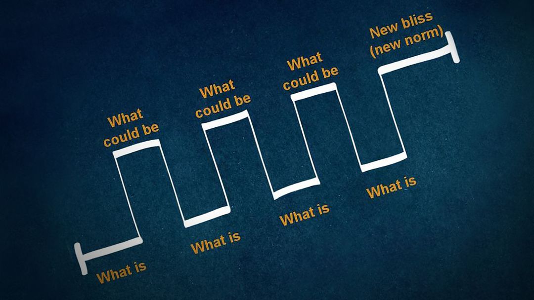
The secret structure of great talks

The beauty of data visualization

TED's secret to great public speaking
How to speak so that people want to listen
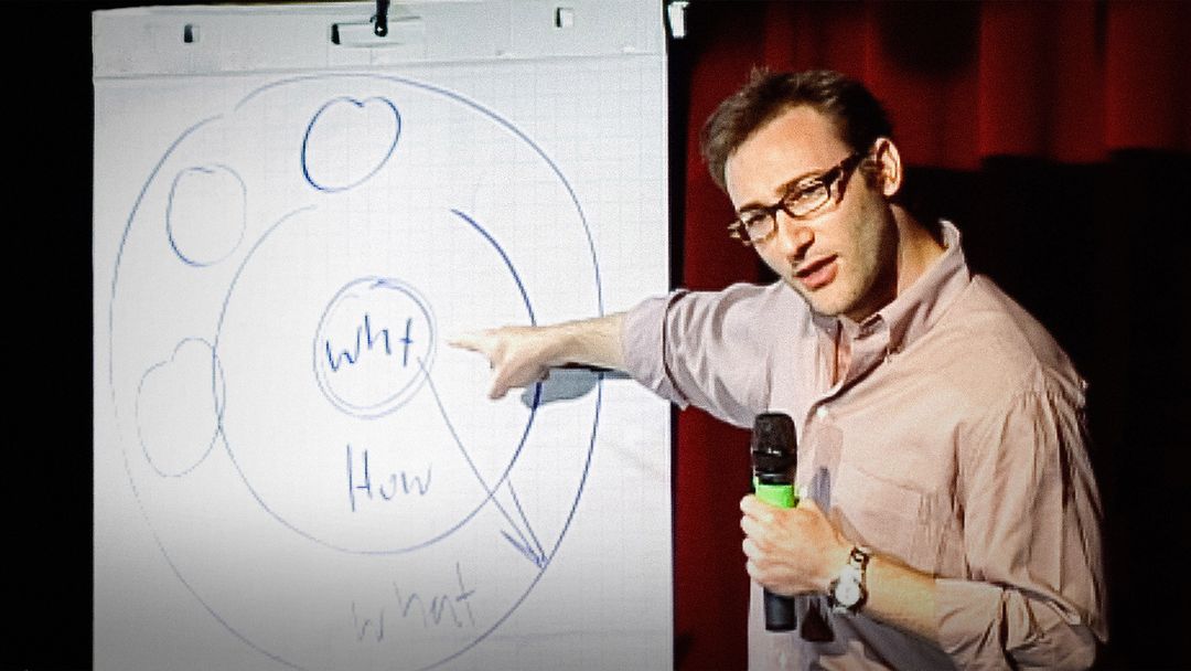
How great leaders inspire action
- SUGGESTED TOPICS
- The Magazine
- Newsletters
- Managing Yourself
- Managing Teams
- Work-life Balance
- The Big Idea
- Data & Visuals
- Reading Lists
- Case Selections
- HBR Learning
- Topic Feeds
- Account Settings
- Email Preferences
What It Takes to Give a Great Presentation
- Carmine Gallo

Five tips to set yourself apart.
Never underestimate the power of great communication. It can help you land the job of your dreams, attract investors to back your idea, or elevate your stature within your organization. But while there are plenty of good speakers in the world, you can set yourself apart out by being the person who can deliver something great over and over. Here are a few tips for business professionals who want to move from being good speakers to great ones: be concise (the fewer words, the better); never use bullet points (photos and images paired together are more memorable); don’t underestimate the power of your voice (raise and lower it for emphasis); give your audience something extra (unexpected moments will grab their attention); rehearse (the best speakers are the best because they practice — a lot).
I was sitting across the table from a Silicon Valley CEO who had pioneered a technology that touches many of our lives — the flash memory that stores data on smartphones, digital cameras, and computers. He was a frequent guest on CNBC and had been delivering business presentations for at least 20 years before we met. And yet, the CEO wanted to sharpen his public speaking skills.
- Carmine Gallo is a Harvard University instructor, keynote speaker, and author of 10 books translated into 40 languages. Gallo is the author of The Bezos Blueprint: Communication Secrets of the World’s Greatest Salesman (St. Martin’s Press).
Partner Center
- PRO Courses Guides New Tech Help Pro Expert Videos About wikiHow Pro Upgrade Sign In
- EDIT Edit this Article
- EXPLORE Tech Help Pro About Us Random Article Quizzes Request a New Article Community Dashboard This Or That Game Popular Categories Arts and Entertainment Artwork Books Movies Computers and Electronics Computers Phone Skills Technology Hacks Health Men's Health Mental Health Women's Health Relationships Dating Love Relationship Issues Hobbies and Crafts Crafts Drawing Games Education & Communication Communication Skills Personal Development Studying Personal Care and Style Fashion Hair Care Personal Hygiene Youth Personal Care School Stuff Dating All Categories Arts and Entertainment Finance and Business Home and Garden Relationship Quizzes Cars & Other Vehicles Food and Entertaining Personal Care and Style Sports and Fitness Computers and Electronics Health Pets and Animals Travel Education & Communication Hobbies and Crafts Philosophy and Religion Work World Family Life Holidays and Traditions Relationships Youth
- Browse Articles
- Learn Something New
- Quizzes Hot
- This Or That Game
- Train Your Brain
- Explore More
- Support wikiHow
- About wikiHow
- Log in / Sign up
- Education and Communications
- Presentations
How to Do an Oral Presentation
Last Updated: April 15, 2024
This article was co-authored by Vikas Agrawal . Vikas Agrawal is a Visual Content Marketing Expert & Entrepreneur, as well as the Founder of Full Service Creative Agency Infobrandz. With over 10 years of experience, he specializes in designing visually engaging content, such as infographics, videos, and e-books. He’s an expert in Making content marketing strategies and has contributed to and been featured in many publications including Forbes, Entrepreneur.com, and INC.com. This article has been viewed 48,785 times.
The power of words can control the thoughts, emotions and the decisions of others. Giving an oral presentation can be a challenge, but with the right plan and delivery, you can move an entire audience in your favor.
Researching Your Presentation

- If speaking about the effect of junk food on an adult’s mind, include the increase of serotonin, a happiness hormone. Then inform the audience how fast the hormone drastically depletes to give out worse feelings. This gives the perspective that even the advantages of junk food are outweighed by the negative effects.

Writing Your Script

- Make sure to begin each argument with a clear description of the content such as. "The result of eating junk food has increased negative emotions such as depression, anxiety and low self-esteem". This gives the audience a quick outlook of what the argument is about. Always remember to state how the argument relates and supports the topic question.

- If necessary, this is where you could include, "My name is ___ and I will be speaking about the effect on junk food on our minds." Then you include a brief out view of each argument you will be speaking about. Do not include any information about your arguments in the introduction.

- Some example concluding sentences include, "The entire process of the mind, changed by a simple bite of a cookie. Our entire body's control system, defined by our choices of food. The definite truth. You are what you eat."
Practicing and Performing

- Taking the effort to memorize your script allows you to keep eye contact with the audience and brings confidence to your speech. Reading from an entire script can easily cause you to lose your place and stutter. Also make sure they are the same size and only put important key words or those that are hard to remember. This allows you to easily flip through and read off the cue cards.

What Is The Best Way To Start a Presentation?
Expert Q&A
- Research persuasive language techniques. Thanks Helpful 0 Not Helpful 1
- Watch online speeches to get an idea of how to tone your presentation. Thanks Helpful 0 Not Helpful 1
- Color code each sentence on your cue cards to never lose track. Thanks Helpful 0 Not Helpful 1

You Might Also Like

- ↑ https://www.princeton.edu/~archss/webpdfs08/BaharMartonosi.pdf
- ↑ https://education.seattlepi.com/give-good-speech-presentations-college-1147.html
About This Article

- Send fan mail to authors
Reader Success Stories
Henry Williams
Mar 20, 2016
Did this article help you?

Pavithra Arthi
Feb 14, 2018

Featured Articles

Trending Articles

Watch Articles

- Terms of Use
- Privacy Policy
- Do Not Sell or Share My Info
- Not Selling Info
Don’t miss out! Sign up for
wikiHow’s newsletter

Improve your practice.
Enhance your soft skills with a range of award-winning courses.
How to Structure your Presentation, with Examples
August 3, 2018 - Dom Barnard
For many people the thought of delivering a presentation is a daunting task and brings about a great deal of nerves . However, if you take some time to understand how effective presentations are structured and then apply this structure to your own presentation, you’ll appear much more confident and relaxed.
Here is our complete guide for structuring your presentation, with examples at the end of the article to demonstrate these points.
Why is structuring a presentation so important?
If you’ve ever sat through a great presentation, you’ll have left feeling either inspired or informed on a given topic. This isn’t because the speaker was the most knowledgeable or motivating person in the world. Instead, it’s because they know how to structure presentations – they have crafted their message in a logical and simple way that has allowed the audience can keep up with them and take away key messages.
Research has supported this, with studies showing that audiences retain structured information 40% more accurately than unstructured information.
In fact, not only is structuring a presentation important for the benefit of the audience’s understanding, it’s also important for you as the speaker. A good structure helps you remain calm, stay on topic, and avoid any awkward silences.
What will affect your presentation structure?
Generally speaking, there is a natural flow that any decent presentation will follow which we will go into shortly. However, you should be aware that all presentation structures will be different in their own unique way and this will be due to a number of factors, including:
- Whether you need to deliver any demonstrations
- How knowledgeable the audience already is on the given subject
- How much interaction you want from the audience
- Any time constraints there are for your talk
- What setting you are in
- Your ability to use any kinds of visual assistance
Before choosing the presentation’s structure answer these questions first:
- What is your presentation’s aim?
- Who are the audience?
- What are the main points your audience should remember afterwards?
When reading the points below, think critically about what things may cause your presentation structure to be slightly different. You can add in certain elements and add more focus to certain moments if that works better for your speech.

What is the typical presentation structure?
This is the usual flow of a presentation, which covers all the vital sections and is a good starting point for yours. It allows your audience to easily follow along and sets out a solid structure you can add your content to.
1. Greet the audience and introduce yourself
Before you start delivering your talk, introduce yourself to the audience and clarify who you are and your relevant expertise. This does not need to be long or incredibly detailed, but will help build an immediate relationship between you and the audience. It gives you the chance to briefly clarify your expertise and why you are worth listening to. This will help establish your ethos so the audience will trust you more and think you’re credible.
Read our tips on How to Start a Presentation Effectively
2. Introduction
In the introduction you need to explain the subject and purpose of your presentation whilst gaining the audience’s interest and confidence. It’s sometimes helpful to think of your introduction as funnel-shaped to help filter down your topic:
- Introduce your general topic
- Explain your topic area
- State the issues/challenges in this area you will be exploring
- State your presentation’s purpose – this is the basis of your presentation so ensure that you provide a statement explaining how the topic will be treated, for example, “I will argue that…” or maybe you will “compare”, “analyse”, “evaluate”, “describe” etc.
- Provide a statement of what you’re hoping the outcome of the presentation will be, for example, “I’m hoping this will be provide you with…”
- Show a preview of the organisation of your presentation
In this section also explain:
- The length of the talk.
- Signal whether you want audience interaction – some presenters prefer the audience to ask questions throughout whereas others allocate a specific section for this.
- If it applies, inform the audience whether to take notes or whether you will be providing handouts.
The way you structure your introduction can depend on the amount of time you have been given to present: a sales pitch may consist of a quick presentation so you may begin with your conclusion and then provide the evidence. Conversely, a speaker presenting their idea for change in the world would be better suited to start with the evidence and then conclude what this means for the audience.
Keep in mind that the main aim of the introduction is to grab the audience’s attention and connect with them.
3. The main body of your talk
The main body of your talk needs to meet the promises you made in the introduction. Depending on the nature of your presentation, clearly segment the different topics you will be discussing, and then work your way through them one at a time – it’s important for everything to be organised logically for the audience to fully understand. There are many different ways to organise your main points, such as, by priority, theme, chronologically etc.
- Main points should be addressed one by one with supporting evidence and examples.
- Before moving on to the next point you should provide a mini-summary.
- Links should be clearly stated between ideas and you must make it clear when you’re moving onto the next point.
- Allow time for people to take relevant notes and stick to the topics you have prepared beforehand rather than straying too far off topic.
When planning your presentation write a list of main points you want to make and ask yourself “What I am telling the audience? What should they understand from this?” refining your answers this way will help you produce clear messages.
4. Conclusion
In presentations the conclusion is frequently underdeveloped and lacks purpose which is a shame as it’s the best place to reinforce your messages. Typically, your presentation has a specific goal – that could be to convert a number of the audience members into customers, lead to a certain number of enquiries to make people knowledgeable on specific key points, or to motivate them towards a shared goal.
Regardless of what that goal is, be sure to summarise your main points and their implications. This clarifies the overall purpose of your talk and reinforces your reason for being there.
Follow these steps:
- Signal that it’s nearly the end of your presentation, for example, “As we wrap up/as we wind down the talk…”
- Restate the topic and purpose of your presentation – “In this speech I wanted to compare…”
- Summarise the main points, including their implications and conclusions
- Indicate what is next/a call to action/a thought-provoking takeaway
- Move on to the last section
5. Thank the audience and invite questions
Conclude your talk by thanking the audience for their time and invite them to ask any questions they may have. As mentioned earlier, personal circumstances will affect the structure of your presentation.
Many presenters prefer to make the Q&A session the key part of their talk and try to speed through the main body of the presentation. This is totally fine, but it is still best to focus on delivering some sort of initial presentation to set the tone and topics for discussion in the Q&A.

Other common presentation structures
The above was a description of a basic presentation, here are some more specific presentation layouts:
Demonstration
Use the demonstration structure when you have something useful to show. This is usually used when you want to show how a product works. Steve Jobs frequently used this technique in his presentations.
- Explain why the product is valuable.
- Describe why the product is necessary.
- Explain what problems it can solve for the audience.
- Demonstrate the product to support what you’ve been saying.
- Make suggestions of other things it can do to make the audience curious.
Problem-solution
This structure is particularly useful in persuading the audience.
- Briefly frame the issue.
- Go into the issue in detail showing why it ‘s such a problem. Use logos and pathos for this – the logical and emotional appeals.
- Provide the solution and explain why this would also help the audience.
- Call to action – something you want the audience to do which is straightforward and pertinent to the solution.
Storytelling
As well as incorporating stories in your presentation , you can organise your whole presentation as a story. There are lots of different type of story structures you can use – a popular choice is the monomyth – the hero’s journey. In a monomyth, a hero goes on a difficult journey or takes on a challenge – they move from the familiar into the unknown. After facing obstacles and ultimately succeeding the hero returns home, transformed and with newfound wisdom.
Storytelling for Business Success webinar , where well-know storyteller Javier Bernad shares strategies for crafting compelling narratives.
Another popular choice for using a story to structure your presentation is in media ras (in the middle of thing). In this type of story you launch right into the action by providing a snippet/teaser of what’s happening and then you start explaining the events that led to that event. This is engaging because you’re starting your story at the most exciting part which will make the audience curious – they’ll want to know how you got there.
- Great storytelling: Examples from Alibaba Founder, Jack Ma

Remaining method
The remaining method structure is good for situations where you’re presenting your perspective on a controversial topic which has split people’s opinions.
- Go into the issue in detail showing why it’s such a problem – use logos and pathos.
- Rebut your opponents’ solutions – explain why their solutions could be useful because the audience will see this as fair and will therefore think you’re trustworthy, and then explain why you think these solutions are not valid.
- After you’ve presented all the alternatives provide your solution, the remaining solution. This is very persuasive because it looks like the winning idea, especially with the audience believing that you’re fair and trustworthy.
Transitions
When delivering presentations it’s important for your words and ideas to flow so your audience can understand how everything links together and why it’s all relevant. This can be done using speech transitions which are words and phrases that allow you to smoothly move from one point to another so that your speech flows and your presentation is unified.
Transitions can be one word, a phrase or a full sentence – there are many different forms, here are some examples:
Moving from the introduction to the first point
Signify to the audience that you will now begin discussing the first main point:
- Now that you’re aware of the overview, let’s begin with…
- First, let’s begin with…
- I will first cover…
- My first point covers…
- To get started, let’s look at…
Shifting between similar points
Move from one point to a similar one:
- In the same way…
- Likewise…
- Equally…
- This is similar to…
- Similarly…
Internal summaries
Internal summarising consists of summarising before moving on to the next point. You must inform the audience:
- What part of the presentation you covered – “In the first part of this speech we’ve covered…”
- What the key points were – “Precisely how…”
- How this links in with the overall presentation – “So that’s the context…”
- What you’re moving on to – “Now I’d like to move on to the second part of presentation which looks at…”
Physical movement
You can move your body and your standing location when you transition to another point. The audience find it easier to follow your presentation and movement will increase their interest.
A common technique for incorporating movement into your presentation is to:
- Start your introduction by standing in the centre of the stage.
- For your first point you stand on the left side of the stage.
- You discuss your second point from the centre again.
- You stand on the right side of the stage for your third point.
- The conclusion occurs in the centre.
Key slides for your presentation
Slides are a useful tool for most presentations: they can greatly assist in the delivery of your message and help the audience follow along with what you are saying. Key slides include:
- An intro slide outlining your ideas
- A summary slide with core points to remember
- High quality image slides to supplement what you are saying
There are some presenters who choose not to use slides at all, though this is more of a rarity. Slides can be a powerful tool if used properly, but the problem is that many fail to do just that. Here are some golden rules to follow when using slides in a presentation:
- Don’t over fill them – your slides are there to assist your speech, rather than be the focal point. They should have as little information as possible, to avoid distracting people from your talk.
- A picture says a thousand words – instead of filling a slide with text, instead, focus on one or two images or diagrams to help support and explain the point you are discussing at that time.
- Make them readable – depending on the size of your audience, some may not be able to see small text or images, so make everything large enough to fill the space.
- Don’t rush through slides – give the audience enough time to digest each slide.
Guy Kawasaki, an entrepreneur and author, suggests that slideshows should follow a 10-20-30 rule :
- There should be a maximum of 10 slides – people rarely remember more than one concept afterwards so there’s no point overwhelming them with unnecessary information.
- The presentation should last no longer than 20 minutes as this will leave time for questions and discussion.
- The font size should be a minimum of 30pt because the audience reads faster than you talk so less information on the slides means that there is less chance of the audience being distracted.
Here are some additional resources for slide design:
- 7 design tips for effective, beautiful PowerPoint presentations
- 11 design tips for beautiful presentations
- 10 tips on how to make slides that communicate your idea
Group Presentations
Group presentations are structured in the same way as presentations with one speaker but usually require more rehearsal and practices. Clean transitioning between speakers is very important in producing a presentation that flows well. One way of doing this consists of:
- Briefly recap on what you covered in your section: “So that was a brief introduction on what health anxiety is and how it can affect somebody”
- Introduce the next speaker in the team and explain what they will discuss: “Now Elnaz will talk about the prevalence of health anxiety.”
- Then end by looking at the next speaker, gesturing towards them and saying their name: “Elnaz”.
- The next speaker should acknowledge this with a quick: “Thank you Joe.”
From this example you can see how the different sections of the presentations link which makes it easier for the audience to follow and remain engaged.
Example of great presentation structure and delivery
Having examples of great presentations will help inspire your own structures, here are a few such examples, each unique and inspiring in their own way.
How Google Works – by Eric Schmidt
This presentation by ex-Google CEO Eric Schmidt demonstrates some of the most important lessons he and his team have learnt with regards to working with some of the most talented individuals they hired. The simplistic yet cohesive style of all of the slides is something to be appreciated. They are relatively straightforward, yet add power and clarity to the narrative of the presentation.
Start with why – by Simon Sinek
Since being released in 2009, this presentation has been viewed almost four million times all around the world. The message itself is very powerful, however, it’s not an idea that hasn’t been heard before. What makes this presentation so powerful is the simple message he is getting across, and the straightforward and understandable manner in which he delivers it. Also note that he doesn’t use any slides, just a whiteboard where he creates a simple diagram of his opinion.
The Wisdom of a Third Grade Dropout – by Rick Rigsby
Here’s an example of a presentation given by a relatively unknown individual looking to inspire the next generation of graduates. Rick’s presentation is unique in many ways compared to the two above. Notably, he uses no visual prompts and includes a great deal of humour.
However, what is similar is the structure he uses. He first introduces his message that the wisest man he knew was a third-grade dropout. He then proceeds to deliver his main body of argument, and in the end, concludes with his message. This powerful speech keeps the viewer engaged throughout, through a mixture of heart-warming sentiment, powerful life advice and engaging humour.
As you can see from the examples above, and as it has been expressed throughout, a great presentation structure means analysing the core message of your presentation. Decide on a key message you want to impart the audience with, and then craft an engaging way of delivering it.
By preparing a solid structure, and practising your talk beforehand, you can walk into the presentation with confidence and deliver a meaningful message to an interested audience.
It’s important for a presentation to be well-structured so it can have the most impact on your audience. An unstructured presentation can be difficult to follow and even frustrating to listen to. The heart of your speech are your main points supported by evidence and your transitions should assist the movement between points and clarify how everything is linked.
Research suggests that the audience remember the first and last things you say so your introduction and conclusion are vital for reinforcing your points. Essentially, ensure you spend the time structuring your presentation and addressing all of the sections.

Search Utah State University:
Oral presentations.
An oral presentation is usually more than just reading a paper or set of slides to an audience (though in some disciplines, this is the expectation). How you deliver your presentation is as important in communicating your message as what you say. Use these guidelines to learn simple tools that help you prepare and present an effective presentation, and design PowerPoint slides that support and enhance your talk.
Download Oral Presentation Template
Preparation Tips
An effective presentation is more than just standing up and giving information. A presenter must consider how best to communicate the information to the audience. Use these tips to create a presentation that is both informative and interesting:
- Organize your thoughts. Start with an outline and develop good transitions between sections. Emphasize the real-world significance of your research.
- Have a strong opening. Why should the audience listen to you? One good way to get their attention is to start with a question, whether or not you expect an answer.
- Define terms early. If you are using terms that may be new to the audience, introduce them early in your presentation. Once an audience gets lost in unfamiliar terminology, it is extremely difficult to get them back on track.
- Don't get lost in the details. It's natural to be excited about your research and want to tell your audience all about it, but they don't need to know every detail. Focus on giving them enough information to broadly understand how you arrived at your conclusion, what your findings are, and why they matter.
- Finish with a bang. Find one or two sentences that sum up the importance of your research. How is the world better off as a result of what you have done?
- Design PowerPoint slides to introduce important information. Consider doing a presentation without PowerPoint. Then consider which points you cannot make without slides. Create only those slides that are necessary to improve your communication with the audience.
- Time yourself. Do not wait until the last minute to time your presentation. Different conferences will allow for different amounts of time. At on-campus events hosted by the Office of Research, you only have 8 minutes to speak, so you want to know, as soon as possible, if you are close to that limit.
- Create effective notes for yourself. Have notes that you can read. Do not write out your entire talk; use an outline or other brief reminders of what you want to say. Make sure the text is large enough that you can read it from a distance.
- Practice, practice, practice. The more you practice your presentation, the more comfortable you will be in front of an audience. Practice in front of a friend or two and ask for their feedback. Record yourself and listen to it critically. Make it better and do it again.
Powerpoint Tips
Microsoft PowerPoint is a tremendous tool for presentations. It is also a tool that is sometimes not used effectively. If you are using PowerPoint, use these tips to enhance your presentation:
- Use a large font. As a general rule, avoid text smaller than 24 point.
- Use a clean typeface. Sans serif typefaces, such as Arial, are generally easier to read on a screen than serifed typefaces, such as Times New Roman.
- Use bullet points, not complete sentences. The text on your slide provides an outline to what you are saying. If the entire text of your presentation is on your slides, there is no reason for the audience to listen to you. A common standard is the 6/7 rule: no more than six bulleted items per slide and no more than seven words per item.
- Use contrasting colors. Use a dark text on a light background or a light text on a dark background. Avoid combinations of colors that look similar. Avoid red/green combinations, as this is the most common form of color blindness.
- Use special effects sparingly. Using animations, cool transition effects, sounds and other special effects is an effective way to make sure the audience notices your slides. Unfortunately, that means that they are not listening to what you are saying. Use special effects only when they are necessary to make a point.
Presentation Tips
When you start your presentation, the audience will be interested in what you say. Use these tips to help keep them interested throughout your presentation:
- Be excited. You are talking about something exciting. If you remember to be excited, your audience will feel it and automatically become more interested.
- Speak with confidence. When you are speaking, you are the authority on your topic, but do not pretend that you know everything. If you do not know the answer to a question, admit it. Consider deferring the question to your mentor or offer to look into the matter further.
- Make eye contact with the audience. Your purpose is to communicate with your audience, and people listen more if they feel you are talking directly to them. As you speak, let your eyes settle on one person for a few seconds before moving on to somebody else. You do not have to make eye contact with everybody, but make sure you connect with all areas of the audience equally.
- Avoid reading from the screen. First, if you are reading from the screen, you are not making eye contact with your audience. Second, if you put it on your slide, it is because you wanted them to read it, not you.
- Blank the screen when a slide is unnecessary. A slide that is not related to what you are speaking about can distract the audience. Pressing the letter B or the period key displays a black screen, which lets the audience concentrate solely on your words. Press the same key to restore the display.
- Use a pointer only when necessary. If you are using a laser pointer, remember to keep it off unless you need to highlight something on the screen.
- Explain your equations and graphs. When you display equations, explain them fully. Point out all constants and dependent and independent variables. With graphs, tell how they support your point. Explain the x- and y-axes and show how the graph progresses from left to right.
- Pause. Pauses bring audible structure to your presentation. They emphasize important information, make transitions obvious, and give the audience time to catch up between points and to read new slides. Pauses always feel much longer to speakers than to listeners. Practice counting silently to three (slowly) between points.
- Avoid filler words. Um, like, you know, and many others. To an audience, these are indications that you do not know what to say; you sound uncomfortable, so they start to feel uncomfortable as well. Speak slowly enough that you can collect your thoughts before moving ahead. If you really do not know what to say, pause silently until you do.
- Relax. It is hard to relax when you are nervous, but your audience will be much more comfortable if you are too.
- Breathe. It is fine to be nervous. In fact, you should be—all good presenters are nervous every time they are in front of an audience. The most effective way to keep your nerves in check—aside from a lot of practice beforehand—is to remember to breathe deeply throughout your presentation.
- Acknowledge the people who supported your research. Be sure to thank the people who made your research possible, including your mentor, research team, collaborators, and other sources of funding and support.
Sharing your work can help you expand your network of contacts who share your research interests. For undergraduate researchers who intend to complete a graduate degree, presenting can be an invaluable experience. We recommend discussing your interest in sharing your research with your faculty advisor. They can help match your interests with the appropriate venue.
See guide for Poster Presentations
- - Google Chrome
Intended for healthcare professionals
- My email alerts
- BMA member login
- Username * Password * Forgot your log in details? Need to activate BMA Member Log In Log in via OpenAthens Log in via your institution

Search form
- Advanced search
- Search responses
- Search blogs
- How to prepare and...
How to prepare and deliver an effective oral presentation
- Related content
- Peer review
- Lucia Hartigan , registrar 1 ,
- Fionnuala Mone , fellow in maternal fetal medicine 1 ,
- Mary Higgins , consultant obstetrician 2
- 1 National Maternity Hospital, Dublin, Ireland
- 2 National Maternity Hospital, Dublin; Obstetrics and Gynaecology, Medicine and Medical Sciences, University College Dublin
- luciahartigan{at}hotmail.com
The success of an oral presentation lies in the speaker’s ability to transmit information to the audience. Lucia Hartigan and colleagues describe what they have learnt about delivering an effective scientific oral presentation from their own experiences, and their mistakes
The objective of an oral presentation is to portray large amounts of often complex information in a clear, bite sized fashion. Although some of the success lies in the content, the rest lies in the speaker’s skills in transmitting the information to the audience. 1
Preparation
It is important to be as well prepared as possible. Look at the venue in person, and find out the time allowed for your presentation and for questions, and the size of the audience and their backgrounds, which will allow the presentation to be pitched at the appropriate level.
See what the ambience and temperature are like and check that the format of your presentation is compatible with the available computer. This is particularly important when embedding videos. Before you begin, look at the video on stand-by and make sure the lights are dimmed and the speakers are functioning.
For visual aids, Microsoft PowerPoint or Apple Mac Keynote programmes are usual, although Prezi is increasing in popularity. Save the presentation on a USB stick, with email or cloud storage backup to avoid last minute disasters.
When preparing the presentation, start with an opening slide containing the title of the study, your name, and the date. Begin by addressing and thanking the audience and the organisation that has invited you to speak. Typically, the format includes background, study aims, methodology, results, strengths and weaknesses of the study, and conclusions.
If the study takes a lecturing format, consider including “any questions?” on a slide before you conclude, which will allow the audience to remember the take home messages. Ideally, the audience should remember three of the main points from the presentation. 2
Have a maximum of four short points per slide. If you can display something as a diagram, video, or a graph, use this instead of text and talk around it.
Animation is available in both Microsoft PowerPoint and the Apple Mac Keynote programme, and its use in presentations has been demonstrated to assist in the retention and recall of facts. 3 Do not overuse it, though, as it could make you appear unprofessional. If you show a video or diagram don’t just sit back—use a laser pointer to explain what is happening.
Rehearse your presentation in front of at least one person. Request feedback and amend accordingly. If possible, practise in the venue itself so things will not be unfamiliar on the day. If you appear comfortable, the audience will feel comfortable. Ask colleagues and seniors what questions they would ask and prepare responses to these questions.
It is important to dress appropriately, stand up straight, and project your voice towards the back of the room. Practise using a microphone, or any other presentation aids, in advance. If you don’t have your own presenting style, think of the style of inspirational scientific speakers you have seen and imitate it.
Try to present slides at the rate of around one slide a minute. If you talk too much, you will lose your audience’s attention. The slides or videos should be an adjunct to your presentation, so do not hide behind them, and be proud of the work you are presenting. You should avoid reading the wording on the slides, but instead talk around the content on them.
Maintain eye contact with the audience and remember to smile and pause after each comment, giving your nerves time to settle. Speak slowly and concisely, highlighting key points.
Do not assume that the audience is completely familiar with the topic you are passionate about, but don’t patronise them either. Use every presentation as an opportunity to teach, even your seniors. The information you are presenting may be new to them, but it is always important to know your audience’s background. You can then ensure you do not patronise world experts.
To maintain the audience’s attention, vary the tone and inflection of your voice. If appropriate, use humour, though you should run any comments or jokes past others beforehand and make sure they are culturally appropriate. Check every now and again that the audience is following and offer them the opportunity to ask questions.
Finishing up is the most important part, as this is when you send your take home message with the audience. Slow down, even though time is important at this stage. Conclude with the three key points from the study and leave the slide up for a further few seconds. Do not ramble on. Give the audience a chance to digest the presentation. Conclude by acknowledging those who assisted you in the study, and thank the audience and organisation. If you are presenting in North America, it is usual practice to conclude with an image of the team. If you wish to show references, insert a text box on the appropriate slide with the primary author, year, and paper, although this is not always required.
Answering questions can often feel like the most daunting part, but don’t look upon this as negative. Assume that the audience has listened and is interested in your research. Listen carefully, and if you are unsure about what someone is saying, ask for the question to be rephrased. Thank the audience member for asking the question and keep responses brief and concise. If you are unsure of the answer you can say that the questioner has raised an interesting point that you will have to investigate further. Have someone in the audience who will write down the questions for you, and remember that this is effectively free peer review.
Be proud of your achievements and try to do justice to the work that you and the rest of your group have done. You deserve to be up on that stage, so show off what you have achieved.
Competing interests: We have read and understood the BMJ Group policy on declaration of interests and declare the following interests: None.
- ↵ Rovira A, Auger C, Naidich TP. How to prepare an oral presentation and a conference. Radiologica 2013 ; 55 (suppl 1): 2 -7S. OpenUrl
- ↵ Bourne PE. Ten simple rules for making good oral presentations. PLos Comput Biol 2007 ; 3 : e77 . OpenUrl PubMed
- ↵ Naqvi SH, Mobasher F, Afzal MA, Umair M, Kohli AN, Bukhari MH. Effectiveness of teaching methods in a medical institute: perceptions of medical students to teaching aids. J Pak Med Assoc 2013 ; 63 : 859 -64. OpenUrl
Newly Launched - World's Most Advanced AI Powered Platform to Generate Stunning Presentations that are Editable in PowerPoint

- Oral Presentations
- Popular Categories
Powerpoint Templates
Icon Bundle
Kpi Dashboard
Professional
Business Plans
Swot Analysis
Gantt Chart
Business Proposal
Marketing Plan
Project Management
Business Case
Business Model
Cyber Security
Business PPT
Digital Marketing
Digital Transformation
Human Resources
Product Management
Artificial Intelligence
Company Profile
Acknowledgement PPT
PPT Presentation
Reports Brochures
One Page Pitch
Interview PPT
All Categories
Powerpoint Templates and Google slides for Oral Presentations
Save your time and attract your audience with our fully editable ppt templates and slides..
Presenting Goods Oral Presentation Ideas In Powerpoint And Google Slides Cpb slide which is completely adaptable. The graphics in this PowerPoint slide showcase four stages that will help you succinctly convey the information. In addition, you can alternate the color, font size, font type, and shapes of this PPT layout according to your content. This PPT presentation can be accessed with Google Slides and is available in both standard screen and widescreen aspect ratios. It is also a useful set to elucidate topics like Goods Oral Presentation Ideas. This well structured design can be downloaded in different formats like PDF, JPG, and PNG. So, without any delay, click on the download button now.
Presenting Business Related Topics Oral Presentation In Powerpoint And Google Slides Cpb slide which is completely adaptable. The graphics in this PowerPoint slide showcase two stages that will help you succinctly convey the information. In addition, you can alternate the color, font size, font type, and shapes of this PPT layout according to your content. This PPT presentation can be accessed with Google Slides and is available in both standard screen and widescreen aspect ratios. It is also a useful set to elucidate topics like Business Related Topics Oral Presentation. This well structured design can be downloaded in different formats like PDF, JPG, and PNG. So, without any delay, click on the download button now.
Presenting our Oral Presentation Types In Powerpoint And Google Slides Cpb PowerPoint template design. This PowerPoint slide showcases four stages. It is useful to share insightful information on Oral Presentation Types This PPT slide can be easily accessed in standard screen and widescreen aspect ratios. It is also available in various formats like PDF, PNG, and JPG. Not only this, the PowerPoint slideshow is completely editable and you can effortlessly modify the font size, font type, and shapes according to your wish. Our PPT layout is compatible with Google Slides as well, so download and edit it as per your knowledge.
Presenting Most Important Part Preparing Oral Presentation In Powerpoint And Google Slides Cpb slide which is completely adaptable. The graphics in this PowerPoint slide showcase three stages that will help you succinctly convey the information. In addition, you can alternate the color, font size, font type, and shapes of this PPT layout according to your content. This PPT presentation can be accessed with Google Slides and is available in both standard screen and widescreen aspect ratios. It is also a useful set to elucidate topics like Most Important Part Preparing Oral Presentation. This well-structured design can be downloaded in different formats like PDF, JPG, and PNG. So, without any delay, click on the download button now.
Presenting Good Oral Presentation Ideas In Powerpoint And Google Slides Cpb slide which is completely adaptable. The graphics in this PowerPoint slide showcase four stages that will help you succinctly convey the information. In addition, you can alternate the color, font size, font type, and shapes of this PPT layout according to your content. This PPT presentation can be accessed with Google Slides and is available in both standard screen and widescreen aspect ratios. It is also a useful set to elucidate topics like Good Oral Presentation Ideas. This well structured design can be downloaded in different formats like PDF, JPG, and PNG. So, without any delay, click on the download button now.
Presenting Oral Presentation Topics In Powerpoint And Google Slides Cpb slide which is completely adaptable. The graphics in this PowerPoint slide showcase four stages that will help you succinctly convey the information. In addition, you can alternate the color, font size, font type, and shapes of this PPT layout according to your content. This PPT presentation can be accessed with Google Slides and is available in both standard screen and widescreen aspect ratios. It is also a useful set to elucidate topics like Oral Presentation Topics This well structured design can be downloaded in different formats like PDF, JPG, and PNG. So, without any delay, click on the download button now.
Presenting this set of slides with name - Oral Presentation Skills Personal Development Skills Decision Making Communication Cpb. This is an editable five stages graphic that deals with topics like Oral Presentation Skills, Personal Development Skills, Decision Making Communication to help convey your message better graphically. This product is a premium product available for immediate download, and is 100 percent editable in Powerpoint. Download this now and use it in your presentations to impress your audience.
Presenting this set of slides with name Effective Oral Communication Ppt Powerpoint Presentation Portfolio Ideas Cpb. This is an editable Powerpoint four stages graphic that deals with topics like Effective Oral Communication to help convey your message better graphically. This product is a premium product available for immediate download and is 100 percent editable in Powerpoint. Download this now and use it in your presentations to impress your audience.
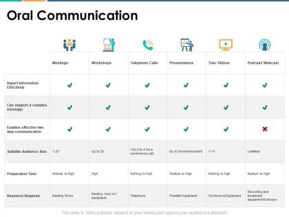
Presenting this set of slides with name Oral Communication Resource Ppt Powerpoint Presentation Pictures Graphics. The topics discussed in these slides are Marketing, Business, Management, Planning, Strategy. This is a completely editable PowerPoint presentation and is available for immediate download. Download now and impress your audience.
Presenting this set of slides with name Oral System Ppt Powerpoint Presentation Layouts Examples. The topics discussed in these slides are Oral System. This is a completely editable PowerPoint presentation and is available for immediate download. Download now and impress your audience.
Presenting Oral Language Development Ppt Powerpoint Presentation Outline Smartart Cpb slide which is completely adaptable. The graphics in this PowerPoint slide showcase four stages that will help you succinctly convey the information. In addition, you can alternate the color, font size, font type, and shapes of this PPT layout according to your content. This PPT presentation can be accessed with Google Slides and is available in both standard screen and widescreen aspect ratios. It is also a useful set to elucidate topics like Oral Language Development. This well-structured design can be downloaded in different formats like PDF, JPG, and PNG. So, without any delay, click on the download button now.
Presenting our Face To Face Conversation Oral Communication Ppt Powerpoint Presentation Styles Influencers Cpb PowerPoint template design. This PowerPoint slide showcases five stages. It is useful to share insightful information on Face To Face Conversation Oral Communication This PPT slide can be easily accessed in standard screen and widescreen aspect ratios. It is also available in various formats like PDF, PNG, and JPG. Not only this, the PowerPoint slideshow is completely editable and you can effortlessly modify the font size, font type, and shapes according to your wish. Our PPT layout is compatible with Google Slides as well, so download and edit it as per your knowledge.

An official website of the United States government
The .gov means it’s official. Federal government websites often end in .gov or .mil. Before sharing sensitive information, make sure you’re on a federal government site.
The site is secure. The https:// ensures that you are connecting to the official website and that any information you provide is encrypted and transmitted securely.
- Publications
- Account settings
Preview improvements coming to the PMC website in October 2024. Learn More or Try it out now .
- Advanced Search
- Journal List
- PLoS Comput Biol
- v.17(12); 2021 Dec

Ten simple rules for effective presentation slides
Kristen m. naegle.
Biomedical Engineering and the Center for Public Health Genomics, University of Virginia, Charlottesville, Virginia, United States of America
Introduction
The “presentation slide” is the building block of all academic presentations, whether they are journal clubs, thesis committee meetings, short conference talks, or hour-long seminars. A slide is a single page projected on a screen, usually built on the premise of a title, body, and figures or tables and includes both what is shown and what is spoken about that slide. Multiple slides are strung together to tell the larger story of the presentation. While there have been excellent 10 simple rules on giving entire presentations [ 1 , 2 ], there was an absence in the fine details of how to design a slide for optimal effect—such as the design elements that allow slides to convey meaningful information, to keep the audience engaged and informed, and to deliver the information intended and in the time frame allowed. As all research presentations seek to teach, effective slide design borrows from the same principles as effective teaching, including the consideration of cognitive processing your audience is relying on to organize, process, and retain information. This is written for anyone who needs to prepare slides from any length scale and for most purposes of conveying research to broad audiences. The rules are broken into 3 primary areas. Rules 1 to 5 are about optimizing the scope of each slide. Rules 6 to 8 are about principles around designing elements of the slide. Rules 9 to 10 are about preparing for your presentation, with the slides as the central focus of that preparation.
Rule 1: Include only one idea per slide
Each slide should have one central objective to deliver—the main idea or question [ 3 – 5 ]. Often, this means breaking complex ideas down into manageable pieces (see Fig 1 , where “background” information has been split into 2 key concepts). In another example, if you are presenting a complex computational approach in a large flow diagram, introduce it in smaller units, building it up until you finish with the entire diagram. The progressive buildup of complex information means that audiences are prepared to understand the whole picture, once you have dedicated time to each of the parts. You can accomplish the buildup of components in several ways—for example, using presentation software to cover/uncover information. Personally, I choose to create separate slides for each piece of information content I introduce—where the final slide has the entire diagram, and I use cropping or a cover on duplicated slides that come before to hide what I’m not yet ready to include. I use this method in order to ensure that each slide in my deck truly presents one specific idea (the new content) and the amount of the new information on that slide can be described in 1 minute (Rule 2), but it comes with the trade-off—a change to the format of one of the slides in the series often means changes to all slides.

Top left: A background slide that describes the background material on a project from my lab. The slide was created using a PowerPoint Design Template, which had to be modified to increase default text sizes for this figure (i.e., the default text sizes are even worse than shown here). Bottom row: The 2 new slides that break up the content into 2 explicit ideas about the background, using a central graphic. In the first slide, the graphic is an explicit example of the SH2 domain of PI3-kinase interacting with a phosphorylation site (Y754) on the PDGFR to describe the important details of what an SH2 domain and phosphotyrosine ligand are and how they interact. I use that same graphic in the second slide to generalize all binding events and include redundant text to drive home the central message (a lot of possible interactions might occur in the human proteome, more than we can currently measure). Top right highlights which rules were used to move from the original slide to the new slide. Specific changes as highlighted by Rule 7 include increasing contrast by changing the background color, increasing font size, changing to sans serif fonts, and removing all capital text and underlining (using bold to draw attention). PDGFR, platelet-derived growth factor receptor.
Rule 2: Spend only 1 minute per slide
When you present your slide in the talk, it should take 1 minute or less to discuss. This rule is really helpful for planning purposes—a 20-minute presentation should have somewhere around 20 slides. Also, frequently giving your audience new information to feast on helps keep them engaged. During practice, if you find yourself spending more than a minute on a slide, there’s too much for that one slide—it’s time to break up the content into multiple slides or even remove information that is not wholly central to the story you are trying to tell. Reduce, reduce, reduce, until you get to a single message, clearly described, which takes less than 1 minute to present.
Rule 3: Make use of your heading
When each slide conveys only one message, use the heading of that slide to write exactly the message you are trying to deliver. Instead of titling the slide “Results,” try “CTNND1 is central to metastasis” or “False-positive rates are highly sample specific.” Use this landmark signpost to ensure that all the content on that slide is related exactly to the heading and only the heading. Think of the slide heading as the introductory or concluding sentence of a paragraph and the slide content the rest of the paragraph that supports the main point of the paragraph. An audience member should be able to follow along with you in the “paragraph” and come to the same conclusion sentence as your header at the end of the slide.
Rule 4: Include only essential points
While you are speaking, audience members’ eyes and minds will be wandering over your slide. If you have a comment, detail, or figure on a slide, have a plan to explicitly identify and talk about it. If you don’t think it’s important enough to spend time on, then don’t have it on your slide. This is especially important when faculty are present. I often tell students that thesis committee members are like cats: If you put a shiny bauble in front of them, they’ll go after it. Be sure to only put the shiny baubles on slides that you want them to focus on. Putting together a thesis meeting for only faculty is really an exercise in herding cats (if you have cats, you know this is no easy feat). Clear and concise slide design will go a long way in helping you corral those easily distracted faculty members.
Rule 5: Give credit, where credit is due
An exception to Rule 4 is to include proper citations or references to work on your slide. When adding citations, names of other researchers, or other types of credit, use a consistent style and method for adding this information to your slides. Your audience will then be able to easily partition this information from the other content. A common mistake people make is to think “I’ll add that reference later,” but I highly recommend you put the proper reference on the slide at the time you make it, before you forget where it came from. Finally, in certain kinds of presentations, credits can make it clear who did the work. For the faculty members heading labs, it is an effective way to connect your audience with the personnel in the lab who did the work, which is a great career booster for that person. For graduate students, it is an effective way to delineate your contribution to the work, especially in meetings where the goal is to establish your credentials for meeting the rigors of a PhD checkpoint.
Rule 6: Use graphics effectively
As a rule, you should almost never have slides that only contain text. Build your slides around good visualizations. It is a visual presentation after all, and as they say, a picture is worth a thousand words. However, on the flip side, don’t muddy the point of the slide by putting too many complex graphics on a single slide. A multipanel figure that you might include in a manuscript should often be broken into 1 panel per slide (see Rule 1 ). One way to ensure that you use the graphics effectively is to make a point to introduce the figure and its elements to the audience verbally, especially for data figures. For example, you might say the following: “This graph here shows the measured false-positive rate for an experiment and each point is a replicate of the experiment, the graph demonstrates …” If you have put too much on one slide to present in 1 minute (see Rule 2 ), then the complexity or number of the visualizations is too much for just one slide.
Rule 7: Design to avoid cognitive overload
The type of slide elements, the number of them, and how you present them all impact the ability for the audience to intake, organize, and remember the content. For example, a frequent mistake in slide design is to include full sentences, but reading and verbal processing use the same cognitive channels—therefore, an audience member can either read the slide, listen to you, or do some part of both (each poorly), as a result of cognitive overload [ 4 ]. The visual channel is separate, allowing images/videos to be processed with auditory information without cognitive overload [ 6 ] (Rule 6). As presentations are an exercise in listening, and not reading, do what you can to optimize the ability of the audience to listen. Use words sparingly as “guide posts” to you and the audience about major points of the slide. In fact, you can add short text fragments, redundant with the verbal component of the presentation, which has been shown to improve retention [ 7 ] (see Fig 1 for an example of redundant text that avoids cognitive overload). Be careful in the selection of a slide template to minimize accidentally adding elements that the audience must process, but are unimportant. David JP Phillips argues (and effectively demonstrates in his TEDx talk [ 5 ]) that the human brain can easily interpret 6 elements and more than that requires a 500% increase in human cognition load—so keep the total number of elements on the slide to 6 or less. Finally, in addition to the use of short text, white space, and the effective use of graphics/images, you can improve ease of cognitive processing further by considering color choices and font type and size. Here are a few suggestions for improving the experience for your audience, highlighting the importance of these elements for some specific groups:
- Use high contrast colors and simple backgrounds with low to no color—for persons with dyslexia or visual impairment.
- Use sans serif fonts and large font sizes (including figure legends), avoid italics, underlining (use bold font instead for emphasis), and all capital letters—for persons with dyslexia or visual impairment [ 8 ].
- Use color combinations and palettes that can be understood by those with different forms of color blindness [ 9 ]. There are excellent tools available to identify colors to use and ways to simulate your presentation or figures as they might be seen by a person with color blindness (easily found by a web search).
- In this increasing world of virtual presentation tools, consider practicing your talk with a closed captioning system capture your words. Use this to identify how to improve your speaking pace, volume, and annunciation to improve understanding by all members of your audience, but especially those with a hearing impairment.
Rule 8: Design the slide so that a distracted person gets the main takeaway
It is very difficult to stay focused on a presentation, especially if it is long or if it is part of a longer series of talks at a conference. Audience members may get distracted by an important email, or they may start dreaming of lunch. So, it’s important to look at your slide and ask “If they heard nothing I said, will they understand the key concept of this slide?” The other rules are set up to help with this, including clarity of the single point of the slide (Rule 1), titling it with a major conclusion (Rule 3), and the use of figures (Rule 6) and short text redundant to your verbal description (Rule 7). However, with each slide, step back and ask whether its main conclusion is conveyed, even if someone didn’t hear your accompanying dialog. Importantly, ask if the information on the slide is at the right level of abstraction. For example, do you have too many details about the experiment, which hides the conclusion of the experiment (i.e., breaking Rule 1)? If you are worried about not having enough details, keep a slide at the end of your slide deck (after your conclusions and acknowledgments) with the more detailed information that you can refer to during a question and answer period.
Rule 9: Iteratively improve slide design through practice
Well-designed slides that follow the first 8 rules are intended to help you deliver the message you intend and in the amount of time you intend to deliver it in. The best way to ensure that you nailed slide design for your presentation is to practice, typically a lot. The most important aspects of practicing a new presentation, with an eye toward slide design, are the following 2 key points: (1) practice to ensure that you hit, each time through, the most important points (for example, the text guide posts you left yourself and the title of the slide); and (2) practice to ensure that as you conclude the end of one slide, it leads directly to the next slide. Slide transitions, what you say as you end one slide and begin the next, are important to keeping the flow of the “story.” Practice is when I discover that the order of my presentation is poor or that I left myself too few guideposts to remember what was coming next. Additionally, during practice, the most frequent things I have to improve relate to Rule 2 (the slide takes too long to present, usually because I broke Rule 1, and I’m delivering too much information for one slide), Rule 4 (I have a nonessential detail on the slide), and Rule 5 (I forgot to give a key reference). The very best type of practice is in front of an audience (for example, your lab or peers), where, with fresh perspectives, they can help you identify places for improving slide content, design, and connections across the entirety of your talk.
Rule 10: Design to mitigate the impact of technical disasters
The real presentation almost never goes as we planned in our heads or during our practice. Maybe the speaker before you went over time and now you need to adjust. Maybe the computer the organizer is having you use won’t show your video. Maybe your internet is poor on the day you are giving a virtual presentation at a conference. Technical problems are routinely part of the practice of sharing your work through presentations. Hence, you can design your slides to limit the impact certain kinds of technical disasters create and also prepare alternate approaches. Here are just a few examples of the preparation you can do that will take you a long way toward avoiding a complete fiasco:
- Save your presentation as a PDF—if the version of Keynote or PowerPoint on a host computer cause issues, you still have a functional copy that has a higher guarantee of compatibility.
- In using videos, create a backup slide with screen shots of key results. For example, if I have a video of cell migration, I’ll be sure to have a copy of the start and end of the video, in case the video doesn’t play. Even if the video worked, you can pause on this backup slide and take the time to highlight the key results in words if someone could not see or understand the video.
- Avoid animations, such as figures or text that flash/fly-in/etc. Surveys suggest that no one likes movement in presentations [ 3 , 4 ]. There is likely a cognitive underpinning to the almost universal distaste of pointless animations that relates to the idea proposed by Kosslyn and colleagues that animations are salient perceptual units that captures direct attention [ 4 ]. Although perceptual salience can be used to draw attention to and improve retention of specific points, if you use this approach for unnecessary/unimportant things (like animation of your bullet point text, fly-ins of figures, etc.), then you will distract your audience from the important content. Finally, animations cause additional processing burdens for people with visual impairments [ 10 ] and create opportunities for technical disasters if the software on the host system is not compatible with your planned animation.
Conclusions
These rules are just a start in creating more engaging presentations that increase audience retention of your material. However, there are wonderful resources on continuing on the journey of becoming an amazing public speaker, which includes understanding the psychology and neuroscience behind human perception and learning. For example, as highlighted in Rule 7, David JP Phillips has a wonderful TEDx talk on the subject [ 5 ], and “PowerPoint presentation flaws and failures: A psychological analysis,” by Kosslyn and colleagues is deeply detailed about a number of aspects of human cognition and presentation style [ 4 ]. There are many books on the topic, including the popular “Presentation Zen” by Garr Reynolds [ 11 ]. Finally, although briefly touched on here, the visualization of data is an entire topic of its own that is worth perfecting for both written and oral presentations of work, with fantastic resources like Edward Tufte’s “The Visual Display of Quantitative Information” [ 12 ] or the article “Visualization of Biomedical Data” by O’Donoghue and colleagues [ 13 ].
Acknowledgments
I would like to thank the countless presenters, colleagues, students, and mentors from which I have learned a great deal from on effective presentations. Also, a thank you to the wonderful resources published by organizations on how to increase inclusivity. A special thanks to Dr. Jason Papin and Dr. Michael Guertin on early feedback of this editorial.
Funding Statement
The author received no specific funding for this work.
Got any suggestions?
We want to hear from you! Send us a message and help improve Slidesgo
Top searches
Trending searches

indigenous canada
8 templates

6 templates

23 templates
114 templates

11 templates

computer technology
293 templates
Public Speaking Workshop
It seems that you like this template, public speaking workshop presentation, free google slides theme and powerpoint template.
Public speaking is an experience that many people avoid, mainly because they get nervous and don't have the necessary techniques to make a successful speech. We have designed this colorful template for you to structure your workshop and help many people overcome their fear of public speaking. With this presentation you will be able to talk about the theory of public speaking and its characteristics, give tips, and organize practical exercises. Download it and have an amazing workshop!
Features of this template
- 100% editable and easy to modify
- 30 different slides to impress your audience
- Contains easy-to-edit graphics such as graphs, maps, tables, timelines and mockups
- Includes 500+ icons and Flaticon’s extension for customizing your slides
- Designed to be used in Google Slides and Microsoft PowerPoint
- 16:9 widescreen format suitable for all types of screens
- Includes information about fonts, colors, and credits of the resources used
How can I use the template?
Am I free to use the templates?
How to attribute?
Attribution required If you are a free user, you must attribute Slidesgo by keeping the slide where the credits appear. How to attribute?
Related posts on our blog.

How to Add, Duplicate, Move, Delete or Hide Slides in Google Slides
How to Change Layouts in PowerPoint

How to Change the Slide Size in Google Slides
Related presentations.

Premium template
Unlock this template and gain unlimited access

Register for free and start editing online
Home Blog Presentation Ideas 10+ Outstanding PowerPoint Presentation Examples and Templates
10+ Outstanding PowerPoint Presentation Examples and Templates

Nobody said it’s easy to make a PowerPoint presentation . There are multiple design decisions to consider, like which layout is appropriate for the content you have to present, font pairing, color schemes, and whether to use animated elements or not.
Making these choices when working under the clock is overwhelming for most people, especially if you only intend to make a report more visually appealing. For this very reason, we curated a selection of 11 good PowerPoint presentation examples categories in different niches to give you insights into what’s valued and how to take your presentations to a professional quality. All the templates used on each case will be linked for easy access.
Table of Contents
General Guidelines for Professional-Quality PowerPoint Presentations
Business pitch powerpoint presentation examples, marketing plan powerpoint presentation examples, company profile powerpoint presentation examples, quarterly/annual results presentation examples, project proposal presentation examples, training presentation examples, change management presentation examples, industry analysis presentation examples, financial planning examples, inspirational presentation examples, academic presentation examples, final words.
Before introducing our presentation slide examples, we need to discuss a list of factors that transform an average slide into a professional-quality one.
Design Principles
For any professional-level slide deck, a consistent layout, color scheme, and font pairing are required throughout the presentation. The slides should remain uncluttered, with proper care of white balance across their composition, and stick to the 10-20-30 rule of presentations ’s concept of one concept per slide.
Contrast between text and background color must comply with web design accessibility standards , meaning to work with a 4.5:1 contrast ratio for normal text, with exceptions for larger text. You can find more information in our article on accessibility for presentations .
A general rule in any graphic design project is to stick with fonts with ample legibility, like Arial, Helvetica, or Calibri. These are known as sans-serif fonts, and they work better than serif ones (i.e., Times New Roman) for larger text blocks.
Avoid using more than two different font families in your presentation; otherwise, the overall design will lose cohesion. Since you ought to ensure readability, the minimum size for body text should be 18pt, opting for larger variations and/or bold text for titles.
Using a combination of font pairing and font sizing helps create a hierarchy in your slides’ written content. For more insights on this topic, browse our article on fonts for presentations .
Color Scheme
Sticking to a color palette selection is one of the first design decisions to make when creating a custom slide deck . Colors have their own psychological impact on presentations, as explained in our article on color theory , so presenters must stick to 3-4 colors to avoid mixing up content in the slides. That being said, the colors have to be carefully selected according to the typical color scheme configurations, and using contrast to highlight key points on presentation slides.
Slide Layout
We can apply multiple graphic design guidelines to create professional-quality presentation slides, but in order to simplify the process, here are the key points to take into account:
- Grids and Guides: Divide your slide into sections using guides in PowerPoint or Google Slides. Then, you can build a grid that helps place elements and catch the viewer’s interest as they follow a logical flow while looking at the slide.
- Whitespace : Empty space is not your enemy. Slides shouldn’t be dense or feel hard on the eyes to read; therefore, work with a minimum of 30% whitespace.
Multimedia Elements
According to our expertise, video presentations and animation effects certainly increase the retention rate of the content you present. This is because they reduce the tiresome 2D presentation layout and add dynamism to the slides. Testing their functionality across different devices is a must to incorporate these elements into your presentation, especially if we consider that not all PowerPoint animation effects are compatible with Google Slides animations .
Sound can be distracting in many scenarios unless you opt for an interactive presentation and require an audio track for an exercise. Action buttons in the form of quizzes or multiple-choice questions are fine examples of how we can integrate hyperlinks in interactive presentations.
The first professional PowerPoint example we will cover is when creating a problem slide business pitch. This selected business pitch PPT template has a 50/50 image-to-content balance that allows us to add images from our organization (or stick to the corporate placeholder image design) and quickly summarize the issue or need that our business aims to solve.
Remember that the selected colors for the text background area and text color are not 100% pure values—they are slight variations to reduce eye strain, making this slide a perfect choice for any kind of meeting room. Ideally, you can present up to three different problems to solve; otherwise, the text will look too small.
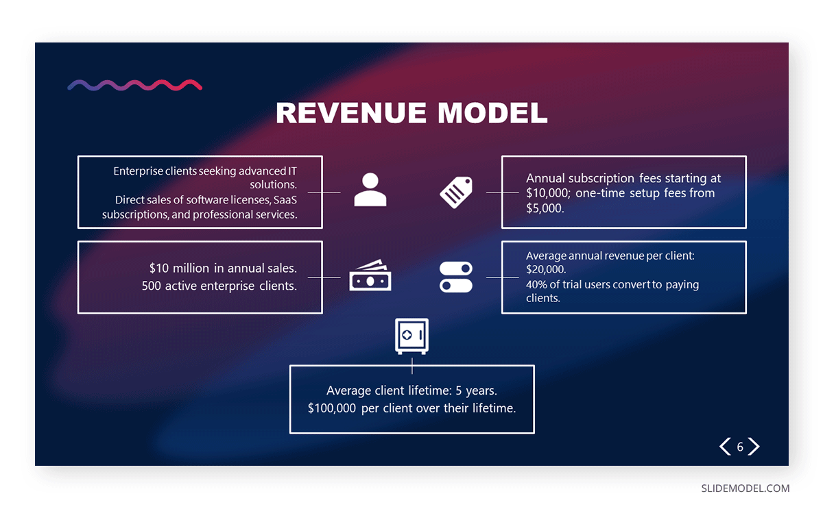
Another fine example of a PowerPoint presentation comes at the time of delivering an elevator pitch . As we all know, this concise presentation format requires a considerable amount of presentation aids to briefly expose each point in the speech under the allotted time frame. In this Revenue Model slide, we can find the answers to typical questions that help us shape the speech, all of them with icons and cues to remember from which areas the information comes.
If we aim to create a sponsorship pitch deck , it is important to bring proof of past sponsorship experiences to build our credibility in front of prospective sponsors. With this best PPT template tailored for sponsorship pitch presentations, we can display such data in an attractive visual format. The neat layout balances whitespace with content, with three distinctive KPI areas to talk about your history in sponsorship experiences.

Talk about the market segmentation strategies of your marketing plan with this creative infographic template. This slide clearly illustrates that not all examples of PowerPoint presentations follow the same structure in terms of graphics-to-text balance. You can introduce data on how purchasing habits, user status, and brand loyalty influence buying decisions. Present key information about demographic & geographic segmentation and how psychographic information can provide deeper insights into consumer motivations to purchase.
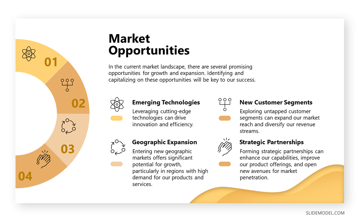
Another PowerPoint example comes in the format of presenting market opportunities in marketing plans . You can list up to four points, which can be extracted from the outcomes of a SWOT analysis or from retrieved data from polls or stakeholders’ insights. The icons are entirely editable, and the crisp layout makes readability much easier.
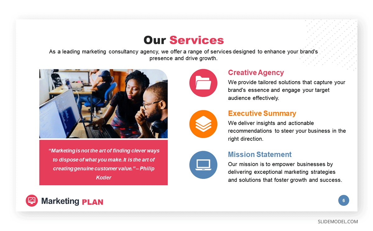
Marketing agencies can benefit from this presentation PowerPoint example, which illustrates how easy it is to customize the content and repurpose slides for different client meetings. This and the other slides of this marketing plan slide deck allow professionals to discuss their expertise, past projects, and proposals for their target clients. In this case, the agency in question is offering insights on their work ethics through a clean slide layout with icons to flag key areas.
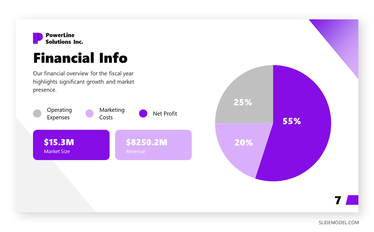
Our next PPT presentation example is suited for a Company Profile presentation in which we have to disclose key financial data. Thanks to the pie chart, presenters can segment revenue streams or do a balance between investments and profit. Additionally, the box placeholders allow us to deepen our knowledge of precise areas of interest.
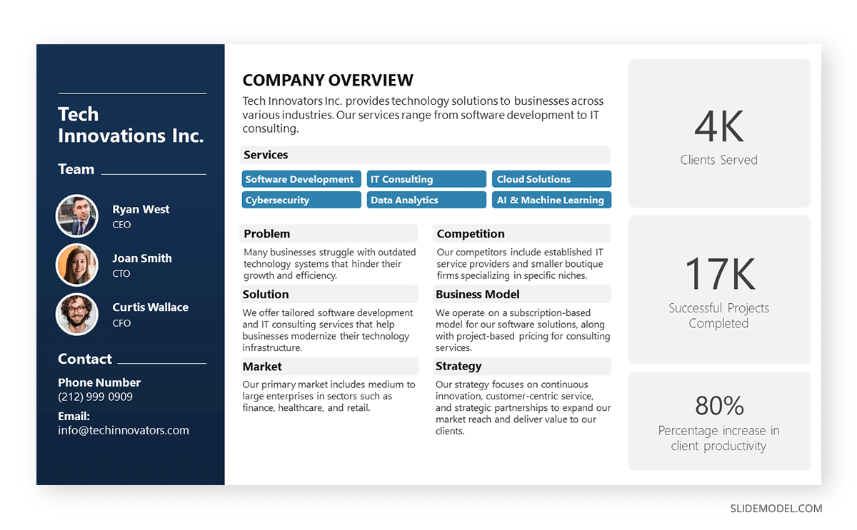
Organizations who are looking to create a company profile can opt for a one-page arrangement to introduce the team members in charge, the overall services or products, the business model, the market, competitors, and relevant strategy information. The text boxes placed in the right area are a perfect opportunity to highlight KPIs.
In any company profile presentation, we have to introduce the organization’s Mission and Vision Statements. This presentation sample slide allows us to creatively discuss those topics. Including icons, users can summarize the primary aspects of their mission statement in one single, professionally styled slide.
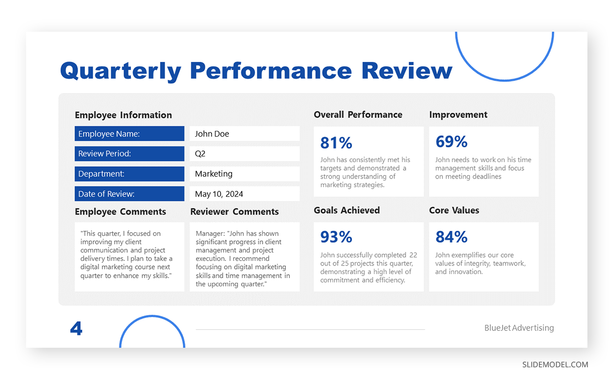
Quarterly reports don’t need to be depicted as boring PDF files. We can work with clean layouts that provide information in an easy-to-follow format that focuses on the core elements of the report. This quarterly report presentation example is perfect for detailed reports as we cover all essentials in a one-page format for an employee’s performance review.
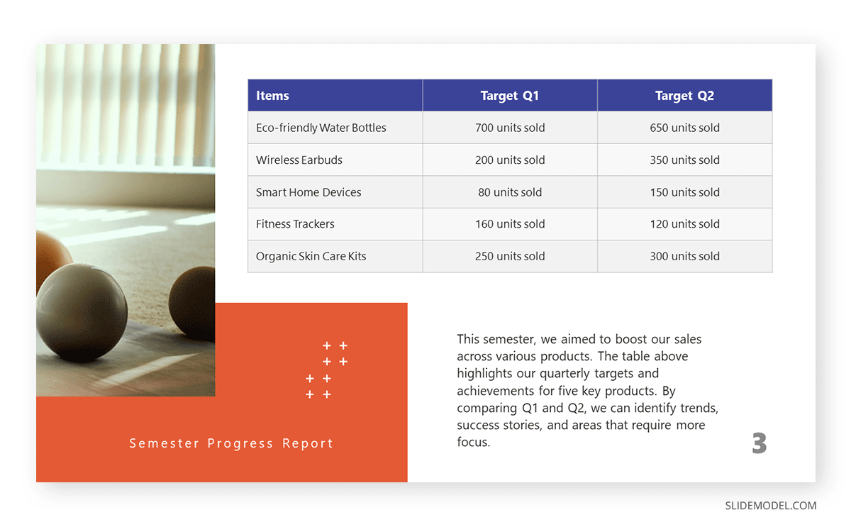
If, instead, you opt for a department-by-department approach, this slide presentation example illustrates two out of four quarters in the annual report. You can compare the product’s performance by production, allowing room to perform further optimizations based on sales behavior.
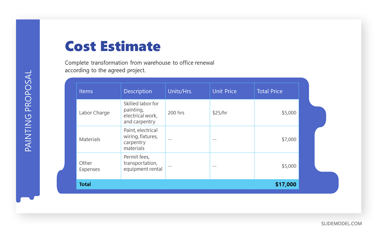
The construction industry requires a detailed presentation that covers all planned and contingency strategies for a project. Such an approach builds trust in the client, and that’s why we believe this PPT template for contractors is an essential tool for securing business deals. This presentation example template shows how to deliver a project proposal in style with accurate cost estimates.
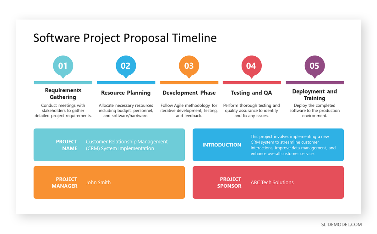
A generic PPT project proposal template allows us to repurpose the slide for many projects—ideal for agencies, consultants, and academics. With this visual project proposal timeline, you can discuss the different stages of a project, plan for resources (both material and workforce), seek funding, or prepare for contingencies.
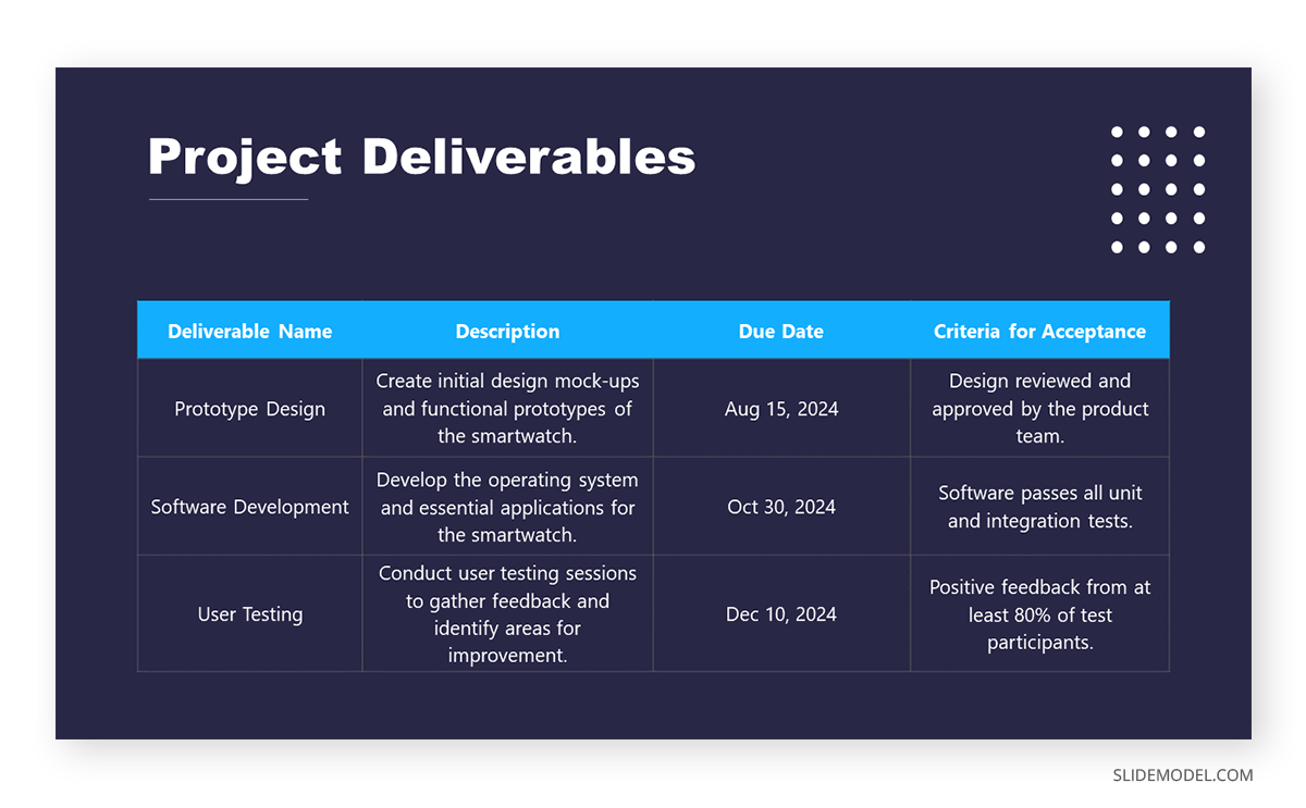
Once the project proposal’s core aspects are approved, teams must align efforts for project deliverables, acceptance criteria, and delivery format. This PPT presentation example illustrates a slide in a multi-team meeting to fine-tune aspects of the project deliverables, with an accurate representation of the due date and expected products.
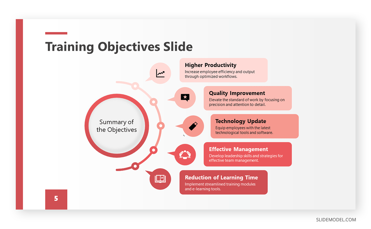
Team training requires a framework in which the objectives of the workshop, coaching, or mentoring programs are laid out for management. HR teams can benefit from this presentation example by summarizing the objectives about missed business opportunities or expansion plans for the organization.
Before even delivering a training program, HR teams discuss the content to cover with the head of each department, mainly to spot any missing area of knowledge required for optimal operations. Presenters can repurpose this slide for that kind of training proposal presentation or the training presentation itself.
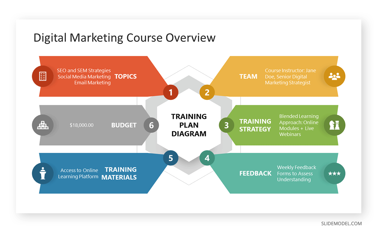
Intended for the early planning stages of a training program, this diagram is a well-rounded presentation example of how to discuss all points in one single slide, from the training budget to how to process employee feedback. We can expand each of these six topics in companionship slides.
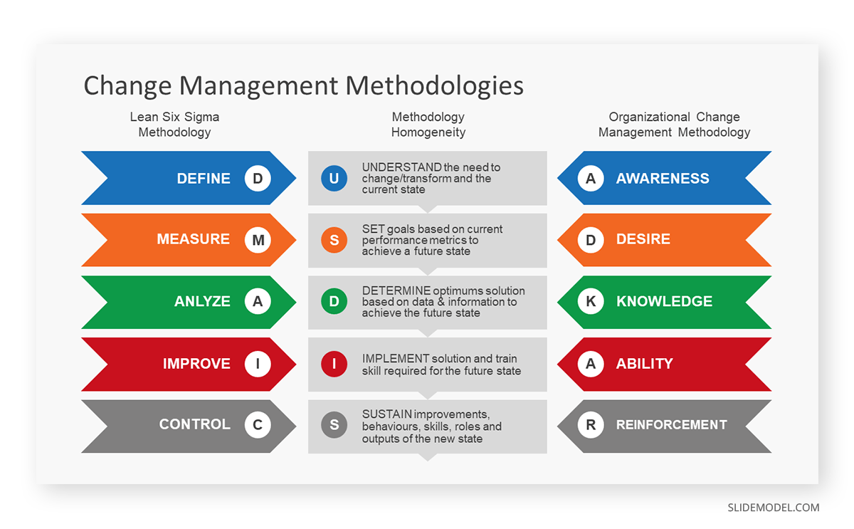
Companies undergoing change management processes can opt to apply the DMAIC or the ADKAR frameworks to orient the workforce. This presentation slide allows management to compare both methodologies and pick the one best suited for their organization.
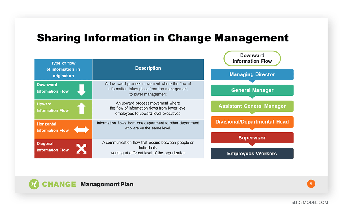
Since data sharing is delicate in charge management situations, implementing an information flow diagram is a good practice to orient your team, get the new owners or management the required information, and exchange information between departments.
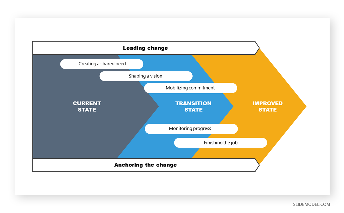
For change management directed at process optimization, this example slide allows management to stress the importance between the current situation and the expected improved state. This PPT template can also introduce the different milestones per stage and involve the management parties per area.
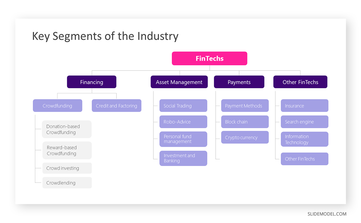
Startups often present their industry analysis to procure investment from venture capitalists. This industry analysis presentation example showcases a typical FinTech segmentation. Presenters can describe the different types of crowdfunding, credit, and factoring services and provide examples of companies or platforms in each subcategory. They can discuss areas like asset management, payments, and other relevant aspects in detail, with successful stories from referents that helped shape their business model.
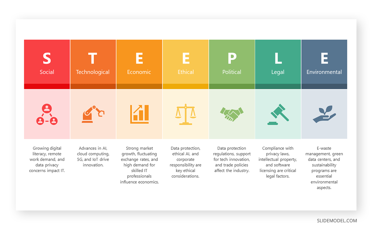
STEEPLE stands for Social, Technological, Economic, Ethical, Political, Legal, and Environmental factors. This framework allows us to perform a multidimensional industry analysis in which stakeholders can evaluate the appropriate approaches for venturing into a new business niche, renewing their overall strategy, or pursuing new goals based on recent industry changes, even those we don’t initially acknowledge.
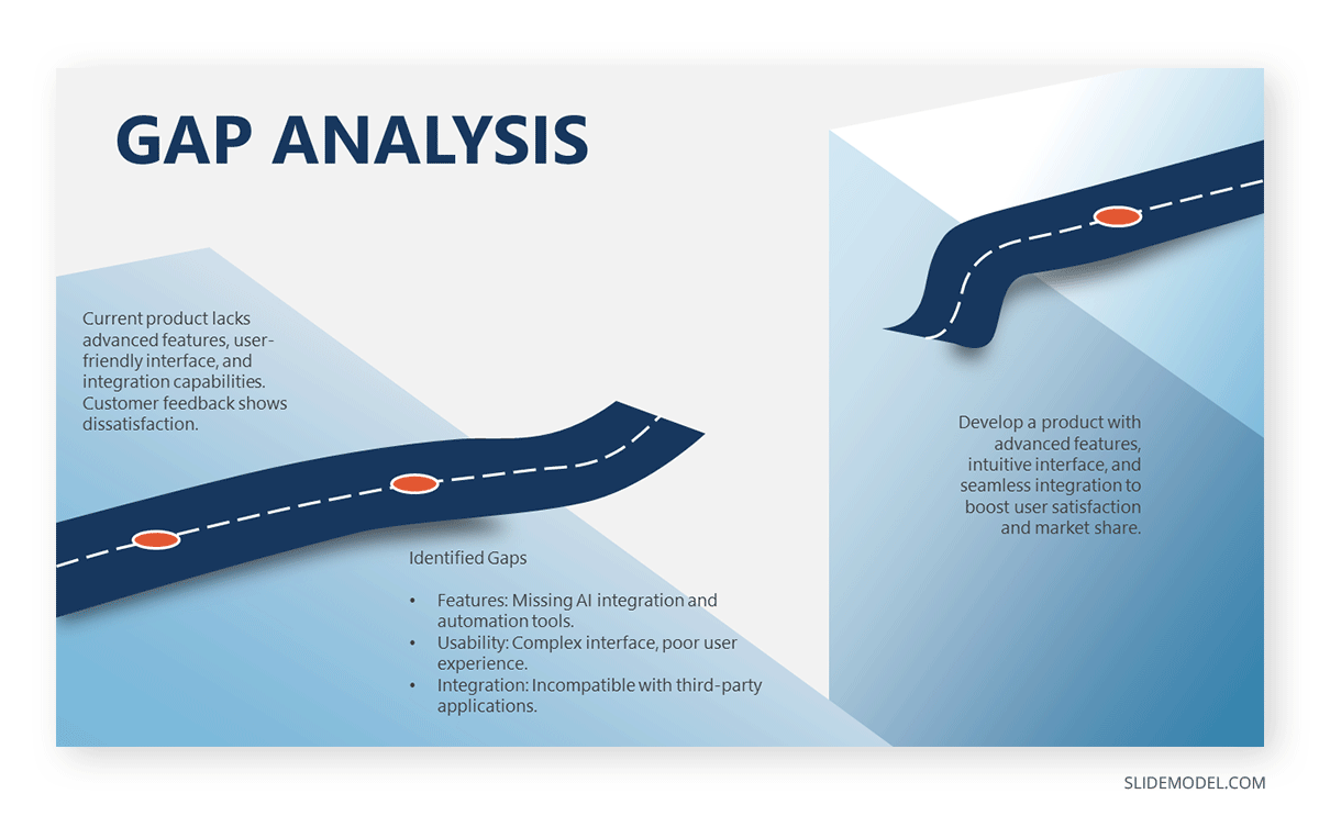
The Gap Analysis concept compares a company’s current status to a desired future state. By doing so, organizations can identify deficits or areas that require improvement in alignment with the future state. Presenters can work with this metaphorical gap analysis template and express the need for a plan that bridges such a gap.
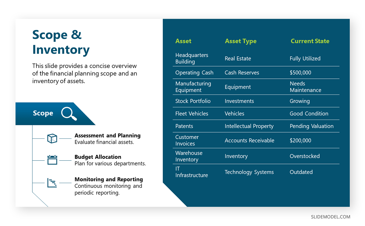
The next example of a PowerPoint presentation is oriented to the financial area, in which a consultant can refer to an organization’s asset management. By Scope, we imply the extent and boundaries of the asset management activities within an organization. It outlines what will be included in the asset management plan and what will not. On the other hand, Inventory points to a comprehensive and detailed list of all the assets owned by an organization. It includes essential information about each asset to facilitate effective management.
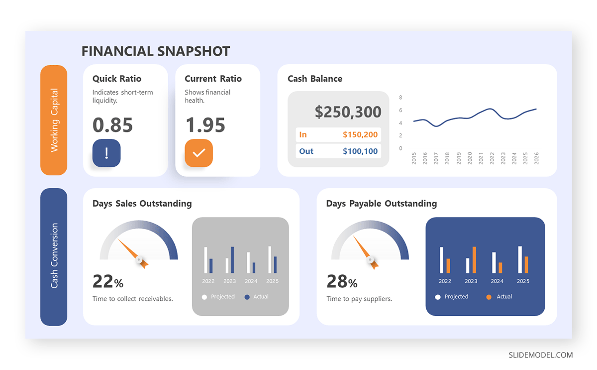
In financial presentations, the information must be clearly arranged so decisions can be made easily. In this case, we observe how a financial dashboard template can represent an organization’s relevant KPIs.

Think about TEDx presentations or Pecha-Kucha . They all have one factor in common: quality graphics to talk about inspirational stories. Graphics can feel overwhelming for some presenters, which ends in picking low-quality pictures or stock images unsuitable for the context of your slide deck. For this reason, we highly recommend you implement vector illustrations into your motivational presentation slides. Easy to customize, they are a valuable asset to mix & match PPT templates and create your custom deck.
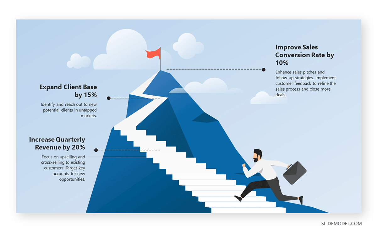
Aligning efforts toward a common goal requires a powerful visual communication language. Images are easier to retain than words, so imagine adding a storytelling factor and turning a goal into a mountain to conquer. Presenters can work with this mountain PPT template and signal the different milestones to reach prior to fulfilling a significant goal for the company/organization.
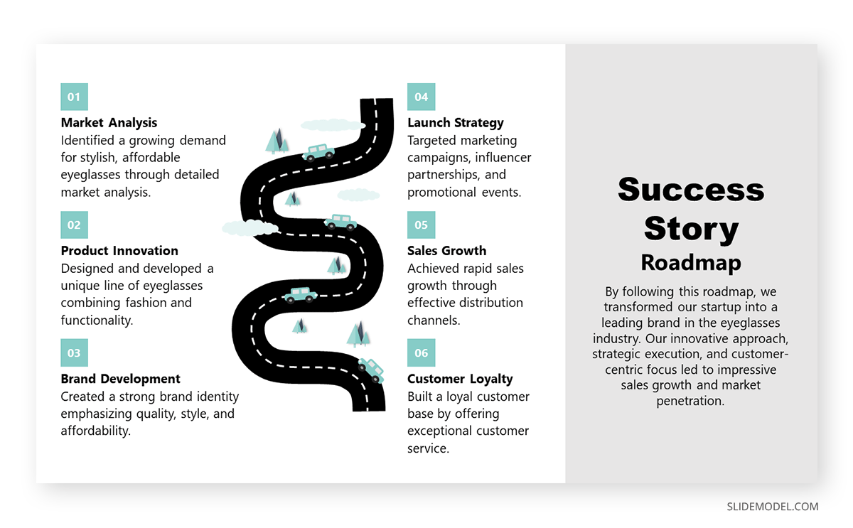
Another take in inspirational presentations is when we need to share our success stories with investors or in networking environments to inspire others. With this roadmap PPT template, presenters can go stage by stage and present the key stages that made them reach their success, or even project for expected goals to achieve.
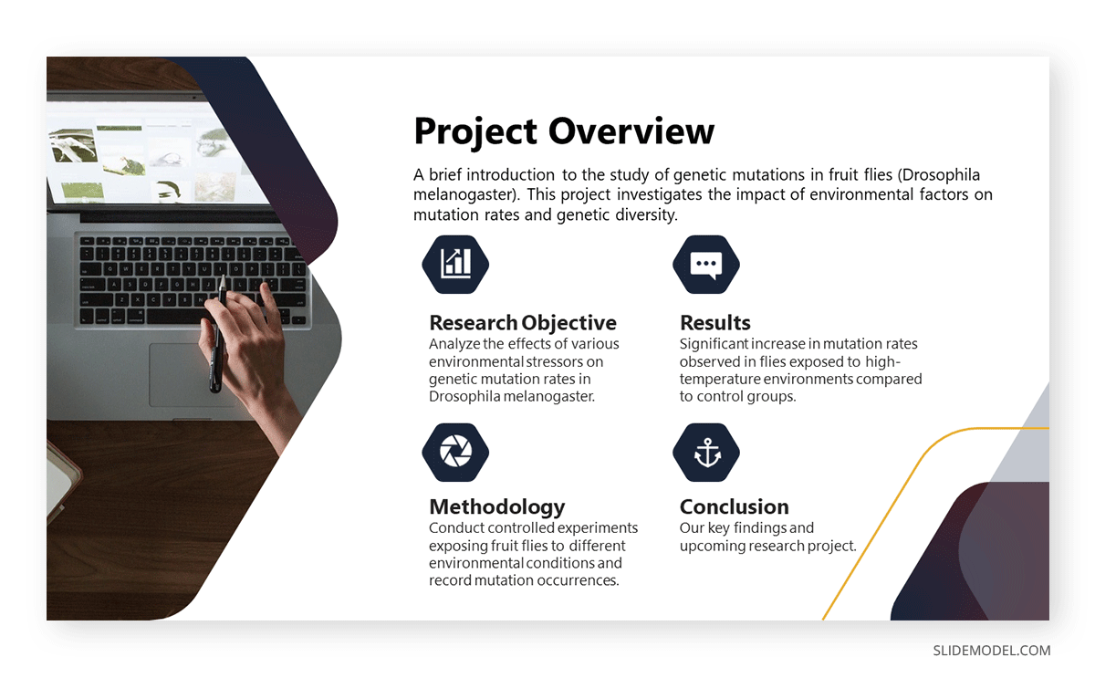
Academic presentations don’t have to look dull or excessively formal. We can incorporate a sleek layout into our slides and use icons to highlight key points. In this case, we observe a project overview for a research project, and the icons represent the main aspects to cover in this research.
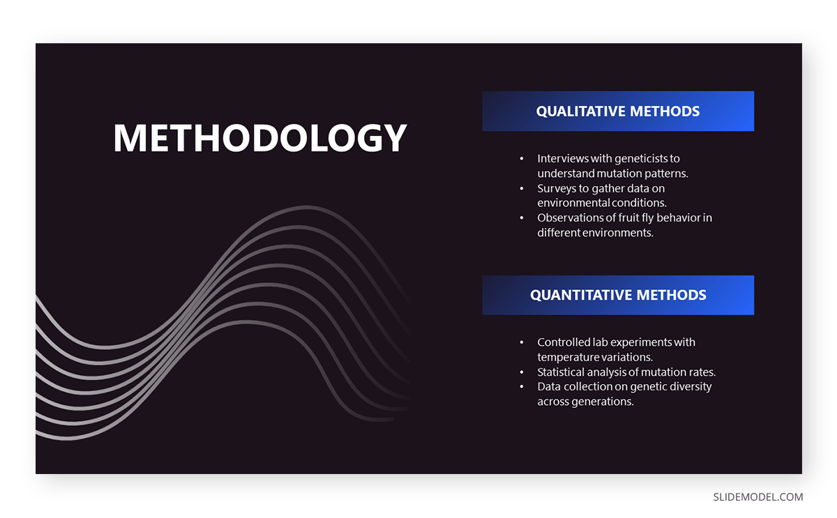
A thesis presentation requires properly introducing the methodology to demonstrate the hypothesis. Rather than adding complex figures, we can work with a minimalistic slide design and briefly describe the research methods. This slide deck is suitable for thesis presentations as well as academic projects, research papers , and more.
As we can see, counting with a professionally designed slide deck makes a difference in how your presentation is perceived by the audience. By working with SlideModel PowerPoint templates, we can reuse and repurpose our slide templates as often as required or mix elements from different slides seen in these PowerPoint presentation examples to create uniquely styled slide decks.

Like this article? Please share
Presentation Approaches, Presentation Ideas Filed under Presentation Ideas
Related Articles
Filed under Google Slides Tutorials • May 22nd, 2024
How to Add Audio to Google Slides
Making your presentations accessible shouldn’t be a hard to accomplish task. Learn how to add audios to Google Slides and improve the quality and accessibility of your presentations.

Filed under Design • May 22nd, 2024
Exploring the 12 Different Types of Slides in PowerPoint
Become a better presenter by harnessing the power of the 12 different types of slides in presentation design.

Filed under Design , Presentation Ideas • May 1st, 2024
The Power of Mind Map Note Taking for Presenters
Add a new tool to your repertoire of presentation skills by mastering the art of mind map note taking. An ideal process to facilitate content retention.
Leave a Reply
Your current User-Agent string appears to be from an automated process, if this is incorrect, please click this link:

IMAGES
VIDEO
COMMENTS
Oral Presentations Oral Presentations Oral presentations are one of the most common assignments in college courses. Scholars, professionals, and students in all fields desire to ... when you have a slide change on your PowerPoint, etc. Practice in front of peers and elicit feedback. Ask your peers to comment on your delivery and
Oral Presentation and Powerpoint. Print. I once attended a talk where the speaker held everyone's attention for a key five minutes by pulling the Seinfeld trick—putting on "a show about nothing." An engineer at a small, struggling company, he was near the end of a slick Powerpoint presentation about whether the design for a critical machine ...
An oral presentation is a formal, structured communication of a message to an audience using visual aids. It is a two-way, participatory process meant to purposefully convey a message and potentially change the audience's understanding or opinions. Common forms of oral presentations include seminars, workshops, student and team presentations ...
How do you create effective speaking PowerPoint presentations? Today, we'll go over when, why, and how to use slides in your talk.
First is a two part set of videos that walks you through organizing a presentation. Part 1 - Creating an Introduction for a 10-15 Minute Scientfic Presentation. Part 2 - Creating the Body of a 10-15 Minute Presentation: Design/Methods; Data Results, Conclusions. Two additional videos should prove useful: Designing PowerPoint Slides for a ...
This document discusses strategies for effective oral presentations. It covers preparing an effective presentation by determining the purpose, analyzing the audience, and creating visual aids.
Powerpoint and Prezi presentations serve as visual aids that can enhance audience engagement and their understanding of your speech.
Erika Bailey, a professional dialect coach and the Head of Voice and Speech at American Repertory Theater, provides seven tips for crafting powerful and professional oral presentations.
In the video below, we show you the key principles for designing effective PowerPoint slides for a scientific presentation. Using examples from actual science presentations, we illustrate the following principles: Create each slide as a single message unit. Explicitly state that single message on the slide.
PowerPoint / Oral Presentation Slide Design Download the handout Watch the videos. Microsoft PowerPoint and its brand of slide design have dominated the market for decades. By some measures, PowerPoint is installed on over a billion computers around the world. Even if you use one of PowerPoint's competitors, like Google Slides, you probably ...
Stressed about an upcoming presentation? These talks are full of helpful tips on how to get up in front of an audience and make a lasting impression.
This document provides tips for effectively preparing and delivering an oral presentation, including determining the purpose and audience, organizing the content, practicing with visual aids, and dressing and speaking appropriately.
What It Takes to Give a Great Presentation. Summary. Never underestimate the power of great communication. It can help you land the job of your dreams, attract investors to back your idea, or ...
The power of words can control the thoughts, emotions and the decisions of others. Giving an oral presentation can be a challenge, but with the right plan and delivery, you can move an entire audience in your favor. Determine your topic....
For many people the thought of delivering a presentation is a daunting task and brings about a great deal of nerves.However, if you take some time to understand how effective presentations are structured and then apply this structure to your own presentation, you'll appear much more confident and relaxed.
Oral Presentations. An oral presentation is usually more than just reading a paper or set of slides to an audience (though in some disciplines, this is the expectation). How you deliver your presentation is as important in communicating your message as what you say. Use these guidelines to learn simple tools that help you prepare and present an ...
The success of an oral presentation lies in the speaker's ability to transmit information to the audience. Lucia Hartigan and colleagues describe what they have learnt about delivering an effective scientific oral presentation from their own experiences, and their mistakes
Free Google Slides theme, PowerPoint template, and Canva presentation template. So, you've been tasked with organizing an oral presentation skills workshop. Don't sweat it! We've got just the thing to make your next workshop stand out from the rest - this duotone design presentation template. It's professional, simple, and chock-full of ...
Difference between Normal View & Slide Show View, Presenting Keyboard ShortcutsHow you design and use visual/audio aids in an oral presentation like a speech...
Take a look at our detailed guide on how to build conference presentation slides that shall guarantee a successful event. Click here for more info.
Presenting Good Oral Presentation Ideas In Powerpoint And Google Slides Cpb slide which is completely adaptable. The graphics in this PowerPoint slide showcase four stages that will help you succinctly convey the information. In addition, you can alternate the color, font size, font type, and shapes of this PPT layout according to your content. ...
The "presentation slide" is the building block of all academic presentations, whether they are journal clubs, thesis committee meetings, short conference talks, or hour-long seminars. A slide is a single page projected on a screen, usually built on the premise of a title, body, and figures or tables and includes both what is shown and what ...
Free Google Slides theme and PowerPoint template. Public speaking is an experience that many people avoid, mainly because they get nervous and don't have the necessary techniques to make a successful speech. We have designed this colorful template for you to structure your workshop and help many people overcome their fear of public speaking.
Looking for inspiration before approaching your next slide design? If so, take a look at our selection of PowerPoint presentation examples.
Microsoft PowerPoint empowers you to create clean slideshow presentations and intricate pitch decks and gives you a powerful presentation maker to tell your story.