Transforming Decision-making with Power BI: a Case Study in the Value of User Empowerment Programs

Case study by Caroline Gore
Digital Transformation is as much of a cultural change as a technological one. As organizations begin to realize the value of their data through adopting new software, they also start to expand the art of the possible with regards to this data, shifting not only the ways of working but the outcomes of it. This calls forth a reconciliation of technology and skills that needs to be addressed in order to fully accept and enjoy the benefits of any technologically disruptive agenda.
One of Thorogood’s recent clients’ experience is a showcase of this reality and offers a case study on how organizations can realize the value of advances in technology by widening access to data through empowered users. Like many organizations, the department in question wanted to improve its efficiency through more informed decision-making by suiting its software stack to the possibilities of their data. But it wanted to do so in a democratic way, putting the power in the hands of its employees, by giving them access to the tools that enable such analyses. The department had already deemed Microsoft’s Power BI as the tool of choice, but it still needed guidance on how to roll the software out organization-wide effectively and in a balanced way. It needed to build a framework that would allow for the sophistication of the staffs’ data and technology skills without letting the idea of self-service and autonomous analytics override any governance structure or standardization needed.
In Thorogood’s Dashboard in a Day program, the client found the tools and knowledge to achieve this. The training offered a crash-course in Microsoft’s Power BI by the end of which users from varied backgrounds and business divisions were able to begin envisioning ways to incorporate Power BI’s capabilities into their work, while at the same time taking the organization into the future with regards to its data capabilities.
In its more than 20 years as a Gold-certified Microsoft Partner, Thorogood has guided thousands of users from nearly 800 different companies through a comprehensive introduction to Power BI – from an initial first contact with the tool to visualization best practices, data modeling, and governance strategies. Without fail, each of these sessions reinforces the notion that the biggest thing allowing companies to dramatically expand their analytical capabilities is closing the gap to easy, intuitive data access for everyday business.

The first step toward a data-driven future
As one of the biggest UK Government departments, the client is heavily dependent on a wide array of data. This pushed the organization to explore how advances in technology could help uncover the value hidden in its records.
With the discovery of new software, the department dedicated itself to improving the way in which it analyzed data. Its infrastructure and institutional knowledge had long been oriented around localized, spreadsheet-based reporting and analytic solutions. The department wanted to instil in its employees an understanding of the way that Power BI’s functionality can outstrip the drawbacks inherent in a more traditional approach. During the Dashboard in a Day sessions, Thorogood consultants guided participants through the various ways that Power BI enables users to unify report creation and sharing. They highlighted the ability of Power BI Service to facilitate cloud-based collaboration and eliminate the need to sort through multiple different versions of the truth that a siloed, desktop approach entails . In doing so, they showed its employees that the biggest benefit of software like Power BI is the time it allows them to spend performing actual analysis.
Previously, user empowerment programs such as Dashboard in a Day have been run in person. But with the world in the midst of the 2020 COVID-19 pandemic, Thorogood quickly adapted the program for a virtual setting that still allowed for individual instruction and real-time interaction between users and consultants. Thorogood created an environment where participants were able to gain a first-hand understanding of how to apply Power BI to their work.
To that end, the training sessions covered all aspects of conducting data analysis using Power BI. Thorogood consultants guided users through a comprehensive introduction to the software’s data processing and analytical capabilities, from the identification and comprehension of data sources to the navigation and manipulation of that data to yield higher-level insights, to the designing and publishing of reports that present those insights in visual form.
A powerful “kick start”
At the end of the program, the feedback was unanimous. While some participants entered the training sessions with rudimentary knowledge of Power BI, they left the training with a holistic understanding of the software and an end-to-end crash course in utilizing Power BI’s capabilities within the context of real-world scenarios. Even in a virtual environment, the DiaD sessions had provided a valuable springboard to a future in which the organization could use Power BI to achieve its goals, improve performance, and better understand citizens. In the words of one user, the sessions proved to be “a powerful and useful kick start.”
“The content was shared really easily, it was very accessible. It’s been great that Thorogood knows the ins and out of our company, really valuable.”
Thorogood has seen the benefits of such a spirit throughout its long history as a Microsoft partner. Whether the setting is in-person or virtual, the opportunity to gain a concrete understanding of Power BI’s applications can be worth its weight in gold.
Find out more

Contact Caroline Gore . Caroline is Head of Operations at Thorogood.
Microsoft customer stories
See how Microsoft tools help companies run their business.

The Total Economic Impact™ of Microsoft Power BI
Get the study, tell us a little about yourself..
Please enable Javascript to view this form.
Discover how organizations created data-driven cultures and saw a three-year 366% return on investment with business intelligence through Microsoft Power BI.
In this commissioned study by Forrester Consulting, 63 companies reported better analytics since moving to Power BI. Learn how these organizations used Power BI to capture tangible business benefits such as:
- A 2.5 percent increase in operating income.
- 22.6 percent faster solutions quoting.
- Reducing time-to-market from 18 months to 10 months for new products and services.
- Savings of 125 hours per BI user per year through self-service.
- Reducing centralized analytics team effort by 42 percent.
Download study

Home › Insights › Case Studies › Case Study: Microsoft Power BI Transforms Large Pharmaceutical Company’s Data Analytics System
Case Study: Microsoft Power BI Transforms Large Pharmaceutical Company’s Data Analytics System
Microsoft Power BI can help your organization accelerate and improve your reporting process.
This free case study talks about howMicrosoft Power BItransformed alarge pharmaceuticalcompany’s data analytics system.
Read the case study to learn how Power BI can:
- Automatically pull data from its source, clean and transform the data, combine sources into a data model, then calculate and report the desired metrics.
- Help reduce reliance on email communication
DOWNLOAD CASE STUDY
Previous Post Next Post

Impact of AI at Work: Your Guide to Key Implications of GenAI and Microsoft Copilot
When discussing AI at work, specifically Generative AI (Gen AI) and the future of work, there are significant opportunities for augmentation, acceleration, automation and analysis across various sectors: The future […]

Digital Workplace Solutions
Delivering personalized and agile Microsoft Cloud and AI-driven solutions that move your business forward. Technology continues to reshape industries. The cloud and AI have unearthed new business capabilities, while automation […]

Quality patient care is what truly matters in today’s ever-changing healthcare society. But, sometimes that focus becomes clouded when you’re struggling to deliver that same level of patient care while […]

Data and Artificial Intelligence
Search withum.com.
Jumpstart your career with the Fabric Career Hub
Find everything you need to get certified on Fabric—skills challenges, live sessions, exam prep, role guidance, and a 50 percent discount on exams.
- Fabric User Groups
Earn a 50% discount on the DP-600 certification exam by completing the Fabric 30 Days to Learn It challenge .
Loading ...
Your group has been submitted for approval
Thank you for your request to start a new user group. Please check your Fabric Community inbox for messages regarding next steps.
Someone else is editing this group
A group can only be edited by one person at a time. Try again later.
Invalid Token. Please refresh the page and try again.
- Microsoft Fabric Community
Power BI Case Studies
Share group.
Step down as a group leader
You can step down and leave the group or stay as a member
Step down and appoint a group leader
As the only leader of your group, you’ll need to appoint a new leader when you step down.
Join the group to participate in the discussion.
- {{groupDiscussionsCtrl.followOptionText(threadDetails.subscription.isSubscrib)}}
- {{groupDiscussionsCtrl.followOptionText(replyDetails.subscription.isSubscrib)}}
No post to display.
Group leaders
Share event

There are no events for this group yet
{{event.multiProducts | uppercase}}
Online, {{event.formattedAddress}}
{{groupLeaders.length}} group leaders
{{memberscount}} {{membersuffixterm}}.
Sign up with your Fabric account
You can use the same account you use to log into the product. If you don’t have a Fabric account, you can create a Community account.
Groups you might like
{{grouphub.multiProducts}}
- Case Studies

Leading building material company leverages sales dashboards to improve business efforts

Predictive Analytics helps catering company optimize their food sourcing and distribution processes

Microsoft Power BI reports developed to manage end-to-end HR analytics, people information and data.

Australian NFP, Grow gets strong data architecture and intuitive BI visuals to improve employee productivity

Insurance company embraces Power BI dashboards to boost their sales team's productivity.

Medical Device Company gets powerful data visualization using Business Intelligence solutions.

Predictive Analytics and Azure-based Machine Learning Algorithm Help Insurance Company

Leading Healthcare NPO Leverages BI - EHR integration to optimize clinic performance and patient care strategies.
Copyright ©2024 All Rights Reserved
You are using an outdated browser. Please upgrade your browser to improve your experience.
Partnership
Partner with Microsoft
Maximize your partnership
Strengthen your security
Compare offerings
Microsoft Action Pack
Go to market
Marketing resources
Commercial marketplace
Sell with Microsoft
Cloud Solution Provider
New commerce experience
Partner incentives
Differentiate
Solutions Partner designations
Specializations
Azure Expert MSP
By opportunity
Device partners
Learning partners
Education partners
By solution area
Solution areas
Azure for partners
Business Applications for partners
Modern Work for partners
Security for partners
By initiative
Build for 2030
Inclusive economy
Microsoft Inspire
Partner Communities
Microsoft Partner Community
Partner-led associations
Microsoft Partner blog
Find a partner
Partner Center
All Microsoft

Transcosmos case study
Transcosmos helps customers transform e-commerce data into insights with microsoft power bi, transcosmos’ client opened six online stores, but were quickly overwhelmed with data.
The client was facing mountains of disparate e-commerce data with no way of unifying it to inform decisions.
A holistic digital solution designed and implemented by transcosmos
Transcosmos built a solution to help their client collect, unify, and transform their data into insights with Power BI.
Saving the client over 500 hours of labor per year and greatly improving agility
Power BI eliminates significant busy work for the client and enables them to make quicker, smarter decisions.
In the digital age, it’s no surprise that e-commerce is thriving. Most retailers are either already doing business online or have plans to enter the fray soon. In some locations, it’s relatively straightforward to break into the e-commerce space, but in China, there are many regulations that sellers must meet if they want to do business online. Additionally, for a business that is just entering the e-commerce arena, it’s easy to get overwhelmed by the mountains of data generated through these websites.
Thankfully, Microsoft partner transcosmos is here to help. Offering customers a wide range of services including contact center management, e-commerce facilitation, and advanced data analytics, transcosmos serves as a one-stop shop for businesses aiming to sell their goods online in China. transcosmos’ solutions and services span across a number of industries, working with customers in home appliances, financial services, retail, automobile, healthcare, and more.
Helping a key customer overcome e-commerce challenges
Recently, transcosmos was engaged by a well-known Japanese brand in the baby and maternity industry that was looking to do business online in China. After opening six online stores on four different e-commerce platforms, the company quickly ran into some challenges.
The first was managing the overwhelming amount of data being generated by their six stores. In addition to all the raw transactional data, transcosmos’ customer was also managing CRM, marketing, and logistical data, putting immense strain on their infrastructure.
The second challenge they faced was an inability to unify their data onto one platform, preventing them from assessing the performance of their various channels side-by-side and reallocating their resources accordingly. Because the data coming from each channel was unique and siloed, it was nearly impossible to aggregate it all into one, helpful view.
The third challenge was responding quickly to market trends. The e-commerce industry in China moves fast, and if sellers want to stay competitive, they need to use yesterday’s data to make decisions today. Prior to working with transcosmos, the company was generating reports manually, but this took their analysts days to finish, and because the work was done by hand, it was hard to guarantee report quality.
After identifying these three challenges, the company came to transcosmos looking for help. They wanted to implement a solution that would allow them to better manage their data, unify that data into one dashboard, and autogenerate reports in real-time so they could respond quicker to e-commerce activity, all without interrupting their booming e-commerce operation.
“For our customer, building that first Power BI dashboard was a bit of a milestone. Before implementing Power BI, our customer had a whole team of people doing repetitive jobs to produce reports every day, week, and month. It was costly, inefficient, and often inaccurate. With Power BI, we were able to automate all of that work, freeing up those analysts to add value in other places.”
—judy li, data analyst, transcosmos, designing and implementing a custom solution.
With these challenges in mind, transcosmos got to work. Leveraging their extensive e-commerce and data analytics experience, transcosmos designed a custom solution to fit the customer’s needs.
The solution is composed of three parts to address the three key challenges identified by the customer.
The first is a data acquisition layer. Here, transcosmos adopted a Robotic Process Automation (RPA) program to automatically collect data from all six of the customer’s stores. This automation meant that the customer no longer had to follow tedious, manual processes to collect data from their various channels, freeing up their data scientists to add value elsewhere.
The second layer is data management, designed to solve the data quantity problem. The customer already had some infrastructure in the cloud, so transcosmos expanded that footprint and implemented MySQL database to collect, store, and manage the customer’s vast amounts of data. By using the cloud, transcosmos helped the customer unlock unprecedented scale for their database, enabling their infrastructure to scale right alongside their data needs with ease.
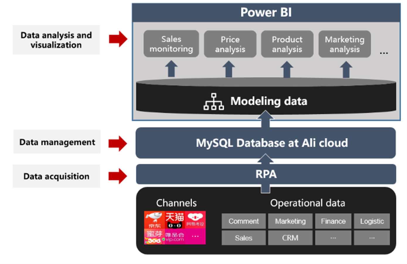
A visual representation of transcosmos’ solution (photo courtesy of transcosmos)
The third layer is data analysis and visualization, designed to help the customer respond quicker to their e-commerce activity. For this, transcosmos implemented Microsoft Power BI , an industry-leading visualization platform designed to help users derive insights from their data and make better business decisions.
“For our customer, building that first Power BI dashboard was a bit of a milestone,” explains Judy Li, Data Analyst at transcosmos. “Before implementing Power BI, our customer had a whole team of people doing repetitive jobs to produce reports every day, week, and month. It was costly, inefficient, and often inaccurate. With Power BI, we were able to automate all of that work, freeing up those analysts to add value in other places.”
As noted by Li, transcosmos didn’t stop at one Power BI dashboard for their customer. To maximize impact and provide specific views requested by the customer, transcosmos has already built nine different dashboards for their client, including two recently added text analysis dashboards featuring chat and comment text analysis, and they have plans to add more. “Our client needed one all-up view of the business, so we designed an overarching dashboard to give them that general information regarding key performance indicators (KPI), but they wanted to see some other things too like the performance of specific promotions,” adds Li. “For that, we built a dashboard that shows sales performance across all six of their stores, color coded by promotion level to help the shop managers monitor sale prices and promotion efficacy.”
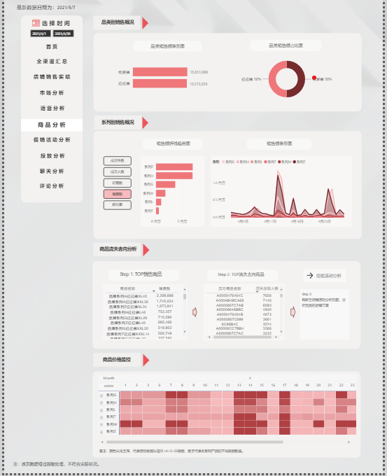
The product report dashboard that shows sales data combined with promotion efficacy (photo courtesy of transcosmos)
Another key dashboard delivered by transcosmos is the omnichannel sales report. This view allows executives at the business to monitor sales across all their stores at once and easily determine if they are on track to reach their KPIs. If they aren’t on track, the user can quickly drill down into the data and see which channels are underperforming and why. Additionally, transcosmos also delivered an advertising report dashboard that reveals where the customer’s marketing money is going and the estimated return on investment (ROI) for each campaign. This enables the company to swiftly evaluate the performance of each advertising effort and make quick changes based on historical data and forecasted trends.
Secure dashboards, available on the go
A bright future, powered by analytics.
While this is not transcosmos’ first project utilizing Power BI, it is one of the largest. “This successful engagement at scale is a great proof of concept for us,” explains Li. “With this completed project in hand, we can take it to other potential clients and show them the tangible impact that we can unlock for them with Power BI.”
As China’s e-commerce industry continues to grow, so does the need for support from companies like transcosmos. The demand for data visualization is already incredibly high, and it’s only going to grow. “Sometimes it can be hard to prove ROI for data visualization projects like this because often they are centered around making better decisions—this can be hard to quantify,” Li continues. “But in this case, it was actually pretty straightforward. With the automated solution and Power BI dashboards we put in place, we saved our client over 500 hours of analyst work per year, and that’s just the time they used to spend generating reports. Now, they can spend less time crunching numbers by hand, and more time managing their successful business.” Going forward, transcosmos plans on continuing to use Microsoft Power BI to help customers glean insights from their data and successfully compete in an increasingly digital world.
Microsoft Azure—innovation for endless possibilities
Discover all the benefits that Microsoft Azure can bring to your business.
WeWALK case study
The WeWALK smart cane: reimagining adaptive technology.
Partnering with Microsoft pays off
The Microsoft Partner Network is the most powerful community of its kind-larger than Amazon Web Services (AWS) and Salesforce combined.


- Business User
- IT Professional
- Microsoft 365
- Microsoft Copilot for Microsoft 365
- Microsoft Copilot for Sales
- Microsoft Copilot for Small and Medium Business
- Microsoft Adoption Score
- Microsoft Dynamics 365
- Microsoft Graph
- Microsoft Lists
- Microsoft Loop
- Microsoft Mesh
- Microsoft Planner
- Microsoft Power Platform
- Microsoft Search
- Classic Microsoft Teams
- New Microsoft Teams
- Microsoft Teams Premium
- Microsoft Teams Phone
- Microsoft Security
- Microsoft Syntex
- Microsoft Viva
- Outlook mobile
- SharePoint Premium
- Champion Management Platform
- Extensibility Look Book Gallery
- Microsoft 365 Archive
- Microsoft 365 Backup
- Microsoft 365 Learning Pathways
- Microsoft Intelligent Document Processing
- Microsoft Teams App Templates
- New Employee Onboarding Solution Accelerator
- Partner Solution Gallery
- Sample Solution Gallery
- SharePoint eSignature
- SharePoint look book
- Accessibility
- Adoption guides
- Azure Adoption Framework
Case Studies
- Employee experience
- FastTrack for Microsoft 365
- Frontline workers
- Guidance for virtual events
- How Microsoft does IT
- Leading in the era of AI
- Microsoft 365 Roadmap
- Meetings, webinars, and town halls in Microsoft Teams
- Microsoft Copilot resources for education
- Modern Collaboration Architecture (MOCA)
- Podcasts & Shows
- Remote learning in education
- Skype for Business to Microsoft Teams upgrade
- Streamline end user training
- AI learning hub
- Become a Service Adoption Specialist
- Coffee in the Cloud tutorials
- Developer training
- End user training
- IT Pro training
- Microsoft 365 Champion Program
- Microsoft Learn
- Modern Work Customer Hub (Microsoft Copilot customer training)
- Office Quick Start guides
- Community Events
- Community Tenant
- Global Community Initiative
- Microsoft Community Hub
- Student Ambassador Community
- Release notes
Learn how customers around the world build an intelligent workplace with Microsoft 365.
Filter case studies
Share this page
- Share on Microsoft Teams
- Share on Facebook
- Share on LinkedIn
This browser is no longer supported.
Upgrade to Microsoft Edge to take advantage of the latest features, security updates, and technical support.
Study guide for Exam PL-300: Microsoft Power BI Data Analyst
- 2 contributors
Purpose of this document
This study guide should help you understand what to expect on the exam and includes a summary of the topics the exam might cover and links to additional resources. The information and materials in this document should help you focus your studies as you prepare for the exam.
Updates to the exam
Our exams are updated periodically to reflect skills that are required to perform a role. We have included two versions of the Skills Measured objectives depending on when you are taking the exam.
We always update the English language version of the exam first. Some exams are localized into other languages, and those are updated approximately eight weeks after the English version is updated. Although Microsoft makes every effort to update localized versions as noted, there may be times when the localized versions of an exam are not updated on this schedule. Other available languages are listed in the Schedule Exam section of the Exam Details webpage. If the exam isn't available in your preferred language, you can request an additional 30 minutes to complete the exam.
The bullets that follow each of the skills measured are intended to illustrate how we are assessing that skill. Related topics may be covered in the exam.
Most questions cover features that are general availability (GA). The exam may contain questions on Preview features if those features are commonly used.
Skills measured as of April 23, 2024
Audience profile.
As a candidate for this exam, you should deliver actionable insights by working with available data and applying domain expertise. You should:
Provide meaningful business value through easy-to-comprehend data visualizations.
Enable others to perform self-service analytics.
Deploy and configure solutions for consumption.
As a Power BI data analyst, you work closely with business stakeholders to identify business requirements. You collaborate with enterprise data analysts and data engineers to identify and acquire data. You use Power BI to:
Transform the data.
Create data models.
Visualize data.
Share assets.
You should be proficient at using Power Query and writing expressions by using Data Analysis Expressions (DAX). You know how to assess data quality. Plus, you understand data security, including row-level security and data sensitivity.
Skills at a glance
Prepare the data (25–30%), model the data (25–30%), visualize and analyze the data (25–30%), deploy and maintain items (15–20%), get data from data sources.
Identify and connect to a data source
Change data source settings, including credentials, privacy levels, and data source locations
Select a shared semantic model, or create a local data model
Choose between DirectQuery, Import, and Dual mode
Change the value in a parameter
Clean the data
Evaluate data, including data statistics and column properties
Resolve inconsistencies, unexpected or null values, and data quality issues
Resolve data import errors
Transform and load the data
Select appropriate column data types
Create and transform columns
Transform a query
Design a star schema that contains facts and dimensions
Identify when to use reference or duplicate queries and the resulting impact
Merge and append queries
Identify and create appropriate keys for relationships
Configure data loading for queries
Design and implement a data model
Configure table and column properties
Implement role-playing dimensions
Define a relationship's cardinality and cross-filter direction
Create a common date table
Implement row-level security roles
Create model calculations by using DAX
Create single aggregation measures
Use CALCULATE to manipulate filters
Implement time intelligence measures
Identify implicit measures and replace with explicit measures
Use basic statistical functions
Create semi-additive measures
Create a measure by using quick measures
Create calculated tables
Optimize model performance
Improve performance by identifying and removing unnecessary rows and columns
Identify poorly performing measures, relationships, and visuals by using Performance Analyzer
Improve performance by choosing optimal data types
Improve performance by summarizing data
Create reports
Identify and implement appropriate visualizations
Format and configure visualizations
Use a custom visual
Apply and customize a theme
Configure conditional formatting
Apply slicing and filtering
Configure the report page
Use the Analyze in Excel feature
Choose when to use a paginated report
Enhance reports for usability and storytelling
Configure bookmarks
Create custom tooltips
Edit and configure interactions between visuals
Configure navigation for a report
Apply sorting
Configure sync slicers
Group and layer visuals by using the Selection pane
Drill down into data using interactive visuals
Configure export of report content, and perform an export
Design reports for mobile devices
Enable personalized visuals in a report
Design and configure Power BI reports for accessibility
Identify patterns and trends
Use the Analyze feature in Power BI
Use grouping, binning, and clustering
Incorporate the Q&A feature in a report
Use AI visuals
Use reference lines, error bars, and forecasting
Detect outliers and anomalies
Create and share scorecards and metrics
Create and manage workspaces and items
Create and configure a workspace
Assign workspace roles
Configure and update a workspace app
Publish, import, or update items in a workspace
Create dashboards
Choose a distribution method
Apply sensitivity labels to workspace content
Configure subscriptions and data alerts
Promote or certify Power BI content
Manage global options for files
Manage semantic models
Identify when a gateway is required
Configure a semantic model scheduled refresh
Configure row-level security group membership
Provide access to semantic models
Configure automatic page refresh
Study resources
We recommend that you train and get hands-on experience before you take the exam. We offer self-study options and classroom training as well as links to documentation, community sites, and videos.
Key to understanding the table: The topic groups (also known as functional groups) are in bold typeface followed by the objectives within each group. The table is a comparison between the two versions of the exam skills measured and the third column describes the extent of the changes.
Skills measured prior to April 23, 2024
Additional resources.
Microsoft Power BI Blog
Power bi may 2024 feature summary.

Welcome to the May 2024 update! Here are a few, select highlights of the many we have for Power BI. There are new On-object Interaction updates, DAX query view is now generally available, find out how to view reports in OneDrive and SharePoint with live connected semantic models.
There is much more to explore, please continue to read on!
Microsoft Build Announcements
At Microsoft Build 2024, we are thrilled to announce a huge array of innovations coming to the Microsoft Fabric platform that will make Microsoft Fabric’s capabilities even more robust and even customizable to meet the unique needs of each organization. To learn more about these changes, read the “ Unlock real-time insights with AI-powered analytics in Microsoft Fabric ” announcement blog by Arun Ulag.
Earn a discount on your Microsoft Fabric certification exam!
We’d like to thank the thousands of you who completed the Fabric AI Skills Challenge and earned a free voucher for Exam DP-600 which leads to the Fabric Analytics Engineer Associate certification.
If you earned a free voucher, you can find redemption instructions in your email. We recommend that you schedule your exam now, before your discount voucher expires on June 24 th . All exams must be scheduled and completed by this date.
If you need a little more help with exam prep, visit the Fabric Career Hub which has expert-led training, exam crams, practice tests and more.
Missed the Fabric AI Skills Challenge? We have you covered. For a limited time , you could earn a 50% exam discount by taking the Fabric 30 Days to Learn It Challenge .

- Version number: v: 2.129.905.0
- Date published: 5/21/24
Modern Tooltip now on by Default
Matrix layouts, line updates, on-object interaction updates.
- Announcing general availability of DAX query view
New Manage relationships dialog
Refreshing calculated columns and calculated tables referencing directquery sources with single sign-on, announcing general availability of model explorer and authoring calculation groups in power bi desktop, microsoft entra id sso support for oracle database, certified connector updates, view reports in onedrive and sharepoint with live connected semantic models, storytelling in powerpoint – image mode in the power bi add-in for powerpoint, storytelling in powerpoint – data updated notification, git integration support for direct lake semantic models, editor’s pick of the quarter, new visuals in appsource, financial reporting matrix by profitbase, horizon chart by powerviz, sunburst chart by powerviz, stacked bar chart with line by jta.
- Drill Down Combo PRO – now with Legend field
Power BI tooltips are embarking on an evolution to enhance their functionality. To lay the groundwork, we are introducing the modern tooltip as the new default , a feature that many users may already recognize from its previous preview status. This change is more than just an upgrade; it’s the first step in a series of remarkable improvements. These future developments promise to revolutionize tooltip management and customization, offering possibilities that were previously only imaginable. As we prepare for the general availability of the modern tooltip, this is an excellent opportunity for users to become familiar with its features and capabilities.

Discover the full potential of the new tooltip feature by visiting our dedicated blog . Dive into the details and explore the comprehensive vision we’ve crafted for tooltips, designed to enhance your Power BI experience.
We’ve listened to our community’s feedback on improving our tabular visuals (Table and Matrix), and we’re excited to initiate their transformation. Drawing inspiration from the familiar PivotTable in Excel , we aim to build new features and capabilities upon a stronger foundation. In our May update, we’re introducing ‘ Layouts for Matrix .’ Now, you can select from compact , outline , or tabular layouts to alter the arrangement of components in a manner akin to Excel.

As an extension of the new layout options, report creators can now craft custom layout patterns by repeating row headers. This powerful control, inspired by Excel’s PivotTable layout, enables the creation of a matrix that closely resembles the look and feel of a table. This enhancement not only provides greater flexibility but also brings a touch of Excel’s intuitive design to Power BI’s matrix visuals. Only available for Outline and Tabular layouts.

To further align with Excel’s functionality, report creators now have the option to insert blank rows within the matrix. This feature allows for the separation of higher-level row header categories, significantly enhancing the readability of the report. It’s a thoughtful addition that brings a new level of clarity and organization to Power BI’s matrix visuals and opens a path for future enhancements for totals/subtotals and rows/column headers.

We understand your eagerness to delve deeper into the matrix layouts and grasp how these enhancements fulfill the highly requested features by our community. Find out more and join the conversation in our dedicated blog , where we unravel the details and share the community-driven vision behind these improvements.
Following last month’s introduction of the initial line enhancements, May brings a groundbreaking set of line capabilities that are set to transform your Power BI experience:
- Hide/Show lines : Gain control over the visibility of your lines for a cleaner, more focused report.
- Customized line pattern : Tailor the pattern of your lines to match the style and context of your data.
- Auto-scaled line pattern : Ensure your line patterns scale perfectly with your data, maintaining consistency and clarity.
- Line dash cap : Customize the end caps of your customized dashed lines for a polished, professional look.
- Line upgrades across other line types : Experience improvements in reference lines, forecast lines, leader lines, small multiple gridlines, and the new card’s divider line.
These enhancements are not to be missed. We recommend visiting our dedicated blog for an in-depth exploration of all the new capabilities added to lines, keeping you informed and up to date.
This May release, we’re excited to introduce on-object formatting support for Small multiples , Waterfall , and Matrix visuals. This new feature allows users to interact directly with these visuals for a more intuitive and efficient formatting experience. By double-clicking on any of these visuals, users can now right-click on the specific visual component they wish to format, bringing up a convenient mini-toolbar. This streamlined approach not only saves time but also enhances the user’s ability to customize and refine their reports with ease.

We’re also thrilled to announce a significant enhancement to the mobile reporting experience with the introduction of the pane manager for the mobile layout view. This innovative feature empowers users to effortlessly open and close panels via a dedicated menu, streamlining the design process of mobile reports.

Publish to folders
We recently announced a public preview for folders in workspaces, allowing you to create a hierarchical structure for organizing and managing your items. In the latest Desktop release, you can now publish your reports to specific folders in your workspace.
When you publish a report, you can choose the specific workspace and folder for your report. The interface is simplistic and easy to understand, making organizing your Power BI content from Desktop better than ever.

To publish reports to specific folders in the service, make sure the “Publish dialogs support folder selection” setting is enabled in the Preview features tab in the Options menu.

Learn more about folders in workspaces.
You can now ask Copilot questions about data in your model
We’re excited to preview a new capability for Power BI Copilot allowing you to ask questions about the data in your model! You could already ask questions about the data present in the visuals on your report pages – and now you can go deeper by getting answers directly from the underlying model. Just ask questions about your data, and if the answer isn’t already on your report, Copilot will then query your model for the data instead and return the answer to your question in the form of a visual!

We’re starting this capability off in both Edit and View modes in Power BI Service. Because this is a preview feature, you’ll need to enable it via the preview toggle in the Copilot pane. You can learn more about all the details of the feature in our announcement post here! (will link to announcement post)
Announcing general availability of DAX query view
We are excited to announce the general availability of DAX query view. DAX query view is the fourth view in Power BI Desktop to run DAX queries on your semantic model.
DAX query view comes with several ways to help you be as productive as possible with DAX queries.
- Quick queries. Have the DAX query written for you from the context menu of tables, columns, or measures in the Data pane of DAX query view. Get the top 100 rows of a table, statistics of a column, or DAX formula of a measure to edit and validate in just a couple clicks!
- DirectQuery model authors can also use DAX query view. View the data in your tables whenever you want!
- Create and edit measures. Edit one or multiple measures at once. Make changes and see the change in action in a DA query. Then update the model when you are ready. All in DAX query view!
- See the DAX query of visuals. Investigate the visuals DAX query in DAX query view. Go to the Performance Analyzer pane and choose “Run in DAX query view”.
- Write DAX queries. You can create DAX queries with Intellisense, formatting, commenting/uncommenting, and syntax highlighting. And additional professional code editing experiences such as “Change all occurrences” and block folding to expand and collapse sections. Even expanded find and replace options with regex.
Learn more about DAX query view with these resources:
- Deep dive blog: https://powerbi.microsoft.com/blog/deep-dive-into-dax-query-view-and-writing-dax-queries/
- Learn more: https://learn.microsoft.com/power-bi/transform-model/dax-query-view
- Video: https://youtu.be/oPGGYLKhTOA?si=YKUp1j8GoHHsqdZo
Copilot to write and explain DAX queries in DAX query view updates
DAX query view includes an inline Fabric Copilot to write and explain DAX queries, which remains in public preview. This month we have made the following updates.
- Run the DAX query before you keep it . Previously the Run button was disabled until the generated DAX query was accepted or Copilot was closed. Now you can Run the DAX query then decide to Keep or Discard the DAX query.

3. Syntax checks on the generated DAX query. Previously there was no syntax check before the generated DAX query was returned. Now the syntax is checked, and the prompt automatically retried once. If the retry is also invalid, the generated DAX query is returned with a note that there is an issue, giving you the option to rephrase your request or fix the generated DAX query.

Learn more about DAX queries with Copilot with these resources:
- Deep dive blog: https://powerbi.microsoft.com/en-us/blog/deep-dive-into-dax-query-view-with-copilot/
- Learn more: https://learn.microsoft.com/en-us/dax/dax-copilot
- Video: https://www.youtube.com/watch?v=0kE3TE34oLM
We are excited to introduce you to the redesigned ‘Manage relationships’ dialog in Power BI Desktop! To open this dialog simply select the ‘Manage relationships’ button in the modeling ribbon.

Once opened, you’ll find a comprehensive view of all your relationships, along with their key properties, all in one convenient location. From here you can create new relationships or edit an existing one.

Additionally, you have the option to filter and focus on specific relationships in your model based on cardinality and cross filter direction.

Learn more about creating and managing relationships in Power BI Desktop in our documentation .
Ever since we released composite models on Power BI semantic models and Analysis Services , you have been asking us to support the refresh of calculated columns and tables in the Service. This month, we have enabled the refresh of calculated columns and tables in Service for any DirectQuery source that uses single sign-on authentication. This includes the sources you use when working with composite models on Power BI semantic models and Analysis Services.
Previously, the refresh of a semantic model that uses a DirectQuery source with single-sign-on authentication failed with one of the following error messages: “Refresh is not supported for datasets with a calculated table or calculated column that depends on a table which references Analysis Services using DirectQuery.” or “Refresh over a dataset with a calculated table or a calculated column which references a Direct Query data source is not supported.”
Starting today, you can successfully refresh the calculated table and calculated columns in a semantic model in the Service using specific credentials as long as:
- You used a shareable cloud connection and assigned it and/or
- Enabled granular access control for all data connection types
Here’s how to do this:
- Create and publish your semantic model that uses a single sign-on DirectQuery source. This can be a composite model but doesn’t have to be.
- In the semantic model settings, under Gateway and cloud connections , map each single sign-on DirectQuery connection to a specific connection. If you don’t have a specific connection yet, select ‘Create a connection’ to create it:

- If you are creating a new connection, fill out the connection details and click Create , making sure to select ‘Use SSO via Azure AD for DirectQuery queries:

2. Finally, select the connection for each single sign-on DirectQuery source and select Apply :

We are excited to announce the general availability of Model Explorer in the Model view of Power BI, including the authoring of calculation groups. Semantic modeling is even easier with an at-a-glance tree view with item counts, search, and in context paths to edit the semantic model items with Model Explorer. Top level semantic model properties are also available as well as the option to quickly create relationships in the properties pane. Additionally, the styling for the Data pane is updated to Fluent UI also used in Office and Teams.
A popular community request from the Ideas forum, authoring calculation groups is also included in Model Explorer. Calculation groups significantly reduce the number of redundant measures by allowing you to define DAX formulas as calculation items that can be applied to existing measures. For example, define a year over year, prior month, conversion, or whatever your report needs in DAX formula once as a calculation item and reuse it with existing measures. This can reduce the number of measures you need to create and make the maintenance of the business logic simpler.
Available in both Power BI Desktop and when editing a semantic model in the workspace, take your semantic model authoring to the next level today!

Learn more about Model Explorer and authoring calculation groups with these resources:
- Use Model explorer in Power BI (preview) – Power BI | Microsoft Learn
- Create calculation groups in Power BI (preview) – Power BI | Microsoft Learn
Data connectivity
We’re happy to announce that the Oracle database connector has been enhanced this month with the addition of Single Sign-On support in the Power BI service with Microsoft Entra ID authentication.
Microsoft Entra ID SSO enables single sign-on to access data sources that rely on Microsoft Entra ID based authentication. When you configure Microsoft Entra SSO for an applicable data source, queries run under the Microsoft Entra identity of the user that interacts with the Power BI report.

We’re pleased to announce the new and updated connectors in this release:
- [New] OneStream : The OneStream Power BI Connector enables you to seamlessly connect Power BI to your OneStream applications by simply logging in with your OneStream credentials. The connector uses your OneStream security, allowing you to access only the data you have based on your permissions within the OneStream application. Use the connector to pull cube and relational data along with metadata members, including all their properties. Visit OneStream Power BI Connector to learn more. Find this connector in the other category.
- [New] Zendesk Data : A new connector developed by the Zendesk team that aims to go beyond the functionality of the existing Zendesk legacy connector created by Microsoft. Learn more about what this new connector brings.
- [New] CCH Tagetik
- [Update] Azure Databricks
Are you interested in creating your own connector and publishing it for your customers? Learn more about the Power Query SDK and the Connector Certification program .
Last May, we announced the integration between Power BI and OneDrive and SharePoint. Previously, this capability was limited to only reports with data in import mode. We’re excited to announce that you can now seamlessly view Power BI reports with live connected data directly in OneDrive and SharePoint!
When working on Power BI Desktop with a report live connected to a semantic model in the service, you can easily share a link to collaborate with others on your team and allow them to quickly view the report in their browser. We’ve made it easier than ever to access the latest data updates without ever leaving your familiar OneDrive and SharePoint environments. This integration streamlines your workflows and allows you to access reports within the platforms you already use. With collaboration at the heart of this improvement, teams can work together more effectively to make informed decisions by leveraging live connected semantic models without being limited to data only in import mode.
Utilizing OneDrive and SharePoint allows you to take advantage of built-in version control, always have your files available in the cloud, and utilize familiar and simplistic sharing.

While you told us that you appreciate the ability to limit the image view to only those who have permission to view the report, you asked for changes for the “Public snapshot” mode.
To address some of the feedback we got from you, we have made a few more changes in this area.
- Add-ins that were saved as “Public snapshot” can be printed and will not require that you go over all the slides and load the add-ins for permission check before the public image is made visible.
- You can use the “Show as saved image” on add-ins that were saved as “Public snapshot”. This will replace the entire add-in with an image representation of it, so the load time might be faster when you are presenting your presentation.
Many of us keep presentations open for a long time, which might cause the data in the presentation to become outdated.
To make sure you have in your slides the data you need, we added a new notification that tells you if more up to date data exists in Power BI and offers you the option to refresh and get the latest data from Power BI.
Direct Lake semantic models are now supported in Fabric Git Integration , enabling streamlined version control, enhanced collaboration among developers, and the establishment of CI/CD pipelines for your semantic models using Direct Lake.

Learn more about version control, testing, and deployment of Power BI content in our Power BI implementation planning documentation: https://learn.microsoft.com/power-bi/guidance/powerbi-implementation-planning-content-lifecycle-management-overview
Visualizations
– Animator for Power BI Innofalls Charts SuperTables Sankey Diagram for Power BI by ChartExpo Dynamic KPI Card by Sereviso Shielded HTML Viewer Text search slicer
Mapa Polski – Województwa, Powiaty, Gminy Workstream Income Statement Table
Gas Detection Chart
Seasonality Chart PlanIn BI – Data Refresh Service
Chart Flare
PictoBar ProgBar
Counter Calendar Donut Chart image
Making financial statements with a proper layout has just become easier with the latest version of the Financial Reporting Matrix.
Users are now able to specify which rows should be classified as cost-rows, which will make it easier to get the conditional formatting of variances correctly:

Selecting a row, and ticking “is cost” will tag the row as cost. This can be used in conditional formatting to make sure that positive variances on expenses are a bad for the result, while a positive variance on an income row is good for the result.
The new version also includes more flexibility in measuring placement and column subtotals.
Measures can be placed either:
- Default (below column headers)
- Above column headers

- Conditionally hide columns
- + much more
Highlighted new features:
- Measure placement – In rows
- Select Column Subtotals
- New Format Pane design
- Row Options
Get the visual from AppSource and find more videos here !
A Horizon Chart is an advanced visual, for time-series data, revealing trends and anomalies. It displays stacked data layers, allowing users to compare multiple categories while maintaining data clarity. Horizon Charts are particularly useful to monitor and analyze complex data over time, making this a valuable visual for data analysis and decision-making.
Key Features:
- Horizon Styles: Choose Natural, Linear, or Step with adjustable scaling.
- Layer: Layer data by range or custom criteria. Display positive and negative values together or separately on top.
- Reference Line : Highlight patterns with X-axis lines and labels.
- Colors: Apply 30+ color palettes and use FX rules for dynamic coloring.
- Ranking: Filter Top/Bottom N values, with “Others”.
- Gridline: Add gridlines to the X and Y axis.
- Custom Tooltip: Add highest, lowest, mean, and median points without additional DAX.
- Themes: Save designs and share seamlessly with JSON files.
Other features included are ranking, annotation, grid view, show condition, and accessibility support.
Business Use Cases: Time-Series Data Comparison, Environmental Monitoring, Anomaly Detection
🔗 Try Horizon Chart for FREE from AppSource
📊 Check out all features of the visual: Demo file
📃 Step-by-step instructions: Documentation
💡 YouTube Video: Video Link
📍 Learn more about visuals: https://powerviz.ai/
✅ Follow Powerviz : https://lnkd.in/gN_9Sa6U
Milestone Trend Analysis Chart by Nova Silva
Exciting news! Thanks to your valuable feedback, we’ve enhanced our Milestone Trend Analysis Chart even further. We’re thrilled to announce that you can now switch between horizontal and vertical orientations, catering to your preferred visualization style.
The Milestone Trend Analysis (MTA) Chart remains your go-to tool for swiftly identifying deadline trends, empowering you to take timely corrective actions. With this update, we aim to enhance deadline awareness among project participants and stakeholders alike.

In our latest version, we seamlessly navigate between horizontal and vertical views within the familiar Power BI interface. No need to adapt to a new user interface – enjoy the same ease of use with added flexibility. Plus, it benefits from supported features like themes, interactive selection, and tooltips.
What’s more, ours is the only Microsoft Certified Milestone Trend Analysis Chart for Power BI, ensuring reliability and compatibility with the platform.
Ready to experience the enhanced Milestone Trend Analysis Chart? Download it from AppSource today and explore its capabilities with your own data – try for free!
We welcome any questions or feedback at our website: https://visuals.novasilva.com/ . Try it out and elevate your project management insights now!
Powerviz’s Sunburst Chart is an interactive tool for hierarchical data visualization. With this chart, you can easily visualize multiple columns in a hierarchy and uncover valuable insights. The concentric circle design helps in displaying part-to-whole relationships.
- Arc Customization: Customize shapes and patterns.
- Color Scheme: Accessible palettes with 30+ options.
- Centre Circle: Design an inner circle with layers. Add text, measure, icons, and images.
- Conditional Formatting: Easily identify outliers based on measure or category rules.
- Labels: Smart data labels for readability.
- Image Labels: Add an image as an outer label.
- Interactivity: Zoom, drill down, cross-filtering, and tooltip features.
Other features included are annotation, grid view, show condition, and accessibility support.
Business Use Cases:
- Sales and Marketing: Market share analysis and customer segmentation.
- Finance : Department budgets and expenditures distribution.
- Operations : Supply chain management.
- Education : Course structure, curriculum creation.
- Human Resources : Organization structure, employee demographics.
🔗 Try Sunburst Chart for FREE from AppSource

Clustered bar chart with the possibility to stack one of the bars
Stacked Bar Chart with Line by JTA seamlessly merges the simplicity of a traditional bar chart with the versatility of a stacked bar, revolutionizing the way you showcase multiple datasets in a single, cohesive display.
Unlocking a new dimension of insight, our visual features a dynamic line that provides a snapshot of data trends at a glance. Navigate through your data effortlessly with multiple configurations, gaining a swift and comprehensive understanding of your information.
Tailor your visual experience with an array of functionalities and customization options, enabling you to effortlessly compare a primary metric with the performance of an entire set. The flexibility to customize the visual according to your unique preferences empowers you to harness the full potential of your data.
Features of Stacked Bar Chart with Line:
- Stack the second bar
- Format the Axis and Gridlines
- Add a legend
- Format the colors and text
- Add a line chart
- Format the line
- Add marks to the line
- Format the labels for bars and line
If you liked what you saw, you can try it for yourself and find more information here . Also, if you want to download it, you can find the visual package on the AppSource .

Drill Down Combo PRO – now with Legend field
We have added an exciting new feature to our Combo PRO, Combo Bar PRO, and Timeline PRO visuals – Legend field support . The Legend field makes it easy to visually split series values into smaller segments, without the need to use measures or create separate series. Simply add a column with category names that are adjacent to the series values, and the visual will do the following:
- Display separate segments as a stack or cluster, showing how each segment contributed to the total Series value.
- Create legend items for each segment to quickly show/hide them without filtering.
- Apply custom fill colors to each segment.
- Show each segment value in the tooltip
Read more about the Legend field on our blog article
Drill Down Combo PRO is made for creators who want to build visually stunning and user-friendly reports. Cross-chart filtering and intuitive drill down interactions make data exploration easy and fun for any user. Furthermore, you can choose between three chart types – columns, lines, or areas; and feature up to 25 different series in the same visual and configure each series independently.
📊 Get Drill Down Combo PRO on AppSource
🌐 Visit Drill Down Combo PRO product page
Documentation | ZoomCharts Website | Follow ZoomCharts on LinkedIn

That is all for this month! Please continue sending us your feedback and do not forget to vote for other features that you would like to see in Power BI! We hope that you enjoy the update! If you installed Power BI Desktop from the Microsoft Store, please leave us a review .
Also, don’t forget to vote on your favorite feature this month on our community website.
As always, keep voting on Ideas to help us determine what to build next. We are looking forward to hearing from you!
- Microsoft Fabric
Inside Track
Discover the inside story of how Microsoft Digital is powering, protecting and transforming Microsoft, helping you learn from our experiences and accelerate your own transformation.

Deploying Copilot for Microsoft 365 in four chapters

Copilot for Microsoft 365 for executives: Sharing our Customer Zero deployment and adoption journey at Microsoft

Artificial Intelligence (AI)
Gain insights into effective AI implementation for a seamless and productive work environment.

Corporate Functions
Unlock the potential of your organization by exploring the critical aspects that drive efficiency, growth, and compliance.

Digital Transformation
Learn how integrated business applications help Microsoft accomplish more, build better, and deliver faster.

End User Services
Learn how Microsoft Digital End User Services empower the enterprise to be creative and work together, securely.

Network and Infrastructure
See how we’ve reimagined our very foundation using modern engineering principles like scalability, agility, and self-service.

Security and Risk Management
Learn how information security solutions are more important than ever in today’s digital-first tech world.

Enterprise Data
Learn about best practices for data health, migration, data governance and valuable insights from Microsoft experts.
Explore our latest content

Working in a phygital world: Why businesses need to rethink their workspace experiences now

Deploying Copilot for Microsoft 365 internally at Microsoft

Empowering employee self-service with guardrails: How we’re using sensitivity labels to make Microsoft more secure

Bonding in 3D: How Microsoft employees are finding connection in Microsoft Teams

IMAGES
VIDEO
COMMENTS
Power BI is not just a tool; it's a transformational force that empowers organizations to unlock the true potential of their data. These real-world case studies demonstrate the diverse ...
Use the scenarios to help you with Power BI architecture planning and implementation decisions. Here are some suggestions: Initially read the scenarios in the order they're documented. Become familiar with the concepts and how the scenarios build upon each other. Focus on the scenarios that align well with your data culture.
This process will involve understanding factors contributing to attrition and identifying appropriate actions to enhance employee retention. In this project, you will: Prepare your data ready for analysis and create a data model. Create calculated columns and measures with DAX. Build a 4-page Power BI report ready for analysis.
Microsoft Power BI Case Studies. Browse Microsoft Power BI case studies and success stories to help make the right purchasing decision. 1-15 of 1,216 results. View... 15. Choose Industry. Choose Company Size. Reset.
Prepare data for analysis. You will explore Power Query as you learn to extract data from different data sources and choose a storage mode and connectivity type. You will learn to profile, clean, and load data into Power BI in preparation for modeling your data. Free, self-paced online learning path. 3 hr 26 min.
Transforming Decision-making with Power BI: a Case Study in the Value of User Empowerment Programs. ... The department had already deemed Microsoft's Power BI as the tool of choice, but it still needed guidance on how to roll the software out organization-wide effectively and in a balanced way. It needed to build a framework that would allow ...
To see the raw data, enable the Data Analysis add-ins, and then select Power Pivot > Manage. If you want to get and use the Excel file in the Power BI service, follow these steps: Download the sample from Power BI Desktop samples. The file is called Retail Analysis Sample-no-PV.xlsx. Open the file in Excel and then select File > Publish ...
Marc-André Lépine, Systems Administrator and Lead BI Architect, and Sébastien Landry, Director of Medical Affairs, both at Hôpital Montfort, were impressed with Power BI, and decided that lab utilization would be a great test case for using it to empower physicians with the evidence they need to focus their effort on the laboratory tests ...
Developer Center. Documentation. Events. Licensing. Microsoft Learn. Microsoft Research. View Sitemap. Microsoft customer stories. See how Microsoft tools help companies run their business.
The Total Economic Impact™ of Microsoft Power BI. Tell us a little about yourself. Discover how organizations created data-driven cultures and saw a three-year 366% return on investment with business intelligence through Microsoft Power BI. In this commissioned study by Forrester Consulting, 63 companies reported better analytics since moving ...
This free case study talks about howMicrosoft Power BItransformed alarge pharmaceuticalcompany's data analytics system. Read the case study to learn how Power BI can: Automatically pull data from its source, clean and transform the data, combine sources into a data model, then calculate and report the desired metrics.
Visual 4: Sum of Quantity by size. With the Power BI desktop app, you can select the Stacked Bar chart in the visualization pane and drag it to the report canvas. Created by selecting Quantity ...
Building the Superstore Sales & Profit Report. After clicking on close & apply, the report view opens. Click Rename to rename the report page in Power BI Desktop. In the Visualizations pane on the right side, from Canvas settings, choose vertical alignment as middle, and from Wallpaper, choose the color as black.
The Power BI Case Studies User Group major focus is to serve as Continuous Learning platform for Power BI Users with some levels of experience. Real life case studies will be treated on a monthly basis, covering technical areas in DAX, Modeling, M, Power Query (Data Prep) and Visualization. UG ID: 11150.
Power BI Case Study - CFI Capital Partners Learning Objectives. Upon completing this course, you will be able to: Transform data in Power Query and create a data model and DAX measures. Analyze and visualize data by creating report visuals. Build in better user experiences with functionality like Page Drillthrough, Bookmarks, and Conditional ...
Power BI Case Study - Learn about the importance and implementation of Power BI in three industries; GE Healthcare, Heathrow and Edsby. Also, explore the challenges faced by companies & the change brought by Power BI tool. ... Using Microsoft Power BI Embedded for advanced analytics into Edsby's web portal, this advanced analytics software is ...
Conduct a phased migration. In 2017, the company began using Power BI. The initial organizational objective was to introduce Power BI as an additional BI tool. The decision provided content authors, consumers, and IT with the time to adapt to new ways of delivering BI. It also allowed them to build expertise in Power BI.
Microsoft Power BI reports developed to manage end-to-end HR analytics, people information and data. Read the full case study. Learn how our Power BI Consultants have helped different industries in implementing Power BI. Read our case studies to know more.
Before implementing Power BI, our customer had a whole team of people doing repetitive jobs to produce reports every day, week, and month. It was costly, inefficient, and often inaccurate. With Power BI, we were able to automate all of that work, freeing up those analysts to add value in other places." —Judy Li, Data Analyst, transcosmos
A completed Microsoft Power BI visualization that will allow your supervisor to drill down by selecting a single year, one or more months within that year, a confidence level, and a selected variation allowance level of his/her choice. 2. A second tab within Power BI that shows all invoices based on selections made in four slicers: a. A single ...
Hey everyone, about a month ago, I posted that I was preparing to take the PL-300 and on August 10th, I took and passed. I got a score of 778/1000. At the time, I had only been using DataCamp to prepare for the exam. The Power BI Data Analyst career track is phenomenal, and I highly recommend completing that track to improve your Power BI skills.
Hill Associates improves their customer relationship management with Microsoft 365 and iGlobe CRM. HR and health & safety advisors reduce redundancies with the power of the cloud, Office 365, and Creospark. Hydra-Grene A/S accelerates sales process with iGlobe CRM, Microsoft Flow, PowerApps, and Power BI.
This study guide should help you understand what to expect on the exam and includes a summary of the topics the exam might cover and links to additional resources. The information and materials in this document should help you focus your studies as you prepare for the exam. Expand table. Useful links. Description.
May 21, 2024. Welcome to the May 2024 update! Here are a few, select highlights of the many we have for Power BI. There are new On-object Interaction updates, DAX query view is now generally available, find out how to view reports in OnDrive and SharePoint with live connected semantic models. There is much more to explore, please continue to ...
Bonding in 3D: How Microsoft employees are finding connection in Microsoft Teams. Discover the inside story of how Microsoft does IT. IT Showcase shares the blueprint of Microsoft's reinvention, helping you learn from our experience and accelerate your transformation.