
Free Site Analysis Checklist
Every design project begins with site analysis … start it with confidence for free!

Understanding Architectural Title Blocks
- Updated: October 15, 2023
“WHERE IS THE NORTH!,” my professor asked as I promptly pointed my finger here and there, even with accurate construction drawings, my sheet was incomplete. The error might seem minute on paper but I learned a valuable lesson – how to present information is key.
One of the key components in sheet presentation is a title block. It’s the first element we’re drawn to and moreover, it provides an organized format and layout to your drawing.
So to make you an expert, we’ve compiled a guide assembled with everything you need to know about architectural title blocks and the techniques required to create the perfect presentation for your project and/or firm.

AutoCAD Template Kit
Format your drawings with the correct set of tools. This CAD template enables you as a designer to spend your time on what matters – the design!

Stop searching for CAD blocks!
What is an architectural title block.
The architecture title block is a rectangular box usually present either at the bottom or on the right-hand side of a drawing sheet.
This box contains various information such as the title of the drawing, scale , the logo or information about the company and people associated, the project which includes name, address, and date.
This helps in tracking the revisions made over time as this drawing goes through several changes and those changes need to be checked upon regularly.
An architectural seal is provided to prove its authenticity which should have the signature and license information of the architect in charge.
Thus, a title block gives you an overview of the project you are working on and data available on the sheet, which makes reading, identifying, and verifying it easier.
This in turn enables a smooth design process and the constant flow of drawing information to be measured and maintained.

What should be included and written in an architectural title block?
Now that we have already discussed a small brief about the standard information required in an architectural title block. We cannot just put that in any way deemed fit, there is a more schematic and orderly way in which these drawings are read.
Additionally we must understand why certain information is important and how they help the sheet to provide vital data.
1. Sheet Information – This section of the title box contains the most valuable piece of information. The title of the drawing is the first thing that anyone will read, so it should be bold and clear.
Every sheet contains a unique drawing number that is specific for the job and to the entire file of blueprints . The dates provided in the sheets are essential and indicate when the drawings were produced. And you must note that these dates should not be tampered with throughout the construction of the project.
This information is particular to the specific sheet rather than the entire set of drawings and is also unique for every sheet. They are located at the bottom of the title box.
2. Drawing Issue/Revision block – It is necessary to have a section dedicated to identify and recording the changes made in the drawing, as we discussed above that design drawing needs amend overtime at the same time it is necessary to keep track of all the changes.
Changes made on the face of drawings should be marked with circles.
They also include major dates related to the entire projects unlike mentioned above, like issued for construction, etc.
3. Project data – The name of the project and a little brief about the site as well as the address of the project should be included. If the scale of the drawing is huge, a key plan may also be included that remains constant throughout the sheets.
4. Project Team data – Depending on who you are and/or work for, there are a few ways to present this section. In some cases, a firm may decide to only publish the company’s info which may include the phone number, address, and email.
In other cases, they may choose to provide contact info of every contributing member. This will help in reducing the time lag when contacting the right person.
5. Architectural approved signatures – It can be a signature or a seal depending upon the regulation of local municipal authority but the signature of the drafter, approving engineer, and issuing officer along with respective dates should be mentioned otherwise the drawing will not be considered authentic.
This is useful because in the case of conflict the issue can be resolved by sourcing these drawings as they become a legal document.
6. Firm Identification – Present at the top of the title block is the logo/name of the firm and the copyright information.
7. Scale and North – Speaking from personal experience, this element is very important and has a dedicated block. However, nowadays many architects have opted not to add it in the title block.
Rather they prefer to place it down in every plan , section, or elevation as the scale may vary throughout the set of drawings.
8. Reference Information – This block deals with details related to other schematics which are similar to the current system.
They are quite helpful in collecting additional details and can be implemented depending on the situation of the contractor or site.

Where can a title block be Positioned?
After understanding the hierarchy of placing different blocks of information in an architectural title block, let’s discuss where to locate the title block.
One of the most common locations to start is the bottom right corner along with the sheet number and strategically moving upwards from there.
This is considered ideal because the sheets are bounded from the left side and make it easier to read and flip through the drawings. Another way is to place the title block at the bottom but nowadays it is not the most adopted way of representing a title block.
What is the correct title block size?
How much of the sheet should be allotted to the title block? Firstly, starting with the border which can also be considered a part of the title block should be a minimum of 10mm to 20mm.
The allocated size can vary from company to company, hence, if you decide to place it on the right or bottom, the length usually stays the same. Well, it’s mainly the width size that changes.
On the other hand, while preparing government drawings you must ensure to follow the guidelines given by them including the size of the title block.
Title block Examples
1. – The below title block by Sakti Studios along the right side of the sheet is a typical example of the title block used in the market today.
The bottom right contains the sheet number and just above it is the sheet title, which provides space for the key plan and a note for construction. At the top is the company logo, project name, and the owner’s name.
They have also provided blocks for structure and interiors including space for the information on progress. The scale and north are beside the sheet number at the bottom for a clear indication on the sheet.

2. – This title block by ricebean is a short and simple box of information located at the right corner, with the company logo and address at the bottom.
The information states the project, client, and site address and along with the logo are the date, area, and scale of the drawing right above. These types of title blocks take very less space and convey only the necessary information.

3. – This BIM title block by BM / Architecture studio is divided into two rectangles on either side. Box one presented at the bottom contains only the firm logo and the second box contains technical information such as the drawing number, date, and project information.
The remainder of the box is left to record the progress and make construction notes. This title block plays with the hierarchy of different information boxes.

4. – The title block CARGO Architecture used for their Villa Boreale project is placed such that it can be viewed from both landscape and portrait. The company logo, sheet title, drawing number, dates, and project information are written in portrait style.
Then as the drawing is in landscape mode, the progress and revisions are stated in landscape so that they don’t have to rotate the sheet every time.

Architecture Title Block Templates
Architecture templates provide the useful kickstart. They increase your efficiency as they come with pre-set plot styles, layers, blocks, styles, etc.
Such sets of predesigned, minimalistic title blocks are available in AutoCAD format available in common metric and imperial sizes, matching cover sheets in four sizes along with notes, legends, and symbols sheets.
You just need to add your logo and branding by removing that of the provider after which these layouts are ready to plot.
We provide a free title block template with our AutoCAD Template Kit here .
Benefits of creating an architecture title block template:
There are numerous benefits of having title block templates:
The most important is the efficiency, you can’t just plot a new sheet every time you are finished drafting. It will be much faster and easier if you have a title block with borders drafted beforehand. Then all that is left is to scale the drawing and compose it in the premade block.
Another benefit of the title block is that you will have all the standard information. You can just change the variable information in the title block suitable to your current project. This will standardize your and your team’s work and leave less room for human errors.
A well-designed title block template gives your sheet an organized look and enhances the presentation style. Not only does it give a nice impression about your firm but also is easier to read and understand as all the information is assembled neatly.
5 tips for creating a successful title block:
Want to create a chic and eye-catchy title block that is unique and authentic to you and your project? Well, there are numerous ways to best represent your sheets. So, here are five tips to create your successful title block –
1. Borders are important, they not only foster a sense of composition but also ensure that the printed sheets are properly aligned.
2. Location of the title block, this might be the most obvious tip by now as emphasized multiple times the placement of the title block should be at the bottom right corner from which it can either go up or side depending on your preference.
3. The text height is important as all the information should be readable and depending upon your sheet size should be at least 3.2mm or 1/8″ high.
4. Another important tip regarding text is to make sure your text heights are appropriate. For instance, avoid writing your name in a bigger size as compared to your clients and remember to always pay attention to the title block guidelines given by the government bodies.
5. While using AutoCAD, the title block should not be drafted in “live” lines and loose text. Rather, it should always be drafted in a block format such that any changes become easier to replicate and reformat.
Title blocks are equally important as any technical drawing on a sheet. It’s a given that this enlisted guideline will help you step one inch closer to easier drafting and formatting.
Remember, a small effort towards presentation can go a long way towards building a relationship with your clients and firm!
Every design project begins with site analysis … start it with confidence for free!.
Leave a Reply Cancel reply
You must be logged in to post a comment.
As seen on:

Unlock access to all our new and current products for life .
Providing a general introduction and overview into the subject, and life as a student and professional.
Study aid for both students and young architects, offering tutorials, tips, guides and resources.
Information and resources addressing the professional architectural environment and industry.
- Concept Design Skills
- Portfolio Creation
- Meet The Team
Where can we send the Checklist?
By entering your email address, you agree to receive emails from archisoup. We’ll respect your privacy, and you can unsubscribe anytime.
How to Create a Good-Looking Title Block
Discover what you should include in a title block and why.
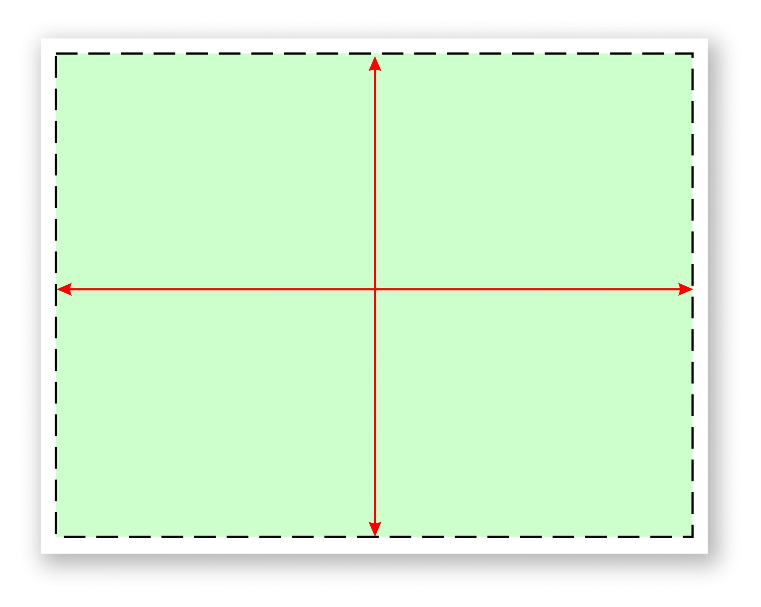
It’s the type of sales meeting you have attended dozens of times; the customer has asked his new building construction manager to attend the meeting so that your installation details can be reviewed. You show up early with all of your files in hand, both electronic and printed versions. The meeting starts and your installation details page quickly becomes the focus of discussion. “Where is your blah blah blah, and your call outs for this blah blah blah. What scale is this drawn at and not to mention we need a page with blah blah blah on it too.”
You quickly realize that your drawing packet really isn’t a packet at all, and it certainly doesn’t follow any sort of logical or systematic layout or format. The one page detailing what you are offering doesn’t have the right title block layout, hence the details are hard for anyone but you to find. It’s obvious that your title block design and in-house implementation of it needs to be revisited and revamped before the next meeting.
Does your title block compliment or hinder your companies image when presented to a savvy customer who is used to looking at title blocks all day long?
Does your title block serve a purpose or is it treated like a picture frame where most of the boxes get left blank? Do the items you have listed really matter in your day-to-day operations? Have you explored your in-house process to determine how the title block can help eliminate errors?
What is the purpose of a title block anyway? You’ve got limited real estate on your page, so you need to know what should be included, what shouldn’t be included, and why. (See Fig. 1) These are the questions you must ask yourself as you start to explore the title block development process. The basics are easy; Your logo, address, phone number, a copyright notice and those official looking little logos that tell everyone which associations you belong to.
But how do you keep track of the important working details that actually make a difference when the file is presented to the client or when it’s used by your in-house team? In order to build a title block, you must first understand what must be included, where on the page, and why. It’s too easy to simply build a template, call it good and move on. There is a process to follow and a trial period where you will fine-tune the template to work with a majority of your project scenarios. You may decide to build templates that are sign-type specific — one for monuments, one for pylons, one for channel letters, etc.
For now, let’s assume you have your in-house team together for a meeting, you have discussed the needs of your in-house process and you are in the process of deciding which elements to include on which title block pages. Here is a step-by-step guide to assist in the discovery and design process.
Step 1: To border or not to border—what look are you going for?
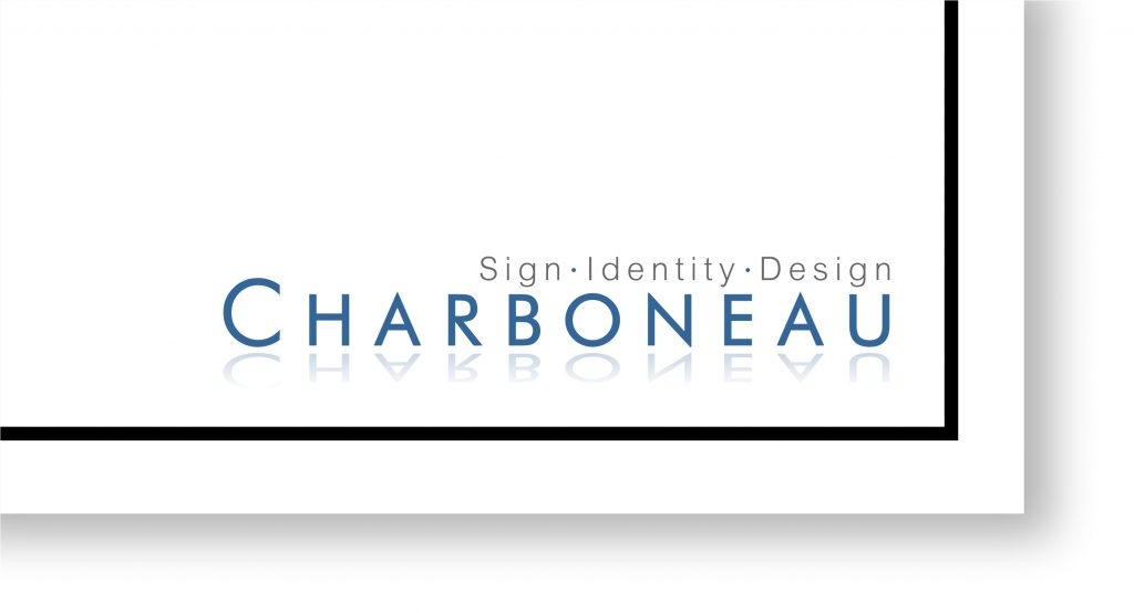
Let’s start with the first step in designing your title block, and that is the border or lack thereof. Do you prefer a thin or thick line border that encompasses the drawing on the page or do you prefer an open border page? If you prefer a border, make sure that your border doesn’t dominate the page. I bring this up because in my experience a thick, heavy or “fancy” border can actually detract from the message on the page. Whichever page framing method you choose, develop a theme and be consistent with your theme throughout the document. (See Fig. 2 and 3)
Step 2: Your logo and contact info
I recommend you keep your logo small so that it doesn’t dominate the page. Considering the limited space on the page, you might want to look at a 1″ wide logo. A large dominant logo on the page can take away from the look of the presentation and can take the focus off of the sign.
What about your contact info? Ask yourself this question: Do you really need your full mailing and or physical plant address along with your phone and fax number on every single page? With a website that can list your contact info in greater detail, what purpose does having your address on every page really serve? Is there someone viewing that page who might want to send you a letter via snail mail, or visit your office without calling for an appointment? The question is, “Would just your logo and web address be sufficient?” With a properly designed cover page and title block, there won’t be any question as to whom the presentation belongs.
Step 3: The disclaimers
How much do you need to say to get someone to understand that your drawing cannot be copied? Isn’t that a universal understanding of our industry? Perhaps not. But let’s face it, if someone wants to copy your design, regardless of the threat you present, they will. Copyright – schmopyright. In my opinion, when it comes to sign design, threats of penalties don’t do much to deter the unscrupulous. That being said, in the interest of saving real estate on your page, could your disclaimer be as simple as the basic copyright notice that every other product uses? (Such as Copyright C Charboneau Signs 2016) It’s a one-line statement that was designed to notify others that the item is protected against being copied. It sort of says it all; however, you and or your legal counsel may feel differently about your specific projects or market exposure… protect your design work but use as little title block space as you possibly can.
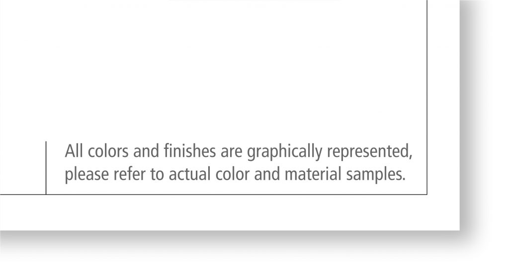
Regarding the Color and Texture disclaimer , I think this is one of the most important items on the whole page. It doesn’t have to be dominant, but simply stated, clear and easy to find in a large enough type that it’s easy to read. For those of us who have many years in the business, this disclaimer can become an insurance policy that will protect you from those customers who might want an “after the install” discount because the finished sign is a slightly darker green than it shows on the illustration. Stating that all colors and textures are conceptual and not meant to be 100 percent accurate pretty much covers you from becoming a victim of these types of opportunists. (See Fig. 4)
Step 4: Affiliations, awards, and shameless horn-blowing
Badges, buttons, awards, and accolades are awesome for marketing your company; however, by the time you have gotten to the illustration stage of the sales process, do they really make any notable impact on the customer’s opinion about the sign design you are presenting? Is the presentation page about how qualified your sign company is, or is it about the sign you designed to address the customer’s sign needs? Because real estate on the page is so coveted, the icons might be better used on other marketing materials such as your website, business card, emails, etc., where each affiliation can be listed prominently, rather than teeny-tiny and tucked into the corner of the title block.
Step 5: The customer, the installation site, signatures, and approvals
Who is the customer? Who is signing the agreement? What is their title? Whether it’s handwritten or electronic, it’s always a good idea to get your clients signature on every page of the presentation document. But do you really need a signature box for this when most people just scribble their initials somewhere on the page or approve it via email? Would a small approval box be sufficient?
How about listing the address of the signs installation location and the location of the home office for invoicing and permitting? This is usually mandatory for permitting with most municipalities, so it should be listed somewhere within the presentation, preferably on the “Installation or Estimation Page.” Should it be listed on every single page of your presentation? (as would occur with a single design title block page) or would it be OK to list it once, on one page? Creating an “Installation Only” page might provide you more room for accurately listing the address and exact location of the sign, as well as city-required site plans and elevation details.
Step 6: Planning the flow of your pages
OK, up until this point the content we have covered has focused on clerical details. Name, title, address, location, approvals, etc. But what about the cover page and any subsequent pages? Do you currently use a cover page? At this stage, you might review your sales and presentation process and determine how the title block packet might be most useful to the salespeople. What would they like to see? What would help the presentation compete more effectively in the marketplace?
Try to look at the title block for its functionality and purpose as it relates to the in-house flow of the job. What types of tracking details should be included on the title block? Should each departments info be on every page? How many of your pages end up with duplicate details or specifications information? Who uses the information provided on the title block and how do they use it? Does your in-house title block need to show a check-off list that addresses the tasks of each department? How about permitting details?
Development of a “packet” approach with a cover page, intro page and design pages is helpful in developing a process that addresses the needs of each department, hence a title block page for each set of details so they are most easily located without being redundant.
And I repeat…. develop a system that avoids repetitious details There is nothing worse for a designer than being told that X, Y and Z need to be changed, and that those repetitive details must be made across several different pages. It’s so very easy for a designer to miss one, especially if they must hunt and search for the instances where those details are listed. It’s better to develop a title block system that contains all the “specific need details” associated with that aspect of the project on one page. (See Fig. 5)
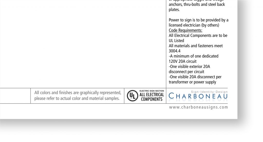
Such as all dimensioning details for estimation and fabrication should be on one page. If an installation detail has changed, it’s much easier to make that change on one drawing page, rather than having to hunt for it and change it on several pages. Granted, major revisions require adjustments to every page; however, all revisions can be made easier and faster when details are compartmentalized onto one page.
Beyond the basic pages
Now that we have expanded beyond the one-page presentation, you can now make your template process look and feel more like an “agency style” working document. Following the cover page, you may consider developing a “Why use us” page, or a “Parameters page” (which showcases the limitations and opportunities of the project.) The possibilities on building your presentation title block packet are endless. You may find that you do not need to clutter your up-front presentation pages with a busy detailed title block. Save those title blocks for the pages that illustrate detailed specifications and try using just your ID in one corner of the page… nothing more… just your logo and your website and whatever border you have decided on. It presents a clean, neat, professional appearance that states who you are without pounding it into the customers face.
Naming the pages
Start with your Illustration page. You can call it anything you want, but most importantly if you have multiple presentation pages, these pages need to be numbered or labeled somehow to keep them identified and organized. (See Fig. 6) Developing a consistent layout and system for labeling the pages is important for referencing.

CorelDRAW Tip: When using CorelDRAW, remember to set your “Page Title Text” to the appropriate left- or right-hand justification setting before you save. It makes for easier left- or right-hand justified text changes later.
Benefits of a boiler-plate presentation process
As you can probably see already, a well-designed title block presentation packet can simplify the flow of information both internally and externally, such as with sub-contractors, permitting departments, etc. If a job is small, you can select which single boiler plate page is most appropriate for that customer and job. If the project warrants a more involved presentation, or any level in between, your new boiler plate process will help you maintain your company’s image in the marketplace and improve your team’s understanding of where to find the info they need.
For the sign designer
Setting up your “Packet” can be done with boilerplates that are ready to go. I recommend setting up one packet set for channel letters, one for monuments, pylons, wall signs, etc. (See Fig. 7) In this way, you simply open the template and start working. All of the call outs, details and specifications needed for the job can be included and then are easily customized for the sign. This can be a huge time saver because all the pertinent details, graphic section views and general call-outs can be stored within the packet set.
The final word
Fortunately, for our industry, we have the ability to design templates and title blocks in-house, which makes changes and revisions a fairly painless process. You probably won’t land on the perfect title block on your first try. It will take a little bit of trial and error to know if the boxes provided will have enough space for the information required. Are the details too small to read once it is reduced from 11×17 to fit onto an 8×11 page? Where is the best place to put that disclaimer for the colors and textures? The key is to bring everybody affected by the title block to the table to discuss its usefulness, function, and purpose. You may decide that yes, you do want your address and phone number on the title block because the permitting department in your city requires it. Details like this are why it’s important to spend time with each department affected by the title block, and build them accordingly.

Matt Dixon is the former executive editor and content manager of GRAPHICS PRO magazine. Before that he served as editor of Sign & Digital Graphics and Sign Business Magazine.
Lawson Hosts Atlanta DTF Demo Day
Delta apparel files for bankruptcy, agrees to sell salt life brand, ninja transfers launches 24/7 customer support, delta apparel to close dtg2go, crystal d appoints operations director, related articles.

Gildan Activewear Releases 2023 ESG Report

Action Printers of Idaho Converts to Minuteman Press Franchise

Nickelytics Acquires Signs Printing Solutions

RED Promotions & MadeToOrder Join Forces

Architectural Title Blocks: Standards and Conventions
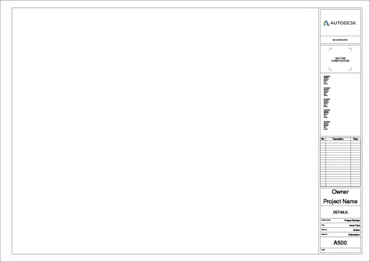
Title blocks are essential for all sheets (aka pages) in a construction drawing set. They tell the viewer information about the project, such as: what the project is and where it’s located, who created the drawings, the date of the drawings, and more. Should a single sheet be separated from the rest of the drawing set, the title block includes all the information needed for the viewer to connect it to the rest of the drawings.
In some cases, the client will dictate the arrangement of the title block or provide one for the architect and consultants to use. This is most common for large corporations or higher education institutions. These organizations have entire portfolios of buildings that need to be maintained and prefer to have the drawings created to their standards.
What should be included in the title block?
Name, contact info, and logo of the architect.
Knowing who did the drawings and how to contact them if needed is a critical piece of information. Include the name, address, and phone number of the company at a minimum.
Designated area for the architect’s stamp
Having a stamped set of drawings indicates to the viewer that these documents have been reviewed and approved by the architect. Stamps could be needed when applying for a building permit or when seeking regulatory approval.
Name and address of the project
Client information, architect’s project number.
Creating a unique project number for each job will help organize files on your computer and for keeping track of billing or other paperwork. How you format the project numbers doesn’t really matter as long as you’re consistent. Incorporating the year into it is common, especially since many of us think chronologically.
“Drawn by” section
Every sheet should have a name describing what the contents of that sheet are. This helps contractors and reviewers to quickly identify where to find the information they are looking for in the table of contents.
Sheet Number
Title of submission / current phase.
Similarly to the date, giving the drawings a name based on the submission will help identify the correct drawings. Over the lifetime of the design of a project, you may issue several sets of drawings for different reasons. For example: drawing sets at each phase for approval by the client, pricing sets, a set for permit, etc.
Space to list revisions
Copyright info.
Understanding copyright laws is a complicated subject and would be better explained by a lawyer. But it’s important to know that there are protections on the intellectual property of architects. If you’d like a little more information, take a look at this article.
Optional items to include in a title block
Client’s logo, north arrow.
A north arrow should always be included on the plans, but including it as part of the title block is a personal preference. Some architects prefer to make it part of the drawing, while others locate it in the title block so that it’s always remembered.
Design team’s information
Other layout considerations, sheet sizes, vertical vs horizontal.
It’s standard for sheets to be viewed and read in landscape orientation (meaning the widest dimension is perpendicular to the viewer). Most often, title blocks are vertical, meaning they are on the right-hand edge of the page spanning from top to bottom of the sheet.
Free title block for download
Get a free downloadable title block.
I’ll send you a title block in Revit and Autocad format that you can edit and use – Free!
Check your inbox for the download.
How to number views on a sheet.
No “rule” describes how to lay out views on a sheet. The least common way I’ve seen is numbering the drawings and placing them on the sheets in the way we are traditionally taught to read, meaning from top left to bottom right. Since sheets are flipped through by looking at the sheet number in the bottom right-hand corner, there’s a logic behind placing the first drawing in the bottom right-hand corner next to it. Where you go from there is up for debate.
Related Posts
What are floor plans & what do they show, what is a roof plan, what does “typ” mean what is a typical detail, leave a comment cancel reply.
Save my name, email, and website in this browser for the next time I comment.

Anatomy of Title Blocks for Interior Designers
Share post:, what needs to be included on a title block and how should it be formatted.
Whenever you’re working on creating drawings for a project, the presentation of these drawings inevitably requires a title block. The mark between a professional’s and amateur’s drawings is usually the professionalism of this title block. There are few key things to keep in mind when adding a title block to your drawings which is what this post is all about.
First of all, likely there are 3 types of title blocks you need in presenting your designs.
Concept or Schematic Title Block
This title block is for those initial presentation documents. When you’re showing a client a mood board, a furniture board, etc., you still need to present certain information to help professionalize these earlier presentations.
Developed Design Title Block
This title block is for those later presentation documents. When you’ve made more specific design decisions, having a more detailed title block will help you record more detailed information to inform the presentation.
Technical Drawings Title Block
When your design is in its final stages, your drawings will be of a more technical nature. These are the drawings you give builders, contractors, cabinet makers, joiners, etc. Therefore, having the technical drawing title block to communicate more of this information can be really helpful not only to you but also to your various trades.
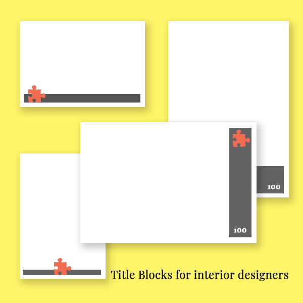
Anatomy of a title block
Key information needs to be on the right-hand or bottom side. The reason for this is binding. You don’t want some important information to get hidden by the binding of your drawing package.
The orientation and size of the title blocks needs to be consistent throughout your presentation, but you can certainly experiment with the orientation and size that works best for you. In most cases, a landscape (horizontally) oriented title block will serve you best as it’s the most often used. However, you may find that a portrait (vertically) oriented title block will serve you best depending on the style of the presentation.
For your concept title blocks, you might only need a small portion of the page to devote to title block information. For developed design packages and technical drawing packages, a larger section of the sheet will be needed to show the relevant information.
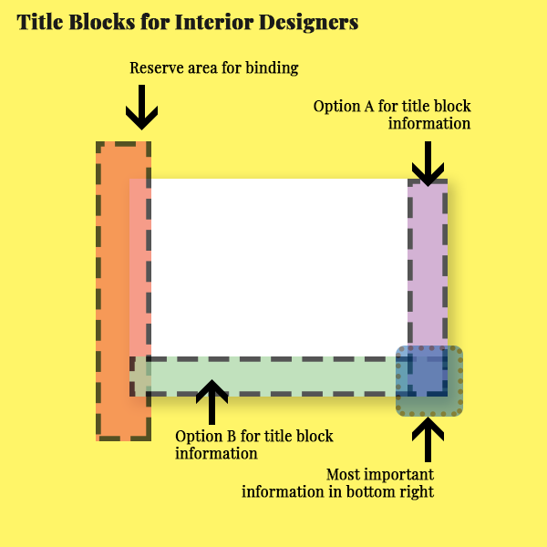
Components of a title block
Branding and identity.
Obviously, including your logo and your name as a designer is important. This not only help professionalize your work, but it also ensures you receive credit when credit is due. If it’s your design but the drawing was made by an assistant, you will likely want to include their name as well.
- Your Logo (all versions)
- Designed by: Your name (all versions)
- Drawn by: Your name or an assistant (developed design and technical drawings)
Dates are another key component of your title block. Including the date on the title block ensures there’s a record of when the drawings, presentation, design was made. This is important to include as it impacts revisions and project schedules. Having a record protects yourself from any misunderstandings.
- General date: the date of the presentation of a conceptual package presentation
- Drawing issue dates: really important for developed design and technical drawing packages
- Revision dates and revision numbers: include these when various iterations are being submitted to ensure there’s a record of the sequence of revisions to your design
Project Information
Of course, including project information will be necessary too. You need to make sure your drawings are easily identified to their relevant project.
- Client: it’s usually a good idea to always include the client name on your title blocks even your concept packages
- Project name
- Project address: I would generally include the address more on the developed design packages and technical design packages
- Project number: I would suggest always including this in your file names, but it might only be appropriate to include it on your technical drawing packages
Drawing information
Is it a floor plan, furniture layout, elevation drawings? If there’s a broad description for the drawings that are on that sheet, including that in the title block.
- Drawing titles
- Scales when relevant
Sheet information
In my opinion, the sheet information is one of the most crucial pieces of information on your title block. This helps you organise and keep track of all the drawings and make the package easy to understand. Making it easy for a client or a builder to find information in a drawing package will definitely make the package more effective.
- Sheet number
- Sheet prefix
Lines and Graphic Elements
Title blocks can always have certain graphic elements. It’s a good idea to keep these functional and relatively minimal as it’s most important that the information on the sheet is clear.
- Border lines consider using a border line to keep the drawing information very distinct on the sheet
Additional information
Title blocks certainly give you the opportunity to share additional information in a formalised way.
- Legends – if you’re using symbols in your drawings, your title block may give you the space to include a legend to define each of these symbols.
- Keys – if you’re keying items like furniture or fixtures, consider including the key list in an area in your title block.
- Notes – notes can be an incredibly important inclusion in terms of legality and liability. For example, you may need a note to clarify that the drawings are not intended for construction, or you may wish to have a note regarding copyright. You’ll need to double-check the need for these types of notes depending on the design, your role, your responsibilities, etc.
Hope that offers some clarity regarding title blocks for interior designers.
What other key elements do you consider for your title blocks?
need to get AutoCAD?
This is an affiliate link, meaning I earn an affiliate commission if you decide to subscribe. However, I recommend AutoCAD no matter what. 🙂

want more like this delivered to your inbox?
Sign up to my mailing list to receive updates, posts, promotions, tips, and free resources.
AutoCAD for Interior Designers Course
Join my AutoCAD for Interior Designers Course today to learn the core skills, workflows, and ins and outs of CAD templates
Looking for digital tools for interior designers?
Head to the tools page for all my favorite tools, programs, and resources.
- Visualizations
- Uncategorized
- Social Media
- Organization
- Interior Design Software
- General Digital Skills
- Design Tips

Autodesk, AutoCAD, and Revit are registered trademarks or trademarks of Autodesk, Inc., and/or its subsidiaries and/or affiliates in the USA and/or other countries. Adobe Photoshop and InDesign are registered trademarks or trademarks of Adobe, Inc., and/or its subsidiaries and/or affiliates in the USA and/or other countries. Sketchup, Sketchup Pro, and Layout are registered trademarks of Trimble, Inc.
Audrey Noakes is not affiliated with Trimble, Inc., Adobe, Inc., or Autodesk, Inc.

Copyright 2024.
Audrey Bardwell, practising as Audrey Noakes
International House, 64 Nile Street, London, N1 7SR, UK
Want to develop your interior design skills?
Sign up for my email list to receive updates, tips, promotions, and tutorials directly in your inbox.
By submitting your details, you agree to the processing and storage of your data in accordance to my privacy policy.
Yes, send me the Sketchup Shortcuts Cheatsheet!
Would you also like to join my email list to receive updates, tips, promotions, and tutorials directly in your inbox?
Ask a question!
Before you get instant access to the freebies....
Would you like to join my email list to receive updates, tips, promotions, and tutorials directly in your inbox?
Electric Symbols Plants Furniture Kitchen Title Templates Bathroom Floor Plans Block Library Hatch Patterns Landscaping CAD
Showing all 16 results
Title Block templates
Title Blocks Layout in Metric
Template – u. n. a. m
Signs and Templates

Sheet Formats – A1 A2 A3 A4
Sheet Format
Project Presentation Format With Borders
Letterhead Flat Foot
Foot of Plane for Architecture Faculty Oaxaca
Foot of Plane Configured Double Letter
Drywall Labeled A2, A3 and A4
Different Templates format Printing
Boxes for Different Plans
Border and Sidebar for Architectural Plans 90×60
A3 Letterhead for Key Levels
Home Blog Presentation Ideas Writing Catchy Presentation Titles: Proven Techniques You Should Know
Writing Catchy Presentation Titles: Proven Techniques You Should Know
It’s easy to overlook or give less attention to presentation titles, especially if you have limited time to assemble your material. You may rather prioritize other aspects, such as gathering information, creating slides, or rehearsing the delivery. Yet, hastily choosing the headline for your presentation is a blunder you wouldn’t want to commit.
First impressions – last, and that also applies when presenting. Engaging presentations begin with engaging titles and opening slides. If your title is sloppy, your audience will think your presentation is your best. This article will discuss what makes a good presentation title and how you can create it.
Table of Contents
The Anatomy of a Good Presentation Title
Presentation titles styles, tips for creating catchy presentation title, frequently asked questions on presentation titles.
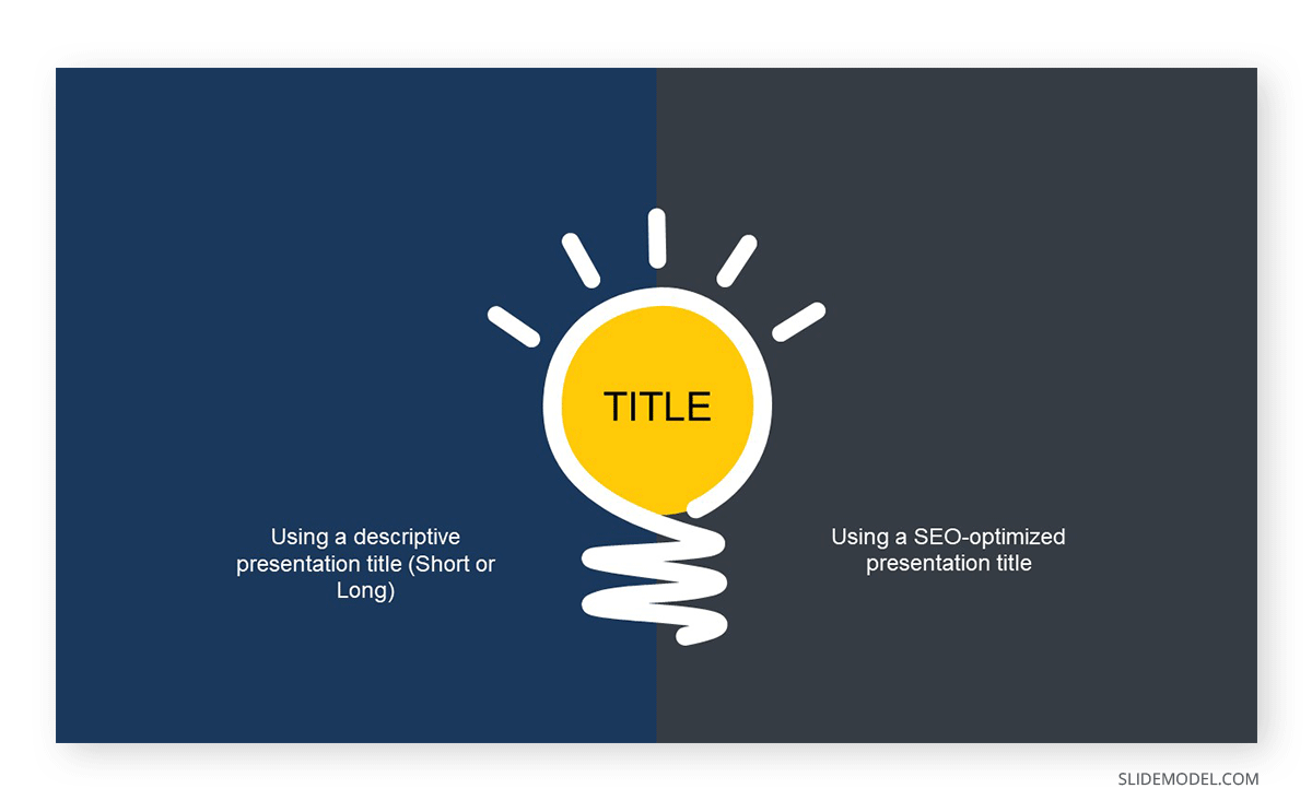
A good presentation headline or title serves two purposes: practical and creative.
The practical purpose of a presentation title is to provide a clear and concise description of the content. It helps set the expectations of your audience, allowing them to anticipate what they will learn or gain from the presentation.
On the other hand, the creative aspect is one thing that charms your audience. An intriguing or thought-provoking title can pique the audience’s curiosity and motivate them to attend the presentation through and through. It generates interest and makes them eager to learn more.
As the presenter, you should strive to find a title that strikes the right balance between informative and engaging. It must go beyond mere description, as a descriptive title may fail to stand out or engage your audience. On the flip side, an overly clever title may sacrifice clarity and fail to encapsulate the content of your presentation accurately.
1. Surprise
Using startling statements or unexpected facts can effectively capture the audience’s attention. When something unexpected is presented, it naturally piques curiosity and leaves a lasting impression.
So, if you come across a fact, statistic, or quote about a topic that truly surprised you, work on it and make it your headline. Chances are, such information will likewise come as a surprise to your audience. Of course, you must ensure that the surprise element is relevant and contributes to the overall message you aim to deliver.
Example: Neil Patel, an online marketing expert, delivered a compelling piece titled “90% Of Startups Fail: What You Need To Know About The 10%”. The title contains an element of surprise, which suggests that most startup companies don’t survive. Within the article, Patel presented advice for startups to avert failure.
2. Intrigue
Ever wonder why you can’t seem to resist Buzzfeed headlines? That’s right; they are often intriguing and clickbaity. This technique also works on presentation titles.
Intrigue headlines capture attention and generate interest in presentations. They can create curiosity, engage the audience, and make your presentation stand out.
When crafting an intriguing headline, you may use thought-provoking questions or vague statements that spark the audience’s interest and, at the same time, clearly convey the topic of your presentation.
Example: Susan Colantuono’s Ted Talk, entitled “The career advice you probably didn’t get,” exhibits intrigue. The title immediately piques curiosity by suggesting that the presentation will provide unconventional or lesser-known career advice that the audience may not have received. This creates a sense of anticipation and motivates individuals to attend the presentation to discover what unique insights or perspectives will be shared.
3. Benefit or Value
Presentation titles that make clear claims about something’s worth may be more engaging than just stating it. When your audience knows exactly what’s in the presentation, they will likely lean in and listen.
The idea is to communicate right off the headline the main advantage the audience will gain from engaging with the content. You don’t have to include the entire proposition, but you may convey the essence of the value proposition to generate interest among the audience.
Example: Lawrence Ong’s “Break The Cycle: How To Gain Financial Freedom” clearly states the benefits of attending the presentation in the headline. It positions itself as a source of knowledge for building wealth and suggests that listening to the talk will equip the audience with the lessons they need to achieve their desired financial independence.
4. Wordplay
Using wordplay in presentation titles can be a clever way to add flair to your presentation title. Playing with words can evoke emotions like humor and curiosity, which engages the audience from the start. It stands out from more specific titles, making people pause and take notice.
There are several types of word plays that you can incorporate into your presentation title, like puns, double-meaning words, metaphors , and rhymes. The idea is to strike the right balance so that the playfulness doesn’t overshadow the clarity and relevance of the title. The wordplay should align with the topic and purpose of your presentation while adding a touch of creativity.
Example: Steve Jobs’s keynote speech 2001 introducing the original iPod with the title “1000 songs in your pocket” is an excellent example of wordplay used in a presentation headline.
The wordplay in this example contrasts the figure “1000”, a substantial quantity, and the phrase “in your pocket,” representing portable space. By combining these elements, the presentation title effectively communicated the storage capacity and convenience of the device playfully and memorably.
1. Keep It Short
A strong presentation title conveys the main topic using a few words. Short statements are more likely to impact the audience immediately, and their brevity makes them easily understood and remembered, leaving a lasting impression.
How short is short? The ideal length for headlines on PowerPoint slides is 6-14 words, and this range helps ensure that the title of your presentation carries the message you want to get across without wordiness.

2. Use Concrete Language
Using concrete language in your presentation title is an effective way to make it more compelling. Concrete language has persuasive power as it clarifies your presentation title and makes it relatable to the audience.
Some powerful words you can inject into your headlines are adjectives, action words, and actual figures. So, instead of “Optimizing Business Processes,” you can say “Cut Costs by 20%: Streamlining Operational Efficiency”.

3. Use Technology or AI
Crafting a catchy presentation headline is hard enough – all the more when you have to fit it into little words. If you find yourself stuck in this task, there are available technologies that can help you generate title ideas for your presentations.
SEMRUSH, in particular, has an AI title generator that suggests headlines for content based on your prompts. You may also use ChatGPT for your presentations in a similar way.
However, we only suggest using these tools to speed up your brainstorming process, as repurposing those presentations into blog posts implies the risk of a site penalty for AI-generated content by Google. Reviewing and refining the generated headline to ensure it aligns with your specific presentation and captures the essence of your message is important.
4. Use Proven Formulas
Another way to speed up the process of generating title ideas presentation is to use proven formulas. Like your typical math equation, these formulas provide a framework to adapt to your specific presentation and audience. You can use them as a starting point to experiment with different combinations of words to create a headline that captures the gist of your piece,
Here are some presentation title formulas you can use:
- How to [Desirable Outcome] in [Specific Time Frame]
- Discover the [Number One] Secret to [Desirable Outcome]
- The [Adjective] Way to [Desirable Outcome]: [Unique Approach/Method]
- Are You [blank]?
- Unlocking the Secrets of [Topic]: [Key Insight/Strategy]”
Q1: What is the purpose of a catchy title in a presentation?
A: The purpose of a catchy title in a presentation is to grab the audience’s attention and, at the same time, communicate the main idea or focus of the talk.
Q2: How do I create a catchy title for my presentation?
A: Creating a catchy title involves balancing creativity, clarity, and relevance. Finding the right balance between description and creativity allows you to create a catchy title that generates interest without sacrificing clarity.
Q3: What are some tips for making a title stand out?
A: To make a title stand out, clearly describe the content while engaging the audience’s curiosity. Additionally, use concrete language and keep it short.
Q4: Can a title be too long for a presentation?
A: Yes. Keep presentation titles concise and to the point, as longer titles can be harder to read, remember, and fit on slides effectively.
Q5: How does a title affect the overall success of a presentation?
A: The title serves as a hook that entices people to attend the presentation and creates a positive first impression. It may be the first and last chance to convince your audience to lend their ears.
Q6: Are there any specific formats for presentation titles?
A: No, there is no specific format for presentation titles, but there are approaches that can make it more effective. You can use descriptive words, wordplay, figures, or surprising facts.
There are infinite ways to make your presentation title catchy, and this article presented some of the proven techniques that work. In creating an attention-grabbing title, ensure your main message is not overshadowed or lost. Keep it relevant, concise, and clear!
Once your compelling headline is ready, designing your opening slide will be next.
Like this article? Please share
Presentation Skills, Presentation Tips Filed under Presentation Ideas
Related Articles
Filed under Google Slides Tutorials • June 11th, 2024
How to Download Google Slides Templates
Become a master of presentations by always having your designs available regardless of the network connection. Join us to learn how to download Google Slides Templates.
Filed under Google Slides Tutorials • June 3rd, 2024
How to Copy a Slide in Google Slides
Learn how to quickly duplicate slides in Google Slides with this guide.
How to Make a Venn Diagram in Google Slides
Learn how to represent Venn Diagrams in Google Slides using three different methods to create them. A step-by-step guide for Google Slides users.
Leave a Reply

Welcome to the SeeMSixty7 Blog
Discuss AutoCAD, Databases, Development and More…

Title Blocks – The start of a good drawing

Title Blocks are a critical portion of any drawing. They represent the area of presentation, the purpose of the drawing, and data about the drawings properties. The Title Block is a critical part of your drawing and it will set the pace for how your quality and presentation are perceived by the person reviewing your Drawing. That person reviewing your Drawing could be the person constructing your design, reviewing your design, approving your design. It could easily be the person paying for the design, your client. The Title Block is a very important part of your drawing. GET IT RIGHT!
Make it a BLOCK
Title Block should in the least be a BLOCK. It is right there in the name Title BLOCK . Creating a Title Block should be something well thought out and standardized. All the components of your Title Block should be within the Block definition of that Title Block.
Use good Block creation practices
Insertion Point : The recommended insertion point should be the lower left corner of the sheet size that the Title Block will print to. So if your drawing size is an ARCH D (24×36) Drawing. The insertion point should be 0,0 and the upper limit should be 36,24. You could draw a sheet outline an place it on a no plot layer if desired, but using Paperspace properly will actually show the paper size of the intended sheet.
Margins: Keep in mind you will want a margin on your drawing as well. So the Sheet edges is not the place for Line work or information you want to show up on a Drawing Print. The Left margin is often used for binding a set together and is usually larger thna the other margins. A typical margin set is 1.25″ from the Left, 0.5″ from the right, 0.5″ from the Bottom and 0.5″ from the top. Margins are something that vary quite a bit across title blocks. Find a good margin that works for what your content is. Maximizing your margins as close to the sheet size as possible is not recommended as you will find content loss when a printer or plotter can not print as close to the paper edge as desired.
Rotation: The Title Block Rotation should be appropriate to your industry. My industry the title block is in Landscape, hence the 36,24 for the upper right corner, referenced above. When inserted at 0 rotation the Title Block should come in as desired.
Layers: Your Title Block will be in every Drawing of the project. Keep your layers to a minimum, keep colors, line weights, and linetypes to BYLAYER Settings. This allows for flexibility down the road. Think about plotting, different Color Tables, different Disciplines, Display of certain Title Block Elements…
Use Attributes: Text that is not meant to change in the Title Block can be plain Text, it will remain Static within a block, but attributes are the best things to use for the Dynamic Text content in your Title Block. You can set these up as fields to link these to drawing properties (a common one is to link the filename to the Drawing Number. (This all depends on your document numbering and file naming standards, you have those, right?) Attributes can easily be extracted, linked to properties in Sheet Set Manager or tied to a database system. With consistent data, you could easily generate a Drawing index or Drawing Status Report from that data, directly from your Title Block data! Attribute tags (names) should all be unique.
Text Styles: Non-Standard Fonts are not always available to every user, Try and make use of standard fonts and text styles. Highly recommend setting up and Text Styles specific for your border, so plotting and display are not affected by user updates to body text styles used. If you make use of standard text style for your title block with a different font, you could lose the formatting you had intended. See images below.

Revision Information: Revision History is an important part of a Title Block. Revision History can be part of the Main Title Block or it can be a separate block inserted into a designate are of the Title Block. My personal preference is to keep the Revision History Attribute data associated within the Main Title Block. Just make sure you set your Prompt Order is right.
Attribute Prompt Order: Attributes are great to use, but if your attribute prompt order is all out of whack it may cause frustration and lead to someone just placing text in your border. Not a good idea. When creating your block be sure to select the attributes in the order you want to be prompted for them. If you mess up the order, you can use BATTMAN to adjust the order, just make sure you set this up properly before using the Title Block on several hundred drawings. Keep in mind if you do, you at least can automate updating all those drawings, because you have a standard Title Block.
Drawing Information: Each industry will have its own required data elements. I recommend the following as a minimum.
Drawing Number Revision (current issue of the drawing) Project Name Project Location Project Number Drawing Title Line 1 Drawing Title Line 2 Drawing Title Line 3 Drawing Title Line 4 Scale (Scale Factor of the Drawing) Drawn Date (Date Drawing was started) Drawn By (Initials or name of person that created drawing)
There are many more you could add (approvals, stamped by, engineer…)
Plot Stamp: A plot or file stamp will show some basic information that is useful that may or may not be evident in the title block data. A plot stamp will typically show the date the file was plotted, who it was plotted by, who the file was saved by and when, and sometimes the filename including the path. The plot stamp can easily be static text with fields within the Title Block. It does not have to be an attribute.

Title Block Name: The Name you give your Title Block is important. Use a defining name that uniquely identifies your Title Block. A generic name like “BORDER” could easily be the same as another block, and create a conflict in the drawing. If someone inserts another BORDER block into their drawing and accepts the Re-Define, then your Title Block suddenly looks like whatever the user is inserting. I recommend combining a few things to name your Title Block Name like CompanyName, sheet size, year created. Example : ABCDrafting-ArchD-2020
Logos: Company Logos often make a Title Block look all that more professional. Problem is most Logos are Raster based images. I highly recommend NEVER EVER placing Images in your drawing files. Take the Time to create the Logo in AutoCAD and Create a separate block for the Logo. You can insert the Logo block directly into your Title Block or you can place it in the drawing in an area of the Title Block. Either way works. I personally place it within the Title Block Definition, so it is part of the Title Block. The benefit of having the log as it’s own block means if you ever get a new logo, you simply redefine the block and you are done. Easily automated as well.
Plotting: Your border is intended to plot to a specific size, and it should be plotted to that size. Not “FIT” Your scale should be 1=1, if you are plotting from Paperspace. This insures a scale factor reference is accurate. If you want to plot a drawing to a B-Size printer that is fine “FIT” works for that, but the sheet size for that page layout should properly be set to the drawings actual sheet size. If your drawing Sheet size is ARCH D (24×36) That is the size you should print to, even if you are plotting to a PDF file. Use the correct size, otherwise scaling is inaccurate and could lead to bid or construction errors. A scale bar on the drawing is often helpful in those cases.
Block Size: Your Title Block will be used in all your projects drawings, This could be 10 drawings it could be thousands. When you write the block to a file, you can see how big the file is in Bytes. A typical Drawing size (excluding complicated models) should be around 100-300K including your Title Block. The goal is to make your Title Block as least impactful on the drawing size as possible. A Basic Title Block (without a logo) can be around 30-50K. Adding a logo, depends on the complexity can easily bump that up above 100K. try and avoid that. Work on your logo to adequately show the logo, but also not be over detailed that it affects the drawing size significantly. Purge the Title Block File of anything unused. You can store some standard layers in the Title Block if Desired, just don’t go crazy.
A properly setup Title block can make your life as a Drafter much less complicated and present you and your company in a much more professional way. Quality and consistency start with that Title Block.
Share this:
Leave a reply cancel reply.
Get 40% Off GKV89ZNF5MH6
Safe and secure payment with DPO PAYMENTS
Safe and secure debit and credit card checkout with DPO payment gateway

20 Presentation Tittle blocks, chic and contemporary, A3-A4 templates , ArchiCAD File (Pln) Version 24 up.
20 archicad contemporary presentation title blocks.
This comprehensive package offers 20 unique and modern title block designs that will transform your design drawings into polished, professional, and visually appealing documents.
- Description
- Features & Benefits
Elevate your architectural presentations to the next level with our 20 ArchiCAD Contemporary Presentation Title Blocks. This essential pack offers a diverse range of 20 distinct, modern title block designs that will transform the way you present your architectural drawings.
Our Modern Architectural Title Blocks are designed to meet the highest professional standards. Choose from a collection of 20 contemporary title block designs, ensuring you find the perfect fit for your project. These title blocks, compatible with ArchiCAD, are meticulously crafted to maintain a clean, simple, and professional appearance for your drawings. The Customizable Title Block Pack allows you to add a personal touch to your presentations. Organize your design drawings effortlessly with these structured title blocks, creating a framework for presenting your project information. These Presentation-Ready Title Blocks are tailored to meet the demands of modern architectural practices.
Download the ArchiCAD Contemporary Presentation Title Blocks Pack and experience the convenience of ArchiCAD Title Blocks. With our Modern Title Block ArchiCAD Template, you'll have the tools you need to make a lasting impression with your architectural presentations. Upgrade your design process today!
- ArchiCAD Version 24 and up
Payment options
Visa, PayPal, MasterCard
Contact Support:
- MesolightBim
- Email: [email protected]
- WhatsApp: +267 73 839 116
- Time-Saving: Eliminate the need to create title blocks from scratch, saving you valuable time for focusing on your design and content.
- Visual Impact: These contemporary title blocks add a touch of sophistication to your presentations, making your architectural drawings stand out.
- Customizable: Tailor these title blocks to your specific project requirements, adding your drawing information seamlessly.
- 20 Contemporary Presentation Title Blocks
File format:
- Zip file: ArchiCAD PLA file
Beneficial to:
- Architects, engineers, and designers
- Choosing a selection results in a full page refresh.

Life of an Architect
Eric Reinholdt – example of a title block
October 15, 2020 by Bob Borson Leave a Comment

My “Serious” Disclaimer
The complimentary advice provided on ‘Life of an Architect’ is based on an abbreviated examination of the minimal facts given, not the typical extensive (and sometimes exhaustive) analysis I conduct when working with my clients. Therefore, anything you read on this site is not a substitute for actually working with me. Following my casual advice is at your own peril … if you want my undivided attention, I would recommend hiring me. Cheers.
- Comment Policy
- Privacy Policy
- Architecture Books+
- Do you want to be an Architect?
Life of an Architect | Bob Borson
- View lifeofanarchitect’s profile on Facebook
- View bobborson’s profile on Twitter
- View bobborson’s profile on Instagram
- View bborson’s profile on LinkedIn
Archives of Awesomeness
- Speech Writing
- Delivery Techniques
- PowerPoint & Visuals
- Speaker Habits
- Speaker Resources
Speech Critiques
- Book Reviews
- Browse Articles
- ALL Articles
- Learn About Us
- About Six Minutes
- Meet Our Authors
- Write for Us
- Advertise With Us
Slide Title Guidelines: Use Assertions, Not Topics
- What kind of titles were used on the slides?
- Do you remember any of them?
- Were there titles like “Background”, “Research Study”, “October Sales”, and “Conclusions”?
If you are nodding to that last question (and most people reading this will be), you already know that most slide titles are pretty mundane: they are quickly written and quickly forgotten.
It doesn’t have to be that way. Slide titles can help communicate your message , and set the context of the slide for your audience.
In this article, we discuss five simple guidelines you can use to quickly improve your slides, and see how these guidelines apply to slide examples .
- Slide Titles
- Slide Fonts
- Slide Charts
- Rule of Thirds (Layout)
- Contrast, Repetition, Alignment, Proximity
- Slide:ology
- Presentation Zen
- Clear and to the Point
Slide Title Guidelines
These guidelines are easy to follow. Once you are aware of them, you will find that they are almost second nature.
- Slide titles should convey your main point as an assertion . Avoid using topics or labels as titles such as “Background”, “Research Study”, “Sales”, and “Conclusions”. Titles like this are weak and do little to help your audience understand the slide. Titles written as clear assertions provide meaning for your audience which is elaborated upon with the visual in the body of the slide (chart, photograph, diagram, table, etc.) and also with your verbal delivery.
- Slide titles should be crisp, not wordy. Titles should fit on one line (or, at most two lines). Spend the time to distill the essential meaning into a short, clear statement.
- Slide titles should be larger than any other text on the slide . In every medium where text is present, size conveys importance. (Think of posters, newspapers, books, reports, and even web pages like this one.) Large text is perceived as more important than small text. Since your slide title conveys your main point, you should make it the largest text on the slide. (I typically use 44 point text for titles.)
- Slide titles should be consistently located. In English and other left-to-right languages, the best place for the title is in the upper-left of the slide. That’s where your audience will glance first, before exploring the rest of the slide. If you choose to go against this guideline, be sure the benefits outweigh the drawbacks. (Beware placing title text along the bottom of a slide. In many presentation venues, your audience will have difficulty seeing the bottom edge of your slides due to heads of people in front of them.)
- Slide titles should be easy to read. Don’t make your audience struggle. Use a clean font and a color with strong contrast so your title can be read and understood at a glance.
If you follow the guidelines above, your audience will understand the purpose of the slide. This will help them as they view and study the evidence you have provided to support the assertion in the body of the slide.
Exceptions to the Guidelines
“ Slide titles should convey your main point as an assertion. ”
Like nearly all speaking guidelines, there are exceptions. In this case, there are many situations where you can safely ignore one or more of the guidelines above:
- title slides, agenda slides, transition slides, housekeeping slides;
- quotation slides (the main idea is the quotation, and so a separate title is rarely helpful);
- setup slides which are employed as part of a sequence (e.g. the first slide might pose a problem or ask a rhetorical question, while the follow-up slide may have the solution as an assertion);
- artistic slides; and
- any other slide where a title is not warranted or perhaps even detrimental
Further, the guidelines above don’t apply if you are using an irregular presentation format, such as the Lessig Method .
These guidelines do, however, apply to the majority of normal “body” slides that are used in business, scientific, and classroom presentations. In most cases, if your slide has a title, it should follow the guidelines.
Proponents of Assertion Slide Titles
Michael Alley and Melissa Marshall offer comprehensive coverage of the benefits of assertions for slide titles. They have conducted research studies which show that students perform better after receiving presentations designed using the assertion-evidence method (as compared to traditional “topic”-titled slides). Their site also includes resources for instructors who teach this approach to slide design.
Olivia Mitchell provides an accessible overview of the assertion-evidence style.
Cliff Atkinson, author of Beyond Bullet Points :
Writing headlines in the form of complete sentences imposes a discipline on your ideas by forcing you to turn them into coherent thoughts and remove any ambiguity. […] The point of the headline is to help your audience understand your point as efficiently as possible.
Slide Examples
Below I’ve given seven pairs of slides (taken from my PowerPoint design course), where the only difference is the slide title.
- The left slide uses a “topic” or “label” title.
- The right slide uses an assertion for a title to convey the primary meaning to the audience.
Slide Example #1
- The title on the left (“Sensory Perceptions”) is the topic being discussed.
- However, the title on the right makes the two-step process much clearer (stimuli must be [1] perceived and then [2] processed)
Slide Example #2
- The title on the left adds no value. The slide is obviously about text sizes.
- The title on the right emphasizes the key takeaway — that text readability is a critical factor to consider.
Slide Example #3
- The title on the left is a weak topic, but leaves the audience wondering: is it good to decorate your text or not?
- The title on the right is a forceful assertion that is reinforced by the slide evidence.
Slide Example #4
- The title on the left describes what is being charted. That’s helpful, but is something that the presenter could explain.
- The title on the right emphasizes the key takeaway — the new safety policies are working!
Slide Example #5
- The title on the left establishes two chart options, but leaves the audience wondering which is better. While the “Do” label suggests line charts are better, it’s not clear why.
- The title on the right emphasizes the key takeaway — line charts do a better job illustrating data trends than bar charts.
Slide Example #6
- The title on the left gives the topic, but no meaning.
- The title on the right emphasizes the key takeaway — that diagram labels should be placed in close proximity to the objects they label.
Slide Example #7
- The title on the left is a form of rhetorical question. That’s not a bad idea, although it would be more effective if the presenter asked the rhetorical question before displaying the slide on the right…
- The title on the right emphasizes the key takeaway — that photographs should be chosen over clip art. This assertion doesn’t say why… that’s part of my verbal delivery.
Summary of Slide Title Guidelines
If you follow these guidelines, your slides will provide effective support for your presentation.
- Slide titles should convey your main point as an assertion.
- Slide titles should be crisp, not wordy.
- Slide titles should be larger than any other text on the slide.
- Slide titles should be consistently located.
- Slide titles should be easy to read.
Please share this...
This is one of many public speaking articles featured on Six Minutes . Subscribe to Six Minutes for free to receive future articles.
Add a Comment Cancel reply
E-Mail (hidden)
Subscribe - It's Free!
| Follow Us |
Similar Articles You May Like...
- The 10-20-30 Rule: Guy Kawasaki on PowerPoint
- Slide Charts: 20 Guidelines for Great Presentation Design
- Slide Fonts: 11 Guidelines for Great Design
- Book Review: Multimedia Learning by Richard E. Mayer
- How to Improve Your PowerPoint Slides with the Rule of Thirds
- PowerPoint Book Review – Clear and to The Point: 8 Psychological Principles for Compelling PowerPoint Presentations
Find More Articles Tagged:
13 comments.
Andrew, Excellent topic to address. Still I meet with much resistance from graduate students in my workshops when confronted with the assertion-evidence slide. Why? Because they’ve seen nothing else. And many of their supervisors say the “old way is the only way”. Thanks, John Kluempers (Germany)
True… “Old way is the only way” thinking often blocks progress.
Another great article Andrew…keep up the good work. It is always a pleasure to read your stimulating take on the art of presenting…
Andrew, loved reading this article. PowerPoint abuse is something we’ve all seen and dealt with. However, proper teaching, like this, can vastly improve the quality of our meetings.
Andrew, Thank you for your article. You have brought together compelling examples to support your argument. One hidden advantage to creating assertion headlines is the effect that creating such a headline has on the speaker. We have found that speakers creating such headlines are more focused in their speaking and will eliminate extraneous details from the body of the slide that do not contribute to the assertion (or message). Best wishes, Michael Alley (Penn State)
Since I began using assertions on slides years ago, I have experienced the positive effect you refer to, Michael. The assertions habit has helped me clarify [1] my overall message, [2] the visual on the slide, and [3] how I deliver it.
Thank you Andrew. I don’t know how you keep coming up with topics, but well done. This is a great idea. I hadn’t thought about it but it makes so much sense.
Great article Andrew. I especially like if somebody provides real examples (don’t/do). I personally do not like 2 lines titles, so I would not recommend those. Based on my experience nobody reads such a long titles. I also recommend using info graphics on the slides. It is a great way to explain your message using minimum amount of words.
Andrew, I’m interested in your thoughts on the timing of *when* to display the assertion as you talk, and to what degree it might “steal the thunder” from the speaker.
Below, I discuss a related topic (namely how to stick to just 1 idea per slide) and I use this example of a (spoken) sentence to illustrate a point: “Our solution has 3 benefits, which are that it’s usable, reliable, and scalable.” In the context of an assertive title, to me it seems “Our solution has 3 benefits” would be good, because it asserts the main point yet also intrigues listeners about what the benefits *are* – so people stay focused to find out. A more thorough title of “Our solution is usable, reliable, and scalable” would be a more memorable and meaningful takeaway, but I believe would also cause people to tune out to the speaker because he or she is relegated to backing up what the slide says, instead of vice versa. http://remotepossibilities.wordpress.com/2011/12/31/minimise-blur-firstframework-part-1m/#one_thought
I think the people at M62 are wary about titles, as #2 on their list of 10 “presentation myths” is: “Slide titles should summarise the content of the slide”: http://www.m62.net/presentation-theory/presentation-best-practice/10-presentation-tips-that-suck/
What’s your view on those examples?
Andrew, I couldn’t agree more – many of us have sat through terrible presentations with no content. For me, the worst ones are always presentations where the you’re left wondering what on earth the key message is. Using titles like this is a great idea.
Great suggestions, Andrew.
Coincidentally, I’m developing a PPT presentation right now. Your column has caused me to review some of my headlines. Plan to make them stronger!
– Tom
Thank you for sharing these clear, simple, and persuasive examples. While many engineering and science students and professors use this approach, I suspect that many other students (high school and university) could benefit by choosing this powerful technique.
I would additionally add that assertive slide titles are even MORE important when you aren’t actually presenting your slides, and instead are passing them around as a proposal or client deliverable.
Use the title to tell your audience EXACTLY what your point is, don’t make them guess or try and figure it out.
Thanks for the great post!
Recent Tweets
Slide Title Guidelines: Use Assertions, Not Topics http://t.co/rwQsTofy via @6minutes — Gavin McMahon Dec 12th, 2012
Slide Title Guidelines: Use Assertions, Not Topics http://t.co/rwQsTofy via @6minutes — fassforward Dec 12th, 2012
Slide Title Guidelines: Use Assertions, Not Topics http://t.co/u2lTf0i1 — Carlisle Rainey Dec 16th, 2012
RT @Stella_Yiu: Slide Title Guidelines: Use Assertions, Not Topics http://t.co/mJCEWkHI via @6minutes — Merrilee Fullerton Dec 20th, 2012
RT @Stella_Yiu: Slide Title Guidelines: Use Assertions, Not Topics http://t.co/mJCEWkHI via @6minutes — Charles de Mestral Dec 20th, 2012
Final preparations for my New York visit – finishing touches to my #presentation with useful hints and tips: http://t.co/nYfESCKl — Dee Clayton Jan 7th, 2013
Slide Title Guidelines: Use Assertions, Not Topics http://t.co/X06EU6dBZm via @6minutes Excellent primer for #presentations #talks #speech — @compellingtalks Apr 16th, 2014
Great advice on slide titles: Use Assertions, Not Topics! https://t.co/rzihwyJXdD by @6minutes #publicspeaking — Christine Clapp (@christineclapp) Jul 9th, 2018
Slide Title Guidelines: Use Assertions, Not Topics https://t.co/XES2kpH2cK #presentations #presentationdesign — @Visual_Hackers Jul 13th, 2018
Slide Title Guidelines: Use Assertions, Not Topics https://t.co/qc9jukkdde by @6minutes — @ericrodwell Jul 31st, 2018
Featured Articles
- Majora Carter (TED, 2006) Energy, Passion, Speaking Rate
- Hans Rosling (TED, 2006) 6 Techniques to Present Data
- J.A. Gamache (Toastmasters, 2007) Gestures, Prop, Writing
- Steve Jobs (Stanford, 2005) Figures of speech, rule of three
- Al Gore (TED, 2006) Humor, audience interaction
- Dick Hardt (OSCON, 2005) Lessig Method of Presentation
Books We Recommend
| [ ] | [ ] | [ ] |
| [ ] | [ ] | [ ] |
| [ ] | [ ] | [ ] |
| Follow Six Minutes |
Six Minutes Copyright © 2007-2022 All Rights Reserved.
Read our permissions policy , privacy policy , or disclosure policy .
Comments? Questions? Contact us .
Williamsburg High School for Architecture and Design
Redefining Career & Technical Education in New York City
Creating a Title Block
October 23, 2013 By Ms. Bruno

Aim : How do we create a Title Block?
Today students learned the procedure for starting every architectural drafting we will make in class: drawing the title block. They used the drafting tools covered yesterday to start their title block and began to get used to manipulating them to draft correctly.
Important Hints!
- If you are right-handed the top of your T-Square should be on the left side of the drafting board. If you are left-handed it should be on the right side.
- Your drafting paper must be COMPLETELY straight when you tape it down securely, or every line you draw will be wrong.
- Architectural scales are for measuring and making marks, NOT for drawing lines.
- T-Squares are for aligning your paper and drawing both horizontal and vertical lines, NOT for making measurements.
Make sure you have the steps to create a title block (from the PowerPoint presentation attached below) written in your notebook!
- Align your paper using the T-Square.
- Securely tape your paper to the drafting board in all four corners.
- Mark a 1/2″ from each corner on your paper (you should have 8 marks).
- Connect the marks (dots) using your T-Square, NOT your architectural scale.
- Measure 7/8″ up from the bottom horizontal line drawn in step 4 and make a horizontal line.
- Erase the lines outside of your title block border
- From the bottom border of your title block create horizontal lines with measurements 1/8″, 1/4″, 1/8″, 1/4″, 1/8″.
- Create vertical lines inside your title block with measurements 1″, 2″, 3″, 2″, 1″, 1″.
[gview file=”https://www.whsad.org/wp-content/uploads/2013/10/How-do-we-create-a-title-block.pdf”]
Recent Posts
- WHSAD Students Recount Their ACE Experiences June 21, 2024
- Class of 2024 Graduation June 18, 2024
- Senior Bulletin – June June 18, 2024
- WHSAD’s Newtown Creek Alliance Living Dock Project June 15, 2024
- WHSAD’s 2023-2024 Freshkills Project June 3, 2024
About Ms. Bruno
Ms. Bruno has been an Assistant Principal at Williamsburg High School for Architecture and Design since 2009. She oversees the departments of Science, Mathematics, Architecture and Design (Career and Technical Education (CTE)), Physical Education and Health. She can be reached at 718-388-1260 ext. 2080, or [email protected] .

Interior Design client presentation | Use titleblocks and firm logo's for more professional looking sampleboards
Last Updated on May 3, 2024 by

Client presentation | Use Titleblocks and firm Logo's for more professional looking sampleboards
When using a drafting program such as AutoCAD or ArchiCAD you typically have a page template that includes the following:
- Job title/project title ( in this case "Gelissimo Gelato")
- Client name
- Address (site position)
- 'Drawn by' name (designers initials, so other people on the project has a reference if they need to query something)
- Note ( as the designer you need to notify if the page is not to scale, or any additional information that's important when reading/viewing the drawing)
- Title of the page ( Sampleboard/Scheme design/Concept)
- Drawing number (this helps with filing the physical plans/sketches in a physical library or electronically in your project folder)
- Firm/company logo with name, address and contact details (usually sits either on the left or right-hand side of the template)

This type of template is standard practice in any architectural or interior design firm. It allows for order, referencing and can range from a complete project drawing package that includes architectural layouts, detail drawings, shop fitting details, elevations, sections, lighting layouts, plumbing layouts etc.to concept scheme ideas and sampleboards.
The reason for this brief introduction to title block template is that I wanted to demonstrate how it lifts the overall feel of your sampleboard to one that can easily be used in a client presentation along with your professional drawing sets. It can form a complete entity which in turn creates a more professional client pitch or presentation.
We are constantly improving and adding to the functionality and features at SampleBoard.com, as well as ensuring it’s an inspiring space from which you can create and interact. We are working on bringing you easy-to-use titleblock templates soon.
Happy creating!

- Home Trends
- Design Styles
- Paint and Color
- Decorating Advice
- Home Maintenance and Repairs
- Decks & Patios
- Home Exteriors
- Ask the Contractor
- Garden Design and Landscaping
- Caring for Your Yard
- Green Living
- Real Estate
- CELEBRATIONS
- Branding and Marketing for Interior Designers
- Resources for Interior Designers
- Design Presentation Templates
- Mood Board and Flat Lay Templates
- Learn Interior Design
20 ArchiCAD Contemporary Presentation Title Blocks
A pack of 20 different designs of contemporary presentation title blocks. Organize your design drawings with these professional layouts and look clean and simple. It is a framework for you to put your drawing information and have polished and professional drawings.
ArchiCAD file for version 23+
Get the Reddit app
A subreddit for those who enjoy learning about flags, their place in society past and present, and their design characteristics
Flag of Elektrostal, Moscow Oblast, Russia

IMAGES
VIDEO
COMMENTS
6. Firm Identification - Present at the top of the title block is the logo/name of the firm and the copyright information. 7. Scale and North - Speaking from personal experience, this element is very important and has a dedicated block. However, nowadays many architects have opted not to add it in the title block.
Step 2: Your logo and contact info. I recommend you keep your logo small so that it doesn't dominate the page. Considering the limited space on the page, you might want to look at a 1″ wide logo. A large dominant logo on the page can take away from the look of the presentation and can take the focus off of the sign.
Architectural Graphics 101 - Title Blocks. October 19, 2020 by Bob Borson 31 Comments. Architectural Graphics are a topic that it seems everybody has an interest in discussing - or at the very least, looking at for comparison purposes. After a very long hiatus, Architectural Graphics 101 is rising from the ashes like the proverbial Phoenix.
Title blocks are essential for all sheets (aka pages) in a construction drawing set. They tell the viewer information about the project, such as: what the project is and where it's located, who created the drawings, the date of the drawings, and more. Should a single sheet be separated from the rest of the drawing set, the title block ...
Title blocks are the professional standard in showing plan drawings, elevations, details, etc. effectively and in light with industry conventions. Whenever you're working on creating drawings for a project, the presentation of these drawings inevitably requires a title block. The mark between a professional's and amateur's drawings is ...
Title Block templates. Title Blocks Layout in Metric. Rated 2.00 out of 5. Template - u. n. a. m; Signs and Templates; Sheet Formats - A1 A2 A3 A4 ... Rated 4.00 out of 5. Project Presentation Format With Borders; Pie Plane; Letterhead Flat Foot; Letterhead; Foot of Plane for Architecture Faculty Oaxaca. Rated 3.50 out of 5. Foot of Plane ...
Tips for Creating Catchy Presentation Title. 1. Keep It Short. A strong presentation title conveys the main topic using a few words. Short statements are more likely to impact the audience immediately, and their brevity makes them easily understood and remembered, leaving a lasting impression.
Title Block Sample. Title Blocks are a critical portion of any drawing. They represent the area of presentation, the purpose of the drawing, and data about the drawings properties. The Title Block is a critical part of your drawing and it will set the pace for how your quality and presentation are perceived by the person reviewing your Drawing ...
This comprehensive package offers 20 unique and modern title block designs that will transform your design drawings into polished, professional, and visually appealing documents. Elevate your architectural presentations to the next level with our 20 ArchiCAD Contemporary Presentation Title Blocks. This essential pack offers a diverse range of ...
Eric Reinholdt - example of a title block. The complimentary advice provided on 'Life of an Architect' is based on an abbreviated examination of the minimal facts given, not the typical extensive (and sometimes exhaustive) analysis I conduct when working with my clients.
Title Presentation Patterns: Techniques for Crafting Better Presentations Author Neal Ford, Matthew McCullough, Nathaniel Schutta What is it About Covers presentation design and delivery with a focus on slide design. Organized according to patterns (i.e. building blocks), both positive and negative, which confront speakers. Who Should Read It
Measure 7/8″ up from the bottom horizontal line drawn in step 4 and make a horizontal line. Erase the lines outside of your title block border. From the bottom border of your title block create horizontal lines with measurements 1/8″, 1/4″, 1/8″, 1/4″, 1/8″. Create vertical lines inside your title block with measurements 1″, 2 ...
Equally important for architects, this time-consuming block to prepare comes with a modern design and a fully customizable template that you can instantly acquire and start using within minutes! PRODUCT CONTENT: 12 different versions of the title block template (.dwt) (2 versions each for A4, A3 and A2 sizes in both Portrait and Landscape ...
Oct 18, 2021 - Explore Kevin Kinney's board "Presentation Title Blocks" on Pinterest. See more ideas about title block, layout architecture, layout design.
Oct 16, 2020 - Explore Oscar Cuevas's board "Title blocks" on Pinterest. See more ideas about title block, architecture presentation, architecture drawing.
Firm/company logo with name, address and contact details (usually sits either on the left or right-hand side of the template) Title block template detail. This type of template is standard practice in any architectural or interior design firm. It allows for order, referencing and can range from a complete project drawing package that includes ...
Brad, For the bits of your title block that are consistent from slide to slide (ie, that don't change), put them on either the slide master or on the slide layout that you use for your slides. If the figure number = slide number, you could have this automatically added by putting a bit of text on the master/layout and then choosing Insert ...
May 19, 2021 - Explore Veronica Spencer's board "Title block" on Pinterest. See more ideas about title block, how to plan, architecture presentation.
20 ArchiCAD Contemporary Presentation Title Blocks. $40. $40. Mesolight BIM. Mesolight BIM. 7 ratings. A pack of 20 different designs of contemporary presentation title blocks. Organize your design drawings with these professional layouts and look clean and simple. It is a framework for you to put your drawing information and have polished and ...
How to define the insertion point of a block, symbol, title block and other Inventor drawing elements like screenshots or images. Edit the definition of the elements that need an insertion point: Once the sketch environment opens, create a point or select an existing one. Use the command "Set Insertion Point Grip" on the Format section of the Sketch ribbon: Save and close the sketch
In 1938, it was granted town status. [citation needed]Administrative and municipal status. Within the framework of administrative divisions, it is incorporated as Elektrostal City Under Oblast Jurisdiction—an administrative unit with the status equal to that of the districts. As a municipal division, Elektrostal City Under Oblast Jurisdiction is incorporated as Elektrostal Urban Okrug.
Top Dzerzhinsky Landmarks: See reviews and photos of sights to see in Dzerzhinsky, Russia on Tripadvisor.
596K subscribers in the vexillology community. A subreddit for those who enjoy learning about flags, their place in society past and present, and…
A mix of the charming, modern, and tried and true. See all. Apelsin Hotel. 43. from $48/night. Apart Hotel Yantar. 2. from $28/night. Elektrostal Hotel.