- Footer navigation

Courses for Career Changers
- Compare all courses
- Take the quiz
User Experience (UX)
Product management, training for business teams.
- Teams Overview
Design & Critical Thinking Course for Teams
- Business Sprints
Freelance & Contract UX Support
- Customised Programmes for Teams
Digital Transformation for Businesses
Agile training & coaching for teams, about curiouscore, our approach, career resources.
- View all resources
For individuals
- Product Management Courses
- UX/UI Design Courses
- Design & Critical Thinking for Teams
- Freelance & Contract UX Support
- UX For Individuals
Analysing Netflix’s User Experience
In this article.
Mention “Stranger Things”, “House of Cards” or (for the Korean drama fans) “Kingdom” to a group of your friends, and you’ll likely receive at least a nod of acknowledgment or two. But beyond these originals (amongst others) that Netflix is well known for, the leading entertainment site is also a prime example of user interface and user experience design done well. In this article, we’ll use Netflix’s mobile site and website as a case study to discuss several features that make it one of the websites with the best user experiences.
So how does Netflix do it?
1. user onboarding ux.
Netflix’s User Experience
The site affords one of the best user onboarding experiences. The homepage is uncluttered with a clear call-to-action – to enter your email address to start watching. They also clearly state their unique selling point: ‘Unlimited films, TV programmes and more. Watch anywhere. Cancel at any time.’ This gives the user a crystal-clear understanding of the value proposition that the site has to offer.
First two steps of signing up for Netflix. Source: Netflix
After inputting your email, the next steps are entering your password, choosing your intended payment plan, and setting up a payment method. In each of the pages, the designers have added progress markers, indicated by “Step 1 of 3” or “Step 2 of 3” as part of the signup process. These markers – along with the simplification of the overall process also serve to motivate the user, as it shows that there are only a few stages before registration is complete.
2. Landing page & navigational UX
After creating an account, Netflix would prompt you to pick films or series that you would like to view. The information is then used by the company to provide other personalised recommendations in the future, and this is further refined as you watch more shows.
The first thing you would note on the landing page is a featured video trailer of either a popular film or series, if not something from your saved list. The main call-to-action here is “play” (which is also common to the individual film/series page), but upon scrolling down, you can immediately see your saved series/films, new releases, productions that are trending now, and so on. These categories are very clearly demarcated so that it is easy for the user to navigate.
Netflix’s landing page. Source: Netflix
Additionally, some of the categories are indicated in the tabs at the top of the screen – such as “TV Shows”, “Movies”, “New & Popular”, “My List” and “Watch Again”. This is a prime example of intuitive user experience, as it makes it easy for the user to peruse through their offerings. Otherwise, they could also use the search key to look for the desired show. Netflix even has a “Kids” and “DVD” section, to appeal to various other user demographics.
For the various offerings on Netflix’s site, they also have an autoplay function, which functions as a “mini-trailer” that could help the user decide if they wish to save the show to their list, watch it or if it simply isn’t for them. While this is a very helpful function, they have also remained cognisant that others may not appreciate this after some time, hence there is also an option to disable these previews.
In each sub-page for different shows, users can scroll down to see the episodes list (or choose their preferred season, if applicable). Otherwise, there are also options to find similar types of shows, which would are quite likely to appeal to users, and inadvertently increase viewership.
3. Well-designed UI
Netflix also features good user interface design principles, such as:
- The use of a consistent colour scheme (black, red, and white) and fonts across all their pages
- Presence of clear and intuitive navigation
- Easy browsing through different titles in the site via thumbnails
- Presence of detailed information such as a summary, episode list, trailers, and a recommendations tab for each title under individual thumbnails
- Useful call to actions and colours (eg. red for Play) to guide the user
These all help to guide the user through the process of navigating the site, and helps to hence reduce the cognitive overload (from the presence of so much information and titles) for a better user experience.
4. Mobile user experience
Netflix has also carefully designed their mobile UX such that navigational features can easily fit into your phone screen. Here, the categories on the top have been compressed into “Series”, “Films” and “Categories”, where the latter has a drop-down bar that could be used for browsing the different types of shows. Similarly, the “play” button here is indicated clearly in white (juxtaposed against black font) to draw the user’s attention to it first.
Source: Netflix App
At the bottom of the screen, other functionalities such as “coming soon”, “search” or “downloads” are arranged neatly so that they are easily accessible. This is different from the desktop version, which is aligned at the side of the screen. In the mobile version, these icons are arranged at the bottom so as to prevent crowding of the phone screen – otherwise, the icons would either be very small or distract the user from the main landing page.
5. Netflix’s UX process
To achieve its status as one of the best user experience websites, Netflix product designers have worked extensively behind the scenes. This site has outlined some of the processes behind the product, including carrying out A/B testing, which is a very important part of their process to get users to test out the customer experience.
Firstly, there would be a specific hypothesis that they would be testing. Then, a random sample of their members would be taken, and this group of people would be randomly assigned into two groups. Group A would be the “control group”, while B would be the “treatment group” i.e they would be subjected to the new experience highlighted in the hypothesis.
Prior to the experiment, metrics specific to the hypothesis would have been developed. These metrics could include time taken for the app to load, quality of video provided, or even relevant results in their searches. After the experiment, these metrics are then compared and used to evaluate the attractiveness of the new feature.
Sometimes, these metrics could be deceiving – while we attempt to establish causality, it may not always be possible, since there could be other factors outside our control. Hence, secondary metrics could also be used as a safeguard when attempting to link a consequence and a new product feature together. Netflix has also implemented “guardrail” metrics, which they use to limit downside consequences – an example of this could be the customer service contact rates in Groups A and B.
6. Personalisation
With over 15,000 titles and 200 million users on Netflix, personalisation on the platform becomes all the more important to differentiate themselves from traditional media offerings. The company has dived into exploring the use of personalised visuals for their shows to better cater to the genre the user is interested in. For example, a user that frequently watches action movies will be presented with a more action-oriented thumbnail for the film. Be sure to check out this article for a detailed breakdown into how Netflix uses artwork personalisation as part of their UX strategy.
Netflix has commonly been cited as one of the websites with the best user experience around. Hopefully, this article has shed some light on the features which make it such a great example, and it could be something worth drawing inspiration from when creating your own product or site!
We also hope that this article has provided you with a better insight into how a successful organisation like Netflix uses UX to increases its user engagement and retention. If you want to know more about user experience and its industry, do check out our other resources available on our websites, such as our articles , weekly webinars , and podcasts .
CuriousCore offers both a 2-day UX Design Course and a 4-month UX Career Accelerator for those keen on transitioning into the industry and working on real client projects. Click the buttons below to find out more.
- Copy post Url to clipboard
Related resources
Refresh your career in 2024 with upskilling in ux, the role of emotional design in ux: creating memorable experiences, getting insights from users: a product manager’s guide to research interviews, the power of growth mindset for mid-career switchers in product and ux, ux design skills that will be totally useless by 2024 (we’re not joking), the wonders of figma: a ux designer’s guide to prototyping with ai.

My Spotify: Everything You Need to Know About Spot...

How Netflix creates Immersive UX Design and What We Can Learn From Them
19 minutes.
This is, on average, how much scrolling time it takes for a Netflix user to either settle for a show or movie or give up (and change platform).
We have so many titles to choose from that we are flooded with indecisiveness. We are happy when offered a panel of choices but we will become less happy the more options we have. That’s the Paradox of Choice phenomenon that American psychologist Barry Schwartz observed. In addition, the more time we take to choose what to stream, the pickier we are: we want to select the ✨perfect ✨title. But how does Netflix manage to have such an impressive UX design ?
Table of Contents
Who’s Watching?
You’d be shocked about how much Netflix knows about you and your watching habits. It actually knows on which day you open the app and at what time of the day, what type of content you watch and for how long, it also knows when you pause and for how long. All this information goes into their magnificent algorithm which allows to give you the ✨ perfect recommendation page✨ to minimise your effort in finding something to enjoy.
To solve the everlasting problem of not finding anything to watch after infinite scrolling that users are facing, they have come up with many very interesting new features over the years. This includes the Top 10 row, Play Something on TV, the ability to edit and tidy the Continue Watching row.… It has recently introduced a set of new features to help them understand what its customers are actually looking for when they open the app:
Evolutive rating system
👍🏻 thumbs-up/thumbs-down.
Netflix gives the ability to rate movies and tv shows by giving a thumbs up or thumbs down. This allows them to, once again, have more information on your movie and tv series preferences. It also allows comparing what you watch with what other people watch to create a pattern with people who have similar tastes. This is how they are able to suggest titles with a match percentage.
👍🏻 👍🏻 Double Thumbs Up
Their new double thumbs-up feature draws from their already existing rating system with a depth added to it. This is part of their continuing journey in learning to understand their customers better. Netflix actually had a 5-star rating system which they gave up in 2017.
During an interview with the Verge , Christine Doig-Cardet, their director of product innovation and personalisation experiences said: “We hope to end choice fatigue with new features that we’re adding this year. It’s a huge part of where we want to invest — providing those mechanisms to give more of the control back to the user to help tailor their experience to their personal taste.”
Netflix wants to get to know you 😉
🔀 play something.
Want to watch something but not sure what? We got you covered! Starting today you’ll find PLAY SOMETHING when you log on to Netflix — locate it underneath your name, as a row on the homepage, or in the menu. It will show you one of three things… pic.twitter.com/xkHgfMHYpR — Netflix (@netflix) April 28, 2021
A year ago, they introduced “Play Something”, a somehow controversial addition to their extensive features list.
I’ve personally tested Play something for the sake of it. The results I got were not very conclusive. Most of the shows they suggested were titles from My List or shows that I had already watched on another streaming platform.
Play Something is a tool that will show us:
- A new series/film similar to the ones you’ve watched before,
- An episode/film you’ve already watched and may want to watch again if it’s been a while, or
- An episode from a show you’ve started but haven’t finished (it will pick up where you left off).
This makes sense, most of the titles suggested have already been featured on my homepage. This feature would be great for people who are indecisive about what they want to watch but not when they want something new. I would rather keep scrolling or choose something from My List.
🔥 New & hot: Coming soon, Everyone’s watching, Top 10
Netflix has added a new section on their mobile app, called New & Hot which includes three categories of recommendations:

The three categories follow the same model of user interaction. You watch the snippet offered to you and choose to either interact with it (add it to “My List” or stream the title) or skip to the next snippet. This section allows to keep the user updated on what they will be able to watch on the app very soon.
People influence people. It’s common for a user to ask their friends whether this show or movie is worth watching. Netflix made it easier for users to know what people worldwide are binging. They created a new section where users can find what’s popular to watch.
🤣 Fast Laugh
This feature allows the user to watch ten second-snippets of movies and tv series. The format follows the structure TikTok has popularised these last few years with infinite scrolling. The user, after watching the snippet, can interact with the content by giving “LOL”, adding the show to their “My List”, sharing the snippet on social media, or playing the movie/show directly. This features more titles that haven’t been previously suggested on the Homepage. Again, this allows Netflix to get to know your tastes better by suggesting titles that you haven’t been familiar with, at least not to their knowledge.

How does their recommendation system work?
Netflix has perfected its recommendation system through the years to give its users the best experience possible when logging in. Not only do they include titles based on your watching history (what you liked, disliked and binge-watched), but it will also choose which rows to suggest first, such as Continue Watching, Watch it Again, Only on Netflix, or, you might even have heard or experienced yourself some hilarious category name:

I didn't realise #Netflix had a category based on the PhD experience #phdlife #phdlife pic.twitter.com/3hdL5n624Y — Alex Mullins (@AlexJMullins) February 21, 2019
They also pay attention to the rank of each title on every row they are suggesting, making it sometimes wholesome.
Netflix also showing love to @KimsConvenience in a number of other categories ("Oddballs & Outcasts"?) pic.twitter.com/aHgQVUvh6T — Kevin Lee (@kglee) July 29, 2018
🤔 Netflix tagging
These category names have a background to them. Each title has “tags” on it, such as genres: Comedy, Romance, Thriller…, but also basic tags: Quirky, Provocative, Suspenseful, Psychological… I think you get the gist. These tags come from professional taggers, and they are exactly what you think they are: people whose job is to watch movies and tv shows with the sole purpose of tagging with words or phrases that describe them the best so that you, as a user, can enjoy very precise recommendation afterwards.
🎨 Netflix artwork
Have you ever noticed the artwork suggested on your homepage? Here are three of the many artworks for Stranger Things that showed up on my homepage the last few days.

This helps to know what kind of artwork would attract the most users, and which artwork would be the most persuasive to you . If you’ve spent the last week watching female leading tv shows, for example, the first artwork would show up. This works for any title but has a focus on Original content.
Netflix doesn’t want you to leave, at all.
🫂 retention.
All of the features mentioned earlier are a part of Netflix’s strategy for customer retention. In this section, we are tackling retention when watching a series. Netflix has popularised binge-watching series, but they are continuing to better it.
In 2019, they changed the countdown time before the next series episode will start. They discovered that the ten-second countdown massively increased hours watched . When you’re binge-watching your series, cosily wrapped in your blanket, you absolutely don’t want to move a finger to press the “watch next episode” button, and you surely don’t want to wait an eternity before continuing your series. This is how they designed it. Enough time for you to digest the episode but not too much that you would lose interest, and surely not enough time to decide to stop watching the series.
👀 binge-watching, verb, /ˈbɪndʒ ˌwɑːtʃ/ to watch several episodes (= separate parts) of a television series or programme, one after another.
🥱 Idleness aversion
You can’t expect your customer to have 100% engagement on your product; our attention span doesn’t allow us to do that. But you can still make your customer happy by subconsciously keeping them busy. Netflix’s way of tackling idleness aversion is genius, here’s why:
Netflix: Should I play this movie? Me: No no I'm just looking at it for a second Netflix: I'll put it on Me: I'm just literally reading what it is Netflix: It's playing 🙂 — Jon (@ArfMeasures) October 28, 2019
Netflix wants you to check out what they have for you. Auto Play will always be here to ensure you are fed with information. This strategy works wonders. Your brain might be focused on that specific title you wanted to stream, but while looking for it, it will give you information on other titles that might pique your interest.
Netflix’s strategy is not about collecting the more information possible from their customers. It’s actually about collecting the right information to improve their recommendation algorithm while also not losing money. They have thoroughly understood why UX is so important and continue to shoot for the moon to find new ways to keep their customer experience as seamless as possible. It strives to achieve a user experience that is both inclusive and innovative. Here are four lessons that we can learn from Netflix:
- Keep a simple user interface with clear CTAs that make users want to click.
- Focus on personalisation as much as you can; users need to feel that they are listened to and understood. Provide a tailored user experience whenever you can; this will make your customers engage with your product much more easily.
- Continuously adding value to your brand. Find a competitive advantage that users can only find with you, just like Netflix originals.
- Apply Idleness Aversion by keeping your customer engaged with information (visuals, animation or gamification )
Take your company to the next level and get results with our world class user experience, interface design and implementation.
Get a FREE 30 min Strategy Session

Related posts

5 Key Learnings from Nintendo’s Success
What can you learn from Nintendo’s success? Yep, Nintendo, the Japanese electronics and video game company that powered your childhood. […]

Top 5 UX Design Agencies for SaaS in Australia
In the competitive world of Software as a Service (SaaS), user experience (UX) can make or break a product. Effective […]

Emojis in Product Design: How They Have Evolved and How to Use Them
A paragraph to a loved one, an Instagram post, a Twitter comment, a marketing email or a work message… these […]
Creative product design that gets results
Take your company to the next level with world class user experience and interface design.
get a free strategy session
Netflix’s E-Commerce UX self.__wrap_n!=1&&self.__wrap_b(":R2abb396:",1)
This is a case study of Netflix’s e-commerce user experience (UX) performance. It’s based on an exhaustive performance review of 240 design elements. 244 other sites have also been benchmarked for a complete picture of the e-commerce UX landscape.
Netflix’s overall e-commerce UX performance is decent. Netflix has good performances across the board with neither any great nor any poor performances.
First benchmarked in December 2021 and reviewed once in July 2024.
Performance : 56.0 Decent
URL : netflix.com
Get Premium Research Access
Overall UX Performance
240 Guidelines · Performance:
Desktop Web
124 Guidelines · Performance:
116 Guidelines · Performance:
To learn how we calculate our performance scores and read up on our evaluation criteria and scoring algorithm head over to our Methodology page.
The scatterplot you see above is the free version we make public to all our users. If you wish to dive deeper and learn about each guideline and even review your own site you’ll need to get premium access .
Netflix’s Desktop Web E-Commerce Design
11 pages of Netflix’s e-commerce site, marked up with 72 best practice examples:

Netflix’s Mobile Web E-Commerce Design
11 pages of Netflix’s e-commerce site, marked up with 78 best practice examples:

Similar Case Studies
Explore similar case studies of Digital Subscriptions & SaaS sites:
26 page designs: desktop, mobile
22 page designs: desktop, mobile
18 page designs: desktop, mobile
24 page designs: desktop, mobile
17 page designs: desktop, mobile
19 page designs: desktop, mobile
Explore Other Research Content
Every week, we publish a new article on how to build “state of the art” e-commerce experiences — here’s 5 popular ones:
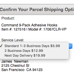
Drop-Down Usability: When You Should (and Shouldn’t) Use Them
Format the “Expiration Date” Fields Exactly the Same as the Physical Credit Card (72% Don’t)
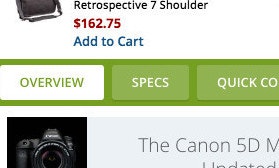
PDP UX: Core Product Content Is Overlooked in ‘Horizontal Tabs’ Layouts (Yet 28% of Sites Have This Layout)
Form Field Usability: Avoid Extensive Multicolumn Layouts (16% Make This Form Usability Mistake)
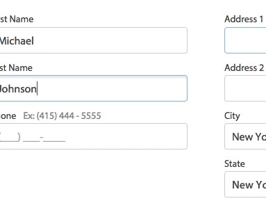
Form Usability: Getting ‘Address Line 2’ Right
See all 387 articles in the full public archive.
Please rotate your device
Netflix case study, inspiration feature.
Spend less time browsing and more time watching
Introduction
- Interface Design
- Future Scope
- Roles & Responsibilities

This is not a real project and we have not worked with Netflix in any official capacity.
Imagine sitting down after a hard days work, wanting to find something new to watch but instead you've found yourself browsing an endless library of thumbnails for over 10 minutes.
You read the odd description, watch the odd preview but it's maybe not the right genre, or you don't have 3 hours to sit through a film. You are stumped.
This sounds familiar doesn't it?
What we wanted to achieve, was an easy to access feature within the app that felt native to the Netflix ecosystem, was quick to use and helped people find something to watch quicker.
We designed an icon that compliments the current set of Netflix assets, striking and obvious. New, yet familiar.
User Interface
The UI of the Inspire feature leans on the existing elements of the Netflix user interface.
We used a segmented control as a way of progressively disclosing further options to refine the search. These controls are an easy way to choose between a movie, a series or a documentary before refining.

The idea for this concept came from two particular frustrations whilst using Netflix.
Struggling to find media of a certain run time
As a result losing time endlessly browsing
The result of these issues generally led to not watching anything at all so with this concept we wanted to change that. The current Netflix search function is a simple text entry system, with this you already need to know what you're looking for or who you want to watch.
The Inspire feature at the most basic level is simply an advanced search, with fields that target the above pain points and get users to media they want to watch quicker.
It is a small feature that offers a very positive impact.
Future enhancements
This concept could be built out to include features such as a Netflix Originals checkbox. We may also take a look in future as to how this solution could work across the entire Netflix ecosystem.
We can help you to do more with digital
Your targets are our targets. We approach every project with empathy, creative thinking and a focus on user experience.
- Find out more
We shared a presentation of the prototype on various social media platforms.
We were not surprised that the feedback reflected our own experiences of using Netflix. Whilst we focused our efforts in this occasion on the Netflix app, these ideas could be applied to most streaming services.
As this was a conceptual RAD project, we took care of the journey mapping, investigation, creative thinking, user interface design and prototyping. Ideas based on experience.
This case study is an example of the work RAD can do by alleviating pain points by implementing small, non-disruptive, changes to the UI to make a big difference in the UX.
We don't need to design projects from the ground up, we can improve products without impacting on existing brand guidelines or design systems.
Get in touch to find out more about our design process.
- 07702 478 940
- [email protected]

NETFLIX SOCIAL

design process

REsearch goals
Research components.
- Market research
- Competitor analysis
- User surveys
- User interviews
Research Plan
Secondary research.

MARKET RESEARCH
- Traditional pay-TV providers lost 1.8 million subscribers in 2018 (USA Today)
- YouTube is the largest video streaming site in the world with over 1 billion users worldwide, with Netflix bringing in the strongest revenue of 15.8 billion in 2018
- 51% of all US streaming service subscribers use Netflix
- 64.5% of digital video viewers in the US watch Netflix at least once a month (eMarketer)

Primary Research
“If I enjoy a show, I want other people to enjoy it also. Why? Because I love when people appreciate things I do and we can then discuss it. Also, it validates my taste in TV shows that others like it.”
“I don’t know how the [recommended] algorithm works but I don’t feel that it’s tailored towards me. If I’m looking for something to watch, and they send me these shows, it’s frustrating when they are so not something I’d like.”
“I would love to be able to recommend or receive recommendations to people through the app.”
QUALITATIVE TAKEAWAYS from questionnaire and interviews
- Overall, research findings showed that the majority of streaming service and Netflix users decide what to watch based on friends’ and families' recommendations.
- Though users vary on whether they watch alone or socially, most report that their choice of selection has to do with recommendations from friends
- Across the research, users expressed a frustration the inaccuracy of recommendation that the app's algorithm develops for them.
Empathy and PERSONA DEVELOPMENT

POINT OF VIEW Statements and How Might We Questions
- How might we help users send and receive recommendations with their friends?
- How might we give users recommendations that better match their interests and mood?
- How might we provide a way to display videos that users are more likely to continue with?
- How might we redesign the categorization so that users spend less time on browsing whilst making the “right-for-them” choice?

SITE MAP AND TasK flow

VISUAL DESIGN

USABILITY TESTING
- Determine the usability of the updated Netflix desktop site and observe how easily a user can complete the supplied tasks
- Make note of any difficulties for further iteration/improvement
- Collect feedback from users on ease of navigating the website

Reflections & Looking Ahead
See more of my work.

- Conversion Optimization
- Growth Marketing
- Digital Analytics
- Brand Marketing
- Digital Marketing
- Digital Psychology
- Ecommerce Marketing
- Product Marketing
- Technical Content Marketing
- Technical Marketing
- Google Analytics 4
- Browse all courses
- CXL Features
- Bottom-of-funnel SEO strategies in tough niches
- Growing AppSumo to 80m with performance marketing
- Account based marketing
- Building a growth process
- Building an innovative product
- Growth mindset: growth vs traditional marketing
- GrowthMaster Training Workshop
- Marketing strategy
- Optimizing Your Growth Process
- Partner Marketing
- Project Management for Marketers
- Retention: the most underrated growth channel
- User-centric marketing
- Data-driven influencer marketing
- Messaging strategy in public relations
- Sales Copywriting & Product Messaging
- Content marketing research
- Content recycling
- Email Marketing: Fundamentals
- Organic Social Media
- Product Marketing Content
- Scaling Content Marketing
- Content strategy and SEO for lead generation
- Growth Focused SEO testing
- On-Page, On-Site & Programmatic SEO
- SEO Link Building
- SEO-Driven Editorial Calendar
- Technical SEO
- Advanced Facebook Ads
- Advanced LinkedIn Ads
- Facebook Ads Creative
- Facebook Ads Experimentation
- Facebook Ads for Beginners
- Google Ads Experiments
- Google Ads for Beginners
- Linkedin Experimentation
- GA4 Intermediate
- Google Analytics 4 for beginners
- Preparing for Your GA4 Implementation
- Special Topics in GTM for GA4
- Attribution
- Data presentation and visualization
- Excel and Sheets for marketers
- Transactional data analysis
- Advanced Google Tag Manager
- Google Tag Manager for Beginners
- The Measurement Matrix
- Advanced Experimentation Masterclass
- CRO Agency masterclass
- Experimentation program management
- Intro to CRO and Experimentation
- Heuristic Analysis frameworks for conversion optimization audits
- Strategic Research for Experimentation
- Voice of Customer data
- A/B testing foundations
- A/B testing mastery
- CRO for Ecommerce Growth
- Good Practices
- Statistics for A/B testing
- Statistics fundamentals for testing
- Testing Strategies
- Applied neuromarketing
- Digital psychology & behavioral design
- Intro to Neuromarketing
- Landing Page Optimization
- People & psychology
- Personalizing for conversion
- Brand strategy
- Positioning
- Radical differentiation
- Integrated Public Relations and SEO
- Storytelling
- Audience building
- Community building
- Community strategy
- Brand tracking 101
- Brand tracking with Momentive
- User research
- Customer storytelling and proof
- Segmentation and Persona Research
- Building a marketing agency
- Managing a remote marketing team
- Marketing Management
- Sales and customer success enablement
- Automation with Apps script
- Data collection on the web
- Data extraction
- Mobile Analytics
- Tag managers
- Python for marketers
- R for marketers
- SQL for marketers
- API Applications
- Cloud computing concepts
- Cloud services
- Intermediate statistics
- Machine learning applications
- Machine learning fundamentals
- Attention Basics
- Decision Making and Emotions
- Learning and Memory
- Building Habits and Loyalty
- Building Trust
- Cognitive Biases
- Nonconscious Motivation
- Principles of Persuasive Design
- Facebook Ads for ecommerce
- Google Ads for Ecommerce
- Google Shopping
- Selling on Amazon: Perfecting Traffic and Conversions
- Ecommerce Content Marketing
- Ecommerce SEO
- Email and SMS Marketing for Ecommerce
- Customer experience for ecommerce
- Customer journey for ecommerce
- Customer segmentation for ecommerce
- Retention and Customer Lifetime Value
- Ecommerce brand strategy
- Ecommerce merchandising
- Personalization for ecommerce
- Promotional events
- Selling on Marketplaces
- Ecommerce data and metrics
- Ecommerce forecasting
- Ecommerce tech stack
- Unit economics for ecommerce
- Competitive intel & market research
- Introduction to product marketing
- Positioning and company storytelling
- Pricing and packaging
- Product Analytics
- Analyst relations
- Product launches
- Hiring product marketers
- Working with the product team
- What is included in All-access
- First time here? See all resources
- Original research studies
- AB test calculator
- Conversion rate optimization guide
- Conversion optimization guide
- Ecommerce best practices
- Bounce rate guide: The foundations
- Clickthrough rate guide: The foundations
- Follow our B2B strategy podcast
- Sign up now
Analyzing Netflix Design, UI and UX: Why It Creates Immersive Experiences

Netflix began in 1997 as a competitor to Blockbuster. Now, it has as many users as the entire population of Canada, UK, and Japan combined.
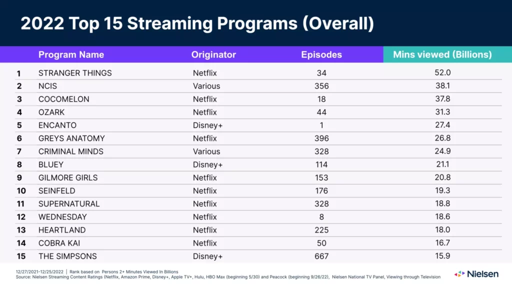
Last year, 10 out of the top 15 most streamed programs in the world were produced by Netflix. It’s is still the king of streaming.
And its customers continue to renew their subscription, even after their attempts to avoid account sharing and their changes in pricings and plans, some of which now display ads.
So, how does a behemoth like Netflix create immersive experiences so captivating that the platform cannot be dethroned by its sea of competition , including Disney+, HBO and Prime Video?
Let’s break down all the elements of Netflix’s UI design and user experience (UX) .
Table of contents
Seamless onboarding process across all devices.
- How Netflix markets its trending original series
Personalization for the win
An email marketing strategy that highlights new content, netflix’s user journey: why it keeps new users hooked.
Unlike other platforms, where the “wow” comes after inputting your credit card information, Netflix reels in new users right from their homepage. The design and copy are minimal, with one goal—signups.

The homepage presents a clean visual hierarchy and is free of clutter, reducing friction between the visitor and the single, straightforward call-to-action to enter an email to get started.
Their unique selling proposition also explicitly describes the biggest benefits and preempts two common FAQs: “Unlimited movies, TV shows, and more. Watch anywhere. Cancel anytime.”
The goal is obvious, the ask is clear, the task is simple.
Together, the USP and UI makeup a value proposition that is optimized for conversions. They are incredibly specific about what they do, include relevant images in the background that support the “unlimited” claim, and feature a value prop booster (i.e. “cancel any time”).
Other elements below the fold that add value include:
- Mention of the numerous platforms Netflix is compatible with, such as game consoles and connected TV devices
- An example of how to download streaming content to watch offline, as well as the ability to stream unlimited movies across all devices
- The provision of child-friendly programming options
- A Frequently Asked Questions (FAQ) section placed directly above a second opt-in form
Here, Netflix has chosen to emphasize its flexibility. Their homepage isn’t offensively long. They use minimal copy to communicate their offering, features, benefits, and FAQs to combat obstacles and sway hesitant buyers.
From there, the user embarks on a short personalized journey. Netflix highlights that there are only three steps, which work to increase motivation to complete the task at hand.

The expectancy-value theory postulates that if the expectation of completing a task is high, and the subjective value is also high, people will be more motivated to follow through. In other words, motivation = expectancy x value. If either one of these factors is missing, motivation easily disintegrates.
By centering “Step 1 of 3”, it dictates that the task will take a short amount of time, thus increasing expectancy. By this stage, the value should already be high (given their strong value proposition, USP, and UX).
On the second screen, they ask you to choose a plan. They again answer the biggest objection upfront to combat hesitancy: “No commitments, cancel anytime.”

Then, you choose your plan. They follow the rule of three when listing out their plans to keep benefits compact and engaging.
This reduces overwhelm and provides ample opportunity to opt out. They list their core benefits again to remind the user why they clicked the signup button in the first place (this works to keep the subjective value high).

Once a user has created an account, Netflix prompts them to choose a few movies or TV titles they enjoy. This data is then used as inputs in the Netflix algorithm to “jump-start” personalized recommendations (more on personalization based on their algorithm in a moment).
Post-signup, the first thing you see is an auto-playing video trailer from one of their original productions that is similar to the preferences selected during onboarding.

The primary CTA is to press “Play” to interact with the platform straight away. Akin to “frustration-free” packaging, a prominent play button motivates engagement and works to keep users on the platform longer.
Once watching commences, their behavior supersedes initial preferences as their algorithm continuously populates the homepage with newly relevant media.
Every streaming option on Netflix also allows a user to thumbs up or thumbs down the content, further instructing the preference algorithm.

For example, when you rate thumbs up for Tiger King, Netflix will show you more true crime documentary series.
The algorithm also estimates “likelihood to watch” based on dozens of metrics, such as:
- Viewing history
- Genre or category
- Time of day watched
- How long the user watched
- Devices currently streaming
- Rating history for similar content
- Other Netflix users with similar preferences on the platform
Their algorithm is continually retrained with specific user signals to improve the accuracy of their recommendations and deliver on their promise of a personalized viewing experience.
Netflix UX lesson #1
- Simplify the user interface. Make your CTA prominent and clear and state your most important benefits next to relevant images.
- Specify the number of steps to complete the signup to increase expectancy and boost motivation. Implement user testing to ensure your UX has minimal barriers to conversion.
- Overcome obstacles by addressing common questions in an FAQ section before your final CTA.
- Emphasize personalization wherever you can. Netflix has taken pains to tailor the experience to users’ expectations.
There are ways you can implement user preferences even if your platform doesn’t use intelligent algorithms. From the beginning, Netflix asked users to state their preferences. They then delivered a customized homepage based on those answers.
Netflix’s sign-up process can be completed on many digital devices, including:
- iPhone, iPad, and iPod Touch
- Smart TV and Streaming Media Players
After registering, a user will be brought to a home screen. They can add a profile by clicking on a simple plus sign icon—another example of efficient UI design.
From here, the user can customize their profile name, add child restrictions, and even add up to four additional profiles for family members or friends to watch across devices anywhere in the world.

To complete the onboarding process, they can customize the type of streaming material they’ll see, including:
- Profile lock
- Maturity level
- Playback settings
- Viewing activity log
- Subtitle appearance
- Language preference
- Specific viewing restrictions
- Personalized TV show and movie suggestions
Netflix’s customization capabilities aren’t necessarily more intelligent than the competition. What helps them differentiate is that they feature them in their onboarding process instead of hiding them in the settings panel.
This allows the user to feel like they’re tailoring a unique experience from the beginning (keeping subjective value high).
Netflix UX lesson #2:
- Another nod to simplification—streamline your onboarding and login screen. Include only the most necessary buttons and copy, and where possible, exchange text for universally understood symbols.
- Give your users the ability to customize their experience. You may already have opportunities to do this in your settings, such as setting language or notification preferences.
- Let users know about this or walk them through the preference set up in the onboarding stage.
As with the rest of their user journey, the beginning is simple, easy, and customer-focused. Once users get into the platform, they’re given an abundance of choice—starting with Netflix’s original content.
Putting an emphasis on original productions
Right above the fold are the latest trending content and Netflix originals. The original productions are made to be larger than any other content to communicate their value.

Recent years have seen a steep increase in the number of households cutting ties with traditional paid TV and opting for other viewing platforms. This trend of cord-cutting and streaming preference was exacerbated by the pandemic and is forecast to continue.

“Consumers are choosing to cut the cord because of high prices, especially compared with streaming alternatives. The loss of live sports in the late years contributed to further declines. While sports have returned, people will not return to their old cable or satellite plans.” – Eric Haggstrom , eMarketer forecasting analys
With this shift has come an increased demand for “streaming originals,” which Netflix has dominated since 2012. Over the past few years, Netflix has grown from just eight hours of original content to nearly 3,000 hours of Netflix originals .
According to Nielsen research , 10 out of the top 15 most popular original video content among streaming providers in the U.S. in 2022 were produced by Netflix.
Original Netflix series such as Orange Is the New Black, Stranger Things, and Black Mirror have become cult classics among modern television enthusiasts. More than 105 million users have watched at least one episode of Orange Is the New Black alone, according to an exclusive interview with ex-executive Cindy Holland.
Though the platform’s ease of use may have exploded their popularity, it’s these original productions that continue to add value to a user’s subscription.
The success of these series has bred innovative tactics that draw users deeper into the Netflix catalog. For each original series, Netflix will develop a dozen thumbnail options that will rotate depending on a user’s specific interests. This tactic is referred to as “ artwork personalization ”.
Take a Netflix original production such as Stranger Things, for instance. If a user has expressed interest in comedies, their platform will display a lighthearted Stranger Things thumbnail with the kids dressed as Ghostbusters. But if a user were to routinely watch crime dramas, Netflix would display a more serious thumbnail of a police officer looking over a foggy pumpkin patch.

This active personalization and consideration of a user’s preferences is one reason why Netflix’s retention rate has remained so consistent over time.
How Netflix markets its trending original series

Netflix updated its product design to replace still images with video trailers that auto-play as soon as a customer starts scrolling.
In the example above, hovering over My Unorthodox Life auto-plays a video trailer about how Julia Haart went from escaping a cult to a successful New York City CEO in seven years.
This UX tactic envelops users in potential binge-watch material, providing a quick view of content that may have been skipped over without the trailer.
Netflix UX lesson #3:
- Give your high-value content pride of place. Feature it prominently, give it a badge, promote it with video, or find another way to help it stand out among the crowd.
- Continually add value to your platform. Netflix does this through its original content.
- If possible, tailor your high-value content to each segment. Netflix does this through the algorithm’s selection of content and their thumbnail design.
We’ve learned about Netflix’s simple, customer-centric user journey that gets users into the platform quickly and easily. Now let’s look at how they’ve mastered the art of keeping them there.
A retention strategy that puts personalization at the forefront
Research from Parks Associates indicates that the average Netflix user has had their subscription for more than 50 months.

On average, two-thirds of users still pay for the service one year after joining. For comparison, only 53% of Hulu users are still signed up in the same timeframe.

The popularity among existing users may also explain why new users are so attracted to the idea of subscribing.
During the early months of the COVID-19 pandemic, in which many Americans cut back on frivolous spending, Netflix experienced the biggest growth spurt in its history. The company added 15.77 million subscribers in the first three months of 2020 alone.
Netflix’s growth has slowed as the pandemic eases, but they’re still a consumer favorite.
For the users that do want to cancel, Netflix makes the process easy while still giving them opportunities to change their minds or come back at any time.

What else can we learn from the platform about how to keep users around for longer?
Personalization is a major factor in why Netflix boasts such high retention rates. As we mentioned above, even thumbnail images on Netflix are customized to match exactly what each user would prefer to see.
In each row below the fold of the homepage, there are three layers of personalization:
- The choice of a row, such as Continue Watching, New Releases, Trending Now, and Because You Watched
- The choice of titles within the row, such as new comedies within New Releases for users who prefer humor
- The ranking of chosen titles, such as placing a romantic comedy before a children’s comedy for users who enjoy more explicit material
In each row of recommendations, the Netflix algorithm weighs dozens of different factors (which they keep close to the chest) to present what they believe a user will want to watch at that moment.
For shows you’ve already started watching, the primary button changes from “Play” to “Resume”. It also prominently displays what episode you are on as well as episode progress.

Offering so much choice may seem like a luxury held in reserve for only the most successful platforms. But leveraging this power of selection has driven their success—and the competition has cottoned on. Hulu, Amazon Prime, and Disney+ all offer ample options to choose from, too.

Netflix also runs a consistent email marketing strategy that highlights new content on the platform. They also invite stagnant users to check out the latest developments in shows they’ve previously watched to spark reengagement.
After an initial welcome email, they typically send out four to seven emails per month to subscribers. Though highly personalized to a user’s watching history, the email subjects typically include:
- New Netflix original content
- New seasons of a show a user previously watched
Netflix utilizes a standardized template that allows it to maintain consistent branding across all messaging . The template also allows for GIFs and moving images to grab and hold a reader’s attention.
Within the email, users can add shows straight to their list or get started watching.
Netflix UX lesson #4:
- Give users the opportunity to choose. Let them personalize their experience and give them as many options as you can allow.
- Make cancellation painless, but offer opportunities for users to change their minds. Netflix does this by offering to keep in touch via email (and then showing users what they’re missing regularly throughout the month).
- Remind users to return to the platform repeatedly through an engaging email marketing strategy.
Of all the streaming platforms, Netflix is the one service that continues to reign supreme, year after year. Both their cutting-edge UI and UX design and high-performing original content keep users engaged and returning.
From a simple interface to highly customized recommendations, Netflix has managed to create a truly immersive experience.
To replicate an experience that rivals Netflix, startup founders should pay keen attention to visual hierarchy. Avoid clutter, keep content highly personalized, and always keep your targeted call-to-action front and center.
Working on something related to this? Post a comment in the CXL community !
Related Posts

Ghost buttons are transparent calls to action found on websites and apps. They tend to…

Don't design your own website. No, really. It will suck. You might think that since…

Best practices are starting points: If you have no data, start with these. They are…

Typography is the detail and the presentation of a story. It represents the voice of…

Erica Schneider
Erica is Head of Content & Operations at Grizzle, a content marketing & SEO agency that helps SaaS and technology brands achieve organic growth and build media empires.
Join the conversation Add your comment
You’re right! Netflix has definitely created immersive usability. The #1 thing every business owner and company NEEDS to scale. If the product/service gets results – and has high usability – it’ll do exceptionally well. Great article, people underestimate the thought put into even simple campaigns done by large companies. Good stuff here!
Comments are closed.
Current article:
Search posts.
- Acquisition (190)
- Audio posts (5)
- Business Building (115)
- Copywriting (43)
- CRO & Testing (316)
- Customer Stories (7)
- Digital Analytics (67)
- Google Analytics (26)
- Marketing Tactics (50)
- Original Research (15)
- Psychology (88)
- Social Media (23)
- The Pe:p Show (49)
- User Experience & Persuasive Design (180)
Being the best is achieved through consistency
Join 130,000+ growth marketers, optimizers, analysts, and UX practitioners and get a weekly email that keeps you informed.
- Your business e-mail *
- I agree to receive updates from CXL.
- Name This field is for validation purposes and should be left unchanged.
IMAGES
VIDEO
COMMENTS
Introducing Netflix Discovery — A new discovery experience. This UX study will mainly focus on how to make the user experience more pleasant for the everyday user. We based the research process through various methods and built our visual hierarchy and UI based on results from interviewing and testing our target group.
In the ever-evolving landscape of digital entertainment, Netflix stands as a beacon of success, reshaping the way we consume content. This case study delves into the user experience (UX) strategies employed by Netflix, examining key elements that contribute to its widespread popularity.
Netflix is a global streaming giant with an approximate net worth of $125 billion. With a little over 20 years, Netflix could foresee the future and, more importantly, user needs. To consume entertainment of our own will and get to choose from a plethora of options felt liberating, and Netflix gave us just about that.
Consistency with Existing UI: Studying and incorporating the existing UI elements and interactions used by Netflix ensures that your solution aligns with the platform's established design language. 02. Personalization: Offering a personalized experience to users is crucial for improving user satisfaction and enhancing content discovery. 03.
The Problem with Netflix — A UX Case Study. As new streaming services such as Apple and Disney are entering into battle with the likes of Netflix, Amazon Prime and Hulu users are starting to ...
3. Well-designed UI. Netflix also features good user interface design principles, such as: These all help to guide the user through the process of navigating the site, and helps to hence reduce the cognitive overload (from the presence of so much information and titles) for a better user experience. 4.
Here are four lessons that we can learn from Netflix: Keep a simple user interface with clear CTAs that make users want to click. Focus on personalisation as much as you can; users need to feel that they are listened to and understood. Provide a tailored user experience whenever you can; this will make your customers engage with your product ...
This is a case study of Netflix's e-commerce user experience (UX) performance. It's based on an exhaustive performance review of 255 design elements. 243 other sites have also been benchmarked for a complete picture of the e-commerce UX landscape. Netflix's overall e-commerce UX performance is decent. This is mainly due to good Site-Wide ...
This case study is an example of the work RAD can do by alleviating pain points by implementing small, non-disruptive, changes to the UI to make a big difference in the UX. We don't need to design projects from the ground up, we can improve products without impacting on existing brand guidelines or design systems.
Hence we'll try to make it a little better in and easier for users. History of where the user left the video also helps the with continuity and hence be maintained. 3. The Solution. 1 Added ...
In summary, this case study showcases how user-centric design and strategic enhancements transformed the Netflix experience. Our redesigned homepage, with tailored categorization and user-friendly ...
Jul 20, 2021. --. N etflix is undoubtedly the top streaming site for today's generation. It offers a multitude of watchable content. With its smooth UI and several functionalities, Netlfix presents a pleasant user experience for the everyday user. Although a choice paradox affects Netflix, this case study will only discuss the pleasing user ...
Netflix is known for doing a lot of UX research, and it shows. They have an experience that feels tailored to the user, recommending appropriate content, with the best thumbnail, to be watched with the click of a button. That's why, no matter how good the shows from other apps are, Netflix still covers a lot of ground, and will probably ...
90 sec or Bust. "Consumer research suggests that a typical Netflix member loses interest after perhaps 60 to 90 seconds of choosing, having reviewed 10 to 20 titles (perhaps 3 in detail) on one or two screens," they write. "The user either finds something of interest or the risk of the user abandoning our service increases substantially.".
Netflix: UX Case Study. 2021 | Timeline: 15 weeks | UX Research & Design . Overview. ... DISCLAIMER: It should be noted that this case study is the outcome of a college project, and was undertaken as an academic exercise completed at Humber College. The information used does not represent the views of Netflix or any other individuals referenced ...
Netflix was founded in 1997 as a DVD delivery service. Today it now has over 139 million subscribers worldwide and acts as a leading streaming service that allows its customers to watch a wide variety of award-winning TV shows, movies, documentaries, and more on thousands of internet-connected devices. ... Client: Netflix Project type: UX/UI ...
Yeah, me too. As someone who lives and breathes UI/UX design, I recently embarked on an exhilarating adventure to redesign Netflix's landing page. Buckle up, because I'm about to take you on a ride through my design process, sprinkled with insights, aha moments, and a little bit of Netflix love.
This UX tactic envelops users in potential binge-watch material, providing a quick view of content that may have been skipped over without the trailer. Netflix UX lesson #3: Give your high-value content pride of place. Feature it prominently, give it a badge, promote it with video, or find another way to help it stand out among the crowd.
One study by Time Warner revealed a particularly valuable insight: a viewer's emotional engagement with television content is 1.3 times higher when watching with others than when watching alone. Here's the fascinating part: the same increase in engagement is found when a viewer is physically alone but interacting on social media (live ...
Divesh Borse. Pune, India. Message. NETFLIX - UX Case Study 2020. This Project is conceptual design of Netflix product. It's been studied and observed only for educational purpose in which the features enhanceme Read More. 144. 5.4k. 2.
UI/UX,Web Design,Product Design,Figma. Navigate to adobe.com opens in a new tab © 2024 Adobe Inc.
Who needs brevity when you can drown your readers in an ocean of text? The more words, the better! Fill your case study with so much volume of text that it makes the reader think it's actually legit. Forget about visuals or concise explanations. Just keep writing and writing until you've created the War and Peace of UX case studies.
The problem statement for this case study has been sourced from a tweet by @_nightsweekends, which can be found at → Link. ⌛TL;DR: If you're pressed for time, check out → Link. Context- FunkFiesta, a concoction of beats, bytes, and brushstrokes, is a whimsical EDM extravaganza dreamt up solely for this case study. 🔖Objective: