
The UX of AI
Using Google Clips to understand how a human-centered design process elevates artificial intelligence
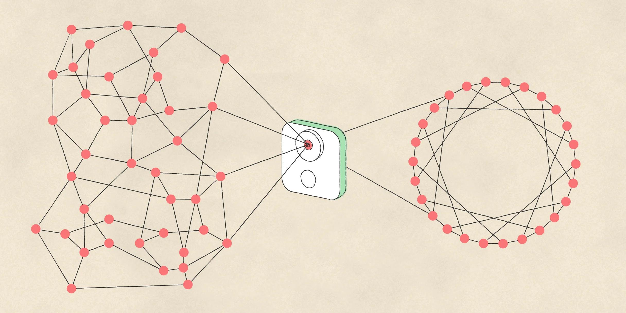
As was the case with the mobile revolution, and the web before that, machine learning will cause us to rethink, restructure, and reconsider what’s possible in virtually every experience we build. In the Google UX community, we’ve started an effort called “ human-centered machine learning ” to help focus and guide that conversation. Using this lens, we look across products to see how machine learning (ML) can stay grounded in human needs while solving for them—in ways that are uniquely possible through ML. Our team at Google works across the company to bring UXers up to speed on core ML concepts, understand how to best integrate ML into the UX utility belt, and ensure we're building ML and AI in inclusive ways .
Real moments of parents, kids, and pets captured by the Google Clips camera.
Google Clips is an intelligent camera designed to capture candid moments of familiar people and pets. It uses completely on-device machine intelligence to learn to only focus on the people you spend time with, as well as to understand what makes for a beautiful and memorable photograph. Using Google Clips as a case study, we’ll walk through the core takeaways after three years of building the on-device models, industrial design, and user interface—including what it means in practice to take a human-centered approach to designing an AI-powered product.
Clips allows you to select the perfect frame (above, left) and save it as a still (above, right). In this instance, I clipped the camera onto a basketball hoop to capture the moment just before my son made a basket.
Just getting more UXers assigned to projects that use ML won’t be enough. It’ll be essential that they understand certain core ML concepts, unpack preconceptions about AI and its capabilities, and align around best-practices for building and maintaining trust. Every stage in the ML lifecycle is ripe for innovation, from determining which models will be useful to build, to data collection, to annotation, to novel forms of prototyping and testing.
We developed the following truths as anchors for why it’s so important to take a human-centered approach to building products and systems powered by ML:
- Machine learning won’t figure out what problems to solve. If you aren’t aligned with a human need, you’re just going to build a very powerful system to address a very small—or perhaps nonexistent—problem.
- If the goals of an AI system are opaque, and the user’s understanding of their role in calibrating that system are unclear, they will develop a mental model that suits their folk theories about AI, and their trust will be affected.
- In order to thrive, machine learning must become multi-disciplinary. It's as much–if not more so—a social systems challenge as it's a technical one. Machine learning is the science of making predictions based on patterns and relationships that've been automatically discovered in data. The job of an ML model is to figure out just how wrong it can be about the importance of those patterns in order to be as right as possible as often as possible. But it doesn't perform this task alone. Every facet of ML is fueled and mediated by human judgement; from the idea to develop a model in the first place, to the sources of data chosen to train from, to the sample data itself and the methods and labels used to describe it, all the way to the success criteria for the aforementioned wrongness and rightness. Suffice to say, the UX axiom “you are not the user” is more important than ever.
Three ways human-centered design elevates AI
Addressing a real human need
This year, people will take about a trillion photos, and for many of us, that means a digital photo gallery filled with images that we won’t actually look at. This is especially true with new parents, whose day-to-day experience is full of firsts. During moments that can feel precious and fleeting, users are drawn to their smartphone cameras in hopes of capturing and preserving memories for their future selves. As a result, they often end up viewing the world through a tiny screen instead of interacting using all their senses.
As a new parent, your gallery might look a lot like mine did—tons of smartphone photos taken in rapid succession, in an effort to capture the perfect cute expression.
What if we could build a product that helped us be more in-the-moment with the people we care about? What if we could actually be in the photos, instead of always behind the camera? What if we could go back in time and take the photographs we would have taken, without having had to stop, take out a phone, swipe open the camera, compose the shot, and disrupt the moment? And, what if we could have a photographer by our side to capture more of those authentic and genuine moments of life, such as my child’s real smile? Those moments which often feel impossible to capture even if one is always behind the camera. That’s what we set out to build.
Guiding the intelligence
When we started the process, the most pressing question was: if people take tons of photos but don’t actually want to go back and curate them, how will we label ground truth? This is where the foundational “HCML exercise” was born: Describe the way a theoretical human “expert” might perform the task today. The theory was twofold: First, if a human can’t perform the task, then neither can an AI; second, by diving deep into the methods of an expert, we can find signal-to-guide data collection, labeling, and component model architecture.
The closest approximation I could think of was a wedding photographer, so I set out to interview and hire contractors using a sufficiently ambiguous job posting (secret project! photography!). We ended up discovering—through trial and error and a healthy dose of luck—a treasure trove of expertise in the form of a documentary filmmaker, a photojournalist, and a fine arts photographer. Together, we began gathering footage from people on the team and trying to answer the question, “What makes a memorable moment?”
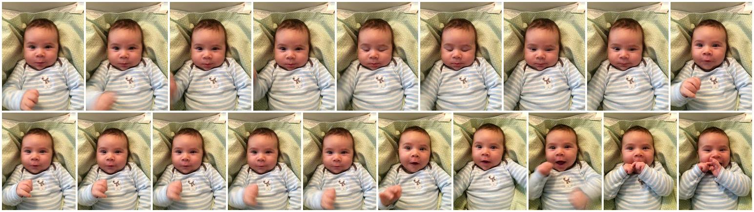
It's important for us to recognize the amount of nuance, aesthetic instincts, and personal history that we often take for granted when evaluating the quality of our photos and videos. For example, I crack up every time I watch my younger son exploring the subtleties of a twisty straw (far left) or trying to juke my kisses (middle). And I well up with pride when I watch my older son on his bike at the park (far right), because I remember that day as a turning point in his self-confidence to ride on his own.
Building trust
The starting point for our work was an assumption that we could ‘show’ the model the stuff we thought was beautiful and interesting, and it would, y’know, learn how to find more. We had romanticized conversations about depth of field, rule of thirds, dramatic lighting, match cuts, storytelling … but what I learned was that we should never underestimate the profound human capability to wield common sense.
These early experiments exposed crucial technical and methodological gaps that helped us reassess our assumptions about what the product could realize, as well as take stock in the unprecedented nature of the work. We shifted our paradigm from putting ML on a pedestal to understanding that it can only learn effectively under quite reductionist framings. Basically, we were trying to teach English to a two-year-old by reading Shakespeare instead of Go, Dog. Go! . This was where the myth of the AI ‘monolith’ crashed hardest for me; the idea that there’s some singular ‘intelligence’ that understands all things and can generalize and transfer knowledge from context to context. Nope. Not even close.
Back to basics
Consistency is the name of the game when trying to teach anything. It’s why we wait as long as possible to unleash the madness of O-U-G-H (e.g. tough, through, thorough) on children when teaching them how to read and speak English. Spelling and pronouncing words like cat , bat , and sat , with their predictable “at” sounds, is so much more consistent!
With consistency comes confidence. Think about how quick—and eager—most students are to point out incongruity when a teacher provides two examples that don’t seem to line up. Algorithms provide no such feedback. As far as an algorithm is concerned, everything they’re shown is of equal value unless directed otherwise. For Clips, that meant we not only needed consistency between examples, but also within each example. Every individual frame needed to be representative of the specific prediction we’re trying to teach it to make. And often that can come in the form of teaching it what to ignore.
We needed to train models on what bad looked like: hands in front of the camera, quick and shaky movements, blurriness.
We used examples like the above to train machine learning models to recognize when the camera was inside a pocket or purse (above, left), or when a finger or hand was in front of the lens (above, right). While it wasn’t immediately intuitive to train models to ignore things, over time it became a crucial strategic piece in our design. By ruling out the stuff the camera wouldn’t need to waste energy processing (because no one would find value in it), the overall baseline quality of captured clips rose significantly.
Composition
We needed to train models about stability, sharpness, and framing. Without careful attention, a face detection model will appreciate a face at the edge of the frame just as much as one in the center.
In an effort to train a model about subject continuity, it was important to specifically highlight examples. Compare the moment where my younger son stays in the shot the whole time (above, left) to the moment where my older son is only in focus and in frame for about five percent of the moment (above, right).
Social norms
Familiarity is such a cornerstone of photography. You point a camera at someone and they offer implicit consent by smiling or posing. Moreover, you’re the one looking through the viewfinder framing and composing the shot. With an autonomous camera, we had to be extremely clear on who is actually familiar to you based on social cues like the amount of time spent with them and how consistently they’ve been in the frame.
Diversity and redundancy is something we take for granted in the way we shoot photos; there’s a little voice in the back of our head saying, “You haven’t seen anything like this!” Or, “You’ve got enough shots of your kid for now, relax.” But our models needed a lot of help.
We approached diversity along three different vectors:
- Time : The simple value of time passing is an important signal to appreciate. Don’t go too long without capturing something.
- Visual : Subtle or dramatic changes in color can tell a lot about changes in environment and activity. Try to capture moments that have distinct aesthetic qualities.
- People :Are you in a big group or a small group or alone? Understanding how many different familiar faces you’re encountering is a crucial part of feeling like you haven’t missed important moments.
I put Clips at the edge of a bookshelf pointing down, which provided a cool angle to watch my kids building together. It also meant I was showing the camera a bunch of very similar content over a lengthy chunk of time. Avoiding unwanted redundancy without missing too many moments was—and continues to be—a wonderfully complex UX challenge.
Trust and self-efficacy
One of the reasons we invested in Clips was because of how deeply important it was to demonstrate the importance of on-device and privacy-preserving machine learning to the world—not to mention its remarkable capabilities (e.g. it uses less power, which means devices don’t get as hot, and the processing can happen quickly and reliably without needing an internet connection). A camera is a very personal object, and we’ve worked hard to ensure it—the hardware, the intelligence, and the content—ultimately belongs to you and you alone. Which is why everything—and I mean everything—stays on the camera until the user says otherwise.
Concept budgeting
With an eye on trust and self-efficacy, we were also very intentional in the way we approached UI design. At the start of the project, that meant working through a few of our own funny assumptions about how “out-there” an AI-powered product needed to be.
When we reach into our brains for future-tech reference points, many designers will jump to the types of immersive experiences seen in movies like Minority Report and Blade Runner . But just imagine of how crazy it’d be to actually explain something like the UI in Minority Report to users: Here, just extend your arm out, wait two seconds, grasp at thin air, then fling wildly to the right while rotating your hand counter-clockwise. It’s easy! Almost every sci-fi faux UI is guilty of something similar; as if the complexity of an interaction model needs to keep pace with the complexity of the system it’s driving. But that’s sort of where we were for awhile during our early design phase, and we got away with it in large part for three reasons:
- We were showing people fake content in an obviously simulated environment, where they had no real connection to the imagery. Note that this issue isn’t unique to AI; it’s often one of the confounding factors when you bring people into the usability lab.
- We were surrounded by people every day who were all speaking the same language; thinking deep thoughts about AI-enabled futures. We were making the mistake of losing touch with the reference points that everyone else would bring to the table.
- We thought our new designs were super cool, so we gave ourselves a healthy amount of forgiveness when people didn’t immediately get it.
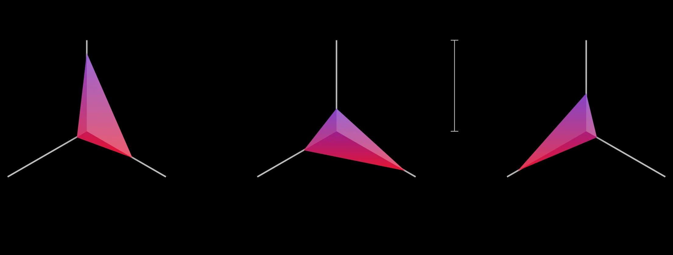
Most products have at least some learning curve, but with the added overhead of AI hype, it’s especially important to ‘spend’ wisely on your user’s cognitive load. When the context of use is novel to the user [figure A], bias for dependability. When there are a lot of new UI tricks to learn [figure B], make sure the primary use cases are super relatable. And when the functionality of the product is especially dynamic [figure C] , your UI should be flush with familiar patterns.
Over time, we snapped out of it. We began fiercely reducing complexity in the UI, and made control and familiarity cornerstones of our experiential framework. We added a software viewfinder and a hardware capture button to the camera. We made sure that the user had the final say in curation; from the best still frame within a clip to its ideal duration. And we showed users more moments than what we necessarily thought was just right , because by allowing them to look a bit below the ‘water line’ and delete stuff they didn’t want, they actually developed a better understanding of what the camera was looking for, as well as what they could confidently expect it to capture in the future.
Through this process we discovered another critically important finding for testing an AI-powered product: fake it till you make it. If forced to choose, it’s leaps-and-bounds more useful to prototype your UX with a user’s real content than it is to test with real ML models. The latter takes an incredibly long time to build and instrument (and is far less agile or adaptive than traditional software development, so it’s more costly to swing and miss), while the former affords you genuine insights into the way people will derive value and utility from your (theoretical) product.
Users preview their clips by streaming them from the camera. On the far left, users choose which clips they want saved to their phone. In the middle, users can toggle on a “suggested” view. On the right, users can pinpoint the exact frame they want to save as a still photo.
In the context of subjectivity and personalization, perfection simply isn’t possible, and it really shouldn’t even be a goal. Unlike traditional software development, ML systems will never be “bug-free” because prediction is an innately fuzzy science. But it’s precisely this fuzziness that makes ML so useful! It’s what helps us craft dramatically more robust and dynamic ‘if’ statements, where we can design something to the effect of “when something looks sort of like x, do y.” And in that departure from rigid logic rules, we also needed to depart from traditional forms of measuring engagement. Success with Clips isn’t just about keeps, deletes, clicks, and edits (though those are important), it’s about authorship, co-learning, and adaptation over time. We really hope users go out and play with it.
Designing with purpose
By re-orienting the conventional AI paradigm from finding ways to make the machine smarter, to exploring ways to augment human capability, we can unlock far greater potential in machine learning. It can become a tool for unprecedented exploration and innovation; a tool to help us seek out patterns in ourselves and the world around us. As human-centered practitioners, we have a tremendous opportunity to shape a more humanist and inclusive world in concert with AI, and it starts by remembering our roots: finding and addressing real human needs, upholding human values, and designing for augmentation, not automation.
The role of AI shouldn’t be to find the needle in the haystack for us, but to show us how much hay it can clear so we can better see the needle ourselves.
For more on Google’s approach to UX for AI, check out our full collection of articles *.*
Product Design Bundle and save
User Research New
Content Design
UX Design Fundamentals
Software and Coding Fundamentals for UX
- UX training for teams
- Hire our alumni
- Student Stories
- State of UX Hiring Report 2024
- Our mission
- Advisory Council
Education for every phase of your UX career
Professional Diploma
Learn the full user experience (UX) process from research to interaction design to prototyping.
Combine the UX Diploma with the UI Certificate to pursue a career as a product designer.
Professional Certificates
Learn how to plan, execute, analyse and communicate user research effectively.
Master content design and UX writing principles, from tone and style to writing for interfaces.
Understand the fundamentals of UI elements and design systems, as well as the role of UI in UX.
Short Courses
Gain a solid foundation in the philosophy, principles and methods of user experience design.
Learn the essentials of software development so you can work more effectively with developers.
Give your team the skills, knowledge and mindset to create great digital products.
Join our hiring programme and access our list of certified professionals.
Learn about our mission to set the global standard in UX education.
Meet our leadership team with UX and education expertise.
Members of the council connect us to the wider UX industry.
Our team are available to answer any of your questions.
Fresh insights from experts, alumni and the wider design community.
Success stories from our course alumni building thriving careers.
Discover a wealth of UX expertise on our YouTube channel.
Latest industry insights. A practical guide to landing a job in UX.
3 real-world UX research case studies from Airbnb, Google, and Spotify—and what we can learn from them
All successful products have at least one thing in common: they’re driven by thorough and ongoing UX research. Learn how the biggest brands conduct user research with these real-world case studies from Airbnb, Google, and Spotify.

Free course: Introduction to UX Design
What is UX? Why has it become so important? Could it be a career for you? Learn the answers, and more, with a free 7-lesson video course.

User research is the foundation of good design. Any successful product you can think of is driven by user insights. And, while all UX designers tap into the same pool of tools and techniques, you’ll find that every team has their own unique approach to user research.
Are you curious about how some of the biggest brands conduct UX research? Then keep reading. In this post, we take a deep dive into three real-world UX research case studies:
- Airbnb: The power of observing behaviour to uncover design opportunities
- Google for Education: The importance of user feedback for rapid product adaptation
- Spotify: The value of human perspectives in a data-driven world
Each of these case studies teaches us a valuable lesson about UX research—lessons you can apply to your own design projects. So let’s jump in!
[GET CERTIFIED IN USER RESEARCH]
UX research case study #1: Airbnb and the power of observing user behaviour to uncover design opportunities
Oftentimes, user research is planned in advance and conducted within a controlled setting—think user interviews , or analysing how people interact with your website over a specific period of time.
But sometimes, user research occurs organically—like an accidental light shining on a major design opportunity. That’s exactly what happened at Airbnb, leading to the design and launch of a new global check-in tool.
Vibha Bamba, Design Lead on Airbnb’s Host Success Team, writes:
“The decision to design the tool was informed by an intriguing host behaviour. We noticed that about 1.5 million photo messages were being sent from host to guest each week—the majority of them to explain location and entry details. Photos of the home were juxtaposed with maps, lockbox locations were described, and landmarks were called out.”
Observing these behaviours over time, the Airbnb team realised that there was a huge opportunity to make the exchange between hosts and guests much more seamless and consistent. This kicked off a year-long project to design a global check-in tool for the Airbnb platform.
The result? An integrated check-in tool that enables hosts to create visual check-in guides for their guests. They can upload photos and instructions which the tool will translate depending on the guests’ preferred language, and the guides can be accessed both on and offline.
And, after launching the tool, the team continued to observe how hosts used it. They were able to flag issues and further design opportunities, adapting and evolving the check-in tool to better meet hosts’ needs. That’s the power of observing user behaviour!
The takeaway
User behaviour provides us with incredibly rich insights. Don’t rely solely on planned or periodic user research—continuously observe how people interact with your product in the wild, too. You don’t know what you don’t know, and this approach will help you to uncover design opportunities you may not have even thought to look for otherwise.
Read the full UX research case study here: Leveraging Creative Hacks: How the Airbnb Community Inspired a Global Check-in Tool .
[GET CERTIFIED IN UX]
UX research case study #2: Google for Education and the importance of user feedback for rapid product adaptation
When the Covid-19 pandemic hit, our lives changed almost overnight. Many of us were suddenly working from home, navigating new challenges of communicating and collaborating remotely.
Teachers were no exception. They had to quickly adapt to teaching online, relying on tools like Google Meet to conduct lessons virtually. But Google Meet was originally designed as a conferencing tool for businesses, so the user experience for teachers and students wasn’t ideal.
In the words of one tech admin speaking to the Google Meet team:
“Students are using the tools in a way that makes it hard for teachers to do their job. Teachers can’t mute students, or put them in groups, they can’t ask questions easily to take the temperature of the class. Students are also jumping on the video without supervision—and that’s an issue. I wish there was more control.”
The Google Meet team needed to act fast to figure out how the software could better meet teachers’ needs. To do this, they went straight to the source, gathering user feedback directly from teachers.
Based on this feedback, they added a range of new features such as attendance taking, hand raising, waiting rooms, and polls.
The result? A rapidly improved user experience for teachers and students which ultimately benefited all Google Meet users.
Sometimes, UX designers must think and act fast; there’s not always time for lengthy user research and cautious feature rollouts. When you need to adapt and evolve a product to quickly improve the user experience, it pays to go straight to your users for their feedback.
Read the full UX research case study here: Adapting Products to Meet Teachers’ Changing Needs .
UX research case study #3: Spotify and the value of human perspectives in a data-driven world
Data is a powerful research tool. It enables you to gather and analyse broad and vast user insights, to make evidence-backed decisions, and to track and measure important UX KPIs .
But, as Nhi Ngo, Insights Manager, User Research & Data Science at Spotify will tell you, it’s important not to become over-reliant on data when conducting UX research. Sometimes, making the best design decision boils down to a human perspective.
Nhi Ngo came to this realisation when developing and launching a feature called “Shortcuts” on the Spotify Home tab. Powered by machine learning, Shortcuts is a dedicated space that showcases the user’s current favourites, as deduced by Spotify’s algorithms.
The feature was developed based on data collected through a variety of research methods, including longitudinal user studies and A/B testing .
So far, so good. But when it came to deciding on a name for the feature, A/B tests came back inconclusive.
In the end, the name was decided based on the product designer’s instinct to go with the name that would create the most human and personal experience. Nhi Ngo explains:
“A few candidates that were tested were ‘Listen Now’ (the objective that the model optimizes for), ‘Shortcuts’ (the user-facing functionality), ‘Quick Access’ (a UX goal of this space), and last but not least, a daypart greeting, ‘Good morning’ (that would change with the time of day to ‘Good afternoon’ or ‘Good evening’). We were counting on the AB test to help us make this important decision. The test returned neutral. Our designer recommended we go with the daypart name, much to my reservations.
Indeed, participants were most often positively surprised in our interview sessions whenever they opened their phone and saw the greetings. Convinced by our designer’s humanistic approach and recognising the intangible benefits of providing users with this joy of being ‘greeted by Spotify’, we decided to go with our perspective-taking as humans to humans, and chose the daypart name.”
The result? A new product feature that evoked delight in Spotify’s users and led to further improvements, such as incorporating more time-based features in the model so that the recommendations changed depending on the time of day (for example, showing sleep music playlists at night).
Data-driven research is an extremely powerful tool, but it may not always give you the full picture or a conclusive answer. Whenever you conduct and interpret research data, it’s important not to lose sight of your human perspective.
In the words of Nhi Ngo: “When data can’t give you a definitive answer, it is OK to be human and make a human decision. Prioritise user joy; treat them as you would any human in your life.”
Read the full UX research case study here: It’s OK to be Human in a Machine-Learned World .
Learn more about UX research
All of these ux research case studies emphasise the importance of user research in UX design . If you’d like to learn more about UX research, check out the 9 best UX research tools , read about a day in the life of a UX research manager with Google’s Dr. Stephen Hassard , and master the art of analysing your UX research and pulling out useful insights in this guide .
- ux research
Subscribe to our newsletter
Get the best UX insights and career advice direct to your inbox each month.
Thanks for subscribing to our newsletter
You'll now get the best career advice, industry insights and UX community content, direct to your inbox every month.
Upcoming courses
Professional diploma in ux design.
Learn the full UX process, from research to design to prototyping.
Professional Certificate in UI Design
Master key concepts and techniques of UI design.
Certificate in Software and Coding Fundamentals for UX
Collaborate effectively with software developers.
Certificate in UX Design Fundamentals
Get a comprehensive introduction to UX design.
Professional Certificate in Content Design
Learn the skills you need to start a career in content design.
Professional Certificate in User Research
Master the research skills that make UX professionals so valuable.
Upcoming course
Build your UX career with a globally-recognised, industry-approved certification. Get the mindset, the skills and the confidence of UX designers.
You may also like
Build your UX career with a globally recognised, industry-approved qualification. Get the mindset, the confidence and the skills that make UX designers so valuable.
6 August 2024
New! Enroll now in the Google AI Essentials course and learn how to boost your productivity. Zero experience required.
Here to help you grow
Whether you're looking to build your business, develop your career, or learn new AI skills, we can help you get started.
What can we help you with?
And what would you like to do?
- Show me everything
- Learn AI skills
- Prepare for a new job
- Develop communication skills
- Increase my productivity
- Learn about digital marketing
- Learn coding & development skills
- Get started with cloud computing
- Stay safe online
- Learn design skills
- Improve my digital wellbeing
- Champion diversity
- Learn about sustainability
- Understand my audience
- Start selling online
- Expand internationally
- Keep my business safe online
Get started with AI
AI has the potential to transform the way we learn and work. Explore the range of training Google offers to help you gain essential AI skills, boost your productivity, or even get you started on a new career path.

Grow your career
Whether you're writing your first CV or deepening your technical knowledge, our library is full of ways to sharpen your digital skillset.

AI Essentials
Learn from AI experts at Google and get in-demand skills to boost your productivity and use AI in the real world. Zero experience required.

Google Career Certificates
Earn a Google Career Certificate to prepare for a job in a high-growth field like Data Analytics, UX Design, and more.

Introductory digital skills courses
Get started with a range of digital skills, with entry level courses in everything from online marketing to coding.

Cloud computing fundamentals
From intro to advanced-level learning, find out more about cloud computing principles and career paths.

Google product trainings
Learn how to get the most out of the Google products you use, like Google Ads or Analytics.
Grow your business
From bringing your business online for the first time to growing its reach internationally, our library of online learning and tools can help you take your business further.

Google for Startups Growth Academies for AI startups
Growth Academies help founders leveraging AI in Education, Health, and Cybersecurity to effectively scale and innovate.

Your Digital Essentials Guide
Get an introduction to the products, tools and tips that can help you build an online presence for your small business.

Flexible online training
Learn online, at your own pace, with a library of training made to help strengthen your business with digital skills.

Resources for startups
Google for Startups connects you to the right people, products and best practices to help your business thrive.
Helpful tools for small business owners

Google Business Profile
Manage how your business shows up on Google Search and Maps to help new customers find you more easily.

Market Finder
Identify new potential markets and start selling to customers at home and around the world.
Growth stories
Meet people all over Europe who are using technology to adapt and grow their business or career.
About Grow with Google
Grow with Google is a programme that helps people to grow their careers or businesses by learning new skills and making the most of digital tools. We partner with governments and local organisations to develop digital skills and tools where they are needed most.
Skip to main content
COVID-19 update: Google is prioritizing everyone's health and safety, this may impact UX Research. Learn More
- English (United Kingdom)
- Español (Latinoamérica)
- Português (Brasil)
- Português (Portugal)
Jump to Content
Help shape the future of Google
Your feedback is important to us.
We’d love to know your thoughts, so we can keep making Google products that fit your needs. You’ll get to influence things millions of people use every day, from email and productivity apps to tools for developers and educators.
Even if you don’t currently use Google products, you can still sign up for a chance to participate in our research. If one of our studies is a good fit for you, we’ll get in touch with details and next steps. Most participants will get a thank-you gift.
Every study opportunity is:
Open - Whether you are a newbie or an experienced Google product user, anyone can sign up to participate.
Secure - You can trust us to never share your data with third parties.
Flexible - Participation can be remote or in person. It’s up to you.
Beneficial - After you participate you may receive a small gift, like a Visa or a retailer-specific gift card.
Valuable - Your feedback will help us build better products for everyone.
Tell us a little bit about yourself by filling out a form . It’ll help us determine if any of the upcoming UX research studies would be a good match.
Join a research session
If a study is a good fit for you, you’ll get a follow-up questionnaire and details about what the study involves, including next steps and location.
Accept our thanks
After completing the study, most participants will get a giftcard to thank them for their time.
Your feedback will make it possible for us to continue our mission of building a more helpful Google for everyone – no matter who they are, where they live, or what they want to accomplish.
For more information, take a look at our FAQ .
Advisory boards aren’t only for executives. Join the LogRocket Content Advisory Board today →
- Product Management
- Solve User-Reported Issues
- Find Issues Faster
- Optimize Conversion and Adoption
21 UX case studies to learn from in 2024

UX case studies are the heart of your design portfolio. They offer a peek into your design process, showcasing how you tackle challenges, your methods, and your results. For recruiters, these case studies serve as a metric for evaluating your skills, problem-solving abilities, and talent.

If you’re considering creating your own UX case study in 2024 but don’t know where to start, you’re in the right place. This article aims to inspire you with 21 carefully hand-picked UX case study examples, each offering valuable lessons.
But before we dive into these examples, let’s address a question that might be lingering: Is a UX case study truly worth the effort?
Is it worth creating a UX case study?
The short answer is yes.
Remember how in math class, showing your workings was even more important than getting the correct answer? UX case studies are like that for designers. They are more than just showcasing the final product (the polished website or app); they detail the steps taken to get there (the research, user testing, and design iterations). By showing your design process, you give potential employers or clients a peek into your thought process and problem-solving skills.
A well-laid-out case study has many benefits, including the following:
Building credibility
As case studies provide evidence of your expertise and past successes, they can build credibility and trust with potential employers or clients.
Educational value
By showing your design process, you provide valuable insights and learnings for other designers and stakeholders.
Differentiation
A compelling case study can leave a lasting impression on potential recruiters and clients, helping you stand out.
Iterative improvement
A case study is like a roadmap of each project, detailing the highs, lows, failures, and successes. This information allows you to identify areas for improvement, learn from mistakes, and refine your approach in subsequent projects.
Now that you know why a stand-out case study is so important, let’s look at 21 examples to help you get creative. The case studies will fall under five categories:
- Language learning app
- Learning app
- Travel agency app
- Intelly healthcare app
- Cox Automotive
- Swiftwash laundry
- Wayfaro trip planner
- New York Times app redesign
- Disney+ app redesign
- Fitbit redesign
- Ryanair app redesign
- Forbes app redesign
- Enhancing virtual teaching with Google Meet
- Airbnb’s global check-in tool
- Spotify home shortcuts
- AI-powered spatial banking for Apple Vision Pro
- Sage Express
In this section, we’ll explore case studies that take us through the complete design journey of creating a digital product from scratch.
1. Language learning app
If you’re a designer looking to get your foot in the door, this is one case study you need to check out. It’s so well detailed that it helped this designer land their first role as a UX designer:

Created by Christina Sa, this case study tackles the all-too-common struggle of learning a new language through a mobile app. It takes us through the process of designing a nontraditional learning app that focuses on building a habit by teaching the Korean language using Korean media such as K-pop, K-drama, and K-webtoon.

Over 200k developers and product managers use LogRocket to create better digital experiences
Key takeaway
This case study shows how a structured design process, user-centered approach, and effective communication can help you stand out. The creator meticulously laid out their design process from the exploratory research phase to the final prototype, even detailing how the case study changed their view on the importance of a design process.
If you’re searching for a comprehensive case study that details every step of the design process, look no further. This one is for you:

This impressive case study by Finna Wang explores the creation of a fan-focused responsive platform for Jambb, an already existing social platform. The creator starts by identifying the problem and then defines the project scope before diving into the design process.
This case study shows us the importance of an iterative problem-solving approach. It identifies a problem (pre-problem statement), creates a solution, tests the solution, and then revises the problem statement based on the new findings.
3. Learning app
If you need a highly visual case study that takes you through every step of the design process in an engaging way, this one is for you:

This case study walks us through the design of a platform where users can find experts to explain complex topics to them in a simple and friendly manner. It starts by defining the scope of work, then progresses through research, user journeys, information architecture, user flow, initial design, and user testing, before presenting the final solution.
This case study demonstrates effective ways to keep readers engaged while taking them through the steps of a design process. By incorporating illustrations and data visualization, the designer communicates complex information in an engaging manner, without boring the readers.
If you’re in search of a case study that details the design process but is also visually appealing, you should give this one a look:

This case study by Orbix Studio takes us through the process of designing GiveHub, a fundraising app that helps users set up campaigns for causes they’re passionate about. It starts with an overview of the design process, then moves on to identifying the challenges and proposing solutions, before showing us how the solutions are brought to life.
This case study illustrates how a visually engaging design and clear organization can make your presentation easy to grasp.
5. Travel agency app
This case study is quite popular on Behance, and it’s easy to see why:

The case study takes us through the process of creating a travel app that lets users compare travel packages from various travel agencies or groups. The creators set out a clear problem statement, propose a solution, and then show us the step-by-step implementation process. The incorporation of data visualization tools makes this case study easy to digest.
This is another case study that shows the importance of using a clearly defined design process. Going by its popularity on Behance, you can tell that the step-by-step process breakdown was well worth the effort.
6. Intelly healthcare app
If you’re looking for a UX case study that explores the design journey for both mobile and desktop versions of an app, this is one you should check out:

This case study explores the process of creating Intelly, an app that transforms patient care with telemedicine, prescription management, and real-time tracking. The case study begins with a clear design goal, followed by a layout of existing problems and design opportunities. The final design is a mobile app for patients and a desktop app for doctors.
This case study highlights the importance of proactive problem-solving and creative thinking in the design process. The creators laid out some key problems, identified design opportunities in them, and effectively leveraged them to create an app.
7. Cox Automotive
If you prefer a results-oriented case study, you’ll love this one:

This case study delves into how Cox Automotive’s Manheim division, used LogRocket to optimize their customers’ digital experience for remote car auctions. It starts by highlighting the three key outcomes before giving us an executive summary of the case study. The rest of the case study takes us through the process of achieving the highlighted outcomes.
A key takeaway from this case study is the significance of using user data and feedback to enhance the digital experience continuously. Cox Automotive used LogRocket to identify and address user-reported issues, gain insights into customer behaviors, and make data-driven decisions to optimize their product.
These case studies are more focused on the visual aspects of the design process, teaching us a thing or two about presentation and delivery.
If you love a case study that scores high on aesthetics with vivid colors, cool illustrations, and fun animations, you need to check this one out:

This case study takes us on a visual journey of creating Rebank, a digital product aimed at revolutionizing the baking industry. It starts with the research process, moves on to branding and style, and then takes us through the different screens, explaining what each one offers.
This case study illustrates the value of thinking outside the box. Breaking away from the conventional design style of financial products makes it a stand-out case study.
9. Swiftwash Laundry
If you’re looking for a case study that prioritizes aesthetics and visual appeal, you should check this one out:

This case study by Orbix Studio gives us a peek into how they created Swiftwash, a laundry service app. It takes us through the steps involved in creating an intuitive, user-friendly, and visually appealing interface.
If there’s one thing to take away from this case study, it’s the value of presenting information in a straightforward manner. Besides being easy on the eye, this case study is also easy to digest. The creators lay out the problem and detail the steps taken to achieve a solution, in an easy-to-follow way, while maintaining a high visual appeal.
10. Wayfaro trip planner
If you’re looking for a concise case study with clean visuals, you should definitely check this one out:

This Behance case study takes us through the design of Wayfaro, a trip planner app that allows users to plan their itineraries for upcoming journeys. The creators dive straight into the visual design process, showing us aspects such as branding and user flow, and explaining the various features on each screen.
This case study shows us the power of an attractive presentation. Not only is the mobile app design visually appealing, but the design process is presented in a sleek and stylish manner.
App redesign
These case studies delve into the redesign of existing apps, offering valuable insights into presentation techniques and problem-solving approaches.
11. New York Times app redesign
If you’re looking for an app redesign case study that’s impactful yet concise, this one is for you:

This study details the creation of “Timely,” a design feature to address issues with the NYT app such as irrelevant content, low usage, and undesirable coverage. It takes us through the process of identifying the problem, understanding audience needs, creating wireframes, and prototyping.
This case study shows us that you don’t always need to overhaul the existing app when redesigning. It suggests a solution that fits into the current information setup, adding custom graphics to the mobile app. Starting with a simple problem statement, it proposes a solution to address the app’s issues without changing what customers already enjoy.
12. Disney+ app redesign
If you’re looking for an engaging case study that’s light on information, you should check out this one:

This case study by Andre Carioca dives right into giving the user interface a little facelift to make it more fun and engaging. By employing compelling storytelling and appealing visuals, the creator crafts a narrative that’s a delight to read.
Given how popular this case study is on Behance, you can tell that the designer did something right. It shows how injecting a little playfulness can elevate your case study and make it more delightful.
13. Fitbit redesign
If you want an in-depth case study that doesn’t bore you to sleep, this one is for you:

This case study by Stacey Wang takes us through the process of redesigning Fitbit, a wearable fitness tracker. The creator starts by understanding personas and what users expect from a fitness tracker.
Next was the development of use cases and personas. Through a series of guerrilla tests, they were able to identify user pain points. The redesign was centered around addressing these pain points.
This case study highlights the importance of clear organization and strong visual communication. The creator goes in-depth into the intricacies of redesigning the Fitbit app, highlighting every step, without boring the readers.
14. Ryanair app redesign
If you’re bored of the usual static case studies and need something more interactive, this app redesign is what you’re looking for:

This case study takes us through the process of giving the Ryanair app a fresh look. Besides the clean aesthetics and straightforward presentation, the incorporation of playful language and interactive elements makes this case study captivating.
This case study shows how adding a bit of interactivity to your presentation can elevate your work.
15. Forbes app redesign

This case study starts by explaining why the redesign was needed and dives deep into analyzing the current app. The creator then takes us through the research and ideation phases and shares their proposed solution. After testing the solution, they made iterations based on the results.
When it comes to redesigning an existing product, it’s a good idea to make a strong case for why the redesign was needed in the first place.
UX research
These case studies are centered around UX research, highlighting key research insights to enhance your design process.
16. Enhancing virtual teaching with Google Meet
This case study by Amanda Rosenburg, Head of User Experience Research, Google Classroom shows us how listening to user feedback can help make our products more useful and inclusive to users.

To improve the virtual teaching experience on Google Meet, the team spent a lot of time getting feedback from teachers. They then incorporated this feedback into the product design, resulting in new functionality like attendance taking, hand raising, waiting rooms, and polls. Not only did these new features improve the user experience for teachers and students, but they also created a better user experience for all Google Meet users.
When there isn’t room for extensive user research and you need to make quick improvements to the user experience, it’s best to go straight to your users for feedback.
17. Airbnb’s global check-in tool
This case study by Vibha Bamba, Design Lead on Airbnb’s Host Success team, shows us how observing user behaviors inspired the creation of a global check-in tool:

By observing interactions between guests and hosts, the Airbnb team discovered a design opportunity. This led to the creation of visual check-in guides for Airbnb guests, which they can access both offline and online.
There’s a lot to be learned from observing user behavior. Don’t limit yourself to insights obtained from periodic research. Instead, observe how people interact with your product in their daily lives. The insights obtained from such observations can help unlock ingenious design opportunities.
18. Spotify Home Shortcuts
This case study by Nhi Ngo, a Senior User Researcher at Spotify shows us the importance of a human perspective in a data-driven world:

When the Spotify team set out to develop and launch the ML-powered Shortcuts feature on the home tab, they hit a brick wall with the naming. A/B tests came back inconclusive. In the end, they had to go with the product designer’s suggestion of giving the feature a name that would create a more human and personal experience for users.
This led to the creation of a humanistic product feature that evoked joy in Spotify’s users and led to the incorporation of more time-based features in the model, making the content more time-sensitive for users.
Although data-driven research is powerful, it doesn’t hold all the answers. So in your quest to uncover answers through research, never lose sight of the all-important human perspective.
Artificial intelligence
The following case studies are centered around the design of AI-powered products.
19. AI-powered spatial banking for Apple Vision Pro
If you want to be wowed by a futuristic case study that merges artificial intelligence with spatial banking, you should check this out:

In this revolutionary case study, UXDA designers offer a sneak peek into the future with a banking experience powered by AI. They unveil their vision of AI-powered spatial banking on the visionOS platform, showcasing its features and their AI use cases.
This case study shows us the importance of pushing boundaries to create innovative experiences that cater to user needs and preferences.
20. Sage Express
If what you need is an AI case study that isn’t information-dense, this one is for you:

This case study by Arounda takes us through the design of Sage Express, an AI-powered data discovery tool that automatically extracts patterns, tendencies, and insights from data. It outlines the challenge, proposes a solution, and details the journey of bringing the proposed solution to life. But it doesn’t stop there: it also shows the actual results of the design using tangible metrics.
This case study underscores the importance of showing your outcomes in tangible form. You’ve worked hard on a project, but what were the actual results?
If you’re looking for a clean and well-structured AI case study, this will be helpful:

This case study takes us through the process of creating Delfi, an AI-driven banking financial report system. It details the entire design process from onboarding to prototype creation.
If there’s one thing to learn from this case study, it’s how a well-structured presentation can simplify complex information. Although the case study is heavy on financial data, the organized layout not only enhances visual appeal but also aids comprehension.
This article has shown you 21 powerful case study examples across various niches, each providing valuable insights into the design process. These case studies demonstrate the importance of showcasing the design journey, not just the final polished product.
When creating your own case study, remember to walk your users through the design process, the challenges you faced, and your solutions. This gives potential recruiters and clients a glimpse of your creativity and problem-solving skills.
And finally, don’t forget to add that human touch. Let your personality shine through and don’t be afraid to inject a little playfulness and storytelling where appropriate. By doing so, you can craft a case study that leaves a lasting impression on your audience.
Header image source: IconScout
LogRocket : Analytics that give you UX insights without the need for interviews
LogRocket lets you replay users' product experiences to visualize struggle, see issues affecting adoption, and combine qualitative and quantitative data so you can create amazing digital experiences.
See how design choices, interactions, and issues affect your users — get a demo of LogRocket today .
Share this:
- Click to share on Twitter (Opens in new window)
- Click to share on Reddit (Opens in new window)
- Click to share on LinkedIn (Opens in new window)
- Click to share on Facebook (Opens in new window)

Stop guessing about your digital experience with LogRocket
Recent posts:.

The Interaction Design Foundation: What it is and what it does
Continuous learning is critical in UX design, and the Interaction Design Foundation could be a major help in honing your skills.

Impact of AI user interface design tools in 2024
Learn 7 unique ways you can leverage AI-powered tools in your next UX design project.

Range of execution and influence in UX
Besides technical abilities, two aspects might influence your UX career growth — how you execute a project and how you generate influence in your team and work.

A guide to UX design specializations
Given the vastness of UX design, it’s impractical to master all its areas. This is where UX specializations come in — find one design area you love and master it.

Leave a Reply Cancel reply
How to Craft an Outstanding Case Study for Your UX Portfolio
Writing case studies for your UX portfolio can feel opaque and overwhelming. There are so many examples out there, and often the ones that make the rounds are the stunning portfolios of top visual designers. It can be inspiring to see the most beautiful work, but don’t let that distract you from the straightforward format of a good UX case study.
At the core, a UX case study relies on excellent storytelling with a clear, understandable structure . This article breaks down the anatomy of a UX case study to help you tell a simple and effective story that shows off your skills. We’ll start with some general guidelines and structure, then break it down one piece at a time:
UX portfolio overview
What is a ux case study, general guidelines, how to structure a case study, how to fill in the details, defining the problem, understanding your users, early or alternate ideation, final design solution, next steps and learnings.
- Final thoughts
1. Before we get started
Before we dive into all the art and science of the case study, here’s a quick refresher on what a job-winning UX portfolio looks like. In this video, pro designer Dee analyses various design portfolios to pick out what works—and what doesn’t:
Simply put, a case study is the story of a design project you’ve worked on. The goal, of course, is to showcase the skills you used on the project and help potential employers envision how you’d use those skills if you worked for them.
A case study is typically written like a highly visual article, with text walking readers through a curated set of images. Curated is an important word here, because it should be short and sweet. It’s a chance to share what you want potential employers to know about your work on this project.
With that in mind, case studies are really a UX designer’s secret weapon in two ways. First, they get you in the door by showing more about your work than a resume and a top UX cover letter ever could. Another benefit is that they’re really handy in job interviews. If someone asks about a past project, you can walk them through the case study you’ve already created (this is sometimes a requirement anyway).
I mentioned that UX case studies are about storytelling. I’d actually say they’re about stories-telling, since they need to tell two intertwined stories .
The first is the story of your project. This answers questions like what problem you solved, who your users were, what solutions you explored, and what impact they had.
The second story is about you as a designer and your process. This is more about which methods you chose to use and why, how you worked within constraints, and how you worked as a member of a team (or without one).
So what are the steps for an effective case study? Well, like most things in design (and life), it depends. Every case study will be different, depending on what stories you’re telling. The six-part outline below, though, should guide you through an effective format for any UX project story. Here’s the outline (we’ll dive into each component in just a minute):
- Defining the Problem
- Understanding your Users
- Final solution
It’s worth it to add a few general notes before we dive into each of the list items above. For each section, include 1-2 short paragraphs and an image of a deliverable that visually tells the story your paragraphs explain. A reader should be able to either just read or just look at the images and roughly get what this moment in the story is communicating.
When choosing images to include, focus on quality over quantity. Choose your best deliverables for each stage and briefly relate them back to the larger narrative. It can be tempting to overload the page with everything you created along the way, but these extra details should stay in your back pocket for interviews.
Lastly, make sure your case study is scannable . In the best of circumstances, people don’t read word for word on the web. Make sure your text is reasonably concise, use headers and strong visual hierarchy, and use bullet points and lists when possible. If you need a refresher on how to achieve this, check out our guide to the principles of visual hierarchy .
Ok, let’s take a look at each step in a bit more detail.
2. Anatomy of a UX case study
Like any story, the introduction sets the stage and gives much of the necessary context readers will need to understand your project. This is one section where people actually might take some extra time to read carefully as they try to discern what this case study is about. Make sure they have all the details they need.
Some key questions to answer are:
- What is your company and/or product?
- What user problem did you try to solve?
- What was your role?
- What tools and methods did you use?
- What are the major insights, impacts, or metrics related to the project
After introducing the project, dive more deeply into the problem you tackled. You touched upon this in the introduction, but this section is an opportunity to make a strong case for why this project exists. Did a competitor analysis or market research demand a new product? Was there past user research in your company that suggests a needed redesign of the product?
Remember that you’ll want to create a through line in the narrative, so try to lay out the problem in a way that frames your design work as a solution.
Deliverables that work really well for this section would be:
- Analytics or usage data
- Market research of internal business metrics
- Survey results or interview highlights
After explaining the problem, show how it impacts your users and their interaction with your product. If you did original user research or you’re seeking user research-oriented jobs, sharing interview scripts, affinity maps , and spreadsheets can be useful in showing your process.
However, this section shouldn’t be only about your process. A key goal of this section is articulating who your users are and what their needs are. These findings should set up your design work that follows, so try to set up that connection.
A few types of the deliverables you might share here are:
- User personas
- Mental models
- Journey maps or customer experience maps
Keep in mind you want to communicate users’ key motivations and challenges, as well as any more specific user groups you identified.
This section can really scale up or down depending on what you have to show. Research shows that hiring managers don’t just want the final product , so it’s clear that showing some of your process is helpful. Especially for students or designers without a fully built product to show, this can be a moment for you to shine.
Don’t worry about the low fidelity of these documents, but the rougher they are, the more you’ll need to guide readers through them. Everything you show here should teach the reader something new about your process and/or your users.
Artifacts you might include are:
- Pen and paper or low fidelity digital wireframes
If you did early testing or faced constraints that determined your future design work, be sure to include them here, too.
This section should include the most final work you did on the project (e.g. wireframe flows or color mockups) and any final product it led to (if you have it). Be clear, though, about which work is yours and which isn’t.
Explain any key decisions or constraints that changed the design from the earlier stages. If you incorporated findings from usability testing, that’s great. If not, try to call out some best practices to help you explain your decisions. Referring to Material Design, WCAG, or Human Interface Guidelines can show the why behind your design.
If you’re able to show the impact of your work, this can take a good case study and make it outstanding. If your project has already been built and made available to users, have a look at any analytics, satisfaction data, or other metrics. See what you could highlight in your case study to show how your design improved the user experience or achieved business goals. Ideally, you can refer back to your original problem statement and business goals from the introduction.
If you don’t have any way of showing the impact of your project, lay out how you would measure the impact. Showing you know how to measure success demonstrates you could do this on future projects.
Lastly, conclude your case study by sharing either your next design steps and/or some key insights you learned from the project. This isn’t just fluff! No project is perfect or final. Showing next steps is a great way to demonstrate your thinking iterative approach (without having to do the work!).
Also, many companies do (or should do) retrospectives after each project to identify challenges and improve future processes. Use this process and the insights you gain from it to inform your case study. Letting employers know you’re capable of reflection shows humility, self-awareness, and the value you can bring to a team.
3. Final thoughts
Since each case study is a unique story you’re telling about your project, it’s a little art and a little science. But starting with the structure laid out in this article will show who you are as a designer and how you solved a problem. And those are two stories companies want to hear!
If you’d like to learn more about how to craft a great UX portfolio, check out these articles:
- 5 Golden rules to build a job-winning UX portfolio
- The best UX design portfolio examples from around the web
- The best free UX/UI portfolio websites to use
- Salary negotiation for UX designers
11 Inspiring UX Case Studies That Every Designer Should Study

A UX case study is a sort of detailed overview of a designer's work. They are often part of a UX designer's portfolio and showcase the designer's skill in managing tasks and problems. From a recruiter's perspective, such a UX portfolio shows the skill, insights, knowledge, and talent of the designer.
Therefore, UX case studies play an important role in the recruitment and demand for designers.
What Makes a Powerful Case Study
Building a UX case study includes showing the design process through compelling stories. They will use plain language to demonstrate how they handled key design issues, offering a comprehensive view of their process. Well done case studies often include:
- A problem statement and solutions with real applications.
- Relevant numbers, data, or testimonials to demonstrate the work and efforts.
- A story that directly connects the problem to the solution.
Any competent UX professional will know that creating a stunning UX case study is about the little details.
11 Best UX Case Studies for Designers
The best way to understand what a good case study looks like is to go over other examples. Each of these UX case study examples shows a designer's insights, basic skills, and other designers' lessons learned through their experience.
1. Promo.com web editor

For this video-creation platform , UX designer Sascha was brought on to revamp v2.0, adding new features that could work alongside the existing UX design. The point was to work on interface details that would help create a user friendly platform, and that users could find simple enough to use.
User personas mapped by the UX designer revealed the most common confusion to be the process of inserting particular features into the video, such as subtitles. The designer's goal, therefore, was to create a platform with improved editor controls.
The designer then used a common text-editor layout to include top and side navigation bars that made it easy to access and implement text editing.
Key Learnings from Promo.com
This case study focuses on addressing a particular problem that customers were currently facing. Its main theme is to show a problem, and how the product designer addressed this problem. Its strength points include:
- clearly highlighting the problem (i.e. inaccessible and limited video-text editor options)
- conduction research to understand the nature of the problem and the kind of solutions customers want
- implementing research insights into the redesign to create a platform that actively served customer needs
2. Productivity tracker app
The main concept behind this UX case study is to address a pre-existing problem through the design of the app. Immediately from the start, the study highlights a common pain point among users: that of a lack of productivity due to device usage.
This UX case study example addressed some of the main problems within existing productivity apps included:a poor UI and UX that made navigation difficult
- a poorly-built information architecture
- limited functions on the mobile application
Key Learnings from the Productivity app case study
The case study highlights the simple design process that was then used to build the app. Wireframes were created, a moldboard developed, and finally, individual pages of the app were designed in line with the initial goals.
3. Postmates Unlimited

This case study clearly identifies the improvements made to the Postmates app in a simple overview before jumping into greater detail. The redesign goal, which it achieved, was to improve the experience and other interface details of the app.
The problems identified included:
- usability that led to high support ticket volume.
- technical app infrastructure issues that prevented scalability.
- lack of efficient product management, such as batching orders.
A UX research course can help understand the kind of research needed for a case study. The app redesign involved bringing couriers in and running usability testing on improvements. The final model, therefore, had input from real users on what worked and what caused issues.
Key Learnings from Postmates
The Postmates redesign works as a great UX case study for the simple way it approaches problem-solving. Following an overview of the work, it addresses the problems faced by users of the app. It then establishes research processes and highlights how changes were made to reduce these issues.
4. TV Guide

Addressing the fragmentation of content across channels, this case study sought to redesign how people consume media. The key problems identified included:
- the overabundance of content across various TV and streaming platforms
- the difficulty in discovering and managing content across all platforms
To deliver on the key goals of content personalization, smart recommendations, and offering cross-platform content search, the design process included conducting interviews, surveys, and checking customer reviews.
The design of TV Guide enables users to get custom recommendations sourced from friends' and family's watchlists.
Key Learnings from TV Guide
Like previous UX design case studies, this one tackled the issue head-on. Describing the research process, it goes into detail regarding the approach used by the UX designers to create the app. It takes readers on a journey, from identifying pain points, to testing solutions, and implementing the final version.
5. The FlexBox Inspector

Designer Victoria discusses how she developed the investigator tool for the Mozilla Firefox browser. Surveys into understanding the problems with the existing CSS Flexbox tool revealed a need for a user-friendly design. Interviews with a senior designer and other designers helped developers understand the features design-focused tools ought to have. A feature analysis revealed what most users look for in such tools.
The final result of the development process was a design that incorporated several new features, including:
- a new layout
- color-coded design
- multiple entry points to make workflow management efficient
Key Learnings from the Flexbox
This UX design case study starts with a clear goal, then addresses multiple user needs. It clearly defines the design process behind each feature developed by the time, and the reasoning for including that feature. To give a complete picture, it also discusses why certain features or processes were excluded.
6. The Current State of Checkouts

This Baymard UX design case study looks into the checkout process in over 70 e-commerce websites. Through competitive analysis, it isolates problem points in the UX design, which, if addressed, could improve the customer's checkout process.
The study found at least 31 common issues that were easily preventable. The study was designed and conducted on a large scale, over 12 years, to incorporate changing design patterns into the review.
Recommendations based on findings include:
- prominent guest checkout option
- simple password requirements
- specific delivery period
- price comparison tool for shipping vs store pickup
Key Learnings from Checkout Case Study
Each identified issue is backed up by data and research to highlight its importance. Further research backs up each recommendation made within the case study, with usability testing to support the idea. As far as UX case studies go, this one provides practical insight into an existing, widely used e-commerce feature, and offers practical solutions.
7. New York Times App

Using a creative illustration website, the designers proposed a landing page feature "Timely" that could counter the problems faced by the NYT app . Its major issues included too much irrelevant content, low usage, and undesirable coverage of content.
The goal behind Timely was to improve user incentives, build long-term loyalty, and encourage reading. Design mapping for the app covered:
- identifying the problem
- understanding audience needs
- creating wireframes
- designing and prototyping
The end result was an app that could help readers get notifications regarding news of interest at convenient moments (at breakfast, before bed). This encouraged interaction and improved readability with short-form articles.
Key Learnings from NYT App
The UX case study proposes a problem solution that works with an existing information architecture, instead adding custom graphics to the mobile app. It leads from a simple problem statement to discuss the project that could address these issues without changing was customers already loved.

UX case studies focused on redesign include the FitBit redesign, which started off by understanding personas and what users expect from a fitness tracker. Developing use cases and personas, Guerilla usability testing was employed to assess pain points.
These pain points were then ranked based on their importance to users and to app performance. They were addressed through:
- Highlighting essential parts and features of the app
- Changing easily missed icons to more recognizable icons
- relabelling tracking options to guide users better to its usage
Key Learnings from Fitbit
While the case study maps user experiences and offers solutions, it does not begin with an intensive research-based approach. The prototype is successful in testing, but problem factors are not identified with research-based statistics, meaning key factors could have been ignored.
9. Rating System UX

The designer behind the rating system UX redesign sought to solve issues with the 5-star rating system. Highlighted issues included:
- the lack of subjective accuracy of a 5-point rating system
- the issue of calculating the average of a zero-star rating
- average ratings are misleading
Better alternatives include:
- 5-star emoticon rating that relates the user experience
- Like/dislike buttons that make approval/disapproval simple
The final design incorporated both these styles to make full use of the rating system.
Key Learnings from Rating System UX
The UX case study stemmed from insight into the limitations of the existing rating system. The new design addressed old issues and incorporated better efficiencies.

The Intuit redesign was focused on making content readable, more engaging, and accessible. Looking into product personalization, the content was found to be lacking aesthetic value, as well as being hard to find. The goal was to create content that was easy to find, clear, and consistent.
The implemented solutions included:
- increased readability with increased body text and header spacing
- table of contents on the sidebar for easier navigation
- visible and prominent search bar
- illustrations and designs for pretty visuals
Key Learnings from Intuit
The Intuit case study approaches the problem from a practical point of view. It begins with isolating problems with the interface, in particular with the content. This is an example of a case study that breaks down problems into broader categories, and solves each problem with a practical solution.

This UX case study about a social platform tackles a commonly-faced problem from existing platforms. It addresses the issue of recognizing non-monetary user engagement, to help creators identify their user base.
The case study addresses the problem statement and establishes the design process (building wireframes and prototypes) as well as conducting user testing. The final result is to develop "Discover" pages, engaging layouts, and animated interactions to increase usability.
Key Learnings from Jambb
The study goes into detail regarding problem identification, then moves on to propose solutions that take into account the perspective of all stakeholders involved. It then explains why each design decision was made, and proves its efficacy through testing and prototyping.
Key Takeaways
Developing good UX case studies examples is as much about the details you include as the ones you leave out. Going over UX courses can give you a better understanding of what your case study should look like. A good case study should provide an overview of the problem, include numbers and statistics, and offer practical solutions that directly address the problem. The above-discussed UX case studies provide a good example of the dos and don'ts of a well-structured UX design case study that should be part of every UX portfolio .
Additional Resources
Check out these resources to learn more about UX case studies:
8 UX Case Studies to Read
UX Design Case Study
Frequently Asked Questions
Upskill your design team effectively.
Equip your design team with the best-in-class design training that sticks.
Do you know your design team skill level? Send them this quick test & see where their skills stand among 300K+ designers worldwide.
Level up your design career
Get step-by-step guide how to build or advance your UX design career.
Do you know your design skills level? Take a quick test & see where you stand among 300K+ designers worldwide.
Continue reading
Top 7 resources for ux/ui designers for meaningful design inspiration, how to write a ux case study in 10 steps, the impact of ux design on application success: exploring costs and trends, cookie settings 🍪.
- Interactive UX learning for all levels
- 20+ UX courses and career paths
- Personalized learning & practice
Design-first companies are training their design teams. Are you?
- Measure & identify team skill gaps
- Tailor learning for your team’s needs
- Unlock extensive learning library
- Visualize team growth over time
- Retain your designers
New Case Study
How small UI delighters have a huge impact on UX

Case studies

Been onboarding

One simple way Apple could improve your sleep habits
Apple sleep notification

How to avoid (and repair) these 3 critical design blunders
Design Blunders

Social Proof: Why people's behaviors affect our actions
Social Proof

Adobe: The growing issue with “Free” trials UX
Adobe Trial UX

Letterboxd: How to nail product market fit with clear Jobs‑To‑Be‑Done
Jobs-To-Be-Done

Spotify Wrapped: 6 psychology principles that make it go viral every year
Spotify Wrapped

The psychology of Temu’s casino‑like shopping UX
Temu Onboarding

GoDaddy: How to improve checkout flows ethically
GoDaddy Checkout UX

Framing Effect: Why context affects decisions
Framing effect

The psychology behind highly effective landing pages
Landing page conversion

Apple vs Meta Threads: The Illusion of Privacy
Apple privacy policy

Beehiiv subscription: 5 small UX mistakes that make a BIG difference
Newsletter subscription

Quiz: Find 4 psychology principles used in Shortform's offboarding
Offboarding Quiz

The Search War: Bing AI Chat vs. Google

The Psychology Behind Loom's Explosive Growth
Loom onboarding

Episode 1: Can Bing's new AI search challenge Google?
Bing onboarding

Mental Models: Why expectations drive user behaviors
Mental Models

Zeigarnik Effect: Why it's hard to leave things incomplete
Zeigarnik Effect

Typeform: How to offboard users the right way
Typeform offboarding

How to increase signup confirmation rates with Sniper Links
Email confirmation UX

Labor Perception Bias: Why faster isn't always better
Labor perception bias

Tech ethics: If cookie consent prompts were honest…
Cookie consent

Amber Alert Redesign: 5 UX Improvements That Could Save Lives
Amber alerts UX

Google: How to increase feature adoption the right way
Google feature adoption

How Linkedin Increased Notification Opt-in Rates by 500%
Linkedin notifications

The Psychology of Advertising: Why this ad made me stop scrolling
Advertising psychology

The Ugly Truth About Net Promoter Score Surveys
Net promoter surveys

The Psychology Behind Amazon's Purchase Experience
Amazon purchase UX

One Simple Psychology Framework To Improve Your Onboarding
Blinkist onboarding

How Blinkist Increased Trial Conversions by 23% (Ethically)
Trial paywall optimization

YouTube’s Attempt To Solve The Paradox of Choice
Youtube retention

Adobe: The Psychology of User Offboarding
Adobe offboarding

Signal: How To Ethically Boost Your Revenues
Signal monetization

Chrome vs Brave: How To Use Ethical Design To Win Customers
Brave onboarding

The Psychology of Clubhouse’s User Retention (...and churn)
Clubhouse retention

The Scary Future Of Instagram
Instagram monetization

The Psychology of Misinformation on Facebook
Facebook misinformation

The Psychology Behind TikTok's Addictive Feed
Tiktok feed psychology

How To Properly Apply Jobs-To-Be-Done To User Onboarding
Headspace onboarding

How To Notify Users Without Being Spammy
Lifecycle emails

User Onboarding: Is HEY Email Worth It?
Hey onboarding

7 Product Team Pitfalls You Should Avoid
Product team pitfalls

How Tinder Converts 8% Of Singles Into Customers In Less Than 15min.
Tinder monetization

Coronavirus Dashboard UX: How Design Impacts Your Perception
COVID dashboard UX

How Morning Brew Grew To 1.5 Million Subs In 5 Years
Morning Brew retention

Uber Eats: How To Ethically Use Scarcity To Increase Sales
Uber Eats retention

Airbnb: How To Reduce Churn With Personalization
Airbnb personalization

6 Ways Mario Kart Tour Triggers You Into Gambling Your Money
Mario Kart monetization

Strava: 7 Strategies To Convert More Freemium Users
Strava monetization

Tesla: How To Grow Through Word-of-Mouth
Tesla charging UX

How Hopper Perfectly Nails Permission Requests UX
Hopper onboarding

9 Ways To Boost SaaS Revenues With A Better Upgrade UX
Zapier monetization

Superhuman's Secret 1-on-1 Onboarding Revealed
Superhuman onboarding

Trello User Onboarding: 7 Tactics To Inspire You
Trello onboarding

5 Deadly Onboarding Mistakes You Should Avoid
Sleepzy onboarding

Duolingo's User Retention: 8 Tactics Tested On 300 Million Users
Duolingo retention

Calm Referral Strategy: Drive Viral Growth With Simple Rewards
Calm referrals

Spotify vs Apple: How Spotify is betting $230M on podcasts to win over Apple users (Ep. 2)
Spotify onboarding

Spotify vs Apple: How Spotify is betting $230M on podcasts to win over Apple users (Ep. 1)
Spotify vs Apple
10x sales on your landing page with Crazy Conversions
Inspiration
10 Captivating UX Case Study Examples That Will Inspire You
Dive into real-life examples of UX case studies that transformed big-named businesses including Apple, Google and Netflix

Craig Barber
Senior Product Designer

Ready to dive into the fascinating world of UX case studies?
If you're passionate about creating exceptional user experiences and love learning from real-life examples, you've come to the right place.
In this blog post, we'll explore some captivating UX case studies that include Apple, Google, Netflix and Dominos Pizza.
So, grab your favorite beverage, sit back, and get ready to be amazed by the incredible UX case study examples done by fellow designers.
Linkedin: How they Increased NotificationOpt-in Rates by 500%
A case study on how linkedin uses a contextual question to encourage you to activate notifications.

Read the full case study here
Netflix: A Masterclass in Pricing Psychology
A case study on how netflix doubled sign-ups to their ad-tier with one simple design tweak.

"Take up for Netflix's ad-supported subscription was initially slow.
The Wall Street Journal reported that only 9% of new signups opted for it, and of those who were happy to watch ads, 43% had downgraded from more expensive options.
So Netflix made a simple design tweak: to 'hide' one of their most popular packages."
Tinder: How they Convert 8% of Singles into Customers in Less than 15 Minutes
A case study on how tinder uses persona-based onboarding and other ux strategies to get you hooked.

Apple Maps vs Google Maps
A case study on why and how google maps is still winning against apple maps.

"Apple and Google have been fighting for map dominance for nearly a decade.
In 2012, just months after Google Maps first hit one billion users, Apple Maps was set as the default mapping application on IOS."
Find out why Google is still the king of maps.
Dominos: Using Dark Patterns to Overcharge for Pizza
A case study on how dominos and pizza hut use ux tricks and design psychology to quietly charge more.

"Dominos is really a technology company, that just so happens to sell pizza.
Although their stores seem to be everywhere, more than 90% of their sales are online. In other words; they're basically an online pizza retailer.
And, whilst creating a case study praising their subtle UX brilliance ( this one ), I stumbled across a darker side of their empire."
Duolingo: 8 User Retention TacticsTested On 300 Million Users
A case study on how duoling uses the zeigarnik effect and other ux principles and strategies to keep it's users hooked.

Ticketmaster: The UX of a True Monopoly
A case study on how behind the growing ticket sales and returning user base, lies a troubled experience with fundamental problems.

" Ticketmaster, who merged with Live Nation in 2010, control more than 70% of the ticketing market. In short; they’re a monopoly.
And they’re often accused of abusing their power with high fees, being slow to react to bots and scalpers, and providing a service that routinely crashes during popular releases.
But let's ignore all of that, and go one level deeper."
Docusign: One Billion Signatures
A case study on docusign and how and why they have an average rating of 4.9 stars on over 500,000 reviews on their ios app.

"DocuSign, the e-Signature service, holds many impressive statistics—including their headline numbers: 100 million customers, 1 billion users, spread across 180 different countries.
Even more remarkably, the IOS app has maintained a 4.9 star score over 500,000 ratings."
Notion: An Onboarding Masterclass
A case study on how and why signing up to notion is a delightful experience.

Morning Brew: How They Grew To1.5M Subscribers In 5 Years
A case study on how they use 'open loops' to increase activation rates and the many other strategies they use to grow exponentially.

That's a wrap!
And there you have it! We've reached the end of our UX case study examples showcase.
Throughout this journey, we've explored a range of inspiring examples, each with its unique challenges, solutions, and lessons to learn.
From mobile apps to e-commerce platforms, we've seen how user-centered design thinking can transform digital products into delightful experiences.
Remember, the key to creating outstanding user experiences lies in empathy, creativity, and continuous iteration.

Showcase your work with a stunning portfolio template
Looking to update your design portfolio? Check out the amazing portfolio templates for Framer at FolioPharmacy.
Get my portfolio template!
You may also like

20 Jaw-Dropping Portfolio Website Examples to Inspire Your Next Folio Design

7 Must-Visit Websites Featuring 10,000+ Portfolio Design Ideas

14 Incredible A/B Testing Case Studies To Inspire You

Product designers
Get inspiration, resources and knowledge sent to your inbox.
One email per week
Easy unsubscribe
Inspiration, resources and knowledge for digital product designers
Bookmark CursorUp: ⌘ + D
Folio Pharmacy
Crazy Conversions
Suggest a site
Suggest a resource
Suggest inspiring site

Hi, I’m Sarah Doody, founder of Career Strategy Lab.
Want to advance your career in 2024? Our career coaching clients have been hired at Blue Origin, Capital One, IBM, Wells Fargo, and more.
Apply to our UX career coaching program →
No fee to apply, we have 5 spots open:
UX Portfolio Course → Deadline is July 10

FREE UX CASE STUDY TEMPLATE
This UX case study template will help you write the story of each project for your UX portfolio

This free Google Doc will show you how to write about your UX projects and stand out as a candidate.
- Learn the 7 questions a UX case study should answer
- Find the right balance of detail recruiters look for
- How to write for the users of your UX portfolio
COMMENTS
My First UX Case Study for Google UX Certification. I'm a Certified Financial Advisor with 3 years of experience who recently pivoted her career to UX Design. This is my first UX Project I did as a part of Google Professional UX Certification. I have completed 5 out of total 7 courses in the program with 95% grade average.
I will be following the structure of Google's course for outlining this UX case study. Design prompt: Design a menu preview app for a modern restaurant. The problem: Working people want healthy meals but don't have time for cooking and don't want to order from fast food restaurants. An overview:
Using Google Clips to understand how a human-centered design process elevates artificial intelligence. As was the case with the mobile revolution, and the web before that, machine learning will cause us to rethink, restructure, and reconsider what's possible in virtually every experience we build. In the Google UX community, we've started ...
UX research case study #2: Google for Education and the importance of user feedback for rapid product adaptation When the Covid-19 pandemic hit, our lives changed almost overnight. Many of us were suddenly working from home, navigating new challenges of communicating and collaborating remotely.
UX (user experience) design is the process of designing a good user experience by making, creating, and organizing the interfaces people interact with, including websites, apps, and products. UI (user interface) design focuses on the graphical interface that users interact with and how it works and responds to users, including navigational ...
These users might not use Google Maps as their primary navigation app. They use it to find things to do, pin locations they want to visit, and see what those places look like using Street View. In general, both user types agreed: Google Maps is great at 1) helping you decide where to go and 2) helping you get there.
Case Study: Defining Problem Statements for Google's UX Design Certificate. Moving from the Design phase to the Define phase. This article is part of an ongoing personal journal, where I talk about my experience taking Google's UX Professional Certificate on Coursera. This article covers topics discussed in Week 4 of Course 2: Start the UX ...
This article is part of an ongoing personal journal, where I talk about my experience taking Google's UX Professional Certificate on Coursera. This article covers topics discussed in Week 5 of Course 2: Start the UX Design Process: Empathize, Define, ... UI/UX Case Study: Empowering Young Women Through Period Tracking.
This article offers a very detailed look at Design a UX for Social Good course. If you search for a course review, view Mike Malewicz video. You can check all the previous Google UX Certificate courses: Course 2 — Empathize, Define, and Ideate. Course 3 — Build wireframes and low-fidelity prototypes. Course 4 — Conduct UX research and ...
You'll get to influence things millions of people use every day, from email and productivity apps to tools for developers and educators. Even if you don't currently use Google products, you can still sign up for a chance to participate in our research. If one of our studies is a good fit for you, we'll get in touch with details and next ...
A case study is like a roadmap of each project, detailing the highs, lows, failures, and successes. This information allows you to identify areas for improvement, learn from mistakes, and refine your approach in subsequent projects. Now that you know why a stand-out case study is so important, let's look at 21 examples to help you get creative.
Make sure your text is reasonably concise, use headers and strong visual hierarchy, and use bullet points and lists when possible. If you need a refresher on how to achieve this, check out our guide to the principles of visual hierarchy. Ok, let's take a look at each step in a bit more detail. 2. Anatomy of a UX case study.
As far as UX case studies go, this one provides practical insight into an existing, widely used e-commerce feature, and offers practical solutions. 7. New York Times App. Using a creative illustration website, the designers proposed a landing page feature "Timely" that could counter the problems faced by the NYT app.
The user personas are fictional characters that are created using real data gathered from our interview subjects. Here's what the course material says -. "Personas are created by conducting user research and identifying common pain points, which are UX issues that frustrate and block the user from getting what they need from a product.
Superhuman onboarding. Trello onboarding. Sleepzy onboarding. Duolingo retention. Calm referrals. Spotify onboarding. Spotify vs Apple. See exactly how companies like Tinder, Airbnb, Trello, Uber and Tesla design products that people love. One new user experience case study every month.
In this blog post, we'll explore some captivating UX case studies that include Apple, Google, Netflix and Dominos Pizza. So, grab your favorite beverage, sit back, and get ready to be amazed by the incredible UX case study examples done by fellow designers. Linkedin: How they Increased NotificationOpt-in Rates by 500%
Carex is a UX Case Study Template made to help UX Designers create and organize their case study without any struggle. It covers almost all the UX research processes and methods making it easier for designers to build and enhance their projects. The contents in the template are created as easily editable components so that the designers can ...
This UX case study template will help you write the story of each project for your UX portfolio. This free Google Doc will show you how to write about your UX projects and stand out as a candidate. Learn the 7 questions a UX case study should answer. Find the right balance of detail recruiters look for.
Discover an expertly curated collection of 20+ inspirational UX/UI design case studies that will empower you to create outstanding case studies for your own portfolio. Key benefits: Handpicked from hundreds of designer portfolios, Medium articles, and Behance projects.Features 20+ unique case st...
UI/UX,App Design,Figma,Adobe Photoshop,notion,Google Forms
An interesting study on professional dancers investigated the prevalence and type of passion dancers have for dance to their psychological well-being: eating attitudes, self-esteem, and perfectionism.