- Color Palettes
- Superhero Fonts
- Gaming Fonts
- Brand Fonts
- Fonts from Movies
- Similar Fonts
- What’s That Font
- Photoshop Resources
- Slide Templates
- Fast Food Logos
- Superhero logos
- Tech company logos
- Shoe Brand Logos
- Motorcycle Logos
- Grocery Store Logos
- Pharmaceutical Logos
- Beer Brand Ads
- Car Brand Ads
- Fashion Brand Ads
- Fast Food Brand Ads
- Shoe Brand Ads
- Tech Company Ads
- Motion graphics
- Infographics
- Design Roles
- Tools and apps
- CSS & HTML
- Program interfaces
- Drawing tutorials


The Amgen Logo History, Colors, Font,

PX to MM Converter
The Novartis Logo History, Colors, Font,

5 Tips for Clean Website Design
Design Your Way is a brand owned by SBC Design Net SRL Str. Caminului 30, Bl D3, Sc A Bucharest, Romania Registration number RO32743054 But you’ll also find us on Blvd. Ion Mihalache 15-17 at Mindspace Victoriei
Academic Appeal: The 11 Best Fonts for Academic Papers
- BY Bogdan Sandu
- 26 February 2024

Imagine settling into the rhythm of crafting your academic magnum opus—the words flow, ideas chime, yet it all hinges on how your prose meets the reader’s eye. You’re well aware that the best fonts for academic papers don’t just whisper to the intellect; they shout to the discerning critic in each evaluator. Here unfolds a narrative, not merely of typography but your academic saga’s silent ambassador.
In forging this guide, I’ve honed focus on one pivotal, often underestimated player in the academic arena: font selection .
Navigate through this roadmap and emerge with a treasure trove of legible typefaces and format tips that ensure your paper stands hallmark to clarity and professionalism.
Absorb insights—from the revered Times New Roman to the understated elegance of Arial —paired with indispensable formatting nuggets that transcend mere compliance with university guidelines .
Dive deep, and by article’s end, unlock a dossier of sage advice, setting your documents a class apart in the scrutinous world of academic scrutiny. Here’s to typography serving not just as a vessel but as your ally in the scholarly discourse.
The Best Fonts for Academic Papers
| Serif | High | Formal papers, journals | Standard and widely accepted | |
| Sans-serif | High | Presentations, less formal | Clean and modern appearance | |
| Sans-serif | High | General academic work | Default in Microsoft Word, well-balanced | |
| Sans-serif | High | Professional papers | Classic and neutral, can be less formal | |
| Serif | Moderate | Long texts, books | Old-style, gives a classic look | |
| Serif | High | Humanities papers | Elegant and easy-to-read | |
| Serif | Moderate | Formal and traditional works | Professional and authoritative | |
| Serif | High | Academic journals | Traditional and long-lasting readability | |
| Serif | High | Online and printed text | Specifically designed for screen readability | |
| Serif | High | Electronic and printed papers | Designed for on-screen readability and output |
Traditional Choices and Their Limitations
Times new roman : ubiquity and readability vs. overuse.

The Pittsburgh Penguins Logo History, Colors, Font, And Meaning
The dallas stars logo history, colors, font, and meaning.

You may also like

Ad Impact: The 19 Best Fonts for Advertising
- Bogdan Sandu
- 20 December 2023

T-Shirt Typography: 30 Best Fonts for T-Shirts
- 21 December 2023
7 Best Fonts For University Essays (Teachers Choice)
Choosing the best font for university essays is really difficult. As a university student, you have to stand out from other students’ academic papers.
The right font can make your paper look more professional and appealing to readers. But it’s hard to find fonts that are both beautiful and easy to read especially when there are thousands of them available online!
Our team consists of experienced writers who also know what it takes to get top grades at universities around the world! So if you need some extra help writing your next academic paper or just want some advice on choosing.
If you are in a hurry! Then you should be considered these quick recommended picks.
UNLIMITED DOWNLOADS: 50+ Million Resume Templates & Design Assets
All the Resume Templates you need and many other design elements, are available for a monthly subscription by subscribing to Envato Elements . The subscription costs $16.50 per month and gives you unlimited access to a massive and growing library of over 50 million items that can be downloaded as often as you need (stock photos too)!
What Are The Best Fonts For University Essays?
Students often use clear sans-serif style Arial, Times New Roman, Helvetica, Calibri fonts on their university academic essays, and some universities have a proper guideline on their website about the fonts that should be used.
1. Wensley Modern Serif Font Family (Top Pick)
2. madelin serif font family, 3. glamour luxury serif font family, 4. adrina modern serif font family, 5. immani serif font family pack.
Immani serif font is a logos-ready font with a modern, eye-catching serif look! This classy typeface is perfect for including in headings and other text collaborations within your project. With its sleek fonts, you can easily create stylish headlines or any other type of text that will catch the eyes of those all around you. It’s time to stop searching: this font is what you need!
6. Bergen Text – Sans Serif Font
In contrast to Fontana families (that are heavy with serifs), Bergen Text is very straightforward. This makes it the perfect candidate for creative works that need a commercial license and readability that will satisfy any customer’s needs.
UNLIMITED DOWNLOADS: 50 Million+ Fonts & Design Assets
All the Fonts you need and many other design elements, are available for a monthly subscription by subscribing to Envato Elements . The subscription costs $16.50 per month and gives you unlimited access to a massive and growing library of over 50 million items that can be downloaded as often as you need (stock photos too)!
7. Morton – Sans Serif Font
But most of the universities don’t have these font selections criteria on their academic guideline. That’s why students use basic and regular free fonts like Helvetica, Arial, Calibri.
Final Words
Unique fonts are the key to standing out and making eye-popping clear academic papers. These best fonts can be really unique with clean formatting. Students and professionals always need these great typefaces for their documents, presentations, or any other assignment that needs design
Recent Posts

15 Best Fonts for Essays: Enhance Your Writing Skills
When it comes to writing essays, students often focus on the content, structure, and grammar. However, one crucial element that is often overlooked is the choice of font. Believe it or not, the font you use can significantly impact the readability and overall presentation of your essay. In this article, we’ll explore the 15 best fonts for essays, and explain why and how each font can be the perfect choice for your academic writing.
Why Choosing the Right Font Matters
Affecting readability and comprehension.
The first reason to consider when choosing a font for your essay is readability. Fonts with clear and distinct characters make it easier for your teacher to read and understand your work. Fonts like Times New Roman and Georgia are excellent choices because they have serif characters that guide the eye smoothly from one letter to the next, enhancing readability.
Impact on Grades and Teacher’s Perception
The font you select can also influence how your teacher perceives your essay. Using a professional and legible font can give your essay a polished appearance and suggest that you take your work seriously. This, in turn, can positively impact your grades.
Adding a Personalized Touch
Additionally, your choice of font allows you to add a personal touch to your essay. While it’s important to follow formatting guidelines, selecting a font that resonates with you and complements your writing style can make your essay feel more unique and engaging.
Serif Fonts
Times new roman.

Classic and Formal
Times New Roman is a timeless choice for academic essays. Its classic and formal appearance makes it suitable for various types of essays. The clear serifs and even spacing contribute to its readability, ensuring that your teacher can focus on your content.

Easy on the Eyes
Georgia is another serif font that’s easy on the eyes. It’s a great choice for longer essays, as it combines readability with a touch of elegance. Its slightly larger x-height (the height of lowercase letters) contributes to its legibility.
Sans-Serif Fonts

Modern and Clean
For essays that are intended to be read on screens, Arial is a modern and clean sans-serif font. It’s easy to read on digital devices, and its simple design ensures that your words take center stage.

Legible and Professional
Calibri is a sans-serif font known for its legibility. It’s an ideal choice for typed assignments, as it looks professional and is easy to read both on paper and on screen.
Script Fonts

Adds a Personal Touch
Cursive fonts can add a personal touch to your essay, making it suitable for creative and reflective pieces. However, use them sparingly and primarily for headings or special emphasis.
Lucida Handwriting

Elegant and Unique
Lucida Handwriting is an elegant script font that can make your essay stand out. It’s a unique choice that adds a touch of sophistication to your work.
Decorative Fonts

Attention-Grabbing Headers
Decorative fonts like “Impact” are best used for attention-grabbing headers or titles. However, avoid using them for the main body of your essay, as they can be challenging to read in longer passages.

Playful and Informal
Comic Sans is a playful and informal font. While it’s not suitable for formal essays, it can work well for humorous or light-hearted pieces.
How to Choose the Best Font
Consider the essay type and purpose.
The type of essay you’re writing and its purpose should guide your font choice. Formal essays benefit from serif fonts like Times New Roman, while creative pieces can experiment with script fonts like Lucida Handwriting.
Prioritize Readability
Above all, prioritize readability. Ensure that the font you choose doesn’t distract from your content and that it’s easy for your teacher to read.
Maintain Consistency
Consistency is key. Stick to one font throughout your essay to maintain a professional and organized appearance.
Seek Teacher’s Guidance
If you’re uncertain about which font to use, don’t hesitate to ask your teacher for guidance. They can provide specific recommendations based on your assignment.
Font Size and Spacing
When you’ve chosen the right font, it’s essential to pay attention to font size and spacing.
Proper Font Size for Readability
Select an appropriate font size that makes your text easily readable. A font size of 12pt is standard for most academic essays.
Appropriate Line Spacing
Use double-spacing or follow your teacher’s instructions for line spacing. Adequate spacing between lines ensures that your essay is well-organized and easy to read.
Margins and Formatting Tips
Maintain proper margins and follow any formatting guidelines provided by your teacher or institution. Consistency in formatting is crucial for a professional appearance.
Sample Essays with Font Choices
Let’s take a look at some sample essays using different fonts and explain why each font is suitable for the given topic. This will help you understand how to apply font choices effectively in your own writing.
In conclusion, the font you choose for your essay is more than just a stylistic decision. It plays a vital role in enhancing readability, impacting your grades, and adding a personal touch to your work. Experiment with different fonts, but always prioritize readability and professionalism. Remember, the best font for your essay is the one that helps you convey your ideas effectively and impress your teacher with your writing skills. So, go ahead, choose your font wisely, and craft outstanding essays that leave a lasting impression. Happy writing!
Related Posts:
- Best Fonts for Your Biology Research Paper
- 15 Best Fonts for Spanish Language: A Guide for…
- 20+ Best Fonts for Embroidery: Elevate Your Stitching
- 15 Best Fonts for Teachers: Making Learning Fun and Engaging
- 15 Best Fonts for Invitations
- 15 Best Fonts for Small Text
12 Best Fonts for Academic Papers in Microsoft Word
Good academic papers deserve good academic fonts. You might not have thought too much about which font you use before, but they play a big part in whether people will take your paper seriously or not. This article will explore the best fonts for academic papers.
Best Fonts for Academic Papers in Microsoft Word
Times new roman, baskerville old face.
Baskerville is a fairly popular choice for published novels, so you might already be familiar with the font style. If you like the way it looks in some of the novels or publications you’ve read, you’ll find that it converts very well to your academic papers.
Georgia ranks very highly when looking for a formal font that will work well in an academic paper. It’s slightly larger than Times New Roman, but a lot of people say that this helps it to become a more “readable” font.
When writing academic papers, it’s wise not to overwhelm your reader with information. The more condensed the font is, the harder it can be to make sense of what you’re writing. With Georgia, this isn’t an issue.
Garamond is another decent option that can work well for academics. Garamond is the smallest font we have included on the list, which can allow you to get a lot of information into a very small space without overwhelming a reader too much.
It’s also quite a popular choice for many writers. You’ll find that it ranks quite highly simply because of how popular it’s become among a lot of writers on Word.
The serif style of this font makes it easy to read. It’s nearly indistinguishable from some of the other more popular serif fonts like Times New Roman and Georgia, which is why it is such a popular choice.
Book Antiqua
Book Antiqua is another suitable serif font. It’s not as popular as some of the others, but it looks really good as far as formal fonts go. People like it because it offers a slightly more authentic feel and looks like it could be used in a published novel or academic study.
It’s a standard-sized font, and it’s quite easy to read. A lot of people enjoy using it because it can offer a lot of character to their writing. You might not think that a font has that much power, but you’d be surprised once you try and use Book Antiqua a bit more.
Bookman Old Style
We encourage you to try this one in multiple different situations. It can work both formally and informally, depending on what you’re looking to get out of it.
Palatino Linotype
Lucida bright.
Lucida Bright is a great font that is very large compared to most. It works well in academic papers, but you’ve got to make sure you know when to use it. If your paper is particularly word-heavy, it might not be wise to use a font that makes each word much larger.
Calibri is like the Times New Roman of the sans serif fonts. It is very popular, and most Microsoft Word versions come with it preloaded as the default font for most written pieces.
Arial is much larger than Calibri when the same font size is used. This makes it a lot more visually appealing, though you have to make sure you don’t overdo it with the number of pages it uses.
Century Gothic
Century Gothic is the final font we want to cover. It’s a sans serif font that can work really well if you’re looking for a slightly larger font. It’s larger than Arial, making it an easy-to-read font that a lot of people like to utilize.
Dr. Mark Womack
What Font Should I Use?
The Modern Language Association (MLA) provides explicit, specific recommendations for the margins and spacing of academic papers. (See: Document Format .) But their advice on font selection is less precise: “Always choose an easily readable typeface (e.g. Times New Roman) in which the regular style contrasts clearly with the italic, and set it to a standard size (e.g. 12 point)” ( MLA Handbook , 7th ed., §4.2).
So which fonts are “easily readable” and have “clearly” contrasting italics? And what exactly is a “standard” size?
For academic papers, an “easily readable typeface” means a serif font, and a “standard” type size is between 10 and 12 point.
Use A Serif Font
Serifs are the tiny strokes at the end of a letter’s main strokes. Serif fonts have these extra strokes; sans serif fonts do not. ( Sans is French for “without.”) Serif fonts also vary the thickness of the letter strokes more than sans serifs, which have more uniform lines.

Books, newspapers, and magazines typically set their main text in a serif font because they make paragraphs and long stretches of text easier to read. Sans serifs (Arial, Calibri, Helvetica, Gill Sans, Verdana, and so on) work well for single lines of text, like headings or titles, but they rarely make a good choice for body text.
Moreover, most sans serifs don’t have a true italic style. Their “italics” are really just “obliques,” where the letters slant slightly to the right but keep the same shape and spacing. Most serifs, on the other hand, do have a true italic style, with distinctive letter forms and more compact spacing.

Since they’re more readable for long passages and have sharper contrast in their italics, you should always use a serif font for the text of an academic paper.
Use A Readable Type Size
The standard unit for measuring type size is the point . A point is 1 / 72 of an inch, roughly one pixel on a computer screen. The point size of a font tells you the size of the “em square” in which your computer displays each letter of the typeface. How tall or wide any given letter is depends on how the type designer drew it within the em square, thus a font’s height and width can vary greatly depending on the design of the typeface. That’s why if you set two fonts at the same point size, one usually looks bigger than the other.
Compare the following paragraphs, both set at 12 point but in different fonts:

For body text in academic papers, type sizes below 10 point are usually too small to read easily, while type sizes above 12 point tend to look oversized and bulky. So keep the text of your paper between 10 and 12 point .
Some teachers may require you to set your whole text at 12 point. Yet virtually every book, magazine, or newspaper ever printed for visually unimpaired grown-ups sets its body type smaller than 12 point. Newspapers use even smaller type sizes. The New York Times , for example, sets its body text in a perfectly legible 8.7 point font. So with proper spacing and margins, type sizes of 11 or 10 point can be quite comfortable to read.
Font Recommendations
I usually ask my students to use Century Schoolbook or Palatino for their papers. If your teacher requires you to submit your papers in a particular font, do so. (Unless they require you to use Arial , in which case drop the class.)
One thing to consider when choosing a font is how you submit your essay. When you submit a hard copy or a PDF, your reader will see the text in whatever typeface you use. Most electronic submission formats, on the other hand, can only use the fonts available on the reader’s computer. So if you submit the paper electronically, be sure to use a font your instructor has.
What follows is a list of some widely available, highly legible serif fonts well-suited for academic papers. I’ve divided them into four categories: Microsoft Word Fonts, Mac OS Fonts, Google Fonts, and Universal Fonts.
Microsoft Word Fonts
Microsoft Word comes with lots of fonts of varying quality. If your teacher asks you to submit your paper in Word format, you can safely assume they have Word and all the fonts that go with it.

Morris Fuller Benton designed Century Schoolbook in 1923 for elementary-school textbooks, so it’s a highly readable font. It’s one of the best fonts available with Microsoft Word. Because it’s so legible, U. S. Supreme Court Rule 33.1.b madates that all legal documents submitted to the Court be set in Century Schoolbook or a similar Century-style font.

Hermann Zapf designed Palatino in 1948 for titles and headings, but its elegant proportions make it a good font for body text. Named for Renaissance calligrapher Giambattista Palatino, this font has the beauty, harmony, and grace of fine handwriting. Palatino Linotype is the name of the font included with Microsoft Word; Mac OS includes a version of the same typeface called simply Palatino.
Microsoft Word includes several other fonts that can work well for academic essays: Bell MT , Californian FB , Calisto MT , Cambria , Garamond , and Goudy Old Style .
Mac OS Fonts
Apple has a well-deserved reputation for design excellence which extends to its font library. But you can’t count on any of these Mac OS fonts being on a computer that runs Windows.

Finding his inspiration in the typography of Pierre Simon Fournier, Matthew Carter designed Charter in 1987 to look good even on crappy mid-80s fax machines and printers. Its ability to hold up even in low resolution makes Charter work superbly well on screen. Bitstream released Charter under an open license, so you can add it to your font arsenal for free. You can download Charter here .

In 1991 Apple commissioned Jonathan Hoefler to design a font that could show off the Mac’s ability to handle complex typography. The result was Hoefler Text , included with every Mac since then. The bold weight of Hoefler Text on the Mac is excessively heavy, but otherwise it’s a remarkable font: compact without being cramped, formal without being stuffy, and distinctive without being obtrusive. If you have a Mac, start using it.
Other Mac OS fonts you might consider are Baskerville and Palatino .
Google Fonts
When you submit a paper using Google Docs, you can access Google’s vast library of free fonts knowing that anyone who opens it in Google Docs will have those same fonts. Unfortunately, most of those free fonts are worth exactly what you paid for them, so choose wisely.

IBM Plex is a super-family of typefaces designed by Mike Abbink and the Bold Monday type foundry for — you guessed it — IBM. Plex serif is a solid, legible font that borrows features from Janson and Bodoni in its design. Plex is, not surprisingly, a thoroughly corporate font that aims for and achieves a bland neutrality suitable for most research papers.

John Baskerville originally designed this typeface in the 1850s, employing new techniques to make sharper contrasts between thin and thick strokes in the letter forms. The crisp, elegant design has inspired dozens of subsequent versions. Libre Baskerville is based on the American Type Founder’s 1941 version, modified to make it better for on-screen reading.
Unfortunately. Google Fonts has few really good serif fonts. Some others you might consider are Crimson Pro and Spectral .
Universal Fonts
Anyone you send your document to will have these fonts because they’re built in to both Windows and Mac OS.

Matthew Carter designed Georgia in 1993 for maximum legibility on computer screens. Georgia looks very nice on web sites, but in print it can look a bit clunky, especially when set at 12 point. Like Times New Roman, it’s on every computer and is quite easy to read. The name “Georgia” comes from a tabloid headline: “Alien Heads Found in Georgia.”

Times New Roman is, for better or worse, the standard font for academic manuscripts. Many teachers require it because it’s a solid, legible, and universally available font. Stanley Morison designed it in 1931 for The Times newspaper of London, so it’s a very efficient font and legible even at very small sizes. Times New Roman is always a safe choice. But unless your instructor requires it, you should probably use something a bit less overworked.
How-To Geek
The best fonts for google docs documents.

Your changes have been saved
Email Is sent
Please verify your email address.
You’ve reached your account maximum for followed topics.
I Get Automatic Notifications When Web Pages Change: Here's How and Why I Do It
Tor browser 13.5 is a last hurrah for old windows pcs and macs, today's nyt connections hints and answer for june 21 (#376), quick links, best fonts to use for google doc, what to look for when choosing a font, choose your favorite google font.
Google has a wide library of fonts that can turn your document into a pleasure to read and write. We've selected the best fonts to make your Google Doc documents look the best they can. We'll cover some classics as well as some underrated new fonts.
If you're a Google Docs user, you probably know that it employs the Arial typeface by default. However, there are also other alternatives offered by Google Fonts that provide similar professional flair and readability.

When it comes to documents, readability will always be a top priority, and Inter excels at this game. There are many types of writings that can be done with this typeface. The font was originally designed to work on the 11px font size specifically. It has a tall x-height that aids in the readability of mixed-case and lower-case texts.
The Inter UI font family has nine different weight styles available on Google Docs. It even has OpenType Features and glyphs if you are looking for more design options.
If you like texts that are carefully spaced out and friendly yet formal, then Inter is your best bet. It's such a popular pick that you may even want to use Inter as your default font on Google Docs .
Where you can best use Inter:
- Blog or article writing
- Personal documents

Clean, sophisticated, and modern---these words best describe this sans serif font. Because of how clear and balanced the typeface is, you will usually see this style being used on the web. In fact, the font is still very readable, even on small screens.
This typeface is considered a humanist sans serif. In simple terms, it means it's written like a human holding a pen with minimalist contrasting strokes. And because of this, humanist sans serif designs are usually used in education, finance, and the government sector.
Since Open Sans is highly legible, it's best to use this font for:
- Academic requirements like reaction papers, research papers, or any kind of homework
- Any type of data that you input in a spreadsheet
- Formal letters
Google Docs only offers 30 fonts by default. To see Open Sans in the fonts list option, you'll need to add it to Google Docs .

Roboto is another sans serif font developed by Google, and it has six available weight styles on Google Docs. If we are going to compare it to the default Google Docs font, which is Arial, the former has a more condensed look.
Because of its condensed look, it is the perfect font to use when a lot of content is needed, but there is not a lot of space to work with. When you use Roboto, the typeface appears to be largely geometric since it belongs to the neo-grotesque family of sans serif typefaces. It also has open curves, which makes it a friendly and versatile font to use overall.
Roboto is part of the regular family, and you can also use this font together with the other family type, the Roboto Condensed, and Roboto Slab.
Now, where should you consider using this sans serif font?
- Documents that will be opened using a phone or a small screen
- Documents where you have to condense the content in one page
Bonus fact: Roboto is the system font of the Android operating system!
Merriweather

Another one of our top Google fonts is called Merriweather. It's a free, open-source serif typeface, and it has a full set of weights and styles available on Google Docs. It also has an interesting set of Glyphs.
Related: What's the Difference Between a Font, a Typeface, and a Font Family?
This font was designed by Sorkin Type, and its signature style balances aesthetics, expression, and utility. No wonder why Merriweather gives off a polished and elegant look, making your documents look more professional.
As for Merriweather's best feature, it's the ability to stand out due to its unique flair. However, it also blends in well when paired with other sans serif fonts such as Roboto, Montserrat, and Merriweather Sans.
Merriweather is best used for:
- Paragraph headings
- Professional letters and documents
Inconsolata

Coming from the monospace family, Inconsolata is designed for printed code listings and is favored by programmers. As we've mentioned, it is monospaced, meaning the letters occupy the same amount of width. This kind of typeface dates back to the typewriter days.
One drawback for monospaced fonts is that they may be a bit harder to read than the other types. But Inconsolata is one of the few monospaced fonts that does not compromise legibility. While each character has the same width, the spaces in between them are just right. It's not too condensed but also not too spaced out.
Consider using Inconsolata if you are doing these types of documents:
- Code listings
- Manuscripts
- Screenplay or scriptwriting
Additionally, you can also try to use Inconsolata as paragraph headings and pair it with sans serif fonts.

We have another humanist sans-serif on the list, and it's PT Mono. This font is part of the Public Type family where they have sans and serif typefaces. But as its name suggests, this is a monospaced typeface. It's very similar to Inconsolata, except PT Mono is sharper on the edges, making it look more straightforward and more formal compared to the other font.
If you are a heavy user of spreadsheets, this font should be your go-to. Each character has the same amount of width, so it's easier to calculate the size of entry fields, cells, or tables. To activate PT Mono on your Google Docs, you have to go to the font options list and select "More fonts."
We recommend you use PT Mono on your next spreadsheet file so you can get a feel of this humanist monospaced font.
In addition to worksheets, this font can also be used for:
- Making work tables
- Creating work forms
Source Sans Pro

Source Sans Pro is Adobe's first Open Source typeface family, and it's best for user interfaces .
But what is an Open Source font? These are free fonts that are developed to be used for any purpose, including commercial work. Most designers use an Open Source font because the design is open for modification. The simplicity of Source Sans Pro makes it very pleasing to the eyes. It is sleek and slender, and the style is known for its minimalist approach.
Source Sans Pro makes a good paragraph heading too. The next time you create something on Google Docs, try pairing Source Sans Pro with Roboto or Open Sans for variation.
You can use Source Sans Pro when you are doing the following types of documents:
- Article writing or blog writing
- Note-taking
Nunito Sans

The last on the list is Nunito Sans. It has seven weight styles available on Google Docs. This font is a well-balanced sans serif typeface.
This font's design looks more rounded than the other sans serif fonts, which makes it more appealing. But it's not so round to the point that it makes the style look soft. If you look at it carefully, the uniformity of the strokes balances out the roundness of the design. Overall, it gives that professional yet friendly vibe.
Similar to Source Sans Pro, designers like to use Nunito Sans as well because it's simple yet formal enough. You can use this font to give more personality to your document while still keeping it formal.
Nunito Sans is best used for these kinds of documents:
- Recommendation letters
- Research papers
Selecting a font to use may look pretty simple, but there are actually many factors to think about. The most essential one to consider is whether the document you're working on is for print or web. Viewing from a screen and from paper are two completely different experiences, so formatting decisions like what font style to use for each should be distinct from each other.
With that, here are the considerations you should review when choosing a font:
Character Line Spacing
When characters are too close to each other, this can cause your content to look denser and messier. Choose a font with wider character spacing so they're easier to read regardless of how small the sizes can be.
Serif vs. Sans-Serif
Related: What Do "Serif" and "Sans Serif" Mean?
Serif fonts have decorative strokes on them that give your writing a more elegant look. However, choosing consistently readable serifs can be challenging. Sans-serif fonts tend to be cleaner, simpler, and easier to read. Choose according to the mood you're going for and, of course, the readability.
Degree of Legibility
The way you use typefaces matters. You have to think about the size, range of weights and ligatures, clarity of the characters, and height and contrast ratio standards. Choose was reads best to your target audience.
There are over a thousand accessible Google fonts to choose from. All of them are 100% safe to use and can easily be downloaded from their website. In addition, there are no licensing restrictions, as all the fonts listed in their directory are open source and free. You can use them on your Google documents, websites, commercial projects, and even on print.
So, take some time exploring these awesome font options and narrow down your choices until you come up with the ones that can best express your message.
Related: How to Find, Add, and Remove Fonts in Google Docs
- Google Docs
go to freepik.com

The Best Fonts for Your Essays, Books & Other Long Form Texts

- Inspirational
- Tips and Trends
Choosing the right font can seem like an impossible task. There are so many things to consider. What is the font going to be used for? What message are you trying to send? Is the font readable? Does the font include special features? Combine these questions with virtually unlimited font choices, and you’ll find your head spinning.
Different styles of fonts serve different purposes. Bold, blocky fonts are typically used for titles or headings. Script fonts are used for creative projects such as invitations, posters and apparel. Finally, there are fonts that work well as body copy. Body text is your longer text that usually appears in paragraphs. Because this text can be anything from a few words to millions of pages, legibility is very important. If a viewer is going to spend longer that a few seconds reading your text, you need to make sure that you’re providing a great reading experience. We’ll take a look at some tips for choosing the right fonts for longer bodies of text and I’ll also make some recommendations for fonts that you can use for your next project.
A Little Spacing Goes A Long Way
One of the biggest mistakes people make when working with longer blocks of text is not using correct spacing. The spacing between lines, paragraphs and characters can be the difference between fomenting being easy to read or impossible to read. Often, people space text and element to close in an attempt to save space, use less pages or get in some extra information in a small area. I get it. Sometimes you have one word left over, and you really don’t want to create a widow and orphan situation. But, there is no reason to cram all of your body text into a small area.
Reserve The Decorations For Parties And Special Events
As graphic designers, we tend to be creative people. I love adding a bit of flair and pizzaz to everything. There’s a time and a place for the fancy had-lettered fonts. Your body text is neither the time nor the place. Using a decorative font to signify a chapter or section header can be a really nice visual break and keep everything from appearing as a never-ending wall of text. Using a decorative font as the default font for your body will be impossible to read and put a lot of strain on the viewers eyes. It will also take up significantly more space than using a clean font designed for long works of text.
Font Pairing Is Still Important
Making your text easy to read is your top priority, but that doesn’t mean you can’t add some variety to your text. We’ve already mentioned how using decorative fonts for chapter and section headers can be useful, but there are some other situations where mixing things up is a great idea. If you have subsections throughout your text, you can implement some font pairing. For subsections, you wouldn’t want to make them decorative, but you would want to find a way to distinguish between the subsections and the body text. If you need help with font pairing check out: How to Mix and Match Fonts to Add Depth to Any Design .
Recommendations
- Best For Font Pairing
Lato is a great font for mixing, matching and pairing fonts. Lato has several variations of thick and thin weights that provide so many possibilities for pairing your fonts. You could use Lato Regular for the body of your text and Lato Heavy for your titles. If you’re new to font pairing and want a really easy way to guarantee your fonts will have some diversity while keeping a consistent style, Lato is for you.
- Best For Universal Titles & Body Text
Gotham is great if you’re looking for a font that works well for titles as well as body text. Gotham is one of those fonts that look great in any size and any case. The characters are spaced well and it’s very easy to read. If you don’t want a ton of variation between your titles and your body, Gotham is a great choice.
- Best Pre-Installed Font
Futura is a font that can be found on most computers. It’s a favorite among many designers and is a great go-to font if you’re not able to install any custom fonts on a machine. Futura can be a bit overused these days, but it’s still a great choice when your options are limited and you need something quick, easy and readily available.
- Best Serif Font
Adobe Caslon Pro is a great choice if you prefer a serif font over a sans serif font. It’s classic, easy to read and adds a bit of a rustic feel to your work.
Related posts

What makes a good logo: Essential logo design tips
By Max Trewhitt June 21, 2024

Using our Background remover to make your products stand out
By Javier Sendra June 20, 2024
Frequently asked questions
What font should i use for a college essay.
Use a standard font such as Times New Roman or Arial to avoid distracting the reader from your college essay’s content.
Frequently asked questions: College admissions essays
When writing your Common App essay , choose a prompt that sparks your interest and that you can connect to a unique personal story.
No matter which prompt you choose, admissions officers are more interested in your ability to demonstrate personal development , insight, or motivation for a certain area of study.
The Common App essay is your primary writing sample within the Common Application, a college application portal accepted by more than 900 schools. All your prospective schools that accept the Common App will read this essay to understand your character, background, and value as a potential student.
Since this essay is read by many colleges, avoid mentioning any college names or programs; instead, save tailored answers for the supplementary school-specific essays within the Common App.
Most importantly, your essay should be about you , not another person or thing. An insightful college admissions essay requires deep self-reflection, authenticity, and a balance between confidence and vulnerability.
Your essay shouldn’t be a résumé of your experiences but instead should tell a story that demonstrates your most important values and qualities.
When revising your college essay , first check for big-picture issues regarding your message and content. Then, check for flow, tone, style , and clarity. Finally, focus on eliminating grammar and punctuation errors .
If your college essay goes over the word count limit , cut any sentences with tangents or irrelevant details. Delete unnecessary words that clutter your essay.
If you’re struggling to reach the word count for your college essay, add vivid personal stories or share your feelings and insight to give your essay more depth and authenticity.
If you’ve got to write your college essay fast , don’t panic. First, set yourself deadlines: you should spend about 10% of your remaining time on brainstorming, 10% on outlining, 40% writing, 30% revising, and 10% taking breaks in between stages.
Second, brainstorm stories and values based on your essay prompt.
Third, outline your essay based on the montage or narrative essay structure .
Fourth, write specific, personal, and unique stories that would be hard for other students to replicate.
Fifth, revise your essay and make sure it’s clearly written.
Last, if possible, get feedback from an essay coach . Scribbr essay editors can help you revise your essay in 12 hours or less.
Avoid swearing in a college essay , since admissions officers’ opinions of profanity will vary. In some cases, it might be okay to use a vulgar word, such as in dialogue or quotes that make an important point in your essay. However, it’s safest to try to make the same point without swearing.
If you have bad grades on your transcript, you may want to use your college admissions essay to explain the challenging circumstances that led to them. Make sure to avoid dwelling on the negative aspects and highlight how you overcame the situation or learned an important lesson.
However, some college applications offer an additional information section where you can explain your bad grades, allowing you to choose another meaningful topic for your college essay.
Here’s a brief list of college essay topics that may be considered cliché:
- Extracurriculars, especially sports
- Role models
- Dealing with a personal tragedy or death in the family
- Struggling with new life situations (immigrant stories, moving homes, parents’ divorce)
- Becoming a better person after community service, traveling, or summer camp
- Overcoming a difficult class
- Using a common object as an extended metaphor
It’s easier to write a standout essay with a unique topic. However, it’s possible to make a common topic compelling with interesting story arcs, uncommon connections, and an advanced writing style.
Yes. The college application essay is less formal than other academic writing —though of course it’s not mandatory to use contractions in your essay.
In a college essay , you can be creative with your language . When writing about the past, you can use the present tense to make the reader feel as if they were there in the moment with you. But make sure to maintain consistency and when in doubt, default to the correct verb tense according to the time you’re writing about.
The college admissions essay gives admissions officers a different perspective on you beyond your academic achievements, test scores, and extracurriculars. It’s your chance to stand out from other applicants with similar academic profiles by telling a unique, personal, and specific story.
A college application essay is less formal than most academic writing . Instead of citing sources formally with in-text citations and a reference list, you can cite them informally in your text.
For example, “In her research paper on genetics, Quinn Roberts explores …”
There is no set number of paragraphs in a college admissions essay . College admissions essays can diverge from the traditional five-paragraph essay structure that you learned in English class. Just make sure to stay under the specified word count .
Most topics are acceptable for college essays if you can use them to demonstrate personal growth or a lesson learned. However, there are a few difficult topics for college essays that should be avoided. Avoid topics that are:
- Overly personal (e.g. graphic details of illness or injury, romantic or sexual relationships)
- Not personal enough (e.g. broad solutions to world problems, inspiring people or things)
- Too negative (e.g. an in-depth look at your flaws, put-downs of others, criticizing the need for a college essay)
- Too boring (e.g. a resume of your academic achievements and extracurriculars)
- Inappropriate for a college essay (e.g. illegal activities, offensive humor, false accounts of yourself, bragging about privilege)
To write an effective diversity essay , include vulnerable, authentic stories about your unique identity, background, or perspective. Provide insight into how your lived experience has influenced your outlook, activities, and goals. If relevant, you should also mention how your background has led you to apply for this university and why you’re a good fit.
Many universities believe a student body composed of different perspectives, beliefs, identities, and backgrounds will enhance the campus learning and community experience.
Admissions officers are interested in hearing about how your unique background, identity, beliefs, culture, or characteristics will enrich the campus community, which is why they assign a diversity essay .
In addition to your main college essay , some schools and scholarships may ask for a supplementary essay focused on an aspect of your identity or background. This is sometimes called a diversity essay .
You can use humor in a college essay , but carefully consider its purpose and use it wisely. An effective use of humor involves unexpected, keen observations of the everyday, or speaks to a deeper theme. Humor shouldn’t be the main focus of the essay, but rather a tool to improve your storytelling.
Get a second opinion from a teacher, counselor, or essay coach on whether your essay’s humor is appropriate.
Though admissions officers are interested in hearing your story, they’re also interested in how you tell it. An exceptionally written essay will differentiate you from other applicants, meaning that admissions officers will spend more time reading it.
You can use literary devices to catch your reader’s attention and enrich your storytelling; however, focus on using just a few devices well, rather than trying to use as many as possible.
To decide on a good college essay topic , spend time thoughtfully answering brainstorming questions. If you still have trouble identifying topics, try the following two strategies:
- Identify your qualities → Brainstorm stories that demonstrate these qualities
- Identify memorable stories → Connect your qualities to these stories
You can also ask family, friends, or mentors to help you brainstorm topics, give feedback on your potential essay topics, or recall key stories that showcase your qualities.
Yes—admissions officers don’t expect everyone to have a totally unique college essay topic . But you must differentiate your essay from others by having a surprising story arc, an interesting insight, and/or an advanced writing style .
There are no foolproof college essay topics —whatever your topic, the key is to write about it effectively. However, a good topic
- Is meaningful, specific, and personal to you
- Focuses on you and your experiences
- Reveals something beyond your test scores, grades, and extracurriculars
- Is creative and original
Unlike a five-paragraph essay, your admissions essay should not end by summarizing the points you’ve already made. It’s better to be creative and aim for a strong final impression.
You should also avoid stating the obvious (for example, saying that you hope to be accepted).
There are a few strategies you can use for a memorable ending to your college essay :
- Return to the beginning with a “full circle” structure
- Reveal the main point or insight in your story
- Look to the future
- End on an action
The best technique will depend on your topic choice, essay outline, and writing style. You can write several endings using different techniques to see which works best.
College deadlines vary depending on the schools you’re applying to and your application plan:
- For early action applications and the first round of early decision applications, the deadline is on November 1 or 15. Decisions are released by mid-December.
- For the second round of early decision applications, the deadline is January 1 or 15. Decisions are released in January or February.
- Regular decision deadlines usually fall between late November and mid-March, and decisions are released in March or April.
- Rolling admission deadlines run from July to April, and decisions are released around four to eight weeks after submission.
Depending on your prospective schools’ requirements, you may need to submit scores for the SAT or ACT as part of your college application .
Some schools now no longer require students to submit test scores; however, you should still take the SAT or ACT and aim to get a high score to strengthen your application package.
Aim to take the SAT or ACT in the spring of your junior year to give yourself enough time to retake it in the fall of your senior year if necessary.
Apply early for federal student aid and application fee waivers. You can also look for scholarships from schools, corporations, and charitable foundations.
To maximize your options, you should aim to apply to about eight schools:
- Two reach schools that might be difficult to get into
- Four match schools that you have a good chance of getting into
- Two safety schools that you feel confident you’ll get into
The college admissions essay accounts for roughly 25% of the weight of your application .
At highly selective schools, there are four qualified candidates for every spot. While your academic achievements are important, your college admissions essay can help you stand out from other applicants with similar profiles.
In general, for your college application you will need to submit all of the following:
- Your personal information
- List of extracurriculars and awards
- College application essays
- Transcripts
- Standardized test scores
- Recommendation letters.
Different colleges may have specific requirements, so make sure you check exactly what’s expected in the application guidance.
You should start thinking about your college applications the summer before your junior year to give you sufficient time for college visits, taking standardized tests, applying for financial aid , writing essays, and collecting application material.
Yes, but make sure your essay directly addresses the prompt, respects the word count , and demonstrates the organization’s values.
If you plan ahead, you can save time by writing one scholarship essay for multiple prompts with similar questions. In a scholarship tracker spreadsheet, you can group or color-code overlapping essay prompts; then, write a single essay for multiple scholarships. Sometimes, you can even reuse or adapt your main college essay .
You can start applying for scholarships as early as your junior year. Continue applying throughout your senior year.
Invest time in applying for various scholarships , especially local ones with small dollar amounts, which are likely easier to win and more reflective of your background and interests. It will be easier for you to write an authentic and compelling essay if the scholarship topic is meaningful to you.
You can find scholarships through your school counselor, community network, or an internet search.
A scholarship essay requires you to demonstrate your values and qualities while answering the prompt’s specific question.
After researching the scholarship organization, identify a personal experience that embodies its values and exemplifies how you will be a successful student.
A standout college essay has several key ingredients:
- A unique, personally meaningful topic
- A memorable introduction with vivid imagery or an intriguing hook
- Specific stories and language that show instead of telling
- Vulnerability that’s authentic but not aimed at soliciting sympathy
- Clear writing in an appropriate style and tone
- A conclusion that offers deep insight or a creative ending
While timelines will differ depending on the student, plan on spending at least 1–3 weeks brainstorming and writing the first draft of your college admissions essay , and at least 2–4 weeks revising across multiple drafts. Don’t forget to save enough time for breaks between each writing and editing stage.
You should already begin thinking about your essay the summer before your senior year so that you have plenty of time to try out different topics and get feedback on what works.
Your college essay accounts for about 25% of your application’s weight. It may be the deciding factor in whether you’re accepted, especially for competitive schools where most applicants have exceptional grades, test scores, and extracurricular track records.
In most cases, quoting other people isn’t a good way to start your college essay . Admissions officers want to hear your thoughts about yourself, and quotes often don’t achieve that. Unless a quote truly adds something important to your essay that it otherwise wouldn’t have, you probably shouldn’t include it.
Cliché openers in a college essay introduction are usually general and applicable to many students and situations. Most successful introductions are specific: they only work for the unique essay that follows.
The key to a strong college essay introduction is not to give too much away. Try to start with a surprising statement or image that raises questions and compels the reader to find out more.
The introduction of your college essay is the first thing admissions officers will read and therefore your most important opportunity to stand out. An excellent introduction will keep admissions officers reading, allowing you to tell them what you want them to know.
You can speed up this process by shortening and smoothing your writing with a paraphrasing tool . After that, you can use the summarizer to shorten it even more.
If you’re struggling to reach the word count for your college essay, add vivid personal stories or share your feelings and insight to give your essay more depth and authenticity.
Most college application portals specify a word count range for your essay, and you should stay within 10% of the upper limit to write a developed and thoughtful essay.
You should aim to stay under the specified word count limit to show you can follow directions and write concisely. However, don’t write too little, as it may seem like you are unwilling or unable to write a detailed and insightful narrative about yourself.
If no word count is specified, we advise keeping your essay between 400 and 600 words.
In your application essay , admissions officers are looking for particular features : they want to see context on your background, positive traits that you could bring to campus, and examples of you demonstrating those qualities.
Colleges want to be able to differentiate students who seem similar on paper. In the college application essay , they’re looking for a way to understand each applicant’s unique personality and experiences.
You don’t need a title for your college admissions essay , but you can include one if you think it adds something important.
Your college essay’s format should be as simple as possible:
- Use a standard, readable font
- Use 1.5 or double spacing
- If attaching a file, save it as a PDF
- Stick to the word count
- Avoid unusual formatting and unnecessary decorative touches
There are no set rules for how to structure a college application essay , but these are two common structures that work:
- A montage structure, a series of vignettes with a common theme.
- A narrative structure, a single story that shows your personal growth or how you overcame a challenge.
Avoid the five-paragraph essay structure that you learned in high school.
Campus visits are always helpful, but if you can’t make it in person, the college website will have plenty of information for you to explore. You should look through the course catalog and even reach out to current faculty with any questions about the school.
Colleges set a “Why this college?” essay because they want to see that you’ve done your research. You must prove that you know what makes the school unique and can connect that to your own personal goals and academic interests.
Depending on your writing, you may go through several rounds of revision . Make sure to put aside your essay for a little while after each editing stage to return with a fresh perspective.
Teachers and guidance counselors can help you check your language, tone, and content . Ask for their help at least one to two months before the submission deadline, as many other students will also want their help.
Friends and family are a good resource to check for authenticity. It’s best to seek help from family members with a strong writing or English educational background, or from older siblings and cousins who have been through the college admissions process.
If possible, get help from an essay coach or editor ; they’ll have specialized knowledge of college admissions essays and be able to give objective expert feedback.
When revising your college essay , first check for big-picture issues regarding message, flow, tone, style , and clarity. Then, focus on eliminating grammar and punctuation errors.
Include specific, personal details and use your authentic voice to shed a new perspective on a common human experience.
Through specific stories, you can weave your achievements and qualities into your essay so that it doesn’t seem like you’re bragging from a resume.
When writing about yourself , including difficult experiences or failures can be a great way to show vulnerability and authenticity, but be careful not to overshare, and focus on showing how you matured from the experience.
First, spend time reflecting on your core values and character . You can start with these questions:
- What are three words your friends or family would use to describe you, and why would they choose them?
- Whom do you admire most and why?
- What are you most proud of? Ashamed of?
However, you should do a comprehensive brainstorming session to fully understand your values. Also consider how your values and goals match your prospective university’s program and culture. Then, brainstorm stories that illustrate the fit between the two.
In a college application essay , you can occasionally bend grammatical rules if doing so adds value to the storytelling process and the essay maintains clarity.
However, use standard language rules if your stylistic choices would otherwise distract the reader from your overall narrative or could be easily interpreted as unintentional errors.
Write concisely and use the active voice to maintain a quick pace throughout your essay and make sure it’s the right length . Avoid adding definitions unless they provide necessary explanation.
Use first-person “I” statements to speak from your perspective . Use appropriate word choices that show off your vocabulary but don’t sound like you used a thesaurus. Avoid using idioms or cliché expressions by rewriting them in a creative, original way.
If you’re an international student applying to a US college and you’re comfortable using American idioms or cultural references , you can. But instead of potentially using them incorrectly, don’t be afraid to write in detail about yourself within your own culture.
Provide context for any words, customs, or places that an American admissions officer might be unfamiliar with.
College application essays are less formal than other kinds of academic writing . Use a conversational yet respectful tone , as if speaking with a teacher or mentor. Be vulnerable about your feelings, thoughts, and experiences to connect with the reader.
Aim to write in your authentic voice , with a style that sounds natural and genuine. You can be creative with your word choice, but don’t use elaborate vocabulary to impress admissions officers.
Admissions officers use college admissions essays to evaluate your character, writing skills , and ability to self-reflect . The essay is your chance to show what you will add to the academic community.
The college essay may be the deciding factor in your application , especially for competitive schools where most applicants have exceptional grades, test scores, and extracurriculars.
Some colleges also require supplemental essays about specific topics, such as why you chose that specific college . Scholarship essays are often required to obtain financial aid .
Ask our team
Want to contact us directly? No problem. We are always here for you.
- Email [email protected]
- Start live chat
- Call +1 (510) 822-8066
- WhatsApp +31 20 261 6040

Our team helps students graduate by offering:
- A world-class citation generator
- Plagiarism Checker software powered by Turnitin
- Innovative Citation Checker software
- Professional proofreading services
- Over 300 helpful articles about academic writing, citing sources, plagiarism, and more
Scribbr specializes in editing study-related documents . We proofread:
- PhD dissertations
- Research proposals
- Personal statements
- Admission essays
- Motivation letters
- Reflection papers
- Journal articles
- Capstone projects
Scribbr’s Plagiarism Checker is powered by elements of Turnitin’s Similarity Checker , namely the plagiarism detection software and the Internet Archive and Premium Scholarly Publications content databases .
The add-on AI detector is powered by Scribbr’s proprietary software.
The Scribbr Citation Generator is developed using the open-source Citation Style Language (CSL) project and Frank Bennett’s citeproc-js . It’s the same technology used by dozens of other popular citation tools, including Mendeley and Zotero.
You can find all the citation styles and locales used in the Scribbr Citation Generator in our publicly accessible repository on Github .
Font To Choose for Your Research Paper: Best Font for Essays

We’ve all, at some time in our lives, pondered the question of how to create an essay that gets good grades. You may find millions of instructions that will walk you through the process of writing an excellent essay by doing a simple search on Google or pay for research paper . However, a lot of individuals neglect to think about typefaces. In addition to learning how to acquire material and present it in an organized manner, students should also be taught how to style their written assignments, such as essays. When it concerns font for essay , typefaces are also a very important factor.
You will require to choose a typeface that is easy on the eyes. The issue is that there are literally thousands upon thousands of typefaces from which to choose. And after you’ve decided which one is the greatest, you’ll need to choose the appropriate size. Is it preferable to have a font size of 12 for the body paragraph and 14 for the titles? Let’s see what the best fonts for essays are out there check DoMyEssay .
What About the Font Size?
When it comes to standard font size for essays, it’s usually 12 or 14. But 12 is usually recommended font size for college papers. New Times Roman, Arial, and Calibri are most often seen in this size. The typefaces you choose should be large enough so that your work can be read without putting undue strain on the eyes of the reader. Points are the standard unit of measurement for distances. MLA, American Psychological Association, and Harvard are the most used citation styles and conventions for scientific research publications. The value indicates the proportion of the display that the typeface uses.
Generally, 12 points are considered the minimum acceptable size for academic writing. Size-wise, it’s ideal for the target demographic without seeming too big or cumbersome. The text size you choose for your research paper is crucial in letting it seem professional and attractive. When completing the assignment, the author should utilize the prescribed font size. In figuring out how many webs pages your work needs, this aspect ratio is crucial. To ensure that we don’t go over or under the page count for the whole project, we’ve been using a font size of 12 to do the calculations.
Wensley Modern Serif Font Family
This one is a standard essay font that people use nowadays. Wensley is a contemporary serif font design that is widely used by undergraduates in a variety of educational institutions. This is the ideal look to go for if you wish to give off an air of sophistication and competence to your teachers, which is exactly what you should strive for. This typeface supports a variety of non-English letters, making it suitable for use in any language.
Serif Or Sans Serif, That’s Always A Dilemma
Serif and Sans Serif are always in sort of a rivalry within academic fonts. When deciding whether to choose one of them for your study, the level of formality of the document and the environment in which it will be presented are the two most important factors to consider. The informality of sans serif typefaces makes them a good choice for casual presentations, while the beauty of serif fonts makes them a good choice for more official scholarly articles. It is often advised to choose a sans serif since it is more readable and less tiresome to write on a pc screen. If we are thinking about the place it will be released, we should take this into consideration.
The majority of analyses and publications, regardless of the publication venue in which they appear, benefit from having either serif or sans serif font for college essay included in the same document. The headlines or restricted quotations in a piece of writing will often benefit link from using one style, whereas the main section of the text may benefit from using the other.
Our further font research leads us to Calibri. The popularity of this typeface is comparable to that of the font Times New Roman. In addition to that, Calibri is a Sans typeface. There are a number of advantages to using this font, including the fact that it is not unusual, that it is simple to read, that it is user-friendly for cell devices, and many more. It is one of the safest options for some of the best research paper writing services too. However, this does not always imply that every aspect of this typeface has solely positive qualities. The fact that it is easy to forget about and not particularly thrilling is another one of its many drawbacks. On the other hand, it is commonly used by electronic firms who are responsible for the creation of websites.
Times New Roman
If you ask any best essay writer service which font is the most appropriate to choose, he or she will pick Times New Roman. The Times of London, a magazine published in the United Kingdom, is where this typeface got its name. A new font was commissioned to be designed by the Times in 1929 by typographer Stanley Morison. He was in charge of leading the project, while Victor Lardent, an advertisement designer for the Times, was the one who designed the letterings under his supervision.
Even when it was brand new, Times New Roman was met with opposition. The fact that the new typeface was featured in a daily paper contributed to its meteoric rise to fame among manufacturers of the era. Times New Roman has consistently been one of the very first typefaces offered for each new writing device, despite the fact that composing technologies have changed significantly in the intervening decades. As a consequence of this, its scope has grown even more.
Creating an essay for high school or university requires the student to pay attention to numerous details. Among the most crucial aspects of an excellent college essay are its subject, structure, substance, trustworthiness of resources, the writer’s voice, simplicity of ideas, and continuity of views. There is, nevertheless, a factor that many university learners grossly undervalue. Making sure you choose a legible typeface is just as important as providing a well-thought-out argument throughout your academic paper.
Stack Exchange Network
Stack Exchange network consists of 183 Q&A communities including Stack Overflow , the largest, most trusted online community for developers to learn, share their knowledge, and build their careers.
Q&A for work
Connect and share knowledge within a single location that is structured and easy to search.
What is the standard/recommended font to use in papers?
I looked around but did not find that anyone has asked this before, but what are the fonts that are standard/recommended while writing academic reports/papers?
- publications
- 19 No need to search for the perfect font. You just download the latex/word template that the journal / conference provides and you stick to it. – Alexandros Commented Aug 7, 2014 at 10:12
- 3 In my case there isn't a template, that is the problem. – Man Commented Aug 7, 2014 at 10:12
- 1 @O.R.Mapper yes very true, although I assume if the OP was looking for the standard font of every language in the world for academic publishing, we could close it as "too broad" – user-2147482637 Commented Aug 7, 2014 at 15:35
- 10 People stick with the Computer Modern default in LaTeX so much that I once had someone tell me a paper where I intentionally chose a different serif font "looked unprofessional." – Matt Reece Commented Aug 7, 2014 at 17:32
- 3 Please do not be "that person" who has the only paper in the journal or proceedings with a different font from the others. – Max Commented Aug 8, 2014 at 8:42
4 Answers 4
If there's no template, then the choice is yours. However, you should make sure to pick a font that's easy to read. The usual standards in academia tend to be the Times, Helvetica/Arial, and Computer Modern families. This doesn't restrict you from using fonts like Book Antiqua, Myriad Pro, Goudy Old Style, or Garamond, but they're definitely not standard.
- 9 As to Helvetica/Arial: I think conventional wisdom is that serif fonts are preferred for large bodies of text, while sans serif should be reserved for short chunks like labels, headings, etc. I've certainly never seen a published paper set entirely in Helvetica. Then again, in my field everyone uses LaTeX, so unless you make a special effort, everything comes out in Computer Modern. – Nate Eldredge Commented Aug 7, 2014 at 15:52
- @NateEldredge: You are correct that serif fonts are easier to handle in large doses, but Helvetica is the "default" font for most "official" documents and reports throughout most of Europe. And this extends to preprints when not done in LaTeX. – aeismail Commented Aug 7, 2014 at 15:56
- 14 Eurghhhhhhhhhhh. – Nate Eldredge Commented Aug 7, 2014 at 16:14
- @NateEldredge: This is not undisputed. @ aeismail: It’s rather Arial due that popular operating system (which does not make this any better; not because of serif vs. sans-serif, but because I do not want to see that font anymore to the extent that I tweaked my browser to auto-replace any resembling fonts). – Wrzlprmft ♦ Commented Aug 8, 2014 at 8:35
- @Wrzlprmft: True, it is normally Arial that is specified; fortunately the differences are small enough that I use Helvetica and no one complains. (And actually I'm starting to see more references to Helvetica nowadays.) – aeismail Commented Aug 8, 2014 at 12:00
For an academic paper each publisher journal have their standards. These do not affect or are affected by the manuscripts sent in to the journal. Some journals specify fonts, commonly standard Times Roman, for their manuscripts. If the journal specifies something, follow that specification. Otherwise use a font that is easy to read. There is no need to use anything but a standard font for whatever typesetting/word processor system.
There isn't any.
Focus on the content, write using your favorite writing software's default font, and let the journal's typesetting staff worry about the looks of the published version.
For the subset of journals that do not take care of typesetting, first make sure they are legitimate, then use the template they provide.
If no template is provided discuss with your supervisor and colleagues whether the journal is really worth your time, if it is then use your favorite software's default font.
As others have mentioned, the standard font varies, but is usually a serif font such as Times New Roman, although sans serif fonts such as Arial and Helvetica seem to be gaining traction as well. Their is major disagreement over which is easier to read--serif or sans serif fonts, with no clear consensus on the outcome. For example, see this paper .
Font size is typically twelve point. Follow the guidelines on this one, and make sure to keep your font consistent. Nothing is more likely to get you minus points than some obvious monkeying with the font size, whether to lengthen your manuscript (most commonly seen in undergrad papers) or to fit your text into the page limit (the rest of us!).
You must log in to answer this question.
Not the answer you're looking for browse other questions tagged publications writing formatting ..
- Featured on Meta
- Upcoming sign-up experiments related to tags
Hot Network Questions
- Equivalent of PSReadLine for bash (or whatever linux shell) as you type
- Which are the hereditarily computably enumerable sets?
- Personal Loan to a Friend
- MileagePlus upgrade on United for international flight segment booked on Y class when there are domestic segments that have class V
- i need help about gears?
- Passkeys: MFA or not?
- Worship and Wandering
- Is there a formulation of topology which excludes most of the pathological objects?
- A "hard core" Sci-Fi movie featuring alien "invasion/infiltration" and a dome creating an atmosphere of methane and ammonia
- Keep your ----- ◯ and find the answer!
- Does every proof need an axiom saying it works?
- What did Jesus mean when he asked "If then David doth call him lord, how is he his son?
- Why do some GA aircraft need weights on the control surfaces?
- Does Last Gasp count Death Defiances used before getting the Boon?
- What can I add to my too-wet tuna+potato patties to make them less mushy?
- Ball thrown by fielder hits batsman’s helmet while batsman is taking a run
- Can a deceased person commit a strict liability offence?
- For safety, must one have the vehicle's engine turned off before attaching A/C manifold gauge sets to top off the A/C system?
- Can 3-speed 24/26" adult trike "keep up" with standard mountain/gravel bikes?
- Is there a category even more general than "thing"?
- How to make Region from Spline curve
- The connection between determinants and eigenvalues
- View doesn't recognise a change to an underlying table when an existing column is dropped and replaced with one with the same name but as computed
- Who first documented the smell of hydrogen sulfide to be "the smell of rotten eggs"?
5 Best Font for College Essays to Boost Your Grades: Pick the Best!

Welcome to our guide on choosing the best font for college essays. College-level essays or personal statements are crucial components of your college applications, and choosing the right font is essential. Your essay must be legible and look professional. Admissions officers receive many applications, and a well-formatted essay will help you stand out.
Being a former student in higher education myself , I understand the importance of using a good font in your essay writing and using the best college essay structure.
In this article, we will provide you with tips and recommendations on font selection , font size, and other formatting aspects to ensure your college essay looks polished and impressive.
This post is all about the best font for college essays.

Full Disclosure: This article contains affiliate links, which means I may earn a small commission if you make a purchase through the provided links. Your support helps keep the party going and the blog thriving. Cheers to a fun-filled life! See our disclaimer page
Before I forget, check out my new book over on Amazon here . It contains all the best tips and trips, and so much more on how how to sudy properly while at college or university. Check out The Ultimate Guide to College Study Skills .

Grab your copy on Amazon here !
BEST FONT FOR COLLEGE ESSAYS
In general, the best font for college essays is Arial, size 12. Whether you are a college student or not, the Arial font can be used on a common application. For example, when writing your personal statement, college essay, and other assignments, it is found on a word processor like Microsoft Word or Google Docs.
Key Takeaways
- Choosing the right font is important to make your essay look professional and readable
- Recommended fonts for college essays are widely accepted and easy to read, especially when set at 12-point font size
- Font selection plays a significant role in creating a visually appealing and professional-looking essay
- Line spacing , page numbers , margins, and section headers are essential formatting tips
- Selecting the right font is just the first step in creating an impressive college essay
The Importance of Font Selection in College Essays
Your college essay is your chance to showcase your skills and personality to admissions officers. With so many applications to review, it’s essential to make a good impression right away. One often overlooked aspect is font selection .
The right font can make a big difference in how professional and polished your essay looks. It can also impact readability, ensuring that your essay is easy to read and understand. A professional editor can help you choose the best font, ensuring that your essay stands out from the crowd.
The Impact of Font Choice on Essay Readability
Font choice affects the readability of your essay in several ways. A font that is too small or hard to read can be distracting, taking away from the content of your essay. On the other hand, a font that is too big or decorative can make your essay look unprofessional.
Choosing an easy-to-read font , such as Times New Roman or Arial, can help ensure that your essay is legible and professional-looking. A font size of 12 points is the standard for most college essays , ensuring that your essay is easy to read and follow.
The Importance of Adhering to Essay Prompts
Font selection can also impact how well you adhere to the essay prompt . Different prompts may require different formatting or font choices, and failing to follow these guidelines can hurt your chances of being accepted.
By choosing a font that adheres to the guidelines set forth in the essay prompt , you can ensure that your essay meets the requirements and stands out in the eyes of the admissions officer.
The Added Benefits of Professional Editing
A professional editor can help you choose the best font for your college essay and ensure that it meets all the necessary guidelines. Editors can also provide valuable feedback on the structure, grammar, and tone of your essay, helping you craft a winning piece of writing that showcases your skills and personality.
Recommended Fonts for College Essays
When it comes to college essays, it’s important to choose fonts that are easy to read and widely accepted. Not all fonts are suited to academic papers, and some may appear unprofessional or difficult to read on a computer screen or in print.
Here are some recommended fonts that will ensure your essay is legible and looks professional, especially when set at a 12-point font size :
| Font Name | Font Examples |
|---|---|
| Arial | Arial, Arial Rounded MT |
| Calibri | Calibri, Calibri Light, Calibri Light Italic |
| Georgia | Georgia, Times New Roman, Times, serif |
| Helvetica | Helvetica, Helvetica Neue, sans-serif |
| Verdana | Verdana, Verdana Bold, Verdana Italic |
These fonts are widely accepted and easy to read, making them ideal for college essays. In addition to font selection, always use a 12-point font size to ensure that your essay is readable and looks professional. For example, 12-point Times New Roman fonts or 12-point Arial fonts .
Using a larger or smaller font size can make your essay appear cramped or difficult to read.
Remember, your font choice is just one part of creating a professional and polished college essay. Incorporating proper formatting, concise writing, and strong arguments will help you craft a successful essay and showcase your academic potential.
Serif vs. Sans Serif Fonts: Which is better for College Essays?
When it comes to font selection for college essays, one common debate is whether to use serif or sans serif fonts . Serif fonts have small decorative strokes at the ends of characters, while sans serif fonts do not. Both font types have their own unique characteristics, and it’s important to understand which one is more suitable for your essay.
Serif Fonts
Serif fonts are commonly used in academic writing and provide a traditional, classic feel to the text. These fonts are easily recognizable with their small, decorative strokes at the end of each character. Some commonly used serif fonts for college essays include Times New Roman, Georgia, and Garamond. Serif fonts are preferred in some cases because they can help guide the reader’s eye along the text, making it easier to read and navigate through the essay.
Sans Serif Fonts
Sans serif fonts , on the other hand, have a more modern look and feel. These fonts lack the decorative strokes found in serif fonts and appear more streamlined and simple. Some commonly used sans serif fonts for college essays include Arial, Calibri, and Verdana. Sans serif fonts are preferred in some cases because they are easier to read on computer screens and can help convey a cleaner, more contemporary design.
The choice between serif and sans serif fonts ultimately depends on the requirements of your essay and personal preference. Some essay prompts may have specific font requirements, so it’s important to read the guidelines carefully. We recommend selecting a font that is easy to read and suits the tone and content of your essay.
Formatting Tips for College Essays
When it comes to presenting your college essay, proper formatting is just as important as font selection. Follow these formatting tips for a professional-looking essay:
- Line spacing : Use double-spacing for the entire essay to ensure readability and leave room for comments.
- Page numbers : Add a header with page numbers to each page to keep your essay organized and easy to navigate.
- 1-inch margins : Keep margins at least 1 inch on all sides of the essay to allow for proper printing and readability.
- Section headers: Use clear and concise headings to organize your essay’s content and make it more readable for readers.
When your college essay is formatted correctly, it shows you have attention to detail and makes your essay stand out from the rest. Remember to focus on all aspects of your essay, not just the font!
Guidelines for Font Usage in College Essays
When it comes to college essays, font selection is not only a matter of visual appeal but also an adherence to specific guidelines set forth by different educational institutions or essay prompts. These guidelines can include requirements regarding font usage, quotation marks , word count limits, and sentence structure .
To ensure you create a polished and professional essay, it’s important to follow these guidelines closely. One important aspect to consider is sentence structure , as it can impact the flow and clarity of your writing. When constructing your sentences, make sure they are grammatically correct and easy to follow.
Another aspect to keep in mind is the use of quotation marks . Always ensure that quotes are accurately cited and enclosed within appropriate quotation marks . This demonstrates your credibility and attention to detail as a writer.
Word count limits are another important consideration. Be concise in your writing and adhere to any word limits set forth in the essay prompt . This shows your ability to communicate effectively while also following directions.
Lastly, make sure to use an easy-to-read font and set it at an appropriate size. A font that is too small or difficult to read can impact the overall impression of your essay. By following these guidelines, you can give your essay a professional look and leave a positive impression on admissions officers.
Ideal Fonts for Different Essay Scenarios
When it comes to choosing fonts for academic writing , it’s important to consider the purpose and target audience of your essay. Different types of academic essays , such as college application essays, scholarship essays, or research papers , may have slightly different font preferences.
Below are some recommendations to help you choose the most appropriate font for each scenario:
College Application Essays
College application essays should be professional and easy to read, as they are often reviewed by admissions officers. A popular choice for college application essays is Times New Roman, set at a 12-point font size. It is a classic serif font that is easy to read and widely accepted.
Scholarship Essays
Scholarship essays are similar to college application essays in that they require a professional and easy-to-read font . However, you may want to consider using a sans-serif font, such as Arial or Calibri, to stand out from other applicants. These fonts are clean, modern, and easy to read, even at a smaller font size.
Research Papers
Research papers have a more formal and scholarly tone, so it’s important to choose a font that reflects this. A popular choice for research papers is Georgia, set at a 12-point font size. It is a serif font that is easy to read and has a more formal look than Times New Roman.
Remember, the ideal font for your academic essay will depend on many factors, including your personal preferences, the requirements of your institution or professor, and the purpose of the essay. Consider these recommendations as a starting point, and don’t be afraid to experiment with different fonts to find the one that best suits your needs.
Fine-Tuning Your Font Choice: More Tips for Successful College Essays
Congratulations on selecting the perfect font for your college essay! But, choosing the right font is only the first step in creating an impressive essay. To make your writing more visually engaging, consider the narrative structure of your essay. A well-written essay is like a story, with a clear beginning, middle, and end.
Additionally, your essay should have appropriate line spacing to enhance readability. Don’t make your essay appear too cluttered; use ample space to make your text look neat and well-organized.
Moreover, revising your first draft is essential for academic essays . Re-reading your essay allows you to correct grammar mistakes, awkward sentence structures, and misspelled words. Remember that academic essays are professional papers, and your writing should reflect that.
Incorporating these tips into your writing style will help you craft a well-written and visually appealing college essay that showcases your skills as a successful student .
Fonts and Other Things to Make Sure You Follow
Avoiding decorative and wacky fonts.
It’s a common practice to avoid fonts that are too decorative or whimsical. Fonts that fall into the “wacky” category might seem appealing for personal projects but are not a good idea for college essays. They can distract from your content and make your document appear less serious, which is the last thing you want in the college admissions process.
Default Font and Formatting Guidelines
MS Word and other word processors have default settings that are a good start for any college paper. However, the Modern Language Association (MLA) and other academic bodies often have specific requirements. A standard way to format your document includes using a one-inch margin on all sides, double spacing your text, and ensuring your first page includes the right margin headers with your personal information.
Size of the Fonts and Line Space
For most college papers, a font size of 12 pt is considered the standard. This size is readable and fits well with the double space requirement, offering extra space between lines for comments or corrections. The body text should maintain a uniform size throughout, with possibly a larger font for section headers, adhering to a classic page layout.
Final Thoughts on the Best Font for College Essays
Choosing the best font for college essays is an essential component of creating a successful academic paper. Your font choice can enhance the readability of your essay, making your application more impressive and easier to read for admissions officers.
By following our recommendations, you’ll be well on your way to selecting a font that not only meets academic requirements but also elevates the overall aesthetic of your essay. Remember, a good college essay goes beyond just the font. It should be well-written, concise, and reflect the qualities of a successful student .
Whether you are writing a college application essay , scholarship essay , or research paper, choosing the right college font will help present your academic achievements in the best light possible. Keep in mind the importance of academic writing conventions, along with the use of appropriate fonts, for an impressive and successful essay.
Check back to my blog every week for more helpful weekly content.
This post was all about the best font for college essays.
OTHER POSTS THAT YOU MAY LIKE:
If you found this article on the best font for college essays helpful, then please consider reading some more below:
📌 PIN FOR LATER

Roshel is a financial enthusiast and pro Student. She graduate with more than 10 years of experience being a student in the Education System. She holds a 1st class LLB (Hons) Law degree from University. Roshel has received an award for Best Overall Academic Performance and has been recognised for being top of her class. She has received multiple certifications, awards and medals throughout her academic career. Having navigated the challenges of managing personal finances as a young adult, Roshel runs a blog where she shares practical tips and strategies to help others achieve financial independence amongst other things. She helps countless young adults achieve their academic and personal goals.
Related Posts

Active Recall vs Rereading: Which Study Technique is Better?

Why Is Student Networking Important? 10 Best Tips For Success

How to Manage Money as a University Student: Helpful Tips

10 Good Eating Habits For Students: Why are Meals Important at Uni?

Top 20 Study Hacks to Smash Your Student Study Goals

What to Pack in a Carry on for a Teenager to Pack Like a Pro
Leave a reply cancel reply.
Your email address will not be published. Required fields are marked *
Save my name, email, and website in this browser for the next time I comment.
This site uses Akismet to reduce spam. Learn how your comment data is processed .
What are you looking for?

Looking to publish? Meet your dream editor, designer and marketer on Reedsy.
Find the perfect designer for your next book
1 million authors trust the professionals on Reedsy. Come meet them.
Guides • Book Design
Last updated on Aug 09, 2022
10 Brilliant Fonts for Your Book Layout
It’s easy to forget that the book fonts we see today result from hundreds of years of design evolution. From designs emulating handwriting to the crisp, clean serif designs you’ll find in most publications, modern fonts are the culmination of centuries of people combining form and function into something magnificent, but that its users barely even notice anymore.
As an author and publisher, you can’t get away with indifference: font selection is an essential step to designing your book — both inside and out . In his post, we're going deep into the topic of font choice in book design.
What is a font?
Before we get started, let’s clarify some terminological details. True typography experts will quickly point out how the term ‘font’ is commonly misused in everyday, non-technical conversation.
For typographers, ‘typefaces’ are different lettering designs, like Times New Roman and Arial. ‘Fonts’, on the other hand, are size, weight and style variations on typefaces, like 12 pt Times New Roman bold and 14 pt Arial italic. However, for convenience’s sake, we’re going to be using the term ‘font’ to refer to both the overall styles of type and their variations.
How to choose a book font
Choosing the 'right' font to use for a book's body matter often comes down to individual taste. With the exception of a few universally reviled typefaces — cough cough, Comic Sans — almost any legible font can be considered. Having said that, there are a few things that any discerning book designer will want to keep in mind.
It needs to be readable
Imagine a beautiful chair . It may be the most gorgeous thing to look at, but if it’s uncomfortable to sit on, then what use is it really? The same goes for fonts. Though you obviously want your font to look nice on the page, it also needs to do its job and be easily readable so that readers can immerse themselves in your words without getting distracted or having to decipher what things say.
To serif or not to serif?

Supposedly, serifs lead the eye from one letter to the next, making the reading experience easier and less tiring — although there isn’t actually much scientific evidence in favor of this. But as a result of this theory, you'll commonly see serif fonts used for large bodies of text while 'sans serif' fonts — literally, without serifs — are usually reserved for shorter bits of text like chapter titles and headings.
All this said, humans are adaptable and your reader should be able to adjust to pretty much any font after a chapter or so. If there is a font choice that you think would really elevate or set your work apart, feel free to choose novelty over convention.
Style is still important
To draw your reader in, you’ll want a modern, stylish font that will appeal — but this is pretty subjective, so again, go with one that you like. Your font choice should also be influenced by the contents of your book. You can get a bit creative with titles and headings that capture the spirit or genre of your book a little better. Or even go all out and do something funky with the body text — as long as it makes sense for the layout of your book . Many of the so-called font rules can be broken if the situation really calls for it.
Use fonts to tell a story
For example, the novel Interior Chinatown tackles the idea of typecasting and stereotyping in the film industry. To give it the feel of a Hollywood movie, the book is written in screenplay format using Courier as the standard font.
Needless to say, this is an unusual choice for a novel — using a specific font that is often strongly advised against for book typesetting. But in the case of Interior Chinatown , Courier is a very intentional choice serving a particular purpose and contributing to the impact of the book itself. This is a prime instance in which typical font conventions can be eschewed in favor of effect.
Pro tip: Some sites such as MyFonts allow you to test samples of text in a particular font before you take the plunge and buy it. This is especially useful when choosing among very similar fonts, as you may not be able to pick up subtle differences until you see them in a larger block of text.
10 brilliant book fonts
1. garamond.

If this font were a character: Garamond, a 1920s detective lurking in the shadows of a New York alleyway, waiting for a corrupt district attorney to leave a mob-connected nightclub — right at home in a suspenseful thriller .

If this font were a character: Caslon, a no-nonsense bespectacled professor, who still gets visits from ex-students years down the line because they feel like they owe all their success to him. Clear and reliable, Caslon is great for nonfiction .
3. Baskerville

If this font were a character: Baskerville , lady of the manor, runs the house like a tight ship. Servants quiver under her iron gaze — but her icy exterior melts away when she sits down at her easel. Baskerville clips down the hallways of a transporting piece of historical fiction.

If this font were a character: Sabon, a shy hopeless romantic, steals a glance at the sweetheart who doesn’t know of her true feelings — before finally plucking up the courage to go and say ‘hello’. Hence springs a sweet and dreamy romance .

If this font were a character: Dante, a mischievous teen who just pressed the forbidden big red button in the control room. The spacecraft lurches. Dante dares to take you on a rollicking sci-fi adventure .
Speaking of which, want to take readers on an otherworldly adventure? Check out our post on how to write science fiction !

If this font were a character: Bembo, a wanderlusting photographer dining alone in the shade of a palm tree, a third helping of fried fish already on its way — but can it truly fill the chasm inside of him? Bembo is a great choice for some evocative literary fiction .

If this font were a character: Janson — a wise old soul who, after years living the fast life of a musician, has traded in the trumpet for a trowel, growing fruit and vegetables in abundance. Take a trip down memory lane with Janson in your memoir .

If this font were a character: Bison, a large and in-charge CEO, feet propped up on the desk, looking out across the city from the 90th floor. Bison brings a sleek and confident touch to headers and titles.
9. Captain Comic

If this font were a character: Captain Comic, a dauntless hero, scales a clocktower in the dead of night — aware of what danger could await at the top, but fearless nonetheless. Captain Comic reigns supreme in an action-packed graphic novel .
10. Pequena Pro

If this font were a character: Pequena Pro, a talking hippo, is on the lookout for food (as always) when she comes across a family of meerkats stuck on the bank, and offers to help them cross the river. Pequena Pro is delightful for a children’s book .
How to access book fonts
The simplest way to get your hands on the most suitable fonts for your book is to work with a professional typographer. They will have access to font libraries and many of these experts can even create bespoke typefaces , should your project call for it.

Make your book font-astic!
The best typographers are on Reedsy. Sign up for free and meet them.
Learn how Reedsy can help you craft a beautiful book.
But if you take the DIY approach to formatting your book , then you’ll need to get hold of fonts yourself. Here’s what to know if you’re taking this route:
You don't buy a font, you license it. If you're going to be printing physical copies as well as publishing ebooks, you need to confirm that the font can be used in print and not just in digital work (which some are).
Fonts come in bundles. Quick switch to typography terminology here — to use all fonts of a certain typeface (for example Caslon Regular, Caslon Bold, and Caslon Italic) you need to buy the whole family of Caslon fonts, either individually or as part of a bundle.
Free isn't always good. Free font download links can sometimes carry viruses. Also, bear in mind that the individual offering the free font might not actually have the right to distribute it — and there could be consequences for using them .
On that note, here some trustworthy sites that offer both free and paid fonts:
- Google Fonts
⚠️ Whether you download your fonts for free or purchase them, make sure to read the Terms and Conditions carefully so that you understand exactly what you are and aren’t allowed to do with them.
All fonts have a time and a place — yes, even Comic Sans — but that place may not be in your book. As you undertake this critical selection process, make sure that you’re thinking about the specificities of your book and precisely what you want your font to achieve.
Join a community of over 1 million authors
Reedsy is more than just a blog. Become a member today to discover how we can help you publish a beautiful book.

The Ultimate FREE Book-Formatting App
Try Reedsy's Book Editor: the free formatting app used by thousands of authors every day.
1 million authors trust the professionals on Reedsy. Come meet them.
Enter your email or get started with a social account:
What are the best fonts for college essays?
One choice that students will have to make when completing college essays is the font. Now, this may not appear like an important factor, however it can make a substantial difference to the presentation of your essay. Some college essay tasks will have a style guide, whereas others will allow students to choose the font. No matter what subject you are doing the essay for or what year of college you are in, the font should always be taken seriously. In this article, we will show you what are the best fonts for college essays.
Times New Roman
The first font that you should be aware of is Times New Roman. This is the default font for many college essays, and it is also one that is considered the standard in APA, MLA, Chicago, and other referencing styles. This is the most commonly used font, and it is considered fairly formal.
It is a serif typeface font that is hugely popular even outside of academia. It has a fantastic reputation, and it is known as a font that is both professional and easy on the eye. If you are unsure of which font to use, then Times New Roman is always a reliable option. This is true especially if the essay will be printed out, since the font looks excellent on paper.
Another well known font is Arial. In contrast to Times New Roman, it is a sans-serif typeface. This is a clean font that is both professional and neutral. It is easy to read which makes it an appealing font choice for college essays. It is also a font which immediately grabs the attention of the reader which makes it a solid choice if you want to impress your professor.
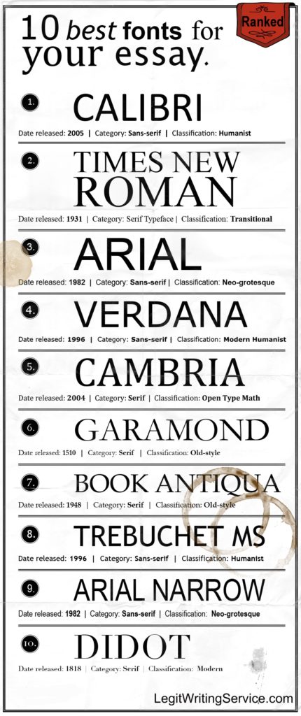
For a combination of modern and classic, Calibri is the font to choose. Calibri has become the new default font for many word processing software. This is because it looks easy on the eye when it is on a computer. If your essay will be submitted online, then this can be a perfect choice of font. It is a clear font that is both straightforward and easy to read.
Another traditional font that is well worth considering, is Georgia. This is another font that looks fantastic on screen, but not so amazing on paper. This font has a classic feel, and was designed to be used on the screen. You can consider using it to make your essays seem more professional and presentable.
Closing Thoughts
Presentation is just as important as the content. Firstly, it is vital to read the instructions of your college essay. Make sure that you fully understand the requirements, and follow the font guidelines if they are given. If there is a choice to be made, you will have a better idea of the best fonts for college essays. These fonts will allow your work to be easily readable, and they will make the best impression.
Leave a Comment Cancel Reply
You must be logged in to post a comment.
5 Best Fonts For Essay Writing

Designbeep is a design blog dedicated to web developers,bloggers,designers and freelancers.Our aim is to share everything about web design,graphic design,tutorials and inspirational articles and more.
Designed by Ellmer Stefan . From TypeTogether .
- Similar to {{variation['original_font']['name']}}
An elegant serif font with a broad palette of typographic goodies.
TypeTogether
In 2006 Veronika Burian and José Scaglione established TypeTogether with the express purpose of creating innovative and stylish solutions to the greatest problems in the global, professional typography market. The foundry focuses on text typography for intensive editorial use, both digital and in print. TypeTogether also partners with discerning clients worldwide to create custom tailored fonts for their specific needs across all communication forms: branding, devices, websites, magazines, newspapers, and more. TypeTogether’s internationally awarded catalogue — honored for its high quality, usefulness, personality, and ability to grab attention — spans many languages and scripts and is diligently expanding each year.
Visit foundry page
As with everything from Adobe Fonts, you can use these fonts for:
Design projects, create images or vector artwork, including logos, website publishing, create a web project to add any font from our service to your website, embed fonts in pdfs for viewing and printing, video and broadcast, use fonts to create in-house or commercial video content, visit the adobe fonts licensing faq for full details.
You may encounter slight variations in the name of this font, depending on where you use it. Here’s what to look for.
In application font menus, this font will display:
To use this font on your website, use the following CSS:
Glyph Support & Stylistic Filters
Fonts in the Adobe Fonts library include support for many different languages, OpenType features, and typographic styles.
Learn more about language support
Learn more about OpenType features
Language Support
Handwriting Fonts
Handwriting fonts are written with a pen, pencil, or marker. Writing fonts include both printing and cursive styles and is less artistic than formal calligraphy. Craft a personalized note with one of these amazing handwritten fonts below.
Related Styles
Calligraphy, hand lettering, valentine's day, tomatoes by billy argel fonts.

Halimun by Creatype Studio

Bulgatti by Creatype Studio

Ananda Black by Billy Argel Fonts

Hello Ketta by Heinzel Studio

Darlington Signature by GlyphStyle

Weddingday by Billy Argel Fonts

Autumn Flowers by Miftaharzaq

Dirty Boy by GraphicsBam Fonts

Stylish Calligraphy by Misti's Fonts

Sweet Getaway by Konstantine Studio

Qaskin by Måns Grebäck

Shifty Notes by Niskala Huruf

Motley Forces by Niskala Huruf

Emotional Rescue by Billy Argel Fonts

Even More Styles
Kids handwriting, cute handwriting, pretty handwriting, fancy handwriting, girly handwriting, handwritten calligraphy, handwritten script, handwriting wedding, modern handwriting, handwriting signature, handwriting display, cursive handwriting, brush handwriting, handwriting lettering, handwriting invitation, handwriting logo, handwriting hand lettering, elegant handwriting, fun handwriting, handwriting kids, vintage handwriting, beautiful handwriting, cool handwriting, handwriting christmas, hand drawn handwriting, bold handwriting, handwriting poster, handwriting monoline, handmade handwriting, feminine handwriting, decorative handwriting, handwriting valentine's day, stylish handwriting, handwriting typography, casual handwriting.
Font Generator
- Word Counter
- Add Text to Photo
- Go to the text page
- Generate text
- Open AI writer
- Go to the AI writer page
- Profile Picture Maker
- Sharpen Image
- Compress Image
- Rotate Image
- Resize Image
- HEIC to JPG
- Color Palette from Image
- Image Mirror
- Go to the Image page
- Calendar Maker
- Color Palette
- Go to the design page
- Letter cases
- Symbol Text
- Smileys & People
- Animals & Nature
- Food & Drink
- Travel & Places
- Mathematical
- Roman Numerals
- Translations
- Grammar checker
- Paraphraser
- Blog titles
- Meta description
- Social media bio
- Story ideas
- Video titles
- Business names
- Email writer
- Side hustle ideas
- Landing page titles
- Product description
- WebM to MP4
- Go to the video page
- Color Picker
- Color Wheel
- Color Codes
- Go to the color page
- PDF to Word
- Excel to PDF
- Word to PDF
- Go to the convert page
- Compress PDF
- Go to the PDF page
- Photo editor
- AI image enhancer
- AI image generator
- Background changer
- Collage maker
- Background remover
- Go to Picsart all-in-one editor
#1 Font & Text Generator with 170+ fonts & 10 font styles (🅒🅞🅞🅛, 𝔣𝔞𝔫𝔠𝔶, 𝒸𝓊𝓇𝓈𝒾𝓋𝑒 and more).
Ⓣⓨⓟⓔ ⓢⓞⓜⓔⓣⓗⓘⓝⓖ ⓣⓞ ⓢⓣⓐⓡⓣ
Light Text Bubbles
𝔗𝔶𝔭𝔢 𝔰𝔬𝔪𝔢𝔱𝔥𝔦𝔫𝔤 𝔱𝔬 𝔰𝔱𝔞𝔯𝔱
𐌕𐌙𐌐𐌄 𐌔Ꝋ𐌌𐌄𐌕𐋅𐌉𐌍Ᏽ 𐌕Ꝋ 𐌔𐌕𐌀𐌓𐌕
Cryptic Italic
𝖳𝗒𝗉𝖾 𝗌𝗈𝗆𝖾𝗍𝗁𝗂𝗇𝗀 𝗍𝗈 𝗌𝗍𝖺𝗋𝗍
𝓣𝔂𝓹𝓮 𝓼𝓸𝓶𝓮𝓽𝓱𝓲𝓷𝓰 𝓽𝓸 𝓼𝓽𝓪𝓻𝓽
Script Bold Italic
ᏖᎩᎮᏋ ᏕᎧᎷᏋᏖᏂᎥᏁᎶ ᏖᎧ ᏕᏖᏗᏒᏖ
♥T♥y♥p♥e♥ s♥o♥m♥e♥t♥h♥i♥n♥g♥ t♥o♥ s♥t♥a♥r♥t♥
🍄🏋🅿𝓔 💲😀Ⓜ𝓔🍄♓🕴🥄🐋 🍄😀 💲🍄🅰🌱🍄
Emojis Text
🅣🅨🅟🅔 🅢🅞🅜🅔🅣🅗🅘🅝🅖 🅣🅞 🅢🅣🅐🅡🅣
Dark Text Bubbles
𝕿𝖞𝖕𝖊 𝖘𝖔𝖒𝖊𝖙𝖍𝖎𝖓𝖌 𝖙𝖔 𝖘𝖙𝖆𝖗𝖙
Fraktur Bold
𝚃𝚢𝚙𝚎 𝚜𝚘𝚖𝚎𝚝𝚑𝚒𝚗𝚐 𝚝𝚘 𝚜𝚝𝚊𝚛𝚝
Monospace Text
ₜyₚₑ ₛₒₘₑₜₕᵢₙg ₜₒ ₛₜₐᵣₜ
ᵀʸᵖᵉ ˢᵒᵐᵉᵗʰⁱⁿᵍ ᵗᵒ ˢᵗᵃʳᵗ
Superscript
Type something to start
⒯⒴⒫⒠ ⒮⒪⒨⒠⒯⒣⒤⒩⒢ ⒯⒪ ⒮⒯⒜⒭⒯
Parenthesis
- 170+ Font Styles (Full Unicode) 🤯
- Easy & 100% FREE to use 🆓
- Pick, Edit, Copy & Paste anywhere 🎯
- People love it, and we love them... ❤️
#1 Font & Text Generator.
50m+ fonts have been copied 🤯, this is how the tool works., 1.find your font(s) 🔍.
- Click 'Inspire me' to see random fonts
- Generate text with our AI Writer
2. Copy & edit text 📝
- Use the Editor to change your texts and keep the font styles
3. Paste anywhere online 📲
- ‘Add to design’ copies your text and opens the Picsart web editor or app.
People use these fonts for...
We know that Social Media is one of the biggest use cases of our font generator tool. We see a lot of LinkedIn and Twitter bios created with our fonts to pimp up social profiles, but it is also pretty cool to use fonts for titles on Instagram or Facebook posts to grab attention. Using our fonts in TikTok on your video or in your description/comments is also getting popular. You can also find our fonts on platforms like Youtube or Snapchat .
NEW: 170+ Font Styles in 10 Categories.
Learn more about online fonts, business fonts: the impact of typography on branding and communication, bold text meaning: emphasizing importance and clarity, unleash your creativity: how to create your own font, combine your fonts with ..., image caption generator, social media bio, other text tools.

- SUGGESTED TOPICS
- The Magazine
- Newsletters
- Managing Yourself
- Managing Teams
- Work-life Balance
- The Big Idea
- Data & Visuals
- Reading Lists
- Case Selections
- HBR Learning
- Topic Feeds
- Account Settings
- Email Preferences
How to Make a “Good” Presentation “Great”
- Guy Kawasaki

Remember: Less is more.
A strong presentation is so much more than information pasted onto a series of slides with fancy backgrounds. Whether you’re pitching an idea, reporting market research, or sharing something else, a great presentation can give you a competitive advantage, and be a powerful tool when aiming to persuade, educate, or inspire others. Here are some unique elements that make a presentation stand out.
- Fonts: Sans Serif fonts such as Helvetica or Arial are preferred for their clean lines, which make them easy to digest at various sizes and distances. Limit the number of font styles to two: one for headings and another for body text, to avoid visual confusion or distractions.
- Colors: Colors can evoke emotions and highlight critical points, but their overuse can lead to a cluttered and confusing presentation. A limited palette of two to three main colors, complemented by a simple background, can help you draw attention to key elements without overwhelming the audience.
- Pictures: Pictures can communicate complex ideas quickly and memorably but choosing the right images is key. Images or pictures should be big (perhaps 20-25% of the page), bold, and have a clear purpose that complements the slide’s text.
- Layout: Don’t overcrowd your slides with too much information. When in doubt, adhere to the principle of simplicity, and aim for a clean and uncluttered layout with plenty of white space around text and images. Think phrases and bullets, not sentences.
As an intern or early career professional, chances are that you’ll be tasked with making or giving a presentation in the near future. Whether you’re pitching an idea, reporting market research, or sharing something else, a great presentation can give you a competitive advantage, and be a powerful tool when aiming to persuade, educate, or inspire others.
- Guy Kawasaki is the chief evangelist at Canva and was the former chief evangelist at Apple. Guy is the author of 16 books including Think Remarkable : 9 Paths to Transform Your Life and Make a Difference.
Partner Center
- International
- Today’s Paper
- T20 World Cup
- Express Shorts
- Mini Crossword
- Premium Stories
- Health & Wellness
UPSC Essays Simplified: Structure and Flow of a good essay– the third step
How to build a 'structure and flow' in a good essay our expert takes you through the third stage of writing an essay in upsc essentials' new series. don't miss the essay exercise towards the end of the article..
How to write essays for UPSC Civil Services Exams? This is one of the most popular questions among aspirants. In UPSC Essentials’ special series UPSC Essays Simplified , we take you through various steps of writing a good essay. While there is no set formula or fixed criteria prescribed, Manas Srivastava talks to Ravi Kapoor , our expert, in this new series who guides the aspirants with a simplified framework on how to write a good essay. Don’t miss ‘The Essay Exercise’ towards the end of the article.
Ravi Kapoor focuses on the following steps of pre-writing and writing stages which will help aspirants to write a ‘good essay’.

| ) | |
| ) | |
Today, we will focus on Step 3.
About our Expert: Ravi Kapoor IRS (R) , has now ditched his coveted rank of deputy commissioner and has offered free quality mentorship to UPSC aspirants, drawing upon his ten years of experience to create customised and productive curriculum. Through a free mentorship programme, he integrates tailored educational materials, psychological principles, visual learning techniques, and a strong emphasis on mental well-being into his teaching skills granting aspirants a chance to learn from his expertise.
How to have a ‘Structure and Flow’ in a good essay?
Everyone knows that an essay should be broken down into an introduction, body and conclusion. But what is written inside these 3 components and HOW it is written makes the difference between an essay fetching average or excellent scores.
Structuring and flow refer to the organisation of the essay and your ideas therein.

A good structure is a way of organising information that fits well with the essay topic and the ideas you wish to present in your arguments such that the reader can make sense of the entire write-up without much effort.
Good flow refers to how your arguments and counterarguments connect from one to another such that the reader finds it logically connected and easy to comprehend.
An essay without these elements will appear to be disorganized, jargoned, hard to comprehend and overall, complicated.
Contrary to popular belief, flow and structure are not subjective writing skills that are inborn in good writers but can be learned and improved upon. What follows is a series of structuring techniques that will help you choose the best one for any essay topic you may encounter.
What are different types of structures?
1. 2 side face-off:.
This is the oldest trick in the book. While writing the body of the essay, you divide it into arguments and counterarguments. In other words, you compare one side of the debate with the other.
For example:
“Thinking is like a game; it does not begin unless there is an opposite team”
The body of the essay can be divided into 2 parts- one agreeing with the statement and one disagreeing with it as follows:
Thinking is reciprocal as thought builds on other thoughts. The Socratic method, championed by Socrates, is a testament to this idea. Socrates would go around Athens spreading knowledge by asking questions and inciting dialogue which would lead the conversationist to the point of realization about something new and profound.
Similarly, when Einstein said he was standing on the shoulders of giants, he meant that his theory of relativity was built using many ideas developed by mathematicians and physicists who came before him.
The reciprocal nature of thought helps to improve it by allowing dissent and counterarguments much like a game of chess. An example is the Case study pioneered by Harvard Business School wherein one case is debated upon in detail considering various strategies before arriving at the optimal one.
While dissent and opposition can lead to many a good idea, there are more ways for thought to develop into ideas within human consciousness. Human cognition is too complex to be restricted to one mode of thinking. A Case in point is intuitive or creative thinking that can arise spontaneously without the interlocking of two human intelligences.
For instance, creative geniuses often hit upon their best ideas out of the blue in ‘Eureka’ moments that seem to arise from within the subconscious mind without the presence of an opponent.
Another example is ‘thought-experiments’ used by philosophers that are designed to be introspective exercises that one engages with, with oneself. Thought experiments are indispensable tools for philosophers and physicists to offer insight into a profound problem of logic and metaphysics.
2.Dimensional analysis:
It has become fashionable to break the essay topic into various dimensions such as Social, Cultural, Historical, Economic etc. But this is not a one-size-fits-all method and may or may not work with every essay topic.
“Education is what remains after one has forgotten what one has learned in the school…”
While this topic can be written about based on various dimensions such as economic, historical, social etc, it is not necessarily the best structure for it.
Instead, a better way to present the information in this essay topic would have a mix of chronology and analysis in the following way-
We are blank slates when we are born onto which society and culture leave their imprint. Through childhood and adolescence, the education system seeks to put us through a treadmill of learning, hoping for a fully functional human to emerge at the end. Sadly, the world that awaits a young adult after school is often very different from what the education system has imparted.
Memorization, exams, grades and NCERT books amount to nothing in a world driven by start-ups, ChatGPT and Social Media influencers…. Please note that the dimensions such as social, cultural and historical factors can also be mentioned in the body of the essay as supporting content ideas.
In most essay topics, these dimensions are best used to describe the reasons and impact of an issue or debate instead of as just a structure.
3. Timeline and Chronology
Some essay topics are uniquely suited for a chronological structure wherein you take the reader through a historical journey or evolution such as :
“History is a series of victories won by the scientific man over the romantic man”
This topic is about the ancient debate between rationality and idealism. To write well about it, you would have to trace the through major historical intellectual movements such as the Scientific Revolution, the Dark Ages, the Renaissance, etc. While doing so, you could mention how each stage was relevant for rational thinking versus idealism with relevant examples.
While you do so chronologically, remember to also present a balanced approach in your arguments- On every stage, you can mention how rational thinking and idealism have been in a tight relationship, but both have been an integral part of human consciousness representing creativity and logic. You may also mention how this to and fro has enriched human civilisation and led to the development of science and art.
4. Anecdotes and stories
Many students like to start their essays with an anecdote- a personal story or an imaginary one about characters highlighting the debate presented in the essay topic. While this is not a bad strategy, it requires a fair amount of creative writing ability to pull off properly. It is also important to mention that anecdotes are not the most suitable vehicle to comprehensively deal with the essay topic as not all arguments can easily fit into a personal story.
An example of a good use of anecdotal structure is:
“Not all who wander are lost”
About 2000 years ago, a wandering prince changed the world by questioning the most profound and radical assumptions about human existence. Prince Siddhartha was bathed in luxury and wanted for nothing. But when we saw the naked reality of the world and all its suffering, he could not silence his mind to the questions that we take for granted- why is there suffering and death? If suffering is inevitable then what is the point of life? Is there peace to be found or are we doomed to suffer in this life?
He wandered for years in search of answers, as lost as a soul can be. But in the end, it was his wandering that changed the world forever. When he became the Buddha, he not only found himself but saved millions of others from being lost themselves….
Anecdotes can make for good hooks or introductions to an essay but may not serve well to cover the entire body of the essay.
The Essay Exercise
|
|
| |
| 1. Use Anecdotes or historical examples in intro 2. 2 side face-offs in body of the essay 3. Balanced conclusion | ||
| Start with comparing USSR and USA in the cold war. Preparation for nuclear war and hint at how being pre-emptive is strategic but not always a good thing. | ||
| Argument- Counter-argument- | ||
| Conclude by saying that we must strike a balance between preparedness and being spontaneous:
|
Important points to note:
- You can choose which type of structure to use- there is no single best choice.
- You may use more than 1 type of structure.
- You may use structures for introduction, body and conclusion.
Subscribe to our UPSC newsletter and stay updated with the news cues from the past week.
The UPSC articles of Indian Express is now on Telegram. Join our Telegram channel- Indian Express UPSC Hub and stay updated with the latest Updates. For your answers, queries and suggestions write at manas.srivastava@ indianexpress.com .

Manas Srivastava is currently working as Deputy Copy Editor with The Indian Express (digital) and majorly writes for UPSC-related projects leading a unique initiative known as UPSC Essentials. In the past, Manas has represented India at the G-20 Youth Summit in Mexico. He is a former member of the Youth Council, GOI. A two-time topper/gold medallist in History (both in graduation and post-graduation) from Delhi University, he has mentored and taught UPSC aspirants for more than four years. His diverse role in The Indian Express consists of writing, editing, anchoring/ hosting, interviewing experts, and curating and simplifying news for the benefit of students. He hosts the YouTube talk show called ‘Art and Culture with Devdutt Pattanaik’ and a LIVE series on Instagram and YouTube called ‘You Ask We Answer’.His talks on ‘How to read a newspaper’ focus on newspaper reading as an essential habit for students. His articles and videos aim at finding solutions to the general queries of students and hence he believes in being students' editor, preparing them not just for any exam but helping them to become informed citizens. This is where he makes his teaching profession meet journalism. He is also currently working on a monthly magazine for UPSC Aspirants. He is a recipient of the Dip Chand Memorial Award, the Lala Ram Mohan Prize and Prof. Papiya Ghosh Memorial Prize for academic excellence. He was also awarded the University’s Post-Graduate Scholarship for pursuing M.A. in History where he chose to specialise in Ancient India due to his keen interest in Archaeology. He has also successfully completed a Certificate course on Women’s Studies by the Women’s Studies Development Centre, DU. As a part of N.S.S in the past, Manas has worked with national and international organisations and has shown keen interest and active participation in Social Service. He has led and been a part of projects involving areas such as gender sensitisation, persons with disability, helping slum dwellers, environment, adopting our heritage programme. He has also presented a case study on ‘Psychological stress among students’ at ICSQCC- Sri Lanka. As a compere for seminars and other events he likes to keep his orating hobby alive. His interests also lie in International Relations, Governance, Social issues, Essays and poetry. ... Read More
- government jobs
- Sarkari Naukri
- UPSC Civil Services Exam
- UPSC Essentials
- UPSC Specials

Afghanistan's historic win over Australia has created a three-way race for the semifinal spots in Group 1, with India currently leading. To secure qualification, India needs to beat Australia or avoid a heavy defeat.
UPSC Magazine

Read UPSC Magazine
- Sonakshi Sinha, Zaheer Iqbal wedding live updates: Sonakshi-Zaheer all set for registered marriage, Shatrughan Sinha to grace festivities 29 mins ago
- KEAM Result 2024 Live Updates: When will results be out at cee.kerala.gov.in 35 mins ago
- NEET 2024 Row Live Updates: NEET PG postponed; protest in Rajkot against re-test of NEET UG 2 hours ago
- Delhi News Live Updates: Haryana govt has shut barrage that supplies water to Delhi, alleges Atishi on Day 3 of fast 3 hours ago

Best of Express

Buzzing Now

Jun 23: Latest News
- 01 NEET UG 2024 Row: Probe into ‘alleged irregularities’ handed over to CBI, says Education Ministry
- 02 EU and China set for talks on planned electric vehicle tariffs
- 03 Cristiano Ronaldo becomes highest assist provider in Euro history as Portugal defeat Turkey 3-0
- 04 3 Alabama men die after becoming distressed while swimming at Florida beach
- 05 ‘Absolute disgrace’: Students, faculty sob as NEET PG 2024 cancelled a night before exam
- Elections 2024
- Political Pulse
- Entertainment
- Movie Review
- Newsletters
- Web Stories
15 Single-Line Writing Fonts for Cricut Design Space (and Where to Find Them)

Your changes have been saved
Email Is sent
Please verify your email address.
You’ve reached your account maximum for followed topics.
I Curated the Perfect List of Free Adobe Software Alternatives
Dall-e 3 now has integrated editing tools, but they need work, 5 essential settings you need to tweak before posting your smartphone photos.
Cricut Design Space is a design software that works with Cricut crafting machines. Typically, Cricut machines are used for cutting rather than drawing; but there is an option to draw and write with Cricut Design Space. Since Cricut technology is for plotting and cutting, it can be quite hard to find typefaces or fonts that suit single-line writing. Here are 15 single-line fonts for your Cricut projects.
What’s the Difference Between Regular and Writing Fonts in Cricut Design Space?

When selecting the Text function in Cricut Design Space, the default operation setting is Basic Cut . This means any text you choose will be cut out around the outer path of each letter. If you go to the Operation dropdown menu, select any setting under Draw , such as Pen or Foil , to enable you to draw or write your letters rather than cutting them.

The default for text is to draw along the cut marks, resulting in “bubble” lettering rather than single-line drawn letters. You can still draw or foil text in this way, but if you want a professional and sleek result, you’ll want a monoline text.
15 Single-Line Writing Fonts for Cricut Design Space
A Cricut machine is a fantastic tool , and you can use a multitude of fonts in your Cricut designs. While Cricut Design Space flaunts its own font library—both free and paid-for—you can also find typefaces in other places, like Google Fonts, Creative Fabrica, and DaFont to name a few. We’ve compiled fonts that fit the agenda, so you don’t have to search yourself.
Cricut Design Space Fonts
If you subscribe to Cricut Access —the $9.99 per month subscription offered for extra Cricut graphics, projects, and discounts—you’ll be able to get any of these fonts. There are some free ones for anyone without access, too. With a new Cricut machine, you can get your first month of Cricut Access for free.

To search for Cricut fonts, use the filters in the Text tool to check boxes for Writing , and you can choose to filter by Free as well. Then, search the font name. Cricut Access fonts are shown with a small green “a” icon on the font listing. Only Cricut Access subscribers can use these fonts. If your subscription runs out, you’ll lose access to those fonts.
1. Poker Night (Free)

This free Cricut font is monoline and monospace. It has an aesthetically pleasing nature to it due to the letters being the same width. Great for precise and neat writing. It doesn’t offer anything too fancy, and the text is written all in capitals.
2. DTC Fall and Flair (Cricut Access)

This font gives slightly Sailor Jerry tattoo vibes with the serif ends on the letters. It has varying height crossbars on its letters, so it’s not a font for the perfectionist in you. This font is written in only capital letters. It has a fun flair to it and would work great for a casual decoration font.
3. Typewriter (Free)

The free Typewriter font is available both as a Regular font and a Writing font.
While a typewriter style is typically wider than this monoline variation allows for, the font has retained some of the classic style’s features—sharp serif ends on the letters and curled tails on Ts and Rs, for example.
4. DTC Shiplap (Cricut Access)

Shiplap is a fun handwritten monoline font. It offers low crossbars that give a playful and young feel to the letters. Like some other paid-for single-line fonts, this one again only writes in capital letters.
It has a cute, quirky vibe. It would be great for address labels, invites, or anything smart casual.
5. Little White Lies (Free)
Little White Lies is another handwritten style. This one is much more playful with circles dotting the I's, varying heights in letters, and quirky X-height across the board. This is a very casual and fun font to use.
6. Telegram Text (Cricut Access)

Telegram Text is a serif font that’s pleasing to the eye. It’s quite formal in looks, but playful in some respects with its rounded serifs ending in little circles. You could find many uses for a text style like this. You can even curve text in Cricut Design Space to add more flair to your text projects.
Creative Fabrica Fonts
Creative Fabrica is an online marketplace—which is great for selling your digital design to make a passive income . It’s a paid-for subscription model that offers the first month for free with 10 free downloads—you can also get SVG files for Cricut projects here. Always read the license information when purchasing or downloading a typeface; this will let you know how and where you may use the fonts.
7. Dear Agatha ($12.00 Standalone)

This is an easy-to-read cursive typeface. The download provides a package of typefaces—two script fonts and two sans serif fonts.
The cursive font option stands up well by itself as a cursive monoline. This would be great for adding handwritten text to homemade invitations, address labels for wedding invites, or anything you need to add a touch of class to.
8. Muggsy Sketch ($12.00 Standalone)

This unbalanced, quirky font is offered as a single-line or hairline font for easy writing, foiling, or engraving with your Cricut machine. Muggsy Sketch is packaged with two uppercase typefaces, multiple ligatures, and extra characters.
DaFont Fonts
DaFont is a great resource for finding a large variety of typefaces. Most free downloads are for personal use only but often come with a way to purchase a commercial license. Check the license agreement for the type of project you intend to make with your downloaded fonts.
9. Lovely Monoline (Free For Personal Use)

This cursive font isn’t officially single-line, but its paths are close enough that when drawing or writing with your Cricut, the results will look single-line. Weld the letters before making your project to ensure the lines are drawn continuously through the joins.
This glamorous hand-drawn script font would add style and class to anything you wanted to write with your Cricut.
10. Cherry (Free For All Uses)

This light monospace typeface is clear and easy to read. Its letters are easily spread out for clear plotting with your Cricut machine. This is perfect for a typed-out design that required professionalism.
Cherry isn’t officially a single-line font, but with a thicker pen—like a Cricut watercolor marker & brush pen —your plotter won’t draw the letters with any gaps, effectively drawing a monoline font.
With Cherry's license, you can create designs to sell. There are many great places to sell your design work , both physical and digital.
11. Thinnyness (Free For Personal Use)

This free personal-use font is a handwritten monoline style. Great for adding neat handwriting that needs to be easily read. It’s a little quirky and cute.
12. Slightly Cursive Characters (Free For Personal Use)

This typeface isn’t officially monoline; however, if you’re writing with a thick enough pen or foiling at bold, then the paths will overlap, giving a single-line result. This typeface wouldn’t be suitable for cutting with your Cricut, since its paths are too close.
Google Fonts
Google Fonts offer free-to-download fonts inclusive of commercial licenses. This means you can sell any designs that use Google Fonts. Just download them to your system for use in Cricut Design Space.
13. Thasadith (Free For All Uses)

Thasadith is not quite monoline, but with a thick enough pen—we used a 0.8mm Cricut Gel Pen —you won't notice the gaps between the paths.
This is a well-balanced typeface with a higher-than-normal x-height. Use this font for writing anything that’s smart and orderly.
14. Grandiflora One (Free For All Uses)

This serif typeface has a typewriter style. It’s bold and strong and works great for anything that you might want to add some authority to in your Cricut projects. The original typeface was designed in non-Latin letters, but once downloaded it can be used with Latin letters as well as the original language.
15. Moirai One (Free For All Uses)

Moirai One is a bubble script rather than a single-line font. However, the way the paths are drawn means it will be written as single-line. The lines are simply open bubbles instead of closed paths. The original font was designed for an Asian writing system, but it's easily readable when typing Latin letters.
This is a fun and unique style that can add some playfulness to any design. The open-ended letters make it different from a typical bubble script.
Expand Your Cricut Designs Using Single-Line Writing Fonts
While there are plenty of typefaces and fonts you can use for traditional Cricut projects, there are much fewer for using Cricut’s Draw option. With this list of 15 fonts from a variety of sources, you can add some flair and unique style to your Cricut projects. Whether you’re drawing or writing with pen, using a foil transfer kit, or engraving letters on a material, it’s great knowing there are font options that work for you.
- Santa Barbara County
- San Luis Obispo County
- Ventura County
- News Channel 3 Investigates
- U.S. / World
- What’s Right
- Local Forecast
- Interactive Radar
- SkyCam Network
- Full Election Results
- Election Coverage
- High School Sports
- College Sports
- More Sports
- Friday Football Focus
- News Channel 3-12 Livestream
- Livestream Special Coverage
- Morning News Guest Segments
- Events Calendar
- Entertainment
- Health Connections
- 805 Professionals
- Work For Us
- 805 Careers
- Advertise with Us
- Closed Captioning
- Download Our Apps
- EEO Public File Report
- FCC Public File
- How to find News Channel 12
- Public File Help
- Jobs and Internships
- Meet the Team
- Newsletters/Alerts
- TV Listings
An AP photographer explains why a good action photo is often about the cropping
By LINDSEY WASSON Associated Press
SEATTLE (AP) — Photographer Lindsey Wasson is in her second year covering baseball — and other events in the Pacific Northwest — for The Associated Press. Here is what she had to say about making this Extraordinary Photo.
Jump to comments ↓
The Associated Press
News Channel 3-12 is committed to providing a forum for civil and constructive conversation.
Please keep your comments respectful and relevant. You can review our Community Guidelines by clicking here
If you would like to share a story idea, please submit it here .
- Comment Comments
- Save Article Read Later Read Later
What Makes for ‘Good’ Mathematics?
February 1, 2024
Peter Greenwood for Quanta Magazine
Introduction
We tend to think of mathematics as purely logical, but the teaching of math, its values, its usefulness and its workings are packed with nuance. So what is “good” mathematics? In 2007, the mathematician Terence Tao wrote an essay for the Bulletin of the American Mathematical Society that sought to answer this question. Today, as the recipient of a Fields Medal, a Breakthrough Prize in Mathematics and a MacArthur Fellowship, Tao is one of the most honored and prolific mathematicians alive. In this episode, he joins our host and fellow mathematician Steven Strogatz to revisit the makings of good mathematics.
Listen on Apple Podcasts , Spotify , Google Podcasts , TuneIn or your favorite podcasting app, or you can stream it from Quanta .
STEVEN STROGATZ : Back in October 2007, way back when the first-generation iPhone was still a hot commodity and the stock market was at an all-time high before the Great Recession, Terence Tao, a professor of math at UCLA, was determined to answer a question that had long been debated among mathematicians: What exactly is good mathematics?
Is it about rigor? Elegance? Real-world utility? Terry wrote a very thoughtful and generous, I would even say openhearted, essay about all the ways that math could be good. But now, more than 15 years later, do we need to rethink what good mathematics is?
I’m Steve Strogatz, and this is “The Joy of Why,” a podcast from Quanta Magazine where my co-host, Janna Levin, and I take turns exploring some of the biggest unanswered questions in math and science today.
( Theme plays )
Here today to revisit the eternal question of what makes math good is Terry Tao himself. Professor Tao has authored more than 300 research papers on an amazingly wide swath of mathematics including harmonic analysis, partial differential equations, combinatorics, number theory, data science, random matrices and much more. He’s been referred to as the “Mozart of Mathematics.” And as the winner of a Fields Medal, a Breakthrough Prize in Mathematics, a MacArthur Fellowship and many other awards, that moniker is certainly well-deserved.
Terry, welcome to “The Joy of Why.”
TERENCE TAO : Pleasure to be here.
STROGATZ : I’m very excited to be able to talk to you about this question of what it is that makes some types of mathematical research good. I can remember pretty vividly flipping through the Bulletin of the American Math Society back in 2007 and coming across your essay about this issue that you posed for us. It’s something that all mathematicians think about. But for people out there who may not be so familiar, could you tell us, how did you land on this question? How did you define good math back at the time?
TAO : Right, yes. It was actually a solicitation. So the editor of the Bulletin at the time had asked me to contribute an article. I think I had a very naive idea of what mathematics was as a student. I kind of had this idea that there was some sort of council of greybeards that would hand out problems for people to work on. And it was kind of a shock to me as a graduate student, realizing that there wasn’t actually this central authority to hand out problems, and people did self-directed research.
I kept going to talks and listening to how other mathematicians talked about what they find exciting and what makes them excited about math, and the fact that each mathematician has a different way of approaching mathematics. Like, some would pursue applications, some by sort of aesthetic beauty, some by just problem solving. They wanted to solve a problem and they would focus on sort of the most difficult, the most challenging tasks. Some would focus on technique; some would try to make things as elegant as possible.
But what struck me when sort of listening to so many of these different mathematicians talk about what they find valuable in mathematics is that, even though we all had sort of different ideals as to what good mathematics should look like, they all kind of tend to converge to the same thing.
If a piece of mathematics is really good, people who pursue beauty will eventually happen across it. People who pursue, who value, you know, technical power or applications will eventually land upon it.
Eugene Wigner had a very famous essay on the unreasonable effectiveness of mathematics in the physical sciences almost a century ago, where he just observed that there were areas of mathematics — for example, Riemannian geometry, the study of curved space — that was initially just a purely theoretical exercise to mathematicians, you know, trying to prove the parallel postulate and so forth, turning out to be precisely what Einstein and Poincaré and Hilbert needed to describe the mathematics of general relativity. And that’s just a phenomenon that occurs.
So it’s not just that mathematics, that [what] mathematicians find intellectually interesting end up being physically important. But even within mathematics, subjects that mathematicians find elegant also happen to provide deep insight.
What I feel like is that, you know, there is some platonic good mathematics out there, and all our different value systems are just different ways of accessing that objective good stuff.
STROGATZ : That’s very interesting. Being a sort of person inclined to platonic thinking myself, I’m tempted to agree. Although I’m a little surprised to hear you say that, because I would have thought where you were going initially seemed to be, like, there are so many different points of view about this. It is an interesting fact, though, kind of an empirical fact, that we do converge on agreeing about what is good or not good, even though, as you say, we come at it from so many different values.
TAO : Right. The convergence may take time. You know, so there are definitely fields, for example, where they look a lot better as measured by one metric than others. Like maybe they have a lot of applications, but their presentation is extremely disgusting, you know.
(Strogatz laughs)
Or things that are very elegant but don’t yet have many good applications in the real world. But I do feel like eventually it will converge.
STROGATZ : Well, let me ask you about this point of contact with the real world. It’s an interesting tension in math. And, you know, as little kids, let’s say, when we first learn about geometry, you might think at that point that triangles are real, or circles or straight lines are real, and that they can tell you about the rectangular shapes you see in buildings out in the world, or that surveyors need to use geometry. And after all, the word comes from the measurement of the Earth, right, “geometry.” And so, there was a time when geometry was empirical.
But what I wanted to ask you has to do with a comment that John von Neumann made. So von Neumann, for anyone not familiar, was himself a great mathematician. And he made this comment in this essay, “ The Mathematician ,” about the relationship between math and the empirical world, the real world, where he says roughly that mathematical ideas originate in empirics, but that at some point, once you get the mathematical ideas, the subject starts to take on a life of its own. And then it’s more like a creative piece of art. Aesthetic criteria become important. But he says that causes danger. That when a subject starts to become too far removed from its empirical source, like especially in its second or third generation, he says that there’s a chance the subject can suffer from too much abstract inbreeding and it’s in danger of degeneration.
Any thoughts about that? I mean, does math have to stay in contact with its empirical source?
TAO: Yes, I think it does have to be grounded. When I say that, empirically, all these different ways of doing mathematics do converge, it’s only because — this only happens when the subject is healthy. So, you know, the good news is that usually it is.
But, for example, mathematicians value short proofs over long ones, all other things being equal. But one could imagine people going overboard and, like, one subfield of mathematics being obsessed with making proofs as short as possible and having these extremely opaque two-line proofs of deep theorems. And they make it kind of this contest, and then it becomes this sort of abstruse game and then you lose all the intuition. You lose maybe deeper understanding because you’re just so obsessed with making all your proofs as short as possible. Now, this doesn’t actually happen in practice. But this is kind of a theoretical example, and I think von Neumann was making a similar point.
And in the sixties and seventies, like, there was an era of mathematics where abstraction was making huge strides in simplifying and unifying a lot of mathematics that was previously very empirical. Especially in algebra, people were realizing, you know, numbers and polynomials and many other objects that were previously treated separately, you could all think of them as members of the same algebraic class, in this case a ring.
And a lot of progress in mathematics was being made by finding the right abstraction, you know, whether it was a topological space or a vector space, whatever, and proving theorems in great generality. And this is sometimes what we call the Bourbaki era in mathematics. And it did veer a little bit too far from being grounded.
We of course had, like, the whole New Math episode in the States, where educators tried to teach math in the Bourbaki style and eventually realized that that was not the appropriate pedagogy at that level.
But now the pendulum has swung back quite a bit. We have kind of — the subject has matured quite a bit and every field of mathematics, geometry, topology, whatever, we have kind of satisfactory formalizations and we kind of know what the right abstractions are. And now the field is again focusing on interconnections and applications. It’s connecting much more to the real world now.
I mean, not just sort of physics, which is a traditional connection, but, you know, computer science, life sciences, social sciences, you know. With the rise of big data, pretty much almost any human discipline now can be mathematized to some extent.
STROGATZ : I’m very interested in the word that you just used a minute ago about “interconnections,” because that seems like a central point for us to discuss. It’s something that you mention in your essay that, along with these, what you call “local” criteria about elegance, or real-world applications, or whatever, you mention this “global” aspect of good mathematics: that good mathematics connects to other good mathematics.
That’s almost key to what makes it good, that it’s integrated with other parts. But it’s interesting because it sounds almost like circular reasoning: that good math is the math that connects to other good math. But it’s a really powerful idea, and I’m just wondering if you could expand on it a little bit more.
TAO : Yeah, so, I mean, what mathematics is about — one of the things that mathematics does is that it makes connections that are very basic and fundamental, but not obvious if you just look at it from the surface level. A very early example of this is Descartes’ invention of Cartesian coordinates that made a fundamental connection between geometry — the study of points and lines and spatial objects — and numbers, algebra.
So, for example, a circle you can think of as a geometric object, but you can also think of it as an equation: x 2 + y 2 = 1 is the equation of a circle. At the time, it was a very revolutionary connection. You know, the ancient Greeks viewed number theory and geometry as almost completely disjointed subjects.
But with Descartes, there was this fundamental connection. And now it’s internalized; you know, the way we teach mathematics. It’s not surprising anymore that if you have a geometric problem, you attack it with numbers. Or if you have a problem with numbers, you may attack it with geometry.
It’s somewhat because both geometry and numbers are aspects of the same mathematical concept. We have an entire field called algebraic geometry, which is neither algebra nor geometry, but it’s a unified subject studying objects that you can either think of as geometric shapes, like lines and circles and so forth, or as equations.
But really, it’s a holistic union of the two that we study. And as the subject has deepened, we’ve realized that that is more fundamental somehow than either algebra or geometry separately, in some ways. So, these connections are helping us discover sort of the real mathematics that initially, somehow, our empirical studies only give us a corner of the subject.
There’s this famous parable of the elephant, I forget where, that if you have… There are four blind men, and they discover an elephant. And one of them feels the leg of the elephant and they think, “Oh, this, it’s very rough. It must be like a tree or something.”
And one of them feels the trunk, and it’s only a lot later that they see that there’s a single elephant object that is explaining all their separate hypotheses. Yeah, so we’re all blind initially, you know. We’re just watching the shadows on Plato’s cave and only later realizing —
STROGATZ : Wow, you are very philosophical here. This is something. I can’t resist now: If you’re going to start talking about the elephant and the blind people, this suggests that you think mathematics is out there — that it is something like the elephant and that we are the blind… Or, you know, we’re trying to see something that exists independent of human beings. Is that really what you believe?
TAO : When you do good mathematics, like, it’s not just pushing symbols around. You do feel like there is some actual object that you’re trying to understand, and all our equations we have are just sort of approximations of that, or shadows.
You can debate the philosophical point of what is actually reality and so forth. I mean, these are things you can actually touch, and the more real things get mathematically, sometimes the less physical they seem. As you said, geometry initially, you know, was a very tangible thing about objects in physical space that you could — you know, you can actually build a circle and a square and so forth.
But in modern geometry, you know, we work in higher dimensions. We can talk about discrete geometries, all kinds of wacky topologies. And, I mean, the subject still deserves to be called geometry, even though there is no Earth being measured anymore. The ancient Greek etymology is very outdated but it’s, but there’s definitely something there. Whether — how real you want to call it. But I guess the point is that for the purpose of actually doing mathematics, it helps to believe it’s real.
STROGATZ : Yeah, isn’t that interesting? It does. It seems like that’s something that goes very deep in the history of math. I was struck by an essay by Archimedes writing to his friend, or at least colleague, Eratosthenes.
We’re talking now, like, 250 B.C. And he makes the remark, he’s discovered a way to find the area of what we would call the segment of a parabola. He’s taking a parabola, he cuts across it with a line segment that’s at an oblique angle to the axis of the parabola, and he figures out this area. He gets a very beautiful result. But he says something to Eratosthenes like, “These results were inherent in the figures all along.” You know, like, they’re there. They’re there. They’re just waiting for him to find.
It’s not like he created them. It’s not like poetry. I mean, it’s interesting, actually, isn’t it? That a lot of great artists — Michelangelo talked about releasing the statue from the stone, you know, as if it were in there to begin with. And it sounds like you and many other great mathematicians have — as you say, it’s very useful to believe this idea, that it’s there waiting for us, waiting for the right minds to discover it.
TAO : Right. Well, I think one manifestation of that is that ideas that are often very complicated to explain when they’re first discovered, they get simplified. I mean, you know, often the reason why something looks very deep or difficult at the beginning is you don’t have the right notation.
For example, we have decimal notation now to manipulate numbers, and it’s very convenient. But in the past, we had like, you know, Roman numerals and then there were even more primitive number systems that were just really, really difficult to work with if you wanted to do mathematics.
Euclid’s Elements , you know — some of the arguments in these ancient texts. Like, there’s one theorem in Euclid’s Elements I think called the Bridge of Fools or something. It’s like the statement that, I think the statement is like an isosceles triangle, the two base angles are equal. Like, this is like a two-line proof in modern geometric texts, you know, with the right axioms. But Euclid had this horrendous way of doing it. And it was where many students of geometry in the classical era just completely gave up on mathematics.
STROGATZ : True. ( laughs )
TAO : But, you know, we now have a much better way of doing that. So often the complications we see in mathematics are artifacts of our own limitations. And, so, as we mature, you know, things become simpler. And it feels more real because of that. We’re not seeing the artifacts. We’re seeing the essence.
STROGATZ : Well, so going back to your essay: When you wrote it, at the time — I mean, this was pretty early in your career, not the very beginning, but still. Why did you feel back then that it was important to try to define what good mathematics was?
TAO : I think… So by that point, I was already starting to advise graduate students, and I was noticing that, you know, there was some misconceptions about, sort of, what is good and what is not. And I was also talking to mathematicians in different fields, and what one’s field valued in mathematics seemed different from others. But yet, somehow we were all studying the same subject.
And sometimes someone would say something that sort of rubbed me the wrong way, you know, like, “This mathematics has no applications, therefore it has no value.” Or “This proof is just too complicated; therefore it has no value,” or something. Or conversely, you know, “This proof is too simple; therefore it is not worth…” You know. Like, there was some, like, sort of snobbery and so forth, sometimes I would encounter.
And in my experience, the best mathematics came when I understood a different point of view, a different way of thinking about mathematics from someone in a different field and applying it to a problem that I cared about. And so my experience of how to use mathematics properly, how to wield it, was so different from these — sort of the “one true way of doing mathematics.”
I felt like this point had to be made somehow. That there’s really a plural way of doing mathematics, but whereas mathematics is still united.
STROGATZ : That’s very revealing, because I had wondered, you know, like, in my introduction I mentioned the many different branches of math that you have explored, and I didn’t even include some. Like, I can remember just a few years ago, your work about this mystery in fluid dynamics, about whether certain equations that we think do a good job of approximating the motions of water and air. I don’t want to go into details too much, but just to say, here you are, people think of you doing number theory or harmonic analysis, and suddenly you’re working on fluid dynamics questions. I mean, I realize it’s partial differential equations. But still, your breadth of interest seems to be related to your breadth of accepting different insights, different valuable ideas from all the different ways of doing good math.
TAO : I forget who said it, but there are two types of mathematicians. There’s hedgehogs and foxes. A fox is someone who knows a little bit about everything. A hedgehog is a creature that knows one thing very, very well. And neither is better than the other. They complement each other. I mean, in mathematics, you need people who are really deep domain experts in one subfield, and they know a subject inside-out. And you need people who can see the connections between one field and another. So I definitely identify as a fox, but I work with a lot of hedgehogs. The work I’m most proud of is often a collaboration like that.
STROGATZ : Oh, yeah. Do they realize that they’re hedgehogs?
TAO : Well, okay, the roles change over time. Like, there are other collaborations where I’m the hedgehog and someone else is the fox. These are sort of not permanent — you know, these are not in your DNA.
STROGATZ : Ah, good point. We can adopt — we can wear both cloaks.
Well, what about, was there a response to the essay at the time? Did people say anything back to you?
TAO : I got a fairly positive response in general. I mean, the Bulletin of the AMS is not a hugely, widely circulated publication, I think. And also, I didn’t really say anything too controversial. Also, this kind of predated social media, so, I think maybe there’s a few math blogs that picked it up, but there was no Twitter. There was nothing to make it go viral.
Yeah, also I think, in general, mathematicians don’t spend much of their time and intellectual capital on speculation. I mean, there’s another mathematician called Minhyong Kim who had this very nice metaphor that, to mathematicians, credibility is like currency, like money. If you prove theorems and you demonstrate that you know the subject, you’re accumulating somehow this currency of credibility in the bank. And once you have enough currency, you can afford to speculate a little bit by being a bit philosophical and saying what might be true rather than what you can actually prove.
But we tend to be conservative, and we don’t want an overdraft in our bank account. You know, you don’t want most of your writing to be speculative and only like one percent to actually prove something.
STROGATZ : Fair enough. So, okay. So, lots of years have passed since then. What are we talking about? It’s more than 15 years.
TAO : Oh yeah, time flies.
STROGATZ : Has your opinion changed? Is there anything we need to revise?
TAO : Well, the culture of math is changing quite a bit. I already had a broad view of mathematics, and now I have an even broader one.
So, one very concrete example is: Computer-assisted proofs were still controversial in 2007. There was a famous conjecture called the Kepler conjecture, which concerns the most efficient way to pack unit balls in three-dimensional space. And there’s a standard packing, I think it’s called the cubic central packing or something, that Kepler conjectured to be the best possible.
This was finally resolved, but the proof was very computer-assisted . It was quite complicated, and [Thomas] Hales eventually actually created a whole computer language to formally verify this particular proof, but it was not accepted as a real proof for many years. But it illustrated how controversial the concept of a proof that you needed computer assistance to verify was.
In the years since, there’s been many, many other examples of proofs where a human can reduce a complicated problem to something which still requires a computer to verify. And then the computer goes ahead and verifies it. We’ve kind of developed practices about how to do this responsibly. You know, how to publish code and data and ways to check and new open-source things and so forth. And now, there’s widespread acceptance of computer-assisted proofs.
Now, I think, the next cultural shift will be whether AI-generated proofs will be accepted . Right now, AI tools are not at the level where they can generate proofs to really advance mathematical problems. Maybe undergraduate-level homework assignments, they can kind of manage, but research mathematics, they’re not at that level yet. But at some point, we’re going to start seeing AI-assisted papers come out and there will be a debate.
The way our culture has changed in some ways… Back in 2007, only a fraction of mathematicians made their preprints available before publishing. Authors would jealously guard their preprints until they had the notification of acceptance from the journal. And then they might share.
But now everyone puts their papers on public servers like the arXiv . There’s a lot more openness to put videos and blog posts, about where the ideas of a paper come from. Because people realize that this is what makes work more influential and more impactful. If you try to not publicize your work and be very secretive about it, it doesn’t make a splash.
Math has become much more collaborative . You know, 50 years ago, I would say that the majority of papers in mathematics were single-author. Now, definitely the majority are two or three or four authors. And we’re just beginning to see really big projects like we do in the sciences, you know, like tens, hundreds of people collaborate. That’s still difficult for mathematicians to do, but I think we’re going to get there.
Concurrently, we’re becoming much more interdisciplinary. We’re working with other sciences a lot more. We’re working between fields of mathematics. And because of the internet, we can collaborate with people across the world. So, the way we do mathematics is definitely changing.
I hope in the future, we will be able to utilize the amateur math community more. There are other fields like astronomy, where astronomers make great use of the amateur astronomy community, like, you know, a lot of comets, for example, are found by amateurs.
But mathematicians… There’s a few isolated areas of mathematics such as like, tiling, two-dimensional tiling, and maybe finding records in prime numbers. There’s some very select fields of mathematics where amateurs do contribute, and they’re welcomed. But there’s a lot of barriers. In most areas of mathematics, you need so much training and internalized or conventional wisdom that we can’t crowd source things. But this may change in the future. Maybe one impact of AI would be to allow amateur mathematicians to contribute meaningfully to mathematics.
STROGATZ : That’s very interesting.
[Break for ad insertion]
STROGATZ : So the amateurs might, with the help of AIs, either ask new questions that are good or help with good explorations of existing questions, that sort of thing?
TAO : There are many different modalities — yeah. So, for example, there are now projects to formalize proofs of big theorems in these things called formal proof assistants , which are like computer languages that can 100% verify that a theorem is true or not and — is proven or not. This actually enables large-scale collaboration in mathematics.
So in the past, if you collaborate with 10 other people to prove a theorem, and each one contributes a step, everyone has to verify everyone else’s math. Because the thing about math is that if one step has an error in it, the whole thing can fall apart.
So you need trust, and so — therefore this prevents, this really inhibits really large-scale collaborations in mathematics. But there are now, there have been successful examples of really large theorems being formalized where there’s a huge community, they don’t all know each other, they don’t all trust each other, but they communicate through uploading to some Github repository or something, like, individual proofs of individual steps in the argument. And the formal proof software verifies everything, and so you don’t need to worry about trust. So we are enabling new modes of collaboration, which we haven’t seen really in the past.
STROGATZ : It’s really interesting to hear your vision, Terry. It’s a fascinating thought. You don’t hear the phrase “citizen mathematician.” You hear of citizen science, but why not citizen math?
But I’m just wondering, are there any trends that you are worried about, for example, with computer-assisted proofs or AI-generated proofs? Will we know that certain results are true, but we won’t understand why?
TAO : So that is a problem. I mean, it’s already a problem even before the advent of AI. So, there are many fields where the papers in a subject are getting longer and longer, hundreds of pages. And I’m hopeful that AI can actually conversely help simplify and it can explain as well as prove.
So there’s already experimental software where, like, if you take a proof that has been formalized, you can actually convert it into an interactive human-readable document, where you have the proof and you see the high-level steps and if there’s a sentence you don’t understand you can double-click on it, and it will expand into smaller steps. Soon I think you can also get an AI chatbot sitting next to you while you’re going through the proof, and they can take questions and they can explain each step as if they were the author. I think we’re already very close to that.
There are concerns. We have to change the way we educate our students, particularly now that many of our traditional ways of assigning homework and so forth, we are almost at the point where these AI tools can just instantly answer many of our standard exam questions. And so, we need to teach our students new skills, like how to verify whether an AI-generated output is correct or not and how to get a second opinion.
And we may see the advent of a more experimental side to mathematics, you know. So, mathematics is almost entirely theoretical, whereas most sciences have both a theoretical and experimental component. We may eventually have results that are first only proven by computers and, as you say, we don’t understand. But then once we have the data that the AI, the computer-generated proofs provide, we may be able to run experiments.
There’s a little bit of experimental mathematics now. People do study, like, large data sets of various things, elliptic curves, say. But it could become much bigger in the future.
STROGATZ : Gee, you have a very optimistic view, it sounds like to me. It’s not like the Golden Age is in the past. If I’m hearing you right, you think that there’s a lot of very exciting stuff ahead.
TAO : Yeah, a lot of the new technological tools are very empowering. I mean, AI in general has many complex ups and downsides. And outside the sciences, there’s a lot of possible disruption to the economy, intellectual property rights and so forth. But within math, I think the ratio of good to bad is better than in many other areas.
And, you know, the internet really has transformed the way we do mathematics. I collaborate with a lot of people in a lot of different fields. I could not do this without the internet. The fact that I can go on Wikipedia or whatever and get started learning a subject, and I can email somebody, and we can collaborate online. If I had to do things old-school where I could only talk to people in my department and use physical mail for everything else, I could not do the math that I do now.
STROGATZ : Wow, all right. I just have to underline what you just said, because I never thought in a million years I was going to hear this: Terry Tao reads Wikipedia to learn math?
TAO : As a starting point. I mean, it’s not always Wikipedia, but just to get the keywords, and then I will do a more specialized search of, say, MathSciNet or some other database. But yeah.
STROGATZ : It’s not a criticism. I mean, I do the same thing. Wikipedia is actually, if there’s any criticism of the math on Wikipedia, maybe it’s that sometimes it’s a little too advanced for the readers that it’s intended for, I think. Not always. I mean, it depends. It varies a lot from article to article. But that’s just funny. I love hearing that.
TAO : I mean, these tools, you have to be able to vet the output. You know, so, I mean, the reason why I can use Wikipedia to do mathematics is because I already know enough mathematics that I can smell if a piece of Wikipedia in mathematics is suspicious or not. You know, it may get some sources and one of them is going to be a better source than the other. And I know the authors, and I have an idea of which reference is going to be better for me. If I used Wikipedia to learn about a subject that I had no experience in, then I think it would be more of a random variable.
STROGATZ : Well, so we’ve been talking quite a bit about what it is that makes good mathematics, the possible future for new kinds of good mathematics. But maybe we should address the question: Why does this even matter? Why is it important for math to be good?
TAO : Well, so, first of all, I mean, why do we have mathematicians at all? Why does society value mathematicians and give us the resources to do what we do? You know, it’s because we do provide some value. We can have applications to the real world. There’s intellectual interest, and some of the theories we develop eventually end up providing insight into other phenomena.
And not all mathematics is of equal value. I mean, you could compute more and more digits of pi, but at some point, you don’t learn anything. Any subject needs some sort of value judgment because you have to allocate resources. There’s so much mathematics out there. What advances do you want to highlight and publicize and let other people know about, and which ones maybe should just be sitting quietly on a journal somewhere?
Even if you think of a subject as being completely objective and, you know, there’s only true or false, we still have to make choices. You know, just because time is a limited resource. Attention is a limited resource. Money is a limited resource. So, these are always important questions.
STROGATZ : Well, interesting that you mention about publicizing, because it is something that I think is a distinctive feature of your work, that you’ve also put in a lot of effort to make math publicly accessible through your blog, through various articles you’ve written. I remember discussing one that you wrote in American Scientist about universality and that idea. Why is it important to make math publicly accessible and understandable? I mean, what is it that you’re trying to do?
TAO : It kind of happened organically. Early in my career, the World Wide Web was still very new, and mathematicians started having webpages with various content, but there wasn’t much of a central directory. Before Google and so forth, it was actually hard to find individual resources.
So, I started sort of making little directories on my webpage . And I would also make webpages for my own papers, and I’d make some commentary. Initially, it was more for my own benefit, just as an organizational tool, just to help me find things. As a byproduct, it was available to the public, but I was kind of the primary consumer, or at least so I thought, of my own webpages.
But I remember very distinctly, there was one time when I wrote a paper and I put it on my webpage, and I had a little subpage called “What’s New?” And I just said, “Here’s a paper. There’s a question in it that I still couldn’t answer, and I don’t know how to solve it.” And I just made this comment. And then like two days later, I got an email saying, “Oh, I was just checking your homepage. I know the answer to this. There’s a paper which will solve your problem.”
And it made me realize, first of all, that people were actually visiting my webpage, which I didn’t really know. But that interaction with the community could really — well, it could help me directly solve my questions.
There’s this law called Metcalfe’s law in networking that, you know, if you have n people, and they all talk to each other, there’s about n 2 connections between them. And so, the larger the audience and the larger the forum where everyone can talk to everybody else, the more potential connections you can make and the more good things can happen.
I mean, in my career, so much of the discoveries I’ve made, or the connections I’ve made is because of an unexpected connection. My whole career experience has been sort of the more connections equals just better stuff happening.
STROGATZ : I think a beautiful example of what you’re just referring to, but I’d love to hear you talk about it, is the connections that you made with people in data science who are interested in questions having to do with medical resonance imaging, MRI. Could you tell us a little about that story?
TAO : So, this was about 2006, 2005, I think. So, there was an interdisciplinary program here on campus at UCLA on, I think, multiscale geometric analysis, or something like that, where they were bringing together pure mathematicians who were interested in sort of multiscale type geometry in its own right, and then, you know, people who had very concrete data type problems.
And I had just started working on some problems in random matrix theory, so I was sort of known as someone who could manipulate matrices. And I met someone who I already knew, Emmanuel Candès , because at the time he worked right next door in Caltech. And he and another collaborator, Justin Romberg , they had discovered this unusual phenomena.
So they were looking at MRI images, but they’re very slow. To collect enough really high-resolution image of a human body, or enough to maybe catch a tumor, or whatever medically important feature you want to find, it often takes several minutes because they have to scan all these different angles and then synthesize the data. And this was a problem, actually, because little kids, for example, just to sit still for three minutes in the MRI machine was quite problematic.
So they were experimenting with a different way, using some linear algebra. They were hoping to get a 10%, 20% better performance improvement. You know, a slightly sharper image by tweaking the standard algorithm a little bit.
So the standard algorithm was called least squares approximation, and they were doing something else, called total variation minimization. But then when they ran the computer software, they got like almost perfect reconstruction of their test image. Massive, massive improvement. And they couldn’t explain this.
But Emmanuel was at this program, and we were chatting at tea or something. And he just mentioned this and, actually, my first thought was that you must have made a mistake in your calculation, that what you’re saying is not actually possible. And I remember going back home that night and trying to write down an actual proof that what they were seeing could not actually happen. And then halfway through, I realized I had made an assumption which wasn’t true. And then I realized that actually it could work. And then I figured out what might be the explanation. And then we worked together, and we actually found a good explanation and we published that.
And once we did that, people realized that there were many other situations where you had to take a measurement which normally required lots and lots of data, and in some cases you can take a much smaller amount of data and still get a really high-resolution measurement.
So now, modern MRI machines, for example — a scan that used to take three minutes can now take 30 seconds because this software, this algorithm is hardwired, hard-coded into the machines now.
STROGATZ : It’s a beautiful story, it’s such a great story. I mean, talk about important mathematics that is changing lives, literally, in this context of medical imaging. I love the serendipity of it and your open-mindedness, you know, to hear this idea and then think, well, “this is impossible, I can prove it.” And then realizing, no, actually. Fantastic to see math making such an impact.
Well, okay, I think I better let you go, Terry. It’s been a real pleasure discussing the essence of good mathematics with you. Thanks so much for joining us today.
TAO : Yeah, no, it’s been a pleasure.
STROGATZ : “The Joy of Why” is a podcast from Quanta Magazine , an editorially independent publication supported by the Simons Foundation. Funding decisions by the Simons Foundation have no influence on the selection of topics, guests or other editorial decisions in this podcast or in Quanta Magazine .
“The Joy of Why” is produced by PRX Productions . The production team is Caitlin Faulds, Livia Brock, Genevieve Sponsler and Merritt Jacob. The executive producer of PRX Productions is Jocelyn Gonzales. Morgan Church and Edwin Ochoa provided additional assistance. From Quanta Magazine , John Rennie and Thomas Lin provided editorial guidance, with support from Matt Carlstrom, Samuel Velasco, Nona Griffin, Arleen Santana and Madison Goldberg.
Our theme music is from APM Music. Julian Lin came up with the podcast name. The episode art is by Peter Greenwood and our logo is by Jaki King and Kristina Armitage. Special thanks to the Columbia Journalism School and Burt Odom-Reed at the Cornell Broadcast Studios.
I’m your host, Steve Strogatz. If you have any questions or comments for us, please email us at [email protected] . Thanks for listening.
Get highlights of the most important news delivered to your email inbox
Comment on this article
Quanta Magazine moderates comments to facilitate an informed, substantive, civil conversation. Abusive, profane, self-promotional, misleading, incoherent or off-topic comments will be rejected. Moderators are staffed during regular business hours (New York time) and can only accept comments written in English.

Next article
- Share full article

Is That Drink Worth It to You?
Alcohol is riskier than previously thought, but weighing the trade-offs of health risks can be deeply personal.
Credit... Photo illustration by Ricardo Tomás
Supported by
By Susan Dominus
Susan Dominus is a staff writer for the magazine.
- Published June 15, 2024 Updated June 18, 2024
About a year ago, a friend of mine started evading my invitations to grab a drink. It was only when we caught up for a walk that she explained she wasn’t putting me off for any personal reason — it was just that she had stopped drinking. She wasn’t a heavy drinker — she had a glass of wine with dinner, the occasional Aperol spritz — but she’d been hearing on podcasts and reading in the news that even a small amount of alcohol was much worse for her health than had previously been understood.
Listen to this article, read by Kirsten Potter
My friend was picking up on a swing in the public-health messaging around alcohol. For many years, she might have felt that she was making a healthy choice in having a glass of wine or a beer with dinner. Right around the time when she came of legal age to drink, the early 1990s, some prominent researchers were promoting, and the media helped popularize, the idea that moderate drinking — for women, a drink a night; for men, two — was linked to greater longevity. The cause of that association was not clear, but red wine, researchers theorized, might have anti-inflammatory properties that extended life and protected cardiovascular health. Major health organizations and some doctors always warned that alcohol consumption was linked to higher cancer risk, but the dominant message moderate drinkers heard was one of not just reassurance but encouragement.
More recently, though, research has piled up debunking the idea that moderate drinking is good for you. Last year, a major meta-analysis that re-examined 107 studies over 40 years came to the conclusion that no amount of alcohol improves health; and in 2022, a well-designed study found that consuming even a small amount brought some risk to heart health. That same year, Nature published research stating that consuming as little as one or two drinks a day (even less for women) was associated with shrinkage in the brain — a phenomenon normally associated with aging.
Drinking increased during the pandemic, which may be why news of any kind about alcohol seems to have found a receptive audience in recent years. In 2022, an episode of the podcast “Huberman Lab” that was devoted to elaborating alcohol’s various risks to body and brain was one of the show’s most popular of that year. Nonalcoholic spirits have gained such traction that they’ve started forming the basis for entire nightlife guides; and more people are now reporting that they consume cannabis than alcohol on a daily basis.
Some governments are responding to the new research by overhauling their messaging. Last year, Ireland became the first country to pass legislation requiring a cancer warning on all alcohol products sold there, similar to those found on cigarettes: “There is a direct link between alcohol and fatal cancers,” the language will read. And in Canada, a government-funded organization recently proposed revised alcohol guidelines, announcing, “We now know that even a small amount of alcohol can be damaging to health.” The proposed guidelines characterize one to two drinks a week as carrying “low risk” and three to six drinks as carrying “moderate risk.” (The current guidelines suggest that women limit themselves to no more than two standard drinks most days, and that men place that limit at three.)
We are having trouble retrieving the article content.
Please enable JavaScript in your browser settings.
Thank you for your patience while we verify access. If you are in Reader mode please exit and log into your Times account, or subscribe for all of The Times.
Thank you for your patience while we verify access.
Already a subscriber? Log in .
Want all of The Times? Subscribe .
Advertisement
IMAGES
VIDEO
COMMENTS
Alright, let's jump into the present and look at what's hot right now in the world of best fonts for academic papers. We're talking fresh, modern, and yes, even trendy. But still, all about that readability and academic vibe. Modern Fonts for Academic Writing Constantia for screen and print readability. First up, Constantia.
Your university professor will love your academic papers and essays after using these fonts. 1. Wensley Modern Serif Font Family (Top Pick) The font of choice for many university students, Wensley is a modern serif font typeface. If you want to impress your professors with an elegant and professional appearance then this style will be perfect ...
5.1 Impact. 5.2 Comic Sans. 6 How to Choose the Best Font. 6.1 Consider the Essay Type and Purpose. 6.2 Prioritize Readability. 6.3 Maintain Consistency. 6.4 Seek Teacher's Guidance. 7 Font Size and Spacing. 7.1 Proper Font Size for Readability.
Here are seven of the most common types used in academic writings: Times New Roman: This classic serif font is a go-to for many writers. It's easy to read and has a timeless look. Arial: A popular sans serif font, Arial is also easy to read and works well for long paragraphs of text. Calibri: Another sans serif font, Calibri is slightly more ...
Best Fonts for Academic Papers in Microsoft Word. The best fonts for academic papers are Times New Roman, Baskerville Old Face, and Georgia. There are plenty of good options, but you'll mainly want to stick to serif fonts. They look much neater and more professional while showing that the reader can trust what you say.
The Modern Language Association (MLA) provides explicit, specific recommendations for the margins and spacing of academic papers. (See: Document Format.)But their advice on font selection is less precise: "Always choose an easily readable typeface (e.g. Times New Roman) in which the regular style contrasts clearly with the italic, and set it to a standard size (e.g. 12 point)" (MLA ...
The last on the list is Nunito Sans. It has seven weight styles available on Google Docs. This font is a well-balanced sans serif typeface. This font's design looks more rounded than the other sans serif fonts, which makes it more appealing. But it's not so round to the point that it makes the style look soft.
Gotham is one of those fonts that look great in any size and any case. The characters are spaced well and it's very easy to read. If you don't want a ton of variation between your titles and your body, Gotham is a great choice. Best Pre-Installed Font. Futura is a font that can be found on most computers.
Times New Roman is the standard choice for academic documents, and the thesis preparation guidelines of some universities stipulate its use. For many years, it was the default body text for Microsoft Word. With the release of Office 2007, the default became a sans serif typeface called Calibri. Lacking the little projecting bits (serifs) at the ...
Most topics are acceptable for college essays if you can use them to demonstrate personal growth or a lesson learned. However, there are a few difficult topics for college essays that should be avoided. Avoid topics that are: Overly personal (e.g. graphic details of illness or injury, romantic or sexual relationships)
When it comes to standard font size for essays, it's usually 12 or 14. But 12 is usually recommended font size for college papers. New Times Roman, Arial, and Calibri are most often seen in this size. The typefaces you choose should be large enough so that your work can be read without putting undue strain on the eyes of the reader.
20. If there's no template, then the choice is yours. However, you should make sure to pick a font that's easy to read. The usual standards in academia tend to be the Times, Helvetica/Arial, and Computer Modern families. This doesn't restrict you from using fonts like Book Antiqua, Myriad Pro, Goudy Old Style, or Garamond, but they're ...
Helvetica. Helvetica, Helvetica Neue, sans-serif. Verdana. Verdana, Verdana Bold, Verdana Italic. These fonts are widely accepted and easy to read, making them ideal for college essays. In addition to font selection, always use a 12-point font size to ensure that your essay is readable and looks professional.
Times, Goudy, Bookman… all those fonts have that grand, slightly fiddly look to them that denotes class. Here's a very elegant one that comes with the Mac, Cochin. The consensus among most ...
10 brilliant book fonts. 1. Garamond. Quick fact: Styled after the work of prominent 16th-century engraver Claude Garamond, this family of fonts rose to prominence as a standard option in Microsoft Word. If this font were a character: Garamond, a 1920s detective lurking in the shadows of a New York alleyway, waiting for a corrupt district ...
These fonts will allow your work to be easily readable, and they will make the best impression. One choice that students will have to make when completing college essays is the font. There are some good fonts for essay: Times New Roman, Arial, Calibri and Georgia.
A good font for a professional essay looks at school levels and. Essay writing can be a tricky subject. There are so many fonts to choose from, the typeface you might use can make your essay read like a hit piece or like something worth reading, or they can make it look dated and unprofessional. A good font for a professional essay looks at ...
9. Autor. Autor is a set of sans serifs with a clean and sharp look. Created for editorials and body text, this typeface is a great font choice for papers and reports that utilize varying headers and titles. 10. Maine. Maine is a modernized version of the classic Book Antiqua serif, with 12 font styles.
Google Fonts makes it easy to bring personality and performance to your websites and products. Our robust catalog of open-source fonts and icons makes it easy to integrate expressive type and icons seamlessly — no matter where you are in the world. About us. Making the web more beautiful, fast, and open through great typography & icons ...
Explore Essay Text designed by Ellmer Stefan at Adobe Fonts. A serif typeface with 2 styles, available from Adobe Fonts for sync and web use. Adobe Fonts is the easiest way to bring great type into your workflow, wherever you are. A serif typeface with 2 styles, available from Adobe Fonts for sync and web use. Adobe Fonts is the easiest way to ...
Looking for Handwriting fonts? Click to find the best 20,140 free fonts in the Handwriting style. Every font is free to download! ... Handwriting Fonts. Handwriting fonts are written with a pen, pencil, or marker. Writing fonts include both printing and cursive styles and is less artistic than formal calligraphy. Craft a personalized note with ...
Font generators differ from font libraries like Google Fonts and Dafont. With font libraries, you can download the fonts to then use them in an application that supports font import like Figma, WordPress, and more. Our biggest fans suggested adding more fonts, so we spent some time finding new fonts and adding them to our font generator.
Here are some unique elements that make a presentation stand out. Fonts: Sans Serif fonts such as Helvetica or Arial are preferred for their clean lines, which make them easy to digest at various ...
It comes in four weights and can be a good choice if you prefer a serif font for the body text in a web design for a more creative brand. 06. PT Sans. Download PT Sans from Google Fonts;
An essay without these elements will appear to be disorganized, jargoned, hard to comprehend and overall, complicated.. Contrary to popular belief, flow and structure are not subjective writing skills that are inborn in good writers but can be learned and improved upon. What follows is a series of structuring techniques that will help you choose the best one for any essay topic you may encounter.
15 Single-Line Writing Fonts for Cricut Design Space A Cricut machine is a fantastic tool, and you can use a multitude of fonts in your Cricut designs.While Cricut Design Space flaunts its own font library—both free and paid-for—you can also find typefaces in other places, like Google Fonts, Creative Fabrica, and DaFont to name a few.
Writing fonts change color after deleting and editing the complete text; Back button shows the Cricut Access popup; When using Korean fonts, the Canvas freezes; Double tapping text triggers a continuous green progress bar while causing the image/text to disappear from the Canvas for a few minutes
By LINDSEY WASSON Associated Press. SEATTLE (AP) — Photographer Lindsey Wasson is in her second year covering baseball — and other events in the Pacific Northwest — for The Associated Press.
Terry, welcome to "The Joy of Why." TERENCE TAO: Pleasure to be here.. STROGATZ: I'm very excited to be able to talk to you about this question of what it is that makes some types of mathematical research good.I can remember pretty vividly flipping through the Bulletin of the American Math Society back in 2007 and coming across your essay about this issue that you posed for us.
Based on the research that formed the basis of Canada's new guidelines, which he helped write, Stockwell walked me through the risks for a woman my age: If I indulged in, say, around six drinks ...