Efficient Elements for presentations
– The Add-in for Microsoft PowerPoint
Interactive Feature Map
System Requirements
- Microsoft PowerPoint 2007 / 2010 / 2013 / 2016 / 2019 or Office 365 (32- or 64-bit)
- Microsoft Windows 7 / 8 / 8.1 / 10 (32- or 64-bit)
- Microsoft .NET Framework 4.0 or newer
- Shared Network Drive / SharePoint 2013 or newer (on-premise) or SharePoint Online (optional, only required for EE Sync)
Agenda Wizard
The Agenda Wizard helps you structure your presentations by adding agenda slides between topics:
- Calculate time slots or page numbers automatically
- Create multiple agendas for a single presentation, e.g. for multi-day-meetings
- Save space in long agendas by collapsing sub-items
- Easily reorganize your agenda – content slides will be sorted for you automatically
- The Agenda Wizard is 100% customizable to fit your company’s specific agenda layout!
Element Wizard
The Element Wizard provides you with a well-organized set of useful slide elements in an easy-to-navigate gallery structure:
- Pick from a selection of box layouts, process chains, Gantt charts, diagrams, maps, flags …
- Get a customized edition to include your company’s slide collection
- Use the My Elements feature to store your own elements for later use and share them with your colleagues
Master Wizard
Insert/remove elements in/from the slide master with a single click of a button, such as
- Confidentiality indications
- Status indications
- Logos or images
Text Wizard
Insert text snippets or special characters from the Text Wizard library
- Get a customized edition to include text snippets relevant for your company, e.g. addresses, mission statement, conventions for numbers/dates/abbreviations…
- Use the My Texts feature to store your own text snippets for later use and share them with your colleagues
Format Wizard
Format and/or position selected objects based on a Format Wizard template:
- Possible predefined formats range from a position or a font size to a combination of most of the format attributes available in PowerPoint
- Get a customized edition to include predefined formats according to your company’s style guide
- Use the My Formats feature to store your own formats for later use and share them with your colleagues
Insert and edit maps of all countries in the world:
- Insert high quality maps: World, UN regions, countries – with or without subdivisions
- Use Microsoft Excel to color or label any of the countries / states within the maps – including conditional formatting
- Embed or link your data source in Microsoft Excel
Smart Elements
Insert smart elements that you can edit interactively on the slide:
- Harvey Balls (quarters or percentage)
- Traffic Lights (color and orientation)
- Percent Bar (percentage)
- Evaluation (stages and evaluation)
- Thermometer (percentage)
Default Bullets | Numbering
If you have trouble with getting the bullets in your presentations to match your corporate design, you will love this feature. One click and your bullets will appear as they should.
- Turn bullets/numbering on | off …
- Increase | decrease indent level (works across cells of tables as well)
- Apply default bullets/numbering format
Manage Your Own | Your Clients' Templates
We can integrate all the templates and styles you might need.
- Pick the desired template from a list with preview
- Set the PowerPoint start-up template
- Change the template of the current presentation to reuse slides for a different customer
- Use our update service to add templates/styles later – your colleagues will be updated automatically
E-Mail | Save Selected Slides
Select slides in the slide sorter and save them or attach them to a new email either as a PowerPoint file or a PDF file.
- Save to file / attach to e-mail / copy to clipboard
- Selected slides or complete presentation
- .pptx / PDF / protected PDF
- Automatic file names incl. topic, version, date and author
- Review and edit file properties before saving
Check Presentations
Check your presentation for compliance with your company’s corporate design and interactively fix any issues with just one click. More than 25 rules – and your custom rules if needed:
- Corporate colors
- Corporate fonts
- Bullet formats
- Orphaned footnotes
- Double or missing spaces
- Proofing languages
Additional clean-up features – just one click away:
- Remove all speech notes to avoid inadvertently conveying confidential information
- Remove all animations
- Remove unused designs from the current presentation to reduce file size
Align Position
Align all selected objects do the respective edge of the Master . The Master is always the object that you selected last. If only one object is selected, the object is aligned to the respective edge of the slide.
Dock Objects
Move the selected objects in the respective direction until they touch the Master . The Master is always the object that you selected last.
Align in Matrix | Stack Objects
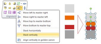
Align the selected objects in a matrix or stack them horizontally / vertically so that they touch each other. The alignment / stacking takes place in the order of selection .
Swap Objects
Swap two or more selected objects. You can specify which dimensions of the objects should be swapped, and whether also the layer position should be swapped.
Slice or Multiply Shape
- Slice or multiply the selected shape in an arbitrary number of rows and columns
- Define the horizontal and vertical spacing precisely.
Align in Table
Align the selected objects (e.g. icons, flags, harvey balls, traffic lights) relative to the table cell they are (roughly) positioned over.
Align the size of all selected objects to the size of the Master , either for width, height, or both. The Master is always the object that you selected last.
Stretch Objects
Stretch the selected objects to the far edge of the Master . The Master is always the object that you selected last.
Fill Space Between Objects
Fill the gap between all selected objects and the Master (if any). The Master is always the object that you selected last.
Magic Resizer
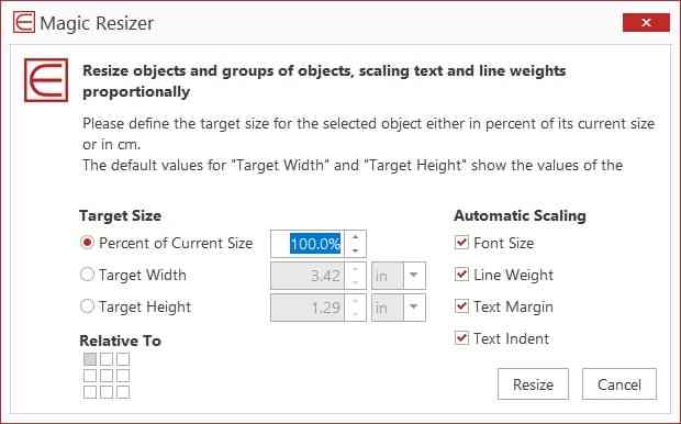
Resize the selected objects to a given absolute or relative size. You can choose to which attributes (size, line weight, font size etc.) the resizing factor should be applied.
Align Angles
Align the angles of all selected block arrows to the Master . The Master is always the object that you selected last.
Align Process Chain
Align the selected block arrows to form a process chain. The Master will define the angle, the position and sizing for all other block arrows in the process chain. The gaps between block arrows are filled from left to right and from top to bottom .
Adjust Pentagon Header
Adjust the header boxes of headed Conclusion boxes (standard elements in the Element Wizard). Select a pentagon (block arrow) and the corresponding header box before using this feature.
Align Block Arrows
Apply a standard style to all selected block arrows or define your own metrics based on the Master . The Master is always the object that you selected last.
Align Rounded Rectangles
Define the radius for the selected rounded rectangles or use the Master object’s value. The Master is always the object that you selected last.
Custom Color Palettes
Use color palettes 100% tailored to your corporate design and easily distinguish all colors by groups, names, or RGB values.
Color Picker | Convert Colors
- Pick and use colors from anywhere on screen
- Convert all theme colors in current selection to RGB colors to make the colors independent of the slide master and theme used.
- Convert all matching RGB colors in current selection to theme colors to automatically adapt to the slide master and theme used.
All fill, line and font colors at your fingertips with a single click.
Split | Merge Text Boxes
Split the selected text box at the cursor position to create two separate text boxes.
Merge the selected text boxes in a single text box. The text boxes will be merged in the order of selection .
Hide Selected Objects Temporarily
The objects will maintain their horizontal, vertical and layer position while hidden. Hidden objects can be shown again with the command Unhide Hidden Objects . This is particularly useful if you have a lot of overlapping or layered objects on a slide. You can easily get rid of everything that is in the way.
Navigate long presentations quickly with the Navigation functions: Go to previous / next slide in history or enter slide number.
Expert Tools
Save even more time with our expert tools: You may not use them on a daily basis but they will be invaluable when you need them.
Language | User Interface Settings
Pick your preferred language. Currently available languages are English , French , German , Italian , Simplified Chinese , Traditional Chinese .
Adjust the user interface to suit your needs:
- Basic – display only the most important functions
- Expert – the default setting displaying all functions
- Admin – includes additional functions for customizing Efficient Elements for presentations
- Time Saving
Finally time to take care of your real job instead of wasting time with office applications.
- Take advantage of ready-to-use slide templates
- Let the Wizards to the work for you
- Get done with less clicks thanks to the optimized user interface
- Save an average of 2 hours per week
- Corporate Design
It has never been easier to comply with your company’s corporate design guidelines.
- Generate agendas derived from your company’s agenda templates
- Insert slide elements from your customized library
- Select colors from a palette defined by your style guide
- Apply your style guide with one-click-formatting
- Format standard bullets to match your style guide
Get professional results of your work satisfying the highest quality standards.
- Be more precise with the Efficient Elements Master Shape Concept
- Use slide templates and elements that have been minutely prepared for your PowerPoint master
- Use the Format Wizard to place objects on predefined exact positions
- Create a summary of your action titles to check your storyline
License Models
We offer three different license models for our products. Most of our customers choose the Corporate License as it offers the best value.
|
| Single User License | Multi User License | Corporate License |
| License Users | Single Named User | Multiple Named Users | All Employees |
| License Period | 1 Year | ||
| License Expiration | Individual | Common | |
| License Key | Individual | Common (can be included in installer package) | |
| Benefits | Flexibility | 1. Additional users can be added during the license period at monthly prices | 1. Attractive pricing model by user groups |
Software Deployment Options
As a standard, we offer two different types of Microsoft Windows Installer (MSI) packages:
Per-User Installation
- Installation for currently logged in Windows user only
- Default installation path: Local Application Data
- No administrative privileges required
- Automatic updates (optional)
Per-Machine Installation
- Installation for all users on a machine
- Default installation path: Program Files (x86)
- Administrative privileges required
- Updates via SCCM or similar deployment tools
- ActiveState Software
- Agisoft LLC
- Atom Security
- AUTOSAR Engineer
- ComponentOne
- FOXIT SOFTWARE
- FusionCharts
- Hex-Rays SA
- Infragistics
- Lassalle Technologies
- LightningChart Ltd
- MATHEMATICA
- Micro Focus
- Nagios Enterprises
- Nitro Software
- NTP Software
- Objective Systems, Inc.
- OSS Nokalva
- PL/SQL DEVELOPER
- print-conductor
- Scientific Software
- Software Companions
- Software FX
- Software Verify
- SonarSource
- Source Insight
- Sparx Systems
- SpectraPLUS-DT
- Steema Software
- Super Flexible Software
- Systat Software
- TEKLYNX SOFTWARE
- THARO SYSTEMS
- Tracker Software
- VanDyke Software
- Wondershare
- New release
- Industry News
- Marketing activities
- Technical Support
- Project Development
- Project production
- Equipment Leasing
- common problem
- Manufacturing
- Financial sector
- Architective
- company profile
- company culture
- development path
© Copyright 2000-2023 COGITO SOFTWARE CO.,LTD. All rights reserved

Presentory for Windows
Presentory for mac, presentory online.
Rebrand your approach to conveying ideas.
Differentiate your classroom and engage everyone with the power of AI.
Knowledge Sharing
Create inspiring, fun, and meaningful hybrid learning experiences
Create with AI
- AI Tools Tips
Presentation Ideas
- Presentation Topics
- Presentation Elements
- Presentation Software
- PowerPoint Tips
Presentation Templates
- Template Sites
- Template Themes
- Design Ideas
Use Presentory Better
- Creator Hub
More Details
- Basic Knowledge
- Creative Skills
- Inspirational Ideas
Find More Answers
- LOG IN SIGN UP FOR FREE
- Mastering Presentation Excellence With Efficient Elements: A How-To Guide
- How to Use Keynote Remote to Control Presentation from iPhone, iPad, or Apple Watch
- 10 Best Sites for Keynote Presentation Templates
- Detailed Explanation of Presentation Tips and Speaking Techniques
- A Comprehensive Guide to Convert PPT to Video with Sound
- 10 Useful PowerPoint Animation Tips in 2023
- Learn and Explore 5 Best Comparison Slides Templates
- A Comprehensive Guide to Creating Mind Maps in PowerPoint
- A Complete Guide to SWOT Analysis PPT For Proper Professional Growth
- Get The Finest Idea of Designing Perfect Roadmap Templates in No Time!
- How to Create Venn Diagram in PowerPoint, Google Docs, and Google Slides
- Elaborating The Unique Ways of How to Create a Timeline in PowerPoint
- Compelling Presentations: The Essential 5 PPT Elements for Engagement
- Unveiling the Key Elements of a Dynamic and Impactful Presentation
- Everything You Need to Know About the Table of Contents of PowerPoint
- How to Create PowerPoint Presentations with ChatGPT [2023 Update]
- How is AI Revolutionizing Presentations? (Tips & Tool)
- Top 14 AI Presentation Makers in August 2023 [Free & Paid]
- How To Add Animations and Transitions In Google Slides
- How to Use Slides Changing Remote to Control Presentation from Mobile Devices
- Over 100 Inspiring Google Slides Themes and Ideas for Every Occasion
- What is Google Slides? A Comprehensive Guide to Practical Usage
- How to easily import themes into Google Slides
- 10 free and aesthetic Google Slides templates sites
- How to Convert Google Slides to Video? [5 Methods]
- A Comprehensive Guide to Adding Video to Google Slides [Easy Navigation]
- How to Add Slide Transitions in PowerPoint?
- How to Use PowerPoint Morph Transition in 2023
- How to Control Your PowerPoint by Using an Apple Watch?
- How to Enhance Your PowerPoint Presentations with 3D Models
- An In-Depth Guide to Using PowerPoint
- Mastering Slide Transitions in Flutter: A Comprehensive Guide
- Tutorial | How to user Slide Master in PowerPoint
- How to Record Your Screen in PowerPoint? [3 Ways]
- How to Convert PowerPoint to Video Conversion on Windows and macOS?
- How to Add Video to PowerPoint from YouTube and Local Path
- 8 Ways to Solve “PPT Cannot Play Media”
- Top Guide to Play Video Automatically in PowerPoint
PowerPoint is the most popular platform for creating presentations. However, professionals from corporate fields need more productivity while creating presentations in PowerPoint. That’s why they use multiple add-ins to enhance their work efficiency.
One such add-in is Efficient Elements, which offers various beneficial functions. You can execute editing and formatting quicker with the Efficient Elements. It also makes data visualization easier by displaying graphs and charts proficiently. You can also add icons, shapes, and illustrations instantly with the help of Efficient Elements. Therefore, you should use Efficient Elements for presentations to boost productivity.
In this article
- Getting Started with Efficient Elements
- Key Features of Efficient Elements for Presentations
- Presentory - Making your Presentation Creation Efficient and Impactful
Part 1. Getting Started with Efficient Elements
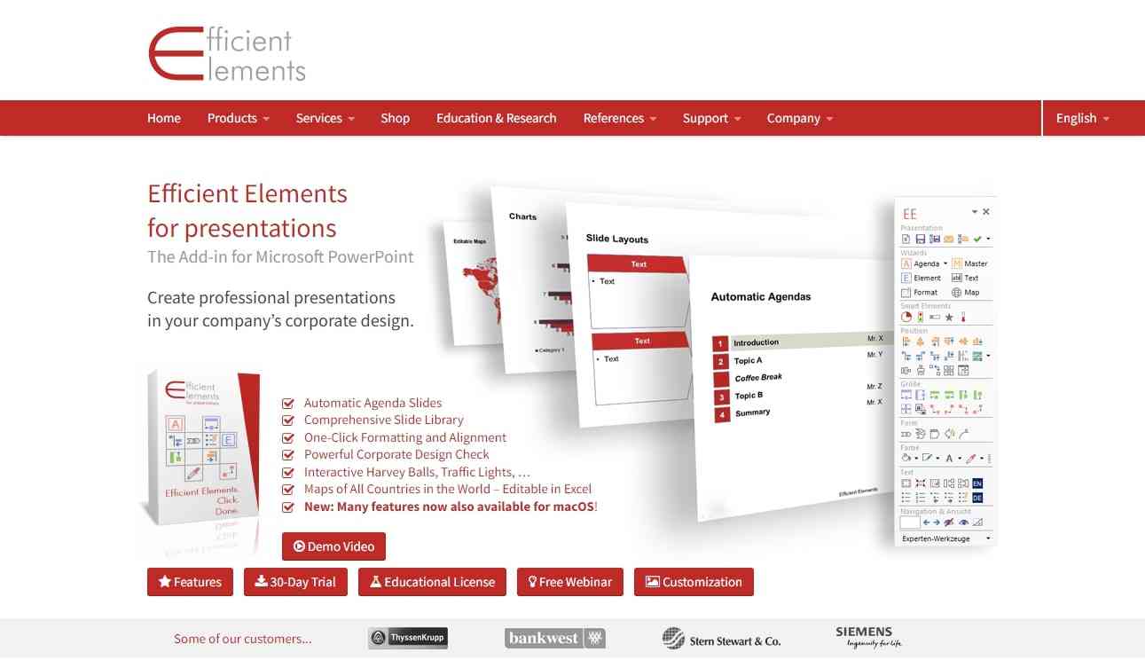
To download the Efficient Elements add-in, navigate to its official website. Click the Download button and specify your operating system. Wait until the installation process is finished. Afterward, follow the on-screen instructions to launch it on PowerPoint. Ensure to activate its license for its free 30-day trial.
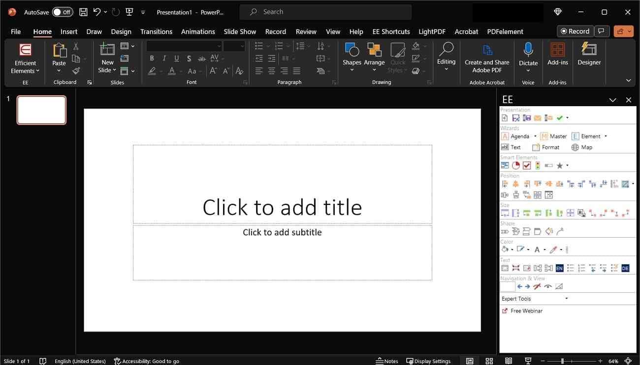
After the successful launch, you will be able to see the interface of the Efficient Elements in the right section. From there, you can select each option to create and edit your presentation. You can also find multiple wizards for content creation. For example, text wizard, format wizard, element wizard, master wizard, etc.
Part 2. Key Features of Efficient Elements for Presentations
Efficient Elements consist of many unique features. This section will provide a detailed overview regarding the main features of the Efficient Elements. Thus, let’s dig into the details below:
1. Agenda Wizard
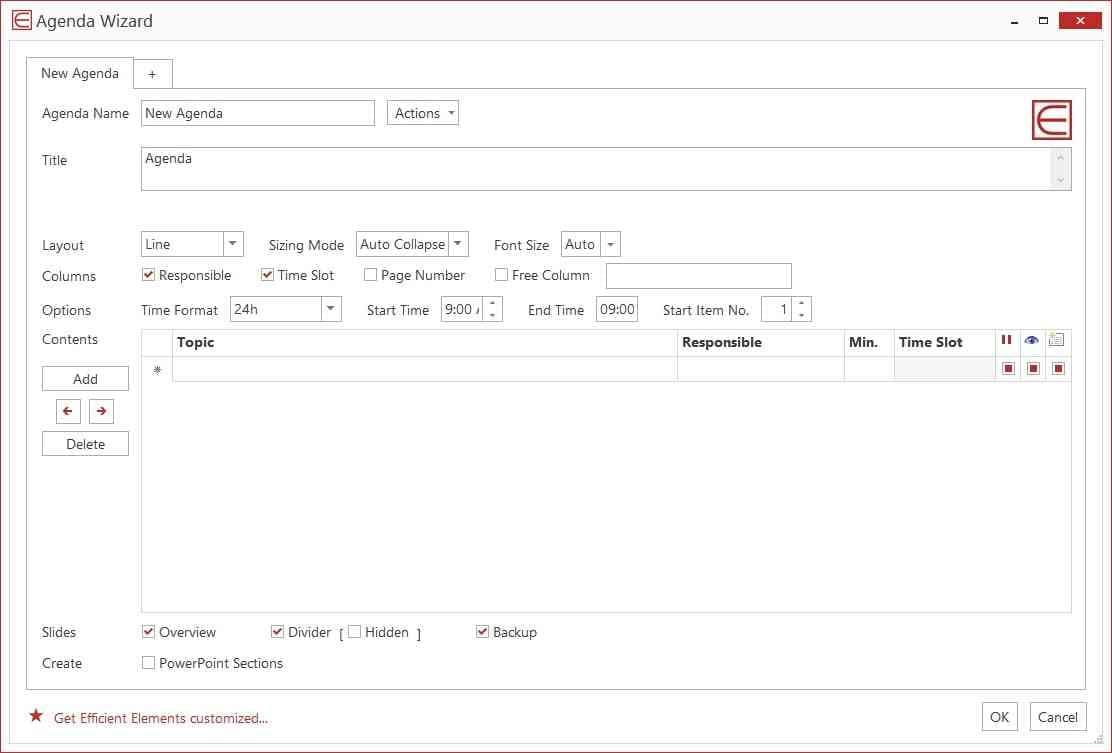
This PowerPoint Efficient Elements Wizard assists you in adding agenda slides to your presentation. It automatically determines time slots and page numbers with great proficiency. If you have multi-day meetings, an agenda wizard can generate multiple agendas for you. It can also hide sub-items in your slides.
Moreover, it can automatically insert line breaks in the slides. While creating agenda slides, you can customize layouts according to your corporate field. You can change the layout design, sizing mode, and font size from the settings. It also lets you export all agenda slides to .xml instantly.
2. Element Wizard
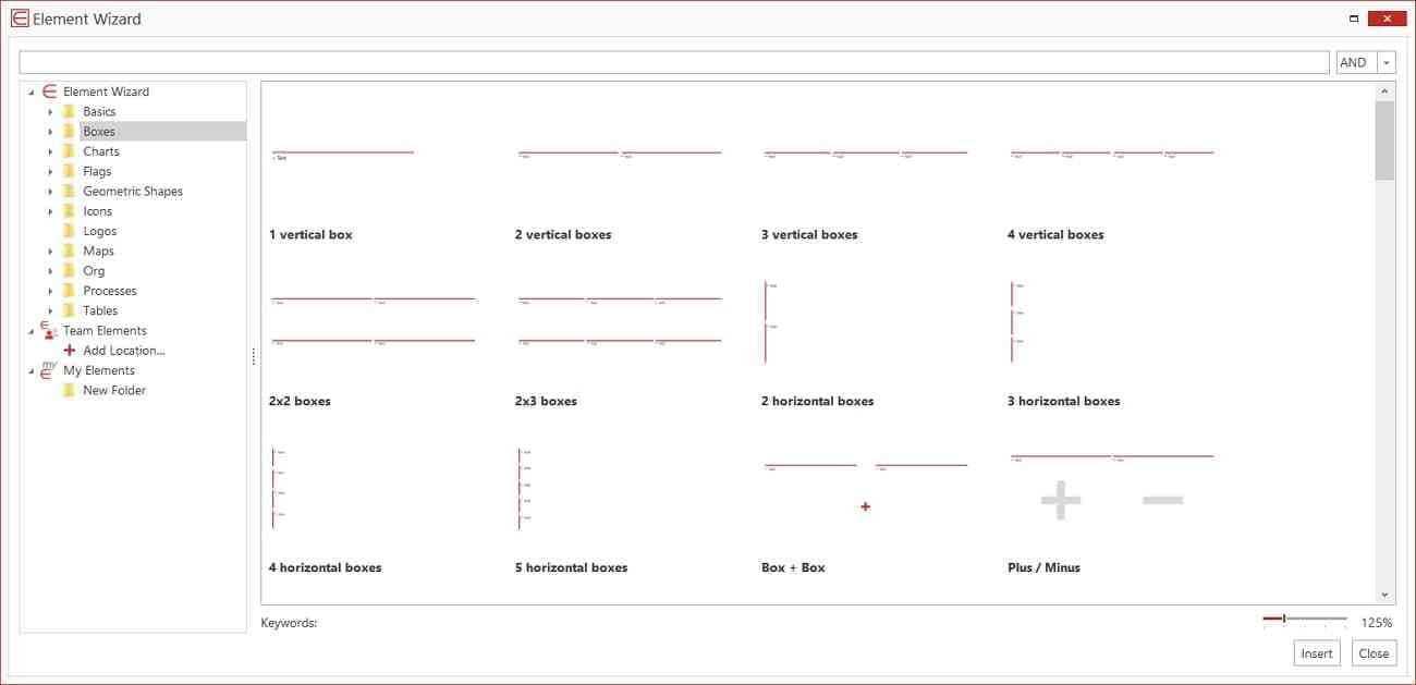
Element Wizard helps you in adding useful elements to the slides. There are many box layouts like vertical boxes, horizontal boxes, action reactions, implications, separation, etc. You can also include charts, data-driven diagrams, manual diagrams, and boxes. To explain your content briefly, you can also insert tables, logos, flags, and shapes.
You can also add your company’s slide collection to its custom edition. By doing so, you can add customized elements relevant to your company in the slides. Furthermore, you can create a separate folder for your team elements. It will make easy collaboration while working on team projects.
3. Text Wizard
Text Wizard helps add text snippets in the slides within a few clicks. It lets you add quotations from various options, such as single quotes, unquotes, etc. Moreover, you can add multiple symbols like copyright, trademark, arrow, plus, minus, etc.
It also allows you to add symbols related to conventions for numbers, abbreviations, and addresses. By using the feature "My Text," you can add your text snippets. This will make it easier for you and your team to add personalized text snippets with a single click.
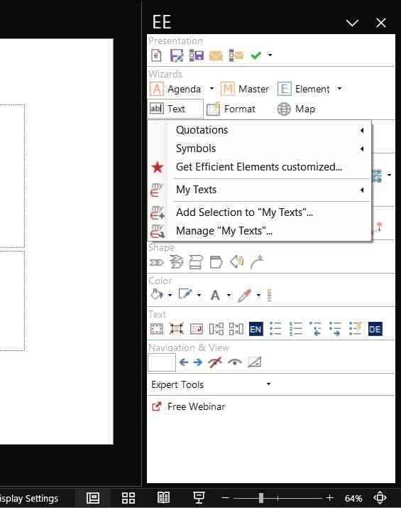
4. Format Wizard
With Format Wizard, you can set predefined formats on specified objects. You can adjust attributes for the size and position of your desired objects. Moreover, you can change the settings of paragraphs, bullet points, and text options. By doing so, you can ensure consistent formatting in all the slides. Moreover, you can execute precise positioning of the selected objects easily.
By using the "My Formats" option, you can define your custom formats. Furthermore, using "Manage My Formats," you can import and export the collected formats flawlessly. Thus, the Format Wizard helps in the efficient formatting of PowerPoint slides.

5. Position, Size, Shape
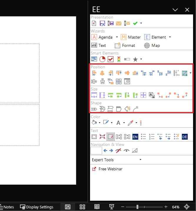
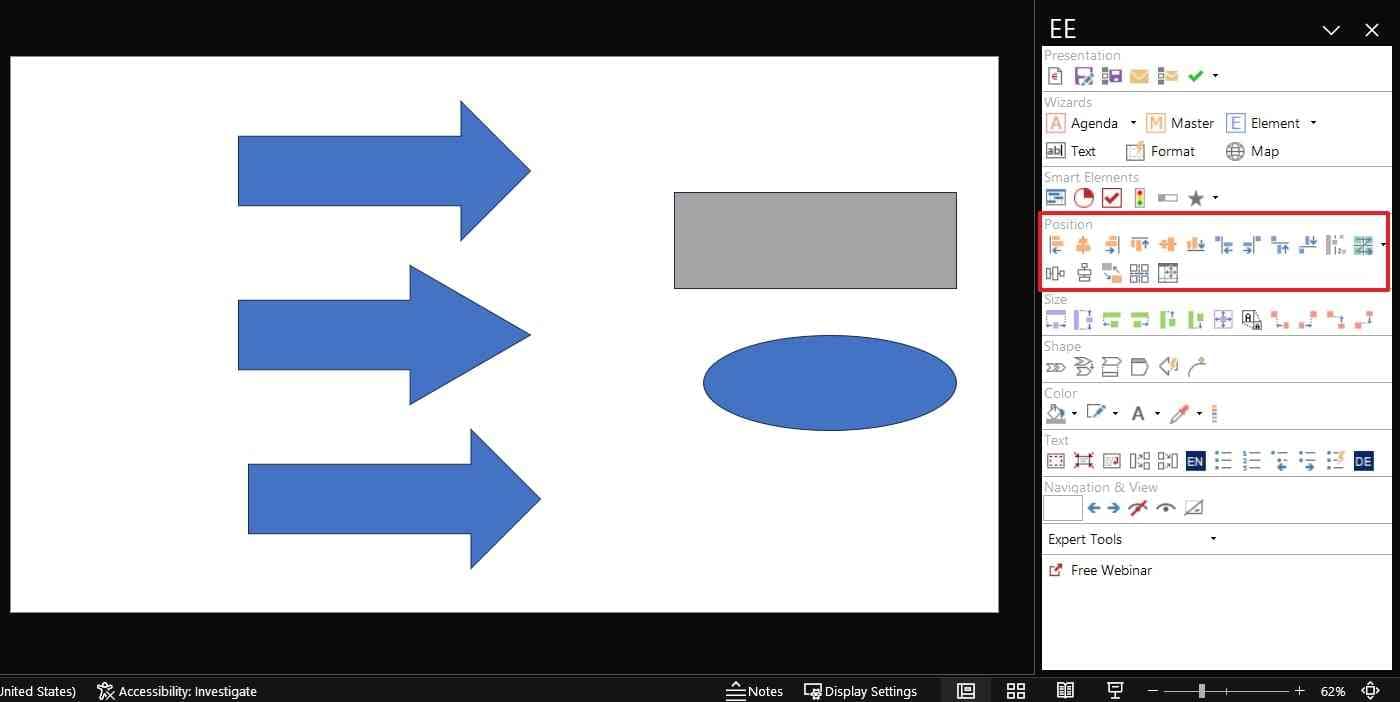
The Position section allows you to adjust the alignment of the objects with precision. You can select a master object that will act as a reference object for positioning and resizing. Using the given options in this section, you can align right, dock right, switch, and distribute horizontally.
Similarly, the Size section determines the size of your elements. It offers all the essential tools through which you can stretch and adjust the width of the elements. With the Magic Resizer option, you can resize the desired objects to a relative size.
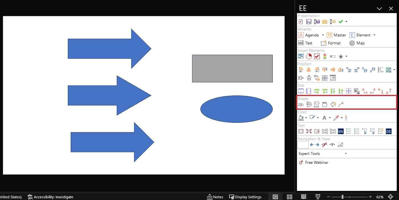
On the other hand, the Shape section allows automated adjustment of shapes. For instance, you can align block arrows and angles easily. Similarly, you can adjust the pentagon header flawlessly. With such options, you can add accuracy to your objects and illustrations.
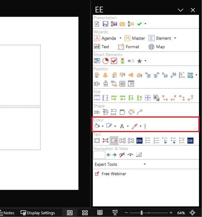
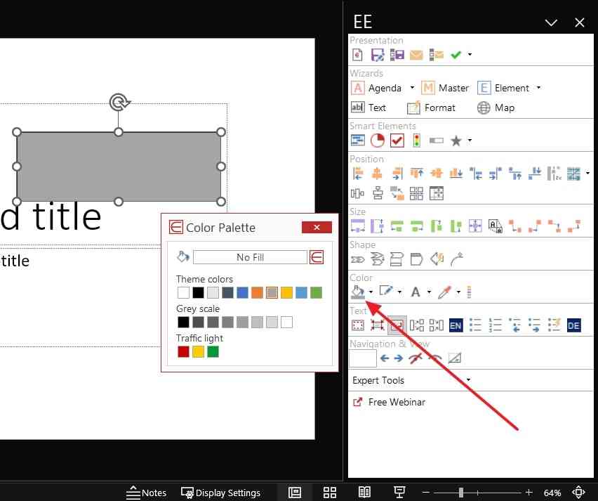
The Color section lets you apply your corporate colors to all the slides. From the color palette, you can choose any desired color and apply it to the selected element. You can also manage fill, line, and font color from the options. You can also pick colors from any part of your screen or convert the selected color into RGB and theme colors.
Complete Instructions to Use the Efficient Elements Add-in On PowerPoint
In this section, we will provide brief details to use the major features of the Efficient Elements PowerPoint . Using its key features, you can edit and format your slides effortlessly. Hence, consider this section.
1. How to Build a Presentation by Adding Agenda Slides Between Topics or Sections
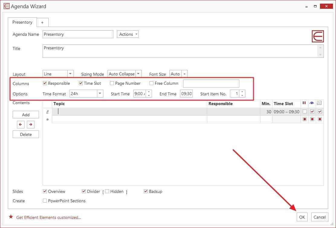
Step 1. After adding the Efficient Element add-in, click on the “Agenda” wizard. It will open a new window in which you can create agenda slides. From the window, add the agenda name, title, and subtitle. You can also manage the layout by choosing font size and sizing mode.
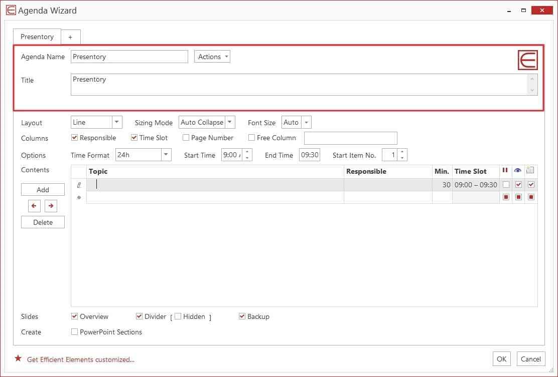
Step 2. You can also specify the agenda items from the Column row. From "Options," you can edit the time format, start timing, and end timing. You can also add and delete the contents, preferably. Once done, hit the “OK” button.
2. How to Use “Position/Size/Shape” to Make Adjustments of Customized Elements Precise and Efficient
Step 1. Your last selected object will serve as a master object. It will function as a reference point for alignment and positioning. After selecting the objects, you can navigate to the Position section. From there, you can align the objects with respect to the master object. You can also dock and distribute the objects from the given options.
Step 2. After adjusting the position, you can go to the Size section. You can align, stretch, and fill the selected objects according to your choice. You can also select “Magic Resizer” to resize the selected objects to absolute or relative value.
Step 3. Now, you can head to the Shape section to adjust the shapes of your objects. From the given options, you can align process chains and angles precisely. Similarly, you can align a rounded rectangular radius.
3. How to Use Colors Allowed By Your Corporate Design in the “Color” Section Instructions.
Navigate to the Color section and set the fill, font, and line colors of the selected objects. Through the color picker option, you can pick the desired color from the screen. Afterward, you can add it to your custom color theme.
Part 3. Presentory – Making your Presentation Creation Efficient and Impactful
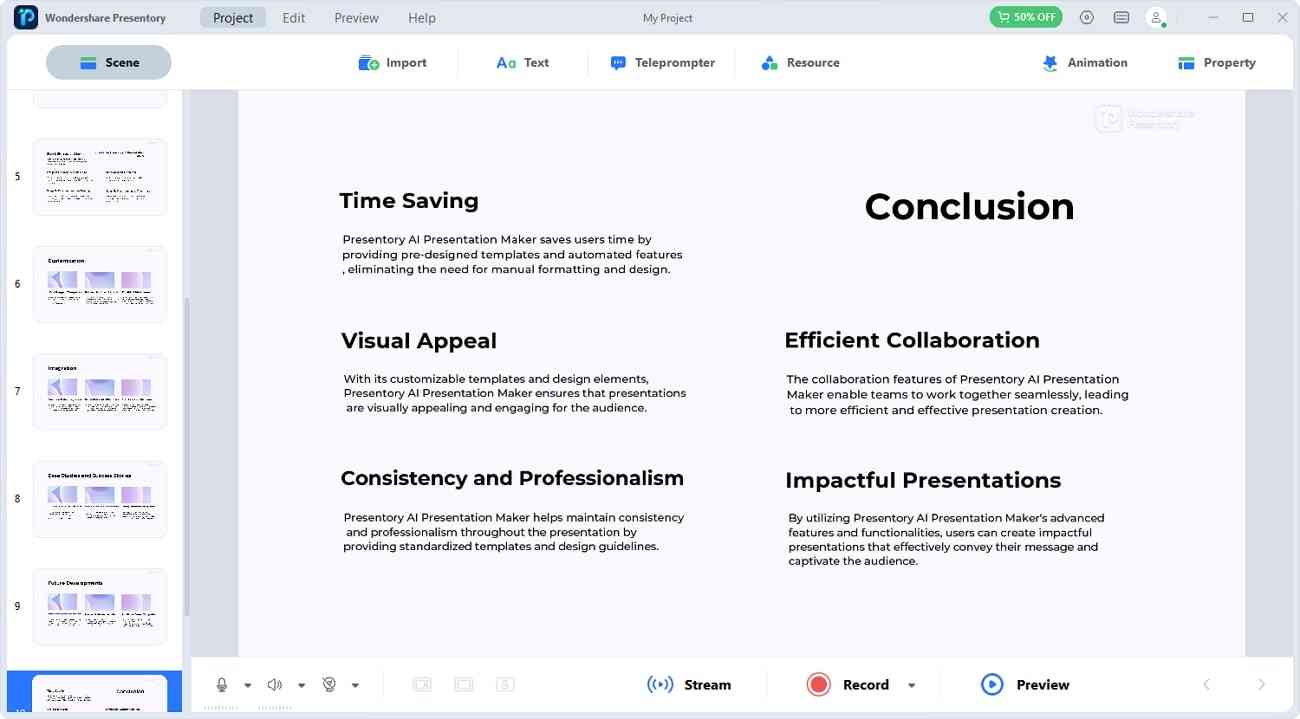
To make the creation of presentations seamless, you can use an AI-powered tool. Wondershare Presentory is an advanced tool that can automate the generation of presentations. It offers many unique features to optimize your presentations. Through this tool, you can add transitions and animated effects to the selected slides. You can also insert colorful or themed backgrounds in the slides to add vibrance.
Moreover, try adding the stickers and text graphics from the given options. You can also use beautification effects to enhance your appearance. It will make you confident while recording or streaming your presentation. Hence, you should try Presentory to create presentations with the use of game-changing AI features.
Free Download Free Download Try It Online
Key Features
- AI Generation of Slides: You can add your presentation topics in the Presentory to create automatic slides. The tools will create a relevant outline and slides in your desired theme style.
- Pre-set Templates: This tool offers many popular and trending templates. Each template has its own unique layout and color theme. Thus, you can select your desired template that is relevant to your presentation.
- Stream Your Presentation: With a single click, you can start presenting your presentation on live-streaming platforms. It also lets you record your presentation with your adjusted microphone and camera settings.
- Collaborate and Share: You can upload and share your presentations in its cloud storage. In addition, you can password-protect your confidential presentations for additional security. Also, you can collaborate with your colleagues through its cloud services.
On PowerPoint, you can incorporate many add-ins to enhance your user experience. Through this article, you can get a detailed review of the Efficient Elements for presentations . However, to improve your overall experience, you should use an AI-supported tool. Therefore, we recommend using Presentory to create fast and impressive presentations. It has a friendly interface that offers a comfortable environment for creating presentations.
You May Also Like
- Crafting an Effective PowerPoint Front Page Design for Maximum Impact
- Mastering Pecha Kucha Presentation: A Comprehensive Template Guide
- Elevate Your Skills: Best Topics for Presentation in English
Related articles
Efficient Elements for Presentations for Windows
- By Efficient Elements
- Trial version
- User Rating
Key Details of Efficient Elements for Presentations
- Create Professional looking PowerPoint presentations in less time.
- Last updated on June 27, 2013
- There have been 1 updates
- Also available on
Clean (it's extremely likely that this software program is clean)
Developer's Description
Explore more.
Word to Image Converter
Clickable card, bcl easypdf printer, team connect.
ProPrompter Software
PlusX Excel 2007/2010 Add-In (32-bit)
S-Ultra Power Spell Checker
Vyapin office 365 management suite.

PlusX Excel 2007/2010 Add-In (64-bit)
PlusX Excel 2013 Add-In (32-bit)
Squirrel ProductivityTools
Full specifications.
- Windows Vista
Related Software
Microsoft Excel 2007
Create and format spreadsheets, analyze and share information to make more informed decisions.
Microsoft Office 2019
Get things done with the next on-premises version of Word, Excel, PowerPoint, Outlook, Project, Visio, Access, and Publisher.
Microsoft Office Word 2007 Update
Get an update to Microsoft Office Word 2007.
Microsoft Word 2013
Take your document processing to another level and work with video and PDF files.
TechRepublic
Account information, share with your friends.
10 slide design tips for producing powerful and effective presentations
Your email has been sent
This article is also available as a PDF download .
By Garr Reynolds
#1: Keep it simple
PowerPoint uses slides with a horizontal, or Landscape, orientation. The software was designed as a convenient way to display graphical information that would support the speaker and supplement the presentation. The slides themselves were never meant to be the star of the show. (The star, of course, is your audience.) People came to hear you and be moved or informed (or both) by you and your message. Don’t let your message and your ability to tell a story get derailed by slides that are unnecessarily complicated, busy, or full of what Edward Tufte calls “chart junk.” Nothing in your slide should be superfluous, ever.
Your slides should have plenty of white space, or negative space. Do not feel compelled to fill empty areas on your slide with your logo or other unnecessary graphics or text boxes that do not contribute to better understanding. The less clutter you have on your slide, the more powerful your visual message will become.
#2 Limit bullet points and text
Your presentation is for the benefit of the audience. But boring an audience with bullet point after bullet point is of little benefit to them. Which brings us to the issue of text. The best slides may have no text at all. This may sound insane given the dependency of text slides today, but the best PowerPoint slides will be virtually meaningless without the narration (that is you). Remember, the slides are meant to support the narration of the speaker, not make the speaker superfluous.
Many people often say something like this: “Sorry I missed your presentation. I hear it was great. Can you just send me your PowerPoint slides?” But if they are good slides, they will be of little use without you. Instead of a copy of your PowerPoint slides, it is far better to prepare a written document that highlights your content from the presentation and expands on that content. Audiences are much better served receiving a detailed, written handout as a takeaway from the presentation, rather than a mere copy of your PowerPoint slides. If you have a detailed handout or publication for the audience to be passed out after your talk, you need not feel compelled to fill your PowerPoint slides with a great deal of text.
We’ll talk more about this in the delivery section below, but as long as we are talking about text, please remember to never, ever turn your back on the audience and read text from the slide word for word.
|
|
#3: Limit transitions and builds (animation)
Use object builds and slide transitions judiciously. Object builds (also called animations), such as bullet points, should not be animated on every slide. Some animation is a good thing, but stick to the most subtle and professional (similar to what you might see on the evening TV news broadcast). A simple Wipe Left-to-Right (from the Animations menu) is good for a bullet point, but a Move or Fly, for example, is too tedious and slow (and yet, is used in many presentations today). Listeners will get bored quickly if they are asked to endure slide after slide of animation. For transitions between slides, use no more than two or three types of transition effects and do not place transition effects between all slides.
#4: Use high quality graphics
Use high quality graphics, including photographs. You can take your own high quality photographs with your digital camera, purchase professional stock photography, or use the plethora of high quality images available online. (But be cautious of copyright issues.) Never simply stretch a small, low-resolution photo to make it fit your layout–doing so will degrade the resolution even further.
Avoid using PowerPoint Clip Art or other cartoonish line art. Again, if it is included in the software, your audience has seen it a million times before. It may have been interesting in 1993, but today the inclusion of such clip art often undermines the professionalism of the presenter. There are exceptions, of course, and not all PowerPoint art is dreadful, but use it carefully and judiciously.
I often use images of people in my slides, as photography of people tends to help the audience connect with the slide on a more emotional level. If the photographic image is secondary in importance, then I decrease the opacity and add a Gaussian Blur or motion filter in Photoshop. If the photographic image is the primary area I want the audience to notice (such as a picture of a product), then the image can be more pronounced and little (or no) text is needed.
#5: Have a visual theme but avoid using PowerPoint templates
You clearly need a consistent visual theme throughout your presentation, but most templates included in PowerPoint have been seen by your audience countless times (and besides, the templates are not all that great to begin with). Your audience expects a unique presentation with new (at least to them) content; otherwise, why would they be attending your talk? No audience will be excited about a cookie-cutter presentation, and we must therefore shy away from any supporting visuals, such as the ubiquitous PowerPoint Design Template, that suggests your presentation is formulaic or prepackaged.
You can make your own background templates, which will be more tailored to your needs. You can then save the PowerPoint file as a Design Template (.pot) and the new template will appear among your standard Microsoft templates for your future use. You can also purchase professional templates online.
#6: Use appropriate charts
Always be asking yourself, “How much detail do I need?” Presenters are usually guilty of including too much data in their onscreen charts. There are several ways to display your data in graphic form; here are a few things to keep in mind:
Pie charts. Used to show percentages. Limit the slices to 4-6 and contrast the most important slice either with color or by exploding the slice.
Vertical bar charts. Used to show changes in quantity over time. Best if you limit the bars to 4-8.
Horizontal bar charts. Used to compare quantities. For example, comparing sales figures among the four regions of the company.
Line charts. Used to demonstrate trends. For example, here is a simple line chart showing that our sales have gone up every year. The trend is good. The arrow comes in later to underscore the point: Our future looks good!
In general, tables are well suited for side-by-side comparisons of quantitative data.
However, tables can lack impact on a visceral level. If you want to show how your contributions are significantly higher than two other parties, for example, it would be best to show that in the form of a bar chart (below). But if you’re trying to downplay the fact that your contributions are lower than others, a table will display that information in a less dramatic or emotional way.
#7: Use color well
Color evokes feelings. Color is emotional. The right color can help persuade and motivate. Studies show that color usage can increase interest and improve learning comprehension and retention.
You do not need to be an expert in color theory, but it’s good for business professionals to know at least a bit on the subject. Colors can be divided into two general categories: cool (such as blue and green) and warm (such as orange and red). Cool colors work best for backgrounds, as they appear to recede away from us into the background. Warm colors generally work best for objects in the foreground (such as text) because they appear to be coming at us. It is no surprise, then, that the most ubiquitous PowerPoint slide color scheme includes a blue background with yellow text. You do not need to feel compelled to use this color scheme, although you may choose to use a variation of those colors.
If you will be presenting in a dark room (such as a large hall), a dark background (dark blue, gray, etc.) with white or light text will work fine. But if you plan to keep most of the lights on (which is highly advisable), a white background with black or dark text works much better. In rooms with a good deal of ambient light, a screen image with a dark background and light text tends to washout, but dark text on a light background will maintain its visual intensity a bit better.
Learn more:
- PresentationPro.com has some great Flash tutorials, including one on color.
- Go to the CreativePro.com to learn more about color.
- Dummies.com has a good short article on how to use the Color Schemes in PowerPoint.
#8: Choose your fonts well
Fonts communicate subtle messages in and of themselves, which is why you should choose fonts deliberately. Use the same font set throughout your entire slide presentation and use no more than two complementary fonts (e.g., Arial and Arial Bold). Make sure you know the difference between a serif font (e.g., Times New Roman) and a sans-serif font (e.g., Helvetica or Arial).
Serif fonts were designed to be used in documents filled with lots of text. They’re said to be easier to read at small point sizes, but for onscreen presentations, the serifs tend to get lost due to the relatively low resolution of projectors. Sans- serif fonts are generally best for PowerPoint presentations, but try to avoid the ubiquitous Helvetica. I often choose to use Gill Sans, as it is somewhere in between a serif and a sans-serif font and is professional yet friendly and “conversational.” Regardless of what font you choose, make sure the text can be read from the back of the room.
#9: Use video or audio
Use video and audio when appropriate. Using video clips to show concrete examples promotes active cognitive processing, which is the natural way people learn. You can use video clips within PowerPoint without ever leaving the application or tuning on a VCR. Using a video clip not only will illustrate your point better, it will also serve as a change of pace, thereby increasing the interest of your audience.
You can use audio clips (such as interviews) as well. But avoid using the cheesy sound effects that are included in PowerPoint (such as the sound of a horn or applause when transitioning slides). The use of superfluous sound effects attached to animations is a sure way to lose credibility with your audience.
#10: Spend time in the slider sorter
According to the Segmentation Principle of multimedia learning theory, people comprehend better when information is presented in small chunks or segments. By getting out of the Slide view and into the Slide Sorter view, you can see how the logical flow of your presentation is progressing. In this view, you may decide to break up one slide into, say, two or three slides so that your presentation has a more natural and logical flow or process. You’ll also be able to capture more of the gestalt of your entire presentation from the point of view of your audience. You will be able to notice more extraneous pieces of visual data that can be removed to increase visual clarity and improve communication.
Garr Reynolds is currently Associate Professor of Management at Kansai Gaidai University, where he teaches Marketing, Global Marketing, and Multimedia Presentation Design. Garr is active in the Japanese community and can often be found presenting on subjects concerning design, branding, and effective corporate communications. In addition to his Web site , he maintains a blog, Presentation Zen , which offers insights into professional presentation design.
Subscribe to the Executive Briefing Newsletter
Discover the secrets to IT leadership success with these tips on project management, budgets, and dealing with day-to-day challenges. Delivered Tuesdays and Thursdays
Create a TechRepublic Account
Get the web's best business technology news, tutorials, reviews, trends, and analysis—in your inbox. Let's start with the basics.
* - indicates required fields
Sign in to TechRepublic
Lost your password? Request a new password
Reset Password
Please enter your email adress. You will receive an email message with instructions on how to reset your password.
Check your email for a password reset link. If you didn't receive an email don't forgot to check your spam folder, otherwise contact support .
Welcome. Tell us a little bit about you.
This will help us provide you with customized content.
Want to receive more TechRepublic news?
You're all set.
Thanks for signing up! Keep an eye out for a confirmation email from our team. To ensure any newsletters you subscribed to hit your inbox, make sure to add [email protected] to your contacts list.

You are located in service: Software for the RWTH Aachen University
Efficient elements.

Efficient Elements is software that helps PowerPoint users enhance their presentations quickly and easily by providing a variety of professional templates, graphics and tools. The following functions are provided:
- Agenda Wizard: Creates complex agenda slides in seconds.
- Slide Wizard: Grouped slide elements such as organizational charts, maps, charts, boxes, columns, table patterns and other standard elements in quick access.
- Smart Elements: Your own, frequently used elements can be saved as favorites and are thus available for quick access. This also applies to objects that are only created in PowerPoint.
- Text Wizard: Use this function to insert text modules and special characters from the library. You can also create your own text modules.
- Efficiency: These tools help with the uniform alignment and scaling of selected elements. For example, you can scale all objects on a slide to the same size with just a few clicks. A pipette facilitates the color selection of objects.
- Slice function: You can simply send individual slides by e-mail or save them as your own presentation.
- Expert functions: Here you can, for example, remove notes from presentations before they are sent, show or hide elements for a better overview or adjust grayscale settings to output the presentation optimally on a monochrome printer.
For support requests for the product itself, please contact Efficient Elements
last changed on 05/06/2024
How did this content help you?

| Tên thành viên: | |
| Mật khẩu: | |
| Hôm nay, Thứ 2 30/09/24 8:38 |
| » » Thời gian được tính theo giờ UTC + 7 Giờ |
Efficient Elements for presentations 4.3.1200.1
| Bạn đang xem trang / trang | [ 1 bài viết ] |
| | | |||||||


COMMENTS
Efficient Elements for presentations · Free 30-day Trial · Windows XP, Vista, 7, 8, 8.1 · Office 2007, 2010, 2013 · 32/64bit
In the Microsoft Start menu: Click on 'All Programs' - 'Efficient Elements' - 'Efficient Elements for presentations'. Here you will find the offline available documentation for. Alternatively you will find direct links in the 'Efficient Elements' menu located on the left side of the PowerPoint 'Home' tab.
The Add-in for Microsoft PowerPoint. Create professional presentations. in your company's corporate design. Automatic Agenda Slides. Comprehensive Slide Library. One-Click Formatting and Alignment. Powerful Corporate Design Check. Interactive Harvey Balls, Traffic Lights, ….
Get started with Efficient Elements for presentations easily!Learn how to ...- Save time using Microsoft PowerPoint- Increase the quality of your slides- Cre...
Efficient Elements for presentations - The Add-in for Microsoft PowerPointCreate professional presentations in your company's corporate design:- Automatic Ag...
[email protected]. 中文版 English. Language
To download the Efficient Elements add-in, navigate to its official website. Click the Download button and specify your operating system. Wait until the installation process is finished. Afterward, follow the on-screen instructions to launch it on PowerPoint. Ensure to activate its license for its free 30-day trial.
Overview. Open a new file, check presentation, mail and save selected slides. Create agendas, set master options, insert and save elements, insert text snippets, apply predefined formats. Align, dock, stack and switch objects. Align sizes, stretch objects, fill gaps and apply the magic resizer. Adjust process chains, pentagons, block arrows and ...
Quick Customization Wizard. 1. Header A. 2. Header B. After selecting your template click on 'Next'. A new dialog as well as a sample presentation will open. Assign a name for your template. Choose the Style you would like to set as default for your template.
Curriculum Materials. TeamSTEPPS 3.0 curriculum includes the introduction, four modules, and the implementation section. Introduction to Curriculum. Module 1: Communication. Module 2: Team Leadership. Module 3: Situation Monitoring. Module 4: Mutual Support. Implementation of TeamSTEPPS 3.0.
Download Efficient Elements for Presentations latest version for Windows free to try. Efficient Elements for Presentations latest update: June 27, 2013. Download.com. Find apps, programs and more.
space. Do not feel compelled to fill empty areas on your slide with your logo. or other unnecessary graphics or text boxes that do not contribute to better. understanding. The less clutter you ...
Create unlimited presentations, websites, and more—in seconds. Everything you need to quickly create and refine content with advanced AI. Gamma allows me to package up information in ways I can't with slides, while still creating good flow for my presentations. Ann Marie, Director of Product at Koalafi.
Efficient Elements for presentations Getting Started If you have only a couple of minutes and need to get started quickly with the most important features of Efficient Elements for presentations, our Getting Started guide is for you. Handbook To learn about each feature of Efficient Elements for presentations in detail, please have a look in our Handbook.
Efficient Elements is software that helps PowerPoint users enhance their presentations quickly and easily by providing a variety of professional templates, graphics and tools. ... for example, remove notes from presentations before they are sent, show or hide elements for a better overview or adjust grayscale settings to output the presentation ...
EE Task Pane, EE Button and EE Home Menu. ask PaneAfter installing Efficient Elements you should find a task pane labeled 'EE' or 'Efficient Ele-ments' on the right side of the PowerPoint. win-dow. If needed, you can close the EE Task Pane by clicking on the 'x' located in the top right cor-ner of the t.
License Terms. Educational licenses are valid for one year and may not be used for commercial purposes. Once the license period has expired you can obtain a new license key repeating the same procedure as long as you qualify for educational licenses. The use of free licenses for educational or research related purposes is subject to the Trial ...
Free Download Efficient Elements for presentations 4.3.1200.1 | 99 MB in your company's corporate design. Automatic Agenda Slides. Comprehensive Slide Library. One-Click Formatting and Alignment. Powerful Corporate Design Check. Interactive Harvey Balls, Traffic Lights, ...
Good training is half way to success. To help you getting started with Efficient Elements, we offer three different trainings: Free Webinar Webinar+ In-depth Training Sign UporWatch Recording You will get a first overview of Efficient Elements for presentations You will get a first overview of Efficient Elements for presentations You will get an in-depth introduction to Efficient Elements for ...
You are welcome to use your own order form. Please make sure the following information is included: Number and description of items ordered. Invoice address. VAT ID (for EU customers) UID (for Swiss customers) Efficient Elements for presentations: License 99 EUR per User per Year · Customization to Your Corporate Design from 199 EUR.